


Today is an exciting time to be a web developer. Web browsers and web standards have matured to the point that today's programmer has rich frameworks available to boost productivity and to reach wide audiences with less code and fewer headaches. HTML, CSS, and JavaScript have converged into a powerful and coherent unit that allows web applications to be both aesthetically and architecturally beautiful and elegant. Kendo UI, from Telerik, is a modern framework that embraces these advances and provides a set of tools to enable rich web development and configurable widgets, all with a familiar and accessible syntax.
Along these same lines, development tools have been improving as well and Visual Studio 2012 from Microsoft is a good example. JavaScript is now a first-class citizen in the Microsoft world and there are many improvements for JavaScript development in the IDE, along with improved support for HTML5 and CSS3. This is largely to support a new programming model in Windows 8 that allows web developers to take their skills to the Windows 8 desktop, but these improvements also directly benefit ASP.NET development —especially ASP.NET MVC. This is the programming environment that we will use throughout this book to demonstrate and learn the Kendo UI framework for the web.
Kendo UI for web development is a client-side, jQuery-powered JavaScript framework that is not dependent on any specific server technology or platform. This means that you can type and run the client-side examples in this book using your choice of tools and debugging/testing environment. However, Telerik has also released a great set of server-side extensions for the Microsoft ASP.NET MVC framework that can significantly boost productivity. To take advantage of both of these models, I will be using Visual Studio 2012 and the ASP.NET MVC 4 project template for all my demonstrations and I invite you to follow along with me. Visual Studio 2012 Express is a freely available download from http://www.microsoft.com/visualstudio/eng/products/visual-studio-overview, if you do not already have it installed.
Tip
Rather download completed samples?
The samples that are displayed in this book are available for download and you can start from the completed code if you do not want to follow all of the steps of setting it up yourself.
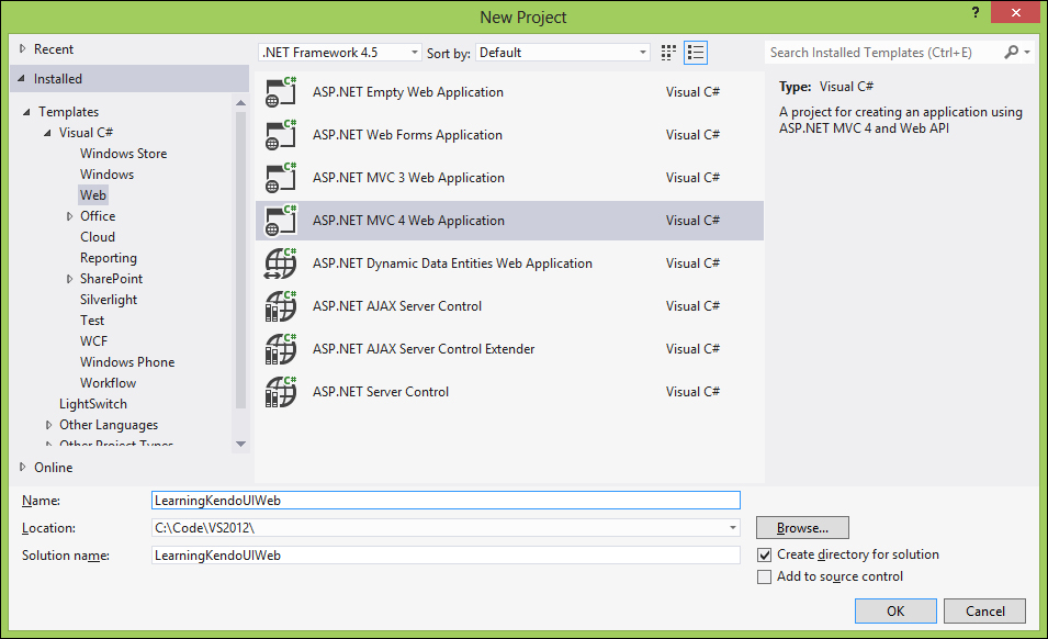
Once you have Visual Studio 2012 installed, click on New Project either from the Start page or from the File menu. Then choose ASP.NET MVC 4 Web Application from the Web group of project choices. As you can see from the following screenshot, I have named my project
LearningKendoUIWeb:
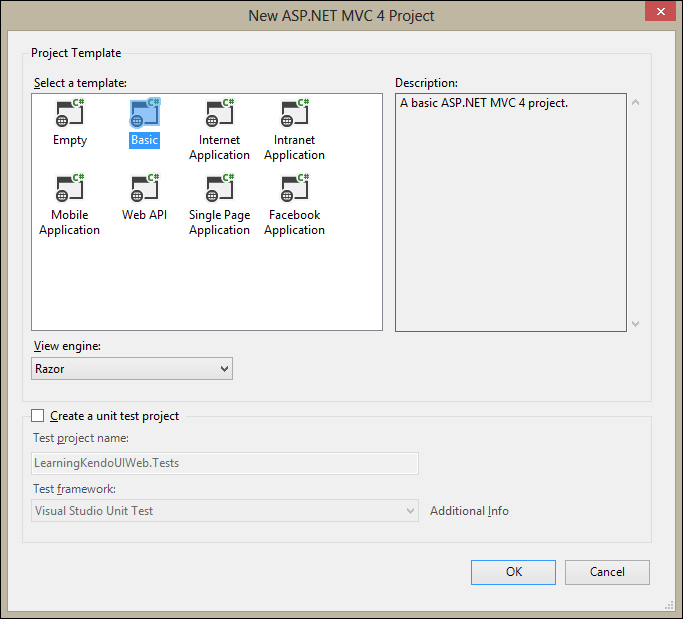
Select this and click on OK. The next window will display some selections for the type of template you want to use. I chose the basic template, but you can choose any of the templates other than the empty template in order to follow along with the examples. You do not need to create a unit test project for the purposes of this book.
Tip
Downloading the example code
You can download the example code files for all Packt books you have purchased from your account at http://www.packtpub.com . If you purchased this book elsewhere, you can visit http://www.packtpub.com/support and register to have the files e-mailed directly to you.
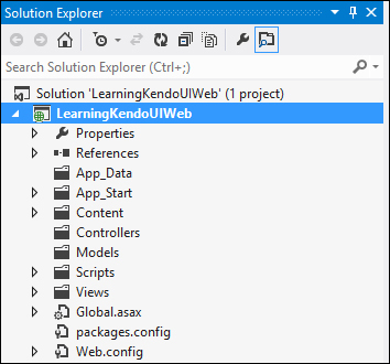
Visual Studio will create the folder structure for your new project, and will copy all of the necessary files into that structure so that you can run your project in the debugger. Once this is complete, you will see your project tree in the Solution Explorer section of the Visual Studio IDE.
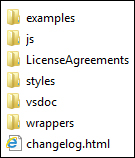
Now that we have our structure, it is time to download the Telerik Kendo UI files and place them in their proper location. Navigate to the Telerik Kendo UI website at http://www.kendoui.com/download.aspx and download the 30-day free trial of the Kendo UI Complete package that includes the server wrappers for ASP.NET MVC. It will arrive as a ZIP file containing everything that you need for development with Kendo UI. Extract the contents of the ZIP file somewhere you will remember since you will need to reference these files throughout the rest of the book. This screenshot shows what the ZIP file should contain:
Now, follow these steps:
Go back to Visual Studio and right-click on the
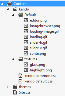
Contentfolder in the Solution Explorer and choose Add, New Folder. Name the new folderkendo.Right-click on the
kendofolder that you just created and create two more folders—Defaultandtextures. Now, right-click on theDefaultfolder and choose Add, Existing Item.In the file dialog that displays, navigate to the folder with the unzipped Kendo files, then open the
Stylesfolder and then theDefaultfolder inside it.Select all of the files in this folder and click on the Add button. This will add all of these items to the Visual Studio project so that they show in Solution Explorer and can be managed from the Visual Studio IDE.
Next, follow these same steps to add all of the items to the
texturesfolder. Once you have these files in place, right click on thekendofolder in Solution Explorer again and choose Add, Existing Item.
In the dialog that displays, choose these two specific files from the Styles folder of the unzipped kendo files and add them as well:
kendo.common.min.csskendo.default.min.css
Once these two files appear in Solution Explorer, rename them by removing the .min portion of their file names (kendo.default.min.css becomes kendo.default.css); this will be explained in greater detail in next few paragraphs. The Content folder in Solution Explorer should look something like this when you are finished:
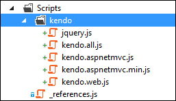
Next, we will prepare the Scripts folder by following some very similar steps. Create a kendo folder inside of the Scripts folder in Solution Explorer and then copy these files from the js folder of the downloaded Kendo files:
jquery.min.csskendo.all.min.jskendo.aspnetmvc.min.jskendo.web.min.js
Once again, remove the .min portion of their filenames. We will, however, need two versions of the kendo.aspnetmvc.js file as will be explained later. Go ahead and copy the file, but only remove the <code>.min</code> portion of the filename from one copy. This way you will have one copy of the file with a .min filename and another copy of the file without the .min file name. The completed kendo folder in Solution Explorer should look something like this:
As a web developer, you are surely familiar with the exercise of referencing scripts and styles in the head portion of your web pages. ASP.NET MVC 4 comes with a great feature that enables bundling and minimization of these scripts, along with built-in caching, so that the browser can download these files faster and thereby increase the performance of your site with very little effort on your part. This feature also works with CDN locations, so that you can run with local files during debugging and still reference CDN hosted scripts or style sheets when your site is deployed. To enable this functionality for our sample project, you will need to add the following code to the BundleConfig.cs file in the App_Start folder of the project. First, add this code at the top of the file to enable CDN functionality and to save the paths of the CDN locations that we want to use:
// Enable CDN
bundles.UseCdn = true;

// CDN paths for kendo stylesheet files
var kendoCommonCssPath = "http://cdn.kendostatic.com/2013.1.319/styles/kendo.common.min.css";
var kendoDefaultCssPath = "http://cdn.kendostatic.com/2013.1.319/styles/kendo.default.min.css";

// CDN paths for kendo javascript files
var kendoWebJsPath = "http://cdn.kendostatic.com/2012.2.710/js/kendo.web.min.js";
Then, add this code at the bottom of the file to create the bundles for your Kendo files. By passing the CDN location as the second parameter of the ScriptBundle constructor, Visual Studio will build your solution using your local files when debugging and will build your solution using the CDN location files when building in release mode. This is also where I should explain why we removed the .min portion of the JavaScript and stylesheet filenames. The bundling and minification features of ASP.NET MVC intentionally ignore files that include .min in their filenames during debugging. This means that none of your script references from the Kendo download will work during debugging because we do not have the pre-minified files included in our project. There are several documented ways to deal with this problem floating around the Internet, but the easiest way to address this for our project is just to rename to files to avoid the entire issue.
// Create the CDN bundles for kendo javascript files
bundles.Add(new ScriptBundle("~/bundles/kendo/web/js", kendoWebJsPath)
.Include("~/Scripts/kendo/kendo.web.js"));
// The ASP.NET MVC script file is not available from the Kendo Static CDN,
// so we will include the bundle reference without the CDN path.
bundles.Add(new ScriptBundle("~/bundles/kendo/mvc/js")
.Include("~/Scripts/kendo/kendo.aspnetmvc.js"));

// Create the CDN bundles for the kendo styleshseet files
bundles.Add(new StyleBundle("~/bundles/kendo/common/css", kendoCommonCssPath)
    .Include("~/Content/kendo/kendo.common.css"));
bundles.Add(new StyleBundle("~/bundles/kendo/default/css", kendoDefaultCssPath)
    .Include("~/Content/kendo/kendo.default.css"));
Now that we have the BundleConfig.cs file properly configured, we can adjust the references in the head portion of our _Layout.cshtml file. The _Layout.cshtml file acts as our default master page by creating a uniform head structure for all of our pages and a default layout within which all the other pages place their specific content. Open the _Layout.cshtml file in the Views, Shared folder and make some changes. By default, it will have some script references that appear in the body portion of the page and some that appear in the head portion.
There are undoubtedly some good reasons for doing this, but since we will have references to Kendo scripts in the body of our page before these script references would appear, we need to move everything to the head portion. Since this file is not very long, I have included my finished version here so that you can copy it:
@using Kendo.Mvc.UI;
<!DOCTYPE html>
<html>
<head>
<meta charset="utf-8" />
<meta name="viewport" content="width=device-width" />
<title>@ViewBag.Title</title>
@Styles.Render("~/Content/css")
@Styles.Render("~/bundles/kendo/common/css")
@Styles.Render("~/bundles/kendo/default/css")
@Scripts.Render("~/bundles/jquery")
@Scripts.Render("~/bundles/kendo/web/js")
@Scripts.Render("~/bundles/kendo/mvc/js")
</head>
<body>
@RenderBody()

@RenderSection("scripts", required: false)
</body>
</html>
Note also that I have added an @using statement at the top of the file, make sure you copy that as well since it will enable Intellisense
on all of your pages. Intellisense is a feature of Visual Studio that auto-completes code as you write and is a great productivity booster. To fully enable this, you will also need to add a reference to the Kendo.Mvc.dll file to your Visual Studio project:
First, right-click on the LearningKendoUIWeb project in the Visual Studio Solution Explorer and choose Add Reference.

Next, click on Browse and navigate the file dialog to the location where you downloaded the Kendo files.
Find the folder named
aspnetmvc, open the folder namedBinariesinside it, and then open the folder namedMvc3inside that.Here you will find the
Kendo.Mvc.dllfile; click on it and choose Add.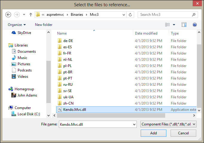
With this reference added, you can make the code inside it available to all of your web pages by adding a special entry in a file called
web.config.This file is located in the root of your LearningKendoUIWeb project. Open
web.configand locate the section callednamespaces. Add theKendo.Web.UInamespace to the list like this:<pages> <namespaces> <add namespace="System.Web.Helpers" /> <add namespace="System.Web.Mvc" /> <add namespace="System.Web.Mvc.Ajax" /> <add namespace="System.Web.Mvc.Html" /> <add namespace="System.Web.Optimization" /> <add namespace="System.Web.Routing" /> <add namespace="System.Web.WebPages" /> <add namespace="Kendo.Mvc.UI" /> </namespaces> </pages>
Now create a folder to hold static content in the project. Right-click the project name in Solution Explorer, choose Add, New Folder. Call the new folder static. This will be the location where we place all of our client-side examples that run apart from the MVC framework.
Visual Studio 2012 includes some good improvements in JavaScript Intellisense and it is going to help us as we write our code. Open the file called "_references.js" in the scripts folder and delete all of the text in it. This is the entire contents of my "_references.js" file, copy this into yours as well:
/// <reference path="kendo/jquery.js" />
/// <reference path="kendo/kendo.web.js" />
/// <reference path="kendo/kendo.aspnetmvc.js" />
Visual Studio 2012 uses this file as the list of JavaScript libraries that it should use for Intellisense in the editor. I have included the jQuery file included with the Kendo zipped package and two JavaScript files that we will be using in the majority of our web pages. Once you have this in place, you will get some very helpful coding assistance in your JavaScript files like this:
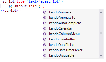
Notice how all of the Kendo options show up as you type JavaScript code in the editor? As you program the examples throughout this book, this will become something that you will help you.
OK, now we are ready!
When using the KendoUI framework in your web pages, you will find that there are two ways to add the widgets to your content. The standard method is to use a jQuery syntax within script elements like this:
<input type="date" id="makeMeADatePicker" />
<script type="text/javascript">
    $("#makeMeADatePicker").kendoDatePicker();
</script>
The convention, as shown, is to select the elements through jQuery and then apply a JavaScript method from the Kendo namespaces that alters the content into an interactive Kendo UI widget.
There is another way, now available through HTML5, to add Kendo UI widgets to your content through a method known as declarative initialization. This is a practice where you typically add special attributes to your elements that start with "data-" and then call an initializer that reads these attributes and then applies the appropriate changes. See this code as an example:
<input type="date" id="makeMeADatePicker" data-role="datepicker" />
<script type="text/javascript">
kendo.init($("#makeMeADatePicker"));
</script>
This type of syntax allows for a cleaner separation between JavaScript and mark-up, and is important in the MVVM pattern that we will cover later in the book. It is also powerfully expressive and can make the code more readable, since relevant attributes are contained directly within the elements to which they pertain. Script blocks containing code do not necessarily appear beside the code actually being affected, which can make things difficult to trace in a complicated project.
Since we will be using ASP.NET MVC quite a bit in this book, I should define some important terms so that there isn't any confusion later. MVC stands for Model-View-Controller;
so let's establish a common terminology around these. First, a web page is referred to as a view and, when using Razor syntax with C#, the web pages have a file extension, cshtml. There is also the option of using Visual Basic in which case the web pages have a file extension, vbhtml, but we will be using C# in this book so you won't see this in the examples.
Second, the controller is a server-side classfile that is responsible for all of the logic used in generating the content included in a web page (view). The controller, along with the route table, is also responsible for establishing the publicly accessible URLs to which the server will respond, and enforcing which HTTP verbs are required to access them. In general, a controller is responsible for contacting any external dependencies, such as a database or web server, performing any necessary logic and calculations on the data retrieved from those external dependencies, and then packaging up all of that processed data into an object called the model.
The model, then, is an object container that contains the data that the web page (view) needs in order to display itself. In a properly separated system, the controller is the engine that performs all logic, data manipulation, user-input handling, authorization, and security. The view is the data presenter and is concerned only with the graphical representation of the data it has been given; no logic apart from what is required for presentation (not to say that presentation can't be complex). The model is the standard data format that the controller uses to send its final product to the view to be presented to the user.
When programming in the ASP.NET MVC environment, Kendo UI offers a rich set of server-side extensions for creating its widgets. Instead of typing out an HTML element, specifying its attributes and wiring it up to Kendo UI JavaScript, the entire process can be done using server-side objects that appear in the view. For example, creating a DatePicker widget in MVC Razor syntax looks like this:
@(Html.Kendo().DatePicker().Name("datePickerField"))No HTML, no JavaScript, just extension methods on the HTML class. When the page is generated, however, you can see what was sent to the browser:
<input class="k-input" id="datePicker" name="datePicker" type="date" />
<script>
jQuery(function(){jQuery("#datePicker").kendoDatePicker({format:"M/d/yyyy",
min:new Date(1900,0,1,0,0,0,0),max:new Date(2099,11,31,0,0,0,0)});});
</script>
The extension methods create all the HTML, JavaScript, and CSS information dynamically. You can see how the final output uses the jQuery method of selecting the input element and using .kendoDatePicker(…) to create the widget through JavaScript. So, although the programmer didn't type out the JavaScript, it was still necessary for Kendo UI to work; the MVC extensions are only wrappers around the normal Kendo UI client-side framework.
I should also explain that even though the view is what generates the final web page sent to the user's browser, it is processed on the server first. The Razor syntax (everything that starts with @) never appears in the final page markup, it is processed on the server in order to generate the final markup. This means that the Kendo MVC extension methods are really a server-side shortcut to creating the final markup needed to make them work as they normally would in JavaScript.
Programming in the MVC framework allows for a very clean separation of concerns within the web server itself and this, in turn, allows for a great deal of flexibility around how the views run and how dependent they are on server-side logic. For example, widgets that use data can receive this data either as embedded material in the view itself (a dependency on server-side logic), or they can query for data from the client-side by calling action methods that return JSON (less dependency on server-side logic).
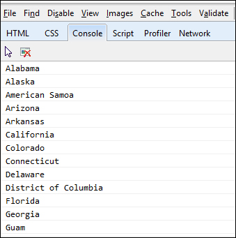
As an example of a server-dependent implementation, here is a strongly-typed view with embedded model data that can then be used by widgets on the page. A strongly-typed view is a view page that specifies a specific type of object that contains its model data. You can see the strongly-typed model object in this sample on the first line starting with @model:
@model IEnumerable<LearningKendoUIWeb.Models.StateTerritory>
<textarea id="serverData" style="display:none">
@Html.Raw(ViewBag.serverData)
</textarea>
<script type="text/javascript">
varserverData = eval($("#serverData").html());
for (var i = 0; i<serverData.length; i++) {
console.log(serverData[i].Name);
    }
</script>
ViewBag
is a dynamic object that is available to you within controller action methods and view pages. It is a dictionary object that can contain any data or objects that you need in your view pages. The controller can add anything that you need to ViewBag, and your view pages will then have access to that data or object just as this sample code has shown. In this case, the controller has attached an object called serverData that contains a JSON representation of its model data. We are using the JavaScript function called eval()
to parse it into a JavaScript object and then showing on the JavaScript console what was inside. This is merely an example of how to embed data into the view itself without having to use additional network requests, such as the jQuery functions $.get or $.ajax, to retrieve data to display on the page; it may prove beneficial in some cases where network traffic needs to be weighed against immediate data availability that the server can provide up front.
The ViewBag.serverData property is filled in the controller like this:
publicActionResultAutoCompletePage()
{
var repository = new SampleRepository();
var data = repository.GetStatesAndTerritories();
ViewBag.serverData = new JavaScriptSerializer().Serialize(data);
return View(data);
}
Note that in this example the controller is both filling in this ViewBag property and sending the same data to the view as a strongly-typed model; this isn't necessary, but it is handy here since we can leverage the server's JavaScriptSerializer class to create JSON for us before we send it to the view. Here is what the JavaScript console shows when we fill ViewBag.serverData with the JSON representation of an array of objects that have a Name property:
It is far more common to request data from a separate endpoint and then use it once it has been retrieved. This allows for data from external sources, and breaks the dependency on the server to provide the data inside the page, which in turn means the specific server implementation is likely less important and less complex. jQuery provides several common and friendly ways of retrieving JSON data such as $.ajax, $.get, and $.getJSON. Kendo also provides standard ways of retrieving external data through configuration options on its widgets, often through the property method transport.read. We will see more about this in the rest of this chapter as we discuss DataSource and Grid, and throughout the rest of the book.
The Kendo UI framework consists of two parts—the framework components and the user interface (UI) widgets. Most of the content that we will cover in this book relates to the user interface widgets and how to use them, but we will begin with the important topic of how to manage data within Kendo UI. The DataSource component and Templates provide a good starting place and will build a foundation that we will use throughout the rest of this book.
Kendo UI Templates are script blocks that contain a small section of page markup that is used by other Kendo UI widgets to display repeating content. We will cover these first, since they will be used throughout the rest of our examples. Here is an example of a simple template:
var template = kendo.template("<span>#= horseColor #</span>");
$("#horseDiv").html(template({
  horseColor: 'brown}));
Running this code would set the HTML content of the horseDiv to a span element that contained the horseColor value that was passed into the template function object. It would produce the following code output:
<div id='horseDiv'><span>brown</span></div>
Templates can also be written within a special type of HTML script block so that their layout appears more naturally within the HTML content.
<script type="text/x-kendo-template" id="template">
<tr>
<td>#= rank #</td>
<td>#= rating #</td>
<td>#= title #</td>
<td>#= year #</td>
</tr>
</script>
In this template sample, note the lines containing the code fragments #= variable_name #. These indicate the sections of code that are interpreted by the Kendo UI Template engine. The variable names inside these code blocks are supplied to the template when it is used. The JavaScript property names that you use inside of a template need to be properties on the object that is passed to the template when it is called. Note also that the script type is x-kendo-template instead of javascript, this is important so that the browser will not attempt to execute the script block on its own. This is a code sample showing this template being initialized in JavaScript:
<script type="text/javascript">
var template = kendo.template($("#template").html());

functionshowMovies() {
$("#moviesTable").html(template(
            {rank: 1, rating: 9.2, title: 'Prometheus', year: 2012}
        ));
    }
showMovies();
</script>
Notice how the template is created through a call to kendo.template(). This method takes the literal template code as its parameter, which is why the example shows a call to the jQuery statement $("#template").html() since this code returns the literal content of the template script block as it appears in the web page. So, in this example, it is equivalent to calling kendo.template('<tr><td>#= rank #</td>…'). This means that templates can also be created in-line by typing out the exact template code directly in the constructor.
When the template object is called as a method, it needs the data passed in as a parameter. When the example code above runs, it produces this output:
<table id="moviesTable">
<tr>
<td>1</td>
<td>9.2</td>
<td>Prometheus</td>
<td>2012</td>
</tr>
</table>
Templates can also include JavaScript which makes it possible to do more advanced operations, such as iterating over an array and rendering the template for each item in that array individually. In this case, you supply the template with an array of objects instead of a single object as before. This time, using the explicit parameter name data is critical. Note how JavaScript code is surrounded by single # signs like # javascript code # and variable statements are surrounded by #= and then # as in #= variable statement #. Note also that the space between the # signs and the content inside is important.
<script type="text/x-kendo-template" id="template">
# for(vari=0; i<data.length; i++) { #
<tr>
<td>#= data[i].rank #</td>
<td>#= data[i].rating #</td>
<td>#= data[i].title #</td>
<td>#= data[i].year #</td>
</tr>
    # } #
</script>
Templates are an important part of building functional Kendo UI widgets, and they become even more useful when used in tandem with the DataSources and Grids as we will see later.
The Kendo UI DataSource is a JavaScript object that gives data a common interface for the various Kendo UI widgets. The full documentation for the DataSource object can be found on the Kendo UI website at this address: http://docs.kendoui.com/api/framework/datasource. The DataSource is a fairly complicated object and relies on some building blocks that deserve explanations of their own. These building blocks are the Kendo objects known as Schema, Transport, and Model. Let's address these first and then continue exploring the DataSource itself.
It is important to note that when creating a DataSource object, you should use the new keyword to instantiate a new object instead of just using an object literal:
var dataSource = new kendo.data.DataSource({...<properties>...});The Model object is from the namespace kendo.data.Model
and inherits from Kendo's ObservableObject. It provides a known structure, or model, to the data that is used by a DataSource and can also be used to enable some more advanced functionality such as change tracking. To create a new model, you must do so through the method kendo.data.Model.define()
. In this method, you pass an object that defines the structure of the model and sets configurable options on the data elements within. Here is an example of a model:
var Service = kendo.data.Model.define( {
id: "serviceId", // the identifier of the model
fields: {
"serviceName": {
type: "string"
        },
"unitPrice": {
type: "number"
        },
"serviceId": {
type: "number"
  }
    }
});

var currentService = new Service( {
serviceName: "Rotate Tires",
unitPrice: 29.95,
serviceId: 400
});

console.log(currentService.get("serviceName")); // outputs "Rotate Tires"
console.log(currentService.get("unitPrice")); // outputs 29.95
In this example, we have created a model with three properties and we set the data type for each of them. We then created a new model object from our model definition and demonstrated how to access its properties through the model.get() method. We just demonstrated that the ID of the model object is defined through the property called id, and that the fields are defined through a property called fields. Within the fields property, these are the options that can be set to configure each data element:
fields: {
"serviceName": {    // Property name for a field
type: "string", // "string"(default), "number", "boolean", or "date"
defaultValue: "Inspection", // Default value for field when model is
                           / created. Default for string is "", number
                         // is 0, and date is new Date() (.i.e. today)
editable: true, // Specifies whether field is editable
nullable: false, // Specifies if default value should be used when empty
parse: function(){...} // Specifies custom parser for field value
validation: {...} // Specifies the validation options used by Kendo
                      // Validator such as 'required', 'min', and 'max'.
    },...
}
These are not all required, but they are available when you want a very specific configuration. Here is an example from the Kendo UI site:
var Product = kendo.data.Model.define( {
id: "id", // the identifier is the "id" field (declared below)
fields: {
  /* name of the field */
name: {
type: "string", // the field is a string
validation: { // validation rules
required: true // the field is required
    },
defaultValue: "<empty>" // default field value
  },

  /* name of the field */ price: {
type: "number", // the field is a number
validation: { // validation rules
required: true, // the field is required
min: 1 // the minimum value is 1
    },
defaultValue: 99.99 // default field value
  },

  /* name of the field */ id: {
editable: false, // this field is not editable
nullable: true // a default value will not be assigned
        }
    }
});
Since the properties within a model are observable, you need to use special getter and setter methods to properly trigger the behaviors that other functions and objects are observing. To retrieve the current value of one of these properties, use model_name.get() such as currentService.get('unitPrice'). To set the value of the property and thereby change it, use model_name.set() such as currentService.set('unitPrice', 14.95). The concept of observable objects is a key feature of the MVVM framework that we will cover in a later chapter.
Two other methods available on model objects are isNew and toJSON. The isNew method checks if the model is new or not. This is determined by whether or not the id field is still set at the default value. If the id field is not set at the default value, the model object is not considered new. The toJSON method returns a JSON representation of the complete model's properties and values.
Since, as I mentioned, the model inherits from ObservableObject, it exposes three events to which you can attach custom behaviors—change, get, and set. The syntax for these is to use model.bind() with the name of the event and a function to handle it:
currentService.bind('change', function(e){
alert(e.field + " just changed its value to " +
currentService.get([e.field]));
});The schema object within a DataSource is responsible for describing the raw data format. It functions at a higher level than the model, and can even contain a model definition within it. The Schema's job is to instruct the DataSource on where to find information on errors, aggregates, data, groups, and total records within the raw data object that the DataSource is using. Each of these pieces of information exists as a property within the schema object like this:
schema: {
  errors: function(response) {
    return response.errors;
  },
  aggregates: function(response) {
    return response.aggregates;
  },
  data: function(response) {
    return response.data;
  },
  total: function(response) {
    return response.totalCount;
  }
}
In the preceding code sample, each of the properties has been set to a function which, when passed the raw data object, will return the appropriate data from within that object. These properties can also be set to text fields, in which case the field name given must exist at the top level of the object and already contain the appropriate data in the appropriate format:
schema: {
  errors: "errors_field_name",
  aggregates: "aggregates_field_name",
  data: "data_field_name",
  total: "total_field_name"
}
The aggregates property needs data returned in an object format with a structure something like this. Each property name inside the aggregates object can contain information on its aggregate values, such as the maximum value (max), minimum value (min), or the total count:
{
unitPrice: {   // Field Name
  max: 100,     // Aggregate function and value
  min: 1     // Aggregate function and value
  },
productName: {  // Field Name
  count: 42     // Aggregate function and value
  }
}
In this case, the data has a max and min defined on the unitPrice field and a count defined on the productName field. The DataSource object has not calculated these values; rather they are already present in the raw data sent from the remote server, and the schema has indicated to the DataSource object where to locate them. It is possible to use a function to calculate aggregate values, but it is normal for the raw data to already contain these values within it as returned by a remote server.
As I said earlier, the schema can contain a model definition within it. If this is the case, the DataSource will call kendo.data.Model.define on the model definition for you, in order to create the model objects from the raw data:
var dataSource = new kendo.data.DataSource({
schema: {
  model: {
    id: "ProductID",
    fields: {
    ProductID: {
      editable: false,
      nullable: true
      },
      ...
If you have already defined a Model definition, you can simply reference it and the DataSource will use it just the same:
vardataSource = new kendo.data.DataSource({
schema: {
model: Product // Use the existing Product model
    }
});
The schema object has a parse property, which you can set to a function that will be called before the raw data is processed. This gives you a chance to do any pre-processing if you need it. There is also a type property that can be set to either json or xml.
The transport object contains properties that a DataSource can use to communicate with a remote server for any of its normal data functions. Those data functions are create, destroy, read, and update (corresponding to the different actions that can be taken on a record). Each of these data functions exists as a property object within the transport object and follows the same pattern of configuration options. I should note that not all of the data functions are required; only those functions that your DataSource should perform need to be defined within your transport object. This is the basic configuration structure for the transport object.
transport: {
  create: { // this sets configuration for creating new records
            // on the remote server
  },
  destroy: { // this sets configuration for deleting records
             // on the remote server
  },
  read: {  // this sets configuration for reading records
           // from the remote server
  },
  update: { // this sets configuration for updating records
            // on the remote server
  },
  autoSync: false, // set true to automatically sync all changes
  batch: false     // set true to enable batch mode
}
Here are the different options for configuring the transport object's remote data operations. Each of the four properties follows the same configuration pattern, but in this code sample I have shown different ways of configuring them for the sake of example. In this first code sample, I have configured the create operation to simply send the value of an HTML element to the remote server.
create: { // for creating data records on remote source.
url: "/orders/create", // the url to the create service.
data: {  // data to send to the create service as part of the request.
// this can also be specified as a function call.
orderId: $("#input").val()
},
cache: true, // make false to force fresh requests every time.
contentType: "application/json", // default is
  // "application/w-www-form-urlencoded"
dataType: "json", // "jsonp" is also common.
type: "POST" // which http verb to use.
  }
In this example, we have set the destroy method to use a jQuery $.ajax function to send data to the remote server instead of configuring it directly on the destroy configuration object. You can do this if you prefer the jQuery syntax and want to easily attach callback functions to the results of the operation.
destroy: {  // same options as "create", with some alternatives shown.
      // this is how you use $.ajax() to run this remote service call.
          // this option can be used with "create", "destroy", "read",
              // and "update"
    $.ajax( {
url: "/orders/destroy",
data: options.data, // the data field contains paging, sorting,
                          // filtering, and grouping data
success: function(result) {
               // notify the DataSource that the operation is complete
Options.success(result);
}
});
}
In this example, we have created a function to serve as the source of data for the read operation. This might be useful if you need to perform some custom logic before receiving remote data, or if you need to bypass the remote data source entirely for some reason.
read: {  // same options as above in "create" and "destroy".
data: function() {  // this is how you specify data as a function.
return {
id: 42,
name: "John Doe"
};
}
}
Remember that the configuration options you just saw are valid for any of the transport operations, I simply showed different operations as an example for each configuration. When a DataSource is configured with a transport configuration like this, it will use the properties and functions within these options to perform the related actions. It will call read when it is loading data, update when a record has been changed, destroy when a record has been deleted, and create when a new record is added.
When reading from local data, you need to reference it by using the property called data like this:
var someData = [{ title: 'Prometheus', year: 2012, rating: 9, rank: 25 }];

var dataSource = new kendo.data.DataSource({
data: someData
});
Some other properties of DataSource that we have not yet seen are more for data manipulation—aggregate
, filter
, group
, sort
, page
, and pageSize. They can work on the data client-side, or they can request that the server do the operations by using the serverAggregates, serverFiltering, serverGrouping, serverSorting, and serverPaging properties by adding these to the DataSource object properties list and setting them to true.
The aggregate property takes an array of fieldnames and aggregate function names:
aggregate: [{ field: 'title', aggregate: 'count' }]The
filter property can take a simple object, an array of simple objects, or a configurable object with some more logic to specify filtering that should be done on the data:
// simple object
filter: { field: 'title', operator: 'startswith', value: 'Shawshank' }

// ...or array...
filter: [{field: 'year', operator: 'eq', value: '1998'}, {field: ...

// ...or configurable object...
filter:{
logic: "or",
filters: [
{ field: 'title', operator: 'startswith', value: 'Shawshank' }]
}
These are the different operators that can be used with the filter object. They can also be used when asking the server for filtering by using the serverFiltering
property.
Equality:
eq,==,isequalto,equals,equalto,equalInequality:
neq,!=,isnotequalto,notequals,notequalto,notequal,neLess:
lt,<,islessthan,lessthan,lessLess or Equal:
lte,<=,islessthanorequalto,lessthanequal,leGreater:
gt,>,isgreaterthan,greaterthan,greaterGreater or Equal:
gte,>=,isgreaterthanorequalto,greaterthanequal,geStarts With:
startswithEnds With:
endswithContains:
contains
The group
and
sort properties can take either an object or an array of objects to specify grouping:
group: { field: 'year', dir: 'asc' }
sort: { field: 'title', dir: 'desc' }
The
page and pageSize properties both take numbers to indicate the page number and records per page respectively.
The DataSource methods are used to either change or retrieve certain elements of the DataSource object. Several of them are related to the same data manipulation properties that we just talked about—aggregate, aggregates, filter, group, page, pageSize, and sort. In each of these cases, calling the method without parameters will return the current value of the like-named property within the DataSource; calling the method with a parameter value will set the value of the like-named property of the DataSource to the new value passed in:
// get the current group descriptors
var g = dataSource.group();

// set a new value for filtering
dataSource.filter({ field: 'year', operator: 'gt', value: 1990 });
There are also methods for adding and removing records. The methods add and insert both add a new record to the DataSource. The
add method simply takes a model object or an object literal matching the current data format of the items in the DataSource. The
insert
method takes the same object as add, but also specifies an index property indicating the zero-based location at which to insert the new record. The remove method takes a model object and removes it from the DataSource:
// add a new item
dataSource.add({ year: 1997, title: 'The Fifth Element', rating: 10 });

// insert an item at the 6th position in the DataSource
dataSource.insert(5, {year: 1995, title: 'Twelve Monkeys', rating 9.5});

// remove an item from the DataSource
var movie = dataSource.at(5);
dataSource.remove(movie);
The at
,
get
, and
getByUid methods retrieve specific records from the DataSource:
// get the 3rd item in the DataSource
var movie = dataSource.at(2);

// get the model instance with an id of 5
// (id is determined by the value of the schema.model.id property)
var movie = dataSource.get(5);

// get the model instance, or ObservableObject if no model has been set
// uid is a property inherited from ObservableObject
varuid = $("tr").data("uid");
var movie = dataSource.getByUid(uid);
The fetch
,
query
,
read
, sync
,
cancelChanges
, and
view
methods are used for managing the current contents and structure of the DataSource:
// fetches data using the current filter/sort/group/paging information.
// will fetch data from transport if data is not already available in memory.
dataSource.fetch(); // can optionally take a callback function which
                    // is executed once the data is ready.

// executes a query over the data (i.e. paging/sorting/filtering/grouping)
// this effects what the call to dataSource.view() will return.
dataSource.query({ page: 5, pageSize: 20, group:{field:'year',dir:'asc'}});

// read data into the DataSource using the transport.read setting
dataSource.read();  // also conveniently causes the change event to fire

// synchronizes changes through the transport for any pending CRUD operations.
// if batch mode is enabled, it uses only one call per operation type (create,
//   read, update, destroy)
dataSource.sync();

// discards all un-synced changes made to the DataSource
dataSource.cancelChanges();

// returns the current state of the items in the DataSource with all applied
//settings such as paging, sorting, filtering, and grouping.
// to ensure that data is available, this method should be used from
//within the change event of the DataSource
change: function(e){
    ...
kendo.render(template, dataSource.view());
}
To finish up the list, we will look at data,
total
, and
totalPages:
// retrieve an observable array of items (the current data within the DataSource)
var movies = dataSource.data();

// set the DataSource to some new data
datSource.data([{year: 2009, title: 'Cargo', rating: 6.8}, {year: ... ]);

// get, but not set, the total number of items in the DataSource
var total = dataSource.total();

// get, but not set, the total number of pages of items in the DataSource
var pages = dataSource.totalPages();
It is important to note that you must call dataSource.read() in order for the DataSource object to initiate the read process and populate itself with data. In other words, until you call dataSource.read(), there is nothing to read inside your DataSource.
There are three events that are available on the DataSource object—
change
, error
, and
requestStart
. The change event is fired when data is changed or read from the transport. The error event is fired any time an error occurs during data read or data sync; it is also fired if schema.errors has been set within the DataSource and the response from a server operation contains data in the field specified by schema.errors. The requestStart event is fired when a data request is about to start. Like other events, these can be set as part of the DataSource definition or later through the bind method.
// set event handler as part of DataSource definition
var dataSource = new kendo.data.DataSource({
change: function(e){
        // handle event
    }
});

// or set event handler later through the bind method
dataSource.bind("error", function(e){
    // handle event
});
As you will see later, the change event can be a good place to put some code in order to generate markup while a DataSource is reading in new records. It is also the appropriate place to put any other code that should respond to changes in the DataSource.
Now that we have seen the definitions of the components within a DataSource, we will put together our first example page to demonstrate the basic usage of the DataSource object in JavaScript. Add a new HTML file to the static folder of the project and name it DataSource.html. Start out by adding this code:
<!DOCTYPE html>
<html>
<head>
<title>DataSource</title>
<script src="/Scripts/kendo/jquery.js"></script>
<script src="/Scripts/kendo/kendo.all.js"></script>
<link href="/Content/kendo/kendo.common.css" rel="stylesheet" />
<link href="/Content/kendo/kendo.default.css" rel="stylesheet" />
</head>
<body>
<div id="example" class="k-content">
<table id="movies">
<thead>
<tr>
<th>Rank</th>
<th>Rating</th>
<th>Title</th>
<th>Year</th>
</tr>
</thead>
<tbody>
<tr>
<td colspan="4"></td>
</tr>
</tbody>
</table>
</div>
</body>
</html>
We have referenced jQuery and Kendo UI Web JavaScript files in the head of our page. Now let's add a template block after the div tag so that we can script the creation of additional table rows:
<script id="template" type="text/x-kendo-template">
<tr>
<td>#= rank #</td>
<td>#= rating #</td>
<td>#= title #</td>
<td>#= year #</td>
</tr>
<script>
Now what we need is the ability to take some data and fill out that table using the layout as defined by this template, enter the DataSource. Add this code after the template script block that you just typed in:
<script type="text/javascript">
    $(document).ready(function() {
        // create a template using the above definition
var template = kendo.template($("#template").html());

var movies = [
{ "rank": 1, "rating": 9.2, "year": 1994,
"title": "The Shawshank Redemption" },
{ "rank": 2, "rating": 9.2, "year": 1972,
"title": "The Godfather" },
{ "rank": 3, "rating": 9, "year": 1974,
"title": "The Godfather: Part II" },
{ "rank": 4, "rating": 8.9, "year": 1966,
"title": "Il buono, ilbrutto, ilcattivo." },
{ "rank": 5, "rating": 8.9, "year": 1994,
"title": "Pulp Fiction" },
{ "rank": 6, "rating": 8.9, "year": 1957,
"title": "12 Angry Men" },
{ "rank": 7, "rating": 8.9, "year": 1993,
"title": "Schindler's List" },
{ "rank": 8, "rating": 8.8, "year": 1975,
"title": "One Flew Over the Cuckoo's Nest" },
{ "rank": 9, "rating": 8.8, "year": 2010,
"title": "Inception" },
{ "rank": 10, "rating": 8.8, "year": 2008,
"title": "The Dark Knight" }
        ];

var dataSource = new kendo.data.DataSource({
data: movies,
change: function () {
// subscribe to the CHANGE event of the data source
$("#movies tbody").html(
kendo.render(template, this.view())); // populate the table
            }
        });

// read data from the "movies" array
dataSource.read();
    });
</script>
Let's step through this code. You should recognize the first few lines where a Kendo template is created from the script block that you typed just a few paragraphs ago. After that, you see a JavaScript array of objects holding data about various movies. This array is going to be the raw data behind the DataSource object that comes next. The DataSource object is instantiated (note the new keyword) into the variable called dataSource. It references the movies array as its data parameter and then defines a function to handle the change event of the DataSource object. Inside this change event, we are using jQuery to select the movies table and then using kendo.render() to generate markup from our template variable for each item in our dataSource object. Note how the template we are using does not need special JavaScript to iterate over a collection; the DataSource object passes all of the data to the change event through this.view(). Finally, we call dataSource.read() which reads in the data and consequently fires the change event, thereby adding the content to our movies table.
The kendo.render() method takes a template function as its first argument and then an array of data as its second argument. It runs the data through the template, generating the resulting markup and returning it back to the caller. In the case above, we have used jQuery to set the <tbody> element's HTML to the result of this kendo.render()function.
Our last example was a demonstration of using local data (a JavaScript array) with a DataSource. It is also very common and important to use the DataSource with data that exists on a remote system. To simulate this, we will turn to the ASP.NET MVC framework to create a server for our remote data.
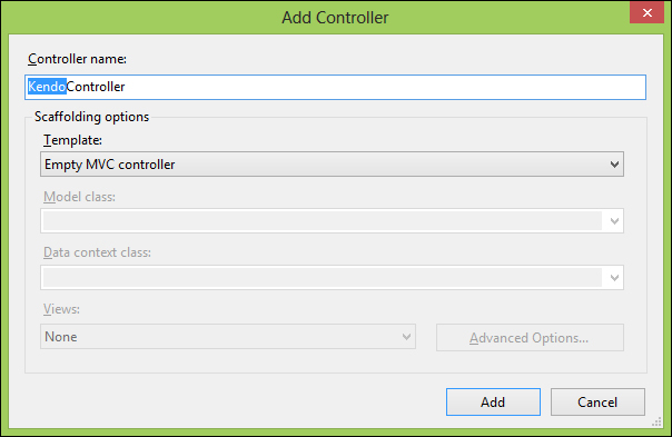
In the Visual Studio Solution Explorer window, right-click on the Controllers folder and choose Add, Controller. Name the new controller KendoController and leave the rest of the dialog that opens at its default settings.
The newly created controller class will appear in the editor portion of Visual Studio and you will see a generic Index() method sitting in the file. This method is known as an action method
and is used to process an HTML response back to a web browser. The comment above it indicates the route and HTTP verb that are used to locate this action method:
// GET: /Kendo/

public ActionResult Index()
{
return View();
}
In this case, it shows that typing the route "Kendo", as in http://<server-name>/Kendo/, would match this action method and cause it to return its view to the browser. It would also work to specify http://<server-name>/Kendo/Index and it is usual to supply both the controller name, "Kendo", and the action method name, "Index", in a normal route. As a matter of convention, the MVC framework names all controller classes with the suffix "Controller", but it does not use the suffix when referring to the controller in an actual route (such as the path in the address bar of your web browser). This means that the KendoController class is referred to as "kendo" when it is part of a route. GET is the default HTTP verb that this controller will accept when the browser requests this route.
At the top of KendoController, add a using statement for a namespace that we are about to create—LearningKendoUIWeb.Repository. Also add Kendo.Mvc.UI and Kendo.Mvc.Extensions:
Add a new action method called RemoteData and set it up like this:
publicJsonResultRemoteData()
{
var repository = new SampleRepository();
var data = repository.GetAllMovies();
returnJson(result, JsonRequestBehavior.AllowGet);
}
This is a simple method that instantiates a repository (which we will create in just a moment), gathers some data from that repository, and then returns it to the client as JSON. The second parameter to the Json() method notifies the controller class that it is acceptable to return JSON data from this method even though the verb is GET.
Right-click on the Models folder and click on Add, Class. Name the new class Movie.cs. This is a very simple class to hold data about a movie:
namespace LearningKendoUIWeb.Models
{
public class Movie
  {
public int Rank { get; set; }
public double Rating { get; set; }
public int Year { get; set; }
public string Title { get; set; }
  }
}
Add a new folder to the project and call it Repository. Add a class to this folder called SampleRepository.cs:
using LearningKendoUIWeb.Models;

namespaceLearningKendoUIWeb.Repository
{
public class SampleRepository
  {
public List<Movie>GetAllMovies()
    {
var movies = new List<Movie>{
new Movie { Rank = 1, Rating = 9.2,
                    Title = "The Shawshank Redemption", Year = 1994 },
new Movie { Rank = 2, Rating = 9.1,
                    Title = "The Godfather", Year = 1974 }
            };
            Return movies;
      }
   }
}
Feel free to add more movies to this list, the more the better. Now we have a simple repository class that can return a list of movie objects, so the action method we created in KendoController is finally valid. When the RemoteData action method is called, it will return the list of Movie objects as a JSON array of objects like this:
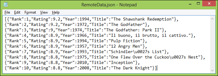
I have added more movies to my repository, but the structure of the result is the same. This is exactly the sort of data that DataSource knows how to use. Here is how to wire up DataSource to use it, find the line in the RemoteData.cshtml file where the dataSource variable is created in JavaScript and change the code so that it looks like this:
var dataSource = new kendo.data.DataSource({
  transport: {
read: {
url: 'Kendo/RemoteData/'
        }
    },
change: function () {
        $("#movies tbody").html(kendo.render(template, this.view()));
    }
});
Instead of the using the data property to point to a locally available array of objects, we are using the transport property to tell Kendo that we need to request the data from a remote source. In this case, all we have specified is how the DataSource can read remote data and that is all we need, since the only method call we make to the DataSource is in this line:
dataSource.read();
These examples have only scratched the surface, but it does show the DataSource in action in a real page. It is hard, however, to really demonstrate a DataSource object in isolation. The DataSource is only actually useful when it serves a data-rich widget, like the Kendo UI Grid. In the pages to follow, we will explore this Grid widget and will be able to demonstrate a more fully configured DataSource that the Grid can take full advantage of. We will also see how to configure both the Grid and the DataSource through the MVC Razor syntax within a view page.
Now that we have discussed the DataSource and Template features of the Kendo UI framework, we can turn our attention to widgets that provide graphical elements on our web pages. Some of these widgets actually assist you in organizing the content or the data in your page, and the Grid is a very good example of this, which we will cover next.
The Kendo UI Grid is a very handy widget to be familiar with. It is an easy way to transform data into a usable and interactive grid that would normally take a full-featured server control (as in ASP.NET WebForms) or some complex and time-consuming JavaScript development in the page markup. In fact, it is remarkably easy to set up a simple example. Let's say we have some JavaScript data like this that we want to display within a web page:
<script type="text/javascript">
var repairs = [{
name: "State Inspection",
price: 39.75,
labor: 1,
staff: 1
            },
            {
name: "Brake & Clutch System Service",
price: 149.95,
labor: 3,
staff: 1
            },
            {
name: "Power Steering Service",
price: 109.96,
labor: 3,
staff: 1
            },
            {
name: "Cooling System Service",
price: 126.95,
labor: 2,
staff: 1
            },
            {
name: "Oil Change",
price: 37.77,
labor: 1,
staff: 1
            },
            {
name: "CV Axle Replacement",
price: 271.11,
labor: 5,
staff: 2
            },
            {
name: "Battery Cabling Replacement",
price: 179.97,
labor: 2,
staff: 1
            },
            {
name: "Battery Replacement",
price: 118.38,
labor: 1,
staff: 1
            },
            {
name: "Fuel Induction Service",
price: 168.88,
labor: 3,
staff: 2
            },
            {
name: "Engine Air Filter Replacement",
price: 36.63,
labor: 1,
staff: 1
            },
            {
name: "Timing Belt Replacement",
price: 221.75,
labor: 3,
staff: 2
            },
            {
name: "Drive Belt Replacement",
price: 194.79,
labor: 3,
staff: 2
            }
        ];
</script>
In order to turn this into a well-formatted dynamic table, it would normally require some looping and HTML markup generation, probably through jQuery. With Kendo UI, however, all we have to do is create a kendoGrid() function and we can see some magic in action. Take note of how little code is involved to create a grid from this data here:
<div id="repairsGrid"></div>
<script type="text/javascript">
        $("#repairsGrid").kendoGrid({
dataSource: repairs
        });
</script>
And here is the page output from this simple code:
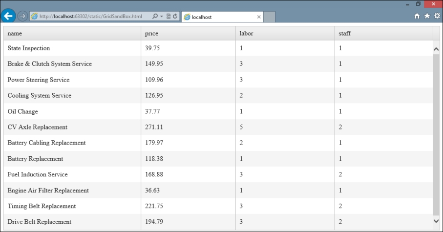
See how the code involved didn't even require a table to be present within the web page? Kendo UI generated everything that it needed in order to display this data as a grid on the page. Now we can turn our attention to creating grids that are more interactive and intelligent, and explore what the Kendo UI Grid widget has to offer in displaying data from different sources.
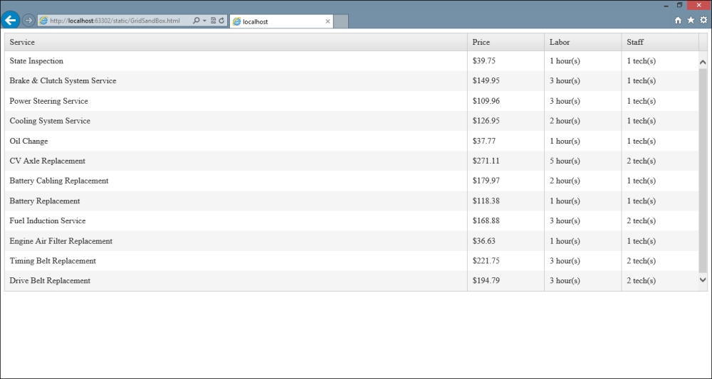
First of all, we can take control of the formatting of the Grid by specifying properties on a columns object array. This object array is used to indicate to the Grid how to display the data appropriately so that it appears as you want on the page. Here is a columns object example using the Grid that we saw just a moment ago to demonstrate the various options available for formatting:
$("#repairsGrid").kendoGrid({
...
columns: [{
field: "name",
title: "Service",
width: 300
    },
    {
field: "price",
title: "Price",
width: 50,
format: "${0:##.##}"
    },
    {
field: "labor",
title: "Labor",
width: 50,
template: "#= labor# hour(s)"
    },
    {
field: "staff",
title: "Staff",
width: 50,
template: "#= staff # tech(s)"
    }]
Here is the effect on the output:
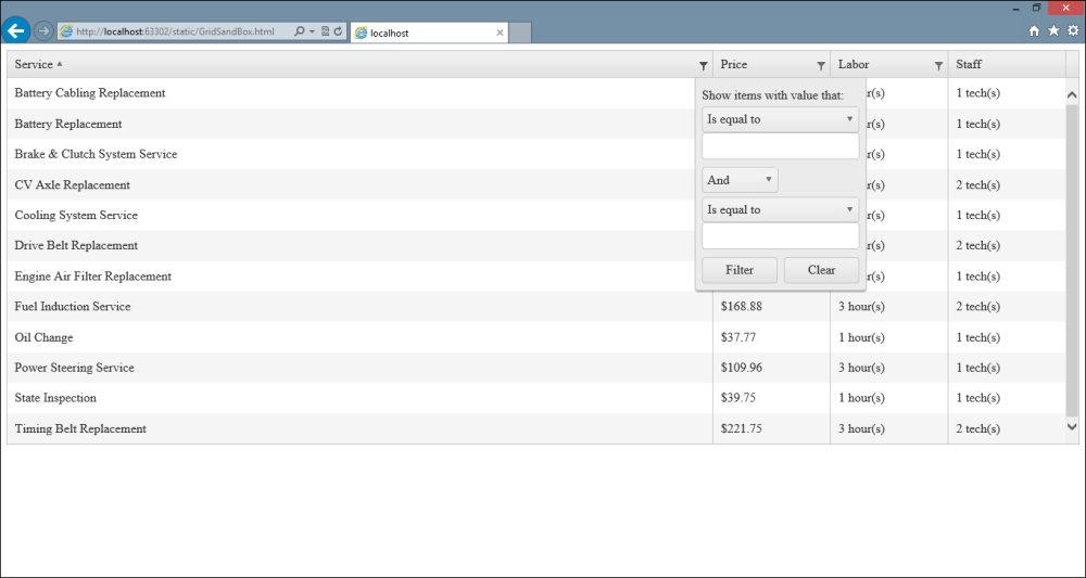
There are also simple options for enabling some dynamic interactive behaviors by specifying which columns are filterable or sortable. Note that these are only useful if the Grid, as a whole, has pageable and/or sortable set to true.
$("#repairsGrid").kendoGrid({
    ...
columns: [{
field: "name",
title: "Service",
width: 300,
sortable: true,
filterable: true
    },
    {
field: "price",
title: "Price",
width: 50,
format: "${0:##.##}",
sortable: true,
filterable: true
    },
    {
field: "labor",
title: "Labor",
width: 50,
template: "#= labor # hour(s)",
sortable: true,
filterable: true
    },
    {
field: "staff",
title: "Staff",
width: 50,
template: "#= staff # tech(s)",
sortable: false,
filterable: false
    }],
sortable: true,
filterable: true
Note in the following screenshot, how the Service column has been sorted alphabetically and I have clicked the filter icon, which enables me to input a filter on the data to be displayed on the page. You can see the filter icon right above the open window on the screen, it looks like a small funnel. Kendo UI takes care of actually doing the sorting and the filtering by means of the dataSource property that we set on the Grid. This means that settings you have put in place on the dataSource that you supply to the Grid will be used by the Grid for sorting and filtering:
When the Grid has been configured to allow editing of data, the columns property allows you to specify a custom editor function that can be used when changing data in that column. This can be a useful way of giving the user an easier way to input a change, or even to control the sort of changes that can be made. For example, this updated code sample shows adding an editor function to the Labor column so that it displays a drop-down list when edited, giving the user a specific set of options to choose from. There are a couple of other changes here that we will talk about next:
$("#repairsGrid").kendoGrid({
dataSource: repairs,
columns: [
  {
title: "Action",
width: 75,
command: ["edit"]
  },
{
field: "name",
title: "Service",
width: 300,
sortable: true,
filterable: true
  },
{
field: "price",
title: "Price",
width: 50,
format: "${0:##.##}",
sortable: true,
filterable: true
  },
{
field: "labor",
title: "Labor",
width: 50,
template: "#= labor # hour(s)",
sortable: true,
filterable: true,
editor: function (container, options) {
varselectEditor = $("<select name=" + options.field +
"></select>");
selectEditor.append(new Option("1", 1));
selectEditor.append(new Option("2", 2));
selectEditor.append(new Option("3", 3));
selectEditor.append(new Option("4", 4));
selectEditor.append(new Option("5", 5));
selectEditor.appendTo(container);
    }
  },
  {
field: "staff",
title: "Staff",
width: 50,
template: "#= staff # tech(s)",
sortable: false,
filterable: false
  }],
sortable: true,
filterable: true,
editable: "inline"
Here is the output of the editor function, showing the drop-down list that appears when a row enters the edit mode. It is important to set the name attribute of the <select> element so that Kendo can bind the user's choice back to the dataSource when the edit is saved.
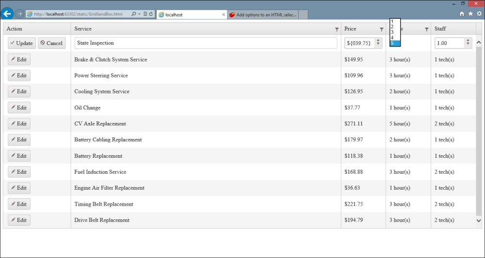
When using a custom editor function like this, the container and options objects that are passed in have some specific properties available to them that can be useful to you when writing your function. The container object is the page element to which you should add any new mark-up, as we did in our example. The options object contains two properties: options.field and options.model. The options.field
property contains the name of the field that you should use in your new mark-up so that Kendo can bind everything properly. The options.model property contains a reference to the actual model of the data being edited if one was specified in the dataSource; this gives you access to data that could be important when creating your custom logic.
Additional changes that appeared in the code sample were the editable: "inline" property on the Grid definition (required for editing to work; the alternative to inline is popup, which opens a special window for editing the record), and the new column that includes command buttons. The command property of a column object takes an array of command buttons to generate within each row. The available options for this array include edit, create, destroy, save, and cancel. We will return to this topic soon when we go into more detail on how to bind a Grid to CRUD operations.
Note that all that was necessary to add these command buttons to the Grid was to specify the command property of the column object. I did not add any <button> elements to the column, nor did I create JavaScript event handlers. Kendo UI generated all of this necessary markup for me through the Grid widget's existing functionality.
A significant portion of Grid functionality can be enabled through properties that describe the Grid's current capabilities. Each of them end in -able. These properties are
editable
,
filterable
,
groupable
,
navigatable
,
pageable
,
scrollable
,
selectable
, and
sortable
. We have already seen filterable and sortable and that they take simple true/false values when used. We have also seen editable, but there is more that can be done with this option:
...
editable: {
confirmation: "Are you sure?", // text displayed to confirm a delete operation
destroy: true, // whether or not to delete item when button is clicked
mode: "popup", // options are "incell", "inline", and "popup"
template: "#= ... #", // template to use for pop-up editing
update: true // switch item to edit mode when clicked?
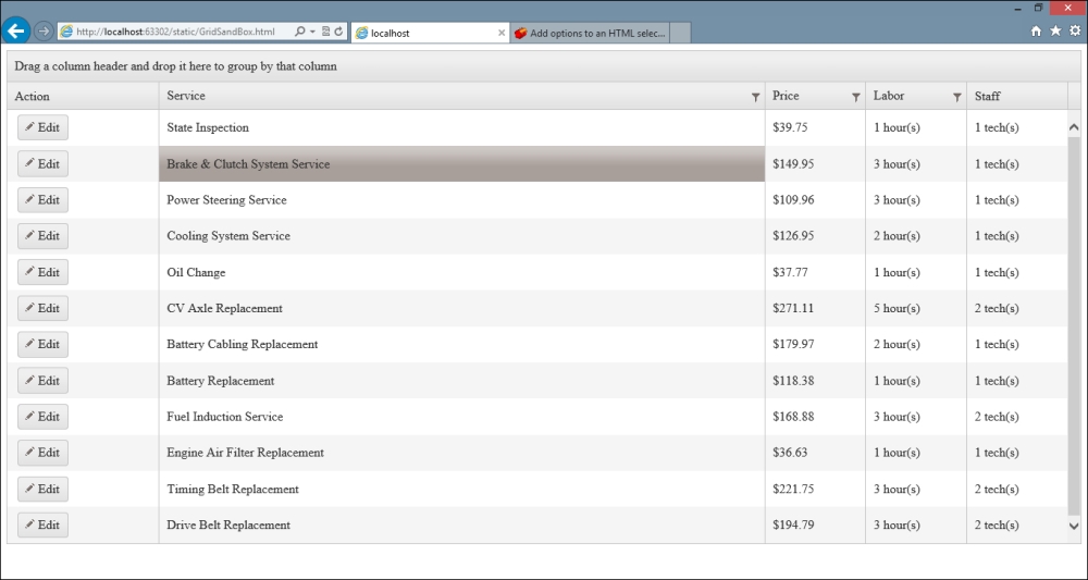
}The groupable property lets the user group columns by dragging them to the top of the screen. The groupable option also includes a property, groupable.messages.empty that will be displayed in an empty grouping area on a Grid. If you specify this messages property, the groupable: true value is assumed and does not need to be specified. The navigatable property turns on or off keyboard navigation within the Grid. Here is how the bottom of our Grid definition would look with groupable and navigatable turned on:
...
sortable: true,
filterable: true,
editable: "inline",
navigatable: true,
groupable: {
messages: {
empty: "Drag column header here for grouping"
    }
}
And the output in the page when rendered with these options:
The pageable option can be simply set to true/false, like several of the other options, but it also allows for more fine-grained control if you desire it:
...
pageable: {
pageSize: 10,
previousNext: true, // show buttons navigating to first/last/next/previous
numeric: true, // show numeric portion of the pager in the Grid?
buttonCount: 10, // number of buttons to show in numeric pager
input: true, // create input element allowing user to navigate to page
pageSizes: [5,10,20], //array of page size choices for user
refresh: true, //  show a refresh button in the Grid?
info: true, // show a label with current paging information in it
messages: {
display: "Detail Template – {1} of {2} items", // info text
empty: "No Records", // text to show when there are no records
page: "Page", // first part of text of input option
of: "of Detail Template", // last part of text of input option
itemsPerPage: "items per page", // text for selecting page size
first: "Go to first page", // text of first page button tooltip
previous: "Go to the previous page", // previous page tooltip
next: "Go to next page", // next page tooltip
last: "Go to the last page", // last page tooltip
refresh: "Refresh" // text of refresh button tooltip
  }
}
Our example code configured for paging with 10 items per page would appear like this:
...
sortable: true,
filterable: true,
editable: "inline",
navigatable: true,
groupable: {
messages: {
empty: "Drag column header here for grouping"
}
},
pageable: {
pageSize: 10
}
And the output generated with these options:
The scrollable
property configures whether a Grid can have a vertical scroll bar within it, and is usually specified if you have restricted the height of the Grid on your page. It can be set to a simple Boolean value of true/false.
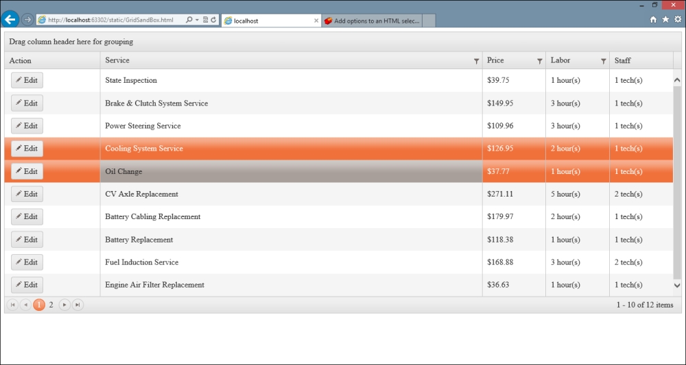
The selectable
property indicates whether selection is enabled or disabled within the Grid. Its possible values are row, cell, multiple, row, and multiple, cell. Here is how our example Grid looks with selectable: "multiple, cell".
Note that I have selected some rows for display.
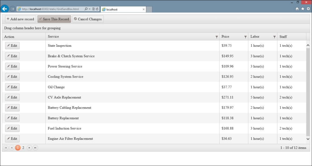
The toolbar
property enables a toolbar for the Grid with a certain set of commands, similar to the command property of the column objects. Each toolbar within the toolbar object array can have a name, template, and text configured:
...
toolbar: [
"create",
{ name: "save", text: "Save This Record" },
{ name: "cancel", text: "Cancel Changes: }]
Note how a toolbar can be a simple text value indicating which command to implement. You can also specify objects to contain the configuration data that you want (as in the preceding screenshot). Refer to the following screenshot:
In this chapter, we have covered a lot of fundamental information so that you can get started creating Kendo UI-enabled web pages properly. It is essential to understand how to use a Template and how to use a DataSource in order to do much at all with the Kendo UI framework. Second to these, the Grid is an essential component of the Kendo UI framework and knowing how to configure it will give you a head start when building pages that need to display tabular data to a user.
In the next chapter, we will learn about the AutoComplete widget. It allows you to add a word-wheel effect to input text boxes, to assist users in typing information that can be looked up from a data source. It is a great tool that many users are drawn to and will add a lot of functionality to your web pages without a lot of effort in writing the code.