


 Download code from GitHub
Chapter 2: Formatting Text and Creating Macros
In the last chapter, we installed LaTeX and used the TeXworks editor, as well as Overleaf, to write our first document. Now, we will look at the structure of text and focus on the text details and its formatting.
In this chapter, we will talk about the following:
- Working with logical formatting
- Understanding how LaTeX reads our input
- Modifying the text fonts
- Creating our own commands
- Using boxes to limit the width of paragraphs
- Breaking lines and paragraphs
- Turning off full justification
- Displaying quotes
By working with examples and trying out new features, we shall learn some basic concepts of LaTeX. By the end of this chapter, you will be familiar with commands and environments. You will even be able to define your own commands.
Now that you've started working intensively, you may encounter error messages when there's a problem with the document code. In such a case, you can look to Chapter 13, Troubleshooting, for possible solutions.
Technical requirements
You either need a LaTeX installation on your computer or you can use Overleaf. You can also edit and compile all the examples online on the book's web page: https://latexguide.org/chapter-02.
The code is also available on GitHub: https://github.com/PacktPublishing /LaTeX-Beginner-s-Guide-2nd-Edition-/tree/main/Chapter_02_-_Formatting_Text_and_Creating_Macros.
In this chapter, we will use the following LaTeX packages: hyphenat, microtype, parskip, url, and xspace. If you don't work online, make sure you have them installed, or you have a full LaTeX installation as suggested.
Working with logical formatting
Within a LaTeX document, we should not apply physical formatting, for example, making words bold or italic or in a different size. Instead, we should use logical formatting, such as declaring a title and the author and giving a section header. The actual formatting, such as printing the title in big letters and making a section heading bold, is done by LaTeX.
Physical formatting in this book
In some examples later in this chapter, we will use physical formatting commands, such as making words bold or italic. However, that's for practicing font commands. The goal of this chapter is to define our own logical commands with the help of font commands.
In a good LaTeX document, physical formatting is only used within the definition of logical formatting commands. If we need some format style, such as for keywords, we will define a suitable logical command in the document preamble. In the document body text, we should only use the logical formatting commands. This gives us consistent formatting throughout the text, and whenever we change our mind on formatting details, we can modify the logical commands in the preamble. We will go through this in the next sections.
First, to understand the typical document structure, let's start with a short, illustrative example.
Creating a document with a title and heading
We will create a short example with some basic formatting. It shall include a title, the author's name, the date, a heading, and some regular text:
- Type the following code into your editor to start a small document:
\documentclass[a4paper,11pt]{article} - Specify the title, author, and date:
\title{Example 2} \author{My name} \date{May 5, 2021} - Begin the document:
\begin{document} - Let LaTeX print the full title, which will include the author and date:
\maketitle
- Make a section heading and add some text:
\section{What's this?} This is our second document. It contains a title and a section with text. \end{document} - Save the document by clicking the Save button (or press Ctrl + S). Give it a name, such as
example2.tex. - Compile the document by clicking the Typeset button (or press Ctrl + T); this translates your code into a PDF file.
- View the output:
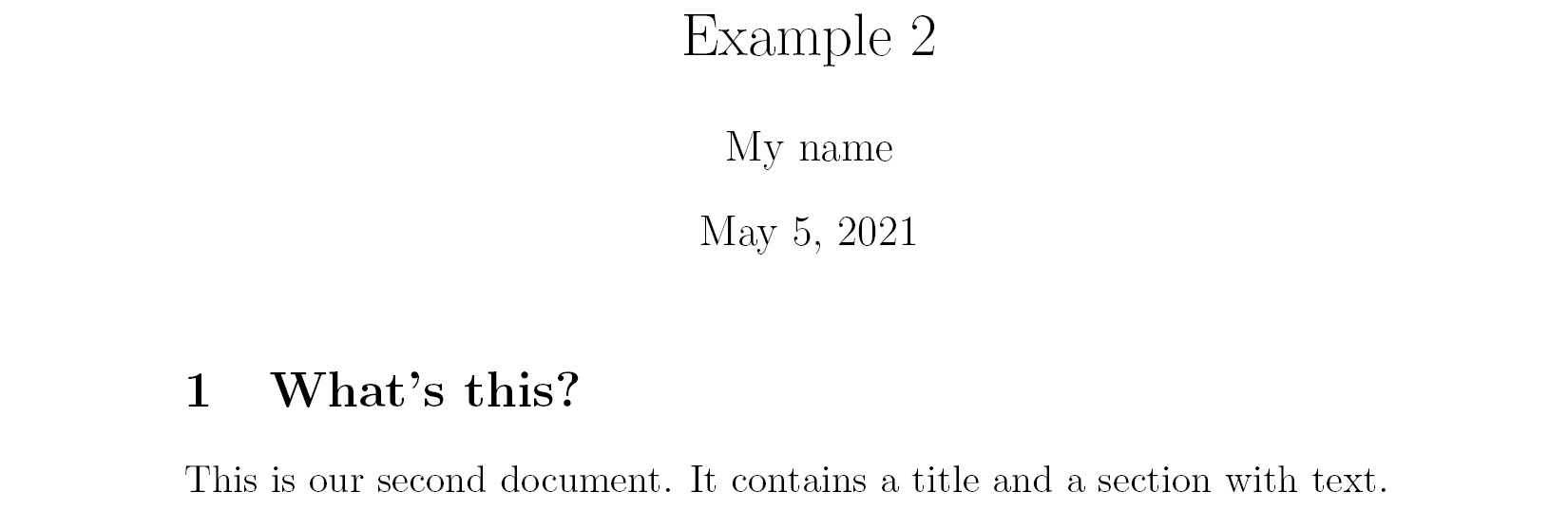
Figure 2.1 – Text with a heading
The TeXworks editor immediately shows the PDF preview after you press the Typeset button. At the same time, a PDF file is also created. In this case, it's called example2.pdf and it's in the same folder as your original code file, example2.tex.
In the first chapter, we talked about logical formatting; let's look at this example from that point of view. We told LaTeX the following:
- Our document is of the
articletype. It will be printed on A4 paper using a size of 11 points for the base font. - The title of the document is Example 2.
- It shows the author's name.
- The document was written on May 5, 2021.
Concerning the content of the document, we stated the following:
- It begins with a title.
- The first section includes the heading What's this?
- Following the heading is the text This is our second document. It contains a title and a section with text..
Note we did not choose the font size of the title or heading, and neither did we make something bold or centered. Such formatting is done by LaTeX but nevertheless, you're free to tell LaTeX how it actually should look.
Auto-saving
Once we have saved a document, we do not need to press the Save button again. TeXworks automatically saves the document when we click the Typeset button.
Exploring the document structure
Let's look at the details of the example we just created. A LaTeX document doesn't stand alone—commonly, the document is based on a versatile template. Such a fundamental template is called a class. It provides customizable features, usually built for a certain purpose. There are classes for books, journal articles, letters, presentations, posters, and many more; hundreds of reliable classes can be found in internet archives, but also on your computer after you've installed TeX Live. In our example, we have chosen the article class, a standard LaTeX class suitable for smaller documents.
The first line starts with \documentclass. This word begins with a backslash; such a word is called a command or a macro. We already used commands to specify the class and to state document properties in our first example in this chapter: \title, \author, and \date. These commands store the properties; they don't print something.
This first part of the document is called the preamble of the document. This is where we choose the class, specify properties, and in general make document-wide definitions.
\begin{document} marks the end of the preamble and the beginning of the actual document. \end{document} marks the end of the document. Everything that follows would be ignored by LaTeX. Generally, such a piece of code that's framed by a \begin and \end command pair is called an environment.
In the actual document, we've used the \maketitle command, which prints the title, author, and date in a nicely formatted manner. With the \section command, we produced a heading, bigger and bolder than normal text. Then, we let some text follow. What we wrote after the preamble, in the document environment, will be printed out. However, the preamble itself will never produce any output.
Now that you've seen what commands look like, let's look at command syntax in detail.
Understanding LaTeX commands
LaTeX commands begin with a backslash, followed by big or small letters, and are usually named in a descriptive way. There are exceptions: you will see some commands consisting of a backslash and just one special character.
Commands can have parameters, that is, options that determine in which way the command does its work. The values that we hand over as parameters are called arguments. They are given in curly braces or square brackets, as we will explain now.
So, calling a command can look like this:
\command
Or, it can look like this:
\command{argument}
Or, it can look like this:
\command[optional argument]{argument}
There could be several arguments, each of them in braces or brackets. Arguments in curly braces are mandatory. If a command is defined to require an argument, one has to be given. For example, calling \documentclass would be futile if we haven't stated a class name.
Arguments in square brackets are optional; they may be given but it's not a must.If no optional argument is provided, the command will use a default one.For instance, in the first example in Chapter 1, Getting Started with LaTeX, we wrote \documentclass{article}. This document was typeset with a base font size of 10 points because this is the class's default base font size. In the second document, we wrote \documentclass[a4paper,11pt]{article}; here, we replaced the default values with the given values, so now the document will be adjusted for A4 paper using a base font size of 11 points.
Commands, macros, and declarations
Most LaTeX commands, including those we define ourselves, consist of other commands. That's why LaTeX commands are also called macros, and the terms macro and command are used interchangeably. A command or macro that doesn't print something but just changes current settings, such as the font shape or text alignment, is also called a declaration.
Now, let's look at the syntax of environments.
Understanding LaTeX environments
LaTeX environments start with \begin and end with \end. Both commands require the name of the environment as their argument.
Simple environments look like this:
\begin{name}
    …
\end{name}
Such environments can be used for each declaration called \name.
Like commands, environments may have arguments. Exactly like in the case of commands, mandatory arguments are written in curly braces and optional arguments in square brackets. So, you will encounter an environment like this:
\begin{name}{argument}
    …
\end{name}
You will also encounter environments like this:
\begin{name}[optional argument]{argument}
    …
\end{name}
Environments are like declarations with a built-in scope. With \begin, the environment introduces a change in layout, font, or other properties. There must be an \end command, where this change will be canceled. The effect of the environment name is delimited to the piece of code between \begin{name} and \end{name}.
Furthermore, the effect of all local declarations used inside an environment will end together with the surrounding environment.
Now that we know the syntax of LaTeX commands and environments, let's see how LaTeX treats what we type.
Understanding how LaTeX reads our input
Before we continue writing, let's look at how LaTeX understands what we type:
- Besides simple alphabet characters, we can directly type (or copy and paste) accented characters, such as ä, ü, and ö, as well as further characters from other languages, such as Greek or Russian.
- A space in the input code will appear as a space in the output document. Several consecutive spaces are treated as one space.
- An end of a line in the source code is treated as a space.
- An empty line in the source code is treated as a paragraph break.
There are some characters with special meanings:
- A backslash,
\, starts a LaTeX command or a LaTeX macro. - Curly braces and square brackets are used for command arguments.
- A dollar sign,
$, starts and ends math mode, which we will explore in Chapter 9, Writing Math Formulas. - A percent sign,
%, tells LaTeX to ignore the rest of the line.
Let's expand upon that last point: the percent sign introduces a comment. Everything following a percent sign until the end of the line will be ignored by LaTeX and won't be printed out. This enables you to insert notes into your document. It's often used in LaTeX templates to inform the user of what the template does or requires the user to do at a certain point. Note that the end of the line, normally behaving as a space, will also be ignored after a percent sign.
Easing experimenting by trial and error
If you want to disable a command temporarily, it may be favorable to insert a percent sign instead of deleting the command. That way, you're able to undo this change easily by removing the percent sign.
If that is how the percent sign works, what should we do if we want to write 100% in our text? And what about the other special symbols? Let's figure out how to solve that issue in the next section.
Printing out special symbols
Common text mostly contains uppercase and lowercase letters, digits, and punctuation characters that you can simply type into your editor. However, some characters are reserved for LaTeX commands and cannot be used directly. We already encountered such characters, including the percent sign and curly braces. To fix this issue, there are LaTeX commands to print such symbols.
We will write a very short example printing out an amount of dollars and a percent number, along with some other symbols:
- Create a new document and enter the following lines:
\documentclass{article} \begin{document} Statement \#1: 50\% of \$100 equals \$50. More special symbols are \&, \_, \{ and \}. \end{document} - Click the Typeset button to compile the document.
- Check out the output:

Figure 2.2 – Special symbols
By putting a backslash before a special symbol, we turned it into a LaTeX command. The only purpose of this commend is to print out that symbol.
Printing the backslash
You may be wondering how to print a backslash. The command for printing a backslash is \textbackslash. If you would like to know what \\ might be used for, it is used as a shortcut for a line break. That may seem a bit odd, but line breaks occur frequently whereas backslashes are rarely needed in the output, therefore this shortcut has been chosen.
There's a wealth of symbols that we can use for math formulas, chess notation, zodiac signs, music scores, and more. We don't need to deal with those symbols for now, but we shall return to that subject in Chapter 9, Writing Math Formulas, when we will need symbols to typeset math formulas.
Now that we know how to enter pure text, let's find out how we can format it.
Modifying the text fonts
LaTeX already does some formatting automatically; for example, we've seen that section headings are bigger than normal text and bold-faced. Now we will learn how to modify the appearance of the text ourselves.
Adjusting the font shape
In this example, we will emphasize an important word in our text, and we will see how to make words appear in bold, italic, or slanted. We shall also figure out how to highlight words in a specific part of the text that's already emphasized.
Let's take a look:
- Create a new document containing the following code:
\documentclass{article} \begin{document} Text can be \emph{emphasized}. Besides from \textit{italics}, words can be \textbf{bold}, \textsl{slanted}, or typeset in \textsc {Small Caps}. Such commands can be \textit{\textbf{nested}}. \emph{See how \emph{emphasizing} looks when nested.} \end{document} - Click Typeset and have a look at the output:
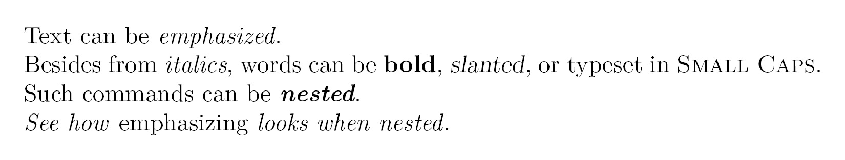
Figure 2.3 – Emphasizing phrases
At first, we used the \emph command, giving one word as an argument to this command. This argument will be typeset in italic because this is the default way LaTeX emphasizes text.
Text-formatting commands usually look like \text**{argument}, where ** stands for a two-letter abbreviation such as bf for bold face, it for italic, and sl for slanted. The argument will then be formatted accordingly, as we've seen in our example. After the command, the subsequent text will continue being typeset as it was before the command—precisely after the closing curly brace, marking the end of the argument.
We nested the \textit and \textbf commands, which allowed us to achieve a combination of those styles, and the text appears in both italic and bold.
Most font commands will show the same effect if they are applied twice, such as \textbf{\textbf{words}}. Here, the words won't become bolder.
But \emph behaves differently. We've seen that \emph changes text to italic, but if we use \emph on a piece of text that is already in italic, it will change from italic to upright font. Imagine an important theorem completely typeset in italic and you would like to highlight a word inside this theorem; that word should not be in italic but formatted as upright font again.
Change the font shape sensibly
Combining font shapes, such as marking bold and italic at the same time, might be considered a questionable style choice. Change the font shape wisely—and consistently.
Choosing the font family
The default LaTeX font is a serif font (also called a Roman font). That means small lines or strokes, called serifs, are attached to letters. If such serifs are absent, we call the font a sans-serif font.
Compare the two lines in Figure 2.4. Look closely at the first letter, T, which clearly shows the difference between serif and sans-serif fonts:

Figure 2.4 – Serif versus sans-serif font
These different types of fonts are called font families or typefaces.
Another typeface is monospaced; here, all letters have the same width. Monospaced fonts are also called typewriter fonts.
Let's switch font families in a small example document. We will start with bold text, but bold text with serif looks very heavy. So, we will use sans-serif bold text instead. The following text will contain an internet address, and we will choose a typewriter font to emphasize it.
Follow these instructions:
- Create a LaTeX document with the following code:
\documentclass{article} \begin{document} \textsf{\textbf{Get help on the Internet}} \texttt{https://latex.org} is a support forum for \LaTeX. \end{document} - Click on Typeset and look at the result:

Figure 2.5 – Text with a URL
Here, we encountered further font commands—by using \textsf, we've chosen the sans-serif font in the heading line, and we used the \texttt command to get the typewriter font for the internet address. Those commands can be used just like the font commands we've learned about before.
Serifs, those small decorative details at the end of a letter's strokes, improve readability by leading the reader's eyes along the line; therefore, they are widely used in printed books and newspapers.
Headings are often done without serifs. Sans-serif fonts are also a good choice for screen text because of their better readability on lower-resolution screens or on mobile phone displays with small font sizes. Sans-serif fonts are often preferred for text in e-books and on internet pages.
Monospaced or typewriter fonts are preferred for writing the source code of computer programs, both in print and in text editors. As in our previous example, this book generally uses a typewriter font to distinguish source code and web addresses from normal text.
The commands we've seen applied formatting to the text in the argument in curly braces. LaTeX also provides commands without arguments, which work like switches.
Using the following instructions, we will modify the previous example using font family switching commands:
- Edit the previous example to get the following code:
\documentclass{article} \begin{document} \sffamily\bfseries Get help on the Internet \normalfont\ttfamily https://latex.org\normalfont\ is a support forum for \LaTeX. \end{document} - Click on Typeset to compile.
- Compare the output to the previous example; it's the same.
By using the \sffamily command, we switched to the sans-serif typeface. The \bfseries command switched the text to bold. We used the \normalfont command to return to the default LaTeX font, and then we used the \ttfamily command to switch to a typewriter font. After the internet address, we used \normalfont again to switch to the default font.
Such switching commands don't produce any output themselves, but they will affect the text that follows it, so they are declarations.
Let's summarize the font commands and their corresponding declarations together with their meanings:
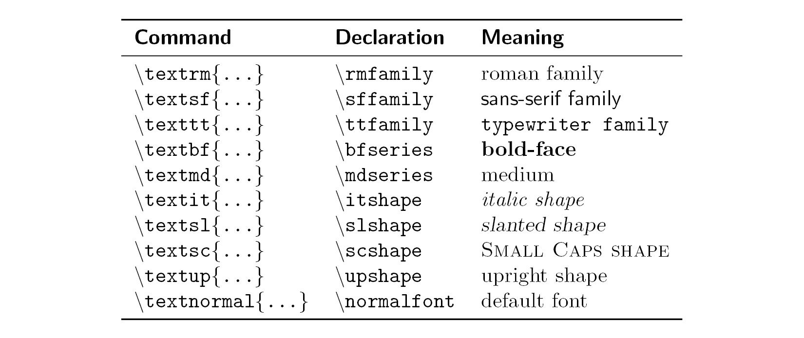
Figure 2.6 – Font commands
Note on emphasizing
The corresponding declaration to \emph is \em.
Confining the effect of commands by braces
In the previous example, we wrote \normalfont to switch the font back to the default font, but there's another way. We shall use curly braces to tell LaTeX where to apply a command and where to stop it:
- Shorten and modify our font shape example that produced Figure 2.3 to get this code:
\documentclass{article} \begin{document} Besides from {\itshape italics}, words can be {\bfseries bold}, {\slshape slanted}, or typeset in {\scshape Small Caps}. \end{document} - Click on Typeset and check out the output:

Figure 2.7 – Using declarations to change the font weight and shape
When we change the font using a declaration, we start with an opening curly brace, and then the font declaration command follows. The effect of that command lasts until we stop it with the corresponding closing brace.
An opening curly brace tells LaTeX to begin a group. The following commands are valid for the subsequent text until a closing curly brace ends the group. Groups can be nested as follows:
Normal text, {\sffamily sans serif text {\bfseries and bold}}.
The area where a command is valid is called its scope. We have to be careful to complete each group. For every opening brace, there has to be a closing brace.
So, in short, groups are defined by curly braces and they contain and confine the effect of local commands.
Exploring font sizes
Now we will try out every font size available with LaTeX's default font size commands:
- Create a document with the following code:
\documentclass{article} \begin{document} \tiny We \scriptsize start \footnotesize very \smallsmall, \normalsize get \large big \Large and \LARGE bigger, \huge huge, \Huge gigantic! \end{document} - Click on Typeset and observe the output:

Figure 2.8 – Font sizes
We used all 10 available font size declarations, starting small with \tiny and ending really big with \Huge. There are no corresponding commands taking arguments, so we would have to use curly braces to delimit their scope, as we learned before.
The actual resulting font size scales with the base font size. If your document has a base font of 12 points, then \tiny would result in text bigger than the base font of 10 points.
Use \footnotesize if you wish to get the same size LaTeX uses for footnotes or use \scriptsize if you wish to create a style with a size matching LaTeX subscripts and superscripts. Document classes provide carefully selected and well-suited font size selections, so you normally don't need to set a certain physical size. This and other advanced font tweaking commands are covered in Chapter 3, Adjusting Fonts, in the LaTeX Cookbook, Packt Publishing.
For practice, we used many predefined font commands in this section. The next level is to create our own logical formatting commands to use them instead of physical font commands within the document body text.
Creating our own commands
If you're frequently using the same term in your document, it would be annoying to type it again and again. What if you later decide to change that term or its formatting? To avoid searching and replacing the term in the whole document, LaTeX allows you to define your own commands in your preamble.
Remember: a command that consists of other commands is called a macro, and that's what we will define now. Basically, we choose a new macro name and define the sequence of text or commands to be used in that macro. Then, when we want to perform an action, we just need to use the macro's name.
We will start with simple macros that are basically abbreviations.
Using macros for simple text
Macros can save us from repeating long words or phrases and can act as placeholders. We can change the content of the macro to update the whole document with a different version of that phrase.
Here, we will define a short command that prints out the name of the TeX Users Group (TUG):
- Type this code into a new document:
\documentclass{article} \newcommand{\TUG}{\TeX\ Users Group} \begin{document} \section{The \TUG} The \TUG\ is an organization for people who use \TeX\ or \LaTeX. \end{document} - Click on Typeset and look at the result:

Figure 2.9 – Using our first macro
\newcommand in the highlighted line defines our command. The first argument is the name we chose for the command, and the second argument is the text we want it to print out in the document.
Now, whenever we type \TUG in our document, the complete name will appear. If we later decide to change the name or its formatting, we just need to change this \newcommand line. Then, the change will be applied to the whole document.
You may use formatting commands inside your command definition. Let's say you would like to change the formatting of all occurrences of this name to be typeset in small caps; just change the definition to the following:
\newcommand{\TUG}{\textsc{TeX Users Group}}
You have also seen that we've used the \TeX command. This abbreviation command just prints out the name of the typesetting system, formatted in the same way as its logo. \LaTeX works similarly.
Note that we used a backslash after \TeX. The following space would just separate the command from the following text; it wouldn't produce a space in the output. Using the backslash followed by a space forces the output of a space that would otherwise be ignored. That also applies to the command we just created.
Now we will see how to avoid that manual spacing.
Proper spacing after commands
A backslash following a command could easily be forgotten. Can't we modify the command in order to automate that? Tasks like this, which aren't supported by LaTeX directly, could be solved by using packages, which are collections of styles and commands.
Here, we will load the xspace package; its only purpose is to adjust the spacing after printed output:
- Insert this line into your preamble, that is, before
\begin{document}:\usepackage{xspace} - Add the
\xspacecommand to your macro definition:\newcommand{\TUG}{\TeX\ Users Group\xspace}
\usepackage{xspace} tells LaTeX to load the xspace package and to import all of its definitions. From now on, we can use all commands contained in that package.
This package provides the \xspace command, which inserts a space depending on the following character:
- If a normal letter follows, then it will print a space after the macro content.
- If a dot, a comma, an exclamation mark, or a quotation mark follows, it won't insert a space.
That automation is the defining reason for using the xspace package.
Creating more universal commands and using arguments
Imagine that your text contains a lot of keywords that you want to be printed in bold. If you use the \textbf command on all the keywords, what will happen if you later decide to use an italic shape instead, or a typewriter font? You would have to change that formatting for each keyword. There's a better way: defining your own macro and using \textbf only inside that macro definition.
Creating a macro with arguments
In this section, we will use \newcommand again, but this time we will introduce a parameter that will contain our keyword. For the example, we will use it on some terms that we've got to know in this chapter.
Let's get started:
- Type the following code example in your editor. The highlighted line will be our own macro definition, as shown here:
\documentclass{article} \newcommand{\keyword}[1]{\textbf{#1}} \begin{document} \keyword{Grouping} by curly braces limits the \keyword{scope} of \keyword{declarations}. \end{document} - Click on Typeset and observe the look of the keywords in the output:

Figure 2.10 – Formatting keywords
Let's look at the highlighted \newcommand line in the code. The number 1 in the square brackets marks the number of arguments that we want to use in the command. #1 will be replaced by the value of the first argument; #2 will be replaced by the value of the second argument, and so on. Now, if you want to modify the appearance of all keywords to be italic, just modify the definition of \keyword and the change will be global.
The first time we used \newcommand, in the Creating our own commands section, we used it with two arguments: the macro name and the macro commands. In the previous example, there were three arguments; the additional argument has been put in square brackets, which is how we mark optional arguments (those arguments may be given or may be omitted). If omitted, they would have a default value.
Previously, we've already worked with the \documentclass command, but how can we define a command with optional arguments ourselves?
Creating a macro with optional arguments
We will use \newcommand another time, but this time with an optional formatting parameter and a mandatory argument for the keyword:
- Modify the previous example to get this code:
\documentclass{article} \newcommand{\keyword}[2][\bfseries]{{#1#2}} \begin{document} \keyword{Grouping} by curly braces limits the \keyword{scope} of \keyword[\itshape]{declarations}. \end{document} - Click on Typeset and check out the result:

Figure 2.11 – Optional arguments
Let's look again at the highlighted \newcommand line in the code. By using [\bfseries], we introduced an optional parameter; we refer to it by #1 and its default value is \bfseries. Since we used a declaration this time, we added a pair of braces to ensure that only the keyword is affected by the declaration. Later in the document, we gave [\itshape] to \keyword, changing the default formatting to italic.
Here's the definition of \newcommand:
\newcommand{command}[arguments][optional]{definition}
These are the meanings of the parameters to \newcommand:
command: The name of the new command, starting with a backslash followed by lowercase and/or uppercase letters, or a backslash followed by a single non-letter symbol. The name must not be already defined and is not allowed to begin with\end.arguments: An integer from 1 to 9, representing the number of arguments of the new command. If omitted, the command will have no arguments.optional: If this is present, then the first of the arguments would be optional with a default value given here. Otherwise, all arguments are mandatory.definition: Every occurrence ofcommandwill be replaced bydefinitionand every occurrence of the form#nwill then be replaced by the nth argument.
Use \newcommand to create styles for keywords, code snippets, web addresses, names, notes, information boxes, or differently emphasized text. How did we achieve the consistent structure of this book? Defining styles with \newcommand is the key. We should use font commands within our macro definitions, rather than in the document body text.
General good practice
As often as possible, create your own macros to achieve a logical structure. You will be rewarded with consistent formatting and changes could easily be applied to the whole document. By defining and using commands, you can ensure that the formatting remains consistent throughout your whole document.
Now that we have seen how to format words and phrases, let's look at whole paragraphs.
Using boxes to limit the width of paragraphs
We won't always write text just from left to right over the complete text width. Sometimes, we'd like a paragraph to have a smaller width, for instance, when we would like to put text and a picture side by side.
In the following sections, we will look at how to work with paragraph boxes in LaTeX.
Creating a narrow text box
For our example, we would like to explain the acronym TUG in a text column of only 3 cm width. To do this, follow these steps:
- Create a new document containing these four lines:
\documentclass{article} \begin{document} \parbox{3cm}{TUG is an acronym. It means \TeX\ Users Group.} \end{document} - Click on Typeset and take a critical look at the output with the too-wide spacing:
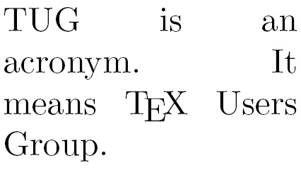
Figure 2.12 – A narrow justified paragraph
We used the \parbox command in the highlighted code line to create a column. The first argument to the \parbox command sets the width to 3 cm, and the second argument to \parbox contains the text.
\parbox takes the argument text and formats the output to fit the specified width. We see that the text is fully justified; however, our example shows an obvious problem: insisting on full justification could lead to undesirable big gaps in the text. Possible solutions are as follows:
- We introduce hyphenation; the word acronym could easily be hyphenated.
- We improve justification in general.
- We give up on full justification; narrow text could look better when it's only left-justified.
We will check out all of these options in the Breaking lines and paragraphs and Turning off full justification sections.
But first, let's understand how \parbox works.
Producing common paragraph boxes
Usually, we just need a text box with a certain width; occasionally, we would like to have some additional alignment to the surrounding text. So, the common definition of the \parbox command is as follows:
\parbox[alignment]{width}{text}
The meanings of the parameters are as follows:
alignment: That's the optional argument for vertical alignment. Statetto align at the baseline of the top line of the box; writebto align at the baseline of its bottom line. The default behavior is to place the box such that its center is in line with the center of the current text line.width: That's the width of the box. It can be given in ISO units, such as 3 cm, 44 mm, or 2 in.text: That's the text that you want to put in that box. It should be a short piece of common text. For complicated or longer content, we can use theminipageenvironment, which we will use in the next section.
Here's a demonstration of the effect of the alignment parameters:
\documentclass{article}
\begin{document}
Text line
\quad\parbox[b]{1.8cm}{this parbox is aligned
at its bottom line}
\quad\parbox{1.5cm}{center-aligned parbox}
\quad\parbox[t]{2cm}{another parbox aligned at its top line}
\end{document}
The \quad command produces some space; we used it to separate the boxes a bit. Here's the output:

Figure 2.13 – Aligned paragraph boxes
The output in Figure 2.13 shows how the alignment works. Text line is our base line, and referring to that base line, the following boxes are aligned at the bottom, the center, or the top line, respectively.
Exploring further features of paragraph boxes
\parbox is capable of doing even more. If you need advanced positioning, here's the complete \parbox definition:
\parbox[alignment][height][inner alignment]{width}{text}The meanings of the parameters are as follows:
height: If this optional argument isn't given, the box will have just the natural height of the text inside. Use this argument if you want to change the height of the box to make it bigger or smaller.inner alignment: If the height of the box is different from the natural height of the contained text, you might want to adjust the text position. You can add the following values:c: Vertically centers the text in the boxt: Places text at the top of the boxb: Places text at its bottoms: Stretches the text vertically (if possible)If you omit this argument, the
alignmentargument will be used here as the default value.
Take our previous demonstration example and try the effect of the optional arguments. Use the \fbox command, which helps to visualize the effect; if you write \fbox{\parbox[...]{...}{text}}, the complete parbox will be framed.
Using mini pages
Paragraph boxes are suitable for boxes with only a little text inside. In the case of a box containing a large amount of text, the closing brace could easily be forgotten or overlooked. The minipage environment would then be a better choice.
In this example, we will use the minipage environment instead of \parbox to get a sample of text with a width of just 3 cm:
- Modify the parbox example to get the following code:
\documentclass{article} \begin{document} \begin{minipage}{3cm} TUG is an acronym. It means \TeX\ Users Group. \end{minipage} \end{document} - Click on Typeset and look at the output:

Figure 2.14 – A minipage example
By using \begin{minipage}, we started a "page in a page." We specified that the width of 3 cm will be the mandatory argument. From this point onward, the text lines will have a width of 3 cm; they will be automatically wrapped and fully justified. We ended this restriction with \end{minipage}. Any text typed afterward would run over the complete body text width.
Preventing page breaks
There will never be a page break within a minipage environment, so that's a way to prevent page breaks within a text area. If that text within the minipage environment doesn't fit on the page, it will move to the next page.
The minipage environment accepts all arguments similar to \parbox with the same meanings.
If text is wrapped in a box or just in a normal line, it may automatically fit well. However, we may need to consider completing line breaking and justification manually. Let's see how to do this in the next sections.
Breaking lines and paragraphs
Generally, when you're writing text, you don't need to care about the line wrapping. Just by typing the text with your editor, LaTeX will make it fit to the line and it will take care of the justification. If you want to begin a new paragraph, just insert an empty line before you continue with your text for the next paragraph.
Now we will find out how to control the line wrapping. First, we will see how to improve the automatic hyphenation, and second, we will learn commands to insert breaks directly.
Improving hyphenation
If you look at longer documents, you will notice that it's outstanding how the text is fully justified by LaTeX and how the spacing between words is evenly distributed on the lines. If necessary, LaTeX will divide words and put hyphens at the end of the line in order to break the lines in a better way. LaTeX already uses very good algorithms to hyphenate words, but it may happen that it can't find an acceptable way to divide a word. The previous example pointed out this problem: breaking the word acronym would improve the output, but LaTeX does not know where to divide it. We shall find out how to solve that.
No matter how good the justification is, text in very narrow columns is extremely hard to justify. To achieve full justification, LaTeX inserts big gaps between the words.
In the following example, we will tell LaTeX how a word could be divided, to give LaTeX more flexibility for paragraph justification:
- Insert the following line into the preamble of the previous example:
\hyphenation{acro-nym} - Click on Typeset and look at the output:
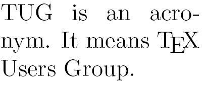
Figure 2.15 – A paragraph with improved hyphenation
We've told LaTeX that the word acronym may have a division point between acro and nym. That means a hyphen might be placed after acro at the end of the line and nym moves down to the following line.
The \hyphenation command tells LaTeX where the division points of a word may be. Its argument may contain several words separated by spaces. For each word, we can indicate several points. For instance, we could extend the argument by more division points and more word variants, like this:
\hyphenation{ac-ro-nym ac-ro-nym-ic a-cro-nym-i-cal-ly}
You could also indicate division points in the body text by inserting a backslash followed by a hyphen, such as ac\-ro\-nym. But by using the \hyphenation command in the preamble, you would collect all rules there and they will be used consistently; so, use it especially in the rare cases where LaTeX's automation fails.
Preventing hyphenation
If you want to prevent the hyphenation of a certain word at all, there are two possible ways:
- Declare it in the preamble by using it in the
\hyphenationargument without any division points, such as\hyphenation{indivisible}. - Protect it inside the text using the
\mboxcommand:The following word is \mbox{indivisible}.
Loading the hyphenat package gives us two more choices:
\usepackage[none]{hyphenat}prevents hyphenation throughout the document.\usepackage[htt]{hyphenat}enables hyphenation for typewriter text; otherwise, such monospaced words won't be hyphenated by default.
These optional arguments to \usepackage are called package options. They configure the behavior of a package. The mentioned options may be combined, separated by commas. Even if you don't use the none option, you can disable hyphenation for short pieces of text using the \nohyphens{text} command. Try out these features if you want to benefit from them. The package documentation explains more features that you may sometimes need, such as hyphenation after special characters such as numerals and punctuation.
Improving the justification
Today's most popular TeX compiler is pdfTeX, which directly produces PDF output. When Hàn Thế Thành developed pdfTeX, he extended TeX with micro-typographic capabilities. When we typeset directly to a PDF, we're actually using pdfLaTeX and we can benefit from the new features by using the microtype package.
Let's improve our previous example by loading the microtype package:
- Insert the following line into the preamble of the previous example:
\usepackage{microtype} - Click on Typeset and look at the output:
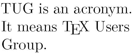
Figure 2.16 – A paragraph with better justification
We have loaded the microtype package without any options, relying on its default behavior. It introduces font expansion to tweak the justification and uses hanging punctuation to improve the optical appearance of the margins. This may reduce the need for hyphenation and avoids having large gaps between words for achieving full justification. You've seen its effect on a narrow column, so imagine the improvement on wide text—keep that in mind and try it out later!
Though microtype provides powerful features and options for the advanced typesetter, we usually won't need to do more than just load it to benefit from it. There's extensive package documentation if you want to study it in depth. microtype does nice tweaking but it's not a cure-all; we should still take care of proper hyphenation when necessary.
Breaking lines manually
We might choose to end a line ourselves, overriding the automation. Here, we will learn about several commands with different effects for ending a line.
We will type the beginning of a famous poem by Edgar Allan Poe. As the poet has specified where a verse has to end, we shall insert line breaks there.
So, let's write up the beginning of the poem:
- Create a document containing these lines:
\documentclass{article} \begin{document} \noindent\emph{Annabel Lee}\\ It was many and many a year ago,\\ In a kingdom by the sea,\\ That a maiden there lived whom you may know\\ By the name of Annabel Lee \end{document} - Click on Typeset and view the output:
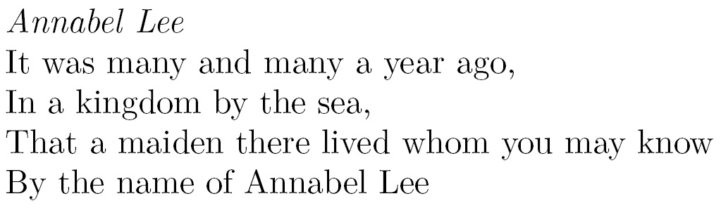
Figure 2.17 – Manually broken lines
The very short \\ command ended a line, while the following text was moved to the next line. That's different from a paragraph break as we're still using the same paragraph. The \newline command also has the same effect.
The \noindent command suppresses the paragraph indentation. Otherwise, the first line in the paragraph would be indented by default. Indenting is actually intended for visually separating paragraphs. We suppressed indentation manually because there is no section heading. After headings, there's no indentation by default. You normally don't need the \noindent command. For generally removing paragraph indentation and replacing it with vertical inter-paragraph spacing, load the parskip package. You can see this in Figure 2.23 and the corresponding code.
Note that although we inserted line endings, it is still a single paragraph. So, a line break doesn't cause a paragraph indentation since it's logically the same paragraph.
Exploring line breaking options
The \\ command understands optional arguments with the following syntax:
\\[value]inserts additional vertical space after the break depending on thevalue, such as\\[3mm].\\*[value]is a variation of the previous argument but prevents a page break before the next line of text.
There's another command called \linebreak that tells LaTeX to end the line but to keep the full justification, therefore the space between the words would be stretched to reach the right margin. This could cause unpleasant gaps—that's why that command is rarely used.
\linebreak[number] can be used to tweak the line break. If number is 0, a line break is allowed; 1 means it's desired; 2 and 3 mark more insistent requests; 4 will enforce it. The latter is the default behavior if no number is given.
You may try out these numbers; for example, change the heading of our poem example to the following:
\emph{Annabel Lee}\\[3mm]
That inserts an additional 3 mm space between our heading and the poem fragment. Continue playing with the options to see their effects.
Preventing line breaks
The \linebreak command has a direct counterpart: \nolinebreak. This command prevents a line break at the current position.
Like its counterpart, it takes an optional argument. If you write \nolinebreak[0], you recommend not to break the line there. Using 1, 2, or even 3 makes the request stronger and \nolinebreak[4] forbids it completely. The latter option will be presumed if you don't provide an argument.
The already mentioned \mbox{text} command not only disables the hyphenation of a word but will also prevent a line break for the complete text.
LaTeX will break lines at spaces between words if meaningful. The ~ symbol stands for an interword space where no break is allowed; if you write Dr.~Watson, the title Dr. would never stand lonely at the end of a line.
By default, the text is fully justified. That means lines are stretched to the right margin if needed. This may result in undesirable gaps between words in a stretched line. Let's see how to disable it if we want to.
Turning off full justification
Though commonly your text will look fine if full justification is used, there may be occasions when it's not optimum. For instance, full justification could be displeasing if the text lines are short; in such a case, it could be sufficient to justify only to the left side. We shall see how to put this into practice, plus how to right-justify and how to get centered lines.
Creating ragged-right text
Remember the first parbox example, which was fully justified but had those big gaps between the words? In this example, we shall give up justification to the right side to avoid such gaps:
- Create a new document containing these lines:
\documentclass{article} \begin{document} \parbox{3cm}{\raggedright TUG is an acronym. It means \TeX\ Users Group.} \end{document} - Click on Typeset and look at the output:

Figure 2.18 – Left-justified text
We inserted the \raggedright declaration. From this point onward, the text will be ragged-right. In other words, the text will be moved to the left margin—"flushed-left." There won't be hyphenation.
Because we used this declaration inside a box, it's only valid there, like inside environments. After the box, the text will be fully justified again.
If we want the whole document to be ragged-right, we just need to use \raggedright in our preamble.
Creating ragged-left text
There might be occasions when we would like to achieve the opposite effect: flushing the text to the right margin. We can do this similarly by inserting the \raggedleft declaration. You're able to control where lines are broken by inserting \\.
Centering text
Text can also be horizontally centered in the middle of the page. We will try centering with a few example lines.
We will manually create a nice-looking title for our document; it should contain the title, the author, and the date, all of which will be centered:
- Write a document containing this code:
\documentclass{article} \pagestyle{empty} \begin{document} {\centering \huge\bfseries Centered text \\ \Large\normalfont written by me \\ \normalsize\today } \end{document} - Click on Typeset to see the output:

Figure 2.19 – Centered text
Because only the title should be centered, we opened a group to limit the centering. With the \centering declaration, the remaining text of this group will be horizontally aligned to the center. We also inserted a paragraph break with an empty line; it's recommended to do this before ending the group to apply our centering to the fully contained paragraph. By using the closing brace, we ended the group. If you complement some text after the closing brace, it will be typeset normally, not centered.
\centering is commonly used when pictures or tables are inserted, or further on title pages and sometimes for headings, but rather as part of logical command definitions.
Using environments for justification
There's a predefined center environment that centers text and prints it in a displayed paragraph at the same time.
Let's test it. We will reuse the fragment of the Edgar Allen Poe poem. This time, we shall center all verses:
- Start a new document:
\documentclass{article} - Now, let's load the
urlpackage so that we can also print a hyperlink at the end:\usepackage{url} - Begin the document with some text:
\begin{document} \noindent This is the beginning of a poem by Edgar Allan Poe: - Now, write text in a
centerenvironment:\begin{center} \emph{Annabel Lee} \end{center} - Again, write text for the body of the poem:
\begin{center} It was many and many a year ago,\\ In a kingdom by the sea,\\ That a maiden there lived whom you may know\\ By the name of Annabel Lee \end{center} - Add some text, including a URL pointing to the poem on the internet, and finish:
The complete poem can be read on \url{http://www.online-literature.com/poe/576/}. \end{document} - Click on Typeset and see the output:
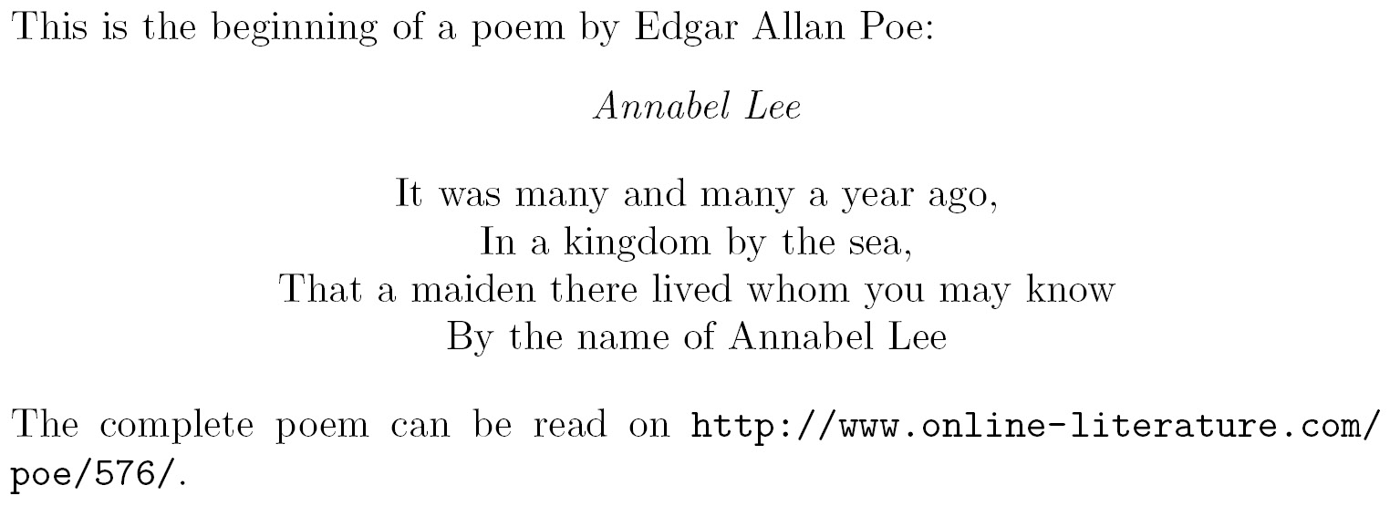
Figure 2.20 – A centered poem within text
We began with \noindent again, avoiding the paragraph indentation. \begin{center} started the center environment, which begins a new paragraph, leaving some space for the preceding text. \end{center} ended this environment. We used the center environment a second time, where we inserted \\ to end the verses. After the center environment ended, some space followed, and the next paragraph began at the left margin.
There's not only an environment for centering. The corresponding environment for ragged-right text is called flushleft; that is, everything within the environment is pushed to the left and ragged at the right side, and, similarly, for ragged-left text, it's flushright.
Centering, as previously, is one way to emphasize some text. Another way is to indent it a bit and to add some vertical space before and after the text. This is a common way to display a quotation. Let's see how to do that.
Displaying quotes
Imagine your text contains a quotation from another author. It might be hard to read if it's just embedded in your text. A common way to improve the readability is setting the text off by indenting both margins. To do this, we will quote thoughts of famous physicists in our example:
- Create a new document with some introductory text:
\documentclass{article} \begin{document} \noindent Niels Bohr said: ``An expert is a person who has made all the mistakes that can be made in a very narrow field.'' Albert Einstein said: - Display the quote:
\begin{quote} Anyone who has never made a mistake has never tried anything new. \end{quote} - Add some more body text, and finish:
Errors are inevitable. So, let's be brave trying something new. \end{document} - Click on Typeset to see the result:
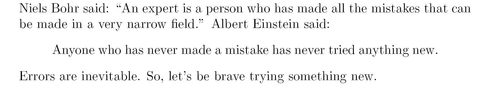
Figure 2.21 – A quote
Firstly, we quoted inline, that is, within the text flow in the paragraph. ` produces a left quotation mark, also called a backtick, and ' provides a right quotation mark. To get double quotes, we just typed two such symbols. We call this inline quoting.
Then, we used the quote environment to display a quotation separated from the surrounding text. We did not begin a new paragraph for it, because the quotation is already set a bit off in its own paragraph. That's called displayed quoting.
Quoting longer text
When writing short quotations, the quote environment looks very good. But when you would like to quote text containing several paragraphs, you might wish to have the same paragraph indentation as in your surrounding text. The quotation environment will do this for you.
Let's quote some of the benefits of TeX and LaTeX found on a web page on CTAN:
- Start a new document and add this text:
\documentclass{article} \usepackage{url} \begin{document} The authors of the CTAN team listed ten good reasons for using \TeX. Among them are: \begin{quotation} \TeX\ has the best output. What you end with, the symbols on the page, is as useable, and beautiful, as a non-professional can produce. \TeX\ knows typesetting. As those plain text samples show, TeX's has more sophisticated typographical algorithms such as those for making paragraphs and for hyphenating. \TeX\ is fast. On today's machines \TeX\ is very fast. It is easy on memory and disk space, too. \TeX\ is stable. It is in wide use, with a long history. It has been tested by millions of users, on demanding input. It will never eat your document. Never. \end{quotation} The original text can be found on \url{https://www.ctan.org/what_is_tex.html}. \end{document} - Click on Typeset and look at the output:
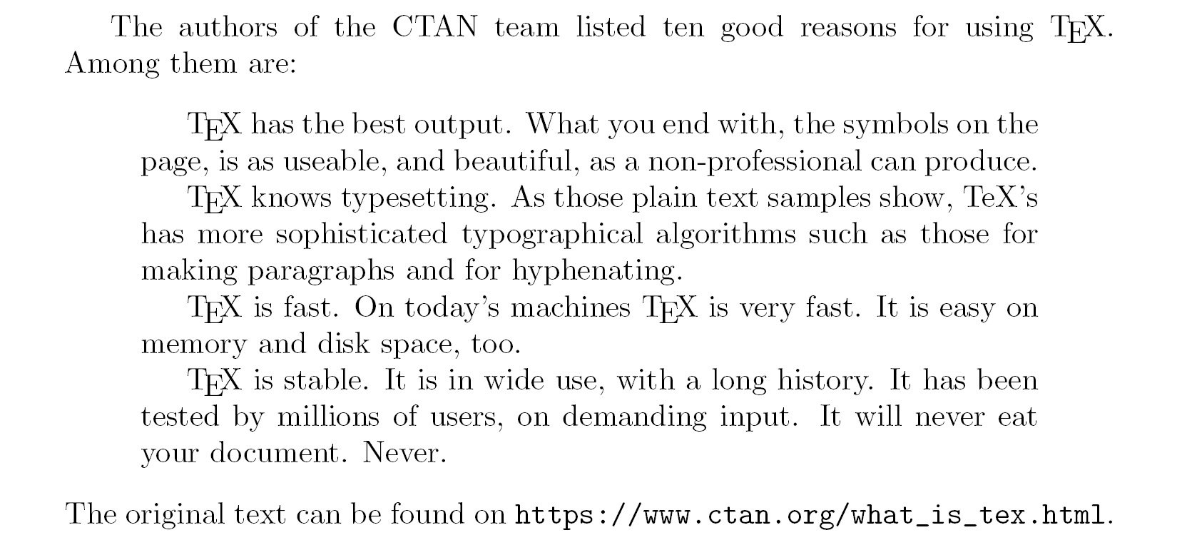
Figure 2.22 – A long section of quoted text
This time, we used the quotation environment to display some paragraphs. As in normal text, blank lines separate the paragraphs; they are left-indented at their beginning just like in all our body text.
But what if we don't like that paragraph indentation? Let's check out an alternative.
In this example, we want to avoid paragraph indentation and instead, we shall separate the paragraphs with some vertical spacing. As filler text, we will use a few sentences of the previous example about quoting, as shown here:
- Create a small document with the following code (make sure the highlighted code is included):
\documentclass{article} \usepackage{parskip} \usepackage{url} \begin{document} The authors of the CTAN team listed ten good reasons for using \TeX. Among them are: \TeX\ has the best output. What you end with, the symbols on the page, is as useable, and beautiful, as a non-professional can produce\ldots The original text can be found on \url{https://www.ctan.org/what_is_tex.html}. \end{document} - Click on Typeset and see the effect:
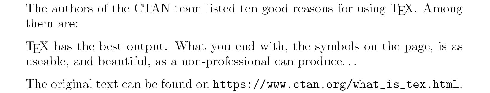
Figure 2.23 – Vertical spacing between paragraphs
Here, we loaded the parskip package—its only purpose is to remove the paragraph indentation completely. At the same time, this package introduces a skip between paragraphs. But this package doesn't affect the definition of the quotation environment; you still could use the quote environment.
Visualizing paragraph breaks
In order to distinguish paragraphs, there are two common ways. One is to indent the beginning of each paragraph; this is the default LaTeX style. The other way is to insert vertical space between paragraphs while omitting the indentation, which is suitable for narrow columns where indenting would cost too much width.
Summary
In this chapter, we explored the basics of editing, arranging, and formatting text. Specifically, we covered modifying fonts and styles of text, using commands and declarations with mandatory and optional arguments, and defining our own commands. We also learned how to format a paragraph—including left, right, or fully justified—and we learned about quoting.
Keep in mind that even though we used formatting commands directly in the text while exploring them, it is better to use them inside command definitions in the preamble to allow easy changes for the future. As you progress through the book, you will get to know further useful commands and packages that could improve your previously written commands.
Now that we've learned about the detailed formatting of text, we're ready to enter the next chapter, which deals with the formatting and layout of whole pages, including margin sizes, headers, and footers.