


In case you haven't already noticed, Masonry works by arranging elements in a grid-based structure. By using a grid, Masonry tiles will flow and get stacked in a very neat and organized manner, which will give us the brick-like appearance we want to achieve. In this section, we will learn how to set up Masonry, at the very minimum, for a single-column system.
To perform the steps listed in this recipe, we will need a text editor, a browser, and a copy of the Masonry plugin. Any text editor will do, but my browser of choice is Google Chrome, as the V8 JavaScript engine that ships with it generally performs better and supports CSS3 transitions (as you'll see later in the book), and as a result we see smoother animations when resizing the browser window. We need to make sure we have a copy of the most recent version of Masonry, which was Version 2.1.08 at the time of writing this book. This version is compatible with the most recent version of jQuery, which is Version 1.9.1. A production copy of Masonry can be found on the GitHub repository at the following address:
https://github.com/desandro/masonry/blob/master/jquery.masonry.min.js
For jQuery, we will be using a content delivery network (CDN) for ease of development. In the code bundle for this book, open the basic single-column HTML file to follow along.
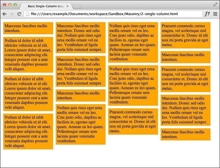
Set up the styling for the
masonry-itemclass with the proper width, padding, and margins. We want our items to have a total width of 200 pixels, including the padding and margins.<style> .masonry-item { background: #FFA500; float: left; margin: 5px; padding: 5px; width: 180px; } </style>Set up the HTML structure on which you are going to use Masonry. At a minimum, we need a tagged Masonry container with the elements inside tagged as Masonry items.
<div id='masonry-container'>
  <div class='masonry-item '>
    Maecenas faucibus mollis interdum.
  </div>
  <div class='masonry-item '>
    Maecenas faucibus mollis interdum. Donec sed odio dui. Nullam quis risus eget urna mollis ornare vel eu leo. Vestibulum id ligula porta felis euismod semper.
  </div>
  <div class='masonry-item '>
    Nullam quis risus eget urna mollis ornare vel eu leo. Cras justo odio, dapibus ac facilisis in, egestas eget quam. Aenean eu leo quam. Pellentesque ornare sem lacinia quam venenatis vestibulum.
  </div>
</div>
All Masonry options need not be included, but it is recommended (by David DeSandro, the creator of Masonry) to set
itemSelectorfor single-column usage. We will be setting this every time we use Masonry.<script> $(function() { $('#masonry-container').masonry({ // options itemSelector : '.masonry-item', }); }); </script>
Using jQuery, we select our Masonry container and use the itemSelector option to select the elements that will be affected by Masonry. The size of the columns will be determined by the CSS code.
Using the box model, we set our Masonry items to a width of 90 px (80-px wide, with a 5-px padding all around the item). The margin is our gutter between elements, which is also 5-px wide. With this setup, we can confirm that we have built the basic single-column grid system, with each column being 100-px wide. The end result should look like the following screenshot:
Setting up a Masonry multi-width column instance is not that different from the procedure to set up a single-column instance. The main difference to know when using a multi-width column system is that elements can span across multiple columns; that is, we will have more than one column size defined in our CSS.
In the code bundle for this book, open the 2-Multicolumn.html file in your preferred text editor to follow along.
Using CSS, we need to set up multiple classes for different column sizes. Every element's total width (which includes the padding and margins) needs to be evenly divisible by the column width we define in Masonry. If we have two elements of different sizes, such as 60-px and 100-px elements, we should choose our Masonry width to be 20 px. If we want the column width to be 100 px, all elements' widths need to be divisible by 100. Just to see the visual effect, let's render the columns in different colors, as follows:
<style>
  .masonry-item {
    margin: 5px;
    padding: 5px;
    float: left;
  }
  .column-1 {
    background: orange;
    width: 80px;
  }
  .column-2 {
    background: red;
    width: 180px;
  }
  .column-3 {
    background: green;
    width: 280px;
  }
</style>
The HTML structure is the same as a single-column structure, but we will now add the additional column classes that we created, to the Masonry items.
<div id='masonry-container'>
  <div class='masonry-item column-1'>
    Maecenas faucibus mollis interdum.
  </div>
  <div class='masonry-item column-3'>
    Maecenas faucibus mollis interdum.
  </div>
  <div class='masonry-item column-2'>
    Nullam quis risus eget urna mollis.
  </div>
</div>
The Masonry script is also the same as the single-column version, but we are going to add the
columnWidthoption and set it to100. Units are not required.<script> $(function() { $('#masonry-container').masonry({ // options itemSelector : '.masonry-item', columnWidth : 100 }); }); </script>
Since we are being a little festive with the background colors, we can see that by setting a specific column width, the elements line up nicely across the defined columns (which you can see in the next screenshot). By setting multiple column classes, we can really mix it up and have fun with Masonry when we have lots of content.
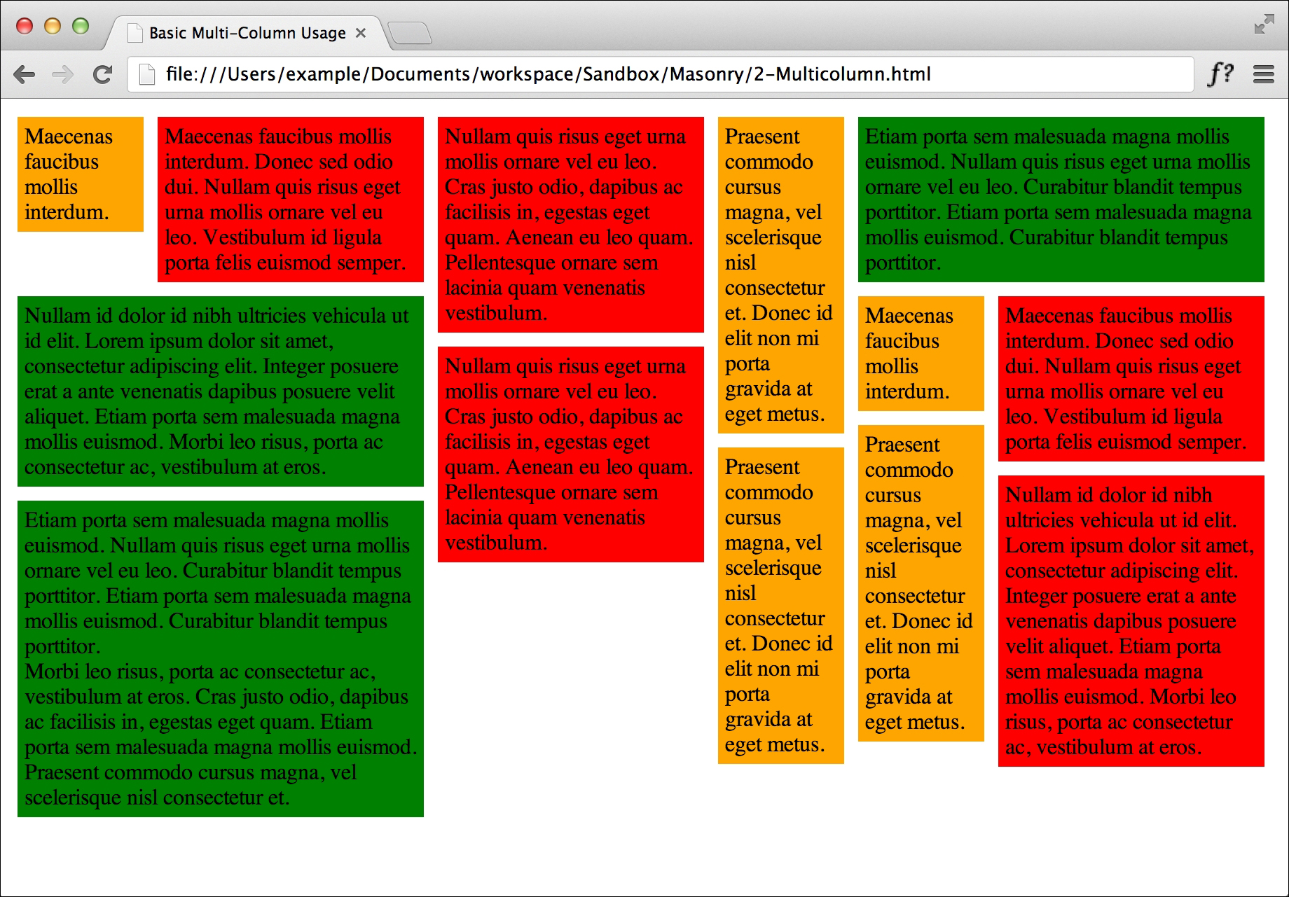
In this example, we kept the size of the elements defined by the CSS divisible by the column width we set in Masonry. If you set the column width to a size that isn't a multiple of the base column width, Masonry becomes inefficient because there is wasted space between the column width defined in CSS and the column width defined in Masonry. You can play around with various widths to understand how it works, but this is why it is important to know how CSS and Masonry work together.
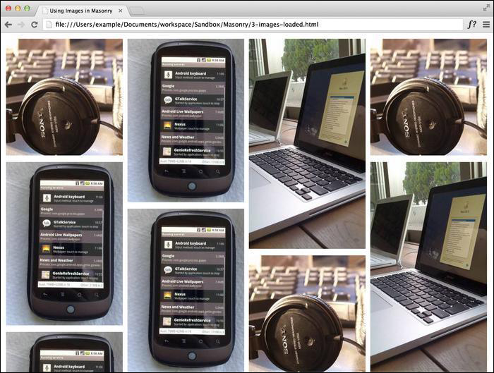
We often use images when building websites, so it's no surprise that we would like to use them in conjunction with Masonry. To avoid the common issue of the Masonry elements not aligning correctly when the dimensions of the images are not available when Masonry initially runs, we need to wait until the images have finished loading before applying Masonry. Luckily, Masonry comes shipped with a plugin called imagesLoaded for image support. We use imagesLoaded to wait for the images to finish loading, after which we need to let Masonry measure the images properly.
In the code bundle for this book, open the 3-images-loaded.html file in your preferred text editor to follow along.
In this example, we are only working with images, so we only need to set our gutters in CSS.
<style>
  .masonry-item {
    margin: 5px;
    float: left;
  }
</style>
Tip
Downloading the example code
You can download the example code files for all Packt books you have purchased from your account at http://www.packtpub.com. If you purchased this book elsewhere, you can visit http://www.packtpub.com/support and register to have the files e-mailed directly to you.
We need to set up some images, so I'm going to use an image placeholder service called LoremPixel. This allows us to dynamically insert dummy images of whatever size and proportion we need. The images I will be using have three arguments after the base URL. The first argument is the width of the image, the second is the height of the image, and the third is the category of the image. The category is optional.
<div id="masonry-container">
  <div class="masonry-item">
    <img src="http://lorempixel.com/250/250/technics" alt="random" />
  </div>
  <div class="masonry-item">
    <img src="http://lorempixel.com/250/350/technics" alt="random" />
  </div>
  <div class="masonry-item">
    <img src="http://lorempixel.com/250/450/technics" alt="random" />
  </div>
</div>
Note
The images used above are loaded in by an image placeholder service called LoremPixel (http://www.lorempixel.com). This allows us to insert test data without needing any actual files in our directory. All images used are licensed under the Creative Commons license (CC BY-SA).
To use
imagesLoaded, we need to first wrap the Masonry container in a jQuery object, after which we can applyimagesLoadedand Masonry actions to the container object.<script> $container = $('#masonry-container'); $container.imagesLoaded(function() { $container.masonry({ itemSelector : '.masonry-item' }); }); </script>
The imagesLoaded plugin works by waiting until all the images have been loaded by the browser and then triggering Masonry. The result should look like the following screenshot:
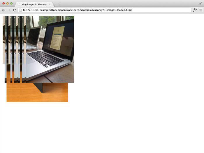
If you do not use the imagesLoaded plugin, you will notice that the images load on top of each other in the same corner in the browser, as shown in the next screenshot. This is because Masonry was running before the images loaded completely, so it tries to organize a set of empty elements it doesn't know the size of. When imagesLoaded is used with Masonry, the script waits until all of the images have been loaded before triggering Masonry.
There are some other alternatives to using the imagesLoaded plugin. For instance, we can assign each image a width and height property using the inline dimensions. Once these values are assigned to the elements, Masonry determines their spacing. Depending on how the site is being built, it might be tedious to ensure that all those image elements have height and width properties assigned.
The last alternative is to use $(window).load(). While this method isn't particularly efficient, as it can result in a potentially longer wait time, it does work; it waits until all the assets (such as images and media) are loaded into the window before triggering Masonry.
<script>
  $(window).load(function() {
    $('#masonry-container').masonry({
      itemSelector : '.masonry-item',
    });
  });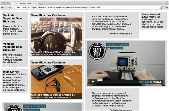
</script>Using Masonry with images and media is relatively simple, but it is not that straightforward when it comes to integrating media with multi-width columns. To implement integration with multiple widths, we need to look back at the multi-column technique and apply the same principles.
In the code bundle for this book, open the 3-images-loaded.html file in your preferred text editor to follow along. There is a lot of additional styling used for various types of elements, so I will only be going over what directly affects the use of Masonry.
We only need to set the width of the various column classes we will be using with CSS.
<style>
  .masonry-item {
    background: #DEDEDE;
    border-radius: 5px;
    margin: 5px;
    padding: 10px;
    float: left;
  }
  .masonry-item img {
    display: block;
    height: auto;
    max-width: 100%;
    margin: 0 auto;
  }
  .column-1 {
    width: 170px;
  }
  .column-2 {
    width: 370px;
  }
  .column-3 {
    width: 570px;
  }
</style>
We will set up our HTML code with various types of media, such as images and videos.
<div id='masonry-container'>
  <div class='masonry-item column-1'>
    <h3>Vehicula Vulputate Sem Ridiculus</h3>
    <p>Maecenas faucibus mollis interdum. Vehicula Vulputate Sem Ridiculus</p>
  </div>
  <div class='masonry-item column-2'>
    <h3>Quam Ridiculus Vestibulum</h3>
    <div class="image-caption">
    <img src="http://lorempixel.com/400/300/technics" alt="random" />
    <span class="caption">Cum sociis natoque penatibus et magnis dis parturient montes, nascetur ridiculus mus.</span>
    </div>
  </div>
  <div class='masonry-item column-2'>
    <blockquote>
    Porta sem malesuada magna mollis euismod. Nullam quis risus eget urna mollis ornare vel eu leo. Curabitur blandit tempus porttitor. Etiam porta sem malesuada magna mollis euismod. </span>
    </blockquote>
  </div>
  <div class='masonry-item column-1'>
    Praesent commodo cursus magna, vel scelerisque nisl consectetur et. Donec id elit non mi porta gravida at eget metus.
  </div>
  <div class='masonry-item column-3'>
    <iframe src="http://player.vimeo.com/video/18743950" width="560" height="320" frameborder="0" webkitAllowFullScreen mozallowfullscreen allowFullScreen></iframe>
  </div>
</div>
The Masonry script in this exercise will use
imagesLoadedin conjunction with thecolumnWidthoption.<script> $container = $('#masonry-container'); $container.imagesLoaded(function() { $container.masonry({ itemSelector : '.masonry-item', columnWidth : 200 }); }); </script>
When designing a site for a mobile interface, some designers prefer to use the fluid layout concept. This means that instead of assigning a fixed width to the columns, the width is set to a percentage of the size of the Masonry container. Assigning padding and margins correctly to the Masonry elements is similar to using fixed widths.
In the code bundle for this book, open the 3-fluid-layout.html file in your preferred text editor to follow along.
Set the width of the Masonry elements to a particular percentage, and be sure to include the percentages of the padding and margins as well. For instance, if you want a four-column fluid layout, set the
widthproperty to20%, setpadding(both left and right padding) to1%, andmargin(both left and right margins) to1%, making the total width of the Masonry item 24 percent.<style> .masonry-item { background: #FFA500; float: left; margin: 5px 1%; padding: 5px 1%; width: 20%; } </style>The HTML structure (shown in the following code snippet) is pretty standard, as in the previous recipes:
<div id='masonry-container'>
  <div class='masonry-item '>
    Maecenas faucibus mollis interdum.
  </div>
  <div class='masonry-item '>
    Maecenas faucibus mollis interdum. Donec sed odio dui.
  </div>
  <div class='masonry-item '>
    Nullam quis risus eget urna mollis ornare vel eu leo.
  </div>
To achieve a fluid layout, we will pass in a function for
columnWidth. It is important to match this up with the width you set for the Masonry items. Setting the width to 24 percent suggests a four-column layout.<script> $(function() { $('#masonry-container').masonry({ itemSelector: '.masonry-item', columnWidth : function(containerWidth) { return containerWidth / 4; } }); }); </script>
In our CSS styles, we defined the width of the Masonry elements to be 24 percent of the container width [20% width + (x2) 1% margin + (x2) 1% padding]. In the highlighted part of the previous code snippet, we can see that we passed a function to change the width of the column to 25 percent (because the container width is considered to be 100 percent, and we divided it by four).
Multi-columns can be implemented in a fluid layout as long as they are a factor of the fluid container width. For instance, if we have a four-column container, we can set the width of a two-column class to 46 percent with 1 percent each for margins and padding—a total width of 49 percent. Once we decide whether or not to go with a fluid layout, we need to be consistent when using percent versus pixels so as not to mix them up.
We have already noticed that Masonry is responsive while resizing the browser window and rearranges the elements according to the width of the container. By default, Masonry has built-in support for animation using standard jQuery animations.
In the code bundle for this book, open the 4-jquery-animation.html file in your preferred text editor to follow along.
Start with the standard Masonry CSS code.
<style>
  .masonry-item {
    background: #FFA500;
    float: left;
    margin: 5px;
    padding: 5px;
    width: 80px;
  }
</style>
Build the standard Masonry HTML structure and add as many Masonry items as necessary.
<div id='masonry-container'>
  <div class='masonry-item '>
    Maecenas faucibus mollis interdum.
  </div>
  <div class='masonry-item '>
    Maecenas faucibus mollis interdum. Donec sed odio dui. Nullam quis risus eget urna mollis ornare vel eu leo. Vestibulum id ligula porta felis euismod semper.
  </div>
  <div class='masonry-item '>
    Nullam quis risus eget urna mollis ornare vel eu leo. Cras justo odio, dapibus ac facilisis in, egestas eget quam. Aenean eu leo quam. Pellentesque ornare sem lacinia quam venenatis vestibulum.
  </div>
</div>
Add the standard Masonry script and then add the
isAnimatedoption and set it totrue.<script> $(function() { $('#masonry-container').masonry({ itemSelector : '.masonry-item', isAnimated: true }); }); </script>
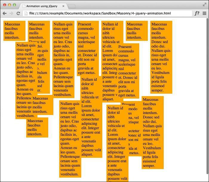
By setting the isAnimated option to true, Masonry will automatically animate rearrangements using the built-in jQuery support. Now if we manipulate the width of the container by shrinking the browser window, we can see the animation in action.
The following screenshot was taken while the animation was happening:
We can include additional jQuery animation options using the animationOptions option. Some of the options include duration, easing, queue, specialEasing, step, and complete. Additional documentation for these options can be found in the jQuery documentation on the official jQuery website at http://api.jquery.com/animate. Some of these options can also be extended by using additional jQuery plugins.
<script>
  $(function() {
    $('#masonry-container').masonry({
      itemSelector : '.masonry-item',
      isAnimated: true,
      animationOptions: {
        duration: 500,
        easing: 'swing'
      }
    });
  });
</script>As an alternative to animating using jQuery, we can use browser-supported CSS3 transitions. Using CSS3 transitions is beneficial in terms of performance because in some browsers and mobile devices, transitions are hardware-accelerated. The rendering engine of the browser can use frame skipping to keep performance smooth and also increase efficiency by reducing the update frequency of animations that are being used in hidden browser tabs.
In the code bundle for this book, open the 4-css-animation.html file in your preferred text editor to follow along. Also, if you have not been using Google Chrome or a browser that supports CSS3 transitions until now, be sure to use one while performing the steps listed under this recipe.
Add the proper CSS3 transition properties in addition to the existing CSS properties that we have already defined for the Masonry elements.
<style>
   .masonry,
   .masonry .masonry-brick {
      -webkit-transition-duration: 0.5s;
      -moz-transition-duration: 0.5s;
      -ms-transition-duration: 0.5s;
      -o-transition-duration: 0.5s;
      transition-duration: 0.5s;
   }
   .masonry {
      -webkit-transition-property: height, width;
      -moz-transition-property: height, width;
      -ms-transition-property: height, width;
      -o-transition-property: height, width;
      transition-property: height, width;
   }
   .masonry .masonry-brick {
      -webkit-transition-property: left, right, top;
      -moz-transition-property: left, right, top;
      -ms-transition-property: left, right, top;
      -o-transition-property: left, right, top;
      transition-property: left, right, top;
   }
</style>
Build the standard Masonry HTML structure and add as many Masonry items as necessary.
<div id='masonry-container'>
  <div class='masonry-item '>
    Maecenas faucibus mollis interdum.
  </div>
  <div class='masonry-item '>
    Maecenas faucibus mollis interdum. Donec sed odio dui. Nullam quis risus eget urna mollis ornare vel eu leo. Vestibulum id ligula porta felis euismod semper.
  </div>
  <div class='masonry-item '>
    Nullam quis risus eget urna mollis ornare vel eu leo. Cras justo odio, dapibus ac facilisis in, egestas eget quam. Aenean eu leo quam. Pellentesque ornare sem lacinia quam venenatis vestibulum.
  </div>
</div>
Add the standard Masonry functions without the
isAnimatedoption.<script> $(function() { $('#masonry-container').masonry({ itemSelector : '.masonry-item', }); }); </script>
Instead of using jQuery, we assigned CSS3 transition properties to the Masonry elements. After Masonry is run, it assigns additional classes and inline styles to the elements; for example, it assigns the masonry class to the container and the masonry-brick class to the individual items.
We assigned the transition-duration property to all items, the container itself and the Masonry items inside it, so that all transitions will last for half of a second. We then assigned the height and width of the container and the left / right / top positions to transition-property. This means that whenever those values change, that is, the size of the container and the position of the Masonry items change, the transition effect will be applied to those changes.
Using CSS3 animations is great—they're efficient and they boost performance if the browser supports them. Luckily, if the browser doesn't support CSS3, we can use Modernizr and go back to using jQuery. Modernizr is a JavaScript library that detects the HTML5 and CSS3 features that are available in a user's browser, which is a great advantage.
Note
Modernizr is available for downloading at http://modernizr.com/download/. You can build your own custom Modernizr tests, such as adding CSS animations and transitions. Modernizr is available for free under the MIT license.
To enable Modernizr, we will have to include the Modernizr script into our page and then add the isAnimated option to the Masonry script with the value !Modernizr.csstransitions, as shown in the following code snippet:
<script src="js/modernizr.csstrans.js"></script>
<script>
$(function() {
$('#masonry-container').masonry({
itemSelector : '.masonry-item',
isAnimated: !Modernizr.csstransitions
});
});
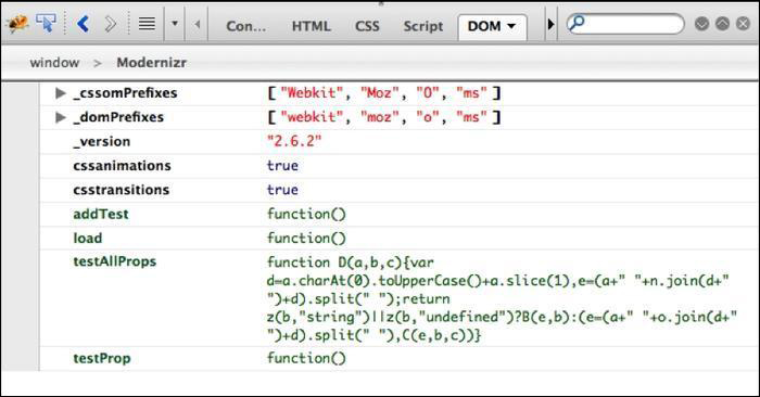
</script>This will detect whether CSS transitions are available in our browser; if not, we will go back to using jQuery animations. In the browser, we can view information about the DOM to see whether the CSS transitions and animations are enabled. In the following screenshot, we can see that CSS transitions are enabled in Firebug for Firefox:
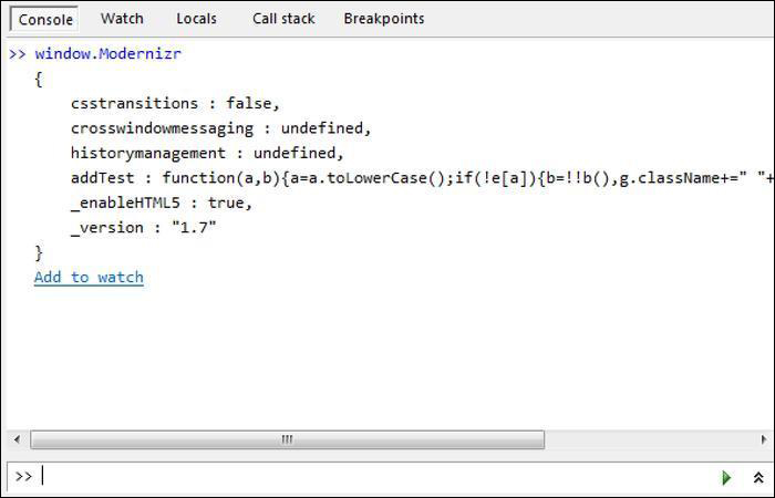
As opposed to that, in the following screenshot we can see that CSS transitions are turned off in Internet Explorer 9; we need to use jQuery to enable transitions:
With the growing popularity of content management systems (CMS), integrating new features can sometimes be difficult. Even though there are some custom plugins available for integrating Masonry with WordPress, it is not necessarily as simple as that. To implement Masonry, we will need to edit a few theme files and use some functions to import our scripts. The upcoming recipe is somewhat complex, so if you don't get it the first time, don't worry! There is also more than one way to do this; if you work with WordPress often, build your site in a way that you are used to.
We will need an installation of WordPress, either local or on a server. In this demonstration, we will be using the version of WordPress that was most recent at the time of writing (WordPress 3.6) and modifying the Twenty Thirteen theme. Demo content has already been added, including categories, so we will be targeting the content of a specific category to apply Masonry to. The demo content being used in this example can be found under WordPress's theme-unit-testing page, located at the following URL:
Open
content.phpin either the WordPress editor under Appearance or locally in a text editor, and locate the following line:<article id="post-<?php the_ID(); ?>" <?php post_class(); ?>>
Replace the line with the following:
<article id="post-<?php the_ID(); ?>" <?php if ( in_category('9') && is_category('9')){ post_class('masonry-item'); }else{ post_class();} ?>>In the same manner, open
category.phpand locate the following line:<div id="content" class="site-content" role="main">
Replace the line with the following:
<div id="content" <?php if( is_category('9')){ print 'class="masonry-container site-content"'; } else { print 'class = "site-content"';} ?> role="main">In the same
category.phpfile, directly below the previous line is anifstatement (<?php if ( have_posts() ) : ?>), and directly below that is aheadersection. Move the entireheadersection above thesite-contentarea and below the primary area, and wrap it in the sameifstatement. When finished, it should look like the following:<div id="primary" class="content-area"> <?php if ( have_posts() ) : ?> <header class="archive-header"> <h1 class="archive-title"><?php printf( __( 'Category Archives: %s', 'twentythirteen' ), single_cat_title( '', false ) ); ?></h1> <?php if ( category_description() ) : // Show an optional category description ?> <div class="archive-meta"><?php echo category_description(); ?></div> <?php endif; ?> </header><!-- .archive-header --> <?php endif; ?> <div id="content" <?php if( is_category('9')){ print 'class="masonry-container site-content"'; } else { print 'class = "site-content"';} ?> role="main"> <?php if ( have_posts() ) : ?> <?php /* The loop */ ?> <?php while ( have_posts() ) : the_post(); ?> <?php get_template_part( 'content', get_post_format() ); ?> <?php endwhile; ?> <?php twentythirteen_paging_nav(); ?> <?php else : ?> <?php get_template_part( 'content', 'none' ); ?> <?php endif; ?> </div><!-- #content --> </div><!-- #primary -->In the Twenty Thirteen theme folder, create a new JavaScript file named
custom-masonry.jsinside thejsdirectory. Insert the following code intocustom-masonry.js:(function($) { var $container = $('.masonry-container'); $container.imagesLoaded(function() { $container.masonry({ itemSelector : '.masonry-item', isAnimated : true }); }); })(jQuery);Open
functions.phpand add the following at the very bottom:/** * Custom script for loading masonry when needed. */ function load_masonry() { if (is_category('9')) { wp_enqueue_script('custom-masonry', get_stylesheet_directory_uri() . '/js/custom-masonry.js', array('jquery'), '1.0', true); } } add_action('wp_enqueue_scripts', 'load_masonry', 20);Lastly, we need to add our Masonry styles at the bottom of the
style.cssfile:.masonry-item { float: left; margin: 5px; padding: 5px; width: 380px; }
We did multiple things in this recipe, in the simplest way. To start with, we created a lot of demo content within the same category with an ID of 9. In content.php, we added the masonry-item class to each article if it was tagged in category 9 and if the current page had articles listed from that category. We did this by passing the class name into post_class(), which adds the masonry-item class to any existing classes that are applied to that article.
In category.php, we did pretty much the same thing. We added the masonry-container class to the content element, where posts appear if the category archive page is based on category 9. We also moved the header outside of the content area since it is not part of implementing Masonry and would break our page. Now we have a container and items we can apply Masonry to.
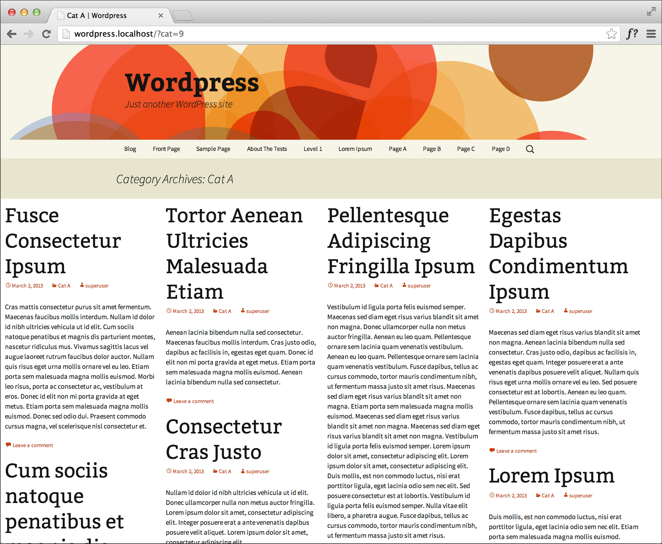
We created a JavaScript file that contains our Masonry script and we included the script by using WordPress's wp_enqueue_script() function, directing the source to the JavaScript folder in the theme; we then placed it in the footer with the other scripts by setting the last parameter set to true. To ensure that we are not running Masonry on every page, we put in another check to only load Masonry when on the category 9 archive page. When using the add_action() function, we set the last parameter to 20 to ensure that it loads after jQuery and that the core of Masonry has been loaded. After everything is completed, the result should look like the following screenshot:
Luckily, with Drupal, integrating Masonry is relatively painless and easy to do. With the help of a couple of contributed Drupal modules, we can have Masonry installed in no time without having to write a single line of custom code.
As with WordPress, we need a local or server installation of Drupal 7. At the time of writing this book, the version of Drupal used was Drupal 7.20, with the default Bartik theme. We need to download five modules: cTools, Libraries, jQuery Update, Masonry, and Views. We also need to download the Masonry plugin, and if we need demo content, we can download the Devel module. Once the modules are downloaded, place them in the /sites/all/modules directory.
Note
At the time of writing, the current versions of the modules were as follows:
cTools– 7.x-1.2Libraries– 7.x-2.0jQuery Update– 7.x-2.3Masonry– 7.x-1.1Views– 7.x-3.5
After downloading, we will enable all of these modules, including the submodules Views UI and Masonry Views, and set jQuery Update to Version 1.7. Libraries and Masonry directories will not have been created yet, so create a folder named libraries in /sites/all, and then create a folder named masonry inside /sites/all/libraries. We will put the Masonry plugin in the /sites/all/libraries/masonry directory. Also, create some demo articles using Devel if no other content is available.
We will start by creating a new view, located in the administration menu, by going to Admin | Structure | Views.
Click on Add new view.
Name it
Masonry.Set the entity to be shown to Content and set the type to Article, as shown in the following screenshot.
Leave all other settings as default.

In the Format section of the Views user interface, set the format to utilize grids and leave all the default options for now, as shown in the next screenshot. Click on Apply (all displays).
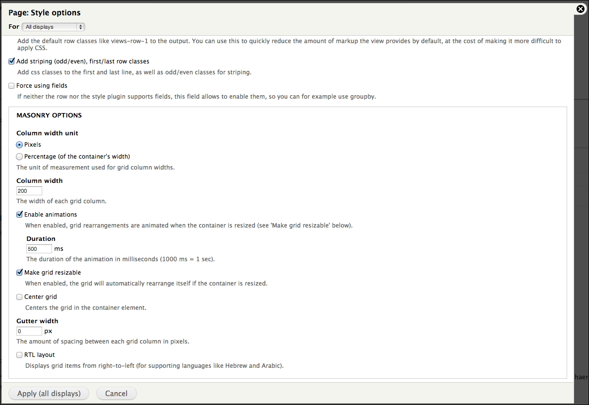
The Masonry module is essentially a Views plugin with Masonry built in. Views is a query builder that posts content in a container based on the provided settings. This makes it easy to set up a page or view with Masonry while having the ability to change the settings through a GUI. If we go back and look at the Masonry grid settings, we can see that we can select or deselect Masonry options such as turning on animations and adding extra gutter space.
We needed the other modules as Masonry is dependent upon them. Most importantly, we needed jQuery Update to upgrade the core Drupal version of jQuery to a version compatible with Masonry.
Using the default Bartik theme doesn't allow us to have a responsive mobile site. Switching our theme with a mobile-friendly version gives us the ability to enable animations and have a resizable grid. Some popular options include using the Bootstrap or Zurb Foundation's frameworks. To install, download Bootstrap from http://www.drupal.org and follow the instructions listed on the project page. Once the theme has been successfully enabled and set to default, we can watch Masonry animate while the browser window is resized.
When working on specialized projects, sometimes you need to build a feature that may involve adding additional content to a page, either through AJAX or through manual processes like comments and submissions. Fortunately for us, not only can we add new content to the Masonry container, we can also trigger Masonry to reload all the items to realign all Masonry elements back into a proper grid.
In the code bundle for this book, open the 5-add-reload.html file in your preferred text editor to follow along. For this exercise, we will be using a small jQuery plugin called Placeholder.js to generate random text when adding new elements. Placeholder.js can be found at the following URL:
https://github.com/decabear/placeholderjs/blob/master/placeholder.min.js
We will start off with the existing CSS properties that we have already defined for the Masonry elements. In this recipe, we will stick to single columns of width 150 px. Also, just for fun, let's make the dynamically generated items a different color for visual effect.
<style>
   .masonry-item {
      background: #FFA500;
      float: left;
      margin: 5px;
      padding: 5px;
      width: 130px;
   }
   .placeholder {
      background: #0BB5FF;
   }
</style>
Build the standard Masonry HTML structure; add as many Masonry items as necessary. We will also add a button above and outside the Masonry container because later in the recipe we will be dynamically generating additional Masonry items by clicking on it.
<div>
   <button id="add-html">Add HTML</button>
</div>
<div id='masonry-container'>
   <div class='masonry-item '>
      Maecenas faucibus mollis interdum.
   </div>
   <div class='masonry-item '>
      Maecenas faucibus mollis interdum. Donec sed odio dui. Nullam quis risus eget urna mollis ornare vel eu leo. Vestibulum id ligula porta felis euismod semper.
   </div>
   <div class='masonry-item '>
      Nullam quis risus eget urna mollis ornare vel eu leo. Cras justo odio, dapibus ac facilisis in, egestas eget quam. Aenean eu leo quam. Pellentesque ornare sem lacinia quam venenatis vestibulum.
   </div>
</div>
Include Placeholder.js after Masonry, making sure to put in the correct relative path, and insert the following script:
<script src="js/placeholder.min.js"></script>
<script>
   $(function(){

      $container = $('#masonry-container');
      $container.masonry({
         itemSelector : '.masonry-item',
         isAnimated: true
      });

      //dynamically add Masonry items to the page
      $('#add-html').click(function(){
         $add = $("<div/>", {"class": "masonry-item placeholder"}).placeholder({"min": 15, "max": 50});
         $container.append($add).masonry('reload');
      });
   });
</script>
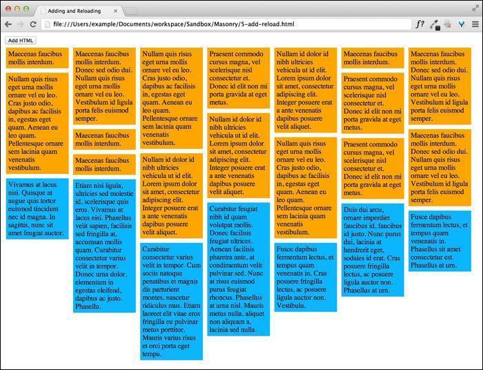
For the first section, you can see that we're just running the ordinary Masonry script to set the Masonry items into the grid. We then assign a click event to the button we created and next bind an event handler that creates a new <div> class with the masonry-item placeholder class that get loaded with a random amount of text using Placeholder.js. Once the Masonry item is created, we use the jQuery append event to add the element to the end of the Masonry container; we then use the Masonry append method to apply the proper position to the appended item, which can be seen in the following screenshot:
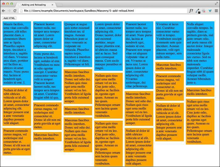
Appending is great for adding content such as comments to the bottom of a page, but sometimes we need to add content to the top of the page. It is more than likely that this is a blog post or some other kind of time-sensitive material. We can easily switch the jQuery append method with the prepend method, which will insert our created content before all the other Masonry items. Note that we used the Masonry append method when appending an item (adding it to the end). If we use the jQuery prepend method instead of the Masonry append method, we need to use reload. This is because we don't know beforehand the size of the element that is being loaded in; so we reload all the elements to recalculate the alignment of the elements in the Masonry grid correctly. The result will look like the following screenshot:
In Masonry, we can define a corner stamp, an element that will stay in the corner no matter where any of the other elements have moved. For example, a featured article in a list of blog posts or maybe a section about the author. Using the corner stamp is possible with a modification to Masonry.
In the code bundle for this book, open the 3-cornerstamp.html file in your preferred text editor to follow along.
Use the CSS properties that we have already defined in the Setting up a single-width column system recipe and make another class for the corner stamp.
<style>
   .masonry-item {
      background: #FFA500;
      float: left;
      margin: 5px;
      padding: 5px;
      width: 80px;
   }
   .cornerstamp {
      width: 180px;
      margin: 5px;
      padding: 5px;
      background: #DEDEDE;
      float: right;
   }
</style>
Add the standard Masonry HTML structure and then add an additional element with the
cornerstampclass.<div id='masonry-container'> <div class='cornerstamp'> Maecenas faucibus mollis interdum. </div> <div class='masonry-item '> Nullam quis risus eget urna mollis ornare vel eu leo. </div> <div class='masonry-item '> Praesent commodo cursus magna, vel scelerisque nisl consectetur et. Donec id elit non mi porta gravida at eget metus. </div>Before the Masonry script, add the following corner stamp modifications:
<script>
   // Masonry corner stamp modifications
   $.Mason.prototype.resize = function() {
      this._getColumns();
      this._reLayout();
   };
   $.Mason.prototype._reLayout = function(callback) {
      var freeCols = this.cols;
      if (this.options.cornerStampSelector) {
         var $cornerStamp = this.element.find(this.options.cornerStampSelector), cornerStampX = $cornerStamp.offset().left - (this.element.offset().left + this.offset.x + parseInt($cornerStamp.css('marginLeft')) );
         freeCols = Math.floor(cornerStampX / this.columnWidth);
      }
      // reset columns
      var i = this.cols;
      this.colYs = [];
      while (i--) {
         this.colYs.push(this.offset.y);
      }
      for ( i = freeCols; i < this.cols; i++) {
         this.colYs[i] = this.offset.y + $cornerStamp.outerHeight(true);
      }
      // apply layout logic to all bricks
      this.layout(this.$bricks, callback);
   };
Now add the standard Masonry script, with the
cornerstampclass assigned to thecornerStampSelectoroption.$(function() { $('#masonry-container').masonry({ itemSelector : '.masonry-item', columnWidth : 100, cornerStampSelector : '.cornerstamp' }); }); </script>
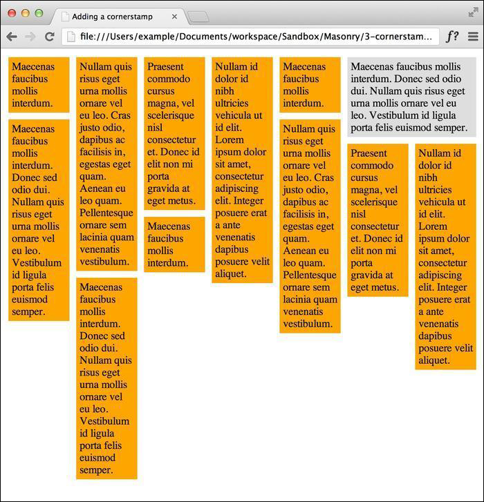
After specifying which element is the corner stamp, Masonry will keep the element in the corner while moving all other items around it. There are a couple of things that will break the corner stamp, which you need to take note of. The code for the corner stamp elements cannot have the class used to identify Masonry elements, in our case masonry-item, which is why we identify it separately. In this example, we put the corner stamp in the top-right corner by floating the element to the right, which can be seen in the following screenshot:
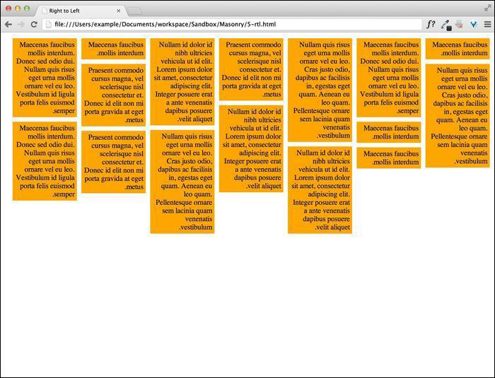
For some Middle Eastern languages such as Hebrew and Arabic, script is primarily written from right to left. The W3C have written a standard that defines the text direction through attributes and CSS properties, but it is hard to make sense of these when the text direction is formatted from left to right. Masonry has a built-in option for such situations.
In the code bundle for this book, open the 5-rtl.html file in your preferred text editor to follow along.
We will start off with the existing CSS properties that we have already defined for the Masonry elements. In this recipe, we have the choice of using either the
dir="rtl"attribute on the Masonry container, or of defining the text direction in CSS. I think CSS is easier, so let us define it here.<style> .masonry-item { background: #FFA500; direction: rtl; float: left; margin: 5px; padding: 5px; width: 130px; } </style>Build the standard Masonry HTML structure and add as many Masonry items as necessary.
<div>
   <button id="add-html">Add HTML</button>
</div>
<div id='masonry-container'>
   <div class='masonry-item '>
      Maecenas faucibus mollis interdum.
   </div>
   <div class='masonry-item '>
      Maecenas faucibus mollis interdum. Donec sed odio dui. Nullam quis risus eget urna mollis ornare vel eu leo. Vestibulum id ligula porta felis euismod semper.
   </div>
   <div class='masonry-item '>
      Nullam quis risus eget urna mollis ornare vel eu leo. Cras justo odio, dapibus ac facilisis in, egestas eget quam. Aenean eu leo quam. Pellentesque ornare sem lacinia quam venenatis vestibulum.
   </div>
</div>
Using the standard Masonry methods, insert the following script; make sure to set the
isRTLoption totrue:<script> $(function(){ $('#masonry-container').masonry({ itemSelector : '.masonry-item', isRTL: true }); }); </script>
This is a fairly simple process. By default, when Masonry is setting the positions of items in the layout, it always starts from the left. For example, the inline style will look like this: style="position: absolute; top: 0px; left: 300px;". When isRTL is set to true, the positioning starts from the right instead. This is a very simple technique, yet very effective. The result should look like the following screenshot: