Flot is powerful and highly configurable, but it's also easy to get started with since Flot uses sensible defaults for most of its options. This recipe will teach you how to create the simplest types of charts.
You can download Flot from http://www.flotcharts.org/. Refer to the What you need for this book section for more information about Flot and jQuery versions and supported browsers.
Flot requires a few lines of HTML and CSS boilerplate to begin with. Our HTML must include a div element that will contain the chart. The div element must have a width and height defined; we do that with some CSS as follows:
<!doctype html>
<html>
<head>
  <meta charset="utf-8" />
  <title>Flot - Basic Charts</title>
  <style>
    .chart {
      width: 500px;
      height: 300px;
    }
  </style>
</head>
<body>
  <div class="chart" id="sampleChart"></div>
</body>
</html>
Tip
Downloading the example code
You can download the example code files for all Packt books you have purchased from your account at http://www.packtpub.com. If you purchased this book elsewhere, you can visit http://www.packtpub.com/support and register to have the files e-mailed directly to you.
Since Flot is a jQuery plugin, we must, of course, include jQuery before we include Flot itself as follows:
...
<body>
  <div class="chart" id="sampleChart"></div>
  <script src="jquery.js"></script>
  <script src="jquery.flot.js"></script>
</body>
</html>
Once we have the boilerplate code in place, we can start creating charts. We'll start with simple line charts, point charts, bar charts, and area charts.
We can create the simplest line chart with just a few lines of JavaScript code:
...
<body>
  <div class="chart" id="sampleChart"></div>
  <script src="jquery.js"></script>
  <script src="jquery.flot.js"></script>
  <script>
    $('#sampleChart').plot(
      [ [[0, 3], [1, -1], [2, 2]] ],
      { series: { lines: {show: true} } }
    );
  </script>
</body>
</html>
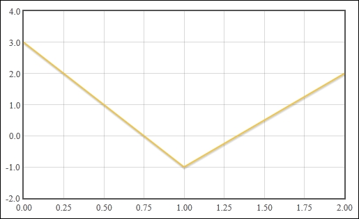
This creates a chart with a line ranging from 0 to 2 on the X axis and -1 to 3 on the Y axis. Flot draws the grid and tick labels for us automatically:
Creating bar charts and point charts is just as easy. Simply change the chart option from lines to points in order to create a point chart as follows:
...
  <script>
    $('#sampleChart').plot(
      [ [[0, 3], [1, -1], [2, 2]] ],
      { series: { points: {show: true} } }
    );
  </script>
...Change the option to bars in order to create a bar chart, as shown in the following code:
...
  <script>
    $('#sampleChart').plot(
      [ [[0, 3], [1, -1], [2, 2]] ],
      { series: { bars: {show: true} } }
    );
  </script>
...
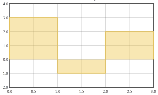
Once again, Flot draws a bar chart with the range of values, grid and tick labels, as expected. A colored bar is drawn for each data point:
An area chart is just a line chart with the fill option specified, as shown in the following code:
...
  <script>
    $('#sampleChart').plot(
      [ [[0, 3], [1, -1], [2, 2]] ],
      { series: { lines: {show: true, fill: true} } }
    );
  </script>
...
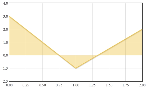
Flot fills in the region between the data point and a horizontal line at the origin:
We first started by defining a div element in our HTML as a placeholder for our chart. Flot uses this element as a container. You can see this in action by using Firebug or your browser's equivalent development tool to inspect the contents of the element after Flot has drawn the chart. Flot creates multiple canvas elements as well as some other div elements in order to construct the chart that we specify.
Since the chart is often part of a larger set of HTML content, Flot does not assume anything about the size of the chart. Instead, we must specify our intended size by setting the CSS properties of the container element.
Lastly, we invoke Flot by calling the plot function via the jQuery object, passing in our container element, our chart data, and our chart options:
$(<placeholder>).plot(<data>, <options>);
The chart data is represented as a set of nested arrays. The first level is an array of series, which is a group of data. The second level is a data set, which is a set of data points. The last level is a data point; an x and y coordinate as shown in the following code:
[ [ [0, 1], [1, 2] ] ]
Data: [ series1, series2 ]
Series: [ datapoint1, datapoint2 ]
Datapoint: [ x1, y1 ]
We use the options object to specify which type of chart should be used to display our data. The object has a series property whose value determines the options applied to all series. We set the show property of the lines, points, or bars objects to enable that particular chart type.
Flot's sensible default options give you a good starting point without too much effort. However, there are many more configurations and options available to us. You can learn about all the options (including the grid and legend configuration options, which we don't cover in this book) at https://github.com/flot/flot/blob/0.8.1/API.md.
The preceding examples use only one series in the data. We can add more series to our data options and Flot will display them accordingly. The options specified in the series object are applied to all series:
...
  <script>
    $('#sampleChart').plot(
      [
        [[0, 3], [1, -1], [2, 2]],
        [[0, 1], [1, 3], [2, -2]]
      ],
      { series: { lines: {show: true} } }
    );
  </script>
...
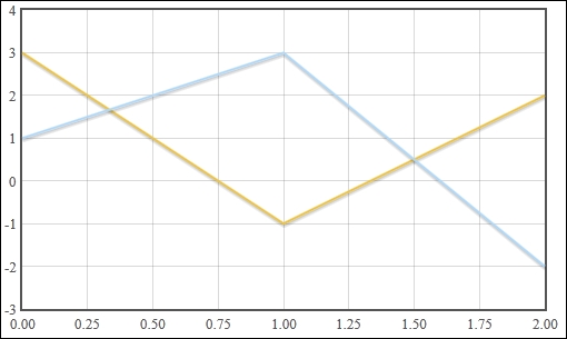
Flot draws a single chart with the series overlapping each other in same order as the data array:
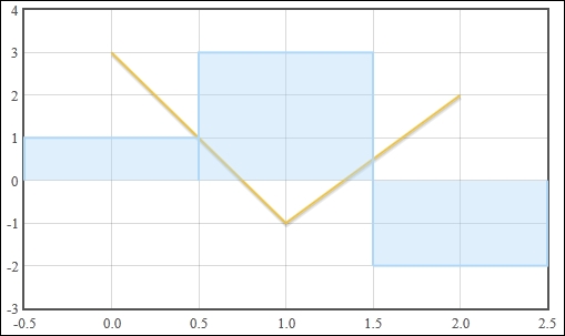
Flot allows us to specify different options for each series by using a different data options format. Instead of directly specifying a data set for each series, we specify a series object. The series object contains a data set and can contain options that apply to that series alone. In this case, we show one data set using the lines chart type and the other using the bars chart type. The bars in the bar chart are aligned to the center of the data point via the align option, as shown in the following code:
...
  <script>
    $('#sampleChart').plot(
     [
       {
         data: [[0, 3], [1, -1], [2, 2]],
         lines: {show: true}
       },
       {
         data: [[0, 1], [1, 3], [2, -2]],
         bars: {show: true, align: 'center'}
       }
     ]
    );
  </script>
...
Once again, Flot will draw a single chart with the bar chart series overlapping the line series:
Flot includes a plugin that allows you to create stacked charts. Stacked charts are especially useful when the data in your series is meant to add up to some total value, for example percentage data.
Using the same boilerplate that we wrote in the Creating basic charts recipe, we just need to include the stack plugin, as shown in the following code:
...
  <script src="jquery.js"></script>
  <script src="jquery.flot.js"></script>
  <script src="jquery.flot.stack.js"></script>
...Using the stack plugin is simply a matter of specifying the stack option. Stacked charts work best with bar charts and area charts.
...
  <script src="jquery.flot.stack.js"></script>
  <script>
    $('#sampleChart').plot(
      [
        { color: 'orange',
          data: [[0, 3], [1, 4], [2, 2]] },
        { color: 'lightblue',
          data: [[0, 6], [1, 3], [2, 6]] },
        { color: 'darkred',
          data: [[0, 1], [1, 3], [2, 2]] }
      ],
      {
        series: {
          stack: true,
          bars: {
            show: true,
            barWidth: 0.2, align: 'center'
          }
        }
      }
    );
  </script>
...
The stack plugin will draw a chart that stacks the first points of each series together into one composite bar and the second points of each series into another bar, and so on:
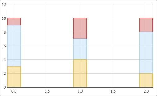
The stack plugin takes the data you specify and readjusts it in such a way that the corresponding data points in the series are offset from each other. The stack plugin assumes that the series are already ordered from bottom to top. In this case, the first series is yellow in the chart, the second is blue, and the last is red.
The stack plugin is quite simple. It only has one option, stack, but it can be used in an alternate way to create multiple groups of stacks on the same chart.
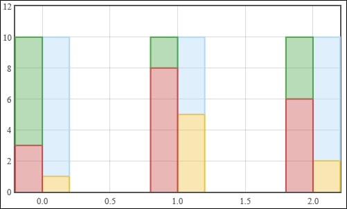
The stack plugin also has the ability to group series to separate stacks. This is done by specifying a unique key on the stack option of each series. The key can be any unique number or string. We combine this option with Flot's align option on bar charts in order to display the stacks side-by-side:
...
    $('#sampleChart').plot(
      [
        { color: 'orange',
          data: [[0, 1], [1, 5], [2, 2]],
          stack: 0, bars: {align: 'left'} },
        { color: 'lightblue',
          data: [[0, 9], [1, 5], [2, 8]],
          stack: 0, bars: {align: 'left'} },
        { color: 'darkred',
          data: [[0, 3], [1, 8], [2, 6]],
          stack: 1, bars: {align: 'right'} },
        { color: 'green',
          data: [[0, 7], [1, 2], [2, 4]],
          stack: 1, bars: {align: 'right'} }
      ],
      {
        series: {
          bars: { show: true, barWidth: 0.2 }
        }
      }
    );
...
The stack plugin now draws a chart where the light blue and orange series are grouped into stack 0 and the green and dark red series are grouped into stack 1:
Similar to the stack plugin, Flot also includes a plugin that adds pie chart capabilities.
Include the following pie plugin:
...
  <script src="jquery.js"></script>
  <script src="jquery.flot.js"></script>
  <script src="jquery.flot.pie.js"></script>
...The pie plugin uses sensible defaults for all of its options, just like Flot. We simply need to enable the plugin in order to create a simple pie chart and a labelled pie chart.
The pie plugin expects multiple series. It takes the first y coordinate in each series and uses it to draw the pie section for that series, as shown in the following code:
...
  <script src="jquery.flot.pie.js"></script>
  <script>
    $('#sampleChart').plot(
      [
        [[0, 1]],
        [[0, 2]]
      ],
      {
        series: {
          pie: { show: true }
        }
      }
    );
  </script>
...
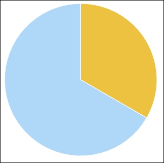
The pie plugin draws a bare pie chart based on our data:
The pie plugin also supports a secondary format that allows you to specify a label corresponding to each pie section. The labels are displayed in a legend as follows:
...
  <script src="jquery.flot.pie.js"></script>
  <script>
    $('#sampleChart').plot(
      [
        {label: 'Series 1', data: 10},
        {label: 'Series 2', data: 60}
      ],
      {
        series: {
          pie: { show: true }
        }
      }
    );
  </script>
...
The legend is drawn to the right of the pie chart with the names and corresponding colors of the series:
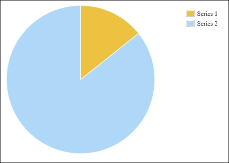
Like the stack plugin, enabling the pie plugin is simply a matter of setting the show property of the pie settings object to true. However, the pie plugin will not accept the typical data format we've used so far. Since each series is represented by one section of the pie, the chart data can only have one data point per series.
The sum of the data points represents the whole of the pie chart. So, datapoint [0, 1] and datapoint [0, 2] represent one third of the pie and two thirds of the pie, respectively.
The pie plugin includes many settings that determine how the pie chart is displayed. The settings affect the size of the pie, its shape, its rendering style including its border and shadow style, the format and styles for labels, and the behavior of "combined" sections of the pie. All of these settings are described in full on the documentation page at http://www.flotcharts.org/flot/examples/series-pie/index.html. Refer to the following sections for some examples of these settings.
The pie plugin includes settings that allow you to display donut charts. It also has an option that tilts the chart to give it a pseudo-3D effect. We specify an inner radius that turns the chart into a donut chart and a tilt setting as well. The radius setting ensures that the pie chart is small enough for Flot to draw the shadow underneath it as follows:
...
  <script src="jquery.flot.pie.js"></script>
  <script>
    $('#sampleChart').plot(
      [
        [[0, 1]],
        [[0, 2]]
      ],
      {
        series: {
          pie: {
            show: true,
            radius: 0.8,
            innerRadius: 0.6,
            tilt: 0.3
          }
        }
      }
    );
  </script>
...
The pie plugin mimics a 3D donut effect by drawing an elliptical pie chart with a white ellipse in the center:

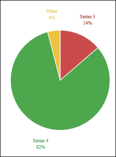
Here we turn the legend setting off, which causes the pie plugin to render labels near the pie sections, and we also use the combine and threshold settings to combine the two smallest sections into one. In this case, we specify a threshold of 0.10, which means that any series that has a value less than 10 percent of the sum of all the series is combined into a single section of the pie labeled Other as follows:
...
$('#sampleChart').plot(
  [
    {label: 'Series 1', data: 1},
    {label: 'Series 2', data: 2},
    {label: 'Series 3', data: 10},
    {label: 'Series 4', data: 60},
  ],
  {
    legend: { show: false },
    series: {
      pie: {
        show: true,
        combine: {
          threshold: 0.10
        }
      }
    }
  }
);
...
This results in a simplified pie chart that eliminates clutter from the visualization:
The axes are the most configurable parts of the chart. Flot gives you the ability to change the position, type, and colors of the axes. It also gives you full control of the ticks and labels on the axes, letting you adjust the number of ticks and alter the formatting. Axes also determine how the data is displayed; you can change the min and max settings to display only a part of the data on the chart and you can also transform the data in various ways.
The full documentation is available at https://github.com/flot/flot/blob/master/API.md#customizing-the-axes. We will take a look at some examples of the configuration options by creating a chart that has a logarithmic axis and another chart that includes multiple axes.
The following code creates some sample data that grows exponentially. We then use the transform and tickSize setting on the Y axis to adjust how our data is displayed:
...
  <script>
    var data = [], i;
    for (i = 1; i <= 50; i++) {
      data.push([i, Math.exp(i / 10, 2)]);
    }

    $('#sampleChart').plot(
      [ data ],
      {
        yaxis: {
          transform: function (v) {
            return v == 0 ? v : Math.log(v);
          },
          tickSize: 50
        }
      }
    );
  </script>
...
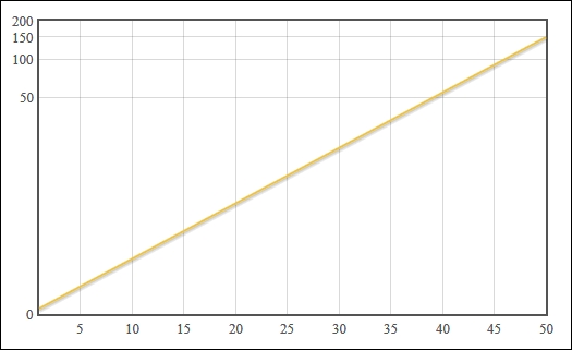
Flot draws a chart with a logarithmic Y axis, so that our exponential data is easier to read:
Next, we use Flot's ability to display multiple axes on the same chart as follows:
...
    var sine = [];
    for (i = 0; i < Math.PI * 2; i += 0.1) {
      sine.push([i, Math.sin(i)]);
    }
    var cosine = [];
    for (i = 0; i < Math.PI * 2; i += 0.1) {
      cosine.push([i, Math.cos(i) * 20]);
    }
    $('#sampleChart').plot(
      [
        {label: 'sine', data: sine},
        {
          label: 'cosine',
          data: cosine,
          yaxis: 2
        }
      ],
      { yaxes: [ {}, { position: 'right' } ] }
    );
...
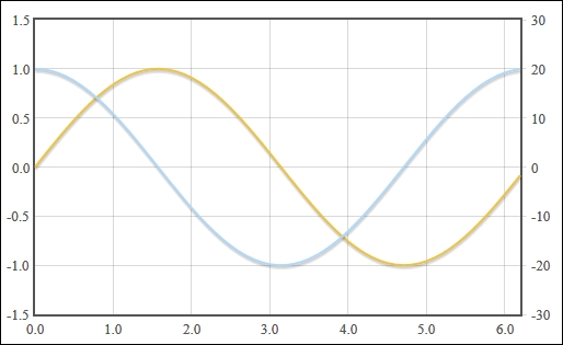
Flot draws the two series overlapping each other. The Y axis for the sine series is drawn on the left by default and the Y axis for the cosine series is drawn on the right as specified:
The transform setting expects a function that takes a value, which is the y coordinate of our data, and returns a transformed value. In this case, we calculate the logarithm of our original data value so that our exponential data is displayed on a linear scale. We also use the tickSize setting to ensure that our labels do not overlap after the axis has been transformed.
The yaxis setting under the series object is a number that specifies which axis the series should be associated with. When we specify the number 2, Flot automatically draws a second axis on the chart. We then use the yaxes setting to specify that the second axis should be positioned on the right of the chart.
In this case, the sine data ranges from -1.0 to 1.0, whereas the cosine data ranges from -20 to 20. The cosine axis is drawn on the right and is independent of the sine axis.
Flot doesn't have a built-in ability to interact with axes, but it does give you all the information you need to construct a solution.
Here, we use Flot's getAxes method to add interactivity to our axes as follows:
...
    var
      showFahrenheit = false,

      temperatureFormatter = function (val, axis) {
        if (showFahrenheit) {
          val = val * 9 / 5 + 32;
        }
        return val.toFixed(1);
      },

      drawPlot = function () {
        var plot = $.plot(
          '#sampleChart',
          [[[0, 0], [1, 3], [3, 1]]],
          { yaxis: { tickFormatter: temperatureFormatter } }
        );

        var plotPlaceholder = plot.getPlaceholder();

        $.each(plot.getAxes(), function (i, axis) {
          var box = axis.box;
          var axisTarget = $('<div />');

          axisTarget.
            css({
              position: 'absolute',
              left: box.left,
              top: box.top,
              width: box.width,
              height: box.height
            }).
            click(function () {
              showFahrenheit = !showFahrenheit;
              drawPlot();
            }).
            appendTo(plotPlaceholder);
        });
      };

    drawPlot();
...
First, note that we use a different way of creating a plot. Instead of calling the plot method on a jQuery collection that matches the placeholder element, we use the plot method directly from the jQuery object. This gives us immediate access to the Flot object, which we use to get the axes of our chart. You could have also used the following data method to gain access to the Flot object:
var plot = $('#sampleChart').plot(...).data('plot');Once we have the Flot object, we use the getAxes method to retrieve a list of axis objects. We use jQuery's each method to iterate over each axis and we create a div element that acts as a target for interaction. We set the div element's CSS so that it is in the same position and size as the axis' bounding box, and we attach an event handler to the click event before appending the div element to the plot's placeholder element.
In this case, the event handler toggles a Boolean flag and redraws the plot. The flag determines whether the axis labels are displayed in Fahrenheit or Celsius, by changing the result of the function specified in the tickFormatter setting.
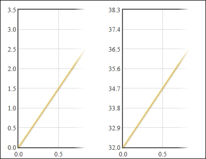
Another of Flot's built-in plugins, the crosshair plugin, allows you to draw a crosshair on top of a chart as the mouse moves over it. We will use this in conjunction with Flot's hover event to track the coordinates that lie under the mouse.
Again, we will use the same boilerplate code that we introduced while creating basic charts. We must also include the crosshair plugin as follows:
...
  <script src="jquery.js"></script>
  <script src="jquery.flot.js"></script>
  <script src="jquery.flot.crosshair.js"></script>
...The simplest use of the plugin displays a crosshair at the mouse position:
...
    var data = [[0, 1], [1, 3], [2, 2]];
    $('#sampleChart').plot(
      [ data ],
      { crosshair: { mode: 'xy' } }
    );
...
The crosshairs are drawn dynamically underneath the mouse as it moves across the chart:

We can also use Flot's hover event to display the coordinates of the mouse position:
...
  <div class="chart" id="sampleChart"></div>
  <span id="coords"></span>
  <script src="jquery.js"></script>
  <script src="jquery.flot.js"></script>
  <script src="jquery.flot.crosshair.js"></script>
  <script>
    var data = [[0, 1], [1, 3], [2, 2]];

    var plot = $.plot(
      '#sampleChart',
      [ data ],
      { grid: { hoverable: true } }
    );
    plot.getPlaceholder().on(
      'plothover',
      function (event, pos) {
        $('#coords').text(
          pos.x.toFixed(2) + ', ' +
          pos.y.toFixed(2)
        );
      }
    );
...
The label below the graph dynamically displays the coordinates, in chart units, of the point under the mouse:

The crosshair plugin is very straightforward. Its settings include color and style configuration as well as a mode setting that can be set to x, y, or xy, depending on which axis of the crosshair you wish to display. The plugin also includes methods that allow you to set, lock, and clear the crosshair, as we'll see later.
The hover event occurs on the plot's placeholder element. The event arguments include the standard jQuery event object and a pos object that holds the x and y coordinates of the mouse cursor. In order to use the hover event, we must set the hoverable setting on the grid object to true.
These techniques allow us to construct a visual aid that helps users pinpoint the values of a series:
We can combine Flot's hover event with the crosshair to display a crosshair on the curve produced from our data. The crosshair will follow the horizontal position of the mouse and will always lie on the curve:
...
    var plot = $.plot(
      '#sampleChart',
      [ data ],
      { grid: { hoverable: true }, crosshair: {mode: 'xy'} }
    );
    plot.getPlaceholder().on(
      'plothover',
      function (event, pos) {
        var j;
        for (j = 0; j < data.length; j++) {
          if (data[j][0] > pos.x) {
            break;
          }
        }

        var
          y,
          p1 = data[j - 1],
          p2 = data[j];
        if (p1 == null) {
          y = p2[1];
        } else if (p2 == null) {
          y = p1[1];
        } else {
          y = (
            p1[1] + (p2[1] - p1[1]) *
            (pos.x - p1[0]) / (p2[0] - p1[0])
          );
        }

        plot.lockCrosshair({x: pos.x, y: y});
      }
    );
...
In our hover event handler, we use the x coordinate of the mouse to get the closest data point in our dataset. If that point is in the middle of the dataset, we try to interpolate the y coordinate by calculating the midpoint between the point and the previous point. Finally, we use the lockCrosshair method to display the crosshair on the curve.

Flot includes a plugin that handles time-based data. The plugin takes care of displaying the X axis accordingly, including date formatting, time zone calculations, and unit conversions.
Again, we can use the same boilerplate along with the time plugin:
...
  <script src="jquery.js"></script>
  <script src="jquery.flot.js"></script>
  <script src="jquery.flot.time.js"></script>
...We enable the time plugin by setting mode to time on the xaxis setting. The time plugin also expects a specific data type for the x coordinates of our dataset as follows:
...
    var data = [
      [1357016400000, 0],
      [1359694800000, 4],
      [1362114000000, 2]
    ];

    $('#sampleChart').plot(
      [ data ],
      { xaxis: { mode: 'time' } }
    );
...
The time plugin automatically draws the points in their appropriate positions on the chart and also changes the labels on the X axis to display the corresponding dates:
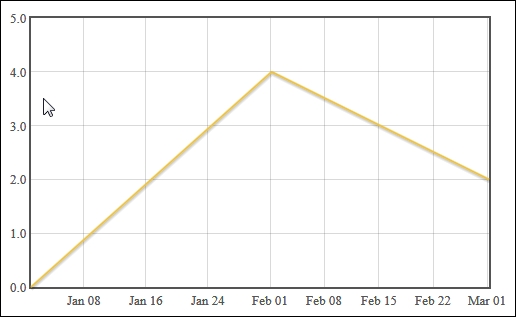
The time plugin expects the x coordinates of our data set to be standard JavaScript timestamps. They represent the number of milliseconds since January 1, 1970 00:00:00 UTC. You can obtain these timestamps in JavaScript by using the getTime method on a Date object.
The plugin also assumes that the timestamps are in the UTC time zone. You may set the timezone setting under the xaxis setting to browser, if your data is in the user's time zone already. Other time zones are supported through a third-party timezoneJS plugin that you can find at https://github.com/mde/timezone-js.
The time plugin also includes settings to control the number of ticks displayed on the axis to use a twelve hour clock format and to change the text displayed for months and days. You can find more information in the Flot documentation available at https://github.com/flot/flot/blob/0.8.1/API.md#time-series-data.
The time plugin also supports custom date and time formats using a formatting string that is a subset of the strftime standard from the C programming language. You can find more details in the preceding linked documentation.
Here we use a custom formatting string to force the time plugin to show the full date and time on the X axis labels as follows:
...
    var data = [
      [new Date('2013-02-28T22:30:00Z').getTime(), 0],
      [new Date('2013-02-28T23:45:00Z').getTime(), 4],
      [new Date('2013-03-01T01:15:00Z').getTime(), 2]
    ];

    $('#sampleChart').plot(
      [ data ],
      { xaxis: {
        mode: 'time',
        timeformat: '%Y-%m-%d %H:%M'
      } }
    );
...
The labels on the X axis are replaced with text in the format we've specified:
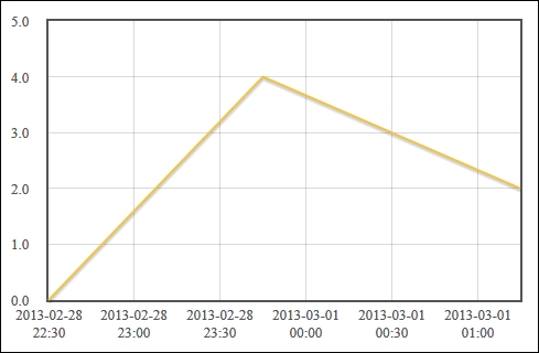
Now that we've learned how to create various types of charts, we can start applying Flot to our real-world data. Statistical data is often accompanied by error margins and visualized on charts using error bars. Flot's errorbars plugin is built specifically for that scenario.
We start with the same boilerplate code that we used to create basic charts and we include the errorbars plugin.
The error bars are displayed with a combination of extra data values, the errorbars and yerr settings, and other settings which help produce a properly formatted chart:
...
  <script src="jquery.flot.errorbars.js"></script>
  <script>
    var data = [
      [1, 2, 0.5],
      [2, 5, 0.2],
      [3, 1, 0.4]
    ];

    var plot = $.plot(
      $('.chart'),
      [ data ],
      {
        series: {
          lines: { show: true },
          points: {
            show: true,
            errorbars: 'y',
            yerr: {
              show: true,
              color: 'red',
              upperCap: '-',
              lowerCap: '-'
            }
          }
        },
        xaxis: { min: 0, max: 4 },
      }
    );
  </script>
...
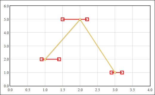
Error bars are drawn in red with short horizontal lines as end caps, as specified:
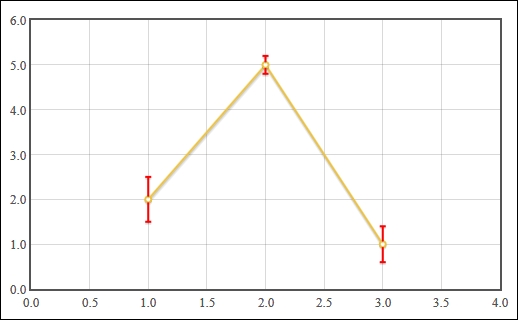
The errorbars plugin expects us to provide extra data values that specify the margin of error for each data point. The margin of error is in the same unit as the y value of the data point. In the preceding example, we've specified the values 0.5, 0.2, and 0.4 respectively.
We enable the errorbars plugin by setting the errorbars setting to y. This tells the plugin to use the extra data value as an error bar on the Y axis. The yerr settings object allows us to specify how the error bars should be displayed. We set the color, upperCap, and lowerCap settings so that the error bars are more easily visible.
We also enable the show settings on the lines and points setting objects so that both lines and points are drawn on the graph. Finally, we explicitly set the min and max settings on the xaxis settings object so that our data points are easier to see on the chart.
The errorbars plugin has the ability to display error bars on the X axis as well. It also gives you the ability to display asymmetric errors and custom end-cap styles.
Here, we use a combination of the asymmetric setting and custom functions for the upperCap and lowerCap settings to display a square end cap. The squareCap function receives a canvas context object (the DOM CanvasRenderingContext2D type) which we use to draw a square at the given X and Y coordinates:
...
    data = [
      [1, 2, 0.1, 0.4],
      [2, 5, 0.5, 0.2],
      [3, 1, 0.1, 0.2]
    ];

    var squareCap = function (ctx, x, y, radius) {
      ctx.beginPath();
      var r2 = radius / 2;
      ctx.rect(x - r2, y - r2, radius, radius);
      ctx.stroke();
    };

    var plot = $.plot(
      $('.chart'),
      [ data ],
      {
        series: {
          lines: { show: true },
          points: {
            show: true,
            errorbars: 'x',
            xerr: {
              show: true,
              asymmetric: true,
              color: 'red',
              upperCap: squareCap,
              lowerCap: squareCap,
              radius: 10
            }
          }
        },
        xaxis: { min: 0, max: 4 },
      }
    );
...
Asymettric error bars expect two error values in the data points. The error bars are drawn independently to the left and right of the data points. Our square caps are rendered as empty red boxes on the ends of the bars:
Flot's fillbetween plugin allows you to visualize percentiles by shading the area between the series that represent each percentile.
Include the fillbetween plugin as follows:
...
  <script src="jquery.js"></script>
  <script src="jquery.flot.js"></script>
  <script src="jquery.flot.fillbetween.js"></script>
...The plugin uses id and fillBetween settings on each series object to identify and configure the filled areas:
...
  <script src="jquery.flot.fillbetween.js"></script>
  <script>
    var data = {
      '25%': [
        [0, 53], [1, 56], [2, 60], [3, 60], [4, 66],
        [5, 72], [6, 71], [7, 74], [8, 76], [9, 80]
      ],
      '50%': [
        [0, 69], [1, 67], [2, 74], [3, 71], [4, 76],
        [5, 79], [6, 77], [7, 81], [8, 82], [9, 85]
      ],
      '75%': [
        [0, 83], [1, 84], [2, 89], [3, 84], [4, 85],
        [5, 86], [6, 86], [7, 88], [8, 91], [9, 93]
      ],
      '90%': [
        [0, 90], [1, 92], [2, 93], [3, 92], [4, 92],
        [5, 93], [6, 91], [7, 93], [8, 94], [9, 95]
      ],
      'mean': [
        [0, 68.44], [1, 70.19], [2, 73.71], [3, 71.97],
        [4, 75.98], [5, 78.86], [6, 78.86], [7, 81.33],
        [8, 83.35], [9, 85.82]
      ]
    };
    var dataset = [
      { id: '25%', data: data['25%'], lines:{ fill: false } },
      { id: '50%', data: data['50%'], fillBetween: '25%' },
      { id: '75%', data: data['75%'], fillBetween: '50%' },
      { id: '90%', data: data['90%'], fillBetween: '75%' },
      { id: 'mean', data: data['mean'], lines:{ fill: false} }
    ];

    $.plot(
      $('.chart'),
      dataset,
      {
        lines: { fill: 0.5 },
        shadowSize: 0
      }
    );
  </script>
...
The plugin draws filled regions that help visualize the volume of the space between series:
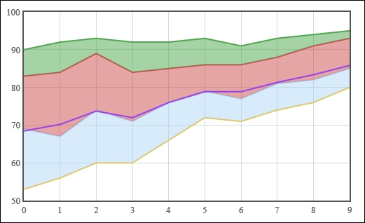
The fillbetween plugin is similar to the stack plugin. It takes your data and manipulates it so that the area between the specified series are filled, or shaded. The plugin does not calculate percentiles for you—it can be applied to any series—but it is especially useful for visualizing percentile data.
The plugin requires that you identify each series with the id setting so that you can refer to them in the fillBetween setting. In this case, we identify our series with names as 25%, 50%, and so on. We then fill the area between the appropriate series by using the fillBetween setting. For example, we shade the area between the 50% series and the 25% series by setting the fillBetween setting on the 50% series to 25%.
Although Flot provides everything you need for visualization, it doesn't include the typical statistical calculations you might want to perform on your raw data. Here, we will learn how to use the jStat library to process your raw data so that it can be visualized with Flot.
jStat includes a large range of advanced statistical calculations. You can view its documentation online at http://jstat.github.io/index.html.
You can download jStat from its GitHub repository at https://github.com/jstat/jstat. We will be using some of the calculations in its vector and linearalgebra modules:
...
  <script src="jquery.js"></script>
  <script src="jquery.flot.js"></script>
  <script src="jstat/core.js"></script>
  <script src="jstat/linearalgebra.js"></script>
  <script src="jstat/vector.js"></script>
...
We use jStat's functions to analyze our data in various ways as follows:
...
    var yvalues = [3, 5, 2, 3, 6, 9, 3, 8, 7, 1];
    var n = yvalues.length;

    var mean = jStat.mean(yvalues);
    var median = jStat.median(yvalues);
    var mode = jStat.mode(yvalues);
    var stdev = jStat.stdev(yvalues);

    var xvalues = jStat(0, n - 1, n);
    var data = jStat([xvalues[0], yvalues]).transpose();
    var corrcoeff = jStat.corrcoeff(yvalues, xvalues[0]);

    var display = function (label, value) {
      $('#sample').
        before(label + ': ' + value.toFixed(3) + '<br />');
    };
    display('Standard deviation', stdev);
    display('Correlation coefficient', corrcoeff);

    var line = function (y) {
      return [ [0, y], [n - 1, y] ];
    };

    $.plot(
      $('#sample'),
      [
        { data: data, points: {show: true}, color: 'black' },
        { label: 'mean', data: line(mean) },
        { label: 'median', data: line(median) },
        { label: 'mode', data: line(mode) }
      ],
      { legend: { position: 'nw' } }
    );
  </script>
...
The data is displayed along with multiple types of analysis information:
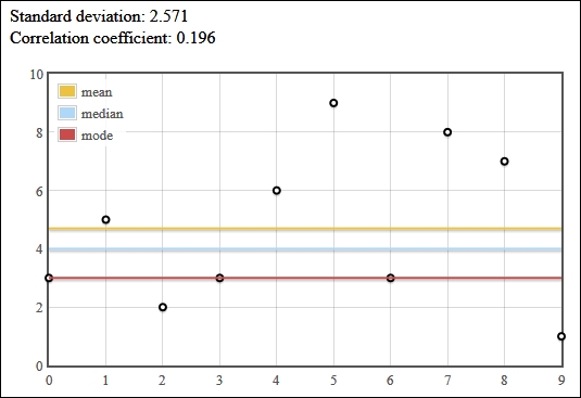
jStat, like most statistical and mathematical software, operates on vectors and matrices. So, we represent our data, yvalues, as a vector in the form of an array of y values. We then use jStat to calculate the mean, median, mode, and standard deviation (stdev) of those y values.
The main jStat function can be used to produce a sequence of values. We use this to create xvalues, an array that contains a sequence from 0 to 9 ([0, 1, 2, ..., 9]). The jStat function can also be used to create a matrix. We do this with our xvalues and yvalues vectors and use the transpose function to create a matrix which happens to be in the same structure that Flot can plot, that is transpose takes a matrix like the following matrix:
[ [0, 1, 2], [7, 8, 9] ]
It produces a matrix like the following matrix:
[ [0, 7], [1, 8], [2, 9] ]
Next, we use jStat's corrcoeff function to calculate the correlation coefficient between our data and xvalues.
Finally, we display all of this information. We display the standard deviation and correlation as text, and we use Flot to plot the data points as well as three horizontal lines that represent the mean, median, and mode.
jStat also comes with a large variety of probability distribution calculations, which are typical tools in statistical analysis. These include the normal (Gaussian) distribution, Beta distribution, Chi-squared distribution, Poisson distribution, and much more.
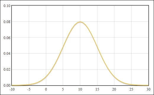
You can calculate the data points for a normal distribution curve in only a few lines. Simply input your mean and standard deviation values into the normal function and use the pdf function to retrieve the y values:
...
var numPoints = 50;

var mean = 10;
var stdev = 5;
var span = stdev * 4;

var xvalues = jStat(mean - span, mean + span, numPoints + 1);
var normalDistribution = xvalues.normal(mean, stdev).pdf();

var normalPlot = jStat([
  xvalues[0],
  normalDistribution[0]
]).transpose();

$.plot( $('.chart'), [ normalPlot ] );
...
Flot draws the distribution curve centered at our mean value:
Now that we've learned how Flot works, we can apply it to our own data sources. Since we can't cover all possible uses of Flot's capabilities, we'll try to demonstrate some examples of how Flot can be applied to real-world data.
There are a myriad of data sources out there and many of them offer their data freely as Open Data sources. One of those sources is The World Bank. They provide data on global statistics and indicators through a simple API.
We use jQuery's getJSON function to query The World Bank's Cellular Indicator API and manipulate the data before displaying pie charts with Flot:
    var getDataPage = function (url, cb, page, data) {
      return function (response) {
        var newData = response[1];
        newData.unshift(newData.length);
        newData.unshift(data.length);

        // append new data to existing data
        data.splice.apply(data, newData);

        // get more data if there are more pages
        if (response[0].pages > page) {
          getData(url, cb, page + 1, data);
        }
        else {
          cb(data);
        }
      };
    };

    var getData = function (url, cb, page, data) {
      page = page || 1;
      data = data || [];

      $.getJSON(
        url + '&page=' + page,
        getDataPage(url, cb, page, data)
      );
    };

    var excludeInvalidData = function (d) {
        // Some data has a null value or actually
        // represents groups of countries.
        return (
          d.value &&
          !/\d/.test(d.country.id) &&
          !/^x/i.test(d.country.id) &&
          ['OE', 'ZJ', 'ZQ', 'ZG', 'ZF', 'EU'].
            indexOf(d.country.id) === -1
        );
    };
    var makeFormatter = function (power, suffix) {
      return function (label, series) {
        return (
          label + '<br />' +
          (
            series.data[0][1] / Math.pow(10, power)
          ).toFixed(0) + ' ' +
          suffix
        );
      };
    };

    var options = {
      series: {
        pie: {
          show: true,
          label: {
            show: true,
            formatter: makeFormatter(6, 'M')
          }
        }
      }
    };

    var plotData = function (rawData) {
      var data = rawData.
        filter(excludeInvalidData).
        map(function (d) {
          return {
            label: d.country.value,
            data: parseFloat(d.value)
          };
        });

      data.sort(function (a, b) { return b.data - a.data; });

      var topFive = data.slice(0, 5);
      $('#topFive').plot( topFive, options );

      var bottomFive = data.slice(-5);
      options.series.pie.label.formatter =
        makeFormatter(3, 'K');
      $('#bottomFive').plot( bottomFive, options );
    };

    getData(
      'http://api.worldbank.org/' +
      'countries/all/indicators/IT.CEL.SETS/?' +
      'format=jsonp&prefix=?&date=2011:2011',
      plotData
    );
The resulting pie charts depict the number of cellular subscription for the top five and bottom five countries in the world:

The API returns a JSON structure that includes several pieces of information, but we are really only interested in the country name and the number of cellular subscriptions. We first filter out some invalid data with JavaScript's filter function, and then map the relevant values to the format that Flot expects for pie charts.
We sort the data, and then extract the top and bottom five countries. Finally, we display pie charts for the data sets with a custom pie label formatter that shows the number of subscriptions in millions or thousands.
The following example shows some personal data analysis. We take weight loss data collected over several years and analyze it using custom averaging and trend calculations:
...
  <script>
    var weightData;
    var goalWeight = 70;
    var MS_PER_DAY = 24 * 60 * 60 * 1000;

    var parseDate = function (d) {
      // Turn a string like '2013-08-18'
      // into a timestamp.
      var dateParts = d[0].split('-');
      var timestamp = new Date(
        parseInt(dateParts[0], 10),
        parseInt(dateParts[1], 10) - 1,
        parseInt(dateParts[2], 10)
      ).getTime()
      return [ timestamp, d[1] ];
    };

    var calculateRunningAvg = function (data, i, arr) {
      // return a data point which has a y-value
      // that is the average of the previous 10 y-values
      // in the array.
      var pointsToAverage =
        arr.slice(Math.max(0, i - 9), i + 1);
      var sum = pointsToAverage.reduce(function (a, b) {
          return a + b[1];
      }, 0);
      var average =  sum / Math.min(i + 1, 10);
      return [ data[0], average ];
    };

    var calculateSlope = function (p1, p2) {
      var rise = p2[1] - p1[1]
      var run = p2[0] - p1[0];
      return rise / run;
    };

    var calculateTrend = function (arr) {
      var n = arr.length - 1;
      var slope = calculateSlope(arr[n - 1], arr[n]);
      var trend = [];
      var start = arr[n];

      // If the slope is positive or close to 0,
      // calculate a trend 10 days in to the future.
      // Otherwise, calculate the trend until it
      // meets the goal weight.
      for (
        var i = 0, y = start[1];
        slope >= -1e-10 ? i < 10 : y > goalWeight;
        i++
      ) {
        var x = start[0] + i * MS_PER_DAY;
        y = start[1] + i * MS_PER_DAY * slope;
        trend.push([x, y]);
      }
      return trend;
    };

    var filterToPeriod = function (data, period) {
      if (period) {
        var start = data[data.length - 1][0] - period;
        data = data.filter(function (d) {
          return d[0] > start;
        });
      }
      return data;
    };
    var plotWeight = function (rawData, period) {
      weightData = weightData || rawData;

      var data = rawData.map(parseDate);

      data = filterToPeriod(data, period);

      var runningAverage = data.map(calculateRunningAvg);

      var trend = calculateTrend(runningAverage);

      var goalWeightLine = [
        [data[0][0], goalWeight],
        [trend[trend.length - 1][0], goalWeight]
      ];

      $('#weight').plot(
        [
          data,
          { label: 'Average', data: runningAverage },
          { label: 'Trend', data: trend },
          { label: 'Goal weight', data: goalWeightLine },
        ],
        {
          xaxis: { mode: 'time' },
          legend: { show: true, position: 'sw' }
        }
      );
    };

    $('#oneYear').click(function () {
      plotWeight(weightData, 12 * 30 * MS_PER_DAY);
    });
    $('#threeMonths').click(function () {
      plotWeight(weightData, 3 * 30 * MS_PER_DAY);
    });
    $('#oneMonth').click(function () {
      plotWeight(weightData, 30 * MS_PER_DAY);
    });
    $('#all').click(function () {
      plotWeight(weightData, null);
    });

    plotWeight([
      ['2010-01-20',97.25],
      ['2010-01-21',96.98],
      ['2010-01-22',97.25],
      ...
      ['2013-08-29',77.30],
      ['2013-08-30',75.00],
      ['2013-09-02',74.60]
    ]);

  </script>
...
The resulting chart shows the raw weight data with an overlaid running average, a trend line and a goal line. The code also adds interactivity to the chart via buttons that dynamically change the visible date range; effectively allowing the user to zoom in on the data.


As we've seen so far, many of Flot's capabilities come from plugins. Flot's extensibility is one of its best features. It allows us to add custom functionality easily and organizes our code into manageable modules.
Here, we extract the running average functionality that we built in the There's more... section and put it into a custom plugin. This allows us to display the running average of any dataset with a simple setting:
...
  <script>
    (function ($) {
      var calculateRunningAverage=function (data, numPoints) {
        return data.map(function (point, i, arr) {
          var pointsToAverage =
            arr.slice(Math.max(0, i - numPoints + 1), i + 1);
          var sum = pointsToAverage.reduce(function (a, b) {
            return a + b[1];
          }, 0);
          var average =  sum / Math.min(i + 1, numPoints);
          return [ point[0], average ];
        });
      };

      var addRunningAverage = function (plot, series) {
        if (
          series.runningAverage &&
          series.runningAverage.show
        ) {
          var allData = plot.getData();

          var averageData = calculateRunningAverage(
            series.data, series.runningAverage.numPoints);

          allData.push({
            data: averageData,
            color: series.runningAverage.color
          });
          // disable the hook to prevent infinite recursion.
          plot.hooks.processRawData =
            plot.hooks.processRawData.filter(function (x) {
              return x !== addRunningAverage;
            });

          plot.setData(allData);

          plot.hooks.processRawData.push(addRunningAverage);
        }
      };
      var init = function (plot) {
        plot.hooks.processRawData.push(addRunningAverage);
      };
      var options = {
        series: {
          runningAverage: {
            show: false,
            numPoints: 2,
            color: 'red'
          }
        }
      };
      $.plot.plugins.push({
        name: 'runningAverage',
        version: '0.1.0',
        init: init,
        options: options
      });
    }(jQuery));

    var data = [
      [0, 240], [1, 228], [2, 312], [3, 272], [4, 335],
      [5, 348], [6, 348], [7, 320], [8, 351], [9, 341],
      [10, 336], [11, 343], [12, 410], [13, 372], [14, 369],
      [15, 425], [16, 375], [17, 377], [18, 479], [19, 439]
    ];
    var data2 = data.map(function (d) {
      return [d[0], d[1] + 200];
    });
    var dataset = [
      { data: data, runningAverage: {show: true} },
      { data: data2, runningAverage: {
        show: true, numPoints: 8
      } }
    ];

    $.plot(
      $('#sample'),
      dataset,
      { lines: { show: true } }
    );
  </script>
...
We use our plugin to display the running averages (in red) of two series, but with different intervals for the average:
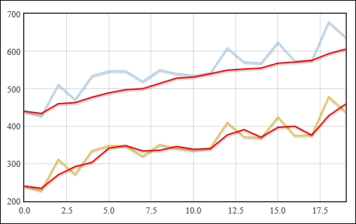
We start our plugin by containing it inside a closure. This allows us to code our plugin without having to worry about contaminating the global scope. We pass the jQuery object into the closure so that we can access and extend Flot with our plugin:
(function ($) {
...
}(jQuery);
Next, we define our plugin. It consists of three functions; calculateRunningAverage, addRunningAverage, and init; and one options object. The init function is the starting point of our plugin. Our plugin hooks into Flot's rendering pipeline at the processRawData phase, which occurs just before Flot interprets the data passed to it. We add our addRunningAverage function to the hook array. The function will be called once for every series in the dataset being plotted.
The addRunningAverage function uses the plot's getData and setData methods to retrieve the dataset and add the new running average data for the current series. Note that we must remove our hook before we call setData because setData calls processRawData internally, causing an infinite recursion. We then add the hook back after setData has been called.
Finally, we make Flot aware of our plugin by adding a plugin object to the $.plot.plugins array. The plugin object gives Flot some metadata about our plugin and tells it about our plugin's starting point, the init function. The object also includes the default options for our plugin. By convention, the options are set to disable the plugin by default; in this case, the show setting is set to false so that users of the plugin can choose to opt in to the plugin as they please.
Flot merges the default options with its options and the options on the individual series when a plot is made.
Our example plugin is very simple, but Flot's powerful extensibility allows plugins to do all sorts of things. For example, you could hook into Flot's rendering phases and draw arbitrary graphics directly onto the canvas, or you could bind to mouse and keyboard events on a plot to respond to user interaction.
You can learn more about plugins in the following Flot's documentation:
Introduction to plugins: https://github.com/flot/flot/blob/0.8.1/API.md#plugins
More plugin information: https://github.com/flot/flot/blob/0.8.1/PLUGINS.md


