


Welcome to Instant Heat Maps in R How-to.
Throughout this book, we will learn how to create simple and advanced heat maps, customize them, and create a nice output for presentations. We will be using data from various different file formats as input and work on our heat maps to add some interactivity to them.
We will also take a look at simple heat maps by creating a choropleth map of the United States and make a contour plot from topographical volcano data.
In this recipe, we will learn how to construct our first heat map in R from the AirPassenger data set, which is a standard data set included in the data package that is available with R distributions. For this task, we will use the levelplot() function from the lattice package and explore the enhanced features of the gplots package, the heatmap.2() function.
The following image shows one of the heat maps that we are going to create in this recipe from the total count of air passengers:

Download the script 5644_01_01.r from your account at http://www.packtpub.com and save it to your hard disk. The first section of the script, below the comment line starting with ### loading packages, will automatically check for the availability of the R packages gplots and lattice, which are required for this recipe.
If those packages are not already installed, you will be prompted to select an official server from the Comprehensive R Archive Network (CRAN) to allow the automatic download and installation of the required packages.
If you have already installed those two packages prior to executing the script, I recommend you to update them to the most recent version by calling the following function in the R command line:
update.packages("gplots")
update.packages("lattice")
Tip
Use the source() function in the R command-line to execute an external script from any location on your hard drive.
If you start a new R session from the same directory as the location of the script, simply provide the name of the script as an argument in the function call as follows:
source("myScript.r")You have to provide the absolute or relative path to the script on your hard drive if you started your R session from a different directory to the location of the script. Refer to the following example:
source("/home/username/Downloads/myScript.r")You can view the current working directory of your current R session by executing the following command in the R command-line:
getwd()
Run the 5644OS_01_01.r script in R to execute the following code, and take a look at the output printed on the screen as well as the PDF file, first_heatmaps.pdf that will be created by this script:
### loading packages
if (!require("gplots")) {
install.packages("gplots", dependencies = TRUE)
library(gplots)
}
if (!require("lattice")) {
install.packages("lattice", dependencies = TRUE)
library(lattice)
}

### loading data
data(AirPassengers)

### converting data
rowcolNames <- list(as.character(1949:1960), month.abb)
air_data <- matrix(AirPassengers,
  ncol = 12,
  byrow = TRUE,
  dimnames = rowcolNames)

### drawing heat maps
pdf("firstHeatmaps.pdf")

# 1) Air Passengers #1
print(levelplot(air_data,
  col.regions=heat.colors,
  xlab = "year",
  ylab = "month",
  main = "Air Passengers #1"))

# 2) Air Passengers #2
heatmap.2(air_data,
  trace = "none",
  density.info = "none",
  xlab = "month",
  ylab = "year",
  main = "Air Passengers #2")

# 3) Air Passengers #3
heatmap.2(air_data,
  trace = "none",
  xlab = "month",
  ylab = "year",
  main = "Air Passengers #3",
  density.info = "histogram",
  dendrogram = "column",
  keysize = 1.8)

dev.off()
Tip
Downloading the example code
You can download the example code files for all Packt books you have purchased from your account at http://www.packtpub.com. If you purchased this book elsewhere, you can visit http://www.packtpub.com/support and register to have the files e-mailed directly to you.
There are different functions for drawing heat maps in R, and each has its own advantages and disadvantages. In this recipe, we will take a look at the levelplot() function from the lattice package to draw our first heat map. Furthermore, we will use the advanced heatmap.2() function from gplots to apply a clustering algorithm to our data and add the resulting dendrograms to our heat maps.
The following image shows an overview of the different plotting functions that we are using throughout this book:

Now let us take a look at how we read in and process data from different data files and formats step-by-step:
Loading packages: The first eight lines preceding the
### loading datasection will make sure that R loads thelatticeandgplotspackage, which we need for the two heat map functions in this recipe:levelplot()andheatmap.2().Loading the data set: R includes a package called
data, which contains a variety of different data sets for testing and exploration purposes. More information on the different data sets that are contained in thedatapackage can be found at http://stat.ethz.ch/ROmanual/ROpatched/library/datasets/.For this recipe, we are loading the
AirPassengerdata set, which is a collection of the total count of air passengers (in thousands) for international airlines from 1949-1960 in a time-series format.data(AirPassengers)
Converting the data set into a numeric matrix: Before we can use the heat map functions, we need to convert the
AirPassengertime-series data into a numeric matrix first. Numeric matrices in R can have characters as row and column labels, but the content itself must consist of one single mode: numerical.We use the
matrix()function to create a numeric matrix consisting of 12 columns to which we pass theAirPassengertime-series data row-by-row. Using the argumentdimnames = rowcolNames, we provide row and column names that we assigned previously to the variablerowColNames, which is a list of two vectors: a series of 12 strings representing the years 1949 to 1960, and a series of strings for the 12 three-letter abbreviations of the months from January to December, respectively.rowcolNames <- list(as.character(1949:1960), month.abb) air_data <- matrix(AirPassengers, ncol = 12, byrow = TRUE, dimnames = rowcolNames)
A si mple heat map using levelplot(): Now that we have converted the
AirPassengerdata into a numeric matrix format and assigned it to the variableair_data, we can go ahead and construct our first heat map using thelevelplot()function from thelatticepackage:print(levelplot(air_data, col.regions=heat.colors, xlab = "year", ylab = "month", main = "Air Passengers #1"))
The
levelplot()function creates a simple heat map with a color key to the right-hand side of the map. We can use the argumentcol.regions = heat.colorsto change the default color transition to yellow and red. X and y axis labels are specified by thexlabandylabparameters, respectively, and themainparameter gives our heat map its caption.Note
In contrast to most of the other plotting functions in R, the
latticepackage returns objects, so we have to use theprint()function in our script if we want to save the plot to a data file. In an interactive R session, theprint()call can be omitted. Typing the name of the variable will automatically display the referring object on the screen.Creating enhanced heat maps with heatmap.2(): Next, we will use the
heatmap.2()function to apply a clustering algorithm to theAirPassengerdata and to add row and column dendrograms to our heat map:heatmap.2(air_data, trace = "none", density.info = "none", xlab = "month", ylab = "year", main = "Air Passengers #2")Note
Hierarchical clustering is especially popular in gene expression analyses. It is a very powerful method for grouping data to reveal interesting trends and patterns in the data matrix.
Another neat feature of
heatmap.2()is that you can display a histogram of the count of the individual values inside the color key by including the argumentdensity.info = NULLin the function call. Alternatively, you can setdensity.info = "density"for displaying a density plot inside the color key.By adding the argument
keysize = 1.8, we are slightly increasing the size of the color key—the default value ofkeysizeis1.5:heatmap.2(air_data, trace = "none", xlab = "month", ylab = "year", main = "Air Passengers #3", density.info = "histogram", dendrogram = "column", keysize = 1.8)
Did you notice the missing row dendrogram in the resulting heat map? This is due to the argument
dendrogram = "column"that we passed to the heat map function. Similarly, you can type row instead of column to suppress the column dendrogram, or use neither to draw no dendrogram at all.
By default, levelplot() places the color key on the right-hand side of the heat map, but it can be easily moved to the top, bottom, or left-hand side of the map by modifying the space parameter of colorkey:
levelplot(air_data,
col.regions = heat.colors,
colorkey = list(space = "top"))
Replacing top by left or bottom will place the color key on the left-hand side or on the bottom of the heat map, respectively.
Moving around the color key for heatmap.2() can be a little bit more of a hassle. In this case we have to modify the parameters of the layout() function. By default, heatmap.2() passes a matrix, lmat, to layout(), which has the following content:
     [,1] [,2]
[1,]    4    3
[2,]    2    1
The numbers in the preceding matrix specify the locations of the different visual elements on the plot (1 implies heat map, 2 implies row dendrogram, 3 implies column dendrogram, and 4 implies key). If we want to change the position of the key, we have to modify and rearrange those values of lmat that heatmap.2() passes to layout().
For example, if we want to place the color key at the bottom left-hand corner of the heat map, we need to create a new matrix for lmat as follows:
lmat
     [,1] [,2]
[1,]    0    3
[2,]    2    1
[3,]    4    0
We can construct such a matrix by using the rbind() function and assigning it to lmat:
lmat = rbind(c(0,3),c(2,1),c(4,0))
Furthermore, we have to pass an argument for the column height parameter lhei to heatmap.2(), which will allow us to use our modified lmat matrix for rearranging the color key:
heatmap.2(air_data,
dendrogram = "none",
trace = "none",
density.info = "none",
keysize = "1.3",
xlab = "month",
ylab = "year",
main = "Air Passengers",
lmat = rbind(c(0,3),c(2,1),c(4,0)),
lhei = c(1.5,4,1.5))
If you don't need a color key for your heat map, you could turn it off by using the argument key = FALSE for heatmap.2() and colorkey = FALSE for levelplot(), respectively.
Tip
R also has a base function for creating heat maps that does not require you to install external packages and is most advantageous if you can go without a color key. The syntax is very similar to the heatmap.2() function, and all options for heatmap.2() that we have seen in this recipe also apply to heatmap():
heatmap(air_data,
    xlab = "month",
   ylab = "year",
main = "Air Passengers")By default, the dendrograms of heatmap.2() are created by a hierarchical agglomerate clustering method, also known as bottom-up clustering.
In this approach, all individual objects start as individual clusters and are successively merged until only one single cluster remains. The distance between a pair of clusters is calculated by the farthest neighbor method, also called the complete linkage method, which is based by default on the Euclidean distance of the two points from both clusters that are farthest apart from each other. The computed dendrograms are then reordered based on the row and column means.
By modifying the default parameters of the dist() function, we can use another distance measure rather than the Euclidean distance. For example, if we want to use the Manhattan distance measure (based on a grid-like path rather than a direct connection between two objects), we would modify the method parameter of the dist() function and assign it to a variable distance first:
distance = dist(myData, method = "manhattan")
Other options for the method parameter are: euclidean (default), maximum, canberra, binary, or minkowski.
To use other agglomeration methods than the complete linkage method, we modify the method parameter in the hclust() function and assign it to another variable cluster. Note the first argument distance that we pass to the hclust() function, which comes from our previous assignment:
cluster = hclust(distance, method = "ward")
By setting the method parameter to ward, R will use Joe H. Ward's minimum variance method for hierarchical clustering. Other options for the method parameter that we can pass as arguments to hclust() are: complete (default), single, average, mcquitty, median, or centroid.
To use our modified clustering parameters, we simply call the as.dendrogram() function within heatmap.2() using the variable cluster that we assigned previously:
heatmap.2(myData,
Colv = as.dendrogram(cluster),
Rowv = as.dendrogram(cluster))
We can also draw the cluster dendrogram without the heat map by using the plot() function:
plot(cluster)
In the previous recipe, we familiarized ourselves with heat map functions in R using built-in data. Now, we will learn how to use external data to create our heat maps.
In real life, we often have no control over the format of the data files that we download, or the data that is the output of a particular program. Because we can not always rely on luck that the data comes in the right format, we will learn in this recipe how to read in data from different file formats and get it into shape.
The following image shows a heat map that we are going to create from the gene_expression.txt data set in this recipe:

Download the script 5644OS_02_01.r and the data sets gene_expression.txt, runners.csv, and apple_stocks.xlsx from your account at http://www.packtpub.com and save them to your hard drive.
I recommend that you download and save the script and data files to the same folder on your hard drive. If you execute the script from a different location to the location of the data files, you have to change the current R working directory accordingly.
Tip
You can change the current working directory of your R session by using the setwd() function. If you saved the data files for this recipe under /home/user/Downloads, for example, you would type setwd("/home/user/Downloads") into the R command-line. Alternatively, you can uncomment the fourth line of the script and provide the location of the data file directory to the setwd() function in a similar way.
For more information on how to view the current working directory of your current R session and an explanation on how to run scripts in R, please read the Getting ready section of the Creating your first heat map in R recipe.
After you have executed the following code from the 5644OS_02_01.r script, take a look at the PDF file readingData.pdf, which was created in the same location where you executed the script:
# if you are running the script from a different location
# than the location of the data sets, uncomment the
# next line and point setwd() to the data set location
# setwd("/home/username/Datasets")

### loading packages
if (!require("gplots")) {
install.packages("gplots", dependencies = TRUE)
library(gplots)
}
if (!require("lattice")) {
install.packages("lattice", dependencies = TRUE)
library(lattice)
}
if (!require("xlsx")) {
install.packages("xlsx", dependencies = TRUE)
library(xlsx)
}

pdf("readingData.pdf")

### loading data and drawing heat maps

# 1) gene_expression.txt
gene_data <- read.table("gene_expression.txt",
  comment.char = "/",
  blank.lines.skip = TRUE,
  header = TRUE,
  sep = "\t",
  nrows = 20)
gene_data <- data.matrix(gene_data)
gene_ratio <- outer(gene_data[,"Treatment"],
  gene_data[,"Control"],
  FUN = "/")
heatmap.2(gene_ratio,
  xlab = "Control",
  ylab = "Treatment",
  trace = "none",
  main = "gene_expression.txt")

# 2) runners.csv
runner_data <- read.csv("runners.csv")
rownames(runner_data) <- runner_data[,1]
runner_data <- data.matrix(runner_data[,2:ncol(runner_data)])
colnames(runner_data) <- c(2003:2012)
runner_data[runner_data == 0.00] <- NA
heatmap.2(runner_data,
  dendrogram = "none",
  Colv = NA,
  Rowv = NA,
  trace = "none",
  na.color = "gray",
  main = "runners.csv",
  margin = c(8,10))

# 3) apple_stocks.xlsx
stocks_table <- read.xlsx("apple_stocks.xlsx",
  sheetIndex = 1,
  rowIndex = c(1:28),
  colIndex = c(1:5,7))
row_names <- (stocks_table[,1])
stocks_matrix <- data.matrix(
  stocks_table[2:ncol(stocks_table)])
rownames(stocks_matrix) <- as.character(row_names)
stocks_data = t(stocks_matrix)
print(levelplot(stocks_data,
  col.regions = heat.colors,
  margin = c(10,10),
  scales = list(x = list(rot = 90)),
  main = "apple_stocks.xlsx",
  ylab = NULL,
  xlab = NULL))

dev.off()Generally, R is able to read data from any file that contains data in a proper text format. First, we will see how to use the universal read.table() function to read data from a .txt file. Next, the recipe shows us how to read data from a Comma Separated Values (CSV) file using the read.csv() function. And finally, we take a look at the xlsx() function from the xlsx package, in order to process Microsoft Excel spreadsheet files.
Inspecting gene_expression.txt: The first file that reads into R,
gene_expression.txt, contains exemplary gene expression data obtained from two different conditions: control and treatment. The individual values in this data file resemble fold-differences of gene expression relative to a housekeeping gene that was used as a reference to normalize the data.The data was saved as a
.txtfile and consists of 105 lines. The first two lines from the top are comments about the data and begin with a slash (/) as the first character. Followed by two blank lines, a header labels the two data columns of the expression data under the two conditions.Notice that the data columns are separated by tab spaces as shown in the following screenshot of the
gene_expression.txtdata set:
Reading data from gene_expression.txt: Let's take a look at the arguments we need to provide in the
read.table()function in order to read this data file as a data table into R:gene_data <- read.table("gene_expression.txt", comment.char = "/", blank.lines.skip = TRUE, header = TRUE, sep = "\t", nrows = 20)When we use the
read.table()function, R ignores every line in the data file that starts with a hash mark (#), which is the default comment character. However, the first character of the comment lines in our data file is a forward slash (/). Therefore, we have to pass it to the function as an additional argument for thecomment.charparameter so R can interpret the first two lines ingene_expression.txtas comments and skip them. The second argument,blank.lines.skip = TRUE, ensures that R also skips the two blank lines after the comment section.Tip
Alternatively, we could also use the argument
skip = 4to force R to ignore the first four lines in this text file.From here on, R will read every line that follows and will interpret it as data—skipping the comment and blank lines at the beginning.
There are two data columns in this text file, which are labeled as
ControlandTreatment. By setting the header parameter toTRUE, R will store these labels as a header for our data table. The header is followed by 100 rows of tab-delimited data (Gene1toGene100). We need to use the argumentsep = "/t"to set the field separator character to a tab space, since the default data field separator is the white space,sep = "".The data file is quite large with its 100 entries, and for this example, we just use the first 20 genes to create our heat map. We can tell R to stop reading data after the 20th entry by providing the argument
nrows = 20in the function call.Converting the data table into a numerical matrix: As we remember from the Creating your first heat map in R recipe, we need to convert our data into a numeric matrix format before we can use it to create a heat map. Instead of using the relative expression measures deployed in the data file, we are interested in showing the fold-changes of the gene expression levels. To calculate those fold-changes of the
Treatmentcolumn in relation to theControlcolumn, we are using theouter()function. This function allows us to create a 20 x 20 matrix by dividing each gene from theTreatmentcolumn (third column in the data file) by each gene from theControlcolumn (second column in the data file):gene_data <- data.matrix(gene_data) gene_ratio <- outer(gene_data[,"Treatment"], gene_data[,"Control"], FUN = "/")
Reading data from runners.csv: The
runners.csvfile contains the fastest personal times of seven popular 100 meters sprinters for the years between 2003 and 2012.If we want to read a data file with comma-separated values, it is most convenient to use the
read.csv()function:runner_data <- read.csv("runners.csv")Dealing with missing values in runners.csv: The default constant for missing values in R is
NA, which stands forNot Available. Therefore, if we read data from a file that contains empty fields, missing values will be replaced byNAwhen R creates the data table.When we read in
runner_data.csv, we see that our data table contains many0.00values, which means that no time was recorded for the runner in those years. However, it would make more sense to have those values denoted as missing data (NA) in our heat map.So, if we want R to interpret values other than
NAor empty fields as missing values, we do this by providing an argument for thena.stringsparameter in ourread.table()orread.csv()function:runner_data <- read.csv("runners.csv", na.strings = 0.00)Note
We can convert also particular data in the table to missing values after we read it from a file. In our case, we could use the following command to convert all
0.00data points to missing values:runner_data[runner_data == 0.00] <- NABy default, cells with
NAvalues will be left blank and appear as white cells in our heat map. This can be very misleading, since the color palette that we are using converges into a very bright yellow. It would be very hard to distinguish those empty cells from values that are seeded very high in our color key.To avoid this confusion, we can simply assign a different color to those cells that contain missing values. Here, we are coloring them in gray:
heatmap.2(runner_data, dendrogram = "none", Colv = NA, Rowv = NA, trace = "none", na.color = "gray", main = "runners.csv", margin = c(8,10))Reading Apple's stock data from an Excel spreadsheet file: Now, let us take a look at Apple's daily stock market data from 1984 to 2013.
The following screenshot shows the
apple_stock.xlsxdata set opened in Microsoft Excel 2011:
R has no in-built function to read data from this proprietary format. But, we are lucky that someone developed the
xlsxpackage especially for this case that is freely available on CRAN. Therefore, we can use theread.xlsx()function to conveniently get this data fromapple_stock.xlsxinto R.stocks_table <- read.xlsx("apple_stocks.xlsx", sheetIndex = 1, rowIndex = c(1:28), colIndex = c(1:5,7))With
sheetIndex, we have selected which sheet we want to read from the Excel spreadsheet file—apple_stock.xlsxonly has data onsheet 1. The spreadsheet consists of 7168 rows of data, but we are interested only in the recent data stock data of 2013. So, to only read in those first 28 lines, we included therowIndex = c(1:28)argument in theread.xlsx()function call above. Furthermore, we are not interested in theVolumecolumn (column 6), so let's skip it via the argumentcolIndex = c(1:5,7).Note
You can also use the
read.xlsx()function to read data from the old Excel spreadsheet format.xls.In most cases, we will use the
read.table()function to read our data into R. The following table summarizes the most important options: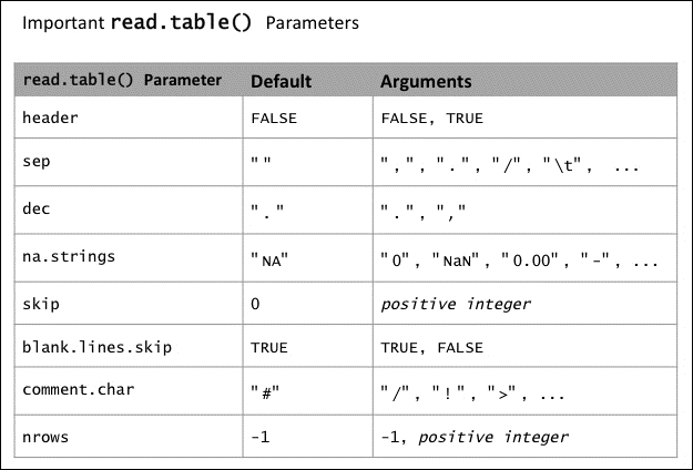
It might happen that we obtain our data in the so-called long format, which contains multiple rows for each individual category, individual or item.
To give you a better understanding, an excerpt from the runners.csv data set in long format is shown as follows:
  Year       Runner  Time
1 2007   Usain_Bolt 10.03
2 2008   Usain_Bolt  9.72
3 2009   Usain_Bolt  9.58
4 2010   Usain_Bolt  9.82
5 2011   Usain_Bolt  9.76
6 2012   Usain_Bolt  9.63
7 2004 Asafa_Powell 10.02
8 2005 Asafa_Powell  9.87
...
Do you see the problem here? The Runner column in the middle of the data table consists of character strings, which are incompatible with the numeric matrix format that is required by our heat map functions.
Fortunately, it is quite easy to convert data from long to wide format—we can simply use the cross tabulation function xtabs():
runners_wide <- xtabs(formula = Time ~ Runner + Year, data =
runners_long))

              Year
Runner          2004  2005  2007  2008  2009  2010  2011  2012
  Asafa_Powell 10.02  9.87  0.00  0.00  0.00  0.00  0.00  0.00
  Usain_Bolt    0.00  0.00 10.03  9.72  9.58  9.82  9.76  9.63
Tip
If you just want to transpose your data, that is, switch columns and rows, you can use the t() function:
transposed_data <- t(my_data)
Several countries use a decimal comma instead of a decimal point. Chances are high that you want to analyze a data set that comes from one of those countries. In this case you just have to provide an additional argument for the dec parameter:
my_data <- read.table("data.txt", dec=",")There is always room for improvements. Now that we have seen how to create impressive heat maps from various different data file types, it is time to add some extraordinary style.
To ensure that our heat maps look good in any situation, we will make use of different color palettes in this recipe, and we will even learn how to create our own.
Further, we will add some more extras to our heat maps including visual aids such as cell note labels, which will make them even more useful and accessible as a tool for visual data analysis.
The following image shows a heat map with cell notes and an alternative color palette created from the arabidopsis_genes.csv data set:

Download the 5644OS_03_01.r script and the Arabidopsis_genes.csv data set from your account at http://www.packtpub.com and save it to your hard drive.
I recommend that you save the script and data file to the same folder on your hard drive. If you execute the script from a different location to the data file, you will have to change the current R working directory accordingly.
Please read the Getting ready section of the Reading data from different data formats recipe for more information on how to change the working directory of your current R session.
For more information on how to view the current working directory of your current R session and an explanation on how to run scripts in R, please read the Getting ready section of the Creating your first heat map recipe.
The script will check automatically if any additional packages need to be installed in R. You can find more information about the installation of packages in the Getting ready section of the Creating your first heat map recipe.
Execute the following code in R via the 5644OS_03_01.r script and take a look at the PDF file custom_heatmaps.pdf that will be created in the current working directory:
### loading packages
if (!require("gplots")) {
install.packages("gplots", dependencies = TRUE)
library(RColorBrewer)
}
if (!require("RColorBrewer")) {
install.packages("RColorBrewer", dependencies = TRUE)
library(RColorBrewer)
}

### reading in data
gene_data <- read.csv("arabidopsis_genes.csv")
row_names <- gene_data[,1]
gene_data <- data.matrix(gene_data[,2:ncol(gene_data)])
rownames(gene_data) <- row_names
### setting heatmap.2() default parameters
heat2 <- function(...) heatmap.2(gene_data,
  tracecol = "black",
  dendrogram = "column",
  Rowv = NA,
  trace = "none",
  margins = c(8,10),
  density.info = "density", ...)

pdf("custom_heatmaps.pdf")

### 1) customizing colors
# 1.1) in-built color palettes
heat2(col = terrain.colors(n = 1000),
  main = "1.1) Terrain Colors")

# 1.2) RColorBrewer palettes
heat2(col = brewer.pal(n = 9, "YlOrRd"),
  main = "1.2) Brewer Palette")

# 1.3) creating own color palettes
my_colors <- c(y1 = "#F7F7D0",
  y2 = "#FCFC3A",
  y3 = "#D4D40D",
  b1 = "#40EDEA",
  b2 = "#18B3F0",
  b3 = "#186BF0",
  r1 = "#FA8E8E",
  r2 = "#F26666",
  r1 = "#C70404")
heat2(col = my_colors,
  main = "1.3) Own Color Palette")
my_palette <- colorRampPalette(c("blue", "yellow", "red"))(n = 1000)
heat2(col = my_palette, main = "1.3) ColorRampPalette")

# 1.4) gray scale
heat2(col = gray(level = (0:100)/100),
  main ="1.4) Gray Scale")

### 2) adding cell notes
fold_change <- 2^gene_data
rounded_fold_changes <- round(rounded_fold_changes, 2)
heat2(cellnote = rounded,
  notecex = 0.5,
  notecol = "black",
  col = my_palette,
  main = "2) Cell Notes")

### 3) adding column side colors
heat2(ColSideColors = c("red", "gray", "red",
rep("green",13)),
  main = "3) ColSideColors")

dev.off()Primarily, we will be using the already familiar functions from the previous recipes, read.csv() and heatmap.2(), to read in data into R and construct our heat maps. In this recipe, however, we will focus on advanced features to enhance our heat maps, such as customizing color and other visual elements:
Inspecting the arabidopsis_genes.csv data set: The
arabidopsis_genes.csvfile contains a compilation of gene expression data from the model plantArabidopsis thaliana. I obtained the freely available data of 16 different genes as log 2 ratios of target and reference gene from the Arabidopsis eFP Browser (http://bar.utoronto.ca/efp_arabidopsis/). For each gene, expression data of 47 different areas of the plant is available in this data file.Reading the data and converting it into a numeric matrix: As we already know from the previous recipe, we have to convert the data table into a numeric matrix first before we can construct our heat maps:
gene_data <- read.csv("arabidopsis_genes.csv")
row_names <- gene_data[,1]
gene_data <- data.matrix(gene_data[,2:ncol(gene_data)])
rownames(gene_data) <- row_names
Creating a customized heatmap.2() function: To reduce typing efforts, we are defining our own version of the
heatmap.2()function now, where we will include some arguments that we are planning to keep using throughout this recipe:heat2 <- function(...) heatmap.2(gene_data, tracecol = "black", dendrogram = "column", Rowv = NA, trace = "none", margins = c(8,10), density.info = "density", ...)
So, each time we call our newly defined
heat2()function, it will behave similar to theheatmap.2()function, except for the additional arguments that we will pass along. We also include a new argument,black, for thetracecolparameter, to better distinguish the density plot in the color key from the background.The built-in color palettes: In the previous recipes, we used the default color palette of
heatmap.2(), heat.colors, which represents a color transition from yellow to red. There are four more color palettes available in the base R that we could use instead of theheat.colorspalette:rainbow,terrain.colors,topo.colors, andcm.colors.So let us make use of the
terrain.colorscolor palette now, which will give us a nice color transition from green over yellow to rose:heat2(col = terrain.colors(n = 1000), main = "1.1) Terrain Colors")
If you recall the heat maps that we created in the previous two recipes, you might have noticed that the transition between the colors in the color key was not really smooth, but rather abrupt. The five color palettes mentioned previously allow us to define the number of different color shades that we can use. Therefore every number for the parameter
nthat is larger than the default value 12 will add additional colors, which will make the transition smoother. A value of 1000 for thenparameter should be more than sufficient to make the transition between the individual colors indistinguishable to the human eye.Note
You can find more information about the positioning of the color key in the There's more... section of the Creating your first heat map in R recipe.
The following image shows a side-by-side comparison of the
heat.colorsandterrain.colorscolor palettes using a different number of color shades:
Tip
Further, it is also possible to reverse the direction of the color transition. For example, if we want to have a
heat.colortransition from yellow to red instead of red to yellow in our heat map, we could simply define a reverse function:rev_heat.colors <- function(x) rev(heat.colors(x)) heat2(col = rev_heat.colors(500))
RColorBrewer palettes: A lot of color palettes are available from the
RColorBrewerpackage. To see how they look like, you can typedisplay.brewer.all()into the R command-line after loading theRColorBrewerpackage. However, in contrast to the dynamic range color palettes that we have seen previously, theRColorBrewerpalettes have a distinct number of different colors. So to select all nine colors from theYlOrRdpalette, a gradient from yellow to red, we use the following command:heat2(col = brewer.pal(n = 9, "YlOrRd"), main = "1.2) Brewer Palette")
The following image gives you a good overview of all the different color palettes that are available from the
RColorBrewerpackage:
Creating our own color palettes: Next, we will see how we can create our own color palettes. A whole bunch of different colors are already defined in R. An overview of those colors can be seen by typing
colors()into the command line of R.The most convenient way to assign new colors to a color palette is using hex colors (hexadecimal colors). Many different online tools are freely available that allow us to obtain the necessary hex codes. A great example is color picker (http://www.colorpicker.com), which allows us to choose from a rich color table and provides us with the corresponding hex codes.
Once we gather all the hexadecimal codes for the colors that we want to use for our color palette, we can assign them to a variable as we have done before with the explicit color names:
my_colors <- c(y1 = "#F7F7D0",
  y2 = "#FCFC3A",
  y3 = "#D4D40D",
  b1 = "#40EDEA",
  b2 = "#18B3F0",
  b3 = "#186BF0",
  r1 = "#FA8E8E",
  r2 = "#F26666",
  r1 = "#C70404")
heat2(col = my_colors,
  main = "1.3) Own Color Palette")
This is a very handy approach for creating a color key with very distinct colors. However, the downside of this method is that we have to provide a lot of different colors if we want to create a smooth color gradient; we have used 1000 different colors for the
terrain.color()palette to get a smooth transition in the color key!Using colorRampPalette for smoother color gradients: A convenient approach to create a smoother color gradient is to use the
colorRampPalette()function, so we don't have to insert all the different colors manually. The function takes a vector of different colors as an argument. Here, we provide three colors:bluefor the lower end of the color key,yellowfor the middle range, andredfor the higher end. As we did it for the in-built color palettes, such asheat.color, we assign the value 1000 to thenparameter:my_palette <- colorRampPalette(c("blue", "yellow", "red"))(n = 1000) heat2(col = my_palette, main = "1.3) ColorRampPalette")Grayscales: It might happen that the medium or device that we use to display our heat maps does not support colors. Under these circumstances, we can use the
graypalette to create a heat map that is optimized for those conditions.The level parameter of the
gray()function takes a vector with values between 0 and 1 as an argument, where 0 represents black and 1 represents white, respectively. For a smooth gradient, we use a vector with 100 equally spaced shades of gray ranging from 0 to 1.heat2(col = gray(level = (0:200)/200), main ="1.4) Gray Scale")
Tip
We can make use of the same color palettes for the
levelplot()function too. It works in a similar way as it did for theheatmap.2()function that we are using in this recipe. However, inside thelevelplot()function call, we must usecol.regionsinstead of the simplecol, so that we can include a color palette argument.Adding cell notes to our heat map: Sometimes, we want to show a data set along with our heat map. A neat way is to use so-called cell notes to display data values inside the individual heat map cells. The underlying data matrix for the cell notes does not necessarily have to be the same numeric matrix we used to construct our heat map, as long as it has the same number of rows and columns.
As we recall, the data we read from
arabidopsis_genes.csvresembles log 2 ratios of sample and reference gene expression levels. Let us calculate the fold changes of the gene expression levels now and display them—rounded to two digits after the decimal point—as cell notes on our heat map:fold_change <- 2^gene_data rounded_fold_changes <- round(fold_change, 2) heat2(cellnote = rounded_fold_changes, notecex = 0.5, notecol = "black", col = rev_heat.colors, main = "Cell Notes")
The
notecexparameter controls the size of the cell notes. Its default size is 1, and every argument between 0 and 1 will make the font smaller, whereas values larger than 1 will make the font larger. Here, we decreased the font size of the cell notes by 50 percent to fit it into the cell boundaries. Also, we want to display the cell notes in black to have a nice contrast to the colored background; this is controlled by thenotecolparameter.Row and column side colors: Another approach to pronounce certain regions, that is, rows or columns on the heat map is to make use of row and column side colors. The
ColSideColorsargument will place a colored box between the dendrogram and heat map that can be used to annotate certain columns. We pass our vector with colors toColSideColors, where its length must be equal to the number of columns of the heat map. Here, we want to color the first and third columnred, the second onegray, and all the remaining 13 columnsgreen:heat2(ColSideColors = c("red", "gray", "red", rep("green", 13)), main = "ColSideColors")You can see in the following image how the column side colors look like when we include the
ColSideColorsargument as shown previously:
Attentive readers may have noticed that the order of colors in the column color box slightly differs from the order of colors we passed as a vector to
ColSideColors. We seeredtwo times next to each other, followed by a green and a gray box. This is due to the fact that the columns of our heat map have been reordered by the hierarchical clustering algorithm.
We have constructed many heat maps so far, including popular applications like gene expression and stock analyses. There are many more fields and disciplines where heat maps are an invaluable tool for intuitive and data analyses and representations. In this recipe, we will learn how to construct the closely related choropleth maps and contour plots, which are very useful to visualize geographic data.
Although choropleth maps get a huge boost of popularity during the election years for sure, there are many more widely used applications, such as population census, disease factors by regions, or income comparisons. Basically, choropleth maps are the representation of choice whenever you want to show and compare statistics between geographic regions on a cartographic map. Those geographic regions are usually separated by county, state, or even country borders.
The following choropleth map shows the annual average temperatures of the US from 1971-2001:

While contour plots are represented less in the media, they are extensively used by engineers and scientists. Common examples are the 2D projections of 3D surfaces, such as geographic terrains. However, contour plots have many more applications and can be used to plot gradients, depths, thicknesses, and other distributions as 2D projections.
Imagine a mountain from a bird's-eye perspective, where the contour lines delineate the different levels of altitude. The regions that are enclosed by the contour lines can be filled with colors or color gradients to better distinguish the different heights.
In the second part of this recipe, we will apply this concept by creating a contour plot of a volcano.
Download the 5644OS_04_01.r script and the data files usa_temp.csv and south_am_pop.csv from your account at http://www.packtpub.com.
I recommend that you download and save the script and data file to the same folder on your hard drive. If you execute the script from a different location to the data file, you have to change the current R working directory accordingly.
Please read the Getting ready section of the Reading data from different file formats recipe for more information on how to change the working directory of your current R session.
For more information on how to view the current working directory of your current R session and an explanation on how to run scripts in R, please read the Getting ready section of the Creating your first heat map in R recipe.
The script will check automatically if any additional packages need to be installed in R. You can find more information about the installation of packages in the Getting ready section of the Creating your first heat map in R recipe.
Execute the following code in R invoking the script 5644OS_04_01.r and take a look at the PDF files chloropleths_maps.pdf and contour_plot.pdf that will be created in the current working directory:
### loading packages

if (!require("ggplot2")) {
install.packages("ggplot2", dependencies = TRUE)
library(ggplot2)
}
if (!require("maps")) {
install.packages("maps", dependencies = TRUE)
library(maps)
}
if (!require("mapdata")) {
install.packages("mapdata", dependencies = TRUE)
library(mapdata)
}

pdf("chloropleth_maps.pdf", height = 7,width = 10)

### 1) average temperature USA

# 1.1) reading in and processing data
usa_map <- map_data(map = "state")

usa_temp <- read.csv("usa_temp.csv", comment.char = "#")

usa_data <- merge(usa_temp, usa_map,
by.x ="state", by.y =  "region") # case sensitive

usa_sorted <- usa_data[order(usa_data["order"]),]

# 1.2) plotting USA chloropleth maps
usa_map1 <- ggplot(data = usa_sorted) +
  geom_polygon(aes(x = long, y = lat,
group = group, fill = fahrenheit)) +
  ggtitle("USA Map 1")
print(usa_map1)

usa_map2 <- usa_map1 + coord_map("polyconic") +
  ggtitle("USA Map 2 - polyconic")
print(usa_map2)

usa_map3 <- usa_map2 +
  geom_path(aes(x = long, y = lat, group = group),
color = "black") +
  ggtitle("USA Map 3 - black contours")
print(usa_map3)

usa_map4 <- usa_map3 +
  scale_fill_gradient(low = "yellow", high = "red") +
  ggtitle("USA Map 4 - gradient 1")
print(usa_map4)

usa_map5 <- usa_map3 +
scale_fill_gradient2(low = "steelblue", mid = "yellow",
  high = "red",  midpoint = colMeans(usa_sorted["fahrenheit"])) +
  ggtitle("USA Map 5 - gradient 2")
print(usa_map5)


### 2) South American population count

# 2.1) reading in and processing data
south_am_map <- map_data("worldHires",
region = c("Argentina", "Bolivia", "Brazil",
  "Chile", "Colombia", "Ecuador", "Falkland Islands",
"French Guiana", "Guyana", "Paraguay", "Peru",
"Suriname", "Uruguay", "Venezuela"))

south_am_pop <- read.csv("south_america_pop.csv",
comment.char = "#")

south_am_data <- merge(south_am_pop, south_am_map,  by.x = "country", by.y = "region")

south_am_sorted <- south_am_data[order(
south_am_data["order"]),]

# 2.2) creating chloropleth maps
south_am_map1 <- ggplot(data = south_am_sorted) +
  geom_polygon(aes(x = long, y = lat,
group = group, fill = population)) +
  geom_path(aes(x = long, y = lat, group = group),
color = "black") +
  coord_map("polyconic") +
scale_fill_gradient(low = "lightyellow",
  high = "red", guide = "legend")
print(south_am_map1)

south_am_map2 = south_am_map1 +
  theme(panel.background = element_blank(),
  axis.text = element_blank(),
  axis.title = element_blank(),
  axis.ticks = element_blank())
print(south_am_map2)

dev.off()


### 3) Volcano contour plot

pdf("contour_plot.pdf", height = 7,width = 10)

data(volcano)
image.plot(volcano)
contour(volcano, add = TRUE)

dev.off()In this recipe we are using three new packages that we have not encountered before. One of them is Hadley Wickham's ggplot2 package, which is a relatively new and powerful plotting system. It has become a very popular alternative to R's basic plotting functions, because it provides both great versatility and a uniform syntax. The complete documentation can be found at http://docs.ggplot2.org/current/.
The other two packages, maps and mapdata, contain the data for our maps that we are going to use as templates for our choropleth maps. You can find a table with all the maps that are available in both maps and mapdata at the end of this section.
The difference between those two map packages is that they contain different maps with different levels of detail.
The following image compares the levels of detail between the map of Japan extracted from the world map of maps, the high resolution world map of mapdata, and the single high resolution mapdata map of Japan.

Annual average temperatures of the United States: The first data file,
usa_temp.csv, contains the annual average temperatures of the USA from 1971 to 2001. The data was made available by the National Climatic Data Center of the United States, National Oceanic and Atmospheric Administration, and has been compiled by current results.Reading in map and temperature data: First, we use the
read.csv()function, known from the Reading data from different file formats recipe, to read our data and assign it to the variableusa_temp. Next, we use themap_data()function from theggplot2package to read in the United States map frommapsas a data frame.Note that in contrast to the heat map functions that we have been using in the previous recipes, the
gplot()function takes a data frame as input instead of data in a numerical matrix format. And as we remember from the Reading data from different file formats recipe, data that we read viaread.csv()is converted into a data frame automatically.Merging and sorting the data frames: Now we will merge the map and temperature data:
usa_data <- merge(usa_temp, usa_map,
by.x = "state", by.y = "region")
usa_sorted <- usa_data[order(usa_data["order"]),]
The following flowchart illustrates this process and shows how the data looks like before and after the merging and conversion:

As we can see in the preceding chart, the map data in the
usa_mapdata frame contains multiple longitudinal (long) and latitudinal (lat) coordinates for each state in the column labeled with region. The numbers in the order column specify the order in which the single dots are connected when we draw the map as a polygon.After we merged both map data and temperature data, we can see that the values in the order column have been shuffled. This would result in quite a mess when we wanted to construct the choropleth map from this data frame. Therefore, we use the
order()function to restore the original order before we merged the data sets.Constructing our first choropleth map: Now that we have our data ready in a nice format, we can proceed to the main plotting functions to create our first choropleth map:
usa_map1 <- ggplot(data = usa_sorted) +
  geom_polygon(aes(x = long, y = lat, group = group,
fill = fahrenheit)) +
  ggtitle("USA Map 1")
Basically, how the
ggplot2package works is that we have to create our plots incrementally. First, we use theggplot()function to assign our data to a new plot object, and then we can add further layers to it. The basic shape ofggplot2plots is determined by so-calledgeoms, or geometric objects. Here, we are usinggeom_polygon(), which will connect our coordinate points to a map. Theaes()function nested inside is there for aesthetics and defines the visual properties of the geoms. We provide the variablefahrenheitas an argument for thefillparameter so that we can shade the areas of our choropleth maps according to the Fahrenheit temperatures in our data set.Note
Similar to the plotting functions of the
latticepackage, which we have used in the previous recipes,ggplot()creates plot graphics as objects. Therefore, we have to use theprint()function on the objects to save them as image files. Note that in an interactive R session, you can omit theprint()function and just need to type the name of the graphics object, for example,usa_map1, to create the map on the screen.Customizing choropleth maps: One of the advantages of
ggplot2is that we do not have to retype the whole heat map function with its arguments each time we want to modify the map, since we store our plots as objects. So if we want to convert our map into a polyconic projection, we can simple reuse our old graphic object and make a small modification:usa_map2 <- usa_map1 + coord_map("polyconic") + ggtitle("USA Map 2 - polyconic")Now, let us add another geometric object so that the state borders will be drawn as black lines:
usa_map3 <- usa_map2 +
  geom_path(aes(x = long, y = lat, group = group),
color = "black") +
  ggtitle("USA Map 3 - black contours")
Since we are showing temperatures on our United States map, it would be more appropriate to replace the blue default color gradient by a color gradient from yellow to red. We can modify the color gradient by adding the
scale_fill_gradient()function with two color arguments for our previous graphic object:usa_map4 <- usa_map3 + scale_fill_gradient(low = "yellow", high = "red") + ggtitle("USA Map 4 - gradient 1")Note
Instead of discrete color names, we can also use the hex color codes that we have seen in the Customizing heat maps recipe.
If we want to add a third color to our gradient, we can use the
scale_fill_gradient2()function instead. For this function, we need an additional argument that specifies the position (mid-point) of the second color. We can simply use the temperature mean such as a midpoint measure:usa_map5 <- usa_map3 + scale_fill_gradient2(low = "steelblue", mid = "yellow", high = "red", midpoint = colMeans(usa_sorted["fahrenheit"])) + ggtitle("USA Map 5 - gradient 2")Extracting regions from the world map: Now that we have seen how we can use
ggplot2to create simple choropleth maps, let us explore some advanced features.As you can see in the table at the end of this section, the number of maps in the
mapsandmapdatapackages is quite limited. However, we are able to extract individual countries from the world map.Our second data set,
south_am_pop.csv, contains recent population counts of all the countries of South America. Unfortunately, neithermapsnormapdatacontains a map of this continent, so we extract all the South American countries from the high resolution world map ofmapdata.south_am_map <- map_data("worldHires", region = c("Argentina", "Bolivia", "Brazil","Chile", "Colombia", "Ecuador", "Falkland Islands", "French Guiana", "Guyana", "Paraguay", "Peru", "Suriname", "Uruguay", "Venezuela"))After we read the data from
south_am_pop.csvand merge and sort the data frames, we can create the choropleth map:south_am_map1 <- ggplot(data = south_am_sorted) + geom_polygon(aes(x = long, y = lat, group = group, fill = population)) + geom_path(aes(x = long, y = lat, group = group), color = "black") + coord_map("polyconic") + scale_fill_gradient(low = "lightyellow", high = "red", guide = "legend")As we have seen it for the USA map before, we use the
ggplot()function to create a new plot object andgeom_polygonto construct the map graphic. With the color parameter ingeom_path, we add a black border around the individual countries, and with thecoord_mapfunction, we convert our map into a polyconic projection. We also change the color gradient from light-yellow to red and make the legend categorical by providing the argumentlegendfor theguideparameter.By default,
ggplot2creates plots on a gray background with a white grid. To get a nicer layout, let us create a map on a clean, white background and remove axes tick marks, labels, and titles altogether:south_am_map2 = south_am_map1 + theme(panel.background = element_blank(), axis.text = element_blank(), axis.title = element_blank(), axis.ticks = element_blank())
In the following image, you can see the resulting choropleth map of South America's population count on a white background:

Volcano contour plot: As mentioned in the introduction of this recipe, we want to take a look at another type of map representation, contour plots:
data(volcano)
image.plot(volcano)
Using the
image.plot()function from thefieldslibrary, we construct a color grid with the topographical data of a volcano from R'sdatapackage. We could also use theimage()base function in R, but theimage.plot()function has some nice additional features, such as placing a legend for the color grid to the right of the plot.After we created the underlying color grid, we use the
contour()function to place the contour lines on top of the color grid.contour(volcano, add = TRUE)
The following image shows the final contour plot that we have created from the
volcanodata set:
The following table summarizes the different maps that are included in the maps and mapdata packages:
|
Package |
Database |
Description |
|---|---|---|
|
|
|
Map of the United States |
|
|
Map of the US Counties | |
|
|
Map of the states in the US | |
|
|
Map of Italy | |
|
|
Map of France | |
|
|
Map of New Zealand | |
|
|
World map | |
|
|
Pacific centric world map | |
|
|
|
High resolution map of China |
|
|
High resolution map of Japan | |
|
|
High resolution map of New Zealand | |
|
|
High resolution world map | |
|
|
High resolution Pacific centric world map |
After the exploratory stage of our data analyses, it is likely that we want to present our graphical heat map representations to an audience. This can be via presentation software over a projector, embedded in a website, a poster printout, or an image in a journal article. In this recipe, we will learn about the different file formats for image export so that we can choose whatever is most suited for the purpose.
Download the 5644OS_05_01.r script from your account at http://www.packtpub.com and save it to your hard drive.
For an explanation of how to run scripts in R, please read the Getting ready section of the Creating your first heat map in R recipe.
The script will check automatically if any additional packages need to be installed in R. You can find more information about the installation of packages in the Getting ready section of the Creating your first heat map in R recipe.
Execute the 5644OS_05_01.r script in R and compare the different image files to other that which were written to the current working directory:
if (!require("gplots")) {
install.packages("gplots", dependencies = TRUE)
library(gplots)
}
if (!require("RColorBrewer")) {
install.packages("RColorBrewer", dependencies = TRUE)
library(gplots)
}

### converting data
data(co2)
rowcolNames <- list(as.character(1959:1997), month.abb)
co2_data <- matrix(co2,
  ncol = 12,
  byrow = TRUE,
  dimnames = rowcolNames)

heat2 <- function(...)
  heatmap.2(co2_data,
trace = "none",
  density.info = "none",
  dendrogram = "none",
  Colv = FALSE,
  Rowv = FALSE,
  col = colorRampPalette(c("blue", "yellow", "red")),
(n = 100),
  margin = c(5,8),
  lhei = c(0.25,1.25),
   ...)


png("1_PNG_default.png")
heat2(main = "PNG default")
dev.off()

png("2_PNG_highres.png",
  width = 5*300,
  height = 5*300,
  res = 300,
  pointsize = 8)
heat2(main = "PNG High Resolution")
dev.off()

jpeg("3_JPEG_highres.png",
  width = 5*300,
  height = 5*300,
  res = 300,
  pointsize = 8)
heat2(main = "JPEG default")
dev.off()

bmp("4_BMP_default.bmp",
width = 5*300,
  height = 5*300,
  res = 300,
  pointsize = 8)
heat2(main = "BMP default")
dev.off()

pdf("5_PDF_default.pdf",
  width = 5,
  height = 5,
  pointsize = 8)
heat2(main = "PDF default")
dev.off()

svg("6_SVG_default.svg",
  width = 5,
  height = 5,
  pointsize = 8)
heat2(main = "SVG default")
dev.off()

svg("7_PostScript_default.ps",
  width = 5,
  height = 5,
  pointsize = 8)
heat2(main = "PostScript default")
dev.off()

png("8_PNG_transp.png",
  width = 5*300,
  height = 5*300,
  res = 300,
  pointsize = 8,
  bg = "transparent")
heat2(main = "PNG Transparent Background")
dev.off()

pdf("9_PDF_mono.pdf",
  family = "Courier",
  paper = "USr")
heat2(main = "PDF Monospace Font")
dev.off()There are two major classes of image formats that we can choose from when we want to save our plots as a file: vector graphics and raster graphics. Raster graphics, also known as bitmaps, comprise popular image formats such as PNG, BMP, and JPEG. These file formats store information of each individual pixel, thus the quality of the image heavily depends on the resolution, that is pixel per inch (ppi). However, high-resolution images come with the additional cost of a large file size. Nowadays, we usually do not have to worry about limited storage space of a hard drive anymore, but large images are not suitable for the Web, and in the worst case, they can also have a negative impact on the responsiveness of your presentation software.
One of the nice features of R is to save plots as vector graphics, such as SVG, PDF, and PostScript. While all three vector graphic formats offer high quality graphics, each has its own area of application. SVG can be easily embedded into HTML code and is the format of choice for displaying your plots on the Web. PostScript is the desired format when you want to send articles to a journal, where as PDF is well known for its great compatibility with a wide range of software including PDF readers.
Note
If you are interested to see how the SVG and PostScript code looks like, I encourage you to open the SVG and PostScript files that were created by this script in your favorite plain text editor (for example, TextEdit on Mac OS X or Notepad on Windows).
Rather than storing information of each pixel in a grid, vector graphic files contain instructions for geometrical shapes that are used by the visualization software to render the image. This allows us to zoom in to the image without any loss of quality. Another advantage of vector images is that they generally have a much smaller file size than raster graphics. The only exception is when your plot is heavily over-plotted, so that a lot of instructions have to be saved in the vector graphic file. Generally, vector graphics are great to store image files on your computer, however images can only be rendered by certain software and are converted to raster graphics for printing.
Images from SVG files, for example, can be rendered in every modern web browser, and since they are saved as Extensible Markup Language (XML) code, they can be easily embedded into HTML, which makes SVG the format of choice if you want to display your graphics on a website.
If you do not consider to embed your graphic in a website or send your graphics off to a journal for professional publication, I recommend using the PDF format, since it has great compatibility with other software and offers best quality output in reasonably small file sizes.
You will find an overview table of the different graphic devices that are available in R at the end of this section.
Now let us dive in and create different image files from our heat maps:
Reading data: For this recipe, we will use the
co2data set from thedatapackage in R. Thisco2data set is a time-series that consists of 468 monthly measurements of carbon dioxide (CO2) concentrations in parts per million (ppm) from 1959 to 1997.We know from the Creating your first heat map in R recipe how to convert data from a time-series format into a numeric matrix, which is the only format that is compatible with the
heatmap2.()function.Setting up our own heatmap.2() function: Like we did in the Customizing heat maps recipe, we create our own derivative of the
heatmap.2()function with some default arguments that we want to use for all our heat maps in this recipe to avoid repetitive typing efforts:heat2 <- function(...) heatmap.2(co2_data, trace = "none", density.info = "none", dendrogram = "none", Colv = FALSE, Rowv = FALSE, col = colorRampPalette(c("blue", "yellow", "red")), (n = 100), margin = c(5,8), lhei = c(0.25,1.25), ...)We use a new parameter
lheithat we have not encountered so far. With this parameter, we can control the height of the different plot elements. The arguments we provide here will make our legend thinner.Before we proceed with the graphic devices, let us briefly take a look at the general paradigm of creating image files in R, which consists of three basic steps as follows:
Opening a graphics device.
Calling a plotting function.
Closing the graphics device.
Creating image files: First, let us create a PNG file using the
png()function with its default parameters:png("1_PNG_default.png") heat2(main = "PNG default") dev.off()The first argument that the graphics device takes is the name of the output file. After we open the graphics device, we create the heat map using our
heat2()function, and lastly, we close the graphic device with thedev.off()function.Note
Very often, the main reason why we cannot open a PDF file that we created in R is that we forgot to close the PDF graphics device after we finished plotting!
Because the resolution of the PNG image is very low (75 ppi) when we use
png()with its default parameters, we create another PNG file with a resolution of 300 ppi, which should provide reasonable quality for a print out on a letter-sized piece of paper. The default size ofpng()is measured in pixels, and here we are creating a 5 x 5 inches output by taking the number of pixels per inch and multiplying it by 5 inches. Further, we decrease the text size slightly from 12 to 8 bp (1 bp equals 1/72 inches) in thepointsizeparameter:png("2_PNG_highres.png", width = 5*300, height = 5*300, res = 300, pointsize = 8) heat2(main = "PNG High Resolution") dev.off()Next, we create a JPEG, BMB, SVG, and PDF file with the same parameters so we can compare them to each other. Note that the height and width of the SVG and PDF files are measured in inches.
Tip
You do not have to download special software to view the SVG file. Simply open it in your favorite web browser.
When we compare those different image files to each other, we see that they all show the same heat map, but if we zoom in, we notice that the quality differs tremendously.
Note
The difference between JPEG, PNG, and BMP is that BMP stores the image file without compression, PNG with lossless compression, and JPEG with a lossy compression, respectively.
In the following image, you can see the tremendous difference in the image quality between the different file formats. This is something you should consider, especially if you are preparing your graphics for an on-screen presentation.

When we view the BMP, PNG, and JPEG images, the quality seems to be quite reasonable. But as soon as we zoom in on the image, we can barely read the text of the PNG file with the 75 ppi default. In contrast to the 300 ppi BMP, PNG and JPEG files do not have any jagged edges in the PDF and SVG files, no matter how far we zoom in.
More options: So if we have the choice between the different raster graphics formats, I recommend using PNG, since the files are way smaller then BMP files due to the lossless compression. Using JPEG over PNG should only be considered if file size really matters to you.
In contrast to JPEG files, BMP and PNG files support transparent backgrounds. This is particularly useful if we want to place the heat map on a patterned background, on a poster, or a presentation slide for example. This can be specified by providing the argument
transparentfor thebg(background) parameter.png("test/8_PNG_transp.png", width = 5*300, height = 5*300, res = 300, pointsize = 8, bg = "transparent") heat2(main = "PNG Transparent Background") dev.off()The PDF format has the further advantage wherein we can choose a different font family if we like. We can choose from
AvantGarde,Bookman,Courier,Helvetica,Helvetica-Narrow,NewCenturySchoolbook,Palatino, andTimes. Also, we can specify the paper format, such asa4for DIN A4,letterfor the American Standard Letter format, ora4randUSrfor the respective rotated landscape formats:pdf("9_PDF_mono.pdf", family = "Courier", paper = "USr") heat2(main = "PDF Monospace Font") dev.off()
The following table shows the different graphic devices that are available in R:
|
On-screen devices | ||
|---|---|---|
|
|
X Window System (X11), default in Unix/Linux | |
|
|
Quartz, default on Mac OS X | |
|
|
Default in Microsoft Windows | |
|
Raster graphics devices | ||
|
|
Joint Photographics Experts Group (JPEG) image file with lossy compression | |
|
|
Portable Network Graphics (PNG) image file with lossless compression | |
|
|
Bitmap (BMP) image file with no compression | |
|
|
Tagged Image File Format (TIFF) with optional compression | |
|
Vector image devices | ||
|
|
Adobe's popular Portable Documents Format (PDF) | |
|
|
XML-based Scalable Vector Graphics (SVG) format | |
|
|
PostScript (PS) format | |
|
Other | ||
|
|
File format for Xfig vector graphics editor | |
|
|
Graphics format for LaTex import | |
We learned how to create heat maps, customize them, and save them as image files. Now, it is time to go a step further and add some interactivity for displaying them on the Web. In this recipe, we will learn how to manipulate heat map-containing SVG files to add a nice hover effect and fade-in tool tips using CSS. Further, we will see how to embed our heat map in HTML files, and make use of JavaScript to add further interactivity.
The following screenshot was captured from a Safari web browser after applying the hover effect to our SVG image. Notice the highlighted cell under the mouse pointer:

Download the 5644OS_06_01.r script and a version of the HeatModSVG program for your operating system from your account at http://www.packtpub.com. It is recommended, but not mandatory, to download the latest version of the svgpan JavaScript library from, by Andrea Leofreddi, https://code.google.com/p/svgpan/downloads/list.
Further, I recommend that you save all files to the same folder on your computer.
For an explanation on how to run scripts in R, please read the Getting ready section of the Creating your first heat map in R recipe.
The script will check automatically if any additional packages need to be installed in R. You can find more information about the installation of packages in the Getting ready section of the Creating your first heat map in R recipe.
Run the 5644OS_06_01.r script and then launch HeatModSVG (see the instructions below the script contents):
if (!require("gplots")) {
install.packages("gplots", dependencies = TRUE)
library(gplots)
}
if (!require("MASS")) {
install.packages("MASS", dependencies = TRUE)
library(MASS)
}

# Writing out matrix file
data(mtcars)
car_data <- mtcars[,1:7]
write.matrix(car_data, "car_data.csv", sep = ",")
norm_cars <- scale(car_data) # automatically matrix

# Creating heat map
svg("car_heatmap.svg")
heatmap.2(norm_cars,
  density.info = "none",
  trace = "none",
  dendrogram = "none",
  Rowv = FALSE,
  Colv = FALSE,
  margin = c(5,10))

dev.off()
After you have ran the R script, make sure that two new files were created in the current working directory: car_heatmap.svg and car_data.csv. Now, double-click on the HeatModSVG program and a new window should appear on your screen. The lines that require your input are highlighted in the sample session as follows. You can just take over the inputs of this sample session, but make sure that you type in the correct location of the car_heatmap.svg heat map file and the car_data.csv data file.
#####################################
##                                 ##
## HeatModSVG v 1.06 (04/04/2013)  ##
##                                 ##
## Written by Sebastian Raschka    ##
##                                 ##
#####################################


===============
=== Options ===
===============

-- Add Tool Tips: t
-- Add Zoom and Panning: z
-- Add Both: tz
-- Quit: q

Enter your choice: tz
Current working directory: /Users/sebastian
SVG file: /Users/sebastian/Desktop/car_heatmap.svg
Matrix file: /Users/sebastian/Desktop/car_data.csv


MATRIX SPECIFICATION
--------------------

Comment character: #

Separator
-- "w" for whitespace
-- "t" for tab
-- "c" for comma
: c
Column names? (y/n): y
Row names? (y/n): n

Read in data from car_data.csv:


21.000  6.000   160.000 110.000 3.900   2.620   16.460
21.000  6.000   160.000 110.000 3.900   2.875   17.020
22.800  4.000   108.000 93.000  3.850   2.320   18.610
...
21.400  4.000   121.000 109.000 4.110   2.780   18.600

Add a label to tool tips? (y/n): n

... inserted CSS <style> tag after line 2

... inserted link to svgPan.js after CSS <style> tag

... added viewport ID in line 286

... IDs and tool tip <title> tags were inserted in lines 289 to 512

Saving . . . . . . . .

==> Created /Users/sebastian/Desktop/NEW_car_heatmap.svg
To add interactivity to our heat maps, we will make use of R's capability to store the created images in the Scalable Vector Graphics format. The content of SVG files is saved as plain text and can be viewed with any text editor. If we open an SVG file in a text editor, we will see XML code that contains the information for our web browser to render the image.
The advantage of this XML code is that we can manipulate it using HTML, CSS, and JavaScript.
Creating a heat map SVG file in R: First, we create our heat map by running the R script
5644OS_06_01.r. By now, the contents of the script should look very familiar to us, but let us go over it briefly.We create our heat map from the
mtcarsdata set from the Rdatapackage. The data set contains information about 32 car models from 1973-1974. The data columns from 1 to 7 contain information on miles per gallon, number of cylinders, displacement in cubic inches, horsepower, rear axle ratio, weight (lb/1000), and one fourth mile time.data(mtcars) car_data <- mtcars[,1:7] write.matrix(car_data, "car_data.csv", sep = ",")
Using the
write.matrix()function, we add themtcarsdata in a CSV file. We will need this data file later to add tool tips to our heat map.We use the
scale()function to normalize the data, so we can compare the different variables ofmtcarsto each other in the heat map. Note thatmtcarsis in a data frame format, butscale()will automatically convert it into a numerical matrix. Finally, we open a new graphic device to save our heat map to an SVG file.norm_cars <- scale(car_data) # Creating heat map svg("car_heatmap.svg") heatmap.2(norm_cars, density.info = "none", trace = "none", dendrogram = "none", Rowv = FALSE, Colv = FALSE, margin = c(5,10)) dev.off()HeatModSVG options overview: Now that we have created an SVG file of our heat map, we can use the
HeatModSVGprogram to add some interactivity to it. Let us take a look at the execution of the program before we discuss how it modifies the SVG file in more detail.First, the program asks us whether we want to add Tool Tips or Zoom and Panning or both. When we choose both, the program will insert tool tip labels from an external data file that will be displayed in the individual heat map cells when we hover over it with the mouse pointer. Further, the program will embed a reference to Andrea Leofreddi's
SVGPanJavaScript library, which will add features like zooming, dragging, and panning to our heat map.Reading a data file into HeatModSVG: To add tool tips to our heat map, the
HeatModSVGprogram will prompt us for a data file in addition to the SVG file that we want to modify.This tool tip label data can stem from the same data file that we used to create our heat map, or it can be another text file that contains data with the same dimensions (a similar number of rows and columns like the heat map data file).
In our case, we want to show the original values of the
mtcarscolumns from 1 to 7 that we saved tocar_data.csvbefore we normalize the data to create the heat map.The following screenshot highlights the important formatting features of the
car_data.csvfile that we have to feed into theHeatModSVGprogram:
The
HeatModSVGprogram will ask us for the format of the comment characters in the data file, so it can ignore those lines when it reads the data. We entered#, but in the case ofcar_data.csv, it does not really matter, sincecar_data.csvdoes not contain any comments.Next, we chose
c(comma) as the column separator, since we createdcar_data.csvas a Comma Separated Value file in R. WhenHeatModSVGasks us for row labels, we chooseno, and for column names, we chooseyes, sincecar_data.csvonly has a header and no row labels.After we have specified all these options
HeatModSVGprompted us to make, the contents of the data file will be printed to the screen based on how it was read in byHeatModSVG. This is the point where we should double-check whether we provided the correct options toHeatModSVGfor reading in the data file—we should only see the matrix values here and no row and column labels.Finally, the program will ask us if we want to add a label that will be placed in front of our tool tips. If we would have chosen
yes, we would have been prompted to enter a character or character string that will appear as a global label in front of our tool tip values, and the tool tips would then be displayed in the following format:<Label:> <value>.Just before the program finishes, it will notify us about the changes that it made to the original SVG file:
... inserted CSS <style> tag after line 2

... inserted link to svgPan.js after CSS <style> tag

... added viewport ID in line 286

... IDs and tool tip <title> tags were inserted in lines 289
    to 512

Saving . . . . . . . .

==> Created /Users/sebastian/Desktop/NEW_car_heatmap.svg
Modification to the SVG file: Let us take a look at the changes made by
HeatModSVGstep-by-step to understand how the interactivity effect works:... inserted CSS <style> tag after line 2
When we open the new SVG file,
NEW_car_heatmap.svg, we see that the program inserted a CSS style tag just after line 2:<style> #hoverItem:hover{opacity: 0.3;} </style>This CSS style tag adds a mouse-over or hover effect to each element in the XML file that we label with the CSS ID
hoverItem.Next, a link to the
SVGPan.jsJavaScript file was inserted at the top of the SVG file, right after the previously inserted CSS style tag:... inserted link to svgPan.js after CSS <style> tag
The link to the JavaScript file looks like this:
<script xlink:href="SVGPan.js"/>
In order for
svgpanto work, it has to be in the same folder as the SVG file, or else we have to add the path in front of it.Tip
Alternatively, you can also copy the complete contents of
SVGPan.jsinto your SVG file script tags:<script> SVGPan.js contents </script>
In order for the
SVGPaneffects to work, we have to add the IDviewportto the heat map elements:... added viewport ID in line 286
Note that the number 286 refers to the location in the original SVG file; since we inserted four lines already, we will find the
viewportID opening tag in line 290 of the new SVG file:<g id="viewport">.
In fact,
viewportreplaced another ID,surface61; this is the ID that determines the start of the visual elements of our heat map.Tip
The contents of the SVG file might seem very confusing. To get an idea about its structure and how it is structured, I recommend you to simply find it out by deleting individual elements from the XML code and see how the SVG image changes in the browser.
At this point, you may ask why we need an extra program to make those tiny changes to the XML code. In fact, we could have done everything manually in no time, but stay tuned, because now comes the laborious part:
... IDs and tool tip <title> tags were inserted in lines 289 to 512
At the beginning, we saw the CSS style tag that contained the hover action added in line number 3. Now, we have to assign it to each individual cell of the heat map by adding the
hoverItemID. Further, we want to add the tool tip label from thecar_data.csvfile to these cells too, so that a value appears if we hover over a particular cell in the heat map.Without a program to automate this process, we would have to repeat this process 224 times to add the
hoverItemID and tool tip label to each cell of the 32 x 7 heat map.The following screenshot shows an XML that shows how an exemplary heat map cell looks like before and after the conversion: