


In this chapter, we will create a standard architecture for our iPhone application. We will base it on the HTML5 Mobile Boilerplate and customize it for the needs of the several projects in this book. From marking up our content in HTML5 to creating a JavaScript framework, we'll create static pages that help us focus on the foundations of iPhone Web Application development.
In this chapter, we will cover:
Implementing the HTML5 Mobile Boilerplate
Creating a preliminary architecture
Customizing our framework
Creating semantic markup
Structuring our stylesheets
Responsive design principles
Establishing our JavaScript architecture
Routing to a mobile site
Home screen icons
Introducing our build script
Deploying our project
When you begin development, it is always critical to start with a basic framework that can be molded to the needs of your project. In many cases, we develop these frameworks in-house where we work, or perhaps for our own personal projects. However, the open source community has presented us with a great framework we can use in our projects—the HTML5 Mobile Boilerplate. This framework is based on the well-known HTML5 Boilerplate, and has been optimized for mobile including a lean HTML template; the utilization of Zepto, and use of tools and helpers optimized for mobile.
The first step we need to take is to download the HTML5 Mobile Boilerplate, which is located here:
http://html5boilerplate.com/mobile/
Once the boilerplate is downloaded, you should see the following structure from the unzipped archive file:
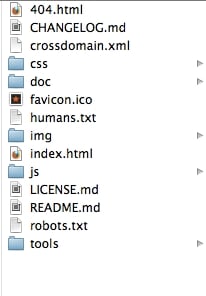
The Preliminary Directory Structure
The next step is to take these files and place them in the directory of your choice. For example, I have placed my files in the following directory on my Mac:
/Users/alvincrespo/Sites/html5iphonewebapp
Next, we'll want to use a build system that helps us create multiple environments, ease the deployment process, and overall make things easier when we want to optimize our site for testing and/or production.
According to the documentation for the HTML5 Mobile Boilerplate, there are two different types of build system, such as the Node Build script and the Ant Build script. In this book, we'll be using the Ant Build script. I would recommend using the Ant Build script since it has been around for a while and has the appropriate features that I use in my projects, including CSS Split, which will help split up the main CSS file that comes with the boilerplate.
To download the Ant Build script, go to the following link:
https://github.com/h5bp/ant-build-script
Then, download the zip file by clicking on the Download as zip button. When you have downloaded the Ant Build script, copy the folder and its contents to your project.
Once your Ant Build script directory is fully transferred over to your project, rename the directory containing the build script to build. At this point, you should have your project completely set up for the rest of the applications in this book. We will cover how to utilize the build script later on in this chapter.
With every project, it's important to create a framework that adjusts to your project's needs. It's critical to think about every aspect of the project. From the required document to the team's strengths and weaknesses, it's important we establish a solid foundation that helps us build and adjust accordingly.
We'll now modify our boilerplate for the needs of the projects we will be building. For simplicity, we'll remove the following items from the folder:
CHANGELOG.mdcrossdomain.xmlREADME.md/doc (Directory)
Now that the directory has been cleaned up, it's time to take a look at some of the boilerplate code and customize it for the needs of the projects in this book.
First, open up the application in your favorite text editor. Once we've opened up the application in the editor of our choice, let's look at index.html.
The index file needs to be cleaned up in order to focus on iPhone Web Application development, and also unused items such as Google Analytics need to be removed. So let's remove some code that is not necessary for us.
Look for the following code:
<!DOCTYPE html>
<!--[if IEMobile 7 ]>    <html class="no-js iem7"> <![endif]-->
<!--[if (gt IEMobile 7)|!(IEMobile)]><!--> <html class="no-js"> <!--<![endif]-->
Tip
Downloading the example code
You can download the example code files for all Packt books you have purchased from your account at http://www.packtpub.com. If you purchased this book elsewhere, you can visit http://www.packtpub.com/support and register to have the files e-mailed directly to you.
And modify it to this:
<!DOCTYPE html>
<html class="no-js">
What we've done here is removed detection for IE Mobile. Although this may be helpful for other projects, for us it doesn't really help in creating a fully compatible application just for the iPhone. However, we also need to remove an IEMobile specific meta tag:
<meta http-equiv="cleartype" content="on">
The previous meta tag turns on cleartype (a utility that assists with the rendering of fonts) for the IE mobile. This isn't necessary for us and is not a requirement for our applications.
Now that we've removed some unnecessary markup from our page, we can go ahead and start enabling features that will enhance our application. Look for the following meta tags and enable them, by removing the comments surrounding them:
<meta name="apple-mobile-web-app-capable" content="yes">
<meta name="apple-mobile-web-app-status-bar-style" content="black">
These directives inform our application that it can run in fullscreen and they set the status bar to black.
We can also remove the following code from the <head> of the document:
<!-- This script prevents links from opening in Mobile Safari. https://gist.github.com/1042026 -->
<!--
        <script>(function(a,b,c){if(c in b&&b[c]){var d,e=a.location,f=/^(a|html)$/i;a.addEventListener("click",function(a){d=a.target;while(!f.test(d.nodeName))d=d.parentNode;"href"in d&&(d.href.indexOf("http")||~d.href.indexOf(e.host))&&(a.preventDefault(),e.href=d.href)},!1)}})(document,window.navigator,"standalone")</script>
-->
Once we've removed the previous script, your markup should now look like the following:
<!DOCTYPE html>
<head>
    <meta charset="utf-8">
    <title></title>
    <meta name="description" content="">
    <meta name="HandheldFriendly" content="True">
    <meta name="MobileOptimized" content="320">
    <meta name="viewport" content="width=device-width">
    <link rel="apple-touch-icon-precomposed" sizes="144x144" href="img/touch/apple-touch-icon-144x144-precomposed.png">
    <link rel="apple-touch-icon-precomposed" sizes="114x114" href="img/touch/apple-touch-icon-114x114-precomposed.png">
    <link rel="apple-touch-icon-precomposed" sizes="72x72" href="img/touch/apple-touch-icon-72x72-precomposed.png">
    <link rel="apple-touch-icon-precomposed" href="img/touch/apple-touch-icon-57x57-precomposed.png">
    <link rel="shortcut icon" href="img/touch/apple-touch-icon.png">
    <meta name="apple-mobile-web-app-capable" content="yes">
    <meta name="apple-mobile-web-app-status-bar-style" content="black">
    <link rel="stylesheet" href="css/normalize.css">
    <link rel="stylesheet" href="css/main.css">
    <script src="js/vendor/modernizr-2.6.1.min.js"></script>
</head>
Now, we can focus on cleaning up our body. Lucky for us, we only need to remove one thing—Google Analytics, since we will not be focusing on tracking for iPhone Web Apps.
To do this, find the following code and remove it:
<!-- Google Analytics: change UA-XXXXX-X to be your site's ID. -->
<script>
    var _gaq=[["_setAccount","UA-XXXXX-X"],["_trackPageview"]];
    (function(d,t){var g=d.createElement(t),s=d.getElementsByTagName(t)[0];g.async=1;
    g.src=("https:"==location.protocol?"//ssl":"//www")+".google-analytics.com/ga.js";
    s.parentNode.insertBefore(g,s)}(document,"script"));
</script>
The only scripts that you should have on the page should be the following:
<script src="js/vendor/zepto.min.js"></script>
<script src="js/helper.js"></script>
Once we've completed the previous steps, our markup should be clean and simple as follows:
<!DOCTYPE html>
<html class="no-js">
<head>
    <meta charset="utf-8">
    <title></title>
    <meta name="description" content="">
    <meta name="HandheldFriendly" content="True">
    <meta name="MobileOptimized" content="320">
    <meta name="viewport" content="width=device-width">

    <link rel="apple-touch-icon-precomposed" sizes="144x144" href="img/touch/apple-touch-icon-144x144-precomposed.png">
    <link rel="apple-touch-icon-precomposed" sizes="114x114" href="img/touch/apple-touch-icon-114x114-precomposed.png">
    <link rel="apple-touch-icon-precomposed" sizes="72x72" href="img/touch/apple-touch-icon-72x72-precomposed.png">
    <link rel="apple-touch-icon-precomposed" href="img/touch/apple-touch-icon-57x57-precomposed.png">
    <link rel="shortcut icon" href="img/touch/apple-touch-icon.png">

    <meta name="apple-mobile-web-app-capable" content="yes">
    <meta name="apple-mobile-web-app-status-bar-style" content="black">

    <link rel="stylesheet" href="css/normalize.css">
    <link rel="stylesheet" href="css/main.css">
    <script src="js/vendor/modernizr-2.6.1.min.js"></script>
</head>
    <body>

        <!-- Add your site or application content here -->

        <script src="js/vendor/zepto.min.js"></script>
        <script src="js/helper.js"></script>
    </body>
</html>
From here, we should examine our stylesheets and scripts for every project and optimize it as much as we can prior to beginning a project. However, this boilerplate that we will be using has been optimized by the community and continuously enhanced with support from many developers, and for our use here, both styles and scripts are good to go. If you are curious, I encourage you to look at the normalize.css file, which contains excellent directives for resetting a page. It would also be beneficial to review the main.css file that has been enhanced with this boilerplate to support mobile devices.
Now, we'll move on to establishing our framework.
It's critical for developers to establish a framework for each project they are working on, no matter how small or big the project may be. Of course, your framework should adjust to the requirements that the project demands as well. In this section, we'll establish a simple framework that we can work with throughout the use of this book.
We've gone through and cleaned up the boilerplate for our needs, now we'll go through and expand upon the boilerplate to include the files that are critical to the applications we will build.
The first application will be based on the HTML5 Video specification (http://dev.w3.org/html5/spec-author-view/video.html). In that application we'll create a specific functionality for our video player that includes play, pause, and fullscreen functionalities. So let's create a directory specific to this application; we'll call this directory video.
In this directory, we'll create an index.html file and copy the contents from the homepage of the index.html file.
Now that we have our video section created, let's create the video.css file inside of our css directory.
Then, create an App directory within our /js folder. Within the /js/App directory, let's create an App.js file. Later, we'll explain in detail what this file is, but for now it will be our main application namespace that will essentially encapsulate global functionality for our application.
Finally, let's create an App.Video.js file that will contain our video application functionality within the /js/App directory.
You will now repeat the previous steps for each of our applications; including Video, Audio, Touch, Forms, Location, Single Page, and Offline. In the end, your directory structure should have the following new directories and files:
/audio
    index.html
/css
    audio.css
    forms.css
    location.css
    main.css
    normalize.css
    singlepage.css
    touch.css
    video.css
/forms
    index.html
/js
    /App/App.Audio.js
    /App/App.Forms.js
    /App/App.js
    /App/App.Location.js
    /App/App.SinglePage.js
    /App/App.Touch.js
    /App/App.Video.js
/location
    index.html
/offline
    index.html
/singlepage
    index.html
/touch
    index.html
/video
    .index.html
At this point, we should fix the references to our dependencies, such as our JavaScript and stylesheet. So let's open up /video/index.html.
Let's modify the following lines:
<link rel="stylesheet" href="css/normalize.css">
<link rel="stylesheet" href="css/main.css">
<script src="js/vendor/modernizr-2.6.1.min.js"></script>
Change the previous markup to the following:
<link rel="stylesheet" href="../css/normalize.css">
<link rel="stylesheet" href="../css/main.css">
<script src="../js/vendor/modernizr-2.6.1.min.js"></script>
Tip
Note that we add ../ to each dependency. This is essentially telling the page to go up one level and retrieve the appropriate files. We also need to do this for the apple-touch-icon-precomposed links, shortcut icon, and the scripts at the bottom of the page.
Our framework is now almost complete, except that they aren't connected yet. So now that we've got everything organized, let's start hooking up everything to one another. It won't look pretty, but at least it will be working and moving towards a fully functional application.
Let's start with the main index.html file, /ourapp/index.html. Once we've opened up the main index.html file, let's create a basic site structure inside our <body> element. We'll give it a class of "site-wrapper" and put it right below the comment Add your site or application content here:
<body>
    <!-- Add your site or application content here -->
    <div class="site-wrapper">

    </div>
    <script src="js/vendor/zepto.min.js"></script>
    <script src="js/helper.js"></script>
</body>
Within the wrapper containing our site, let's use the new HTML5 <nav> element to semantically describe the main navigation bar that will exist across all our apps:
<div class="site-wrapper">
<nav>
</nav>
</div>
Nothing too special yet, but now we'll go ahead and use the unordered list element and create a navigation bar with no styling:
<nav>
    <ul>
        <li>
            <a href="./index.html">Application Architecture</a>
        </li>
        <li>
            <a href="./video/index.html">HTML5 Video</a>
        </li>
        <li>
            <a href="./audio/index.html">HTML5 Audio</a>
        </li>
        <li>
            <a href="./touch/index.html">Touch and Gesture Events</a>
        </li>
        <li>
            <a href="./forms/index.html">HTML5 Forms</a>
        </li>
        <li>
            <a href="./location/index.html">Location Aware Applications</a>
        </li>
        <li>
            <a href="./singlepage/index.html">Single Page Applications</a>
        </li>
    </ul>
</nav>
If we copy the code that we have created in /video/index.html and test the page, you see that it will not work correctly. For all subdirectories, like video and audio, we'll need to change the relative path from ./ to ../ so that we can go up one folder. With this in mind, the nav element would look like the following within the other applications:
<nav>
    <ul>
        <li>
            <a href="../index.html">Application Architecture</a>
        </li>
        <li>
            <a href="../video/index.html">HTML5 Video</a>
        </li>
        <li>
            <a href="../audio/index.html">HTML5 Audio</a>
        </li>
        <li>
            <a href="../touch/index.html">Touch and Gesture Events</a>
        </li>
        <li>
            <a href="../forms/index.html">HTML5 Forms</a>
        </li>
        <li>
            <a href="../location/index.html">Location Aware Applications</a>
        </li>
        <li>
            <a href="../singlepage/index.html">Single Page Applications</a>
        </li>
    </ul>
</nav>
Now, we can copy the navigation from /video/index.html to the rest of the application files or to the index.html files we created previously. Once this is done, we will have a single site that now connects well with each other.
Believe it or not, we have a very simple website going on here. Our pages are set up with basic markup and general styles. At this point, we need a navigation that brings our pages together. However, we've barely touched on some important aspects, including semantic markup for applications, which we'll discuss next.
Semantic markup is important for several reasons, including search engine optimization, creating maintainable architectures, making code easily understandable, and meeting accessibility requirements. However, you should be familiar with structuring your page with markup that is related to your content. There are new elements within the HTML5 specification that help to ease this process, including the <header>, <nav>, <footer>, <section>, <article>, and <aside> elements. Each one of these elements helps describe the aspects of a page and easily identifies components of your application. In this section, let's structure our applications, beginning with our Video application.
First, let's start by giving our main index page a title and a header that describes the page we are on. Let's open the main index.html file in our application at /index.html.
Find the <title> tag and enter it in iPhone Web Application Development – Home. Note that we use a hyphen here. This is important since it makes it easier for users to scan the content of the page and helps with the ranking for specific keywords.
You should now have the following <title> in the <head> tag of your document:
<title>iPhone Web Application Development - Home</title>
Now we want the content of the page to reflect the title as well and alert the user of their progress on our site. What we want to do is create a header that describes the section they are on. In order to achieve this, let's place the following code before the navigation we created previously. Your code should then look like this:
<hgroup>
    <h1>iPhone Web Application Development</h1>
    <h2>Home</h2>
</hgroup>
<nav>...</nav>
The <hgroup> element is used to group multiple headers for a section. The rank of the headers is based on <h1> to <h6>, with <h1> being the highest rank and <h6> the lowest. Therefore, the highlighted text places our <h1> content higher than our <h2>.
Also note that we are not using the <section> element yet. However, this page does validate using the W3C Markup Validation Service (http://validator.w3.org/).
We can further describe the page by wrapping our <hgroup> and <nav> elements within a <header> element to give the page an introductory aid. Once you do this, you should have the following code:
<header>
<hgroup>... </hgroup>
<nav>... </nav>
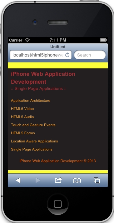
</header>With the previous code, we have finally given our page some structure. We are describing our page with a main header for the site and a sub header for the page. We have also given the page a navigation menu, allowing the user to navigate across applications.
Now let's add a <footer> that contains the name of this book with its copyright date:
<footer>
<p>iPhone Web Application Development © 2013</p>
</footer>The previous code will basically relate to the nearest sectioning ancestor. Thus the footer will relate to the content before it, which we will fill in a bit later. At this point, your content should look like this:
<div class="site-wrapper">
    <header>
        <hgroup>...</hgroup>
        <nav>...</nav>
    </header>
    <footer>...</footer>
</div>You may be wondering why we are not using the <section> element right away for the <div> element that contains both the <header> and <footer> element. In this case, it's not necessarily useful since we are not creating a page where the element's contents would be listed in an outline. This is the suggestion by the W3C and is something every developer should be aware of when deciding which element to use, <div> or <section>. In the end, it comes down to the content itself and the outline the team wishes to create.
Now that we have a basic structure for our pages, we can go ahead and do the same for the rest of our applications. This will be done for you in the code provided with this book in case you wish to review a final version.
With this in mind, we will move forward with our application development, making sure that we use semantic code when and where it makes sense.
Styling is extremely important in any application we build, especially since it is the first aspect of any application the user experiences. In this section, we'll start structuring our styles appropriately.
First, let's open our main.css file, located in the CSS directory. When you open this file, you'll see default boilerplate styles. At this point, let's skip through these to create our own styles. We'll review those styles as we continue to develop our applications.
Find the following line in main.css:
/* ==========================================================================
   Author's custom styles
========================================================================== */
It's after this comment that we want to include the global styles for the semantic code we wrote previously.
Start by defining the global site styling such as the background color:
html{
    background: #231F20;
    border-top: 10px solid #FDFF3A;
    border-bottom: 5px solid #FDFF3A;
    width: 100%;
}
In the previous styling, we are making some stylistic choices like setting our background color and some borders. The important part here is that the width is defined at 100 percent for the HTML element. This will basically allow us to extend to 100 percent of the width of the phone for all our content.
We then have to define overall fonts on the page. This will be basic for now and can continue to extend as design as per our application, but for now take a look at the following styles:
h1, h2, p, a {
    font-family: Arial, Helvetica, sans-serif;
    text-decoration: none;
}

h1, h2 {
    color: #A12E33;
    font-weight: bold;
    margin: 0;
    padding: 0;
}

h1 {
    font-size: 18px;
}

h2 {
    font-size: 14px;
    font-weight: normal;
}

p {
    color: #F15E00;
    font-size: 12px;
}

a,
a:visited {
    color: #F19C28;
}
In the previous code, you can see that we are working from a higher level down, the essential understanding of Cascading Style Sheets. We first define our headers, anchors, and paragraphs by using a specific font family and having no decoration.
As we work down the previous styles, we start to define each one more specifically, with headers having no padding or margins and a specific color. Then, when we go down further, we can see that each type of header has a specific font size and we do the same for paragraphs and anchors.
Once we've defined some of our fonts and site styling, we include some basic layout information for the <div> element containing our content:
.site-wrapper {
    padding: 5px 10px 10px;
}
Since our element automatically scales to 100 percent of the width of the screen, we tell the content to have a padding of 5px at the top, 10px at the left and right, and 10px on the bottom. Alternatively, we could have written the following styles:
    padding-top: 5px;
    padding-left: 10px;
    padding-right: 10px;
    padding-bottom: 10px;
The former is known as a shorthand property setting and is considered best practice.
Since we also want to make sure our second header is differentiated in some form, we can use a CSS3 pseudo class selector and property to define the before and after content, as following:
hgroup h2:before,
hgroup h2:after {
    content: " :: ";
}
Note
Keep in mind that the
:before
and :after
pseudo selectors are supported in Safari 3.2 and above.
The previous selector targets the <h2> elements within the <hgroup> element and appends the content we have defined in the property before and after it, as per the :before and :after pseudo class selector.
Next, let's style our navigation to look and feel a bit more useable.
nav ul {
    padding: 0;
}

nav li {
    list-style: none;
}

nav a {
    display: block;
    font-size: 12px;
    padding: 5px 0;
}
Here we remove the padding off the <ul> element and then remove the default styling option from each list element. Finally, we make sure each anchor is displayed correctly by setting the font size to 12px and add padding to the top and bottom of each anchor to allow for easy selection on the iPhone.
Finally, we'll add some styling to our footer.
footer p {
    text-align: center;
}
Very simply, we're aligning the paragraph within the footer to center. Since we've defined the default styles for our paragraph in our fonts section, the styling gets picked.
When the previous styles are applied properly, your result should be similar to the following display:
Responsive design is the key to our mobile applications. Given the fact that many mobile experiences now surpass those viewed on desktop, it is essential we create applications that fit our evolving technological landscape. Lucky for us, the HTML5 Mobile Boilerplate comes with preliminary styles that we can modify.
First, let's open up our main.css file in our
css directory.
Next, scroll down to the bottom of the file and you should see the following styling:
/* ==========================================================================
   EXAMPLE Media Queries for Responsive Design.
   Theses examples override the primary ('mobile first') styles.
   Modify as content requires.
========================================================================== */

@media only screen and (min-width: 800px) {
}

@media only screen and (-webkit-min-device-pixel-ratio: 1.5),
       only screen and (min-resolution: 144dpi) {}
Although this styling gets us off the ground, for iPhone development, we need some more customization. The first media query is specific for tablet devices, and the second media query helps us by targeting devices with higher resolution, such as the iPhone 4.
What we want to do is make this a bit simpler. Since we are only targeting iPhones, this is what we can replace the previous code with:
/* iPhone 4 and 5 Styles*/
@media only screen and (-webkit-min-device-pixel-ratio: 2) { }
The previous code will target both the iPhone 4 and 5. We specifically target these two devices by checking the –webkit-min-device-pixel-ratio property on the device, and if it is true it means we can serve high definition graphics.
Another aspect we want to check is our viewport settings in the index.html pages we've set up. Luckily, we cleaned this up earlier and it should have the following:
<meta name="viewport" content="width=device-width">
The previous code snippet will basically resize our content based on the width of the device.
At this point, we should be set for implementing responsive styling later on in our applications. Now that our styling is set for our applications and is general enough to expand upon, let's start adding the framework behind the scripts.
Images are an extremely important part of any application. It helps showcase the features of a product and exemplifies information you want the user to understand. However, today's varying amount of devices require content to respond correctly. On top of that, we need to be able to deliver content that is appropriate for the experience, meaning we need to tailor to higher resolution devices so that the highest quality content reaches that audience.
There are multiple techniques for delivering the appropriate content. However, the one you choose depends on the requirements of your project. In this part, we'll review the traditional responsive web design principle of resizing an image according to its content and/or container.
In this technique, the developer sets all the images to a maximum width of 100 percent. We then define the container of the image to adjust accordingly.
To achieve full width images, we can do the following:
<body>
<img src="img/batman.jpeg" alt="Its Batman!">
</body>
The markup is pretty simple, we essentially wrap an image into an element that extends the full width of what we need. In this case, the body will extend 100 percent in width.
Next, we'll define the style of the image as follows:
img {
    max-width: 100%;
}
With this simple CSS declaration, we are telling our images to have their maximum width set to 100 percent of the containing content. This will automatically resize the image as the device's width changes, which is essential if we want to make sites responsive to the user's device.
In this case, we want the image to stay its full width, but we also need it to cut off accordingly.
To achieve this, we can start by simply creating a div with a class, in this case we add a class of overflow:
<div class="overflow"></div>
We can then create the styling that keeps the image at full width and cuts off based on the resizing of the content:
overflow {
    background: transparent url('img/somgimg.jpg') no-repeat 50% 0;
    height: 500px;
    width: 100%;
}
This is a bit complex, but essentially we attach the image with a background property. The key here is to make sure we center it using 50 percent. The height property is just to show the image, and the width tells the container to be 100 percent related to its content.
These are the two techniques we use when implementing a traditional responsive design. We'll be implementing these techniques much later when we create the video and image galleries.
When establishing a JavaScript architecture for your application, there's a lot to think about, including possible changes in the near or short term, security, ease of use and implementation, documentation, and more. Once we can answer the various questions we have, we can then decide on the pattern (module, facade and/or mediator, and so on). We also need to know what library or framework would be best suited for us, such as jQuery, Zepto.js, Backbone.js, or Angular.js.
Luckily for us, we'll be keeping it plain and simple in order to deliver an effective application on an iPhone. We'll be utilizing Zepto.js as our supported library to keep it light. We'll then build upon Zepto by creating a custom JavaScript framework that follows a modular pattern.
First, let's open up our application directory in our preferred text editor.
Next, open the App.js file we created earlier within our JavaScript directory. The App.js file should be completely empty, and it shouldn't be included anywhere. This is where we will begin writing our framework.
If you're new to JavaScript, you have most likely created most of your code in the global scope—perhaps laying out most of your JavaScript inside of script tags. Although this may achieve some of your goals, when working on large scale applications we want to avoid such practices. Some of the reasons we want to namespace our applications is for maintainability, efficiency, and portability.
Let's start out by checking for the App namespace; if it exists we'll use what's there, if it does not exist, then we'll make an empty object. The following code shows how we can achieve this:
var App = window.App || {};Great! We are checking for the App namespace, now let's define it. Let's include the following code after the check:
App = (function(){}());The previous code is doing several things, let's take it one step at a time. First, we're setting the App namespace to what is known as an Immediately Invoked Function Expression (IIFE). We are essentially creating a function that is wrapped by parentheses and immediately invoking it after the closing brace.
When we use the previous technique, or IIFE, we create a new execution context or scope. This helps in creating self-containing code that will hopefully, not impact other code on the site. It protects us and helps us follow the modular pattern efficiently.
Let's extend the previous functionality by passing in the window, document, and Zepto objects, as follows:
App = (function(window, document, $){
}(window, document, Zepto));
I know that this may be a bit confusing, but let's take a second to think through what we're doing here. First, we are setting some parameters in the function named window, document, and $. Then, we are passing in window, document, and Zepto when we invoke this method. Remember, we discussed previously that this creates a new scope or execution context? Well, this becomes useful to us because we can now pass in references to any object that might be global.
How is this useful to us? Well, imagine if you wanted to use the actual Zepto object over and over again it would be kind of tiring. It's not that difficult to type Zepto, but you can just namespace it to the dollar sign and keep it simple.
Ok, so we've got our module setup. Now let's continue to extend it by including the use strict directives:
App = (function(window, document, $){
    'use strict';
}(window, document, Zepto));
This directive helps us debug our applications by making changes to how JavaScript runs, allowing certain errors to be thrown instead of failing silently.
Default options are a great way of giving your codebase some extensibility. If, for example, we want to customize or cache an element related to the application itself then following are the defaults we will use:
var _defaults = {
'element': document.body,
    'name': 'App',
    'videoOptions': {},
    'audioOptions': {},
    'touchOptions': {},
    'formOptions': {},
    'locationOptions': {},
    'singlePageOptions': {}
};
Let's look at these defaults briefly. First we will create a defaults variable, which will contain all the defaults for our application(s). Inside it, we have defined a default location to be referenced for our application with the 'element' default set to document.body—which gets our body element in DOM (Document Object Model). We then create a custom name for our application called 'App'. After this, we create empty objects for our video, audio, touch, form, location, and single page applications—to be built later. These empty objects will be extended as we continue through the book.
Now we need to define our constructor after the use strict directive. This constructor will take a single parameter named options. We will then extend the defaults with the parameter options and store these settings that can be retrieved later, if needed. We will then ultimately cache the 'element' option as a Zepto object.
function App(options) {
    this.options = $.extend({}, _defaults, options);
    this.$element = $(this.options.element);
}
Here is what the previous code is accomplishing. First, we are using the keyword this, which is a reference to what will be, an instance of App itself. Thus, this is the context of the object itself. Hopefully, this is not too confusing and will become clear as we go on. In this case, we are using this to define an object options, which will contain the merged contents of _defaults and any custom options we pass into the constructor.
Note, when we pass an empty object, or {} into $.extend() as the first parameter, we are telling Zepto to merge _defaults and options into a new object, thus not overwriting the _defaults object. This is useful when we need to do some sort of check in the future with the default options.
Once we've defined the options, we then cache the element with this.$element, where $ in front of element is just for my reference so that I immediately recognize a Zepto object versus a plain JavaScript object.
Ok, so we've created our App namespace, constructed an IIFE to contain our code and defined our constructor. Now, let's start creating some public methods that can be accessed to make this a bit modular. But before we do that, let's try to understand JavaScript's prototype.
Think of prototype as a live object that can be accessed, modified, and updated whenever and however you like. It can also be thought of as a pointer, because JavaScript will continue to go down the chain until it finds the object or it will return undefined. The prototype is simply a way of extending functionality to any non-plain object.
To make things a bit more confusing, I mentioned that non-plain objects have prototypes. These non-plain objects would be Arrays, Strings, Numbers, and so on. A plain object is one where we simple declare an empty object as follows:
var x = {};The x variable does not have a prototype, it is simply there as a key/value storage similar to our _defaults object.
If you haven't yet understood the prototype, don't worry, it's all about getting your hands dirty and getting some experience. So, let's keep moving and getting our applications to work.
At this point, your App.js file should look like the following:
var App = window.App || {};
App = (function(window, document, $){
    'use strict';
    var _defaults = {
        'element': document.body,
        'name': 'App',
        // Configurable Options for each other class
        'videoOptions': {},
        'audioOptions': {},
        'touchOptions': {},
        'formOptions': {},
        'locationOptions': {},
        'singlePageOptions': {}
    };
    function App(options) {
        this.options = $.extend({}, _defaults, options);
        this.$element = $(this.options.element);
    }
}(window, document, Zepto));Now we need to create some public methods by typing into the prototype. We'll create a getDefaults method, which returns our default options; toString will overwrite the native
toString method so we can return a custom name. Then we'll create initialization methods to create our other applications, and we'll name these initVideo, initAudio, initLocalization, initTouch, initForms, and initSinglePage respectively.
App.prototype.getDefaults = function() {
    return _defaults;
};

App.prototype.toString = function() {
    return '[ ' + (this.options.name || 'App') + ' ]';
};

App.prototype.initVideo = function() {
    App.Video.init(this.options.videoOptions);
    return this;
};

App.prototype.initAudio = function() {
    App.Audio.init(this.options.audioOptions);
    return this;
};

App.prototype.initLocalization = function() {
    App.Location.init(this.options.locationOptions);
    return this;
};

App.prototype.initTouch = function() {
    App.Touch.init(this.options.touchOptions);
    return this;
};

App.prototype.initForms = function() {
    App.Forms.init(this.options.formOptions);
    return this;
};

App.prototype.initSinglePage = function() {
    App.SinglePage.init(this.options.singlePageOptions);
    return this;
};
At this point we have several methods we can access publicly when we create an instance of App. First, let's review the code we implemented previously, specifically this line that gets duplicated, but customized based on the init method:
App.Touch.init(this.options.touchOptions);
For every init method we have created a call to the appropriate application, for example, App.Touch, App.Forms, App.Video, and so on. Then we pass it the options we've defined in the constructor that merged our defaults, for example, this.options.touchOptions, this.options.formOptions, this.options.videoOptions, and so on.
Note, we haven't created these classes yet for Video, Forms, Touch, and others, but we will be creating these soon.
The last thing we need to do in App.js includes returning the constructor. So, after all the public methods defined previously, include the following code:
return App;
This bit of code, although simple, is extremely important. Let's look at a stripped down version of App.js to better understand what's going on:
App = (function(){
    function App() {}
    return App;
}());
As mentioned earlier, we are creating an App namespace that gets set to the immediately invoked function expression. When we do this, we create a new scope inside this function.
This is why we can have a function or constructor with the name App as well and have no conflicts or errors. But if you recall, our function App is also an object, just like everything in JavaScript is an object. This is why, when we return our function App the App namespace gets set to the constructor. This then allows you to create multiple instances of App, while centralizing your code inside of a new scope that is untouchable.
Now, to get the rest of our architecture together we need to open up every other App file in the JavaScript directory we are in (/js/App).
When we have these files open, we need to paste the following template, which is based on the script we've written for App.js:
var App = window.App || {};

App.Module = (function(window, document, $){
    'use strict';

    var _defaults = {
        'name': 'Module'
    };

    function Module(options) {
        this.options = $.extend({}, _defaults, options);

        this.$element = $(this.options.element);
    }

    Module.prototype.getDefaults = function() {
        return _defaults;
    };

    Module.prototype.toString = function() {
        return '[ ' + (this.options.name || 'Module') + ' ]';
    };

    Module.prototype.init = function() {

        return this;
    };

    return Module;

}(window, document, Zepto));
When we have each template in, we must then change Module to the appropriate type, that is Video, Audio, Location, and so on.
Once you are done with pasting in the section and changing the names, you should be all set with the basic JavaScript architecture.
One of the last items you will need to take care of is including this basic architecture into each index.html file. In order to do this, you will need to paste the following code at the bottom of the page, right after the inclusion of helper.js:
<script src="js/App/App.js"></script>
<script src="js/App/App.Audio.js"></script>
<script src="js/App/App.Forms.js"></script>
<script src="js/App/App.Location.js"></script>
<script src="js/App/App.SinglePage.js"></script>
<script src="js/App/App.Touch.js"></script>
<script src="js/App/App.Video.js"></script>
<script src="js/main.js"></script>
We are basically including each script of the framework. What's important here is to always include App.js first. The reason for this is that App.js creates the App object and directly modifies it. If you include it after all the other scripts, then App.js will overwrite the other scripts because it's directly affecting the App object.
The last item we need to take care of is main.js, which includes the initialization of our application. We do this by wrapping our code in IIFE and then exposing the instance to the window object. We do this with the following code:
(function(window, document) {
    'use strict';

    var app = new App({
        'element': document.querySelector('.site-wrapper')
    });

    window.app = app;

}(window, document));
What we've seen earlier is an IIFE being assigned to an object. Here we don't see that because it's not necessary. We just want to make sure our code would not affect the rest of the code, which in most cases would not happen because of the simplicity of this project. However, as a best practice I try to self contain my code in most cases.
The difference in the previous code is that we see the initialization of our framework here:
var app = new App({
    'element': document.querySelector('.site-wrapper')
});
We do that by using the new keyword, creating a new instance of App, and then passing it an object, which will be merged into our default options we previously wrote.
Note
querySelector
is a JavaScript method that is attached to the document object. This method accepts a selector that we would normally use in CSS, parse DOM, and find the appropriate element. In this case, we are telling our application to self contain itself to the element with the site-wrapper class.
When we finally initialize our application, we then attach app to the window object:
window.app = app;
This basically makes it accessible anywhere in our application by attaching it to the window object.
We are now done with the framework for our application. Although we don't have anything being manipulated on the page, or have attached any events that correlate with a user's input, we now have a solid foundation for coding that follows best practices, is effective, efficient, and easily accessible.
Unless we are making a completely responsive site where the styles of the site shift based on the dimensions of the device, we most likely will need to do some sort of redirect to a mobile friendly version of our site.
Lucky for us, this can easily be achieved in several ways. Although I won't cover in detail the ways in which we can achieve this, here are a few techniques that might help out when deciding how to move forward.
Tip
Since this book is geared towards the frontend, routing to a mobile site will be briefly covered with PHP and htaccess. We can always perform this process on the frontend, but it should be avoided for SEO and page-ranking purposes.
In PHP we could do the following type of redirect:
<?php
    $iphone = strpos($_SERVER['HTTP_USER_AGENT'], "iPhone");
    if ($iphone) {
        header('Location: http://mobile.site.com/');
    }
?>
In this example we are creating a variable, $iPhone, and giving it a Boolean value of true or false. If iPhone is found in the user agent, which may or may not be the best technique to use, then we tell the page to redirect using the
header() method in PHP.
Again, there are other ways of achieving this, but this will get you off the ground and running.
We can also detect the iPhone and redirect it by putting these instructions on the server using an htaccess file:
RewriteEngine on
RewriteCond %{HTTP_USER_AGENT} iPhone
RewriteRule .* http://mobile.example.com/ [R]
In this example, we are turning on the rewrite engine, creating a rewrite condition that checks for the iPhone text in the user agent, and then creates a rewrite rule if the condition is met.
In essence, if we want to redirect to a mobile version of our site, we need to be able to detect the type of device, not its dimensions, and then redirect appropriately.
If you're creating an application that should mimic the feeling of being a native application, or to simply increase the experience of a web app—it is a good idea to have bookmark icons that represent your application.
At the moment, we do support this feature with the following markup in our index.html files:
<link rel="apple-touch-icon-precomposed" sizes="144x144" href="img/touch/apple-touch-icon-144x144-precomposed.png">
<link rel="apple-touch-icon-precomposed" sizes="114x114" href="img/touch/apple-touch-icon-114x114-precomposed.png">
<link rel="apple-touch-icon-precomposed" sizes="72x72" href="img/touch/apple-touch-icon-72x72-precomposed.png">
<link rel="apple-touch-icon-precomposed" href="img/touch/apple-touch-icon-57x57-precomposed.png">
<link rel="shortcut icon" href="img/touch/apple-touch-icon.png">
These directives inform Safari that we have home screen icons for the appropriate devices. Starting from top to bottom we are supporting retina display, first-generation iPad and non-Retina iPhone, iPad Touch, and even Android 2.1+.
To put it simply, we have an application that users can bookmark to their home screen, allowing them to instantly access the web application from their home screen.
Earlier, we installed our build script along with the HTML5 Mobile Boilerplate. We'll now explore the build script a bit further by customizing it for our purposes. We'll need to make sure our styles, scripts, images, and markup are optimized for deployment. It will also be necessary for us to set up multiple environments to test our application thoroughly.
Let's start by configuring the build script for our needs, this way we'll have a custom build script that works for us and gets us going immediately.
First, let's make sure our scripts get concatenated and minified. So let's open all our index.html files and wrap all our scripts at the bottom of the page with the following comments:
<!-- scripts concatenated and minified via ant build script-->
<script src="path/to/script.js"></script>
<!-- end scripts-->
The previous comments are used by the ant task, or build script, to find all JavaScript files being used, concatenate, and minify them. The process will also use a timestamp for the newly optimized JavaScript file in order to bust caching on the server.
By default, the Ant Build script minifies and concatenates our styles. However, if we want to retain comments that identify a particular section of our app, such as the video or audio section, then we need to do something that will keep those comments.
The comments can be used to identify a section, and it can be written as follows:
/*!
  Video Styling
*/
Write the previous comments for each stylesheet.
We then need to add each of our stylesheets to the project properties so that each can be minified by the YUI compressor. To do this, we need to open up the project.properties file located in /build/config.
Then find the following line:
file.stylesheets =
Once we've found that line, let's add all our css files as follows:
file.stylesheets = audio.css,forms.css,location.css,singlepage.css,touch.css,video.css
Note, that there are no spaces after each file. This is necessary for the build script to process.
This is all we need to do at the moment for optimizing our styles.
Typically a project will run on a development, test, and production environment. The test environment should be closest to production in terms of configuration, allowing us to effectively reproduce any issues that might come up.
In order to build our environments correctly, let's go through the process of building our project. First, let's open up Terminal, a program that allows you to interact with the operating system of any Unix style computer through a command-line interface.
Once the terminal is up and running, we have to navigate to our project. Here are a couple of commands that will help you navigate:
cd /somesite
The previous command means we are changing our directory from the current directory to the somesite directory, relative to where you're now.
cd ../somesite
This command tells us to change the directory, but going up a level with ../ and then going into the somesite directory.
As an easier example to understand, my project exists in /Sites/html5iphonewebapp. So what I can do is use the following command to enter my project:
cd /Users/somuser/Sites/html5iphonewebapp
This changes the directory for me to the project where I am developing this application.
Once we've entered the project directory, we can start building our project. By default, the Ant Build script creates a production environment, which optimizes all parts of the process.
ant build
This command tells us to build our project, and as explained creates our production version in a directory labeled publish. You will also notice that when you run that command, your terminal will update, letting you know what step in the process the build is in.
Once the build is complete, your directory structure should look similar to the following screenshot:
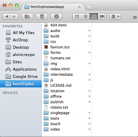
The publish directory represents the production environment. You will also see that an intermediate directory has been created; this is your test environment.
However, let's say you wanted to have full control of the build and wanted to create your environments manually, then one can do the following in the terminal:
ant build -Denv=dev
This command, ant build –Denv=, lets us define which environment we want to build and does it accordingly.
We now have a project that is ready to be built upon. There were many steps in this process, so I encourage you to practice this process in order to develop a good architecture and deployment process that works for you and/or your team.
In this chapter, we saw how to use the HTML5 Mobile Boilerplate for our projects, from downloading the default package to customizing it for our needs. We also took a couple of simple steps to establish a solid architecture for our JavaScript, CSS, and HTML. As a bonus, we went over including a build process and customizing it for our project. We then quickly reviewed best practices for JavaScript applications and gave a couple of tips on how to direct users to a separate mobile site. We are now prepared for in-depth development of the mobile web applications.