


In this chapter, we will cover the following recipes:
Finding documentation on Highcharts
Creating your first chart
Including multiple series in one chart
Displaying multiple charts in one graph
Using the same data in multiple charts
Creating spiderweb graphs for comparison
Creating custom tooltips
Adding extra content to tooltips
Making charts internationalizable/localizable
Creating a new theme
Creating reusable graphs
This chapter explains the basics of creating and rendering a chart using Highcharts and how to work with different Highcharts options to configure charts. All charts are created by providing a chart with the options object; options allows the user to define the behavior and look and feel of the chart.
Charts are created by making instances of a Highcharts.Chart object, either directly via its constructor or indirectly using plugins developed for different JavaScript frameworks.
Highcharts has a very well-documented Application Programming Interface (API), and while many of the examples we go through will include details of the various options and settings used, this book is by no means a complete reference.
To get started, follow the ensuing instructions:
Visit http://docs.highcharts.com to find an introduction to core concepts in Highcharts, learn about chart features, and get an introduction to working with charts.
Highcharts also has a searchable API document found at http://api.highcharts.com, which has details of every method, property, and configuration option available to set up a chart. Many of the configuration options in the API include links to examples where it is possible to see the option in action or modify an existing chart.
Lastly, there are the demos that can be found either at http://www.highcharts.com/demo, or within the
examplesfolder from the Highcharts ZIP file. Demos show a variety of examples used and configurations to give some idea of what Highcharts is capable of creating.
To create and render a chart, we'll need to create a Highcharts.Chart instance and provide it with some options.
There are a few things that we need to do before we get started:
Install
bower(http://bower.io), a package manager for JavaScript.Create a
bower.jsonfile that lists information about our project, most importantly, its dependencies, as shown in the following code:{ "name": "my-project", "dependencies": { "highcharts": "~3.0", "jquery": "^1.9" } }Tip
Downloading the example code
You can download the example code files for all Packt books you have purchased from your account at http://www.packtpub.com. If you purchased this book elsewhere, you can visit http://www.packtpub.com/support and register to have the files e-mailed directly to you.
From the same folder, run
bower installto install our dependencies.Create a simple HTML page where we will create our chart, as shown in the following code:
<html>
    <head>
        <style type='text/css'>
            #container {
                width: 300px;
                height: 300px;
                border: 1px solid #000;
                padding: 20px;
                margin: 10px;
            }
        </style>
    </head>
    <body>
        <div id='container'></div>


        <script src='./bower_components/jquery/jquery.js'></script>
        <script src='./bower_components/highcharts/highcharts-all.js'></script>

        <script type='text/javascript'>
            $(document).ready(function() {
                // our code will go here
            });
        </script>
    </body>
</html>
To get started, follow the ensuing instructions:
First, we create an
optionsobject that will define what our chart looks like, as shown in the following code:var options = { chart: { type: 'bar' }, title: { text: 'Creating your first chart' }, series: [{ name: 'Bar #1' data: [1, 2, 3, 4] }] }Next, we render our new chart by calling the
.highchartsjQuery function on some element on the page. In this case, we select an element on the page with anidvalue equal tocontainer, as shown in the following code:var options = { chart: { type: 'bar' }, title: { text: 'Creating your first chart' }, series: [{ name: 'Bar #1', data: [1,2,3,4] }] }; $('#container').highcharts(options);The following is the rendered chart:
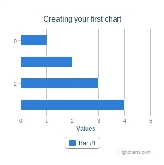
The .highcharts function is actually a part of a jQuery plugin used to create the Highcharts.Chart objects. It uses jQuery's element selector (for example, $('#container')) to find the element we want to render the chart to and renders the chart inside that element. Even if we supply a more general selector (for example, $('div')), it will only render the first element.
As previously mentioned, it is not necessary to use jQuery to render a chart. We can create a chart instance manually using the chart.renderTo option and the Highcharts.Chart constructor. Using this method, we can either pass in the ID of an element or a reference to an element, as shown in the following code:
    // Using an element id
    var options = {
        chart: {
            renderTo: 'container'
        },
         // ...
    }

    var chart = new Highcharts.Chart(options);

    // Using an element reference
    var otherOptions = {
        chart: {
            renderTo: document.getElementById('container');
        },
         // ...
    }

var otherChart = new Highcharts.Chart(options);While it is useful to display one data series, we may want to add more data to a chart. For example, we may want to compare two different sets of data over the same period of time.
In Highcharts, we can display additional data in a separate series array. The series arrays are just lists of data with a name. In Highcharts, this list is represented by a JavaScript array.
To get started, follow the ensuing instructions:
Define options for our chart as in the previous recipe, as follows:
var options = {
    chart: {
        type: 'bar'
    },
    title: {
        text: 'Including multiple series in one chart'
    },
    series: [{
        name: 'Bar #1',
        data: [1, 2, 3, 4]
    }]
};
Add a second series object as shown in the following code:
var options = {
    chart: {
        type: 'bar'
    },
    title: {
        text: 'Including multiple series in one chart'
    },
    series: [{
        name: 'Bar #1',
        data: [1, 2, 3, 4]
    },  // Add a new series
    {
        name: 'Bar #2',
        data: [4, 3, 2, 1]
    }]
};
Finally, render the chart using the
highchartsfunction$('#container').highcharts(options)". This output is shown in the following screenshot: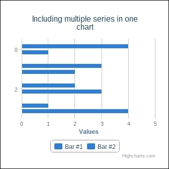
If we want to add another series to the chart after it has been rendered, you can use the addSeries method and pass it in the series object. We can get a reference to the chart in one of the following two ways:
Create the chart, then call
.highcharts()with the appropriate jQuery selector, as shown in the following code:$('#container').highcharts(options); var chart = $('#container').highcharts();When creating the chart, chain together a call to
.highcharts()as follows:var chart = $('#container').highcharts(options).highcharts();Using the chaining method, we can add a series as follows:
    var chart = $('#container').highcharts(options).highcharts();
    chart.addSeries({
        name: 'Series 2',
        data: [4,3,2,1]
    });
The addSeries method also has a few other arguments that can be passed. The addSeries method also has optional second and third arguments that determine whether the chart should be redrawn (defaults to true) and how the new series should be animated (defaults to true, but we could supply an animation object that is best described in the documentation).
We are not limited to displaying a single series in a chart, and likewise, we are not limited to displaying a single type of chart within the same chart. In some circumstances, we may want to display the same data using different types of charts.
Earlier, we saw that a series object can have data associated with it, such as name. Similarly, a series object can also have a type, which changes how the data is displayed in the rendered chart.
To get started, follow the ensuing instructions:
Define our chart options as we did in the previous recipe, as shown in the following code:
var options = {
    chart: {
        type: 'bar'
    },
    title: {
        text: 'Displaying multiple charts in one graph'
    },
    series: [{
        name: 'Bar #1',
        data: [1, 2, 3, 4]
    }, {
        name: 'Bar #2',
        data: [4, 3, 2, 1]
    }]
Add a new series to our chart with the type
pieusing the following code:var options = { chart: { type: 'bar' }, title: { text: 'Displaying multiple charts in one graph' }, series: [{ name: 'Bar #1', data: [1, 2, 3, 4] }, { name: 'Bar #2', data: [4, 3, 2, 1] }, { // add new series type: 'pie', data: [1,2,3,4], center: [0,0] }] }The following is the rendered chart:

By default, Highcharts will use the chart.type string to determine how the different series should be displayed. However, if a series has its own type provided, it will use that type when it is rendered in the chart.
Just changing the type string of the series will probably result in something ugly or otherwise undesired, especially in the case of a pie chart where it will render on top of the existing chart. Fortunately, it is possible to adjust the positioning and style of a pie series by providing a center option.
If we wanted to enable the labels on the pie chart, we could set dataLabels.enabled to true, as shown in the following code:
    var options = {
        // ...
        series: [{
            type: 'pie',
            name: 'Bar #1',
            data: [1,2,3,4],
            dataLabels: {
                enabled: true
            }
        }]
    };
In fact, a series object can have any options that you would normally set inside plotOptions.<chartType>. For more details, visit http://api.highcharts.com/highcharts#plotOptions.
Oftentimes, we have data that we want to display in different ways on the same page, but we may not want to show that data in the same chart. For example, we may want to have an aggregate view of a set of data in one chart and another where we can see the same data over a time period. In this case, we want to share the same data in different charts.
To get started, follow the ensuing instructions:
Create a set of data or have a set of data available, as shown in the following code:
var data = [1,2,3,4];
Define options for our two charts as shown in the following code:
var chartOptions = {
    // other fields omitted for brevity
    series: [{
        name: 'X',
        data: data
    }];
};

var chart2Options = {
    // other fields omitted for brevity
    series: [{
        name: 'Y',
        data: data
    }];
}
Render our two charts as shown in the following code:
$('#container').highcharts(chartOptions);
$('#container2').highcharts(chart2Options);
If the data changes, call
<series>.setDataon each chart to reflect the changes in the charts as follows:// e.g. data = [1, 9, 9, 2, 1, 1, 2, 4]; $('#container').highcharts().series[0].setData(data); $('#container2').highcharts().series[0].setData(data);The following chart reflects these changes:

We like to compare different things, but sometimes, the things that we want to compare differ in more than just one or two axes. Rather than displaying multiple graphs, we can amalgamate these different axes into one graph and use the spiderweb graph.
To get started, follow the ensuing instructions:
Define options for our basic chart, setting the
polarproperty of the chart totrueusing the following code:var options = { chart: { polar: true, type: 'line' }, title: { text: 'Creating spiderweb graphs for comparison' } }Label the axes of our graph by setting
xAxis.categories, as shown in the following code:options= { // ... xAxis: { categories: ["Strength", "Speed", "Defense"], tickmarkPlacement: 'on' } };Set
yAxis.gridLineInterpolationtopolygonto make the chart less rounded, as shown in the following code:var options= { // ... yAxis: { gridLineInterpolation: 'polygon' } };Define the data for our spiderweb graph as follows:
var options = {
    // ...
    series: [{
        name: 'Fighter',
        data: [10, 1, 5],
        pointPlacement: 'on'
    }, {
        name: 'Rogue',
        data: [5, 10, 1],
        pointPlacement: 'on'
    }]
};
The following is the rendered graph:

So far, we haven't done a lot with the behavior of charts. One common behavior in charts is the tooltip object, which can display useful information about a data point in the graph when a user hovers the mouse over that point. Tooltips are added by default to a graph, but it is useful to be able to extend this basic functionality.
To get started, perform the following instructions:
Create a function for our tooltip as follows:
var formatter = function () {
    var tooltipMessage = '';

    tooltipMessage += 'X value: ' + this.x + '<br>';
    for (var i=0; i < this.points.length; i++) {
        tooltipMessage += 'Y[' + i + '] value: ' + this.points[i].y+ '<br>'
    }

    return tooltipMessage;
}
Define options for our chart as follows:
var options = {
    chart: {
        type: 'bar'
    },
    title: {
        text: 'Creating custom tooltips'
    },
    series: [{
        name: 'Bar #1',
        data: [1,2,3,4]
    }, {
        name: 'Bar #2',
        data: [4,3,2,1]
    }]
};
Assign this function to our options as
tooltip.formatter, as shown in the following code:var options = { // ... tooltip: { formatter: formatter, borderColor: '#f00', backgroundColor: '#ccc', shared: true } };The following is the output chart:

Note
The formatter function will render any string within the tooltip window. The this keyword refers to the data point that we are hovering over, so we can access the x and y values of the current point via this.x or this.y.
We can also change the appearance of the tooltip via options such as changing the border with tooltip.borderColor or the background with tooltip.backgroundColor.
It is even possible to disable the tooltip entirely by setting tooltip.enabled to false.
More details on tooltip options can be found at http://api.highcharts.com/highcharts#tooltip or in the individual plot options for a chart at http://api.highcharts.com/highcharts#plotOptions.
By default, tooltips are not shared—every series displays only the data for its own tooltip. If you want to have all the data to be available from a single tooltip, you can set tooltip.shared to true. In this case, if we are using tooltip.formatter, we need to change how we refer to our y values, that is, instead of this.y, we need to use this.points[i].y (where i is the series index). In fact, any value that we would normally access via this.<value> needs to be accessed via this.points[i].<value> when we have the shared Boolean value set to true. The one exception to this rule is this.x, which is always common.
If we wanted, we could also make our tooltips look better by adding HTML to our formatter function. The formatter function supports the <b>, <strong>, <i>, <em>, and <br/> tags, which gives us a bit more flexibility in how we design our tooltips. This is shown in the following code:
var options = {
    // ...
    tooltip: {
        formatter: function() {
            return 'The <b>value</b> at this point is <em>' + this.y +'</em>';
        }
    }
}We've already seen that tooltips can add useful behavior to our charts; however, we are not merely limited to changing colors or text in the tooltip. It is possible to access more data than just what Highcharts provides.
To get started, follow the ensuing instructions:
Create or make available a set of additional data that we would like to use in our tooltips as follows:
var altName = ["apple", "banana", "pear"];
Define options for our chart, including our series and its additional data, as shown in the following code:
var options = {
    chart: {
        type: 'bar'
    },
    title: {
        text: 'Adding extra content to tooltips'
    },
    series: [{
        data: [{
            'x': 1,
            'y': 4,
            'category': 'Apple'
        }, {
            'x': 2,
            'y': 3,
            'category': 'Pear'
        }, {
            'x': 3,
            'y': 2,
            'category': 'Banana'
        }]
    }]
};
Access our desired fields in the
formatterfunction viathis.point.optionsas shown in the following code:var options = { // ... tooltip: { formatter: function() { return 'We have ' + this.y + ' ' + this.point.options.category + 's' } } }The following is the output chart:

Highcharts supports multiple data formats. Earlier, we were using its most basic format—an array of numeric data. However, as in this example, we have seen that the data array can be more complex. A data series can support two other formats—an array of objects with named values (as we used previously) and an array of the [x,y] coordinates, as you can see in the following code:
var options = {
    // ...
    series: {
        data: [
            [1,1],
            [2,2],
            [3,3]
        ]
    }
}
When we specify data as an array of objects, we can access the information about the individual points via this.point.options. Since the formatter function is just a JavaScript function, we can do whatever we might normally do inside a JavaScript function, such as displaying our additional information.
Making charts for our own purposes is fine; however, in a business environment, we may be working with people who need to view charts in a different language or localize the chart. Fortunately, Highcharts makes it possible to change language and display settings by changing Highcharts global settings.
We will need to have access to some translated words. We could use Google Translate or a similar service; but for our purposes, we will use French, just to ensure that changes have been made.
To get started, follow the ensuing instructions:
Define our chart options as shown in the following code:
var options = {
    chart: {
        type: 'spline'
    },
    xAxis: {
        type: 'datetime',
        dateTimeLabelFormats: {
            month: '%B'
        }
    },
    title: {
        text: 'Making charts internationalizable / localizable'
    },
    series: [{
        name: 'Temperature?',
        data: [
            [Date.UTC(2013,  0, 1), 1],
            [Date.UTC(2013,  1, 1), 10],
            [Date.UTC(2013,  2, 1), 100],
            [Date.UTC(2013,  3, 1), 1000],
            [Date.UTC(2013,  4, 1), 10000],
            [Date.UTC(2013,  5, 1), 1000],
            [Date.UTC(2013,  6, 1), 100],
            [Date.UTC(2013,  7, 1), 1000],
            [Date.UTC(2013,  8, 1), 10000],
            [Date.UTC(2013,  9, 1), 1000],
            [Date.UTC(2013,  10, 1), 100],
            [Date.UTC(2013,  11, 1), 1],
        ]
    }]
};
Create a
langobject with the appropriate keys for the text that we want to change, as shown in the following code snippet. For example, if we want to change the months, we would createlang.months. We can also change the thousands separator (lang.thousandsSep) or symbols (lang.numericSymbols) we use for different counters (for example, normally 1,000 = 1K, but we can instead use 1 mille).var lang = { months: ['Janvier', 'Février', 'Mars', 'Avril', 'Mai', 'Juin', 'Juillet', 'Août', 'Septembre', 'Octobre', 'Novembre', 'Décembre'], thousandsSep: ' ', numericSymbols: [' mille'] };Call
Highcharts.setOptionsto change these language settings globally using the following code:Highcharts.setOptions({lang: lang});Note
We must call
Highcharts.setOptionsbefore any charts are rendered, otherwise the changes will not take effect.The following is the new graph:

The Highcharts.setOptions function allows us to change the options of all the charts prior to the charts being rendered. Unlike other options, lang can only be set in this way. Internally, Highcharts has a number of different settings for language strings, and what we have done in our example is overwritten the default English strings with French ones.
Number formats and other numeric details can also be changed for languages that differ from English. Again, using French as the example, we will change the decimal separator to a comma and the thousands separator to a space instead of a comma, as shown in the following code:
Highcharts.setOptions({
    lang: {
        decimalPoint: ',',
        thousandsSep: ' '
    }
});
We can also change the numeric symbols if we like. Numeric symbols are used when we have large numbers to display, such as one million (1,000,000). By default, metric prefixes are used for every power of one thousand (1,000), such as k for one thousand (1k) and M for one million (1M). However, we can change these values as we like. We can also disable shortening altogether if we set lang.numericSymbols to null. This is shown in the following code:
Highcharts.setOptions({
    lang: {
        numericSymbols: [' thousand', ' millions']
    }
});
Some languages are displayed right-to-left (RTL) rather than left-to-right (LTR), as English is. If the language we are working with is an RTL language, we may want to move the positions of the x and y axes such that they are also right oriented. We can do this by setting yAxis.opposite to true (to move the y axis to the right-hand side) and xAxis.reversed to true (to start the x axis on the right-hand side), as shown in the following code snippet:
var options = {
    // ...
    yAxis: {opposite: true},
    xAxis: {opposite: true}
}
By calling Highcharts.setOptions for different lang options (refer to http://api.highcharts.com/highcharts#lang for more details), we can change just about any of the default strings in Highcharts including the strings used to determine the loading text (for example, lang.loading), the strings for downloading the chart (for example, lang.downloadJPEG.), and other date fields (for example, lang.weekdays).
If, for whatever reason, we need to render the chart before we set language options, there is a way to do so. All that we have to do is redraw the existing chart after it has rendered, as shown in the following code:
    Highcharts.setOptions(options);
$('#container').highcharts().redraw();When working on charts, we may find that there is a set of colors that works well or that there are settings that we may want to use in other charts. This is where themes are helpful. Themes are just a collection of common options that we can apply to all charts.
To get started, follow the ensuing instructions:
Create an empty options object using the following code:
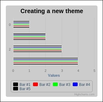
var myTheme = {};Assign the properties we want in the theme, such as colors or a background color as follows:
myTheme.colors = ["#000000", "#ff0000", "#00ff00", "#0000ff"] myTheme.chart = { backgroundColor: '#cccccc' }; myTheme.title = { style: { fontSize: '20px', fontFamily: '"Georgia", "Verdana", sans-serif', fontWeight: 'bold', color: '#000000' } }Call
Highcharts.setOptionsto apply our theme to all charts using the following code:Highcharts.setOptions(myTheme);
The following is the output chart:
The
Highcharts.setOptions function, as previously discussed, sets options globally; a theme is just a set of options that we want applied to all charts.
If we want to store the theme in a separate file, we only need to make a few small changes. First, we will create our theme in a new file. In this file, we will create our theme in the Highcharts namespace, include our theme file after highcharts.js on our main page, and call Highcharts.setOptions, as shown in the following code:
    // myTheme.js
    Highcharts.myTheme = {
        // Our theme goes here
    };

    // main page
    <script type='text/javascript' src='highcharts.js'></script>
    <script type='text/javascript' src='myTheme.js'></script>

    <script type='text/javascript'>
        // ... chart creation ...

        Highcharts.setOptions(Highcharts.myTheme);

        // ... chart rendering …
</script>Highcharts provides a few basic themes out of the box. This includes grid, skies, gray, dark blue, and dark green, in addition to the default colors. They can be found in the themes folder and are included just as you would include any other theme. More details on theming can be found at http://highcharts.com/docs/chart-design-and-style/themes.
So far we have experimented with a lot of different graph options and configurations where themes defined a common set of styles; we may find a time where we have a very common type of graph that we want to create and we do not want to define the same options over and over again. We can avoid this tedium by creating reusable charts.
To get started, follow the ensuing instructions:
Determine what type of a chart you want to make reusable. Suppose that we want to take our existing spiderweb chart.
Create a new function
spiderWebChart. This chart will take anoptionsargument to let us configure the chart and return aHighcharts.Chartinstance, as shown in the following code:var SpiderWebChart = function (options) { return Highcharts.Chart(options); };Define default values for the chart that will give it the correct appearance, as we did in the recipe Creating spiderweb graphs for comparison, using the following code:
    var SpiderWebChart = function (options) {
        // create options if they don't exist
        var modifiedOptions = options || {};

        // create a chart option if it does not exist
        modifiedOptions.chart = modifiedOptions.chart || {};
        modifiedOptions.chart.polar = true;

        // create an xAxis option if it does not exist
        modifiedOptions.xAxis = modifiedOptions.xAxis || {};
        modifiedOptions.xAxis.tickmarkPlacement = 'on';
        modifiedOptions.xAxis.lineWidth = 0;

        // create a yAxis option if it does not exist
        modifiedOptions.yAxis = modifiedOptions.xAxis || {};
        modifiedOptions.yAxis.gridLineInterpolation = 'polygon';
        modifiedOptions.yAxis.lineWidth = 0;

        return new Highcharts.Chart(modifiedOptions);
    };
Create a spiderweb graph using the options from the previously mentioned recipe, using the following code:
    var chart = SpiderWebChart({
        chart: {
            renderTo: 'container'
        },
        title: {
            text: 'Creating spiderweb graphs for comparison'
        },
        series: [{
            name: 'Fighter',
            data: [10, 1, 5],
            pointPlacement: 'on'
        }, {
            name: 'Rogue',
            data: [5, 10, 1],
            pointPlacement: 'on'
        }]
    });
We have created a wrapper function for common options. Instead of using jQuery, we use the renderTo option to find an element with container as its ID and render the chart within that element. As we only overwrite certain properties in our SpiderWebChart function, we can pass in as many other options as we like and only the ones relevant to the SpiderWebChart function will be affected.