


This chapter explains the Foundation grid system, introduces various grid features included in Foundation, shows by example how to apply layout techniques, and offers tips to deal with special cases.
We'll discover how to work with cells, rows, and columns. We'll look at nesting rows in columns. We'll learn about gutters, page width, and row height and see how to apply the grid to small and large devices. We'll use built-in styles to tweak your layout and we'll learn what to expect when you put images in your grid.
Throughout the chapter, we'll include a few tips and tricks that show how, with just a few styles in a custom style sheet, you can have a nice effect on your design.
The foundation (pun intended) of Zurb Foundation is its grid system—rows and columns, much like a spread sheet, a blank sheet of graph paper, or tables similar to what we used to use for HTML layout. Think of it as the canvas upon which you design your website.
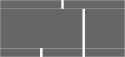
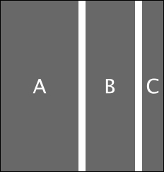
The following is a way to picture a blank grid before you begin your design:
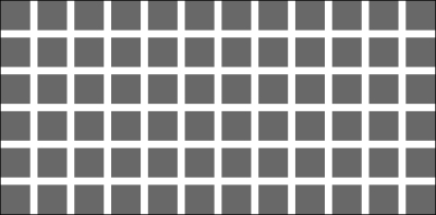
Each cell is a content area that can be merged with other cells beside or below it to make larger content areas. A default installation of Foundation will be based on 12 cells in a row. This is convenient because the number 12 is divisible by 1, 2, 3, 4, 6, and 12.
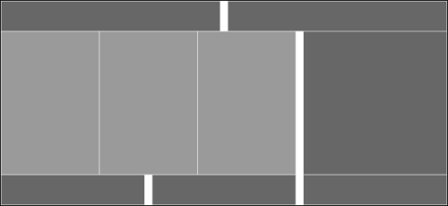
The following is the grid again with the cells in a row grouped into 12, 6, 4, 3, 2, and 1 columns respectively:
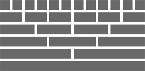
A column is comprised of one or more individual cells in a row. The total width of the columns in a row cannot exceed the number of underlying cells in the grid's row.
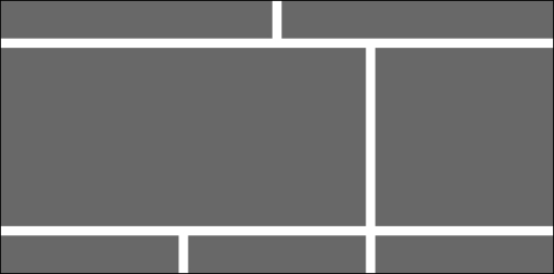
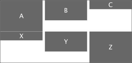
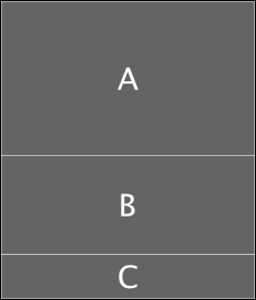
The following figure is an example of a typical blog layout:
How do we create these areas for our website? We simply define rows and columns using HTML. The following is the HTML code for the header row in the example blog:
<div class="row">
  <div class="large-6 column">
    <!-- Header left -->
  </div>
  <div class="large-6 column">
    <!-- Header right -->
  </div>
</div>
The outer <div> tells the browser to form a block representing a row. It gives that block all the styles associated with a row class. Each inner <div> tells the browser to form a block representing a column within the row where each column has a width of 6 cells. As our grid has 12 cells in a row, each column with six cells is 50 percent of the row width.
Foundation styles look after keeping the two columns in one row and making them equal in width. We'll cover the small-n and large-n classes in more detail further on. In this example, specifying each column as large-6 means that it will use six cells on a regular display.
From this, you can write the HTML for the content and footer rows in our sample blog. Each will be a row. The content area has two columns, of which one is eight cells wide and the other is four cells wide. The footer area has three columns, each being four cells wide.
The real strength of Foundation as a tool for website layout is its nesting capability. Besides a simple grid with rows and columns, you can nest rows within columns. Each newly defined row has its own cells to be grouped into columns.
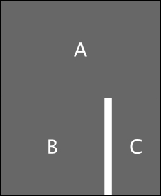
Going back to our blog, let's say you have something in your content area that would best be displayed in three equal columns. That area was eight cells wide. 8 is not divisible by 3. But 12 is divisible by 3.
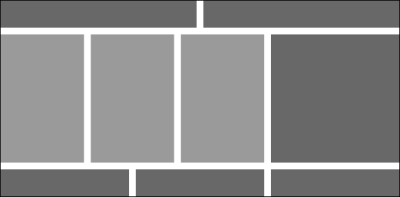
So let's create a new row within the content area. We'll refer to this as an inner row as it is treated a little differently than the outer rows we've seen up until now. This is what we want it to look like where the three columns shown in a lighter grey are columns in an inner row:
The HTML for the eight-column content area is as follows:
<div class="large-8 column">
  <div class="row">
    <div class="large-4 column"><!--content left--></div>
    <div class="large-4 column"><!--content center--></div>
    <div class="large-4 column"><!--content right--></div>
  </div>
</div>
Imagine the possibilities. Any space you have on your website can contain a grid with its own rows and columns.
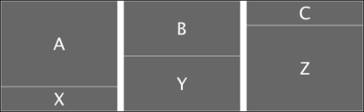
By design, Foundation leaves spaces between columns. This space is called a gutter. Foundation does not leave gutter space between rows. That is left for the content to manage. So if we look at the actual space defined by the row and column styles in our original blog layout, it looks like the following figure:
Most content will have margins or padding above or below it. For example, the paragraph tag <p> is defined in Foundation as having a margin-bottom property of 1.25 em. So if you are using paragraph tags, you will have a 1.25 em space between rows. But that is derived from the content. It is not inherent in Foundation's grid definitions.
Now what if we want to create a gutter between rows? For example, what if we are putting images inside columns? Images have no inherent space above or below them, so there would be no space between rows. The following custom styles will add a 1 em gutter between rows, half at the top and half at the bottom:
.row {
  padding-top: 0.5em;
  padding-bottom: 0.5em;
}
.row .row {
  margin-top: -0.5em;
  margin-bottom: -0.5em;
}
To avoid double gutters for nested rows, we added a negative margin at the top and bottom of the nested rows.
Foundation leaves spaces between columns through the use of padding. The following are the values from a default installation:
.column, columns {
  padding-left: 0.9375em;
  padding-right: 0.9375em;
}
For outer rows, there will be a 0.9375 em space on the left and right. Between the columns, there will be a 1.875 em (2 * 0.9375 em) gutter.
For nested, inner rows, the padding on the left and right columns is omitted. Only the padding between the columns remains. This allows the content of the inner rows to line up within its space. Foundation accomplishes this bit of magic by defining negative margins on inner rows:
.row .row {
  margin-left: -0.9375em;
  margin-right: -0.9375em;
}
These negative margins on the row are equal to the left and right padding of columns, so they effectively cancel each other out.
Let's say you want to set the gutter to 16 px (1 em) instead of the default 30 px (1.875 em). In your custom style sheet, just set the padding on columns and the margin on inner rows as follows:
.column, .columns {
  padding-left: 0.5em;
  padding-right: 0.5em;
}
.row .row {
  margin-left: -0.5em;
  margin-right: -0.5em;
}
There may be times when you want to get rid of the gutters between columns. Foundation makes that easy with the collapse class.
For example, to eliminate the gutters from the inner row of our eight-columned content area, simply add the collapse class while defining the inner row.
<div class="large-8 column">
  <div class="row collapse">
    <div class="large-4 column"><!--content left--></div>
    <div class="large-4 column"><!--content center--></div>
    <div class="large-4 column"><!--content right--></div>
  </div>
</div>
We've only included the preceding code for the inner row. Because of the collapse class there are no gutters between the columns in the inner row. This is what it will look like:
There are a couple of limitations in having fixed-width gutters. As content is scaled to a smaller display, only the content area in a column scales. The gutters remain fixed. You might prefer for them to scale proportionally along with the column content.
This is particularly noticeable when you have images in columns. As soon as your page is squeezed to less than the full width, each column gets squeezed proportionally. But the columns include padding, which has a fixed width. Narrower images get squeezed a greater percentage than wider ones, and as the height is proportional, it decreases more, thereby putting things out of perspective.
The solution is surprisingly simple. Instead of specifying column padding in em (or px), specify it in percentage. In the following example, gutters are set to 5 percent, half on the left and half on the right:
.column, .columns {
  padding-left: 2.5%;
  padding-right: 2.5%;
}
.row .row {
  margin-left: -2.5%;
  margin-right: -2.5%;
}
Now, content such as images in columns will scale proportionally. Be sure to include the offset for inner rows so they continue to align properly.
The simplest way to set the maximum page width for your website is to put all your content inside a containing row.
<body>
<div id="container" class="row"><div class="large-12 column">
<!-- website content -->
</div></div><!-- end #container -->
</body>
This code creates an outside row with a maximum width equal to the max-width value of the row (the default value is 62.5 em or 1000 px).
As a general rule, while creating an outer containing row, always include a column that has the full width (for example, large-12 columns). Otherwise, the negative margins of an inner row will make your website wider than you anticipated.
Only the outermost row has a specific maximum width value. Inner rows expand to fill the container in which they reside.
While having a single containing row is the simplest way to set the maximum width for your site, you can also build your site in sections. In the blog we created earlier, we had an outside row for each of the three sections: header, main, and footer.
This also works to keep your site at a fixed maximum width. As long as all the content is within those rows, the content will align itself, and the site width will be limited to the maximum width for the outer row class in Foundation.
To override the maximum width of your site in a custom style sheet, simply add a style as follows:
.row { max-width: 128em; }That's it. Now your outer rows, and therefore your site width, will use as much as 128 em (2048 px). Choose your own maximum width, larger or smaller than the default 62.5 em.
Column height is determined by its content. Row height is determined by the highest column in a row.
The following code snippet shows two rows, each with three columns of different heights:
<div class="row">
  <div class="large-4 column"><!-- content A --></div>
  <div class="large-4 column"><!-- content B --></div>
  <div class="large-4 column"><!-- content C --></div>
</div>
<div class="row">
  <div class="large-4 column"><!-- content X --></div>
  <div class="large-4 column"><!-- content Y --></div>
  <div class="large-4 column"><!-- content Z --></div>
</div>
The following figure shows the output of the preceding code:
Foundation does not squeeze a column from one row up into the space of another row even when it might fit. Sometimes you are working with content where you just don't know in advance how high a column will be. In those situations, let the content guide you on how it should be organized.
At other times, you may be designing for a more predictable height and decide you want to mesh the columns together. You can display the same content as the preceding example meshed together as follows:
<div class="row">
  <div class="large-4 column">
    <!-- content A -->
    <!-- content X -->
  </div>
  <div class="large-4 column">
    <!-- content B -->
    <!-- content Y -->
  </div>
  <div class="large-4 column">
    <!-- content C -->
    <!-- content Z -->
  </div>
</div>
The output is shown in the following figure:
One of the key principles of Zurb Foundation 4 is that you are encouraged to design for small, generally mobile devices first. Then adapt your design for large displays, usually desktops and laptops. This is called mobile-first design.
Intuitively, it just makes sense. The traditional approach was to design for regular displays and make exceptions for larger and smaller devices. It is easier to design for small devices (one end of the spectrum) and make exceptions for larger devices.
While Foundation is capable of handling multiple breakpoints, in this book we'll concentrate on two sizes, small and large. A breakpoint is a specific browser width that delineates small and large displays. Foundation's default breakpoint is 768 px. When a browser is narrower than the breakpoint, we call it a small display. When it is wider, we call it a large display. The principles are the same when you introduce additional sizes, so if you can manage two, you can manage three.
When we defined columns in our previous examples, we prefixed them with the large-n class. We can use either the small-n or large-n classes. The following are the rules:
Use
small-nalone to define the number of cells to use in both small and large devices.Use
large-nalone to define the number of cells to use only on large devices. When the content is then displayed on small devices, it assumessmall-12and uses all available width.Use
small-nandlarge-nwhen you want to control the view on small and large devices independently.
Let's look at some examples. Assume a row with three columns. The first column is six cells wide, the second is four cells wide, and the third is two cells wide.
If we specify all three columns with the small-n classes, then on a small device, the content will appear narrow and require more vertical height as shown in the following figure:
When viewed on a desktop or laptop, the relative width of each column is the same, but the content will spread out horizontally and require less vertical height as shown in the following figure:

If we specify all three columns with the large-n classes, then on a small device each column takes the full width of the screen because nothing was specified for small-n, and it defaults to full width, as follows:
When viewed on a desktop or laptop, it will look exactly as it did when only the small-n columns were defined.
We can specify both the small-n and large-n classes separately as follows:
<div class="row">
  <div class="small-12 large-6 column"><!-- content A --></div>
  <div class="small-8 large-4 column"><!-- content B --></div>
  <div class="small-4 large-2 column"><!-- content C --></div>
</div>
When viewed on a small device, column A takes the full width of the screen because it was specified as small-12. Columns B and C flow under column A. Column B is small-8 and column C is small-4, so between them they take up the full width. We have columns totaling 24 cells in the small view. That's ok. Foundation looks after wrapping. As soon as a column exceeds the grid maximum (12 here), subsequent columns wrap into a new row.
The preceding code's output will look as follows on small devices:
When viewed on a desktop or laptop, it will look exactly as it did when only the small-n or large-n columns were defined.
How does Foundation know whether it is a small or large device that is being used to display content? It uses media queries.
A media query is a conditional statement used in a style sheet in such a way that styles within the media query take effect only if that condition is true. For small devices, styles are defined outside of a media query. This way they remain in effect unless there is an override within a media query. Therefore, all styles specific to large devices must be within a media query.
The following is the media query for large devices:
@media only screen and (min-width: 768px) {
// .large-n styles
}
Any devices that report a browser width of 768px or greater will use the large-n classes when they are used in the markup. Otherwise, they will default to the classes defined outside the media query.
Can we always rely on media queries? Unfortunately, the answer is no. Newer browsers and the latest devices all support media queries. So for the majority of Internet users, media queries are fine.
But if you are in an organization where you must support older browsers (for example, IE8 and earlier), look for JavaScript add-ins that emulate media queries for those browsers. Or at the very least, do a bang-up design for small devices because that's what users with old browsers that do not support media queries will see.
There are a few additional things you can do to adjust your layout within the grid. These include centering, offsetting, and changing the order of columns.
There may be times when you want to center some columns within your grid. For example, by creating a column with fewer than twelve cells and centering that column, you effectively create a margin on either side. The following is an example:
<div class="row">
  <div class="small-10 small-centered column">
  <!-- centered -->
  </div>
</div>
This will create a ten-cell column that is centered in the row as follows:

When you use the small-centered class alone, it centers the column on small devices and regular displays. If you want your column to float left on small devices and be centered only on regular displays, add the large-centered class alone.
If you want your column to float right on small devices and be centered on regular displays, add the right and large-centered classes.
If you want your column to be centered on small devices and float left on regular displays, add the large-uncentered class.
If you want your column to be centered on small devices and float right on regular displays, add the large-uncentered and opposite classes.
Sometimes, you may want to display your columns in one order for small devices and a different order for regular displays. A simple example of this would be when you want your blog sidebar content to be at the top on small devices, and you want it on the right on regular displays.
Foundation provides a way to do this through the use of the push-n and pull-n classes.
Browsers will display content in the order it is delivered, unless you override the sequence. So the idea is to deliver sidebar content A, before blog content B. The small device will display it in that sequence:
<div class="row">
  <div class="small-12 column">A</div>
  <div class="small-12 column">B</div>
</div>
Because we've made each column small-12, each one will take up the full width on small devices and display one above the other:
But on a regular display, we want to display the sidebar content A to the right of blog content B. This is the opposite of the order in which it is delivered to the browser as follows:
<div class="row">
  <div class="small-12 large-3 push-9 column">A</div>
  <div class="small-12 large-9 pull-3 column">B</div>
</div>
The preceding code results in the following layout:

The push-9 class pushes content A nine cells to the right of where it otherwise would be by default. The pull-3 class pulls content B three cells to the left of where it otherwise would be.
As an aside, you may recall that the small-12 class is the default when we have a large-n class, so it could have been left out of this example.
This was a simple example. You can push and pull when you have multiple columns and within nested rows. It is a very useful technique for managing the presentation of the same content on mobile devices and regular displays.
The push-n and pull-n classes only affect the order on regular displays. You can still use the small-n class to define columns for both. The following code will display A to the left of B on small devices and B to the left of A on regular displays:
<div class="row">
  <div class="small-3 push-9 column">A</div>
  <div class="small-9 pull-3 column">B</div>
</div>
A subtle point in understanding source ordering is that the push and pull classes only affect the column where they are specified. They do not affect prior or subsequent columns unless those columns also have a push or pull class. So you typically have at least one pull for every push, and vice versa. Otherwise, you would simply slide one column under another.
You would use an offset when you want to leave an empty space in your row.
An offset-n class is similar to a push-n class, in that it moves a column some number of cells to the right. The difference is that it also moves all subsequent columns to the right. An offset is like creating an empty column, the width of the offset.
A simple use of offsets would be to indent the content:
<div class="row">
  <div class="small-offset-2 small-10 column">Indented 2</div>
  <div class="small-offset-4 small-8 column">Indented 4</div>
</div>
The following figure shows how this would appear:

The first column has a width of 10 cells and is offset 2 cells, so it uses the full width of the row. The second column has a width of 8 cells and is offset 4 cells, so it also uses the full width of the row.
Offsets can also be used anywhere in a row to create space between columns as shown in the following code snippet:
<div class="row">
  <div class="small-2 column">A</div>
  <div class="small-offset-2 small-4 column">B</div>
  <div class="small-offset-2 small-2 column">C</div>
</div>
This code produces empty space as shown in the following figure:

Unlike push and pull classes, which only apply to regular displays and override the default order of columns on small devices, offsets can be defined for small and large devices separately.
Similar rules apply for the small-n and large-n columns. When small-offset-n is used alone, it has the same effect on small and large displays. When large-offset-n is used alone, it is ignored on small displays and only affects large displays. When both small-offset-n and large-offset-n are used, each of them affects its respective display.
Foundation has a built-in offset that you should be aware of. When you use fewer cells in a row than there are available, the last column will float to the right, effectively leaving an offset equal to the number of unused cells.
In the following figure, three columns are defined. A is four cells wide, B is four cells wide, and C is two cells wide. Column C floats to the right as if it had a small-offset-2 class defined for it.

To change the default behavior on the last column and shift it back to the right of the column preceding it, you can add the end class to the last column:
<div class="row">
  <div class="small-4 column">A</div>
  <div class="small-4 column">B</div>
  <div class="small-2 column end">C</div>
</div>
The preceding code shifts column C back so that it is next to column B as follows:

While designing a website, it is important to understand how images will be presented by default so you can adjust when necessary. In a Foundation-based site, where images are inside a row and column, this is especially true.
An image has an inherent width and height. Styles on the <img> tag will determine how an image will be presented in the browser. The following are Foundation's defaults:
img {
  max-width: 100%;
  height: auto;
  display: inline-block;
  vertical-align: middle;
}
When presented with these defaults, an image will use all the space that it can while being constrained by that space.
The following is an example code that demonstrates these styles:
<div class="row">
  <div class="small-3 column">
    <img src="http://placehold.it/220x220">
  </div>
  <div class="small-3 column">
    <img src="http://placehold.it/100x400">
  </div>
  <div class="small-3 column">
    <img src="http://placehold.it/400x400">
  </div>
  <div class="small-3 column">
    <img src="http://placehold.it/100x100">
    <img src="http://placehold.it/100x300">
  </div>
</div>
We started with a grid that was 1000 px wide and created four equal columns that were 250 px wide. With 15 px padding on each side, there is 220 px left for content.
The following is a screenshot of the result when shown in a browser that is wider than 1000 px and therefore shows the content at its maximum width:
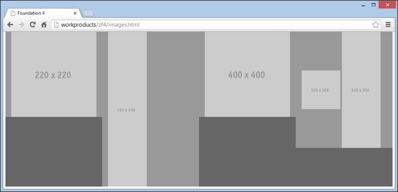
The image in the first column exactly fits the width of the column, which is 220 px. The column height (medium gray) is exactly the height of the image.
The second column contains an image having width 100 px and height 400 px. As the width of the image is less than the width of the column, the full width of the image is displayed, and therefore, the full height is also displayed. As this is the highest column, it determines the height of the row, which is also 400 px.
The third column contains an image having width 400 px and height 400 px respectively. This is wider than the available 220 px, so the image width is constrained to 220 px. As the height is adjusted proportionally to the width, it is also 220 px. This image is displayed having exactly the same size as the image in column one, even though the underlying image is larger.
The fourth column contains two images. The first one is 100 px by 100 px and the second one is 100 px by 300 px. As each one is only 100 px wide, there is sufficient width in the column to display them side by side. Because the full width of each image is displayed, the full height is also displayed. This makes the column 300 px high, and the height of the taller image and the smaller image sits in the middle vertically. Of all the images shown here, this smaller image is the only one that does not determine its column height.
If you could learn only one thing from this book, the most important would be to understand the grid system. It is the basis for web page layout with Foundation, and with it, you can create professional sites with ease.
In this chapter we learned how Foundation's grid system is comprised of cells, rows, and columns. We learned to manipulate rows, columns, and the space between them to get different effects. We learned how content in general, images in particular, both influence and are constrained by the grid system. Throughout, we took home some tips that allow us to create our own styles to improve control over our grid-based layout.
Now that you've mastered the grid system, in the next chapter we'll dig into all the additional components included in the Foundation toolkit that only require style sheets to work. You may not use all of them right away, but it helps to be aware of the possibilities, how to put them to work, and how to tweak them to your preferences.