


Currently, web technologies are growing rapidly. Though most current websites use these technologies, we come across many with a bad, unresponsive UI design and awful performance. The only reason we should think about a responsive website is that users are now moving to the mobile web. 55% of web users use mobile phones because they are faster and more comfortable. This is why we need to provide mobile content in the simplest way possible. Everything is moving to minimalism, even the Web.
The new web standards are changing rapidly too. In this chapter, we will cover one of these new technologies, web components, and what they do. Using web components, you can easily create your web application by splitting it into parts/components.
We will cover the following topics:
Introduction to web components
Templates
Shadow DOM
Custom elements
HTML imports
Styles and selectors
These are the specifications of web components. Each one of these creates magic. Polymer is a library that uses the features of web components. Hence, we need to study web components in detail before we start working with it.
Let's talk about web components. What are they? Why should we use them on the Web and what kind of problems can they solve?
Imagine for a moment, what if you could write less code and make more things than now, what if you could just create a <website> component and give it some attributes and create your entire website in a second. You think it is possible only in the future? Nope, it's happening now! Web components are here and they will solve all your problems.
There is no issue with browser support because now (at the time of writing this chapter) all modern browsers support web component polyfills.
Look at the following screenshot of code blocks from Gmail:
If you can read and understand this code, the only thing I would say to you is that you're a hero, because I can't!
What if I showed you code similar to the following? (I like this one, by the way):
This code is written using the features of web components and is way easier to read/understand/execute. Now, compare both the examples. Do you see any difference? I guess you already know which one is better.
Web components allow us to create complex UI widgets and applications. We can fill in the gaps with our own reusable components and then use them whenever we want.
There is a saying that:
"If you think that the Web was changed by HTML5, then wait and see what changes web components make."
Web components are a new era of web development and, in this book, we will discuss the benefits you can get using Polymer from Google. You can create your own elements that contain templates, encapsulated styles, and logic (JS). They also take advantage of a rich collection of ready-made elements (take a look at http://customelements.io).
"The platform of the future" is a set of standards that allows us to describe new types of DOM elements with their properties and methods that encapsulate their DOM and styles.
This means that the styles you have in a document will always render as you intend them to and your HTML code is safe from other users of external JavaScript code.
Web components have four specifications and we will discuss them in this chapter. They are as follows:
Templates
Shadow DOM
Custom elements
HTML imports
In this section, we will discuss what we can do with templates. However, let's answer a few questions before this.
What are templates and why should we use them?
Templates are basically fragments of HTML, but let's call these fragments the "zombie" fragments of HTML as they are neither alive nor dead. What is meant by "neither alive nor dead"? Let me explain this with a real-life example.
Once, when I was working on the
ucraft.me project (it's a website built with a lot of cool stuff in it), we faced some rather new challenges with the templates. We had a lot of form elements, but we didn't know where to save the form elements content. We didn't want to load the DOM of each form element, but what could we do? As always, we did some magic; we created a lot of div elements with the form elements and hid it with CSS. But the CSS display: none property did not render the element, it loaded the element. This was also a problem because there were a lot of form element templates and it affected the performance of the website.
I recommended to my team that they work with templates. Templates can contain HTML content, but they do not load the element nor render.
We call template elements "dead elements" because they do not load the content until you get their content with JavaScript. Let's move ahead and let me show you some examples of how you can create templates and do some stuff with their contents.
Imagine that you are working on a big project where you need to load some dynamic content without AJAX. If I had a task such as this, I would create a PHP file and get its content by calling the jQuery .load() function. However, now you can save your content inside the <template> element and get the content without any jQuery or AJAX, but instead with a single line of JavaScript code. Let's create a template.
In index.html, we have <template> and some content we want to get in the future, as shown in the following code block:
<template class="superman">
  <div>
   <img src="assets/img/superman.png" class="animated_superman" />
  </div>
</template>
The time has now come for JavaScript! Execute the following code:
<script>
  // selecting the template element with querySelector()

  var tmpl = document.querySelector('.superman');
  //getting the <template> content
  var content = tmpl.content;
  // making some changes in the content
  content.querySelector('.animated_superman').width = 200;

  // appending the template to the body
  document.body.appendChild(content);
</script>
So, that's it! Cool, right? The content will load only after you append the content to the document. So, do you realize that templates are a part of the future web? If you are using Chrome Canary, just turn on the flags of experimental web platform features and enable HTML imports and experimental JavaScript.
There are four ways to use templates, which are:
Add templates with hidden elements in the document and just copy and paste the data when you need it, as follows:
<div hidden data-template="superman">
  <div>
    <p>SuperMan Head</p>
    <img src="assets/img/superman.png" class="animated_superman" />
  </div>
</div>
However, the problem is that a browser will load all the content. It means that the browser will load but not render images, video, audio, and so on.
Get the content of the template as a string (by requesting with AJAX or from
<script type="x-template">).However, we might have some problems in working with the string. This can be dangerous for XSS attacks; we just need to pay some more attention to this:
<script data-template="batman" type="x-template">
  <div>
    <p>Batman Head this time!</p>
    <img src="assets/img/superman.png" class="animated_superman" />
  </div>
</div>
Compiled templates such as Hogan.js (http://twitter.github.io/hogan.js/) work with strings. So they have the same flaw as the patterns of the second type.
Templates do not have these disadvantages. We will work with DOM and not with the strings. We will then decide when to run the code.
In conclusion:
The
<template>tag is not intended to replace the system of standardization. There are no tricky iteration operators or data bindings.Its main feature is to be able to insert "live" content along with scripts.
Lastly, it does not require any libraries.
The Shadow DOM specification is a separate standard. A part of it is used for standard DOM elements, but it is also used to create web components. In this section, you will learn what the Shadow DOM is and how to use it.
The Shadow DOM is an internal DOM element that is separated from an external document. It can store your ID, styles, and so on. Most importantly, the Shadow DOM is not visible outside of its scope without the use of special techniques. Hence, there are no conflicts with the external world; it's like an iframe.
The Shadow DOM concept has been used for a long time inside browsers themselves. When the browser shows complex controls, such as an <input type = "range"> slider or a <input type = "date"> calendar within itself, it constructs them out of the most ordinary styled <div>, <span>, and other elements.
They are invisible at first glance, but they can be easily seen if the checkbox in Chrome DevTools is set to display Shadow DOM:
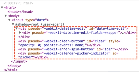
In the preceding code, #shadow-root is the Shadow DOM.
Getting items from the Shadow DOM can only be done using special JavaScript calls or selectors. They are not children but a more powerful separation of content from the parent.
In the preceding Shadow DOM, you can see a useful pseudo attribute. It is nonstandard and is present for solely historical reasons. It can be styled via CSS with the help of subelements—for example, let's change the form input dates to red via the following code:
<style>
  input::-webkit-datetime-edit {
    background: red;
  }
</style>

<input type="date" />
Once again, make a note of the pseudo custom attribute. Speaking chronologically, in the beginning, browsers started to experiment with encapsulated DOM structure inside their scopes, then Shadow DOM appeared which allowed developers to do the same.
Now, let's work with the Shadow DOM from JavaScript or the standard Shadow DOM.
The Shadow DOM can create any element within the elem.createShadowRoot() call, as shown by the following code:
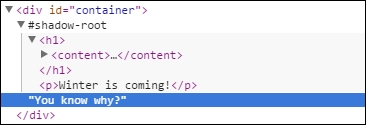
<div id="container">You know why?</div>

<script>
  var root = container.createShadowRoot();
  root.innerHTML = "Because I'm Batman!";
</script>
If you run this example, you will see that the contents of the #container element disappeared somewhere and it only shows "Because I'm Batman!". This is because the element has a Shadow DOM and ignores the previous content of the element.
Because of the creation of the Shadow DOM, instead of the content, the browser has shown only the Shadow DOM.
If you wish, you can put HTML content via JavaScript inside this Shadow DOM. To do this, you need to specify where it is to be done. The Shadow DOM is done through the "insertion point" and it is declared using the <content> tag; here's an example:
<div id="container">You know why?</div>

<script>
  var root = container.createShadowRoot();
  root.innerHTML = '<h1><content></content></h1><p>Winter is coming!</p>';
</script>
Now, you will see "You know why?" in the title followed by "Winter is coming!".
Here's a Shadow DOM example in Chrome DevTool:
The following are some important details about the Shadow DOM:
The
<content>tag affects only the display and it does not move the nodes physically. As you can see in the preceding picture, the node "You know why?" remained inside thediv#container. It can even be obtained usingcontainer.firstElementChild.Inside the
<content>tag, we have the content of the element itself. In this example, the string "You know why?".
With the select attribute of the <content> element, you can specify a particular selector content you want to transfer; for example, <content select="p"></content> will transfer only paragraphs.
Inside the Shadow DOM, you can use the <content> tag multiple times with different values of select, thus indicating where to place which part of the original content. However, it is impossible to duplicate nodes. If the node is shown in a <content> tag, then the next node will be missed.
For example, if there is a <content select="h3.title"> tag and then <content select= "h3">, the first <content> will show the headers <h3> with the class title, while the second will show all the others, except for the ones already shown.
In the preceding example from DevTools, the <content></content> tag is empty. If we add some content in the <content> tag, it will show that if there are no other nodes.
Check out the following code:
<div id="container">
  <h3>Once upon a time, in Westeros</h3>
  <strong>Ruled a king by name Joffrey and he's dead!</strong>
</div>

<script>
  var root = container.createShadowRoot();

  root.innerHTML = '<content select='h3'></content> \
  <content select=".writer"> Jon Snow </content> \
  <content></content>';
</script>
When you run the JS code, you will see the following:
The first
<content select='h3'>tag will display the titleThe second
<content select = ".hero">tag would show the hero name, but if there isn't element with this selector, it will take the default value:<content select=".hero">The third
<content>tag displays the rest of the original contents of the elements without the header<h3>, which it had launched earlier
Once again, note that <content> moves nodes on the DOM physically.
After the creation of a root in the internal DOM, the tree will be available as container.shadowRoot.
This is a special object that supports the basic methods of CSS requests and is described in detail in ShadowRoot.
You need to go through container.shadowRoot if you need to work with content in the Shadow DOM. You can create a new Shadow DOM tree of JavaScript; here's an example:
<div id="container">Polycasts</div>

<script>
  // create a new Shadow DOM tree for element
  var root = container.createShadowRoot();

  root.innerHTML = '<h1><content></content></h1> <strong>Hey googlers! Let\'s code today.</strong>';
</script>

<script>
  // read data from Shadow DOM for elem
  var root = container.shadowRoot;
  // Hey googlers! Let's code today.
  document.write('<br/><em>container: ' + root.querySelector('strong').innerHTML);
  // empty as physical nodes - is content
  document.write('<br/><em>content: ' + root.querySelector('content').innerHTML);
</script>
To finish up, Shadow DOM is a tool to create a separate DOM tree inside the cell, which is not visible from outside without using special techniques:
A lot of browser components with complex structures have Shadow DOM already.
You can create Shadow DOM inside every element by calling
elem.createShadowRoot(). In the future, it will be available aselem.shadowRootroot and you will be able to access it inside the Shadow DOM. It is not available for custom elements.Once the Shadow DOM appears in the element, the content of it is hidden. You can see just the Shadow DOM.
The
<content>element moves the contents of the original item in the Shadow DOM only visually. However, it remains in the same place in the DOM structure.Note
Detailed specifications are given at http://w3c.github.io/webcomponents/spec/shadow/.
Now, let's move to custom elements, which are also a part of web components. You can do lots of cool stuff with custom elements, so go ahead to the next topic and keep rocking the world!
In this section, we will discuss another great feature of web components.
A reader with a critical mind would say, "Why do we need more standard types of elements? I can create any element right now! In any of the modern browsers, I can create any HTML tag I want using custom tags (<customtag>) or create elements from JavaScript using document.createElement('customtag')."
However, the default element with a nonstandard name (for example, <customtag>) is seen by the browser as something vague and incomprehensible. It corresponds to the HTMLUnknownElement class and it does not have any special methods.
The standard of custom elements allows you to describe the elements of its new properties and methods, declare your DOM and construction similarity, and much more.
Note
Running examples of this book
Since the specification is not final, it is recommended that you run the examples used in this book in Google Chrome, better yet, in the latest build of Chrome Canary, which tends to reflect the latest changes.
Let's look at the following examples.
For the description of a new element, we will use document.registerElement (name, {prototype: proto}), which can be explained as follows:
name: This is the name of the new tag, such assuper-tag. It must contain a dash (-). The specification requires a dash to avoid future conflict with the standard elements of HTML. You cannot create an item or timer with the namemyTag. The DOM will identify this element as an unknown element.prototype: This is the prototype object for the new element and it must be inherited from theHTMLElementproperty, standard properties, and methods of the element.
Let me show you some examples of how to create custom elements and play with them using JavaScript.
At first, we need to create the custom <show-logo> element that has two attributes (id and logo). Let's go ahead and take a look at the ways in which we can choose to create a custom element, as follows.
HTML
<!—Creating Framework Logos tag -->
<!-- You can use names like (polymer, angular-js, backbone, ember, underscore, bower) -->
<show-logo id="showLogo" logo="polymer"></show-logo>
JavaScript
var logo = Object.create(HTMLElement.prototype);
logo.show = function(){
    // Creating info text
    var info = document.createElement('p');
    info.innerHTML = 'Hover me to feel the Logo!';

    var fwork = this.getAttribute('logo');

    var img = document.createElement('img');
    img.src = 'frameworks/logo/' + fwork + '.png';
    img.width = 300;
    img.height = 240;

    this.appendChild(img);
    this.appendChild(info);

    this.onmouseover = function(){
        this.audio.play();
    };
    this.onmouseout = function(){
        this.audio.pause();
    };
};
logo.audio = new Audio('logo/music/logo.ogg');

// Registering our Framework Logo element
document.registerElement('show-logo', {prototype: logo});
showLogo.show();
You can see the result in the following figure:

Here, we have our <show-logo> component, which contains an image that we have given as the logo attribute. The logo gets the image from the attribute value. You can try this live in the Examples page in the Chapter 1 folder in the accompanying code bundle of this book, available on the Packt website or on GitHub.
Let's have a look at what we did here. We created and registered our <show-logo> component, which has the .show() method. The .show() method creates some information and an image and appends it to our custom element. We also have audio attached here that starts playing when we hover over the element.
In the end, we will call our component's .show() method and it will create our scene.
If your new element is not defined in HTML, you can register it through registerElement(). The browser has a special mode to "upgrade" the existing elements.
When the browser sees an element with an unknown name that has a dash (-) (these elements are called unresolved), then:
It puts this special CSS pseudo class as
:unresolvedand CSS might show that it is still "not loaded"When we call
registerElement(), the elements will be updated automatically to the correct class
In the following example, the registration element takes 3 seconds after the document is loaded, as shown here:
<style>
  / * Style for: unresolved element (prior to registration) * /
  say-hello:unresolved {
    color: white;
    background: #cc0000;
  }
  say-hello {
    transition: all 4s;
  }
</style>
<say-hello id="hello">Hey, guys!</say-hello>
<script>
  // Registration will take place in 3 seconds
  setTimeout(function() {
    document.registerElement("say-hello", {
      prototype: {
        __proto__: HTMLElement.prototype,
        sayHelloAgain: function() { alert('I said HEY!'); }
      }
    });

    // the new type of elements is a method sayHelloAgain
    hello.sayHelloAgain();
  }, 3000);
</script>
Now, you can create <say-hello> elements in JavaScript and call createElement(), as follows:
var time = document.createElement('say-hello'); We discussed an example to create an element based on the HTMLElement base. But it is possible to expand more specific HTML elements.
To extend built-in elements, there is a registerElement() option called extends in which you can specify the tag you are inheriting from.
The following is an example of a button:
<script>
  var proto = Object.create(HTMLButtonElement.prototype);
  proto.count = function() {
    this.innerHTML++;
  };

  document.registerElement("timer-tag", {
    prototype: proto,
    extends: 'button'
  });
</script>

<button is="timer-tag" id="counter">0</button>

<script>
  setInterval(function() {
    counter.count();
  }, 1000);

  counter.onclick = function() {
    alert("Current value: " + this.innerHTML);
  };
</script>
Some points to check are as follows:
The prototype is not inheriting from
HTMLElementbut fromHTMLButtonElement.To expand an element, it is necessary to inherit the prototype of its class.
In HTML, you can see the
is='…'attribute.This is HTML's version of
extendsin the JavaScript prototype. It extends the type of the element and applies to its prototype. Now,<timer-tag>will not work, you need to implement the tag and use theisattribute.Work methods, styles, and button events.
When you click on the button from the previous example, it won't identify whether it is a built-in element. By the way, it is built in and the method is
tick().When you use the new element in JS, you use
extends; you must specify and include the source tag, as shown:var time = document.createElement("button", "timer-tag");
In the prototype of the element, we can define special methods that will be fired when they are created, attached, or detached from the DOM, as shown in the following table:
|
|
The element is created |
|
|
The element is added to the document |
|
|
The element is removed from the document |
|
|
The attribute is added, modified, or deleted |
As you probably noticed, createdCallback is an inspired designer. It is called only when an item is created, so it makes sense to describe any additional initialization.
Let's use createdCallback to initialize the timer and attachedCallback to start the timer automatically when you append it into your document:
<script>
  var proto = Object.create(HTMLElement.prototype);

  proto.count = function() {
    this.counter++;
    this.innerHTML = this.counter;
  };

  proto.createdCallback = function() {
    this.counter = 0;
  };

  proto.attachedCallback = function() {
    setInterval(this.count.bind(this), 1000);
  };

  document.registerElement("timer-tag", {
    prototype: proto
  });
</script>

<timer-tag id="timer">0</timer-tag>
So, we have discussed how to create DOM elements using standard custom elements, and we will further explore new opportunities to work with web components. Next, we will move on to further exploring opportunities to work with web components, which are called HTML imports.
The new specification of HTML imports describes how to insert one document into another using the HTML tag <link rel="import">.
Yeah, you're right! There's an <iframe> element in the HTML code, so why should we use HTML imports instead of iframes?
With <iframe>, everything is okay. However, the meaning of <iframe> is a separate document:
It's useful when you want to show one page's content on another.
However, what if you want to build another document as a natural part of this? This can be done with a single scripting space and with the same style, but at the same time, it will be a new document.
For instance, it is necessary to load the external parts of the document (web components) from the outside. This is an excellent component because you will not to have to face origin problems with different domains. If we really want to connect an HTML page in one domain with another, we should be able to do it without having to "dance with a tambourine."
In other words, <link rel="import"> is an analogue of <script> for the connection of full documents, templates, libraries, web components, and so on. Everything will become clear when we look at the details.
Let's consider the following example of insertion:
<link rel="import" href="imported.html">
Unlike the
<iframe>tag,<link rel="import">can be anywhere in the document, even in<head>.When you insert via
<iframe>, the document is displayed in a frame. In the case of<link rel="import">, it is not displayed, and the imported document does not appear at all.
HTML loaded via <link rel="import"> has a separate document, but the scripts it contains are carried out in the general context of the page.
The file (imported.html) is loaded via <link rel = "import">, is processed, the scripts are run, and the DOM implementation is built. However, it is not shown and is recorded in the property link.import.
We will decide when and where to insert it.
In the following example, the <link rel="import" href="import.html"> code imports the import.html document and, after downloading it, calls the load() function. This function selects interesting parts of the loaded document through link.import.querySelector('custom-tag') and appends them into the current index.html file, as shown in the following example code:
<script>
  function load() {
    var element = link.import.querySelector('custom-tag')
    document.body.appendChild(element);
  };
</script>
<link rel="import" id="link" onload="load()" href="import.html">
The import.html file has elements and script that "revives" import.html, as shown here:
<!DOCTYPE HTML>
<html>
<body>
  <custom-tag id="counter">0</custom-tag>
  <script>
    var document = document.currentScript.ownerDocument;
    var counter = localDocument.getElementById('counter');

    var counterId = setInterval(function() {
      counter.innerHTML++;
    }, 1000);
  </script>
</body>
</html>
Here are some important details:
After downloading all of the scripts in the imported
import.htmlfile, our main HTML file will execute the imported script so that the timer and other variables would be the global variables of the page.The variable document is a document main page. For access to imported documents that are inside the current
import.htmldocument, you can get it asdocument.currentScript.ownerDocument.The timer function in the imported document begins immediately. The new document comes alive immediately after being loaded, though the transfer of nodes in the main document cannot be seen.
In this example, the main document is controlling the imported document, but the imported document can control itself and use document.body.appendChild(timer) to append itself inside the parent document. In this way, we don't need the onload event.
Imports are created as a part of the web components platform.
It is assumed that the main documents can import all the HTML, JS, and CSS elements and then use them.
Here's an example:
<link rel="import" href="paper-button.html">
<link rel="import" href="paper-radio-button.html">

<paper-button>...</paper-button>
<paper-radio-button>...</paper-radio-button>
Reimporting the same URL uses an existing document.
If the file (for example, lib.html) is imported twice, CSS and scripts are merged and executed exactly once.
This can be helpful in not loading the same file many times. We can use lib.html to manipulate imports, subimports, and so on and can connect without any fear many times.
Here's an example:
The main
index.htmlfile connects documentsThe
paper-button.htmlfile connectslib.htmlThe
paper-radio-button.htmlfile also useslib.html
The lib.html file will then be connected only once. This allows you to not be afraid of too much duplication of libraries; it is used to describe a variety of components.
So, the <link rel="import"> tag allows you to connect to the page of any document, in which:
The scripts and styles of the page are shared.
The imported DOM is available from the outside as
link.import, so you can catch the imported DOM, but you can also get the owner document (the document that imports you) withdocument.currentScript.ownerDocument. So you have access from the main document to the imported document and vice versa.Imports can contain other imports.
If a URL is reimported, it connects ready documents without reexecuting the scripts in them and it avoids the duplication of using a library in a variety of places.
Now, we are finished with features of web components . In the next subtopic, we will discuss styles and selectors in web components. Stay with me and change the world!
Shadow DOM uses the standard styling specifications of CSS scoping. You can check the specifications at https://drafts.csswg.org/css-scoping/.
Default styles in the Shadow DOM apply only to its contents.
Consider the following example:
<p>Once upon a time,</p>
<p id="text">we are learned about Web Components</p>

<template id="template">
  <style>
    p {
      color: blue;
    }
  </style>
  <h1><content></content></h1>
  <p>Hello, from Shadow Root!</p>
</template>

<script>
  var root = text.createShadowRoot();
  root.appendChild(template.content.cloneNode(true));
</script>
When you open the document, the blue color will apply to only the <p> element inside the template. Let me note that as the color of the element, which is located directly in the Shadow DOM, and the items that appear in the Shadow DOM use the <content> tag, the style will not work; they have their own styles on the outer page.
Although a boundary between primary DOM and Shadow DOM exists, using special selectors, it is possible to pass it.
If you want to stylize the main page or select items within the Shadow DOM, you can use the following selectors:
:: shadow: This selects the Shadow DOM root.The selected item does not create a CSS box itself, but it serves as a starting point for further sampling inside the Shadow DOM tree.
For example, the
#text::shadow>div selector will find all the first-level divs inside the Shadow DOM with the#textID.>>>: This is a special kind of CSS selector for all elements of Shadow DOM that completely ignores the boundaries between DOM elements, including nested subelements, which can also be your Shadow DOM.For example, the
#text >>>span finds all spans in Shadow DOM#text, but in addition, if there is sub#textthat has its own Shadow DOM, then it will continue to search for it.Here's an example where we have a single
<input type="date">tag in a Shadow DOM, which also has a Shadow DOM:<style> #text::shadow span { /* to span within Shadow DOM #elem */ border-bottom: 1px solid red; } #text >>> * { /* All elements within the Shadow DOM #elem continue in input [type = date] */ color: blue; } </style> <p id="text"></p> <script> var root = text.createShadowRoot(); root.innerHTML = "<span>Current time:</span> <input type='date'>"; </script>
In addition, the Shadow DOM has simple CSS inheritance if the property is supported by its defaults.
In this example, CSS styles for the body inherited the internal elements, including Shadow DOM, as can be seen here:
<style>
  body {
    color: blur;
    font-weight: bold;
  }
</style>
<p id="text"></p>
<script>
  text.createShadowRoot().innerHTML = "<span>Hello, Yerevan!</span>";
</script>
The following selections allow the Shadow DOM on the inside to select an external element (member-owner):
:hostselects a host in which the Shadow DOM lives.:hostis selected in the context of the Shadow DOM. That is, the access is not an external element but rather to the root of the current Shadow DOM. After:host, we can specify the selectors and styles to be applied if the owner meets a particular condition:<style> :host > div { background-color: teal; } </style>This selector works for the first level
<p>inside the Shadow DOM.The
:host(the host selector) selects the host if it matches the selector.This selector is used to host styling from "within", depending on the classes and attributes. It is great to add a simple
: host; here's an example::host > div { background-color: teal; } :host(.underline) p { text-decoration: underline; }In this example, the divs will have a background color teal, but if the master component has an
underlineclass, all the paragraphs will have anunderlinedecoration.The
:host-context(master selector) selects a host if any of the parents meets the selector; here's an example::host-context(h1) strong { /* selector work for strong, and if the owner is inside the h3 */ }This is used for advanced theming. This means you can give a style to the parent of the host element. In this example, it is
<h1>.
The <content> tag does not alter the HTML DOM. It describes how and where to show the content inside the Shadow DOM. Therefore, if an item was originally located in the host cell, the external document retains access to it.
It will take styles and selectors, as always.
To access the <content> tag from the styles, you can use the ::content pseudo-class to select the content.
For example, from within the Shadow DOM, the selector content [select = "h1"] ::content span finds the element <content select = "h1"> and its contents will find <span>.
In the following example, the selector ::content span stylizes all <span> tags within all <content> tags:
<style>
  span { border: 1px solid black; }
</style>

<p id="text"><strong>Valar Marghulis!</strong></p>

<template id="template">
  <style>
    ::content strong { color: green; }
  </style>
  <h1><content></content></h1>
  <span>Valar Dohaeris!</span>
</template>

<script>
  text.createShadowRoot().appendChild( template.content.cloneNode(true) );
</script>
The text inside <h1> is green and has a border at the same time, but it is stylized as <strong>, which is shown in <content>, and the other one, which has Shadow DOM, isn't.
Priority selectors are calculated by the usual rules of specificity. If the style of the page is the same style as the Shadow DOM, it will have more priority and will overwrite the CSS rules of the Shadow DOM, but you can always use !important to make the Shadow DOM styles dominant.
So, default styles and selectors of the DOM tree act only on their parents.
The border can be defeated easily. Of course, this is done from parent to Shadow DOM rather than vice versa, as follows:
Outside of the Shadow DOM, you can select and style elements within the Shadow DOM using selectors
::shadowand>>>Inside the Shadow DOM you can stylize not only the native content of the Shadow DOM but also the nodes that are displayed in
<content>You can also set the style depending on the host using the
::hostand::host-contextselectors, but you can't stylize the arbitrary tags inside the host
Tip
Detailed steps to download the code bundle are mentioned in the Preface of this book. Have a look.
The code bundle for the app in Chapter 5, First Application with Polymer, is hosted on GitHub at https://github.com/AKHXtern/poly. The code bundle for Chapter 1, Web Compo nents, is hosted on GitHub at https://github.com/AKHXtern/polymer-book-examples. We also have other code bundles from our rich catalog of books and videos available at https://github.com/PacktPublishing/. Check them out!
Here we are, finishing with the first chapter. As we haven't covered the concept of web components just yet, we will discuss Polymer in Chapter 3, Introduction to Polymer, the favorite framework of web components. It has a lot of components and features that use web components and even make it super powerful.
In the next chapter, we will cover the concepts of Material Design by Google and consider how to create an awesome app with these design concepts.
While we are here, let me mention two points about web components. First, you can make components, make elements with Shadow DOM in your page, import other HTML and make a lot of templates. When I started to write this book, modern browsers had problems supporting web components, but it's okay now! You can use them for sure. Second, please don't use any libraries to make web components. For example, jQuery has problems with the Shadow DOM components. It's always better to use JavaScript instead.
See you in the next chapter!

