


 Download code from GitHub
iPhone Project – Tax Calculator Design
In the previous chapter, we did a recap of Swift and SwiftUI. We looked at the requirements, the coding standards used, and the basics of SwiftUI components. We will use these in the following chapters.
In this chapter, we will work on the design of our first project, a tax calculator. We will assess the requirements for designing such an application and discuss the design specifications, allowing us to get a better understanding of what is required and how it will all fit together. Then, we will start our application’s coding process to build out the UI, which will be connected together allowing the application to fully function in the next chapter. This project will teach us the foundations of SwiftUI components and how to interact with external code bases. We will discuss all of this in the following sections:
- Technical Requirements
- Understanding the Design Specifications
- Building the Calculator UI
By the end of this chapter, you will have a better understanding of what is required and the design of our application. You will also have a skeleton UI that will be used as the foundation for making the calculator work in the next chapter.
In the next section, we will provide clarity on the specifications of our application’s design and look at mockups of what the app will look like.
Technical requirements
This chapter requires you to download Xcode version 14 or above from Apple’s App Store.
To install Xcode, just search for Xcode in the App Store, then select and download the latest version. Open Xcode and follow any additional installation instructions. Once Xcode has opened and launched, you’re ready to go.
Version 14 of Xcode has the following features/requirements:
- Includes SDKs for iOS 16, iPadOS 16, macOS 12.3, tvOS 16, and watchOS 9.
- Supports on-device debugging in iOS 11 or later, tvOS 11 or later, and watchOS 4 or later.
- Requires a Mac running macOS Monterey 12.5 or later.
Download the sample code from the following GitHub link:
https://github.com/PacktPublishing/Elevate-SwiftUI-Skills-by-Building-Projects
In the next section, we will provide clarity on the specifications of our application’s design and look at mockups of what the app will look like.
Understanding the Design Specifications
In this section, we will look at the design specifications of our tax calculator application. This section describes the features we are going to implement in our tax calculator app. The best method for figuring out the features required is to put yourself in the user’s shoes to determine how they will use the app and break it into individual steps.
The features of our app are as follows:
- Income entry – the ability to enter an income.
- Salary summary – a summary of how much is going to be taxed and how much is left as income.
- Tax breakdown – a breakdown of how much tax is paid on a given salary, that is, tax brackets.
- Different taxes – the ability to calculate a breakdown for different types of taxes, such as income, property flipping, inheritance, and stamp duty.
- Tax geography – the ability to calculate a breakdown for taxes in different geographies, including countries and states.
- Combination of the previous two – the ability to calculate a breakdown for different taxes in different geographies.
- User system – allows users to create an account to store tax calculations, see how the tax has changed over time relative to new tax laws, and so on.
Now that we have listed the ideal features we would like, next, it is important for us to determine which features are absolutely crucial. To do this, we must understand the end use of our product. For me, the purpose of creating this tax calculator is not to release it and have it serve millions of people but to be a personal project for our use. It is to demonstrate a basic implementation of SwiftUI within the context of this book. Based on that, I know that all the features are not required; actually, it would be useful if some were omitted and assigned as extra tasks for you as the developer to undertake. Based on all of this, the following are the core features we will be implementing:
- Income entry
- Salary summary
- Tax breakdown
The rest of the features will be left for you to implement as an exercise once you have completed this and the next chapter. The next section will cover the acceptance criteria for our application.
Acceptance criteria
We will discuss the mandatory requirements for our application that we absolutely want to see in the end product at the end of the next chapter. If possible, we should try to make them measurable. Let’s do this right now:
- Error detection:
- Not a Number (NaN) values
- Values that are equal to or less than 0
- Provides the before- and after-tax salaries
- A pie chart to illustrate the breakdown visually
- Progress bars to further expand upon the breakdown
- Navigation to allow users to switch between the pages effortlessly
Develop test cases in which the application’s acceptance criteria will be tested. Using this method allows you to see the conditions in which the application will be used by the end user and the level of functionality that needs to be attained for it to be considered successful.
Wireframe
One of the most useful tools for designing layouts is wireframing. A wireframe is an overview of how the layout will look. The following figure shows what the front page of our app would look like using a wireframe:
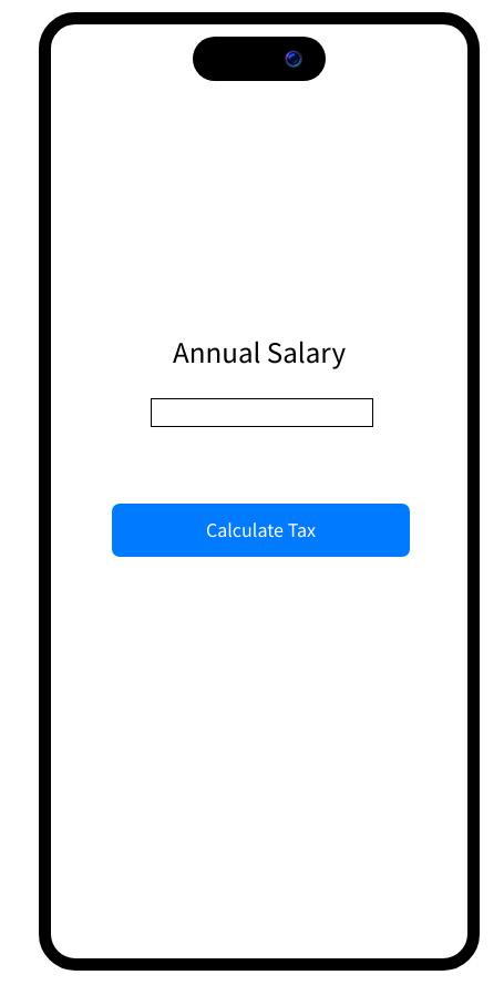
Figure 2.1 – Front page wireframe preview
The following figure shows the wireframe of what our results page would look like:
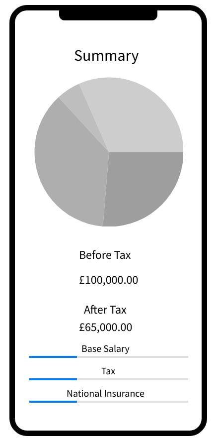
Figure 2.2 – Results page wireframe preview
In the next section, we will build the interface for our application and make sure it looks the way we designed it in the wireframes. Though we will build it the same way, there can be small differences. This will serve as the foundation for connecting it all together in the next chapter.
Building the calculator UI
We will now build the UI for the calculator app. There are two main parts to the calculator, the first being the front page, which is loaded on launch. Once the user inputs an income and hits Calculate Tax, they are taken to the results page, which is the second part. On this page, the results of the tax calculation and a breakdown of it will be displayed. Naturally, we will start off with the first part, the front page, but before even that, we will create our project. Follow these steps:
- Open Xcode and select Create a new Xcode project:
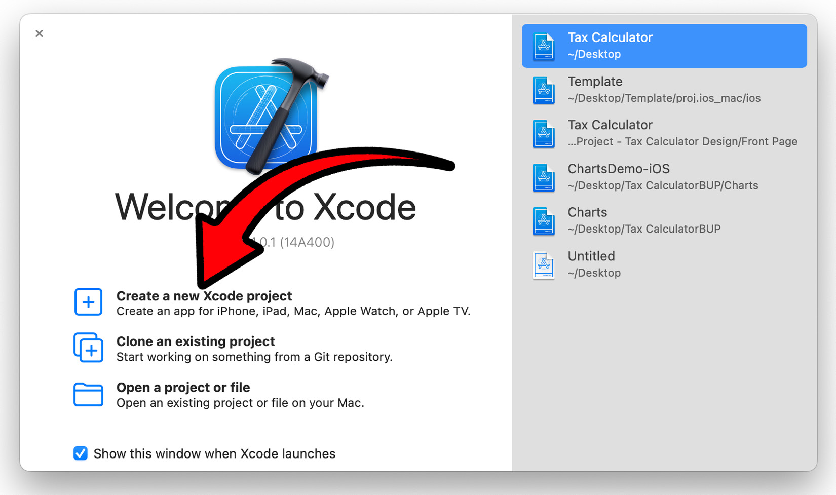
Figure 2.3 – Create a new Xcode project
- Now, we will choose the template for our application. As we are creating an iPhone application, we will select iOS from the top and then select App and click Next:
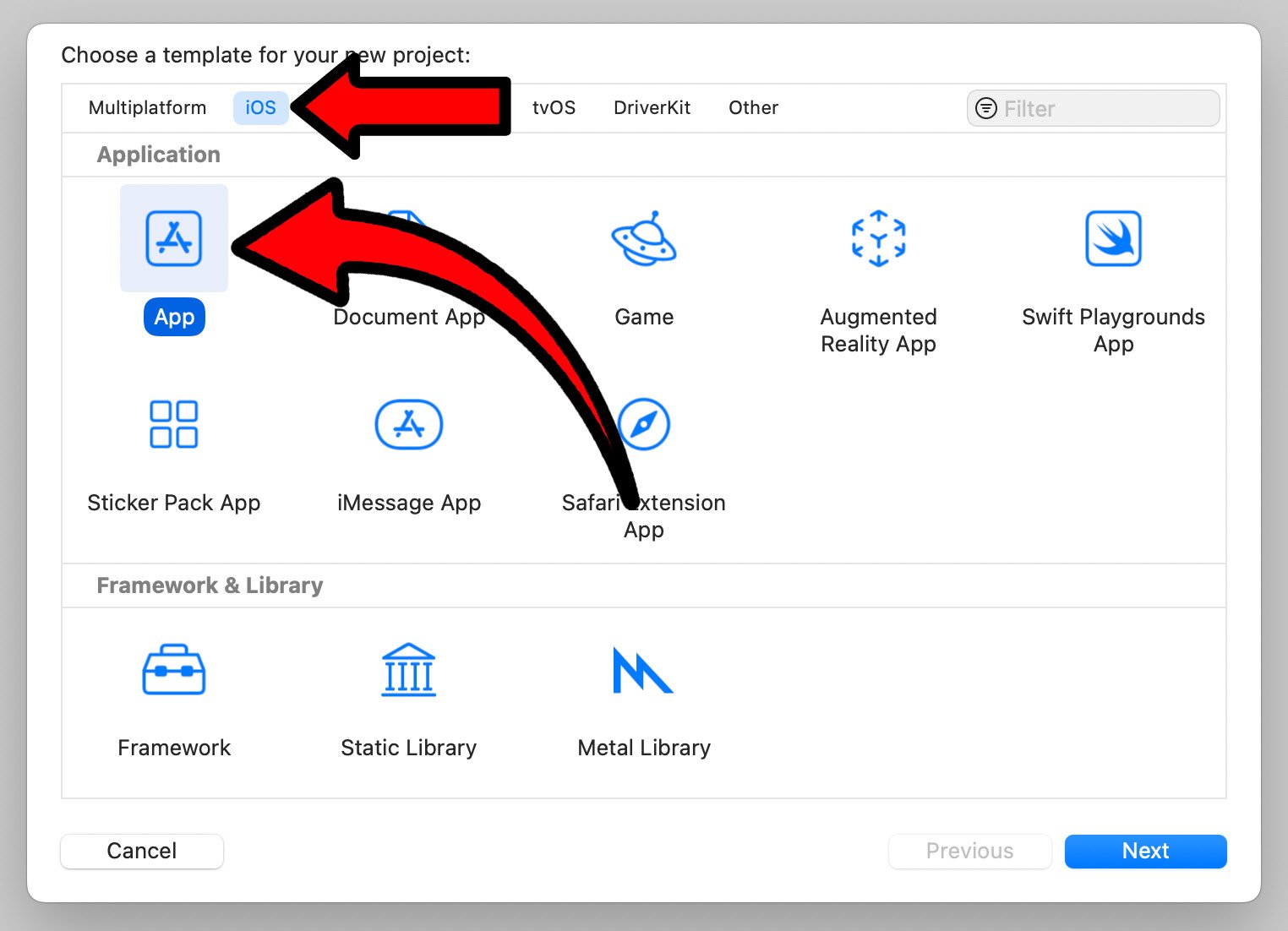
Figure 2.4 – Xcode project template selection
- We will now choose the options for our project. Here, there are only two crucial things to select/set. Make sure Interface is set to SwiftUI; this will be the UI our system will use. Set Language to Swift; this is the programming language used for our application:
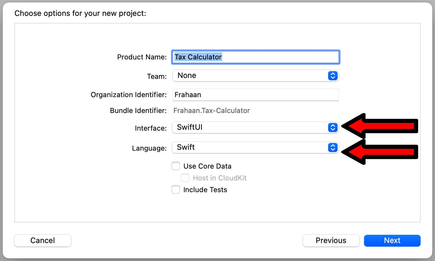
Figure 2.5 – Xcode project options
- Once you press Next, you can choose where to create your project, as seen in the following screenshot:
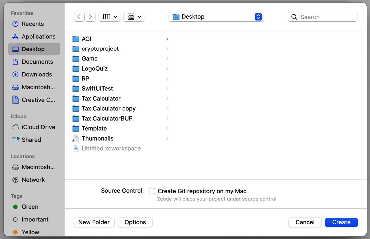
Figure 2.6 – Xcode project save directory
- Once you have found the location you would like to create the project in, click on Create at the bottom right. Xcode shows your project in all its glory, as seen in the following screenshot:
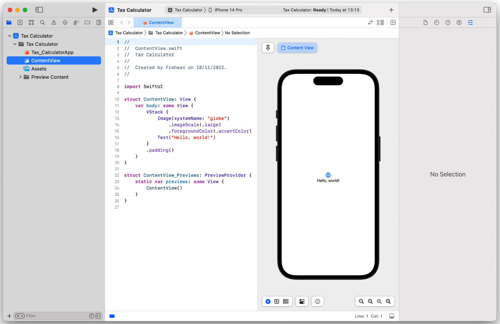
Figure 2.7 – New Xcode project overview
In the next section, we will implement the front page of our application using SwiftUI and further look at the Xcode IDE as we do so.
Front page
In this section, we will implement the front page’s UI. As a reminder, here is what it will look like:
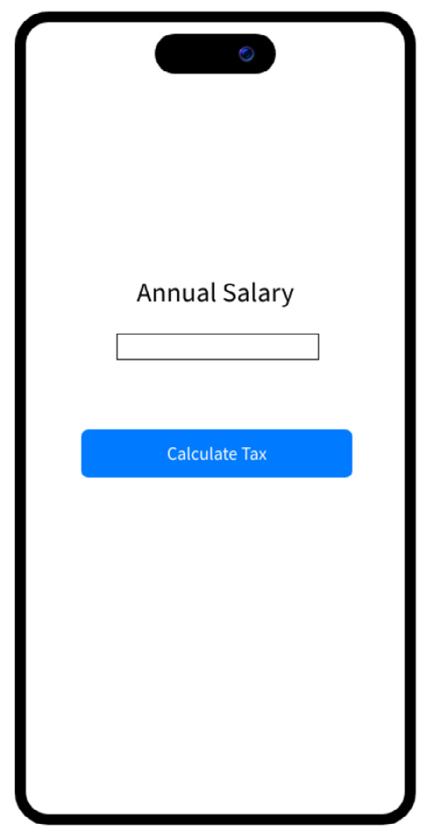
Figure 2.8 – Front page wireframe preview
There are three main elements on the front page. As a little task, see whether you can figure out what they are. Don’t worry if you don’t know the exact UI component names; we will look at these components in the following sections.
Text
A Text component is one of the simplest components offered by SwiftUI. It allows you to display a string of characters/numbers, which is very useful for headings and providing information. We will use it to provide context to the next component, which is TextField. Without the Text component, the user doesn’t know the purpose of the TextField. The following figure shows the label on the front page, telling the user what the following text input field is used for:

TextField
TextFields allow the user to input text that can consist of numbers and any character. Our TextField will be used to input a number, hence it will only accept numbers. This is a feature we will configure. Some applications put background text in the text field providing context to the purpose of the TextField; however, we have opted for a label component to provide context and do not require this. The following figure shows the TextField that the user can use to input their salary:

Figure 2.10 – Front page TextField
Button
Buttons are used when you want the user to explicitly trigger some functionality. In our case, we want the user to press the button when they are ready to calculate their tax calculation. Naturally, we as developers must error-check this to check whether the button can be pressed when the TextField is empty or if the wrong type of data has been inputted in the TextField. We will handle that with an error message instead of displaying the tax calculation. If you take a look at the following screenshot, you will see what this button looks like:

Figure 2.11 – Front page button
In the next section, we will add the elements we discussed previously using SwiftUI into our application.
Adding Front Page Components
In this section, we will add the components we listed previously to create our front page. Look for the ContentView file, which can be found in the Project navigator, usually on the left, as shown in the following screenshot:
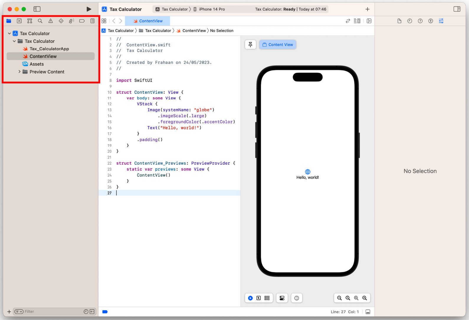
Figure 2.12 – Project navigator
See the following code and add it to the ContentView file:
import SwiftUI
struct ContentView: View
{
    @State private var salary: String = ""
    var body: some View
    {
        VStack
        {
            Text( "Annual Salary" )
            TextField( "Salary", text: $salary )
            Button
            { }
            label:
            { Text("Calculate Tax") }
        }
        .padding( )
    }
}
struct ContentView_Previews: PreviewProvider
{
    static var previews: some View
    {
        ContentView( )
    }
}
Using the preceding code, we are able to render a Text, TextField, and Button. This will form the basis of allowing the user to enter their salary and click the button to calculate the tax breakdown. We use a variable called salary to store TextField’s data. Let’s take a look at the end result:
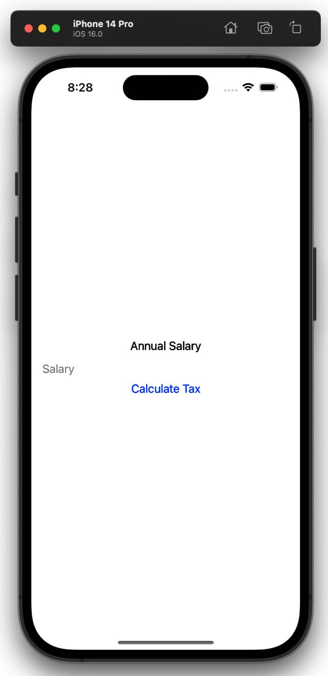
Figure 2.13 – Elements without styling preview
As you can see, the Text component looks pretty good, but the TextField has no obvious boundaries. I put a placeholder inside it as without it, the user wouldn’t even know where the TextField is. Next, the Button has the wrong styling. Let’s fix both of these with the following updated code:
VStack
{
    Text( "Annual Salary" )
    TextField( "", text: $salary )
        .border( Color.black, width: 1 )
    Button
    { }
    label:
    { Text("Calculate Tax") }
        .buttonStyle( .borderedProminent )
}
.padding( )
Using the preceding code, we added a black border with a width of 1 to the TextField and removed the placeholder text. Next, we added a button style to the Text component of the button. We used the borderedProminent style, which is exactly what we need. All these changes result in the following:
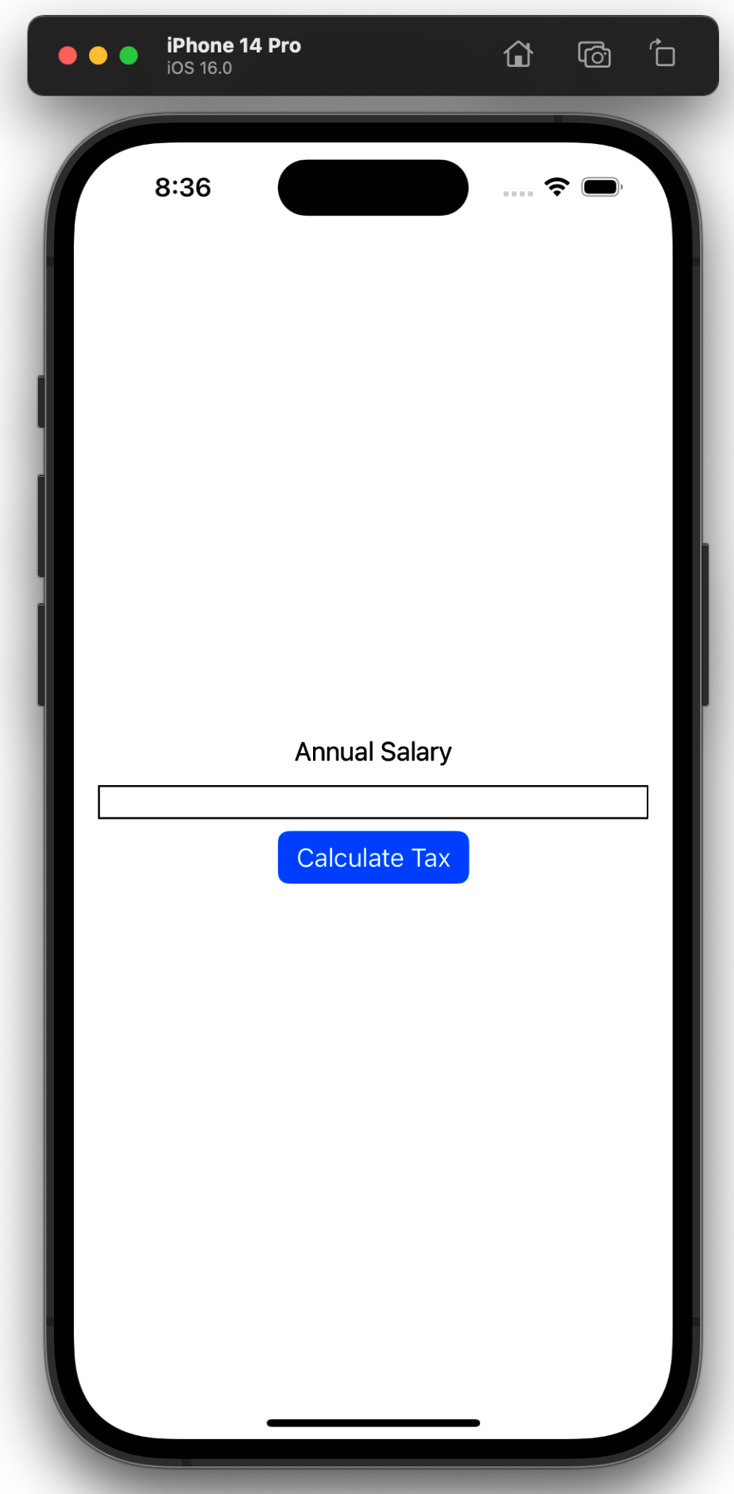
Figure 2.14 – Updated code preview
The preview shows we are very close. For the type of data we are inserting into TextField, it doesn’t need to be this wide. Let’s make it smaller. Modify TextField as follows:
TextField( "", text: $salary )
                .frame( width: 200.0 )
                .border( Color.black, width: 1 )
We have added a width of 200 to make the TextField look better suited for what we need. Thus far, we have changed the properties of our app’s components programmatically. However, you can use the Xcode UI to tweak the properties as well. Doing this is simple: select a component in the code by hovering the mouse cursor over it and clicking the code as if you are going to edit it. Now, on the right, a pane including the Attributes Inspector will appear.
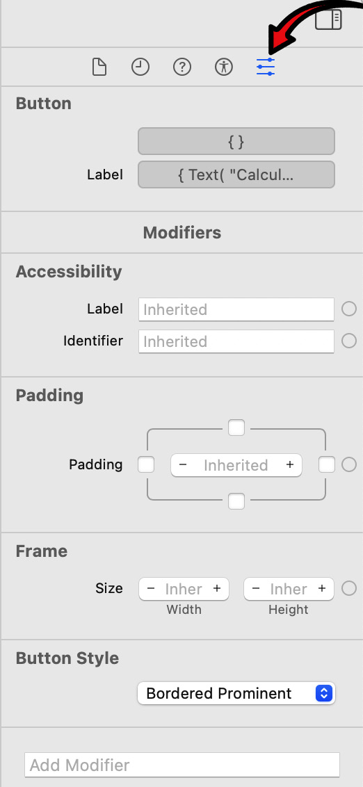
Figure 2.15 – Attributes Inspector
If the Attributes Inspector pane doesn’t appear, go to View | Inspectors | Attributes.
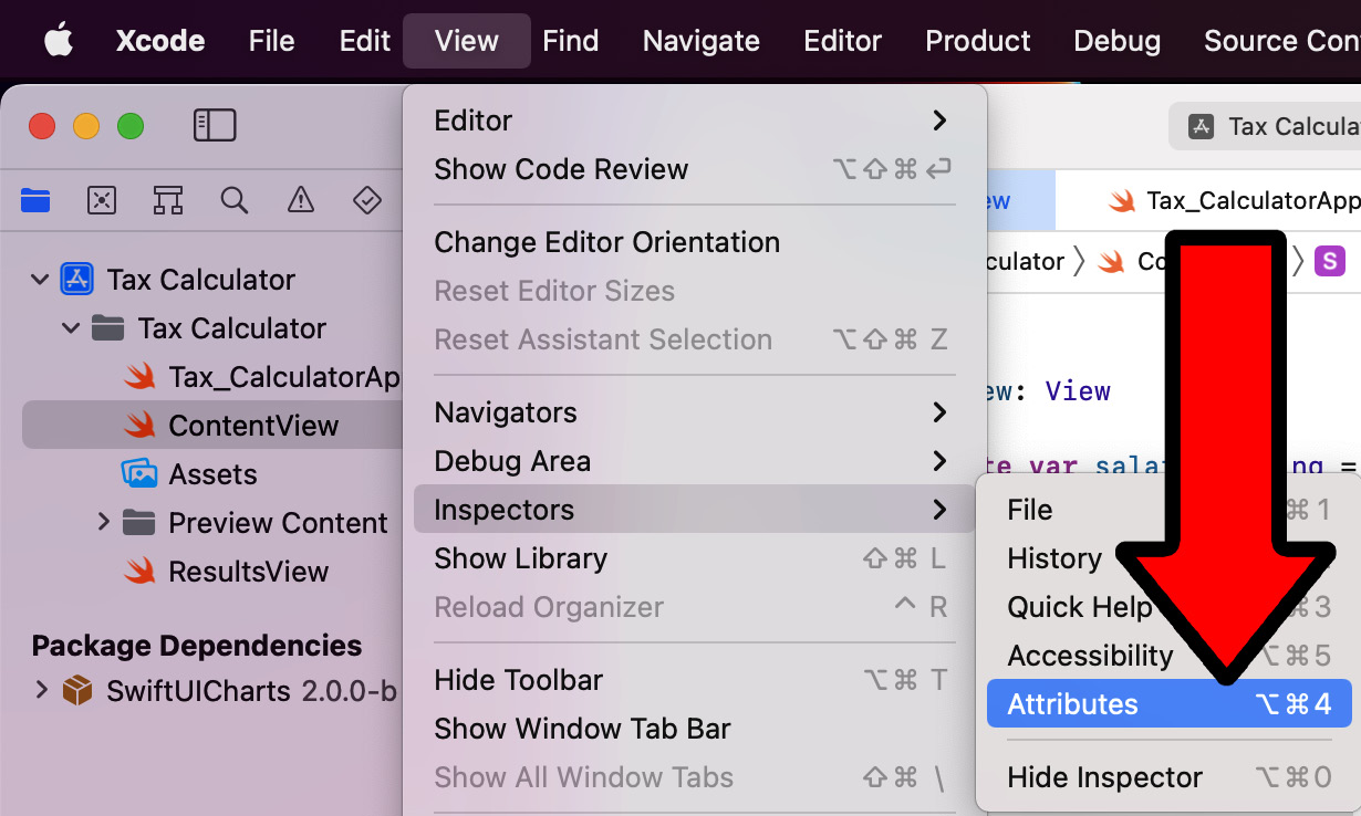
Figure 2.16 – Opening Attributes Inspector manually
We are almost done; we only have three UI components. The interface is currently quite compact. Let’s spread out the components to make it look nicer. Add the following code to space out the components:
VStack
{
    Text( "Annual Salary" )
        .padding(.bottom, 75.0)
    TextField( "", text: $salary )
        .frame( width: 200.0 )
        .border( Color.black, width: 1 )
        .padding( .bottom, 75.0 )
    Button
    { }
    label:
    { Text( "Calculate Tax" ) }
        .buttonStyle( .borderedProminent )
}
.padding( )
In the preceding code, we added padding at the bottom of the Text and TextField components to evenly spread all three items out. Feel free to experiment with the padding values to get the UI to feel like what you are looking for.
Important note
If you have four components and want to add padding to the top three, the formula would be n - 1 in terms of the number of components that need padding to be evenly spread out. n is the total number of components.
Our front page now looks like the following:
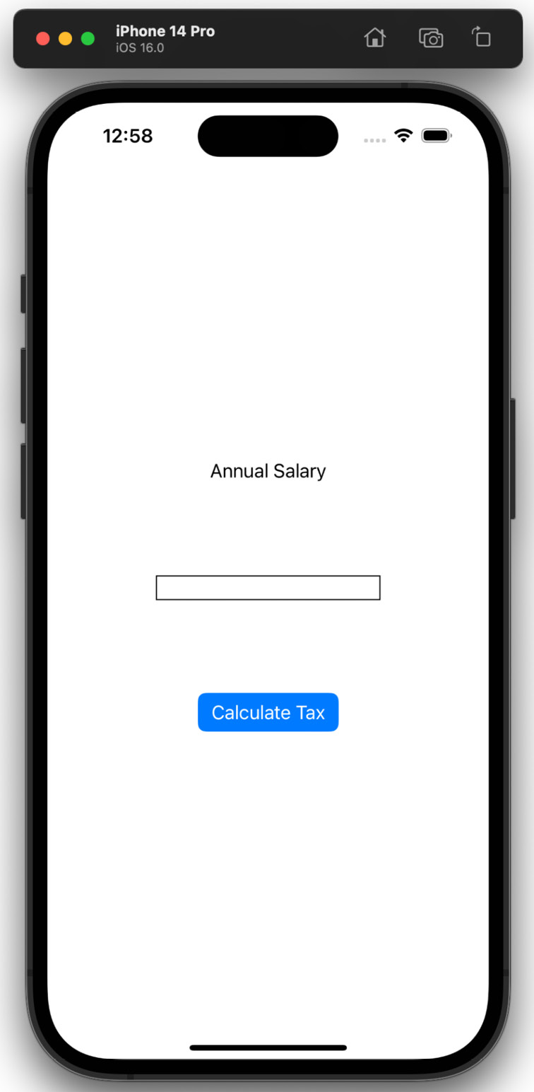
Figure 2.17 – Preview with padding
Right now, if we launch our app and click the TextField, a regular keyboard appears, as shown in the following screenshot:
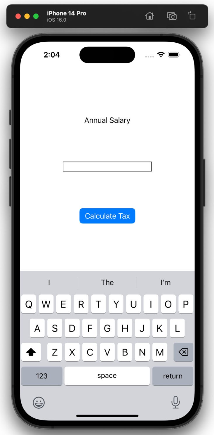
Figure 2.18 – Front page of the regular keyboard preview
This is fine for a field that requires text input for names or addresses, but this field only requires a salary and therefore only needs numerical input. Let’s update our code to set the keyboard type to decimalPad:
TextField( "", text: $salary )
    .frame( width: 200.0 )
    .border( Color.black, width: 1 )
    .padding( .bottom, 75.0 )
    .keyboardType( .decimalPad )
Important note
There is a numberPad option but it doesn’t allow the input of decimal numbers, so we will go ahead and use the decimalPad type.
If you run the app now, it will show the following:
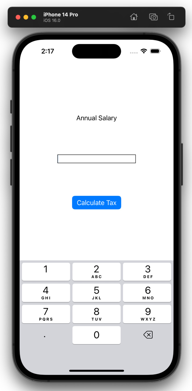
Figure 2.19 – Front page decimal pad preview
The keyboard type can also be changed in the Attributes Inspector. This is a great place to quickly see all the available keyboard types:
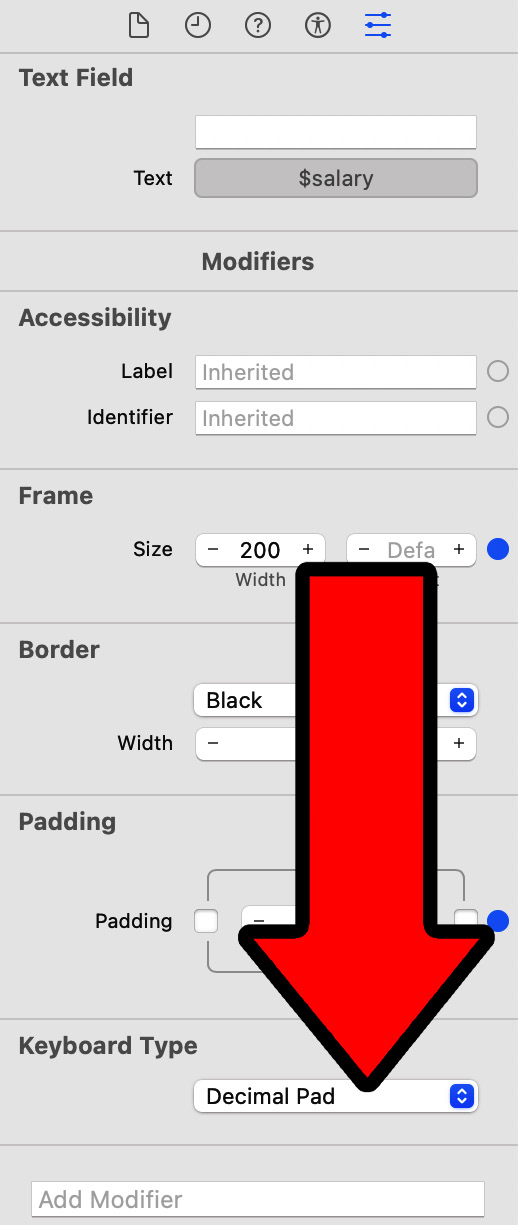
Figure 2.20 – Keyboard Type
Important note
For more information on keyboard types, check out https://developer.apple.com/documentation/swiftui/view/keyboardtype(_:).
If the keyboard doesn’t show in the simulator, this is due to the fact your Mac already has a keyboard and the simulator decides you don’t need it displayed. But this can be overridden. Either use the + K keyboard shortcut to open and + + K to close it, or go to I/O | Keyboard | Toggle Software Keyboard:
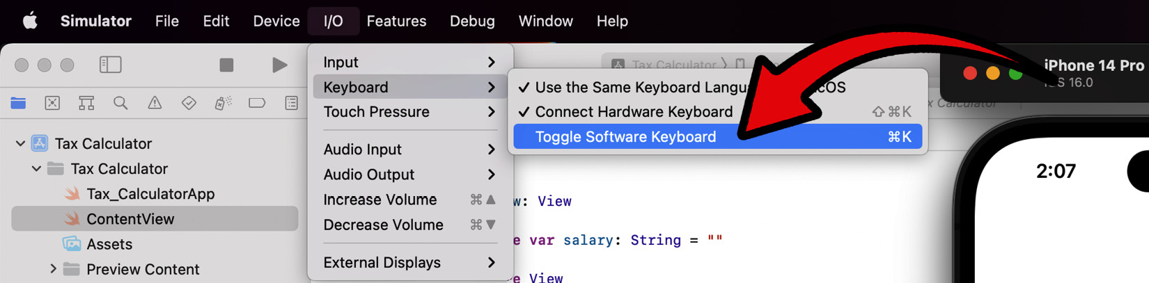
Figure 2.21 – Toggle Software Keyboard
Now the software keyboard in the simulator will appear. This should only need to be done once. We have now completed the design for the front page. Currently, there is no functionality, but this will be implemented in the following chapter. But we are not done with the design. We will now implement the design for the results page.
Implementing the results page
In this section, we will implement the results page’s UI. As a reminder, here is what it will look like:
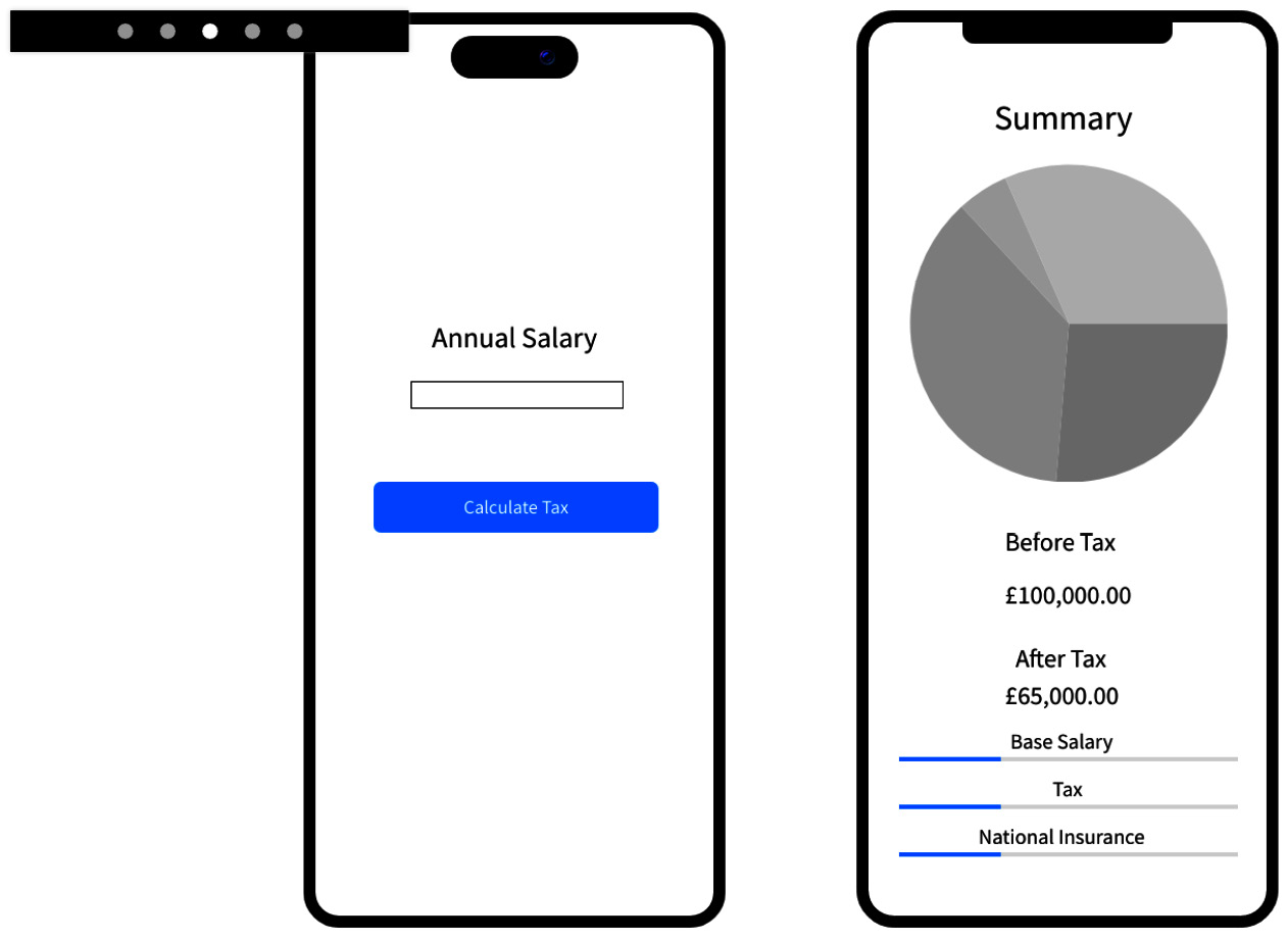
Figure 2.22 – Results page wireframe preview
There are three main sections on the results page. Each section is composed of two or more components. As a little task, see whether you can figure out what they are. Don’t worry if you don’t know the exact UI component names as we will take a look at them in the following sections.
Graph Summary Section
The graph summary section comprises two main components, a Text component and a pie chart. SwiftUI doesn’t provide a pie chart, so we will use an external library. We will use the ChartView library created by Andras Samu, which can be found here: https://github.com/AppPear/ChartView.
This section will visually showcase a simple breakdown of the tax calculation.
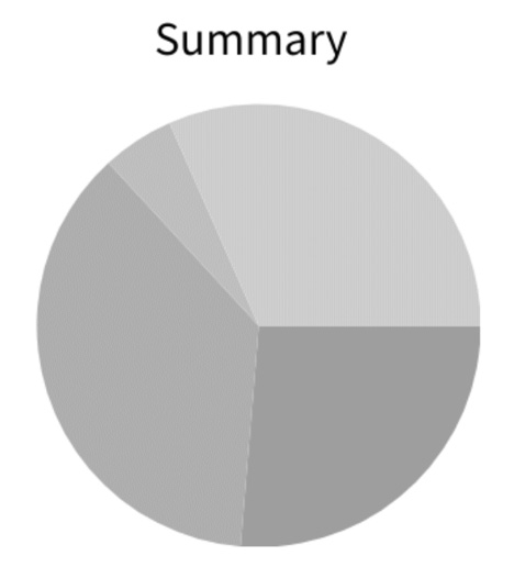
Figure 2.23 – Graph summary wireframe
Text Summary Section
In the text summary section, there are four text components. The first component informs the user that the following Text component is used to display the Before Tax salary title. The second component tells the user that the following text component is used to display the After Tax salary title. This does not include a breakdown of how the tax is split. This will come in the next section:
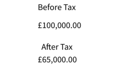
Figure 2.24 – Text summary wireframe
Individual breakdown section
The individual breakdown section displays how the tax and salary are broken down. There are six components, three Text components and three ProgressView components. Each is paired together to make three subsections, Base Salary, Tax, and National Insurance. This design is simple but extendible. Once it is created, I give you the task of adding further breakdowns of the tax, such as student loans and pension:
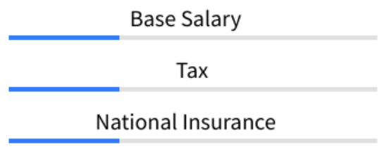
Figure 2.25 – Individual breakdown wireframe
In the next section, we will add the elements that make up the results page before wrapping up this chapter.
Adding results page components
In this section, we will add the previously discussed components to our results page. However, firstly we must integrate the ChartView framework by Andras Samu. Follow these steps:
- Go to File | Add Packages…:
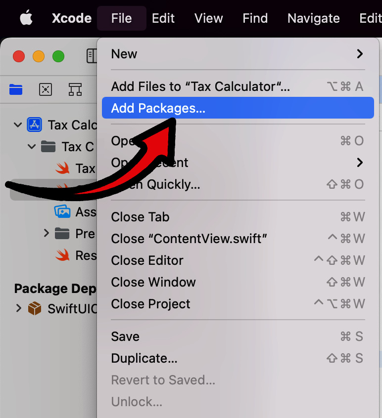
Figure 2.26 – Xcode Add Packages… option
- Search for the
ChartViewframework using the following URL: https://github.com/AppPear/ChartView. - Select Exact Version from the Dependency Rule dropdown and set the text input to
2.0.0-beta.2, or whatever the latest version is for you. Then, click Add Package at the bottom right. It is grayed out in mine as I have already added it:
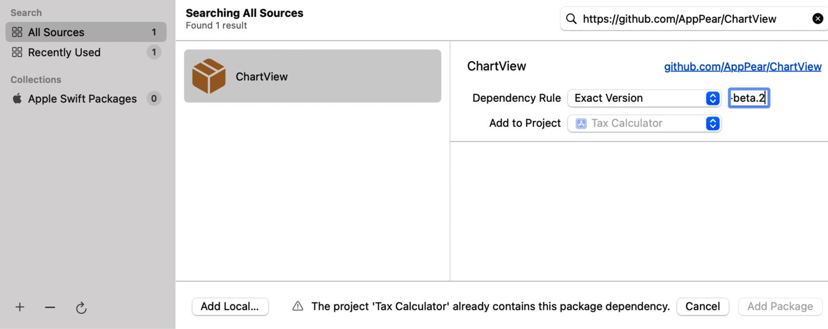
Figure 2.27 – Search for the ChartView package
- Clicking on Add Package will add the package to the project successfully.
- We will now create a new SwiftUI View for the results page. Right-click the calculator folder inside of your Project Navigator pane and select New File…:
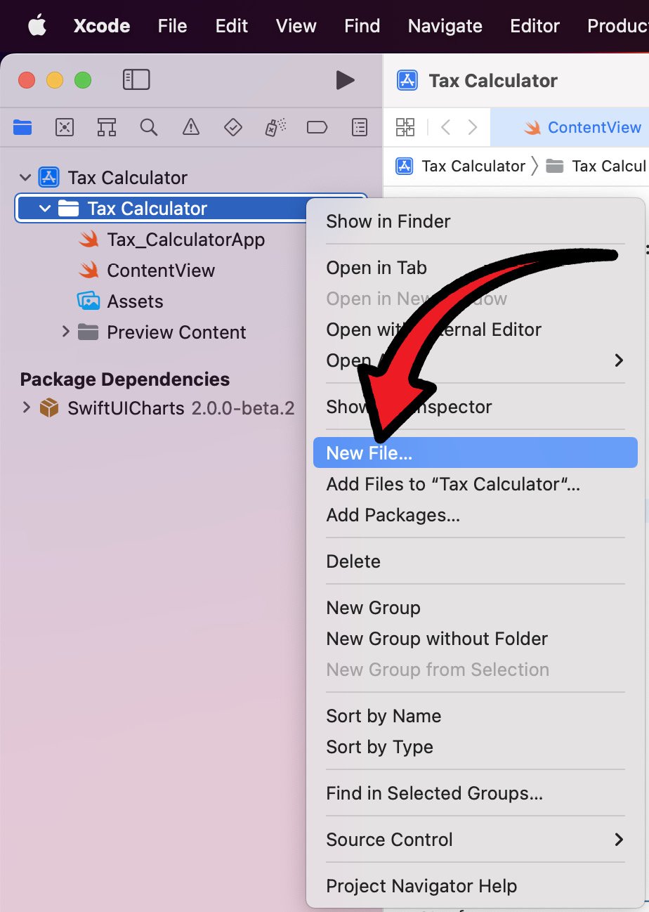
Figure 2.28 – New File…
- Next, we will select the type of file we want to add, which for us is a SwiftUI View (selecting this provides a SwiftUI template, which saves us time and effort retyping the SwiftUI file structure every time), under the User Interface section:
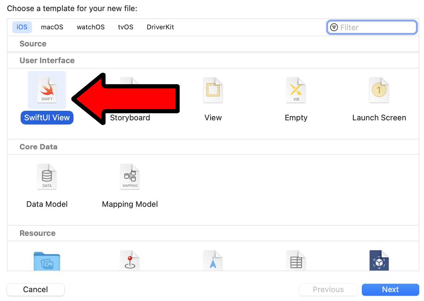
Figure 2.29 – SwiftUI View selection
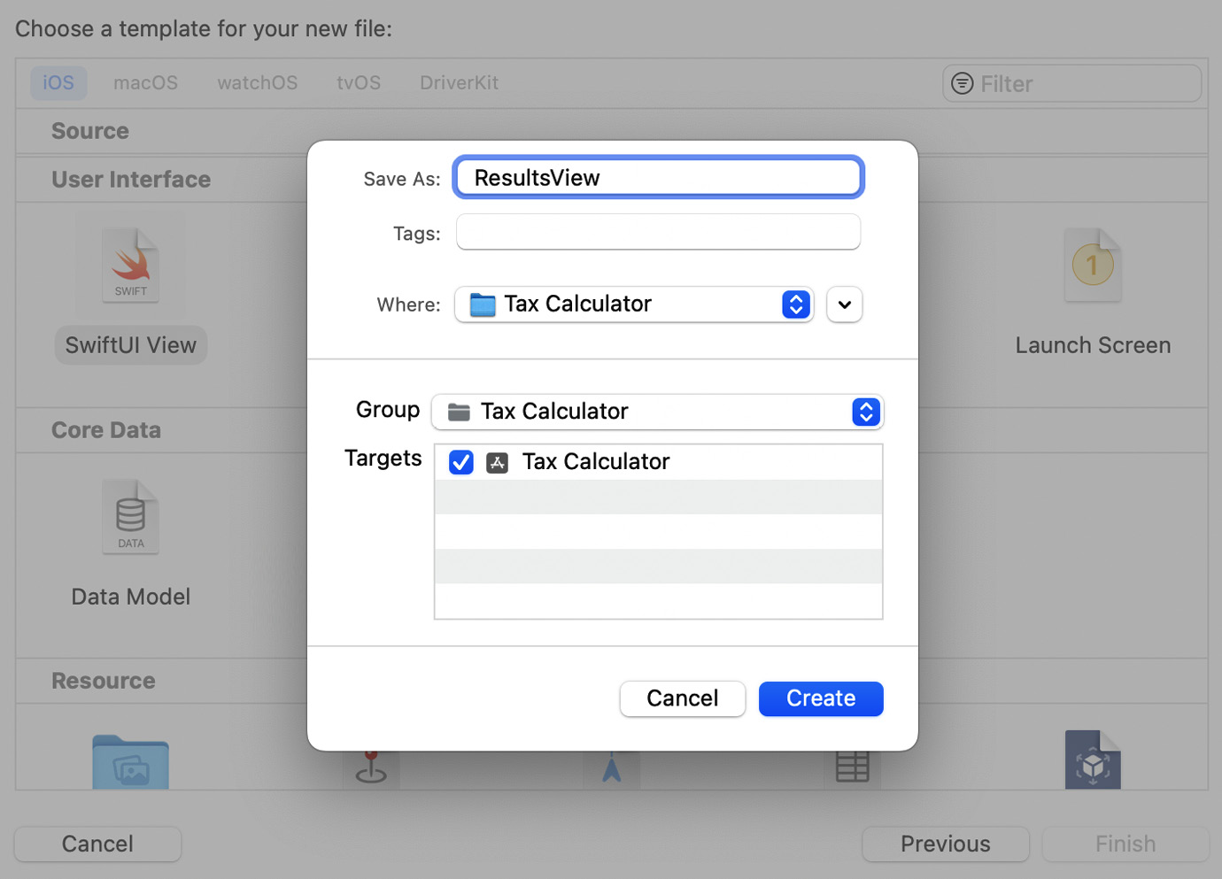
Figure 2.30 – View naming
- Open the
ResultsViewfile and import theSwiftUIChartsframework by adding the following code to the top of the file:import SwiftUICharts
- Next, we need to create the chart itself. Doing so is very simple, thanks to the
ChartViewlibrary. First, add the data the chart will be using. For now, we will add some dummy hardcoded data for testing:struct ResultsView: View { var taxBreakdown: [Double] = [5, 10, 15] var body: some View { } }The values in the array will represent the base salary, tax, and national insurance.
- Next, we will implement our pie chart using
ChartView:struct ResultsView: View { var taxBreakdown: [Double] = [5, 10, 15] var body: some View { PieChart( ) .data( taxBreakdown ) .chartStyle( ChartStyle( backgroundColor: .white, foregroundColor: ColorGradient( .blue, .purple) ) ) } }The preceding code will result in the following:
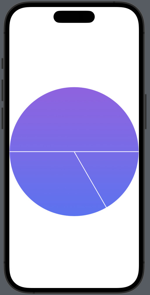
Figure 2.31 – Pie chart added
- To view the
ResultsView, you will need to use the Live Preview Window. By default, it should appear. If it doesn’t, use the following keyboard shortcut: + + Return. Now, Xcode will look like the following screenshot:

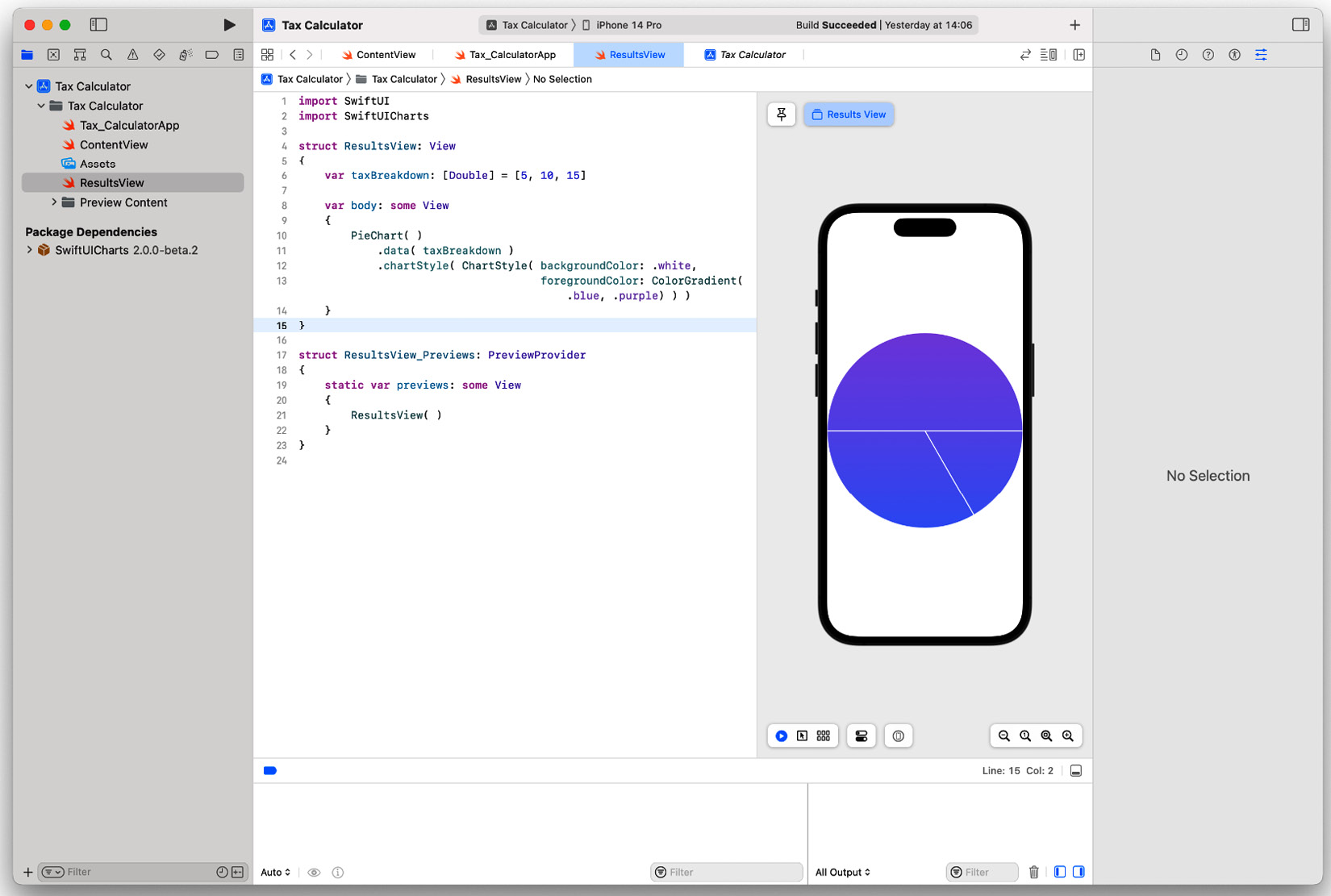
Figure 2.32 – Live preview window location
- Right now, the pie chart goes up to the edges. Let’s put the pie chart inside a VStack with padding. Edit the code as follows:
struct ResultsView: View
{
    var taxBreakdown: [Double] = [5, 10, 15]
    var body: some View
    {
        VStack
        {
            PieChart( )
                .data( taxBreakdown )
                .chartStyle( ChartStyle( backgroundColor: .white,
                                         foregroundColor: ColorGradient( .blue, .purple ) ) )
        }.padding( )
    }
}
The changes in the preceding code will now make the chart look like the following:
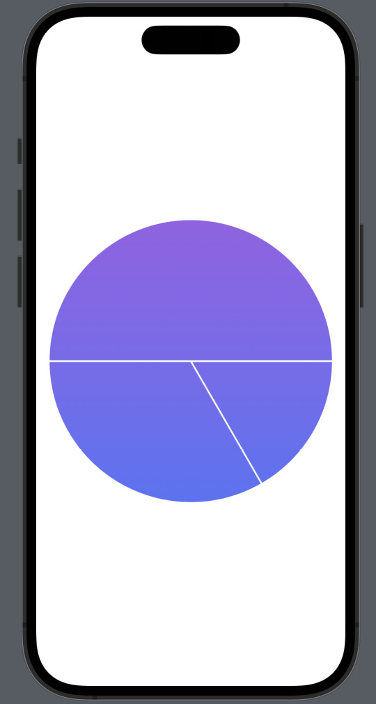
Figure 2.33 – Pie chart with padding
- Let’s add a
Textcomponent that says Summary above the pie chart. But as it will be a header, we will make it bold and set the font size to36. Add the following code to the body:var body: some View { VStack { Text( "Summary" ) .font( .system( size: 36 ) ) .fontWeight( .bold ) PieChart( ) .data( taxBreakdown ) .chartStyle( ChartStyle( backgroundColor: .white, foregroundColor: ColorGradient( .blue, .purple ) ) ) }.padding( ) }The following output shows the new summary text above the pie chart that we added previously.
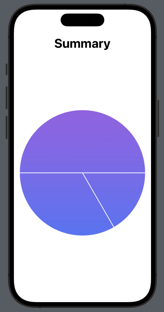
Figure 2.34 – Summary header
- Below the pie chart, we will add four more text components, for Before Tax and After Tax: one for the heading of each subsection and one for the actual figure. For now, we will hardcode the values. Update the code as follows:
var body: some View
{
    VStack
    {
        Text( "Summary" )
            .font( .system( size: 36 ) )
            .fontWeight( .bold )
        PieChart( )
            .data( taxBreakdown )
            .chartStyle( ChartStyle( backgroundColor: .white,
                                     foregroundColor: ColorGradient(
.blue, .purple ) ) )
        Text( "Before Tax" )
            .font( .system( size: 32 ) )
        Text( "£100,000.00" )
            .font( .system( size: 32 ) )
        Text( "After Tax" )
            .font( .system( size: 32 ) )
        Text( "£65,000.00" )
            .font( .system( size: 32 ) )
    }.padding( )
}
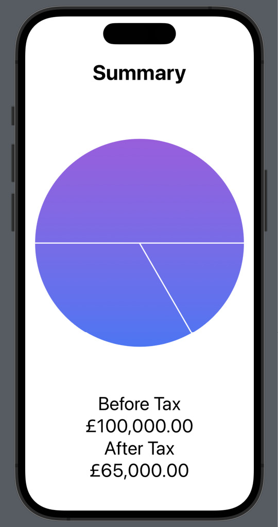
Figure 2.35 – Before Tax and After Tax text
- Right now, the text components on the bottom of the page are crammed together. Let’s add padding to the top and bottom of each text component to spread them out. You can obviously use the Attributes Inspector to do this, but we will do it programmatically:
Text( "Before Tax" )
    .font( .system( size: 32 ) )
    .padding(.vertical)
Text( "£100,000.00" )
    .font( .system( size: 32 ) )
    .padding(.vertical)
Text( "After Tax" )
    .font( .system( size: 32 ) )
    .padding(.vertical)
Text( "£65,000.00" )
    .font( .system( size: 32 ) )
    .padding(.vertical)
After adding the padding in the preceding code, we will have a results page that looks like this:
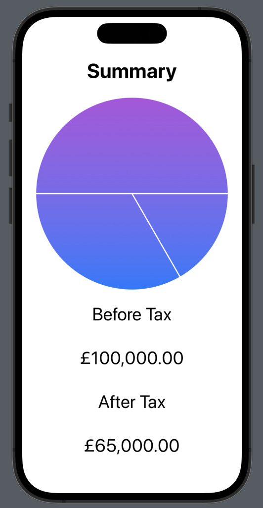
Figure 2.36 – Results after padding
- Next, we need to add the progress bars, which will represent the salary, tax, and national insurance. We will use the
ProgressViewcomponent combined with aTextcomponent to display the tax breakdown. After the previously addedTextcomponents, add the following code:Text( "Post Tax Salary" ) ProgressView( "", value: 20, total: 100 ) Text( "Tax" ) ProgressView( "", value: 20, total: 100 )
The preceding code adds the two
ProgressViewandTextcomponent pairs, which shows the post-tax salary and tax. This will result in the following:
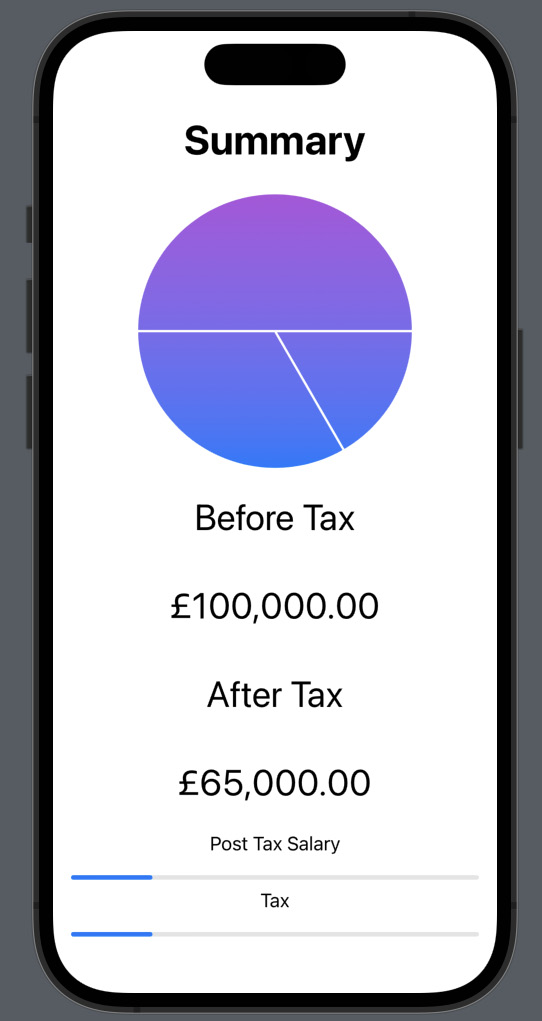
Figure 2.37 – Breakdown components added
- You have probably noticed that we only added two of the three
ProgressViewcomponents. The reason for this is to showcase an error that occurs. So, now add the following code after the previously added code:Text( "National Insurance" ) ProgressView( "", value: 20, total: 100 )
This will result in the following error: Extra arguments at positions #11, #12 in call. This is because you cannot have more than 10 components displayed. But there is space, so how do we get around this? The solution is simple. The limit of 10 is for components, not components within components. Put basically, we can group multiple components using the
Groupcomponent, which will make the view detect it as one. - We will group the three
ProgressViewandTextcomponents as follows:Group { Text( "Post Tax Salary" ) ProgressView( "", value: 20, total: 100 ) Text( "Tax" ) ProgressView( "", value: 20, total: 100 ) Text( "National Insurance" ) ProgressView( "", value: 20, total: 100 ) }This will solve the annoying 10-limit error and result in the following:
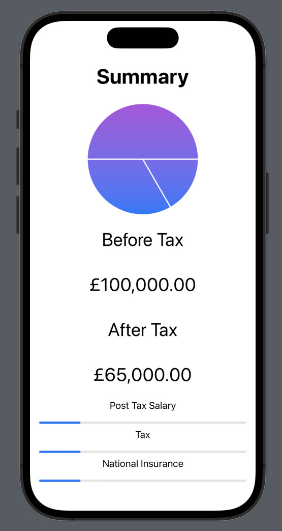
Figure 2.38 – Components grouped
Here is a look at the whole code now that we are finished with this section:
import SwiftUI
import SwiftUICharts
struct ResultsView: View
{
var taxBreakdown: [Double] = [5, 10, 15]
var body: some View
{
VStack
{
Text( "Summary" )
.font( .system( size: 36 ) )
.fontWeight( .bold )
PieChart( )
.data( taxBreakdown )
.chartStyle( ChartStyle( backgroundColor: .white,
foregroundColor: ColorGradient( .blue, .purple ) ) )
Text( "Before Tax" )
.font( .system( size: 32 ) )
.padding(.vertical)
Text( "£100,000.00" )
.font( .system( size: 32 ) )
.padding(.vertical)
Text( "After Tax" )
.font( .system( size: 32 ) )
.padding(.vertical)
Text( "£65,000.00" )
.font( .system( size: 32 ) )
.padding(.vertical)
Group
{
Text( "Post Tax Salary" )
ProgressView( "", value: 20, total: 100 )
Text( "Tax" )
ProgressView( "", value: 20, total: 100 )
Text( "National Insurance" )
ProgressView( "", value: 20, total: 100 )
}
}.padding( )
}
}
struct ResultsView_Previews: PreviewProvider
{
static var previews: some View
{
ResultsView( )
}
} We have covered a lot in this vast section. We started off by adding an external framework, which we saw is very easy to integrate and extremely powerful. The framework allowed us to easily implement a pie chart. This is very useful as not all basic features are provided by Apple in Swift and SwiftUI, so being able to add external code bases makes the development process less painful. After that, we implemented the pie chart, text summaries, and progress views to further illustrate the tax breakdown.
Summary
In this chapter, we covered the design of our tax calculator application. We looked at wireframes and broke down each element into SwiftUI components. We then implemented the SwiftUI components to match the design from the wireframes. We also took a look at the requirements for building this application, and the design specifications, which looked at the features a tax calculator app can have. Then, we simplified it to the core features our app will provide. We further advanced in the design specifications with acceptance criteria for what we would like our app to do. We also looked at how external libraries can be integrated to provide additional functionality.
In the next chapter, we’ll take a look at implementing the tax calculation backend functionality and tying the two views together.