


We will be covering the following recipes in this chapter:
Installing and enabling a theme
Uploading a new logo
Uploading a new favicon
Adding a slogan to the theme
Displaying a different theme for administration
Adding an existing block to the theme
Adding a custom block to the theme
Displaying a block only on the front page
Controlling block visibility based on user role
Controlling block visibility based on node type
Drupal is designed to separate logic from presentation with the former usually handled through the use of modules and the latter via themes. Although this separation is not absolute, it is distinct enough to facilitate quick and efficient customization and deployment of websites. This especially holds true when the site is developed in a team environment as it enables developers, designers, and content managers to work independently of each other.
Themes are synonymous with skins in other applications and control the look and feel of a website. Each theme can consist of a variety of files ranging from a .info configuration file, which registers the theme with Drupal, to .tpl.php template files accompanied by CSS, JavaScript, and other files that determine the layout and style of the content. Depending on the nature of the site and its requirements, developers can choose from the slew of themes available on http://drupal.org as contributed themes or instead, decide to roll their own.
Contributed themes are, as the name suggests, themes that have been contributed by the Drupal community at large. They usually tend to be designs that have been developed by a user for a site and then shared with the community, or designs from other packages or sites which have been ported over to Drupal. Consequently, while they are ready-to-wear, they are generic in nature and lack uniqueness. Furthermore, the quality of these themes vary significantly from one to the other with some being excellent and others well below par. Contributed themes are an acceptable choice for sites that require rapid deployment or for hobby sites with simple needs where uniqueness is not a factor.
Custom themes, on the other hand, are a necessity for sites with unique requirements in layout, usability, and design. While they are often built from the ground up, it is now established practice to use special starter themes as a base from which they can be extended.
Contributed themes can be accessed at http://drupal.org/project/themes. This page, by default, lists all available themes and provides filters that can be used to whittle the results down based on Drupal version compatibility as well as other search terms. Additionally, sorting options can be used to rearrange contributions based on their popularity, update status, and other criteria. More information about each theme can be accessed by clicking on its Find out more link.
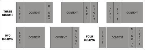
There are a number of considerations to keep in mind whilst choosing a contributed theme. Firstly, it is important to have a general idea of the layout required for our site with the chief concern usually revolving around the column structure of the design. Most themes support a three-column (with two sidebars and a content area) layout which can also optionally function as a two-column single sidebar layout if no content is added to one of the sidebars. The more exotic ones support four or more columns and are only really a viable option for special cases:
Secondly, while fewer themes nowadays are being laid out using tables, they are still around. Unless there is no other recourse, these should be avoided in favor of CSS layouts.
Next, check to see whether the theme is a fixed-width or a fluid theme or supports both types. Fixed-width themes, as the name suggests, maintain a predefined width irrespective of the screen resolution of the user. As a result, the site has a consistent appearance. Fluid layouts, or liquid layouts as they are sometimes referred to, grow according to the user’s screen size and consequently make better use of the available real estate. The question of which to use is generally decided on a case by case basis.
The Drupal theme system also supports the use of different theme engines to render the design. Each engine uses a different process by which the designer can interact with Drupal to implement a design. The PHPTemplate engine is built into Drupal and is by far the most popular of the ones available. The vast majority of contributed themes available are compatible with PHPTemplate. Nevertheless, it is prudent to check the specifications of the theme to ensure that it does not require a different theme engine. Contributed theme engines can, if necessary, be downloaded from http://drupal.org/project/theme+engines.
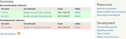
Every theme’s project page usually provides screenshots and explicitly specifies layout and other pertinent information. A number of them also link to a demonstration page, as in the following screenshot, where the theme can be previewed and tested using different browsers, screen resolutions, and so on. A third-party site http://themegarden.org, which showcases various contributed themes, comes in very handy for the same reason:
Additionally, project pages customarily link to their Git repositories where files within the theme can be viewed prior to downloading it. It is also worth exploring the issue queue of a project to see if bugs have been reported and are being addressed in a timely manner.
Note
Git is a tool used by Drupal developers to manage their code and control their releases. It is effectively a repository for modules, themes, and Drupal itself. More information on Git is available at http://drupal.org/handbook/git.
Once the list of candidate themes has been narrowed down to a short list, the only way to test them further is to download and install them. The theme project page lists available downloads based on version and stability along with release notes which might be useful to glance through as well. Download the latest release recommended for Drupal 7. The recipes in this chapter will address the installation and configuration of a downloaded contributed theme.
Drupal is designed to separate logic from presentation with the former usually handled through the use of modules and the latter via themes. Although this separation is not absolute, it is distinct enough to facilitate quick and efficient customization and deployment of websites. This especially holds true when the site is developed in a team environment as it enables developers, designers, and content managers to work independently of each other.
Themes are synonymous with skins in other applications and control the look and feel of a website. Each theme can consist of a variety of files ranging from a .info configuration file, which registers the theme with Drupal, to .tpl.php template files accompanied by CSS, JavaScript, and other files that determine the layout and style of the content. Depending on the nature of the site and its requirements, developers can choose from the slew of themes available on http://drupal.org as contributed themes or instead, decide to roll their own.
Contributed themes are, as the name suggests, themes that have been contributed by the Drupal community at large. They usually tend to be designs that have been developed by a user for a site and then shared with the community, or designs from other packages or sites which have been ported over to Drupal. Consequently, while they are ready-to-wear, they are generic in nature and lack uniqueness. Furthermore, the quality of these themes vary significantly from one to the other with some being excellent and others well below par. Contributed themes are an acceptable choice for sites that require rapid deployment or for hobby sites with simple needs where uniqueness is not a factor.
Custom themes, on the other hand, are a necessity for sites with unique requirements in layout, usability, and design. While they are often built from the ground up, it is now established practice to use special starter themes as a base from which they can be extended.
Contributed themes can be accessed at http://drupal.org/project/themes. This page, by default, lists all available themes and provides filters that can be used to whittle the results down based on Drupal version compatibility as well as other search terms. Additionally, sorting options can be used to rearrange contributions based on their popularity, update status, and other criteria. More information about each theme can be accessed by clicking on its Find out more link.
There are a number of considerations to keep in mind whilst choosing a contributed theme. Firstly, it is important to have a general idea of the layout required for our site with the chief concern usually revolving around the column structure of the design. Most themes support a three-column (with two sidebars and a content area) layout which can also optionally function as a two-column single sidebar layout if no content is added to one of the sidebars. The more exotic ones support four or more columns and are only really a viable option for special cases:
Secondly, while fewer themes nowadays are being laid out using tables, they are still around. Unless there is no other recourse, these should be avoided in favor of CSS layouts.
Next, check to see whether the theme is a fixed-width or a fluid theme or supports both types. Fixed-width themes, as the name suggests, maintain a predefined width irrespective of the screen resolution of the user. As a result, the site has a consistent appearance. Fluid layouts, or liquid layouts as they are sometimes referred to, grow according to the user’s screen size and consequently make better use of the available real estate. The question of which to use is generally decided on a case by case basis.
The Drupal theme system also supports the use of different theme engines to render the design. Each engine uses a different process by which the designer can interact with Drupal to implement a design. The PHPTemplate engine is built into Drupal and is by far the most popular of the ones available. The vast majority of contributed themes available are compatible with PHPTemplate. Nevertheless, it is prudent to check the specifications of the theme to ensure that it does not require a different theme engine. Contributed theme engines can, if necessary, be downloaded from http://drupal.org/project/theme+engines.
Every theme’s project page usually provides screenshots and explicitly specifies layout and other pertinent information. A number of them also link to a demonstration page, as in the following screenshot, where the theme can be previewed and tested using different browsers, screen resolutions, and so on. A third-party site http://themegarden.org, which showcases various contributed themes, comes in very handy for the same reason:
Additionally, project pages customarily link to their Git repositories where files within the theme can be viewed prior to downloading it. It is also worth exploring the issue queue of a project to see if bugs have been reported and are being addressed in a timely manner.
Note
Git is a tool used by Drupal developers to manage their code and control their releases. It is effectively a repository for modules, themes, and Drupal itself. More information on Git is available at http://drupal.org/handbook/git.
Once the list of candidate themes has been narrowed down to a short list, the only way to test them further is to download and install them. The theme project page lists available downloads based on version and stability along with release notes which might be useful to glance through as well. Download the latest release recommended for Drupal 7. The recipes in this chapter will address the installation and configuration of a downloaded contributed theme.
This recipe will cover the steps required to install and enable a downloaded theme.
Downloaded themes are made available in both the ubiquitous zip format as well as the format which usually offers superior compression. These files can be extracted using archive programs such as 7-Zip (http://www.7-zip.org) as well as commercial packages such as WinZip (http://www.winzip.com) and WinRAR (http://www.rarlabs.com).
To install a theme, open Windows Explorer and navigate to the Drupal installation:
1. Browse to
sites/all/themes.2. Extract the downloaded theme into a subfolder inside this folder. In other words, if the theme is called
mytheme, the foldersites/all/themes/mythemeshould contain all the files of the theme:
 |
In the previous screenshot, we see the Sky theme’s installation folder situated within sites/all/themes. Themes also often contain a README.txt file which provides documentation which is worth a read-through.
Note
File structure options
In this recipe, we have chosen to use the folder sites/all/themes/ to store our theme. By positioning our theme inside sites/all, we are stating that the theme is to be available to all sites using this Drupal installation. In other words, this enables multi-site setups to share modules and themes. In case we want to restrict access to the theme solely to one particular site, we would position its folder within sites/foo.example.com/themes/ where foo.example.com is the site in question.
3. Access the Drupal site in a browser and navigate to
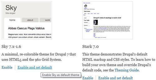
admin/appearance[Home | Administration | Appearance].4. As in the following screenshot, the newly installed theme should now be listed on this page under the Disabled themes section. Click on the associated Enable and set default link to activate the theme:
Drupal scans folders within sites/all/themes and in particular looks for files with the extension .info. These files contain information about each theme such as its name, description, version compatibility, and so on. If the theme is compatible, it is listed on the theme administration page.
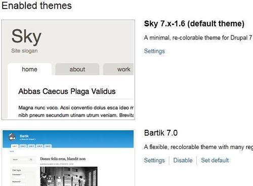
A site can have multiple themes enabled. Out of these, only one can be chosen as the default theme. The default theme is, as the name suggests, the primary theme for the website. In the following screenshot, we can see that the Sky theme is now enabled and is the new default theme for the site overriding the core theme, Bartik, which is relegated to second position in the list of enabled themes:
Drupal makes it easier for us to manage our sites by following preset naming conventions when it comes to the folder structure of the site.
Themes do not necessarily have to be placed at the root of the sites/all/themes folder. For organizational purposes, it might be useful to create sites/all/themes/contrib and sites/all/themes/custom. This will allow us to differentiate between downloaded themes and custom themes.
Note
Since Drupal’s core themes are located within the root themes folder, we might be led to believe that this could be a good place to store our contributed or custom themes. While this will certainly work, it will prove to be a bad decision in the long run as it is never a good idea to mix core files with custom files. The chief reason for this separation is manageability. It is far easier to maintain and update Drupal when there is a clear distinction between the core installation and contributed or custom modules and themes. It also ensures that we do not accidentally overwrite or lose our changes when we upgrade our site to the next Drupal release.
Enabled themes can be disabled by clicking on their associated Disable links. However, this can only be done if they are not currently the default theme of the site. If the link is missing, then another theme will first need to be set as the default. Once this is done, the Disable link should automatically become available.
Once a theme is enabled, the next logical step would be to configure it. The following recipes in this chapter, namely Uploading a new logo, Uploading a new favicon, and so on describe how to do so.
While this recipe dealt with installing and enabling a downloaded theme, it is also a good idea to consider Creating a subtheme based on a core theme recipe in Chapter 2, Beyond the Basics as well as Creating a theme from scratch recipe in Chapter 3, Custom Themes and Zen.
Most websites incorporate a logo into their design, usually accompanying the site name in the header. For example, the Drupal logo or "Druplicon" in the following screenshot represents the default logo displayed for every core theme that comes packaged with Drupal:

These logos tend to play an important role in the branding and identity of the site and are frequently an important facet in the overall design of the theme. This recipe details the steps involved in changing the logo displayed in a theme.
The new logo should be in a suitable format and should balance quality with size. The rule of thumb usually followed is as follows:
A custom logo can be added to a theme using the following steps:
1. Navigate to the
admin/appearance[Home | Administration | Appearance] page.2. Click on the Settings link accompanying the theme in question.
3. Look for the Logo image settings fieldset. Within the fieldset, uncheck the Use the default logo checkbox as we want to use a custom image:
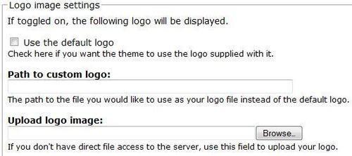
The uploaded file is saved in the Drupal filesystem and the path to the logo is registered as a configuration setting in the database. During display, rather than using the logo supplied by Drupal or the theme itself, this setting is loaded to embed the custom logo within the Drupal page. The following screenshot displays the theme with its default logo replaced with a custom PNG:

Besides specifying the logo file via a theme’s configuration page, there are other avenues that can also be pursued.
Alternatively, instead of uploading the logo via Drupal, use the Path to custom logo textfield to point to an existing logo file on the server. This is often handy when the same image is being shared by multiple themes.
Yet another option is to simply place the logo file in the theme’s folder and rename it to logo.png. Provided that the Use the default logo field is checked, the theme will automatically look for this file in its folder and use it as its logo.
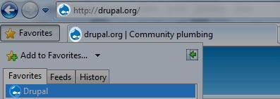
This recipe details the steps involved in changing the favicon displayed with the theme. A favicon, dubbed as a shortcut icon in the Drupal interface, is an image that is particular to a site and is displayed in the address bar of the browser next to the site URL as well as the browser tab. It also makes its presence felt if the site is bookmarked in the browser as shown in the following screenshot:
We are going to need the icon file to be added which is recommended to be of size 32x32 pixels or higher. An example icon file named favicon.ico can be seen in the misc folder in the Drupal installation.
Adding a custom favicon to the theme can be done by performing the following steps:
1. Navigate to the
admin/appearance[Home | Administration | Appearance] page.2. Click on the Settings link accompanying the theme in question.
3. Look for the Shortcut icon settings fieldset.
4. As in the following screenshot, uncheck the Use default shortcut icon checkbox as we want to use a custom icon:
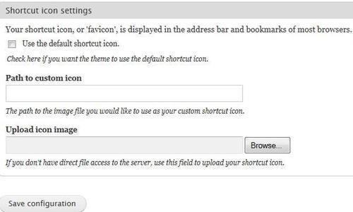
The uploaded file is saved in the Drupal filesystem and the path to the icon is registered as a theme setting in the database. When a page is being rendered, the Drupal theme system designates this .ico file as the favicon for the site.
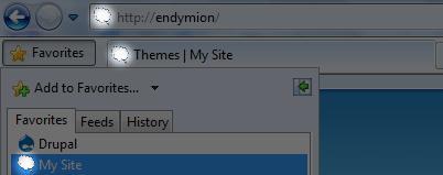
In the following screenshot, we can see the logo image added in the previous recipe also being used as the basis for a favicon:
Besides manually uploading the icon file via the configuration page of the theme, other avenues are also available to accomplish the same objective.
Just as we saw when uploading a custom logo image, instead of uploading the icon file via Drupal, use the Path to custom icon textfield to point to the icon file on the server. A third option is to place the icon file in the theme’s folder and rename it to favicon.ico. Provided that the Use the default shortcut icon field is checked, the theme will automatically look for this file in its folder and use it as its favicon. Not specifying a favicon will instead result in the site using Drupal’s default icon, Druplicon, which is located within the misc folder.
Note
Other formats besides the ICO format are also supported by some, but not all, browsers. More information is available at http://en.wikipedia.org/wiki/Favicon.
This recipe details the steps involved in adding a slogan to the theme. Site slogans are a common feature on most sites and are typically witty or involve clever wordplay. They are synonymous with catchphrases, taglines, mottoes, and so on.
Drupal offers a global setting to store the site slogan which is customarily displayed by themes near the site logo or site name and is also regularly added to news feeds and site e-mails as part of the site’s identity.
Think up a good slogan! This is the biggest stumbling block to getting this recipe right.
Adding a slogan to a theme involves the following steps:
1. Navigate to
admin/config/system/site-information[Home | Administration | System | Site information].2. Locate the Slogan textfield and add the slogan here as shown in the following screenshot:

3. Click the Save configuration button at the bottom of the page to save our changes.
4. Now, navigate to the theme administration page at
admin/appearance[Home | Administration | Appearance].5. Click on the Settings tab at the top of the page.
The resulting page should have multiple tabs: one titled Global settings which affects all themes and others representing each enabled theme. Configuration options under the Global settings tab serve as the site’s default settings for all themes, while equivalent settings within each theme’s tab work as overrides for the global settings.
6. On the Global settings page, look for the Site slogan setting in the Toggle display section and ensure that it is checked:

Drupal saves the provided slogan as a configuration setting in the database. The theme system makes this setting available as a variable to the theme which outputs it accordingly when the page is being rendered.
In the following screenshot, we can see that the slogan is enabled and is displayed along with the logo and the name of the site:

This recipe describes how to set up Drupal to use a different theme only for administration pages. This is a frequent requirement especially on brochure sites which have a limited number of regions where blocks can be placed or have missing page elements such as breadcrumbs which reduces usability. Having a separate administration theme also comes in handy during custom theme design as the site could well be largely unusable during the initial stages of development. A stable administration interface will therefore ensure that administrative tasks can still be performed effortlessly until the new theme becomes ready.
Depending on the amount of real estate required, it will be worthwhile to put some thought into deciding on the right theme to use as the administration theme. Themes such as the aptly named Administration theme (http://drupal.org/project/admin_theme) and RootCandy (http://drupal.org/project/rootcandy) have been designed specifically with the administration pages in mind. That said, if the requirement is temporary, using a core theme such as Garland will usually suffice.
Specifying an administration theme can be done by following these steps:
1. Navigate to
admin/appearance[Home | Administration | Appearance].2. Choose Garland (or any other theme of choice) in the Administration theme drop down at the bottom of the page.

3. Click the Save configuration button to save our changes in the database.
Viewing an administration page should confirm that the specified administration theme is being used in preference to the default theme.
Every time a page is displayed, Drupal checks to see if the URL of the page begins with admin. If it does and if we have specified an administration theme, Drupal overrides the default theme being used with the specified theme.
Just as Drupal can dynamically change the theme being used to render administration pages, so can we. This is covered in the Displaying a different theme for each day of the week recipe in Chapter 2, Beyond the Basics.
Drupal’s page layout is customarily divided into a number of regions which are laid out differently from theme to theme. For example, a theme could have regions named Left sidebar and Right sidebar which will be displayed to the left and right hand side respectively of another region named Content. Regions serve as containers for blocks.
Blocks are self-contained elements which are located within regions and typically contain information or functionality that is repeated consistently across multiple pages. They can contain contextual information that complements the actual content of a page such as a block that outputs information about the author of the node currently being displayed, or static information such as a login form block or a block that displays advertisements. While previous versions of Drupal considered the primary content of a page to live outside the block system, Drupal 7 does not render it any such importance.
This recipe details the steps involved in adding an existing block to a region of a theme.
For this example, we will be adding a Who’s online block to the Left sidebar region, assuming that such a region exists, of the Garland core theme. The position of a block both in terms of region as well as its weight (which determines its order among other blocks in the same region) can prove to be very important in terms of usability and exposure.
It is assumed that the Garland theme is enabled and, ideally, also set as the default theme.
The Who’s online block can be added by following these steps:
1. Navigate to
admin/structure/block[Home | Administration | Structure | Blocks].2. If more than one theme is enabled on the site, choose the appropriate tab at the top of the page.
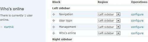
3. Look for the Who’s online block under the Disabled section.
4. Click on the crosshairs icon to its left and drag the block to the Left sidebar region.
5. Click on the Save blocks button at the bottom of the page to save our changes.
The block should now be visible in the left sidebar as can be seen with the Garland theme in the following screenshot:
Drupal maintains a table named blocks in its database which contains a list of all the blocks exposed by the modules in its installation. By moving the Who’s online block to the Left sidebar region, we are effectively just manipulating this table in the database. When a page is displayed, Drupal uses this table to determine the status and location of each block for the current theme and the theme system positions them accordingly.
Block layouts are particular to each theme and can therefore be customized differently for different themes.
Seeing that each theme is laid out with its own set of regions, it stands to reason that a block can also be positioned in different regions for different themes. For example, the Who’s online block seen in this recipe can be positioned in the Left sidebar region of the Garland theme and the Right sidebar of another theme such as Bartik. Taking this idea further, we can also have the block enabled only for Garland and not for Bartik.
The block layout for each theme can be managed by clicking on the appropriate theme tab at the top of the block management page at admin/structure/block [Home | Administration | Structure | Blocks]. Each theme provides a Demonstrate block regions link which can be used to obtain an overview of the regional layout of the theme.
This recipe details the steps involved in adding a block with custom content to the theme. Drupal blocks can either be declared using a module or, as we are doing here, added manually via the block administration interface.
For this recipe, we will be adding a simple welcome message in a custom block within a predetermined region. As with standard blocks, position matters!
The following procedure outlines the steps required to add a custom block to a theme:
1. Navigate to
admin/structure/block[Home | Administration | Structure | Blocks].2. If more than one theme is enabled, select the theme that we are adding our block to by clicking on its tab.
3. Click on the Add block link at the top of the page.
4. In the ensuing page, type a welcome message in the Block description textfield.
5. Next, if the block requires a title to be displayed above its content, add one via the Block title textfield. In this case, we do not need one as we are just looking to display a welcome message.
6. As displayed in the following screenshot, enter the welcome text into the Block body textarea:
Welcome to Mysite. Enjoy your stay!.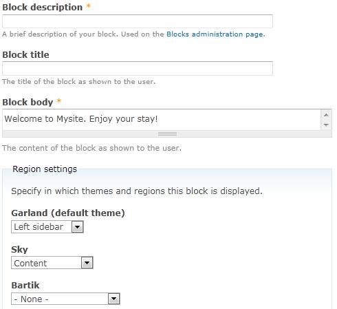
7. The Region settings fieldset lists all currently enabled themes. Optionally, choose the region where this block is to be displayed for each of them (or None if it is not to be displayed at all).
8. Finally, click on Save block to create the block.
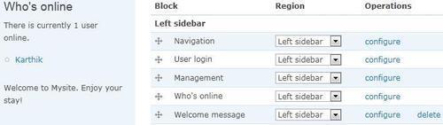
Just as with standard blocks, Drupal maintains a table named block_custom which tracks all custom blocks including their content and input format. Once a custom block is enabled, it is added to the block table and tracked as if it was a standard block.
When created, a custom block appears in the block list and can be treated just like any other block. It can be dragged around different regions, have its visibility settings controlled, and so on. The following screenshot displays our newly created welcome block as part of the Garland theme:
Custom blocks are useful for more than simply embedding text strings.
Custom blocks can be very handy to not only add visible content, but also to execute short code snippets on specific pages provided the appropriate input format has been selected. For example, we could embed some custom JavaScript required only for a few specific page nodes, by adding it to a custom block—equipped with a suitable input format—which is set to be displayed only with the aforementioned page nodes.
That said, if a more optimal solution is available—such as using a module to hold our code—then it should be pursued instead of inserting code into blocks and thereby into the database.
Now that we have seen how to add and manage blocks, we can proceed to control it further by playing with its visibility configuration. The final three recipes of this chapter outline the steps required for Displaying a block only on the front page, Controlling block visibility based on user role, and Controlling block visibility based on node type.
This recipe details the steps involved in displaying a block only on a certain page, which in this case, is the front page. We will be displaying the welcome message block created in the previous recipe as an example.
The front page is a special case on most sites as it usually showcases the rest of the site. Manipulating block visibility for front page blocks is a frequent requirement and in our case, we are going to ensure that the welcome message block is only going to be displayed on the front page and nowhere else.
Block visibility is controlled from the block’s configuration page as follows:
1. Navigate to
admin/structure/block[Home | Administration | Structure | Blocks].2. Locate the block that needs to be configured, the Welcome message block, and click on its Configure link listed in the Operations column.
3. On the configuration page, scroll down to the Visibility settings section and select the Pages tab.
4. In the Pages tab, choose the Only the listed pages radio button for the Show block on specific pages setting:
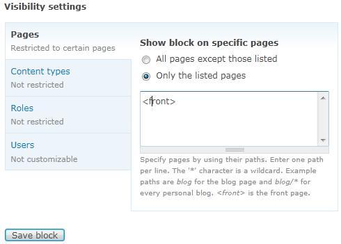
5. As shown in the previous screenshot, add the word
<front>within the associated textarea.6. Click on the Save block button at the bottom of the page to save our changes.
7. Finally, visit the front page of the site as well as other pages to confirm that the block is only being displayed on the front page.
Whenever a block is to be displayed, Drupal checks to see if we have any visibility settings applied to it. In this case, we have Only the listed pages switched on. As a result, Drupal checks the textarea configured within the Pages tab to see which pages have been listed. The use of the<front> keyword, which is a special indicator that represents the front page of the site, tells Drupal that unless this is the root of the site, this block should not be displayed.
This is all done before the content of the block is processed by Drupal thereby improving performance and making this method cleaner and more efficient than hiding the block using CSS or elsewhere in the theme.
Drupal offers a number of page-matching options to help further refine when and where we display our blocks.
Multiple pages can be specified in the textarea within the Pages tab. For example, if the block is to be displayed only on the front page and on user pages, the list would be the following:
<front>
user/*
Drupal will now compare the path of the page against each entry in this list and decide to display the block only if there is a match.
Drupal’s Path module allows users to specify URL aliases for nodes and system paths. While this can potentially be a source of indecision when it comes to choosing which paths to use while configuring a block’s page-visibility settings, the Block module’s page-matching code intelligently compares against both possibilities. For example, consider the following table that specifies the internal paths and corresponding aliases for three nodes:
|
Internal path |
URL alias |
|---|---|
|
node/1 |
products/foo |
|
node/13 |
products/bar |
|
node/22 |
products/baz |
If we wanted to match against all three nodes, we could specify the three node paths directly as follows:
node/1
node/13
node/22
Or, we could specify the three aliases as follows:
products/foo
products/bar
products/baz
Alternatively, we could simply use the aliases with a wildcard as follows:
Drupal allows administrators to segregate users into logical subsections named roles which facilitate features such as access control and content targeting. This recipe details the steps involved in toggling block visibility based on the role of the user viewing the page. For example, a block displaying advertisements might only need to be visible for anonymous users and not for authenticated users.
For this recipe, we will be configuring the welcome message block, which we created in an earlier recipe in this chapter, to only be visible to authenticated users, or to be more precise, to users belonging to the authenticated user role.
Controlling block visibility is handled from the block administration pages outlined as follows:
1. Navigate to
admin/structure/block[Home | Administration | Structure | Blocks].2. Locate the block that needs to be configured, the Welcome message block, and click on its Configure link.
3. On the configure screen, scroll down to the Visibility settings section and select the Roles tab.
4. In the Roles tab, check the authenticated user checkbox for the Show block for specific roles setting as shown in the following screenshot:
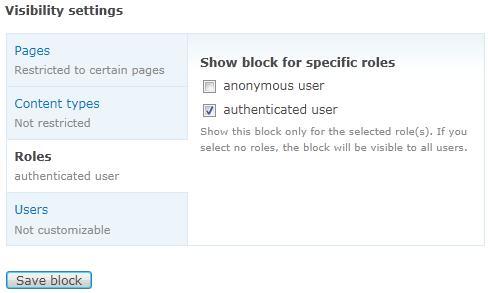
5. Click the Save block button at the bottom of the page to save the changes.
6. Finally, confirm that our changes have worked by checking if our block is visible only for users who have logged into the site—authenticated users—and not for those who have not—anonymous users.
Drupal maintains a table named block_role which keeps track of role-specific settings for all blocks. Changes made to role settings on the block configuration page are cataloged in this table. When an anonymous user now visits the site, Drupal will look up this table and note that the Welcome message block is restricted to authenticated users only. Consequently, the block will not be displayed.
So far in this chapter, we have looked at controlling block visibility based on the path of the page and the role of the user. In this recipe, we will look to configure a block to be displayed based on the node type of the content on the page.
We will be configuring the Recent comments block which is provided by the Comment module to only be visible for two particular node types, story and blog. The blog type is automatically created upon enabling the Blog module via the module administration page at admin/build/modules [Home | Administration | Site building | Modules]. The story type and another example type named page, however, need to be created manually via the Add content type page at admin/structure/types/add [Home | Administration | Structure | Content types].
It is assumed that both the Blog and Comment modules have been enabled and that the story and page node types have been created. It is also recommended that sample nodes and associated comments be created for all node types to reliably test our recipe.
Block visibility can be configured from the block’s configuration page as per the following steps:
1. Navigate to
admin/structure/block[Home | Administration | Structure | Blocks].2. Look for the block that needs to be configured, Recent comments, and click on its Configure link.
3. On the configure screen, scroll down to the Visibility settings section and select the Content types tab.
4. In the Content types tab, check the checkboxes that correspond to the Blog entry and Story types as shown in the following screenshot:
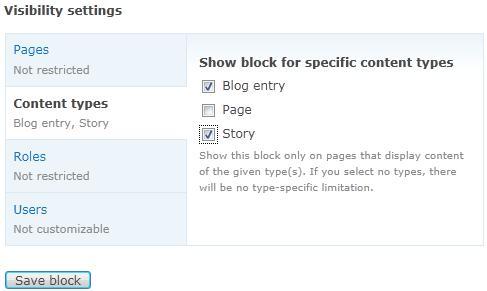
5. Finally, click on Save block to save our changes.
To test if our changes have taken effect, visit pages representing each of the three node types: blog, page, and story, and verify that the Recent comments block is being displayed only for the two configured in this recipe and not the rest.
Drupal maintains a table named block_node_type which keeps track of type-specific settings for all blocks. When a block is to be displayed, Drupal looks up this table if node type-specific conditions are in effect. If they are, then Drupal compares the type of the node being displayed against the types loaded from the block_node_type table and displays the block only if there is a match.
In this case, the block will only be displayed if we are viewing a blog or story node.