Download code from GitHub
Exploring Data for Machine Learning
Imagine embarking on a journey through an expansive ocean of data, where within this vastness are untold stories, patterns, and insights waiting to be discovered. Welcome to the world of data exploration in machine learning (ML). In this chapter, I encourage you to put on your analytical lenses as we embark on a thrilling quest. Here, we will delve deep into the heart of your data, armed with powerful techniques and heuristics, to uncover its secrets. As you embark on this adventure, you will discover that beneath the surface of raw numbers and statistics, there exists a treasure trove of patterns that, once revealed, can transform your data into a valuable asset. The journey begins with exploratory data analysis (EDA), a crucial phase where we unravel the mysteries of data, laying the foundation for automated labeling and, ultimately, building smarter and more accurate ML models. In this age of generative AI, the preparation of quality training data is essential to the fine-tuning of domain-specific large language models (LLMs). Fine-tuning involves the curation of additional domain-specific labeled data for training publicly available LLMs. So, fasten your seatbelts for a captivating voyage into the art and science of data exploration for data labeling.
First, let’s start with the question: What is data exploration? It is the initial phase of data analysis, where raw data is examined, visualized, and summarized to uncover patterns, trends, and insights. It serves as a crucial step in understanding the nature of the data before applying advanced analytics or ML techniques.
In this chapter, we will explore tabular data using various libraries and packages in Python, including Pandas, NumPy, and Seaborn. We will also plot different bar charts and histograms to visualize data to find the relationships between various features, which is useful for labeling data. We will be exploring the Income dataset located in this book’s GitHub repository (a link for which is located in the Technical requirements section). A good understanding of the data is necessary in order to define business rules, identify matching patterns, and, subsequently, label the data using Python labeling functions.
By the end of this chapter, we will be able to generate summary statistics for the given dataset. We will derive aggregates of the features for each target group. We will also learn how to perform univariate and bivariate analyses of the features in the given dataset. We will create a report using the ydata-profiling library.
We’re going to cover the following main topics:
- EDA and data labeling
- Summary statistics and data aggregates with Pandas
- Data visualization with Seaborn for univariate and bivariate analysis
- Profiling data using the
ydata-profilinglibrary - Unlocking insights from data with OpenAI and LangChain
Technical requirements
One of the following Python IDE and software tools needs to be installed before running the notebook in this chapter:
- Anaconda Navigator: Download and install the open source Anaconda Navigator from the following URL:
https://docs.anaconda.com/navigator/install/#system-requirements
- Jupyter Notebook: Download and install Jupyter Notebook:
- We can also use open source, online Python editors such as Google Colab (https://colab.research.google.com/) or Replit (https://replit.com/)
The Python source code and the entire notebook created in this chapter are available in this book’s GitHub repository:
https://github.com/PacktPublishing/Data-Labeling-in-Machine-Learning-with-Python
You also need to create an Azure account and add an OpenAI resource for working with generative AI. To sign up for a free Azure subscription, visit https://azure.microsoft.com/free. To request access to the Azure OpenAI service, visit https://aka.ms/oaiapply.
Once you have provisioned the Azure OpenAI service, deploy the LLM model – either GPT-3.5-Turbo or GPT 4.0 – from Azure OpenAI Studio. Then copy the keys for OpenAI from OpenAI Studio and set up the following environment variables:
os.environ['AZURE_OPENAI_KEY'] = 'your_api_key'
os.environ['AZURE_OPENAI_ENDPOINT") ='your_azure_openai_endpoint'
Your endpoint should look like this: https://YOUR_RESOURCE_NAME.openai.azure.com/.
EDA and data labeling
In this section, we will gain an understanding of what EDA is. We will see why we need to perform it and discuss its advantages. We will also look at the life cycle of an ML project and learn about the role of data labeling in this cycle.
EDA comprises data discovery, data collection, data cleaning, and data exploration. These steps are part of any machine learning project. The data exploration step includes tasks such as data visualization, summary statistics, correlation analysis, and data distribution analysis. We will dive deep into these steps in the upcoming sections.
Here are some real-world examples of EDA:
- Customer churn analysis: Suppose you work for a telecommunications company and you want to understand why customers are churning (canceling their subscriptions); in this case, conducting EDA on customer churn data can provide valuable insights.
- Income data analysis: EDA on the Income dataset with predictive features such as education, employment status, and marital status helps to predict whether the salary of a person is greater than $50K.
EDA is a critical process for any ML or data science project, and it allows us to understand the data and gain some valuable insights into the data domain and business.
In this chapter, we will use various Python libraries, such as Pandas, and call the describe and info functions on Pandas to generate data summaries. We will discover anomalies in the data and any outliers in the given dataset. We will also figure out various data types and any missing values in the data. We will understand whether any data type conversions are required, such as converting string to float, for performing further analysis. We will also analyze the data formats and see whether any transformations are required to standardize them, such as the date format. We will analyze the counts of different labels and understand whether the dataset is balanced or imbalanced. We will understand the relationships between various features in the data and calculate the correlations between features.
To summarize, we will understand the patterns in the given dataset and also identify the relationships between various features in the data samples. Finally, we will come up with a strategy and domain rules for data cleaning and transformation. This helps us to predict labels for unlabeled data.
We will plot various data visualizations using Python libraries such as seaborn and matplotlib. We will create bar charts, histograms, heatmaps, and various charts to visualize the importance of features in the dataset and how they depend on each other.
Understanding the ML project life cycle
The following are the major steps in an ML project:
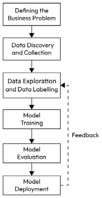
Figure 1.1 – ML project life cycle diagram
Let’s look at them in detail.
Defining the business problem
The first step in every ML project is to understand the business problem and define clear goals that can be measured at the end of the project.
Data discovery and data collection
In this step, you identify and gather potential data sources that may be relevant to your project’s objectives. This involves finding datasets, databases, APIs, or any other sources that may contain the data needed for your analysis and modeling.
The goal of data discovery is to understand the landscape of available data and assess its quality, relevance, and potential limitations.
Data discovery can also involve discussions with domain experts and stakeholders to identify what data is essential for solving business problems or achieving the project’s goals.
After identifying various sources for data, data engineers will develop data pipelines to extract and load the data to the target data lake and perform some data preprocessing tasks such as data cleaning, de-duplication, and making data readily available to ML engineers and data scientists for further processing.
Data exploration
Data exploration follows data discovery and is primarily focused on understanding the data, gaining insights, and identifying patterns or anomalies.
During data exploration, you may perform basic statistical analysis, create data visualizations, and conduct initial observations to understand the data’s characteristics.
Data exploration can also involve identifying missing values, outliers, and potential data quality issues, but it typically does not involve making systematic changes to the data.
During data exploration, you assess the available labeled data and determine whether it’s sufficient for your ML task. If you find that the labeled data is small and insufficient for model training, you may identify the need for additional labeled data.
Data labeling
Data labeling involves acquiring or generating more labeled examples to supplement your training dataset. You may need to manually label additional data points or use programming techniques such as data augmentation to expand your labeled dataset. The process of assigning labels to data samples is called data annotation or data labeling.
Most of the time, it is too expensive or time-consuming to outsource the manual data labeling task. Also, data is often not allowed to be shared with external third-party organizations due to data privacy. So, automating the data labeling process with an in-house development team using Python helps to label the data quickly and at an affordable cost.
Most of the data science books available on the market are lacking information about this important step. So, this book aims to address the various methods to programmatically label data using Python as well as the annotation tools available on the market.
After obtaining a sufficient amount of labeled data, you proceed with traditional data preprocessing tasks, such as handling missing values, encoding features, scaling, and feature engineering.
Model training
Once the data is adequately prepared, then that dataset is fed into the model by ML engineers to train the model.
Model evaluation
After the model is trained, the next step is to evaluate the model on a validation dataset to see how good the model is and avoid bias and overfitting.
You can evaluate the model’s performance using various metrics and techniques and iterate on the model-building process as needed.
Model deployment
Finally, you deploy your model into production and monitor for continuous improvement using ML Operations (MLOps). MLOps aims to streamline the process of taking ML models to production and maintaining and monitoring them.
In this book, we will focus on data labeling. In a real-world project, the datasets that sources provide us with for analytics and ML are not clean and not labeled. So, we need to explore unlabeled data to understand correlations and patterns and help us define the rules for data labeling using Python labeling functions. Data exploration helps us to understand the level of cleaning and transformation required before starting data labeling and model training.
This is where Python helps us to explore and perform a quick analysis of raw data using various libraries (such as Pandas, Seaborn, and ydata-profiling libraries), otherwise known as EDA.
Introducing Pandas DataFrames
Pandas is an open source library used for data analysis and manipulation. It provides various functions for data wrangling, cleaning, and merging operations. Let us see how to explore data using the pandas library. For this, we will use the Income dataset located on GitHub and explore it to find the following insights:
- How many unique values are there for age, education, and profession in the Income dataset? What are the observations for each unique age?
- Summary statistics such as mean value and quantile values for each feature. What is the average age of the adult for the income range > $50K?
- How is income dependent on independent variables such as age, education, and profession using bivariate analysis?
Let us first read the data into a DataFrame using the pandas library.
A DataFrame is a structure that represents two-dimensional data with columns and rows, and it is similar to a SQL table. To get started, ensure that you create the requirements.txt file and add the required Python libraries as follows:
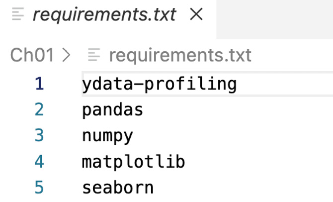
Figure 1.2 – Contents of the requirements.txt file
Next, run the following command from your Python notebook cell to install the libraries added in the requirements.txt file:
%pip install -r requirements.txt
Now, let’s import the required Python libraries using the following import statements:
# import libraries for loading dataset
import pandas as pd
import numpy as np
# import libraries for plotting
import matplotlib.pyplot as plt
import seaborn as sns
from matplotlib import rcParams
%matplotlib inline
plt.style.use('dark_background')
# ignore warnings
import warnings
warnings.filterwarnings('ignore')
Next, in the following code snippet, we are reading the adult_income.csv file and writing to the DataFrame (df):
# loading the dataset
df = pd.read_csv("<your file path>/adult_income.csv", encoding='latin-1)'
Now the data is loaded to df.
Let us see the size of the DataFrame using the following code snippet:
df.shape
We will see the shape of the DataFrame as a result:

Figure 1.3 – Shape of the DataFrame
So, we can see that there are 32,561 observations (rows) and 15 features (columns) in the dataset.
Let us print the 15 column names in the dataset:
df.columns
We get the following result:
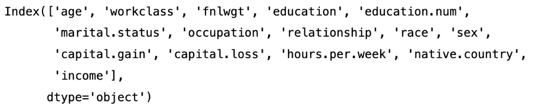
Figure 1.4 – The names of the columns in our dataset
Now, let’s see the first five rows of the data in the dataset with the following code:
df.head()
We can see the output in Figure 1.5:
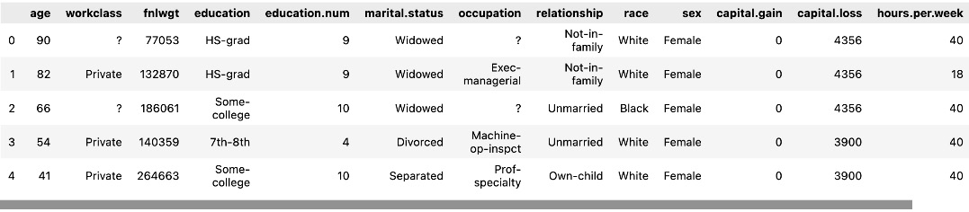
Figure 1.5 – The first five rows of data
Let’s see the last five rows of the dataset using tail, as shown in the following figure:
df.tail()
We will get the following output.
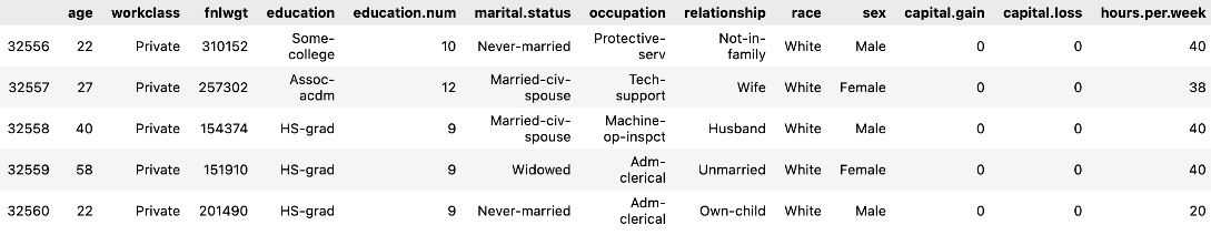
Figure 1.6 – The last five rows of data
As we can see, education and education.num are redundant columns, as education.num is just the ordinal representation of the education column. So, we will remove the redundant education.num column from the dataset as one column is enough for model training. We will also drop the race column from the dataset using the following code snippet as we will not use it here:
# As we observe education and education.num both are the same , so we can drop one of the columns
df.drop(['education.num'], axis = 1, inplace = True)
df.drop(['race'], axis = 1, inplace = True)
Here, axis = 1 refers to the columns axis, which means that you are specifying that you want to drop a column. In this case, you are dropping the columns labeled education.num and race from the DataFrame.
Now, let’s print the columns using info() to make sure the race and education.num columns are dropped from the DataFrame:
df.info()
We will see the following output:
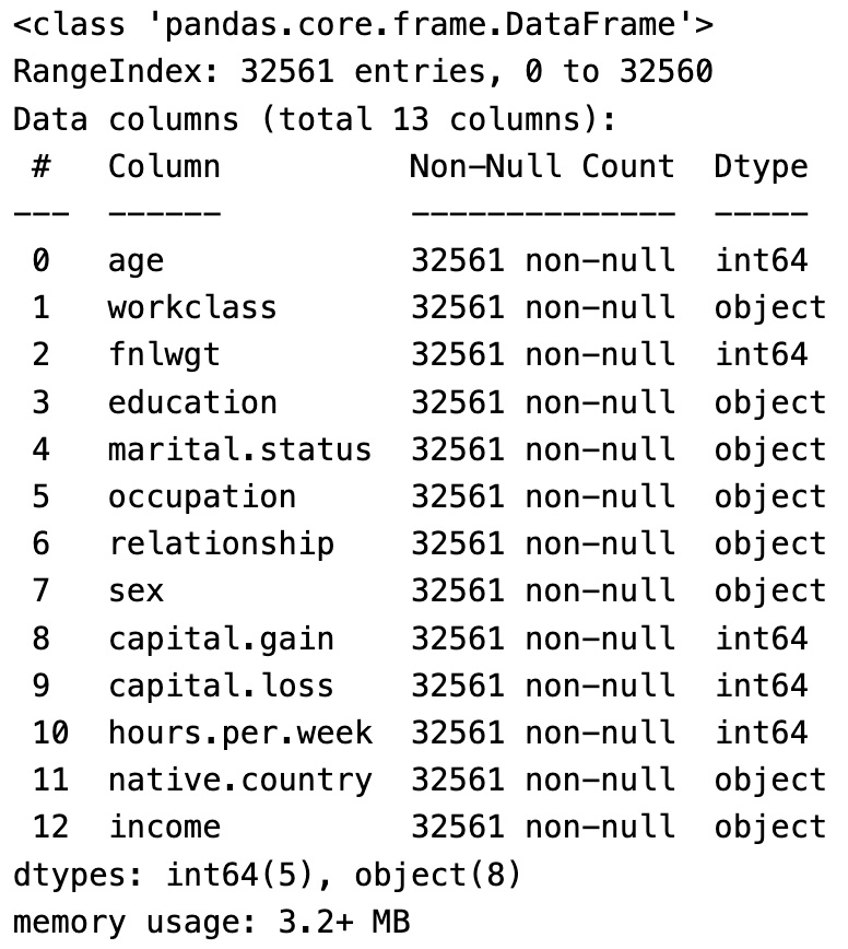
Figure 1.7 – Columns in the DataFrame
We can see in the preceding data there are now only 13 columns as we deleted 2 of them from the previous total of 15 columns.
In this section, we have seen what a Pandas DataFrame is and loaded a CSV dataset into one. We also saw the various columns in the DataFrame and their data types. In the following section, we will generate the summary statistics for the important features using Pandas.
Summary statistics and data aggregates
In this section, we will derive the summary statistics for numerical columns.
Before generating summary statistics, we will identify the categorical columns and numerical columns in the dataset. Then, we will calculate the summary statistics for all numerical columns.
We will also calculate the mean value of each numerical column for the target class. Summary statistics are useful to gain insights about each feature’s mean values and their effect on the target label class.
Let’s print the categorical columns using the following code snippet:
#categorical column
catogrical_column = [column for column in df.columns if df[column].
dtypes=='object']
print(catogrical_column)
We will get the following result:

Figure 1.8 – Categorical columns
Now, let’s print the numerical columns using the following code snippet:
#numerical_column
numerical_column = [column for column in df.columns if df[column].dtypes !='object']
print(numerical_column)
We will get the following output:

Figure 1.9 – Numerical columns
Summary statistics
Now, let’s generate summary statistics (i.e., mean, standard deviation, minimum value, maximum value, and lower (25%), middle (50%), and higher (75%) percentiles) using the following code snippet:
df.describe().T
We will get the following results:
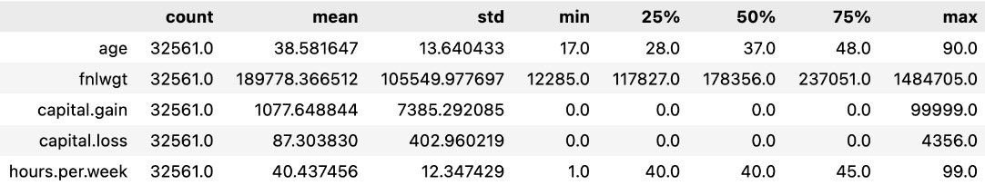
Figure 1.10 – Summary statistics
As shown in the results, the mean value of age is 38.5 years, the minimum age is 17 years, and the maximum age is 90 years in the dataset. As we have only five numerical columns in the dataset, we can only see five rows in this summary statistics table.
Data aggregates of the feature for each target class
Now, let’s calculate the average age of the people for each income group range using the following code snippet:
df.groupby("income")["age"].mean() We will see the following output:
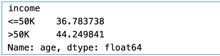
Figure 1.11 – Average age by income group
As shown in the results, we have used the groupby clause on the target variable and calculated the mean of the age in each group. The mean age is 36.78 for people with an income group of less than or equal to $50K. Similarly, the mean age is 44.2 for the income group greater than $50K.
Now, let’s calculate the average hours per week of the people for each income group range using the following code snippet:
df.groupby("income")["hours.per.week"]. mean() We will get the following output:
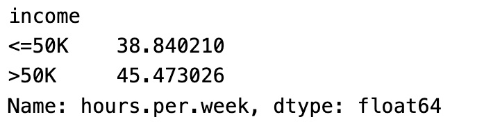
Figure 1.12 – Average hours per week by income group
As shown in the results, the average hours per week for the income group =< $50K is 38.8 hours. Similarly, the average hours per week for the income group > $50K is 45.47 hours.
Alternatively, we can write a generic reusable function for calculating the mean of any numerical column group by the categorical column as follows:
def get_groupby_stats(categorical, numerical):
    groupby_df = df[[categorical, numerical]].groupby(categorical).
        mean().dropna()
    print(groupby_df.head)
If we want to get aggregations of multiple columns for each target income group, then we can calculate aggregations as follows:
columns_to_show = ["age", "hours.per.week"]
df.groupby(["income"])[columns_to_show].agg(['mean', 'std', 'max', 'min'])
We get the following results:
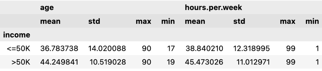
Figure 1.13 – Aggregations for multiple columns
As shown in the results, we have calculated the summary statistics for age and hours per week for each income group.
We learned how to calculate the aggregate values of features for the target group using reusable functions. This aggregate value gives us a correlation of those features for the target label value.
Creating visualizations using Seaborn for univariate and bivariate analysis
In this section, we are going to explore each variable separately. We are going to summarize the data for each feature and analyze the pattern present in it.
Univariate analysis is an analysis using individual features. We will also perform a bivariate analysis later in this section.
Univariate analysis
Now, let us do a univariate analysis for the age, education, work class, hours per week, and occupation features.
First, let’s get the counts of unique values for each column using the following code snippet:
df.nunique()

Figure 1.14 – Unique values for each column
As shown in the results, there are 73 unique values for age, 9 unique values for workclass, 16 unique values for education, 15 unique values for occupation, and so on.
Now, let us see the unique values count for age in the DataFrame:
df["age"].value_counts()
The result is as follows:

Figure 1.15 – Value counts for age
We can see in the results that there are 898 observations (rows) with the age of 36. Similarly, there are 6 observations with the age of 83.
Histogram of age
Histograms are used to visualize the distribution of continuous data. Continuous data is data that can take on any value within a range (e.g., age, height, weight, temperature, etc.).
Let us plot a histogram using Seaborn to see the distribution of age in the dataset:
#univariate analysis
sns.histplot(data=df['age'],kde=True)
We get the following results:

Figure 1.16 – The histogram of age
As we can see in the age histogram, there are many people in the age range of 23 to 45 in the given observations in the dataset.
Bar plot of education
Now, let us check the distribution of education in the given dataset:
df['education'].value_counts()
Let us plot the bar chart for education.
colors = ["white","red", "green", "blue", "orange", "yellow", "purple"]
df.education.value_counts().plot.bar(color=colors,legend=True)

Figure 1.17 – The bar chart of education
As we see, the HS.grad count is higher than that for the Bachelors degree holders. Similarly, the Masters degree holders count is lower than the Bachelors degree holders count.
Bar chart of workclass
Now, let’s see the distribution of workclass in the dataset:
df['workclass'].value_counts()
Let’s plot the bar chart to visualize the distribution of different values of workclass:

Figure 1.18 – Bar chart of workclass
As shown in the workclass bar chart, there are more private employees than other kinds.
Bar chart of income
Let’s see the unique value for the income target variable and see the distribution of income:
df['income'].value_counts()
The result is as follows:

Figure 1.19 – Distribution of income
As shown in the results, there are 24,720 observations with an income greater than $50K and 7,841 observations with an income of less than $50K. In the real world, more people have an income greater than $50K and a small portion of people have less than $50K income, assuming the income is in US dollars and for 1 year. As this ratio closely reflects the real-world scenario, we do not need to balance the minority class dataset using synthetic data.

Figure 1.20 – Bar chart of income
In this section, we have seen the size of the data, column names, and data types, and the first and last five rows of the dataset. We also dropped some unnecessary columns. We performed univariate analysis to see the unique value counts and plotted the bar charts and histograms to understand the distribution of values for important columns.
Bivariate analysis
Let’s do a bivariate analysis of age and income to find the relationship between them. Bivariate analysis is the analysis of two variables to find the relationship between them. We will plot a histogram using the Python Seaborn library to visualize the relationship between age and income:
#Bivariate analysis of age and income
sns.histplot(data=df,kde=True,x='age',hue='income')
The plot is as follows:

Figure 1.21 – Histogram of age with income
From the preceding histogram, we can see that income is greater than $50K for the age group between 30 and 60. Similarly, for the age group less than 30, income is less than $50K.
Now let’s plot the histogram to do a bivariate analysis of education and income:
#Bivariate Analysis of  education and Income
sns.histplot(data=df,y='education', hue='income',multiple="dodge");
Here is the plot:

Figure 1.22 – Histogram of education with income
From the preceding histogram, we can see that income is greater than $50K for the majority of the Masters education adults. On the other hand, income is less than $50K for the majority of HS-grad adults.
Now, let’s plot the histogram to do a bivariate analysis of workclass and income:
#Bivariate Analysis of work class and Income
sns.histplot(data=df,y='workclass', hue='income',multiple="dodge");
We get the following plot:

Figure 1.23 – Histogram of workclass and income
From the preceding histogram, we can see that income is greater than $50K for Self-emp-inc adults. On the other hand, income is less than $50K for the majority of Private and Self-emp-not-inc employees.
Now let’s plot the histogram to do a bivariate analysis of sex and income:
#Bivariate Analysis of  Sex and Income
sns.histplot(data=df,y='sex', hue='income',multiple="dodge");

Figure 1.24 – Histogram of sex and income
From the preceding histogram, we can see that income is more than $50K for male adults and less than $50K for most female employees.
In this section, we have learned how to analyze data using Seaborn visualization libraries.
Alternatively, we can explore data using the ydata-profiling library with a few lines of code.
Profiling data using the ydata-profiling library
In this section, let us explore the dataset and generate a profiling report with various statistics using the ydata-profiling library (https://docs.profiling.ydata.ai/4.5/).
The ydata-profiling library is a Python library for easy EDA, profiling, and report generation.
Let us see how to use ydata-profiling for fast and efficient EDA:
- Install the
ydata-profilinglibrary usingpipas follows:pip install ydata-profiling
- First, let us import the Pandas profiling library as follows:
from ydata_profiling import ProfileReport
Then, we can use Pandas profiling to generate reports.
- Now, we will read the Income dataset into the Pandas DataFrame:
df=pd.read_csv('adult.csv',na_values=-999) - Let us run the
upgradecommand to make sure we have the latest profiling library:%pip install ydata-profiling --upgrade
- Now let us run the following commands to generate the profiling report:
report = ProfileReport(df)
report
We can also generate the report using the profile_report() function on the Pandas DataFrame.
After running the preceding cell, all the data loaded in df will be analyzed and the report will be generated. The time taken to generate the report depends on the size of the dataset.
The output of the preceding cell is a report with sections. Let us understand the report that is generated.
The generated profiling report contains the following sections:
- Overview
- Variables
- Interactions
- Correlations
- Missing values
- Sample
- Duplicate rows
Under the Overview section in the report, there are three tabs:
- Overview
- Alerts
- Reproduction
As shown in the following figure, the Overview tab shows statistical information about the dataset – that is, the number of columns (number of variables) in the dataset; the number of rows (number of observations), duplicate rows, and missing cells; the percentage of duplicate rows and missing cells; and the number of Numeric and Categorical variables:
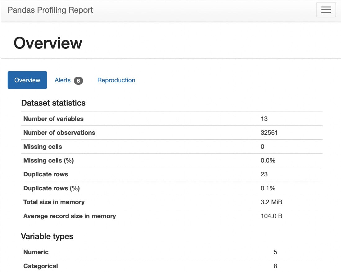
Figure 1.25 – Statistics of the dataset
The Alerts tab under Overview shows all the variables that are highly correlated with each other and the number of cells that have zero values, as follows:
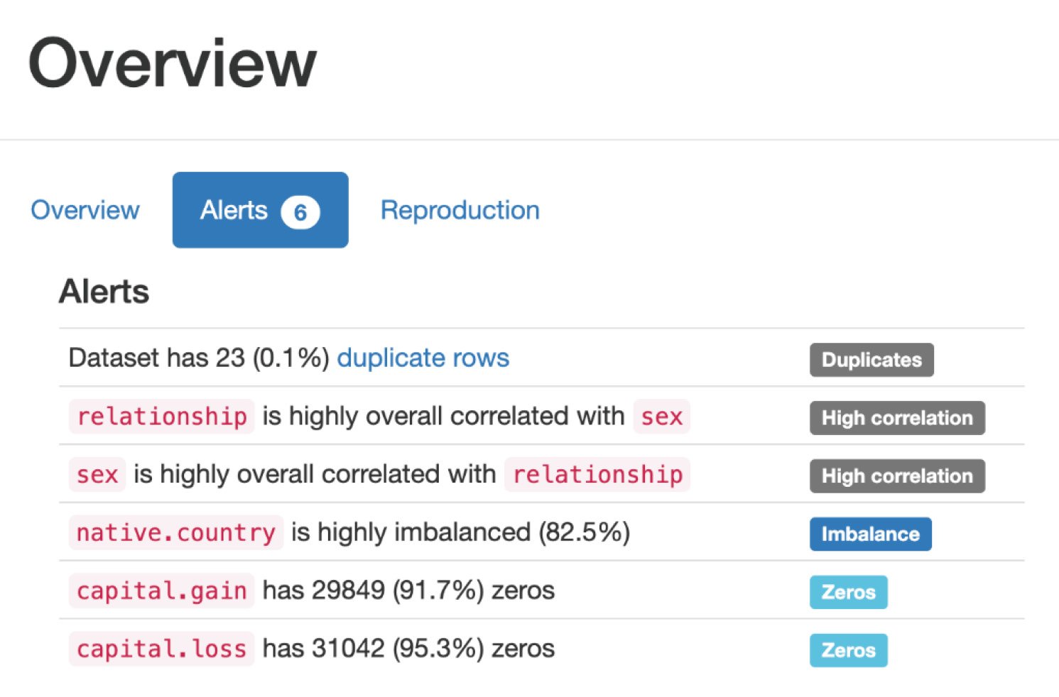
Figure 1.26 – Alerts
The Reproduction tab under Overview shows the duration it took for the analysis to generate this report, as follows:
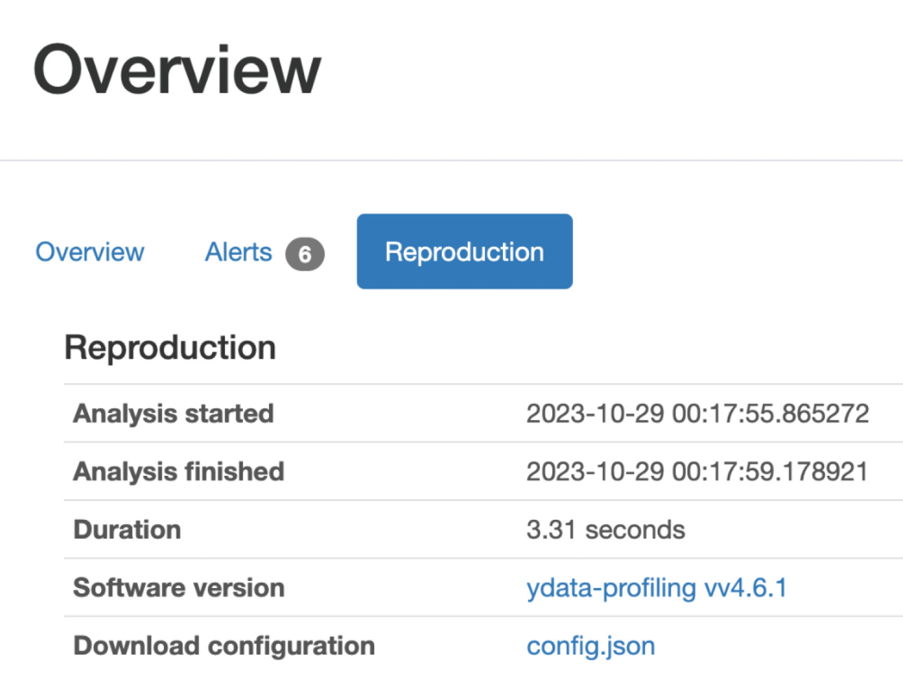
Figure 1.27 – Reproduction
Variables section
Let us walk through the Variables section in the report.
Under the Variables section, we can select any variable in the dataset under the dropdown and see the statistical information about the dataset, such as the number of unique values for that variable, missing values for that variable, the size of that variable, and so on.
In the following figure, we selected the age variable in the dropdown and can see the statistics about that variable:
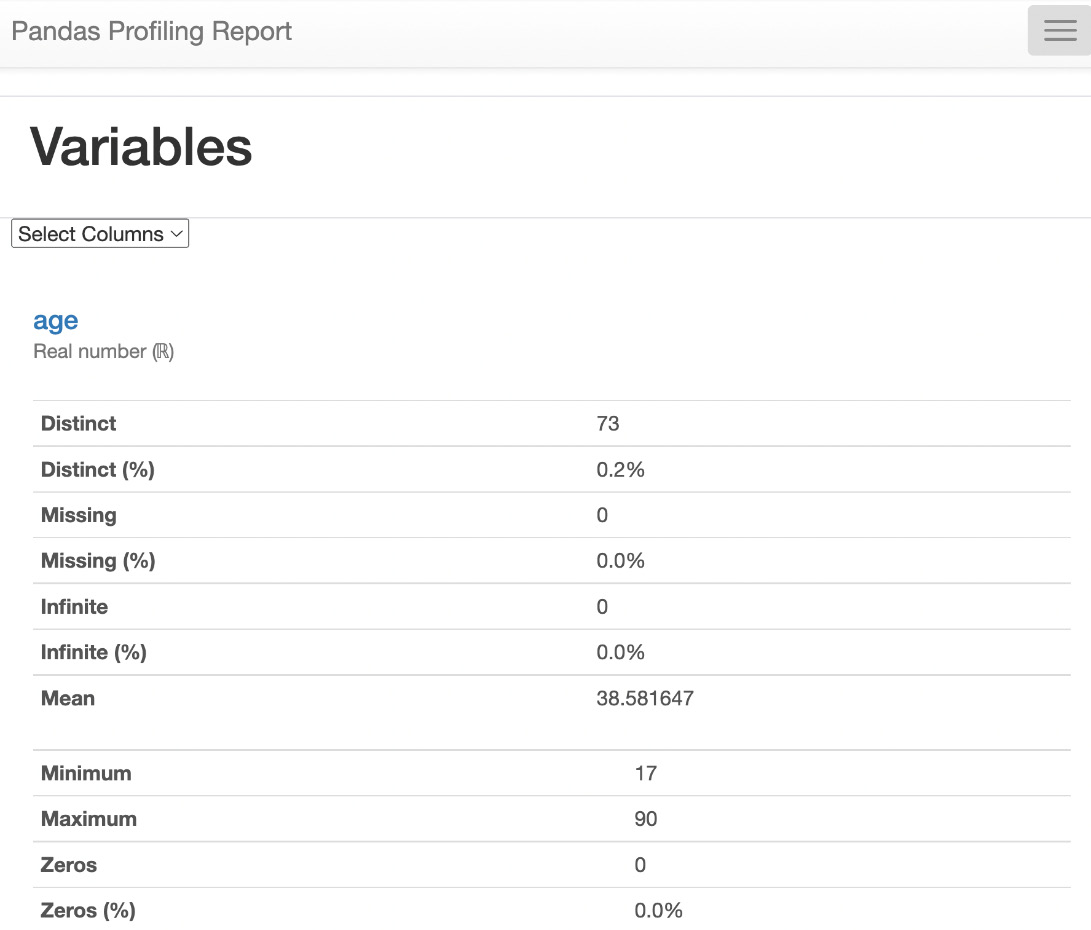
Figure 1.28 – Variables
Interactions section
As shown in the following figure, this report also contains the Interactions plot to show how one variable relates to another variable:
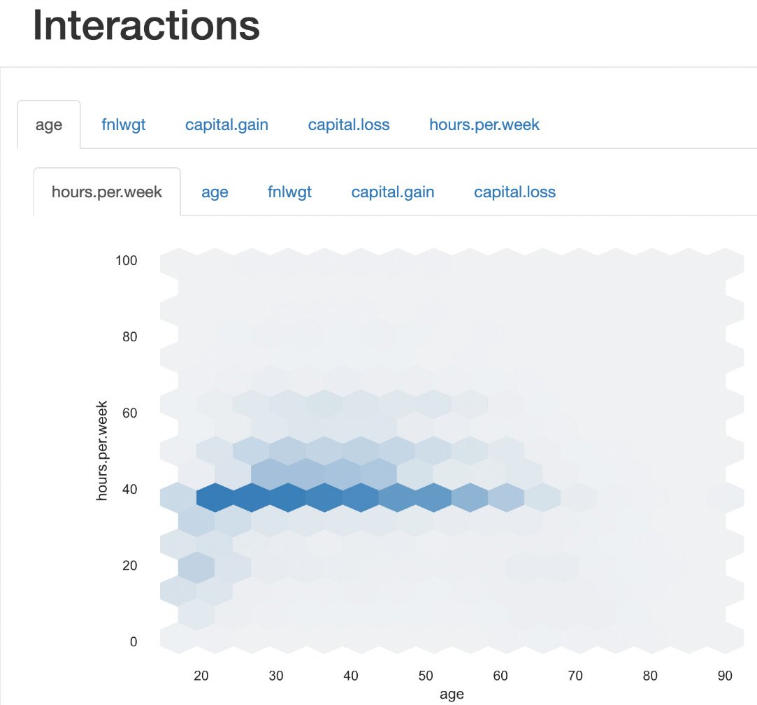
Figure 1.29 – Interactions
Correlations
Now, let's see the Correlations section in the report; we can see the correlation between various variables in Heatmap. Also, we can see various correlation coefficients in the Table form.
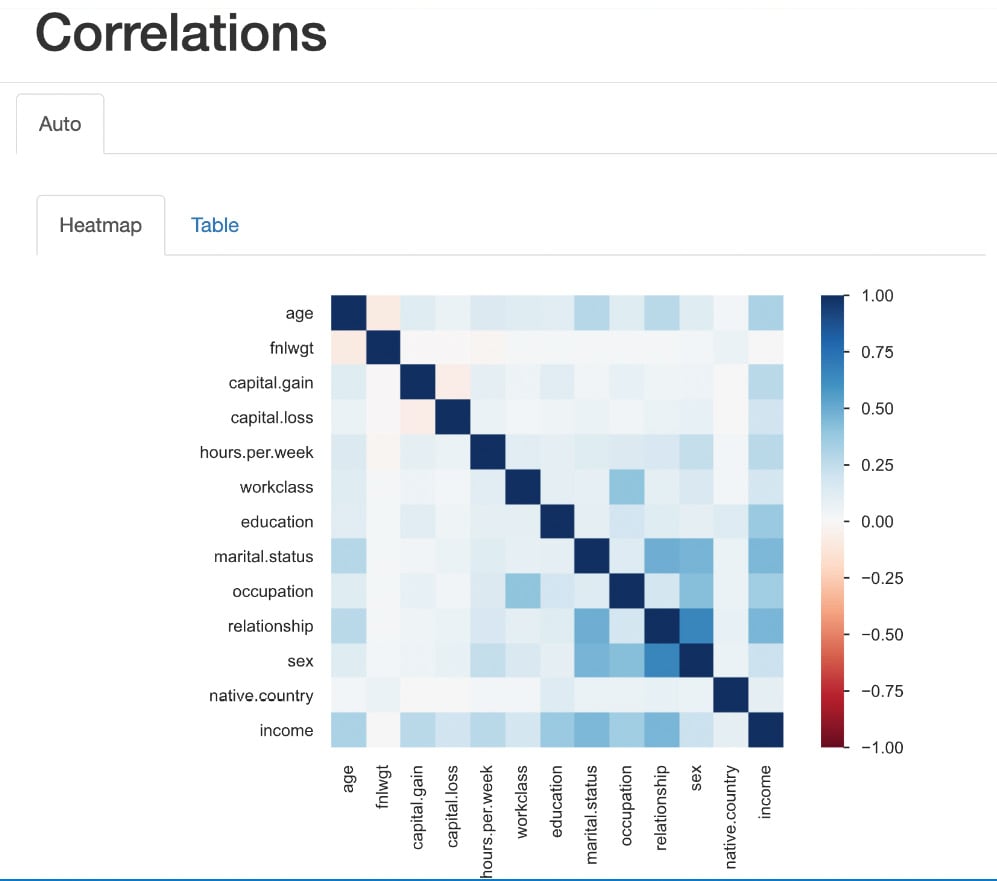
Figure 1.30 – Correlations
Heatmaps use color intensity to represent values. The colors typically range from cool to warm hues, with cool colors (e.g., blue or green) indicating low values and warm colors (e.g., red or orange) indicating high values. Rows and columns of the matrix are represented on both the x axis and y axis of the heatmap. Each cell at the intersection of a row and column represents a specific value in the data.
The color intensity of each cell corresponds to the magnitude of the value it represents. Darker colors indicate higher values, while lighter colors represent lower values.
As we can see in the preceding figure, the intersection cell between income and hours per week shows a high-intensity blue color, which indicates there is a high correlation between income and hours per week. Similarly, the intersection cell between income and capital gain shows a high-intensity blue color, indicating a high correlation between those two features.
Missing values
This section of the report shows the counts of total values present within the data and provides a good understanding of whether there are any missing values.
Under Missing values, we can see two tabs:
- The Count plot
- The Matrix plot
Count plot
In Figure 1.31, the shows that all variables have a count of 32,561, which is the count of rows (observations) in the dataset. That indicates that there are no missing values in the dataset.
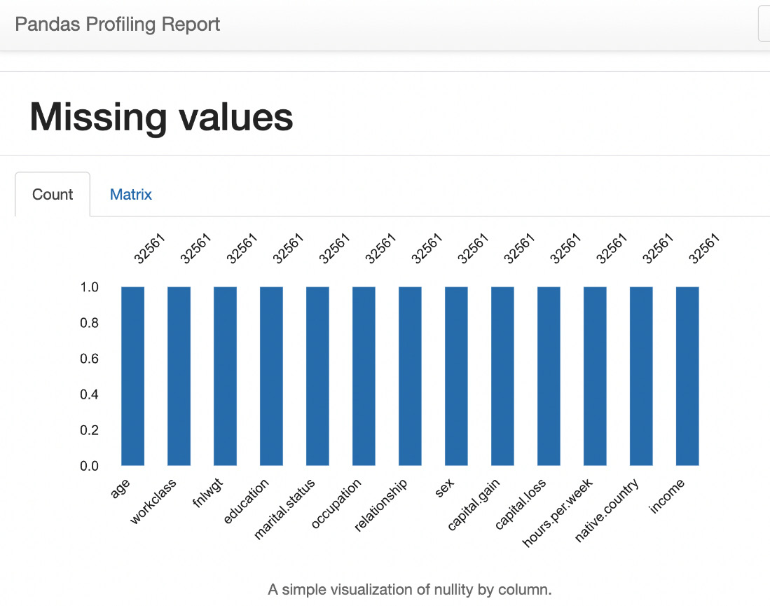
Figure 1.31 – Missing values count
Matrix plot
The following Matrix plot indicates where the missing values are (if there are any missing values in the dataset):
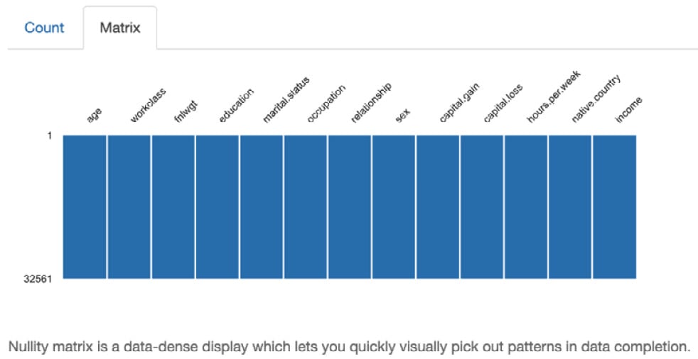
Figure 1.32 – Missing values matrix
Sample data
This section shows the sample data for the first 10 rows and the last 10 rows in the dataset.
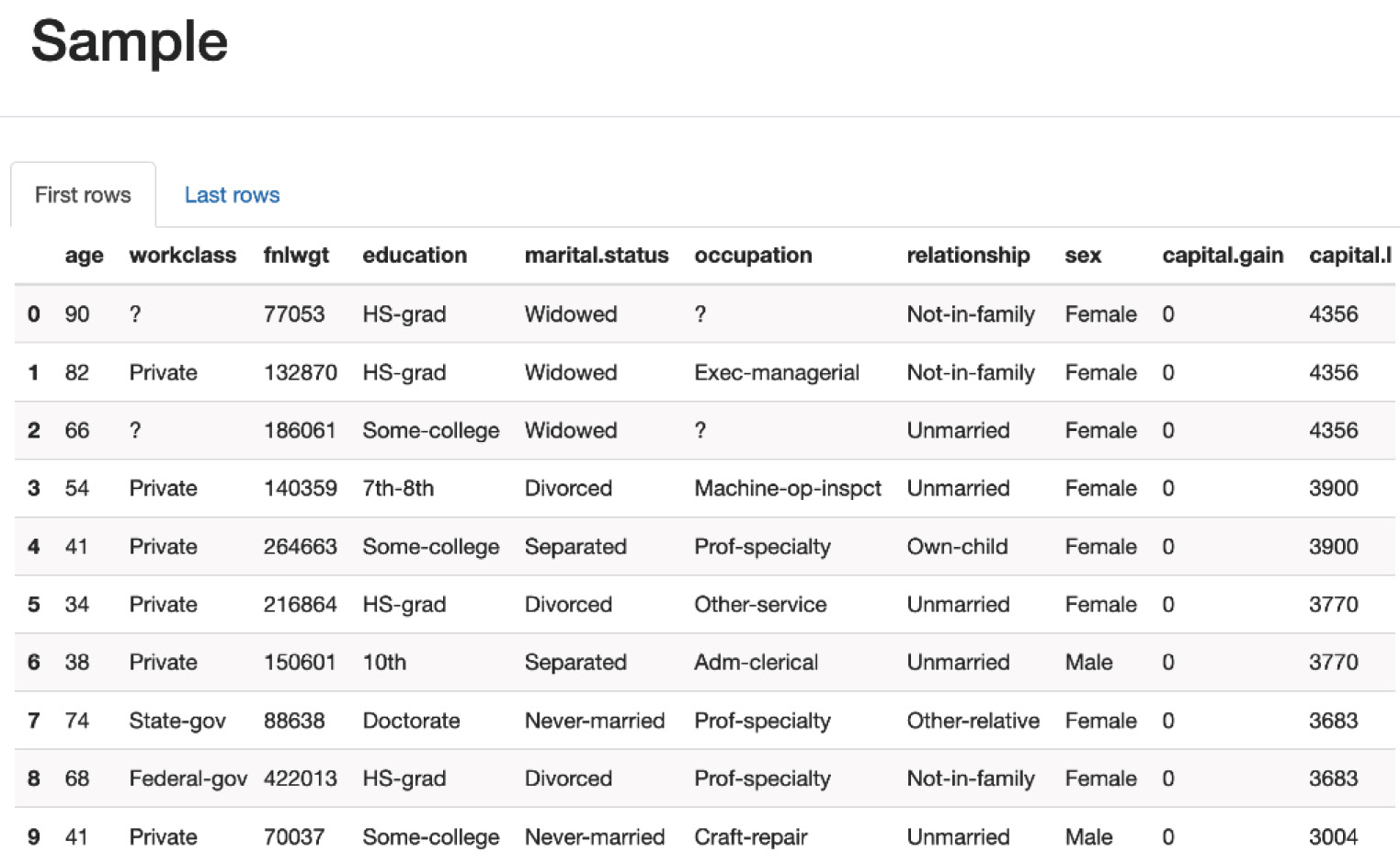
Figure 1.33 – Sample data
This section shows the most frequently occurring rows and the number of duplicates in the dataset.
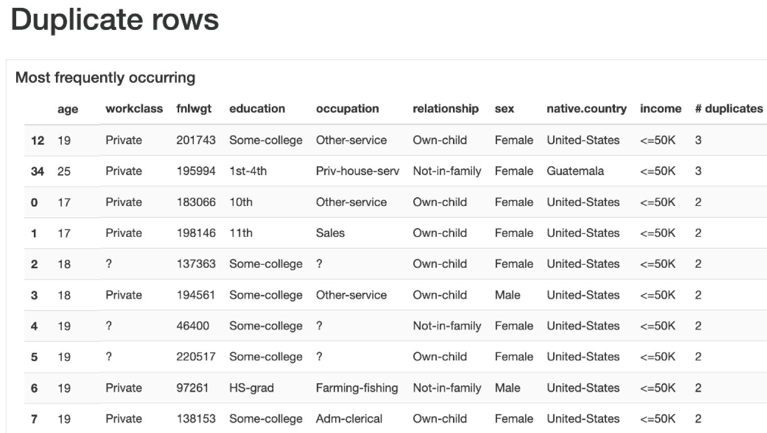
Figure 1.34 – Duplicate rows
We have seen how to analyze the data using Pandas and then how to visualize the data by plotting various plots such as bar charts and histograms using sns, seaborn, and pandas-ydata-profiling. Next, let us see how to perform data analysis using OpenAI LLM and the LangChain Pandas Dataframe agent by asking questions with natural language.
Unlocking insights from data with OpenAI and LangChain
Artificial intelligence is transforming how people analyze and interpret data. Exciting generative AI systems allow anyone to have natural conversations with their data, even if they have no coding or data science expertise. This democratization of data promises to uncover insights and patterns that may have previously remained hidden.
One pioneering system in this space is LangChain’s Pandas DataFrame agent, which leverages the power of large language models (LLMs) such as Azure OpenAI’s GPT-4. LLMs are AI systems trained on massive text datasets, allowing them to generate human-like text. LangChain provides a framework to connect LLMs with external data sources.
By simply describing in plain English what you want to know about your data stored in a Pandas DataFrame, this agent can automatically respond in natural language.
The user experience feels like magic. You upload a CSV dataset and ask a question by typing or speaking. For example, “What were the top 3 best-selling products last year?” The agent interprets your intent and writes and runs Pandas and Python code to load the data, analyze it, and formulate a response...all within seconds. The barrier between human language and data analysis dissolves.
Under the hood, the LLM generates Python code based on your question, which gets passed to the LangChain agent for execution. The agent handles running the code against your DataFrame, capturing any output or errors, and iterating if necessary to refine the analysis until an accurate human-readable answer is reached.
By collaborating, the agent and LLM remove the need to worry about syntax, APIs, parameters, or debugging data analysis code. The system understands what you want to know and makes it happen automatically through the magic of generative AI.
This natural language interface to data analysis opens game-changing potential. Subject-matter experts without programming skills can independently extract insights from data in their field. Data-driven decisions can happen faster. Exploratory analysis and ideation are simpler. The future where analytics is available to all AI assistants has arrived.
Let’s see how the agent works behind the scenes to send a response.
When a user sends a query to the LangChain create_pandas_dataframe_agent agent and LLM, the following steps are performed behind the scenes:
- The user’s query is received by the LangChain agent.
- The agent interprets the user’s query and analyzes its intention.
- The agent then generates the necessary commands to perform the first step of the analysis. For example, it could generate an SQL query that is sent to the tool that the agent knows will execute SQL queries.
- The agent analyzes the response it receives from the tool and determines whether it is what the user wants. If it is, the agent returns the answer; if not, the agent analyzes what the next step should be and iterates again.
- The agent keeps generating commands for the tools it can control until it obtains the response the user is looking for. It is even capable of interpreting execution errors that occur and generating the corrected command. The agent iterates until it satisfies the user’s question or reaches the limit we have set.
We can represent this with the following diagram:
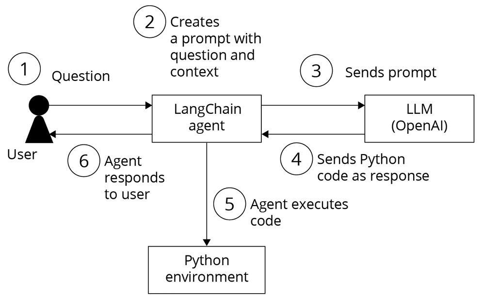
Figure 1.35 – LangChain Pandas agent flow for Data analysis
Let’s see how to perform data analysis and find insights about the income dataset using the LangChain create_pandas_dataframe_agent agent and LLM.
The key steps are importing the necessary LangChain modules, loading data into a DataFrame, instantiating an LLM, and creating the DataFrame agent by passing the required objects. The agent can now analyze the data through natural language queries.
First, let’s install the required libraries. To install the LangChain library, open your Python notebook and type the following:
    %pip install langchain
    %pip install langchain_experimental
This installs the langchain and langchain_experimental packages so you can import the necessary modules.
Let’s import AzureChatOpenAI, the Pandas DataFrame agent, and other required libraries:
from langchain.chat_models import AzureChatOpenAI
from langchain_experimental.agents import create_pandas_dataframe_agent
import os
import pandas as pd
import numpy as np
import seaborn as sns
import matplotlib.pyplot as plt
import openai
Let’s configure the OpenAI endpoint and keys. Your OpenAI endpoint and key values are available in the Azure OpenAI portal:
openai.api_type = "azure"
openai.api_base = "your_endpoint"
openai.api_version = "2023-09-15-preview"
openai.api_key = "your_key"
# We are assuming that you have all model deployments on the same Azure OpenAI service resource above.  If not, you can change these settings below to point to different resources.
gpt4_endpoint = openai.api_base # Your endpoint will look something like this: https://YOUR_AOAI_RESOURCE_NAME.openai.azure.com/
gpt4_api_key = openai.api_key # Your key will look something like this: 00000000000000000000000000000000
gpt4_deployment_name="your model deployment name"
Let’s load CSV data into Pandas DataFrame.
The adult.csv dataset is the dataset that we want to analyze and we have placed this CSV file in the same folder where we are running this Python code:
df = pd.read_csv("adult.csv") Let’s instantiate the GPT-4 LLM.
Assuming, you have deployed the GPT-4 model in Azure OpenAI Studio as per the Technical requirements section, here, we are passing the gpt4 endpoint, key, and deployment name to create the instance of GPT-4 as follows:
gpt4 = AzureChatOpenAI(
    openai_api_base=gpt4_endpoint,
    openai_api_version="2023-03-15-preview",
    deployment_name=gpt4_deployment_name,
    openai_api_key=gpt4_api_key,
    openai_api_type = openai.api_type,
)
Setting the temperature to 0.0 has the model return the most accurate outputs.
Let’s create a Pandas DataFrame agent. To create the Pandas DataFrame agent, we need to pass the gpt4 model instance and the DataFrame:
agent = create_pandas_dataframe_agent(gpt4, df, verbose=True)
Pass the gpt4 LLM instance and the DataFrame, and set verbose to True to see the output. Finally, let’s ask a question and run the agent.
As illustrated in Figure 1.36, when we ask the following questions to the LangChain agent in the Python notebook, the question is passed to the LLM. The LLM generates Python code for this query and sends it back to the agent. The agent then executes this code in the Python environment with the CSV file, obtains a response, and the LLM converts that response to natural language before sending it back to the agent and the user:
agent("how many rows and how many columns are there?") Output:
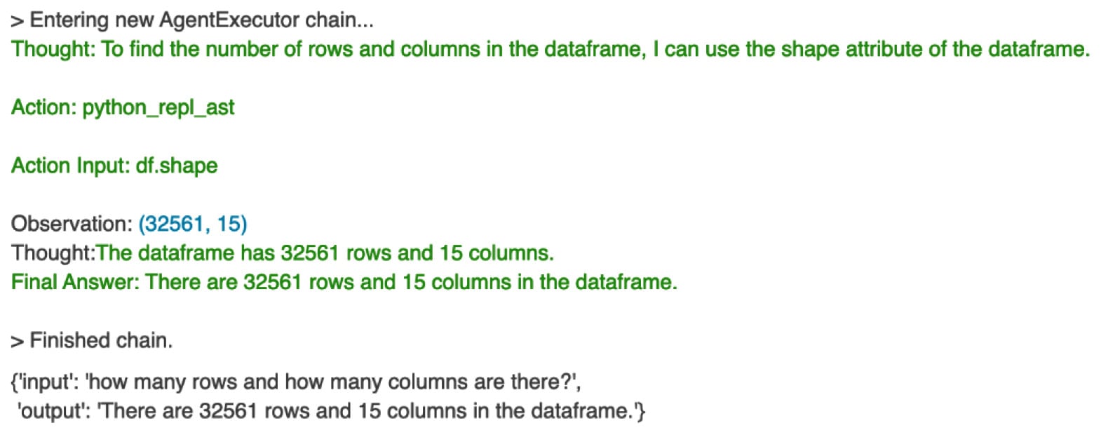
Figure 1.36 – Agent response for row and column count
We try the next question:
agent("sample first 5 records and display?") Here’s the output:
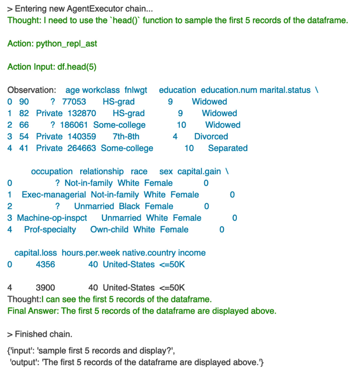
Figure 1.37 – agent response for first five records
This way, the LangChain Pandas DataFrame agent facilitates interaction with the DataFrame by interpreting natural language queries, generating corresponding Python code, and presenting the results in a human-readable format.
You can try these questions and see the responses from the agent:
query = "calculate the average age of the people for each incomegroup ?"query ="provide summary statistics forthis dataset"query = "provide count of unique values foreach column"query = "draw the histogram ofthe age"
Next, let’s try the following query to plot the bar chart:
query = "draw the bar chart  for the column education"
results = agent(query)
The Langchain agent responded with a bar chart that shows the counts for different education levels, as follows.
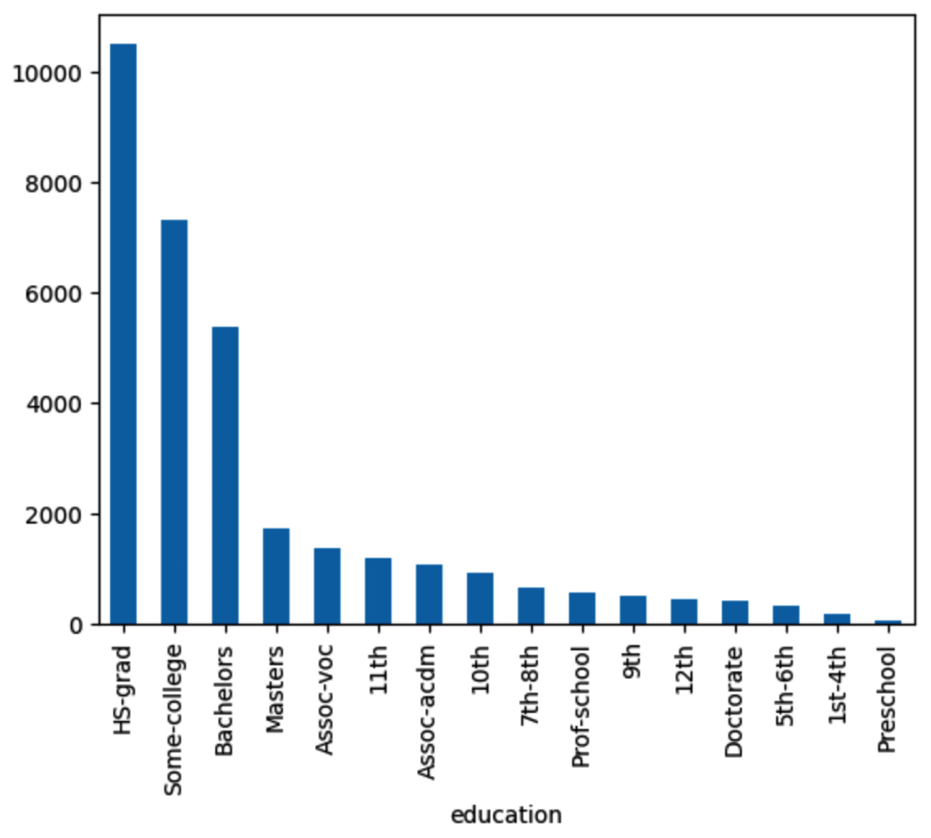
Figure 1.38 – Agent response for bar chart
The plot of the following query shows a comparison of income for different education levels – master’s and HS-GRAD. And we can see the income is less than $5,000 for education.num 8 to 10 when compared to higher education:
query = "Compare the income of those have Masters with those have HS-grad using KDE plot"
results = agent(query)
Here’s the output:
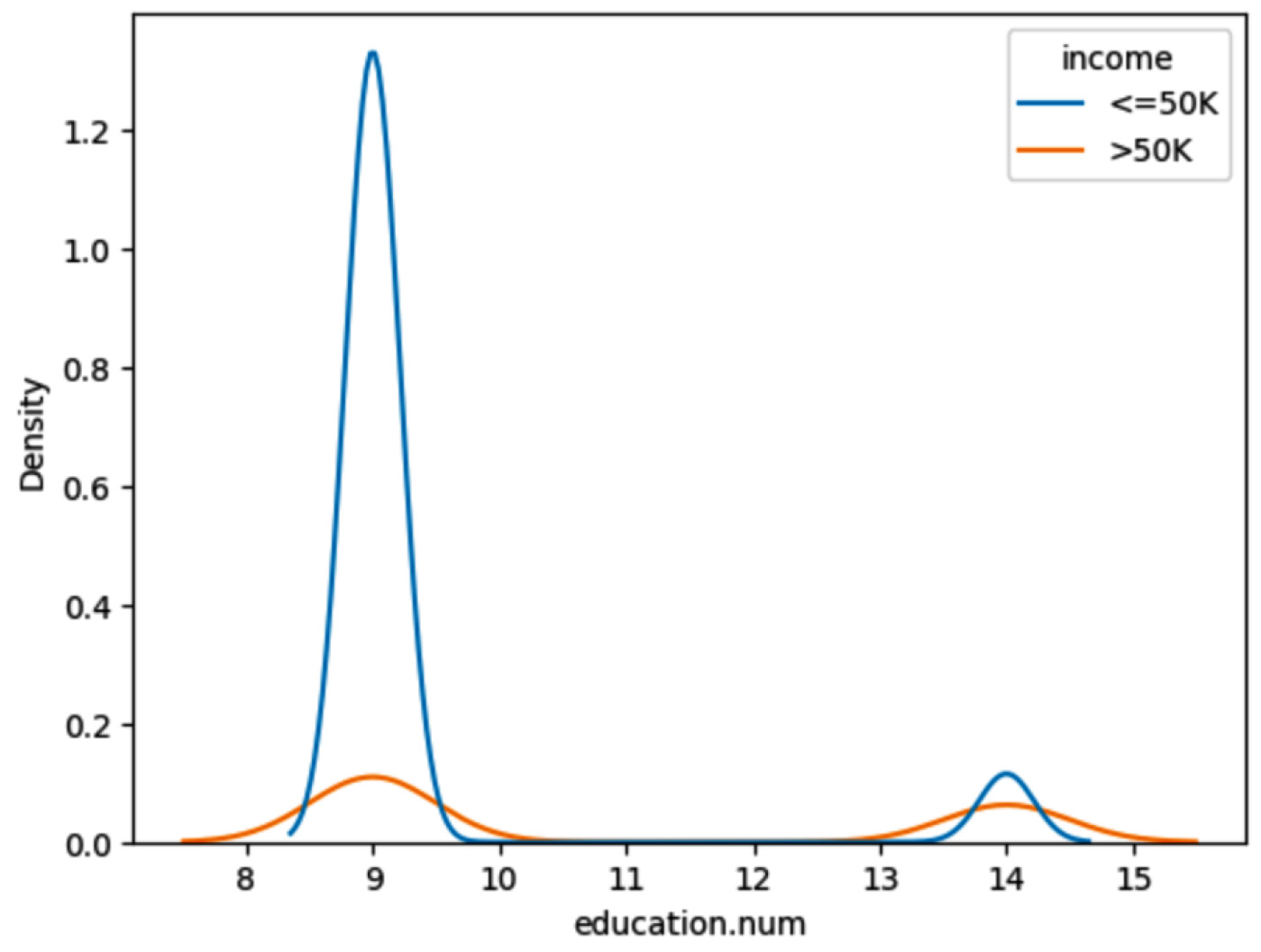
Figure 1.39 – Agent response for comparison of income
Next, let’s try the following query to find any outliers in the data:
query = "Are there  any outliers in terms of age. Find out using Box plot."
results = agent(query)
This plot shows outliers in age greater than 80 years.
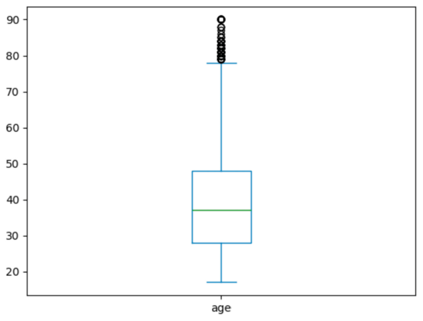
Figure 1.40 – Agent response for outliers
We have seen how to perform data analysis and find insights about the income dataset using natural language with the power of LangChain and OpenAI LLMs.
Summary
In this chapter, we have learned how to use Pandas and matplotlib to analyze a dataset and understand the data and correlations between various features. This understanding of data and patterns in the data is required to build the rules for labeling raw data before using it for training ML models and fine-tuning LLMs.
We also went through various examples for aggregating columns and categorical values using groupby and mean. Then, we created reusable functions so that those functions can be reused simply by calling and passing column names to get aggregates of one or more columns.
Finally, we saw a fast and easy exploration of data using the ydata-profiling library with simple one-line Python code. Using this library, we need not remember many Pandas functions. We can simply call one line of code to perform a detailed analysis of data. We can create detailed reports of statistics for each variable with missing values, correlations, interactions, and duplicate rows.
Once we get a good sense of our data using EDA, we will be able to build the rules for creating labels for the dataset.
In the next chapter, we will see how to build these rules using Python libraries such as snorkel and compose to label an unlabeled dataset. We will also explore other methods, such as pseudo-labeling and K-means clustering, for data labeling.