


In this chapter, what flat design is and how this style came to be will be explained. We will cover its predecessors in graphic design since 1950, moving on to how important skeuomorphic design was in the process of making flat design one of the biggest trends in digital design in the last few years.
We will also learn what the current status of flat design is, how it has been adopted by some of the biggest brands in the market, and how we interact everyday with interfaces designed in flat design. There's also a simple exercise to help you understand how to build a skeuomorphic element and its flat counterpart, to better clarify the differences between skeuomorphic and flat design.
Flat design is a digital design style that was one of the most discussed trends throughout 2013. It is characterized by a really minimalistic look, focused on removing all extra elements and effects from a design, such as bevels, shadows, lighting effects, depth, texture, and every element that creates and gives an extra dimension to these elements.
This kind of treatment results in creating a very simple and clean look that seems visually flat on the screen, by using white space, bright colors, and simple lines as layout elements. Flat design, as a style, rose quickly to fame and to mass use because of its impactful look but surprisingly simple approach. It started to gather a big fan base and supporters of the style, because most people saw in flat design an opportunity for them to be able to create a simple and good looking web page.
It was undoubtedly one of the most discussed topics in design during 2013, and as there were many supporters, there were also a large number of people opposed to such a style and against the importance and discussion of it.
Also, one of the biggest reasons why flat design was so impactful in the community was because of its timing. Flat design came in a time when skeuomorphic design was one of the most famous and used styles in digital design and interfaces. They contrasted in such a significant way that it was indeed a really rough and extreme transition for users of these apps as well as for designers that needed to switch their design style to accommodate the users' wishes and expectations. And what is skeuomorphic design, you say?
Flat design as a digital design trend and name surfaced on the web around 2012. As a response and alternative to skeuomorphic designs, the first adopters got a lot of attention because it was considered a risk to go down a path of creating such simple and clear layouts, opposed to the complex and heavy ones being created at the time. This shift of trends is something that always happened, as history shows. Fashion and style are cyclic, and in this day and age where everything is digital, these cycles tend to be even shorter and changes can happen quicker than ever.
To truly find the first origins of flat, we need to go back to 1950, with the development of the International Typographic Style (or the Swiss Style). This style was also focused on creating a clean, readable design in contrast to the complex illustrations, textures, and photos used in printed posters at the time. It was also when Akzidenz-Grotesk, the first version of the typeface that would eventually become Helvetica, started to be used more often, which gave a newfound strength and focus on sans-serif typography. Typography was one of the big focus points of the posters of the Swiss Style, specifically big sans-serif type, thus creating a really impactful message. We can say that this is historically the first form of flat design.
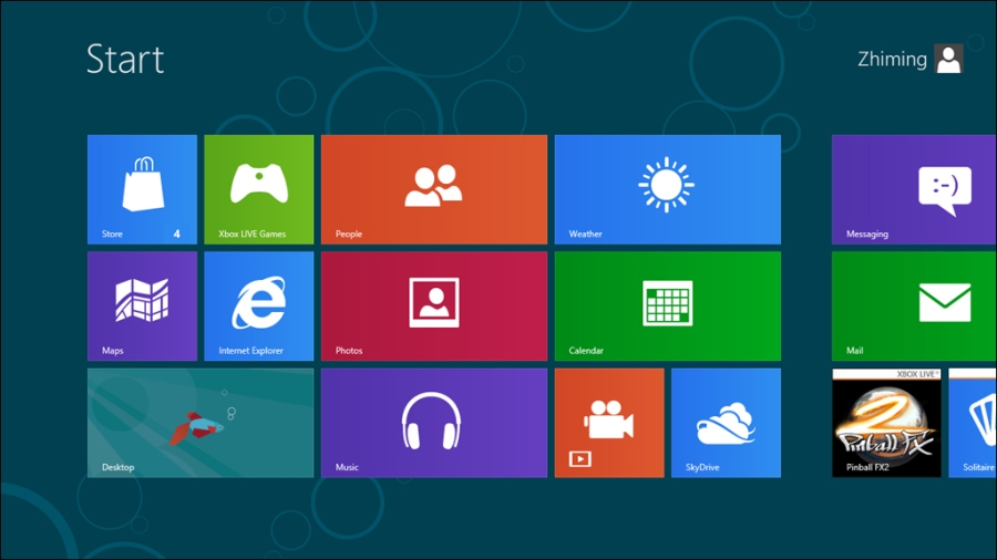
Some decades later, already in the digital spectrum, Microsoft was one of those responsible for pushing this kind of minimalistic look forward with the launch of the Zune music player in 2006. Even though the device in itself wasn't a commercial success, its interface was revolutionary. The focus on thin and big typography, and its clear and minimalistic approach to its navigation and iconography, was one of the roots for today's Microsoft interfaces redesign, which can still be found on the strongly typographic menus presented on the Windows Phone. Zune also influenced other products, such as the Xbox 360 dashboard and Windows 8. The Windows 8 interface, known by the code name Metro UI, was also one of the biggest interface overhauls that emphasized the flat design style. It was a great change of look for Microsoft Windows and a really bold one that generated a lot of appraisal by the design community and influenced a lot of websites that try to replicate the squared layout up to this day. The following screenshot shows the use of flat design in Metro UI:
But getting back to the definition of flat design, this as a term and as a style was defined by designers who wrote about this subject. One of them, Allan Grinshtein, from LayerVault—a version control for designers—wrote in his post The Flat Design Era (http://layervault.tumblr.com/post/32267022219/flat-interface-design) how he believes that elegant interfaces are ones that have the most impact with the fewest elements. This, along with the success and great feedback on the LayerVault flat design interface, reinforced the notion that a very minimalistic interface can be thought out to be usable and achieve great success among an application's user base. At this time, and with the success of the first bold designers, the community followed and adhered to this style, creating an enormous number of design proposals and applications following the flat design aesthetic.
Skeuomorphic design, also known as realism, is a style that was very much used during 2012 and 2013, and it consists of creating visual elements that represent their original, physical counterpart.
Skeuomorphism is defined as an element of design or structure that serves little or no purpose in the artifact fashioned from the new material but was essential to the object made from the original material (courtesy: Wikipedia—http://en.wikipedia.org/wiki/Skeuomorph).
Apple created several skeuomorphic interfaces for their desktop and mobile apps; apps such as iCal, iBooks, Find My Friends, Podcast apps, and several others.
This kind of interface was both loved and hated among the design community and users. It was a style that focused a lot on the detail and texture, making the interface heavier and often more complex, but interesting because of the clear connection to the real objects depicted here. It was an enjoyable and rich experience for the user due to the high detail and interaction that a skeuomorphic interface presented, which served to attract the eye to the detail and care put into these designs; for example, the page flip in iBooks, visually representing the swipe of a page as in a traditional book. But this style also had its downsides.
Besides being a harsh transition from the traditional interfaces (as in the case of Apple, in which it meant coming from its famous glassy and clean looking Aqua interface), several skeuomorphic applications on the desktop didn't seem to fit in the overall OS look. Apart from stylistic preferences and incoherent looks, skeuomorphic design is also a bad design choice because the style in itself is a limitation to innovation. By replicating the traditional and analogical designs, the designer doesn't have the option or the freedom to imagine, create, and design new interfaces and interactions with the user. Flat design, being the extremely simple and clear style that it is, gives all the freedom to the designer by ignoring any kind of limitations and effects. But both styles have a place and time to be used, and skeuomorphic is great for applications such as Propellerheads that are directly replacing hardware, such as audio mixers. Using these kinds of interfaces makes it easier for new users to learn how to use the real hardware counterpart, while at the same time previous users of the hardware will already know how to use the interface with ease.
Regardless of the style, a good designer must be ready to create an interface that is adapted to the needs of the user and the market. To exemplify this and to better learn the basic differences between flat and skeuomorphic, let's do a quick exercise.
In this exercise, we'll create a simple call to an action button, the copy of Buy Now. We'll create this element twice; first we'll take a look at the skeuomorphic approach by creating a realistic looking button with texture, shadow, and depth. Next, we will simply convert it to its flat counterpart by removing all those extra elements and adapting it to a minimalistic style.
You should have all the materials you'll need for this exercise. We will use the typeface Lato, also available for free on Google Fonts, and the image wood.jpg for the texture on the skeuomorphic button. We'll just need Photoshop for this exercise, so let's open it up and use the following steps:
Create a new Photoshop document with 800 x 600 px. This is where we will create our buttons.
Let's start by creating the skeuomorphic one. We start by creating a rectangle with the rounded rectangle tool, with a radius of 20 px. This will be the face of our button. To make it easier to visualize the element while we create it, let's make it gray (
#a2a2a2).
Now that we have our button face created, let's give some depth to this button. Just duplicate the layer (command + J on Mac or Ctrl + J on Windows) and pull it down to 10 or 15 px, whichever you prefer. Let's make this new rectangle a darker shade of gray (
#393939) and make sure that this layer is below the face layer. You should now have a simple gray button with some depth. The side layer simulates the depth of the button by being pulled down for just a couple of pixels, and since we made it darker, it resembles a shadow.
Now for the call to action. Create a textbox on top of the button face, set its width to that of the button, and center the text. In there, write
Buy Now, and set the text to Lato, weight to Black, and size to 50 pt. Center it vertically just by looking at the screen, until you find that it sits correctly in the center of the button.
Now to make this button really skeuomorphic, let's get our image
wood.jpg, and let's use it as our texture. Create a new layer namedwood-faceand make sure it's above ourfacelayer. Now to define the layer as a texture and use our button as a mask, we're going to right-click on the layer and click on Create clipping mask. This will mask our texture to overlay the button face.
For the side texture, duplicate the
wood-facelayer, rename it towood-sideand repeat the preceding instructions for the side layer. After that, and to have a different look, move thewood-facelayer around and look for a good area of the texture to use on the side, ideally something with some up strips to make it look more realistic.
To finish the side, create a new layer style in the
sidelayer,gradient overlay, and make a gradient from black to transparent and change the settings as shown in the following screenshot. This will make a shadow effect on top of the wood, making it look a lot better.
To finish our skeuomorphic button, let's go back to the text and define the color as
#7b3201(or another shade of brown; try to pick from the button and make it slightly darker until you find that it looks good), so that it looks like the text is carved in the wood.
The last touch will be to add an Inner Shadow layer style in the text with the settings shown. Group all the layers and name it
Skeuomorphicand we're done.
And now we have our skeuomorphic button. It's a really simple way of doing it but we recreated the look of a button made out of wood just by using shapes, texture, and some layer styles.
Now for our flat version:
Duplicate the group we just created and name it
flat. Move it to the other half of the workspace.Delete the following layers:
wood-face,wood-side, andside.This button will not have any depth, so we do not need the side layer as well as the textures. To keep the button in the same color scheme as our previous one, we'll use the color
#7b3201for our text and face. We'll make a transparent button, which only has color on the border and fills up on a mouse hover (we will cover those effects later in the book). Your document should look like what is shown in the following screenshot:
Create a new layer style and choose Stroke with the following settings. This will create the border of our button. To make the button transparent, let's reduce the Layer Fill option to 0 percent, which will leave only the layer styles applied.

Let's remove the layer styles from our text to make it flat, reduce the weight of the font to Bold to make it thinner and roughly the same weight of the border, and align it visually, and our flat button is done!

This type of a transparent button is great for flat interfaces, especially when used over a blurred color background. This is because it creates an impactful button with very few elements to it, creating a transparent control and making great use of the white space in the design. In design, especially when designing flat, remember that less is more.
With this exercise, you were able to build a skeuomorphic element and deconstruct it down to its flat version, which is as simple as a rounded rectangle with border and text. The font we chose is frequently used for flat design layouts; it's simple but rounded and it works great with rounded-corner shapes such as the ones we just created.
There was an incredibly quick adoption and usage from the designers on this style. Big brands and companies such as Apple, Google, and Facebook redesigned their interfaces and brands to create a simpler look. iOS 7, the mobile operating system of the Apple iPhone, is definitely the biggest example of this adoption, since its interface was completely redesigned to simplify the navigation, controls, iconography, and pretty much every element existent in the operating system. This was already expected given the kind of changes seen in the user interface world, but it was an enormous jump from iOS 6 and its skeuomorphic apps to iOS 7 and its flat look and experimental interfaces. A lot more brands followed this transition, such as Facebook, and redesigned their brand and app to be simpler and flatter. Most mobile apps redesigned their interfaces and their icons and adhered to this flat style. Less is more; flat design helped brands understand that and change their look to a simpler and cleaner one. Have a look at the following examples:


So there you have it! We looked at how flat is not new as a design style as its minimalistic look can be traced back to the 1950s with the International Typographic Style. We also covered how to design in skeuomorphic and in flat, and what their main differences are. Also, we learnt how important and how widespread the flat design is over some world famous companies such as Google, Facebook, and Apple, having redesigned their logos and user interfaces to match that look.
Now that we know what flat design is, next we will discover how to design in flat, and what you, as a designer, should focus on to create a great flat interface.

