


 Download code from GitHub
Bootstrap's popularity as a frontend web development framework is easy to understand. It provides a palette of user-friendly, cross-browser tested solutions for most standard UI conventions. Its ready-made, community-tested combination of HTML markup, CSS styles, and JavaScript behaviors greatly speeds up the task of developing a frontend web interface, and it yields a pleasing result out of the gate. With the fundamental elements quickly in place, we can customize the design on top of a solid foundation.
But not all that is popular, efficient, and effective is good. Too often, a handy tool can generate and reinforce bad habits; not so with Bootstrap, at least not necessarily so. Those who have watched it from the beginning know that its first release and early updates have occasionally favored pragmatic efficiency over best practices. The fact is that some best practices, right from semantic markup to mobile-first design to performance-optimized assets, require extra time and effort to implement.
If handled well, I will suggest that Bootstrap is a boon for the web development community in terms of quality as well as efficiency. Since developers are attracted to the web development framework, they become part of a coding community that draws them increasingly into current best practices. From the start, Bootstrap has encouraged implementation of tried, tested, and future-friendly CSS solutions, from Nicholas Galagher's CSS normalize to CSS3's displacement of image-heavy design elements. It has also supported (if not always modeled) HTML5 semantic markup.
With the release of v2.0, Bootstrap helped take responsive design into the mainstream, ensuring that its interface elements could travel well across devices, from desktops to tablets to handhelds.
Now, with its v3.0 release, Bootstrap has stepped up its game again by providing the following features:
The responsive grid is now mobile-first friendly
Icons now utilize web fonts and are thus mobile- and retina-friendly
With the drop of support for IE7, markup and CSS conventions are now leaner and more efficient
In addition, there is the power of Leaner CSS (LESS) to consider. When we move beyond merely applying classes to markup and take the next step to dig in and customize Bootstrap's LESS files, we gain tremendous power and efficiency. Starting with a solid basis using Bootstrap's default styles, we can move on to innovate and customize to our heart's content.
In other words, Bootstrap is a powerful resource. I intend to help you leverage it in exciting and serious ways, working with efficiency, adhering to best practices, and producing beautiful, user-friendly interfaces.
There are many ways to download Bootstrap, but not all ways of downloading Bootstrap are equal. For what follows, we must be sure to get the LESS files as these files give us the power to customize and innovate upon Bootstrap's underlying style rules. For this exercise, we'll go straight to the source, that is, GetBootstrap.com.

Once there, the large Download source button is your friend. At least as of Version 3.0.2, this is the second large button on the homepage of GetBootstrap.com.

In case something should change, you can always follow the GitHub project link, and once at the GitHub repository, click on the Download ZIP button.
Once you've downloaded the Bootstrap source files, you should see a file structure that is similar to the following screenshot:

Admittedly, that's a lot of files, and we don't need them all. On the plus side, we have everything we want from Bootstrap.
While the exact contents of the repository will change over time, the main contents will remain relatively consistent. Most notably, in the less folder, you will find all the important LESS files, which are key to every project in this book. Another benefit is that the js folder contains Bootstrap's individual JavaScript plugins so that these may be selectively included as needed.
On the other hand, if you want Bootstrap's default precompiled CSS or JavaScript files (such as bootstrap.css or bootstrap.min.js), those are still available within the dist folder. As a bonus, you'll find the example HTML templates in the examples folder. In fact, we'll use one of these examples to set up our first project template folder.
Let's create a folder with the essential files we'll need to launch a project. We'll use the excellent HTML5 Boilerplate (H5BP) for our starting point, folding Bootstrap's files in their appropriate places.
Navigate to h5bp.com in your browser, a short link that will redirect you to H5BP's main documentation page. You may download the H5BP files directly from this page or from the linked GitHub project by clicking on the SOURCE CODE tab available at h5bp.com.
Extract the ZIP file and rename the folder to Project Template 1.
Inside this folder, you'll find the file and folder structure as shown in the following screenshot:

Delete the following folders and files, which are specific only to H5BP:
The
cssfolder because we'll soon create our own CSS files using LESSCHANGELOG.mdCONTRIBUTING.mdThe
docfolder and its contents
If you have not read about the H5BP's .htaccess file before, you should take a look at the H5BP documentation, which is featured prominently at http://h5bp.com. In addition, the file itself is very well commented. Open it in your editor and read through it. Depending on your hosting setup and the needs of your site, you may or may not need all or a part of what this file does. Part of the purpose of what's in this file is to maximum site performance. Take it seriously, consult wise advice, and decide accordingly. In my case, my hosting provider handles these things, and so I don't need the .htaccess file.
The following files provide standard information about your project. They may be updated and used, if desired, or you may leave them out. It's up to you.
humans.txt: This file assigns appropriate credits to you, H5BP, Bootstrap, and any other contributors.LICENSE.md: Prior to the H5BP license, add your own desired licensing information for the website you'll build with this license. After H5BP's license, add the licensing information for Bootstrap and other libraries that play a significant role in your end product.README.md: Update this file to provide a basic orientation to the entire project.
Remember to replace the Boilerplate's default icon images with your desired images for your project. These include the following icon images:
apple-touch-icon-precomposed.pngFor best results across all mobile devices, including high-pixel-density screens, this should be 144px square (or 152px as in the Boilerplate version).
favicon.icoA 32px square icon image.
Note
Previous versions of the Boilerplate once included as many as six sizes of touch icons. Recently, this strategy was re-evaluated. Because the large icon will be used by all relevant devices, and the performance hit is very very small, it has been decided to reduce development overhead and have only one touch icon. For the discussion, see https://github.com/h5bp/html5-boilerplate/issues/1367#ref-pullrequest-18787780.
We are ready to pull Bootstrap's files into our Project Template 1 folder and file structure. We'll move down through the big Bootstrap repository, selecting out only the parts we need. To speed up this process, I highly recommend having your Bootstrap 3 files open in one file browser window and your project template files open in another to facilitate comparing, dragging, and dropping.
From the main Bootstrap folder, copy the fonts folder, and paste it into the main directory of your Project Template 1 folder. This contains the important Glyphicon fonts that come with Bootstrap. (If you've not used font icons before, you're in for a treat.)
For good measures, I'm going to suggest that you add a cross-domain-friendly .htaccess file to this folder. Why? As more hosting services provide Content Delivery Network (CDN) for your site's static assets, you may discover, as I have, that some browsers refuse to recognize your web fonts without this access file. (Note that the H5BP .htaccess file contains lines to take care of this. The step we are taking now is aimed at ensuring that we do not run into problems even if the H5BP .htaccess file is not in the root directory of the site.)
Create a new file in your code editor, and add the following lines:
<FilesMatch "\.(ttf|otf|eot|woff)$">
  <IfModule mod_headers.c>
    Header set Access-Control-Allow-Origin "*"
  </IfModule>
</FilesMatch>
Tip
Downloading the example code
You can download the example code files for all Packt books you have purchased from your account at http://www.packtpub.com. If you purchased this book elsewhere, you can visit http://www.packtpub.com/support and register to have the files e-mailed directly to you.
Save the newly created file directly inside the fonts folder naming it .htaccess. (Note that if you're working locally, your OS may make the file invisible. If you have trouble getting your OS to make hidden files visible, you can often view it again by using your FTP client, setting its preferences to view hidden files, and using it to navigate to this folder.)
Once in place, the .htaccess file travels with your fonts folder, ensuring that your web fonts work in all browsers across whichever hosting and CDN services your websites may use.
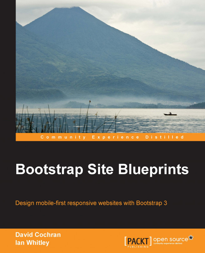
Now let's try to bring in Bootstrap's JavaScript. Thanks to the HTML5 Boilerplate, we already have a JavaScript folder (named js) in place. Inside this, you'll find four files, two of them inside a subfolder named vendor, as shown in the following screenshot:
Bootstrap's plugins make use of jQuery, and the Boilerplate has it ready for us. Alongside jQuery, you'll see the Modernizr script. If you're unfamiliar with Modernizr, it includes an HTML5 shiv, which enables HTML5 sectioning elements in Internet Explorer 8. We're supporting IE8 in these projects, and so we need this here. In addition, Modernizr enables us to test for specific browser capabilities easily, such as CSS 3D transforms (to read more, see http://modernizr.com/docs/). We'll use Modernizr's feature-detection powers in the last chapter of the book.
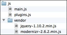
Now, we need to add Bootstrap's plugins to the mix. First, let's bring them over as a group of individual plugins. Inside the main js folder of your Project Template 1 folder, create a subfolder named bootstrap. Now copy into this the files you'll find in Bootstrap's js folder. The following are the Bootstrap's plugins, each as an individual file:
By copying and pasting these plugins into your new js/bootstrap folder, when you're ready to optimize your site for performance, you can select just the plugins you need, thereby eliminating the others and reducing file size.
Meanwhile, it may be helpful to have all of Bootstrap's plugins available during the development phase. That way, if you need to add an accordion, a tooltip, or a carousel, you can do it at your whim. Let's do this for ourselves now.
The H5BP method of doing this is to paste the code for all plugins into the provided plugins.js template file. This is a best practice when we're finished and ready to optimize the site because fewer HTTP requests means faster site loading times. (Loading one file of, say, 80 KB is more efficient than loading four files of 20 KB each.)
While developing, it's fairly convenient to use this same structure. It simply requires that we copy and paste the code for our required plugins into the plugins.js file. Let's find Bootstrap's big file of plugins and do this here.
Note
You may prefer to work otherwise during the development stage, adding links to individual plugins to your markup during development, and then rolling the plugins into one minified file at the end. If you prefer that method, you can ignore this set of instructions and replace them with your own steps.
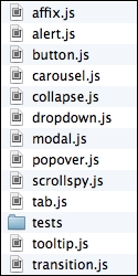
From Bootstrap's main folder, navigate to the dist folder to find the distribution files. Here, in the js folder, are bootstrap.js and bootstrap.min.js, containing all of Bootstrap's plugins rolled into one fat file. We will not be editing the plugins in these exercises, so let's use the minified version.
Once you've found it, perform the following steps:
Open
bootstrap.min.jsin your editor.Copy the code, including the comment at the top. (Select all, then copy.)
Now, open
plugins.jsfrom your new project files.Paste Bootstrap's plugin code inside the file, below the
// Place any jQuery/helper plugins in here.comment. So, you'll now see something like the following:// Place any jQuery/helper plugins in here. /** * bootstrap.js v3.0.0 by @fat and @mdo * Copyright 2013 Twitter Inc. * http://www.apache.org/licenses/LICENSE-2.0 */ if(!jQuery)throw new Error("Bootstrap requires jQuery");+function(a){"use strict"; ...And of course the rest of the lengthy block of code will follow.
You now have Bootstrap's plugins loaded and ready!
Note
By keeping the comments from the top of Bootstrap's plugins, as well as from any other plugins we may include down the line, we are giving credit where credit is due and including essential licensing information. We're also making it easier for ourselves to search and sort through our plugins later. For instance, while optimizing the following projects for production, you'll want to substitute minified versions of only the specific Bootstrap plugins you'll be using in the project. Keeping these comments in place will help greatly at that point.
The main folder of your Project Template 1 folder should now look like the following screenshot:

Your fonts folder, with the new .htaccess file within it, should contain the following files:

Note
I've used my FTP client to view these files, and set it to show hidden files. You may not be able to see your .htaccess file without taking similar steps.
The img folder should be empty, as was the H5BP folder from which it came.
The js folder should contain the following subfolders and files:

Because of its modular approach, Bootstrap's less folder contains a long list of files. We'll double-check these as we prepare to compile them in the forthcoming sections.
First, let's set up an HTML file.
From your new project folder, open index.html in your editor. This sample markup file came with H5BP and contains several best practices and recommendations within it. We'll build on this basis and integrate it with our Bootstrap workflow. First, let's take a moment to note what's in it.
Scanning down through the file, you'll notice several interesting features. These are clearly explained in the H5BP documentation. You may easily get there from http://h5bp.com, but let me briefly run through a few of the features here. You'll see them in the following order:
The HTML5 doctype:
<!DOCTYPE html>
Conditional comments for Internet Explorer, which enable developers to compose fixes for older IE browsers using appropriate nested selectors:
<!--[if lt IE 7]><html class="no-js lt-ie9 lt-ie8 lt-ie7"> <![endif]-->
<!--[if IE 7]><html class="no-js lt-ie9 lt-ie8"><![endif]-->
<!--[if IE 8]><html class="no-js lt-ie9"><![endif]-->
<!--[if gt IE 8]><!--><html class="no-js"><!--<![endif]-->
The
htmltag also has a class ofno-js. If a browser's JavaScript is enabled, this class will be removed by the Modernizr script (referenced in the preceding part of this chapter) and replaced with the classjs. If it is not removed, it signals that JavaScript is not enabled, and we may craft CSS rules for such cases using nested selectors.You'll see meta tags for the following things:
Specifying the character set as follows:
<meta charset="utf-8">
Instructing an IE browser to use the most updated version of its rendering engine, or to use Google's Chrome Frame if it is installed as follows:
<meta http-equiv="X-UA-Compatible" content="IE=edge,chrome=1">
The description tag for providing a description of the site is as follows:
<meta name="description" content="">
A mobile-friendly viewport meta tag will be as follows:
<meta name="viewport" content="width=device-width">
In place of links to a favicon or touch icon, you'll find a comment recommending that we simply place the icons in the site's root directory, where they will automatically be found by the users' browsers and devices.
You'll see two stylesheet links—one to
normalize.cssand another tomain.css—as follows:<link rel="stylesheet" href="css/normalize.css"> <link rel="stylesheet" href="css/main.css">
Then, you will see a script tag loading the Modernizr script. This needs to be loaded here in order for the HTML5 shiv it contains to equip IE8 so that it recognizes the HTML5 sectioning elements.
<script src="js/vendor/modernizr-2.6.2.min.js"></script>
Then there is an IE conditional comment, with a message recommending the users of older IE browsers to upgrade to a more modern browser.
<!--[if lt IE 7]>
  <p class="chromeframe">You are using an <strong>outdated</strong> browser. ...
<![endif]-->
A single paragraph of content text.
A link to Google's hosted version of jQuery, followed by a link to a local fallback copy of jQuery:
<script src="//ajax.googleapis.com/ajax/libs/jquery/1.10.2/jquery.min.js"></script>
<script>window.jQuery || document.write('<script src="js/vendor/jquery-1.10.2.min.js"><\/script>')</script>
Links to
plugins.jsandmain.js, which are intended to hold the code for JavaScript plugins (inplugins.js) and your custom code (inmain.js):<script src="js/plugins.js"></script> <script src="js/main.js"></script>
The Google Analytics script:
<script>
  var _gaq=[['_setAccount','UA-XXXXX-X'],['_trackPageview']];
  (function(d,t){var g=d.createElement(t),
    s=d.getElementsByTagName(t)[0];
  g.src=('https:'==location.protocol?'//ssl':'//www')+'.google-analytics.com/ga.js';
  s.parentNode.insertBefore(g,s)}(document,'script'));
</script>
If you wish to know more about the reason and purpose for any of these elements, I would encourage you to take some time to read through the H5BP HTML documentation (see https://github.com/h5bp/html5-boilerplate/blob/v4.3.0/doc/html.md), where these lines are clearly explained with references.
For our purposes, we will perform the following operations on the elements of this template:
We'll give our site a title. We'll update the legacy IE conditional comment for users of old browsers.
We'll compile Bootstrap's CSS from the LESS files. We'll add some basic page content.
We'll integrate Bootstrap's JavaScript plugins and ensure that the responsive navbar works as it should.
Once we've done the these things, we'll have everything in place to begin building our designs.
Take a moment to update index.html by giving it a title that fits this project. You can call your portfolio whatever you'd like to. I'll call mine as Bootstrappin' Portfolio. For the sake of precision, I'll use the HTML entity ' for the apostrophe, as shown in the following line of code:
<title>Bootstrappin' Portfolio</title>
The file carries a message for users of ancient browsers. You'll find this right around line 20. It reads as follows:
You are using an outdated browser. Please upgrade your browser or activate Google Chrome Frame to improve your experience.
Note that it includes links to http://browsehappy.com, which features recommended browser upgrades, and to the Google Chrome Frame, a free plugin to retrofit Internet Explorer with modern browser capabilities. (Note that the Google Chrome Frame reference may go away after Google stops supporting it in January 2014.)
At the time of writing this book, this message came wrapped in a conditional comment that targets only Internet Explorer browsers older than IE7 (thus, IE6, IE5, and so on). No one else will see this message unless, of course, they view the source code.
Meanwhile, the world is pressing on. Many organizations are upgrading browsers, and many designers are dropping or reducing support for IE7. Typically, the goal is to ensure that IE7 users can navigate through the site and gain access to its information, though they will not have the full experience.
The reason for this is pretty pragmatic. Fully supporting IE7 requires writing a number of workarounds, both in CSS and in JavaScript, at the cost of more code, more bandwidth, more time, and more money.
Thus, Bootstrap 3 has dropped support for IE7. When we're done developing, we should test to ensure nothing restricts IE7 users from reading and navigating through our site. However, they won't see its full beauty.
So, let's update the message to include IE7 users. We need to change the opening tag of the conditional comment by adding an e for = , so that it reads the following:
<!--[if lte IE 7]>
Note that it now says lte where originally it was only lt.
A few notes seem in order.
Note
For IE7 and older browsers, you might consider providing basic styles in a legacy stylesheet to ensure these users can utilize your site.
If you have a large base of users who rely on IE7 and who are unlikely to be able to upgrade, you probably need to consider reverting back to Bootstrap 2.2.3, which supports IE7.
Note that if you would like to see what this message looks like, and perhaps customize its style, you can view it in any browser by temporarily deleting or commenting out the IE comment at the beginning (<!--[if lte IE 7]>) and at the end (<![endif]-->).
We're almost ready for page content. Right now, there's only a paragraph. Let's go ahead and get a bit more content rolling. Specifically, we'll create the following:
A banner space with our logo and navigation
A main content space for page content
A footer area for copyright information and social links
We'll set this up using current HTML5 best practices with the support of major Accessible Rich Internet Applications (ARIA) role attributes (with roles such as banner, navigation, main, and contentinfo). If you've been following HTML5 but not closely in the past few months, note the recently added element, <main role="main"></main>, whose purpose is to provide a sectioning element dedicated to the main content of a page or section. For more information, see this sitepoint article at http://www.sitepoint.com/html5-main-element/.
So, consider the following comment and paragraph:
<!-- Add your site or application content here -->
<p>Hello world! This is HTML5 Boilerplate.</p>
And replace the preceding code with the following:
<header role="banner"> <nav role="navigation"> </nav> </header> <main role="main"> <h1>Main Heading</h1> <p>Content specific to this page goes here.</p> </main> <footer role="contentinfo"> <p><small>Copyright © Company Name</small></p> </footer>
This gives us some basic page structure and content. Let's keep rolling.
You'll remember that we have not brought over the precompiled CSS files from Bootstrap, nor have we yet compiled CSS from our LESS files. We'll do the latter shortly. But first, let's put at least one Bootstrap-specific element in place, that is, the navbar.
Initially, we want only Bootstrap's basic navbar (we'll add other details later). I've used the markup taken from Bootstrap's documentation and adjusted it in the following ways:
I've added the class
navbar-static-topsince we want the navbar to be positioned at the very top, and yet scroll with the pageI've linked the brand link to
index.htmlI've changed the parent
divtags to semantic HTML5navtags
The preceding adjustments lead to the following result, nested with our header element:
<header role="banner">
<nav role="navigation" class="navbar navbar-static-top navbar-default">
<div class="container">
<div class="navbar-header">
<a class="navbar-brand" href="index.html">Project name</a>
</div>
<ul class="nav navbar-nav">
<li class="active"><a href="index.html">Home</a></li>
<li><a href="#">Link</a></li>
<li><a href="#">Link</a></li>
</ul>
</div>
</nav>
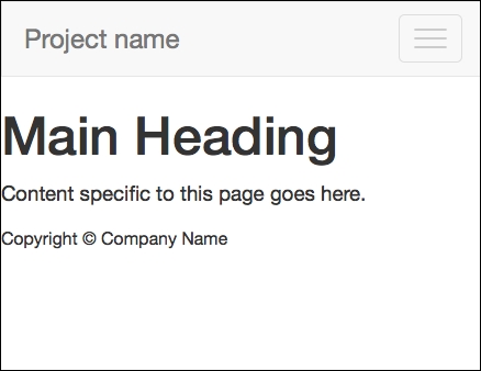
</header>Save your results, and open or refresh index.html in your browser. You'll note that we don't have much yet, as shown in the following screenshot:

We have content. Now, we desperately need our stylesheet to come to the rescue. Let's compile and link up Bootstrap's default styles.
We could have just brought over Bootstrap's default bootstrap.css file, but let's use this opportunity to take a trial run at compiling the LESS files. This will ensure we've got the fundamentals ready for doing more serious work to come.
If you've worked with LESS before, this will be a familiar territory. If you have not worked with LESS before, I'll help you along. However, I highly recommend that you stop and refer to the documentation at http://lesscss.org. Additionally, you may want to find a good basic LESS tutorial and work through it. As you'll soon see, working with LESS is powerful and fun, and the time spent learning will reward well.
For this first step, we won't be writing any LESS files, only compiling.
Navigate to less/bootstrap.less and open it in your editor. You'll see that this file imports all the other files from the less folder. When compiled, this file generates the complete bootstrap.css stylesheet. This is what we want for our first step.
If you've not compiled LESS files before, you'll need to download and install one of the following compilers:
For Windows users, download and install the following compiler:
WinLess (a free desktop application), which can be found at http://winless.org
For Mac users, download and install the following compilers:
The LESS app (free), which can be found at http://incident57.com/less/
CodeKit (not free), which can be found at http://incident57.com/codekit/
Once your chosen LESS compiler is downloaded, installed, and ready for action, the following are your steps to be performed:
Create a new folder named
cssin the main directory at the same level as thefonts,img,js, andlessfolders.
Use one of the following two methods to add your project's main folder (the parent folder of
css,fonts,img,less, and so on) to your compiler:Drag-and-drop the folder into the application window
Alternatively, navigate to the application's File | New Project menu to add the parent folder
You should see that the application loads the LESS files (and perhaps other files) into its window. Search or scan for the
less/bootstrap.lessfile.Right-click on
bootstrap.less. Select Set output path (or your application's similar option). Navigate to thecssfolder you created earlier. The file should automatically be namedbootstrap.css. Click on Select.With the output path set, now click on Compile.
Check to see that
bootstrap.csswas created in thecssfolder.Note
If you run into problems, check your compiler's log to ensure it was successful, then double-check your output path. In addition, you may run into a situation where your chosen compiler runs into an error because it has not been updated to stay in sync with the development of LESS. I have recently found this with another free compiler. If your compiler refuses to compile the default Bootstrap LESS files, it's an indication that the compiler needs updating.
Once the file is in place in the
cssfolder, we only need to coordinate our file's name with the stylesheet link in ourindex.htmlfile.In
index.html, remove the stylesheet link tocss/normalize.css, as normalize is included in Bootstrap (normalize.lessis the first file imported bybootstrap.less).The remaining stylesheet link looks for the
css/main.cssfile. Because we'll be customizing Bootstrap to generate our own custom stylesheet, let's leave this link as it is. In the forthcoming steps, we'll usemain.cssfor the custom styles we generate.For now, let's cheat by making a copy of
bootstrap.css. In thecssfolder, create a copy ofboostrap.css. Name the copy asmain.css(in the future steps, we'll overwrite this file with our customizations) as shown in the following screenshot:
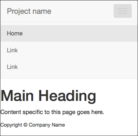
Refresh your browser. You should now see Bootstrap 3's default navigation styles, and you'll see some typographic enhancements as shown in the following screenshot. This is Bootstrap CSS at work. Congratulations!

We now have the default Bootstrap styles in place. Now, let's complete our navbar by making it responsive. As a bonus, this will test to ensure that Bootstrap's JavaScript plugins are working as they should.
To complete our navbar to take advantage of Bootstrap's responsive navbar solution, we need to add two new elements, with appropriate classes and data attributes. You'll find this documented under Bootstrap's Components page, under the Navbar tab at http://getbootstrap.com/components/#navbar.
We'll begin by adding the necessary additional markup as follows:
Search for
<div class="navbar-header">. Inside this element, we'll add thenavbar-togglebutton, which will be used to slide the responsive navbar open and closed. The following is what you'll need (and I will include thenavbar-headeras the parent element):<div class="navbar-header"> <button type="button" class="navbar-toggle" data-toggle="collapse" data-target=".navbar-collapse"> <span class="icon-bar"></span> <span class="icon-bar"></span> <span class="icon-bar"></span> </button> <a class="navbar-brand" href="index.html">Project name</a> </div>A few notes about the preceding code are as follows:
The button includes a class of
navbar-togglefor CSS styles.The data attributes are used by Bootstrap's collapse JavaScript plugin to indicate its desired behavior and its desired target, namely an element with the
navbar-collapseclass. This element is coming in the next step.The spans of the
icon-barclass are used by the CSS to create the small horizontal bars in the toggle button.
Now to wrap the navigation items within a collapsing div, wrap
<ul class="nav navbar-nav">with a div with the appropriate Bootstrap classes as follows:<div class="navbar-collapse collapse"> <ul class="nav navbar-nav"> <li class="active"><a href="index.html">Home</a></li> <li><a href="#">Link</a></li> <li><a href="#">Link</a></li> </ul> </div><!--/.nav-collapse -->
In the preceding two steps, I've divided the resulting code into two halves and all within <div class="container">. To double-check your work, see the full code in the sample code for this chapter.
Note
The tag structure, class names, or data attributes may change with future versions of Bootstrap. If yours does not work as it should, be sure to check Bootstrap's own documentation. As a fallback option, you can start with the starting files provided with the sample code for this book.
Now save the file and refresh your browser. Using a modern browser (such as IE9 or a recent version of Firefox, Google Chrome, or Safari), click on and drag the edge of the browser window to make the window narrower than 980px.
If all works as it should, you should see a collapsed version of the navbar, as shown in the following screenshot, with the site name or logo and a toggle button.
This is a good sign! Now click on the toggle button, and it should slide open, as shown in the following screenshot:
Success! Congratulations!
If things are running smoothly at this point, it means that you've successfully compiled Bootstrap's CSS from LESS, and you've also successfully included Bootstrap's JavaScript plugins.
If things are not running smoothly, you should double-check the following things:
Is your markup properly structured? Any unclosed, incomplete, or malformed tags, classes, and so on present?
Did you successfully compile Bootstrap's LESS to CSS? And did the resulting CSS file wind up in the correct folder under the proper name?
Is the CSS link in the head of
index.htmlupdated as it should be?Have you successfully included Bootstrap's JavaScript plugins?
You might find it helpful to do the following:
Work back through the preceding steps, double-checking things along the way.
Validate your HTML to ensure it's well formed.
Compare the completed version of the exercise files with your own.
Refer to the Bootstrap documentation for new updates to the relevant tag structures and attributes.
Place your code in a snippet at http://jsfiddle.net/ or http://www.codepen.com/, and share it with the good folks at http://stackoverflow.com/ for help.
When we have so many moving parts to work with, things do happen. And these are some of our best survival methods!
Now, assuming things are working, let's move on to take care of one more potential problem. We intend to support Internet Explorer 8 in our designs. To do this, we need to help this older browser out a little.
To support Internet Explorer 8, we need to add a bit of JavaScript that equips the browser to respond to media queries. This is the respond.js polyfill by Scott Jehl.
Bootstrap's own documentation recommends this step for IE8 compatibility. You'll find it referenced briefly in the Bootstrap 3 documentation at http://getbootstrap.com/getting-started/#browsers.
You'll also find respond.js linked in the example HTML templates found in the bootstrap-master download under the examples folder, which is found in the docs folder. There you'll see respond.js linked in the head of the document within an IE conditional comment that limits its use to IE browsers lower than IE9. The HTML5 shiv is also included as follows:
<!--[if lt IE 9]>
  <script src="../../assets/js/html5shiv.js"></script>
  <script src="../../assets/js/respond.min.js"></script>
<![endif]-->
Because we have already included the HTML5 shiv with Modernizr, we can leave that out here. In addition, Andy Clarke has recommended an improved conditional comment that excludes IE mobile browsers to ensure that we do not unnecessarily feed the script to Windows mobile devices that don't need it. See his repository, 320andup, at https://github.com/malarkey/320andup/.
Clarke's recommended code works as follows:
<!--[if (lt IE 9) & (!IEMobile)]>
...
<![endif]-->
Armed with these starting points, we're ready to implement it in our site template files as follows:
Navigate to https://github.com/scottjehl/Respond (you may also search
respond.jsand find the GitHub link). If you'd like, take a few minutes to scroll down the page and read the documentation to learn more about how it works.
Now to get the file and download the ZIP repository.

Extract the directory, and find the minified version of the file named as
respond.min.js.Copy the file to your project files in the
js/vendordirectory, right alongside the scripts for jQuery and Modernizr.
Then, add the following lines of code to load the
respond.jsfile, which is wrapped in the targeted IE conditional comment. We'll do this is in the head ofindex.html, directly beneath the line loading Modernizr.<!-- Modernizr --> <script src="js/vendor/modernizr-2.6.2.min.js"></script> <!-- Respond.js for IE 8 or less only --> <!--[if (lt IE 9) & (!IEMobile)]> <script src="js/vendor/respond.min.js"></script> <![endif]-->
That's it! We've successfully provided IE8 with what it needs so that it responds, as it should, to our mobile-first responsive websites.
Note
If you want to test this and do not have IE8 available, you might use an online service such as Browsershots that is available at http://browsershots.org (free) or BrowserStack that is available at http://www.browserstack.com (premium with free trial).
Our site template is almost complete. Let's pause to take stock before moving on.
If you've made it this far, you have everything you need ready to do some serious work. Taking stock of our progress, we have the following:
A solid HTML5 markup structure with many current best practices baked in
A standard Bootstrap stylesheet linked up
JavaScript linked up and working
A responsive navbar
Perhaps the most important, we have our LESS compiler ready and working
Now it's time to have some fun. In the next chapter, we'll take Bootstrap for a spin, creating a beautiful portfolio site.

