


Blend is a full-featured professional design tool used to create engaging and sophisticated user interfaces for .NET applications with minimal or no code. Whether you are a developer or a designer, Blend offers you capabilities to decrease the delivery time of your .NET applications.
This book is for Blend beginners. In this chapter, we will cover the following topics:
How to download and install blend
Set up the default environment for application development using Blend
Various tools and panels available in the latest version
Develop the "Hello World" application using Blend
If you are a designer, you could design the visuals using Blend, and Blend will generate the XAML code for it behind the scenes that could be used by the developer. If you are a developer, you still code the XAML by hand as in Visual Studio, but you could also utilize the simple designing capabilities offered by Blend to do your job more efficiently and effectively. This book will teach you how to work with Blend using hands-on examples.
We can develop the following types of applications using Blend:
Windows Presentation Foundation (WPF): We can design the next generation of Windows client applications utilizing the hardware capabilities of client machines. WPF applications can be both standalone applications as well as browser-hosted applications.
Silverlight: This is a cross-browser, cross-platform implementation of the .NET framework created to deliver next-generation, rich, interactive media and content over the Web and to develop browser-hosted Rich Internet Applications (RIAs). Silverlight applications can run in browsers as well as in applications.
Windows Phone apps: We could design the applications for Windows Phones. We will have a look these in Chapter 10, Creating Windows Phone Apps.
WPF/Silverlight Prototypes: We could prototype the application before working on the final design of the application. We will have a look at these in detail in bonus chapter.
Windows Store apps: Design Metro style applications using XAML or HTML5 and CSS3. We will have a look these in detail in Chapter 11, Creating Windows 8 Store Apps.
WPF and Silverlight share a set of features, but their runtime stacks are different. WPF uses the full .NET framework and runs on Common Language Runtime (CLR), whereas Silverlight uses the full .NET framework but executes on the browser-hosted version of CLR.
You can buy the full version of Visual Studio at http://www.microsoft.com/visualstudio/eng/buy. You can even download the free express edition at http://www.visualstudio.com/en-us/products/visual-studio-express-vs.aspx to give it a test run.
If you are a student, then you can take advantage of the DreamSpark program from Microsoft at https://www.dreamspark.com/Student/Software-Catalog.aspx.
You can also buy MSDN subscription, which offers you the most complete library of Microsoft products and services at http://www.visualstudio.com/en-us/products/msdn-subscriptions-vs.
Before you buy or download any version of Visual Studio, you need to decide which types of applications you will develop. To develop all the applications described in this book, we need Visual Studio 2012 Premium or Ultimate. The following is the combination of the various versions of Visual Studio and operating systems and the applications we can develop on them:
|
Visual Studio 2012 Update 4 |
Windows 7 |
Windows 8 |
|---|---|---|
|
Professional |
WPF and Silverlight |
WPF, Silverlight and Windows Store |
|
Premium |
WPF, Silverlight, and SketchFlow |
WPF, Silverlight, SketchFlow, Windows Phone and Windows Store |
|
Ultimate |
WPF, Silverlight, and SketchFlow |
WPF, Silverlight, SketchFlow, Windows Phone and Windows Store |
At the time of writing this book, Blend is available with Visual Studio 2012 only after applying Update 4. You need to download this update from http://www.microsoft.com/en-in/download/details.aspx?id=39305 and install it to use Blend.
Once you have downloaded Visual Studio, you need to install it as follows:

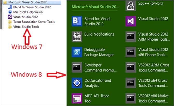
Having installed Visual Studio on our computer, we can see that we have Blend for Visual Studio 2012 along with Visual Studio 2012 in the Start menu. In Windows 7, we can see it in All Programs | Microsoft Visual Studio 2012, and in Windows 8, we can see it in Apps under Microsoft Visual Studio 2012. This is shown in the following image:
Blend is not a tool for designers who want to use it like Photoshop but is for the task of designing applications. Blend provides simple drag-and-drop options to design the application and a pretty extensive Properties panel to customize all the components used. Blend helps us design the complete application, and the output of Blend is ready to use XAML.
XAML (pronounced "zammel") is an XML-based markup language aimed at defining elements in the user interface of a .NET application. It is the language behind the visual presentation of an application that we develop in Blend just as HTML is the language behind the visual presentation of a web page. We will have a look at XAML in detail in Chapter 3, Working with XAML.
Let's create a Silverlight application in Blend:
Now, as we have installed Blend, let's go ahead and launch it.
If you are on Windows 7, then, from the Start menu, go to All Programs | Microsoft Visual Studio 2012 | Blend for Visual Studio 2012, and, if you are on Windows 8, then you need to go to Apps | Microsoft Visual Studio 2012 | Blend for Visual Studio 2012.
We will see the startup screen. Once you have created one or more projects, the screen also shows a list of recent projects for easy access. Go ahead and click on New Project.
Once we do that, we can see that we have multiple templates available to create different applications in Blend. We can also create new projects in Blend by navigating to File | New Project in Blend. The following screenshot shows this:

Select Silverlight in the left panel and Silverlight Application in the right panel. Then, add the name of the application to
HelloWorld. Go ahead and select a location for the project code to reside in. Then, select Visual C# as the language and 5.0 as the version and click on OK. When we select the individual project on the right panel, you will see the type of application you will create just as we are creating a cross-platform web application here.
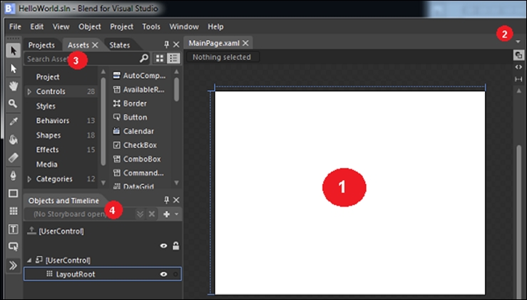
We will now navigate through Blend and take a look at the various pieces. We will also see how and where we can find the things you would need to do a specific job. This screenshot represents various pieces of Blend:
We will explore the pieces of Blend in the following list:
The Art board: This (highlighted as 1) is where we can see the current design we are working on. It will update as we keep changing the design. Above the art board, we can see the name of the document (
MainPage.xaml) that we are currently working on. We can open multiple documents in different tabs and navigate between them.Open documents: This is highlighted as 2. When we click on the white downward arrow icon in the top-right corner of the art board, we can see the files that are currently open in this project. It is helpful to navigate through them if the list of open files becomes too long to fit in a single row on the screen, as shown here:
.jpg)
The Assets panel: This is highlighted as 3. In the top-left corner, we see the Assets panel. This is the place where we have a list of all the controls, styles, media, behaviors, and effects that we could add. We could select the element we want to use or even search for it. We could add the element to the art board by simply grabbing that element and dragging it to the workspace and start working with it. We could also add them to the art board by double-clicking on the element.
The Objects and Timeline panel: This is highlighted as 4. We can see the Objects and Timeline panel below the Projects panel. This panel shows the complete hierarchy of elements in the document that we are working on. We can select the objects that we want to modify.
The Projects panel: This is highlighted as 5. Alongside the Assets panel, we also see the Projects panel. If we click on it, it will show the project we are working on currently. This is the place from where we can view all files of the currently open project. The first item in this panel is a search box where we can search for a project file. This is shown in the following screenshot:
.jpg)
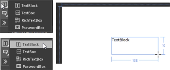
On the extreme left, we can see the tools panel. In this panel, we have the set of common elements that are used to create the UI of our applications. Some of these tools panel items have multi buttons (the ones with a little triangle  alongside them). These are the buttons that have multiple functions. So, if we move the mouse cursor to the text icon, as shown in the following image, and press and hold the mouse's left button, we can see the multiple text controls available in the tools panel. If we simply click on the text button, it is the same as selecting the default text control or the last selected text control. There might be a slight difference between the tools that are available in a Silverlight application and a WPF application. The following screenshot shows this:
.jpg)
This is the place where we will get the building blocks of our application. The toolbox can be divided into nine sections:
Selection tools: This section is highlighted as 1. These tools allow us to select objects:
View tools: This section is highlighted as 2. These tools are used to pan, zoom, and orbit the camera on the art board. The camera orbit tool is not available in a Silverlight project:
Pan: This is used to position the art board in the workspace area. We can double-click on the pan icon to center the art board in the workspace available for the art board.
Zoom: This is used to see the different views of the art board and objects. We can double-click on the zoom icon to resize the current document to its actual size (100 percent zoom).
Camera orbit: This is used to position the camera face for a 3D object.
Brush tools: This section is highlighted as 3. These tools are used to work with the various visual attributes, such as foreground, background, and so on. The brush tools are as follows:
Path tools: This section is highlighted as 4. The pen and pencil tools are both path tools:
Shape tools: This section is highlighted as 5. The rectangle, ellipse, and line are used to draw the respective shapes onto the art board.
Layout panels: This section is highlighted as 6. These are the various layout panels that help us to design the layout structure of the application screen.
Text controls: This section is highlighted as 7. Text controls allow us to display text to the user or take text input from the users.
Common controls: This section is highlighted as 8. These are the various input controls available in WPF/Silverlight and are the ones that are most used while developing an application. The other controls can be accessed using the Assets toolbar menu described next.
Assets: This toolbar menu is highlighted as 9. This is the place where we can find all the controls:
UI components: These include button, label, textbox, menu, and listbox, among others and are referred to as controls
Styles: This is a group of property settings that determines how a control will appear
Effects: This is an easy-to-use API to create a graphical effect
Behaviors: These are reusable code packages that can be added to any object and then fine-tuned by changing their properties
Styles, effects, and behaviors allow us to enhance the controls and add more interactivity. We will have a look at each of these in detail in later chapters.
Let's add TextBlock to the art board.
Left-click and hold the text tool icon until we see the popup to select one of the text controls.
Select TextBlock by clicking on it.
Move the mouse to the art board, press the mouse's left button down, and, without releasing the mouse button, drag the mouse diagonally to create TextBlock. The following screenshot shows this:
Once we do that, we can see multiple things. The first thing that we notice is that we have the Properties panel filled with various options to configure TextBlock. Before we move on, let's take a look at the Properties panel in detail:
.jpg)
2: This allows us to sort the properties by Name, Source, or Category.
3: This allows us to select the Fill, Background, and Stroke brushes for geometry elements, such as Rectangle, Ellipse, and Path, and BorderBrush, Foreground, and Background for elements inherited from
UIElements, such as TextBlock, Button, and so on.4: This is used to select the solid and gradient brushes.
5: This is used to select the color of choice by moving this slider.
6: Here, the three sections show initial, current, and last color respectively.
7: Eyedropper can be used to select any color within Blend or outside Blend. Different eyedroppers are available depending on where the solid and gradient brushes are selected.
8: This allows us to switch between events and properties available for the selected element.
9: This allows us to search and reach the properties faster.
10: This is used to switch between no brush, solid brush, gradient brush, tile brush, and brush resource.
11: This shows the color resources available.
12: This shows the RGB equivalent values (0–255) of the selected color. RGB values can also be set here.
13: This shows the alpha value and could also be set.
14: This is used to convert colors to resources.
15: This shows and edits the hex equivalent value of the selected color.
16: This shows the gradient slider, along with the various gradient stops.
17: This shows the other properties available for the element.
Also, you will notice that, in the Objects and Timeline panel, we have a new element named TextBlock below LayoutRoot.
We can rename the control from the Objects and TimeLine panel.
Also, a small * sign appears with the
MainPage.xamlfilename in the projects panel. This means that we have made some modifications in the file, but the changes are not yet saved.
We can see that the default text in TextBlock is selected. Perform the following steps to add text to TextBlock:
Let's type
Hello Worldinside TextBlock and press the Esc key. We can see that we come out of TextBlock. If we need to go back into editing mode, we should double-click TextBlock.In the tools panel, we see two different kinds of arrow buttons. One of them is the selection arrow (black arrow), and the other one is the direct selection arrow (white arrow). The selection arrow helps us select the element and make changes in the sizing of the element, whereas the direct selection arrow helps us make changes in the positioning of the element. So, click on any of these selection arrows and then on the textbox in the art board, and it will select the properties of TextBlock in the Properties panel. We can now configure the various properties of TextBlock , such as the foreground color, visibility, height, width, alignment, text font, and so on.
A brush paints an area with its output, and different brushes have different output. A brush can be used to describe the fill of a shape, foreground of a text, or background of a control. We can define these brushes using a solid color or a complex set of patterns and images. Most of the visual objects allow us to specify the brush to paint them. The following is a list of common controls, with their properties, on which we can use a brush:
|
Class |
Brush properties |
|---|---|
|
Border |
BorderBrush and Background |
|
Control |
BorderBrush and Background |
|
Panel |
Background |
|
Pen |
Brush |
|
Shape |
Fill and Stroke |
|
TextBlock |
Background and Foreground |
We have the following types of brushes.
Solid color brush paints an area with a solid color. We can specify Solid color brush for a control in multiple ways. The following screenshot represents the options available with Solid color brush:
.jpg)
These options are discussed further in the following numbered list:
1: The color editor allows us to select the color by dragging around the circular marker
2: We can specify the alpha, blue, green, and red channels for the color
3: We can specify the hex value of the color
Let's assign a color to the text we are displaying:
.jpg)
The gradient brush provides us with the option to specify a sequence of colors for our element. We use GradientStop objects to specify the colors in the gradient and their positions. We could have any number (a minimum of two) of GradientStop with the same color or a different color in GradientBrush.
Let's change the background color of the grid:
Select
LayoutRootand then, on the Properties panel, select Background. When we do that, Editor becomes visible.Click on the gradient brush. When we do that, we get to see the default gradient brush offered by Blend. It has two gradient stops: one at offset 0 (Black) and one at offset 100 (white). The following screenshot shows this:
.jpg)
When we move the mouse over these gradient stops, we see the color of the stop and the position of the gradient stop on the gradient slider. The following screenshot shows this:
.jpg)
Move the white gradient stop to the center by clicking and dragging it, and then add a new gradient stop at the end of the gradient slider by clicking on the gradient slider. Now, change the color of this gradient stop to black. The following screenshot depicts this:
.jpg)
When we slide these markers, we can see the gradient shift along with that. To remove a marker, we can either click on a marker and press the delete key or drag the gradient stop off the bottom of the gradient slider.
.jpg)
Let's change the background of the grid using an image brush:
Select LayoutRoot, and then, on the Properties panel, select Background. When we do that, the editor becomes visible.
Click on the tile brush. When we do that, we see that the background of the grid is reset and we have the option to select the stretch and source of the image.
Click on the Browse button next to ImageSource, and browse and select an image we want to use for the image brush for the background of the grid. This sequence of steps is shown here:
.jpg)
.jpg)
Right-click on the solution file, and select Edit in Visual Studio. It will open the same project in Visual Studio 2012. Now, open
MainPage.xaml:.jpg)
Go back to Blend, change the foreground color of TextBlock to red, and save the changes.
Go to Visual Studio, and you will see a prompt. This shows that the files that we have been working on have been modified in Blend and we need to reload it to work with the updated version.
The same thing would happen if we edited a file in Visual Studio and saved it. Blend will prompt us to reload the file to start working with the latest version of the file.
We can navigate to help from the Help menu or by pressing F1:
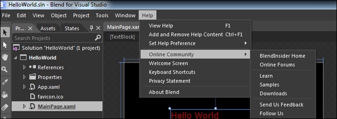
Pressing F1 will lead us to contextual help, which will open Design Windows Store apps using Blend for Microsoft Visual Studio. Ctrl + F1 will allow us to manage the help content installed on the local machine. The following screenshot shows this:
.jpg)
We installed Blend for Visual Studio 2012 and created the "Hello World" application using Blend. You specifically learned about the versions of Blend 2012 available, Blend IDE layout, and project templates available in Blend. You also saw how to create a project in Blend, use the brush tool, and run a project in Blend.
Now that we have the basics of Blend ready to create an application, we will look into layouts and controls in the next chapter.
