Home Data Applied Data Visualization with R and ggplot2

Applied Data Visualization with R and ggplot2

By Dr. Tania Moulik
books-svg-icon Book
eBook $25.99 $17.99
Print $32.99
Subscription $15.99 $10 p/m for three months
$10 p/m for first 3 months. $15.99 p/m after that. Cancel Anytime!
What do you get with a Packt Subscription?
This book & 7000+ ebooks & video courses on 1000+ technologies
60+ curated reading lists for various learning paths
50+ new titles added every month on new and emerging tech
Early Access to eBooks as they are being written
Personalised content suggestions
Customised display settings for better reading experience
50+ new titles added every month on new and emerging tech
Playlists, Notes and Bookmarks to easily manage your learning
Mobile App with offline access
What do you get with a Packt Subscription?
This book & 6500+ ebooks & video courses on 1000+ technologies
60+ curated reading lists for various learning paths
50+ new titles added every month on new and emerging tech
Early Access to eBooks as they are being written
Personalised content suggestions
Customised display settings for better reading experience
50+ new titles added every month on new and emerging tech
Playlists, Notes and Bookmarks to easily manage your learning
Mobile App with offline access
What do you get with eBook + Subscription?
Download this book in EPUB and PDF formats, plus a monthly download credit
This book & 6500+ ebooks & video courses on 1000+ technologies
60+ curated reading lists for various learning paths
50+ new titles added every month on new and emerging tech
Early Access to eBooks as they are being written
Personalised content suggestions
Customised display settings for better reading experience
50+ new titles added every month on new and emerging tech
Playlists, Notes and Bookmarks to easily manage your learning
Mobile App with offline access
What do you get with a Packt Subscription?
This book & 6500+ ebooks & video courses on 1000+ technologies
60+ curated reading lists for various learning paths
50+ new titles added every month on new and emerging tech
Early Access to eBooks as they are being written
Personalised content suggestions
Customised display settings for better reading experience
50+ new titles added every month on new and emerging tech
Playlists, Notes and Bookmarks to easily manage your learning
Mobile App with offline access
What do you get with eBook?
Download this book in EPUB and PDF formats
Access this title in our online reader
DRM FREE - Read whenever, wherever and however you want
Online reader with customised display settings for better reading experience
What do you get with video?
Download this video in MP4 format
Access this title in our online reader
DRM FREE - Watch whenever, wherever and however you want
Online reader with customised display settings for better learning experience
What do you get with video?
Stream this video
Access this title in our online reader
DRM FREE - Watch whenever, wherever and however you want
Online reader with customised display settings for better learning experience
What do you get with Audiobook?
Download a zip folder consisting of audio files (in MP3 Format) along with supplementary PDF
What do you get with Exam Trainer?
Flashcards, Mock exams, Exam Tips, Practice Questions
Access these resources with our interactive certification platform
Mobile compatible-Practice whenever, wherever, however you want
BUY NOW $10 p/m for first 3 months. $15.99 p/m after that. Cancel Anytime!
eBook $25.99 $17.99
Print $32.99
Subscription $15.99 $10 p/m for three months
What do you get with a Packt Subscription?
This book & 7000+ ebooks & video courses on 1000+ technologies
60+ curated reading lists for various learning paths
50+ new titles added every month on new and emerging tech
Early Access to eBooks as they are being written
Personalised content suggestions
Customised display settings for better reading experience
50+ new titles added every month on new and emerging tech
Playlists, Notes and Bookmarks to easily manage your learning
Mobile App with offline access
What do you get with a Packt Subscription?
This book & 6500+ ebooks & video courses on 1000+ technologies
60+ curated reading lists for various learning paths
50+ new titles added every month on new and emerging tech
Early Access to eBooks as they are being written
Personalised content suggestions
Customised display settings for better reading experience
50+ new titles added every month on new and emerging tech
Playlists, Notes and Bookmarks to easily manage your learning
Mobile App with offline access
What do you get with eBook + Subscription?
Download this book in EPUB and PDF formats, plus a monthly download credit
This book & 6500+ ebooks & video courses on 1000+ technologies
60+ curated reading lists for various learning paths
50+ new titles added every month on new and emerging tech
Early Access to eBooks as they are being written
Personalised content suggestions
Customised display settings for better reading experience
50+ new titles added every month on new and emerging tech
Playlists, Notes and Bookmarks to easily manage your learning
Mobile App with offline access
What do you get with a Packt Subscription?
This book & 6500+ ebooks & video courses on 1000+ technologies
60+ curated reading lists for various learning paths
50+ new titles added every month on new and emerging tech
Early Access to eBooks as they are being written
Personalised content suggestions
Customised display settings for better reading experience
50+ new titles added every month on new and emerging tech
Playlists, Notes and Bookmarks to easily manage your learning
Mobile App with offline access
What do you get with eBook?
Download this book in EPUB and PDF formats
Access this title in our online reader
DRM FREE - Read whenever, wherever and however you want
Online reader with customised display settings for better reading experience
What do you get with video?
Download this video in MP4 format
Access this title in our online reader
DRM FREE - Watch whenever, wherever and however you want
Online reader with customised display settings for better learning experience
What do you get with video?
Stream this video
Access this title in our online reader
DRM FREE - Watch whenever, wherever and however you want
Online reader with customised display settings for better learning experience
What do you get with Audiobook?
Download a zip folder consisting of audio files (in MP3 Format) along with supplementary PDF
What do you get with Exam Trainer?
Flashcards, Mock exams, Exam Tips, Practice Questions
Access these resources with our interactive certification platform
Mobile compatible-Practice whenever, wherever, however you want
About this book
Applied Data Visualization with R and ggplot2 introduces you to the world of data visualization by taking you through the basic features of ggplot2. To start with, you’ll learn how to set up the R environment, followed by getting insights into the grammar of graphics and geometric objects before you explore the plotting techniques. You’ll discover what layers, scales, coordinates, and themes are, and study how you can use them to transform your data into aesthetical graphs. Once you’ve grasped the basics, you’ll move on to studying simple plots such as histograms and advanced plots such as superimposing and density plots. You’ll also get to grips with plotting trends, correlations, and statistical summaries. By the end of this book, you’ll have created data visualizations that will impress your clients.
Publication date:
September 2018
Publisher
Packt
Pages
140
ISBN
9781789612158


Chapter 1. Basic Plotting in ggplot2

This chapter will cover basic concepts of ggplot2 and the Grammar of Graphics, using illustrative examples. You will generate solutions to problems of increasing complexity throughout the book. Lastly, you will master advanced plotting techniques, which will enable you to add more detail and increase the quality of your graphics.

In order to use ggplot2, you will first need to install R and RStudio. R is a programming language that is widely used for advanced modeling, statistical computing, and graphic production. R is considered the base package, while RStudio is a graphical interface (or IDE) that is based on R. Visualization is a very important aspect of data analysis, and it has its own underlying grammar (similar to the English language). There are many aspects of data analysis, and visualization is one of them. So, before we go further, let's discuss visualization in more detail.

By the end of this chapter, you will be able to:

  • Distinguish between different kinds of variables
  • Create simple plots and geometric objects, using qplot and ggplot2
  • Determine the most appropriate visualization by comparing variables
  • Utilize Grammar of Graphics concepts to improve plots in ggplot2
 

Introduction to ggplot2


ggplot2 is a visualization package in R. It was developed in 2005 and it uses the concept of the Grammar of Graphics to build a plot in layers and scales. This is the syntax used for the different components (aesthetics) of a geometric object. It also involves the grammatical rules for creating a visualization.

ggplot2 has grown in popularity over the years. It's a very powerful package, and its impressive scope has been enabled by the underlying grammar, which gives the user a very file level of control - making it perfect for a range of scenarios. Another great feature of ggplot 2 is that it is programmatic; hence, its visuals are reproducible. The ggplot2 package is open source, and its use is rapidly growing across various industries. Its visuals are flexible, professional, and can be created very quickly.

Note

Read more about the top companies using R at https://www.listendata.com/2016/12/companies-using-r.html. You can find out more about the role of a data scientist at https://www.innoarchitech.com/what-is-data-science-does-data-scientist-do/.

Similar Packages

Other visualization packages exist, such as matplotlib (in Python) and Tableau. The matplotlib and ggplot2 packages are equally popular, and they have similar features. Both are open source and widely used. Which one you would like to use may be a matter of preference. However, although both are programmatic and easy to use, since R was built with statisticians in mind, ggplot2 is considered to have more powerful graphics. More discussion on this topic can be found in the chapter later. Tableau is also very powerful, but it is limited in terms of statistical summaries and advanced data analytics. Tableau is not programmatic, and it is more memory intensive because it is completely interactive.

Excel has also been used for data analysis in the past, but it is not useful for processing the large amounts of data encountered in modern technology. It is interactive and not programmatic; hence, charts and graphs have to be made with interactivity and need to be updated every time more data is added. Packages such as ggplot2 are more powerful in that once the code is written, ggplot is independent of increases in the data, as long as the data structure is maintained. Also, ggplot2 provides a greater number of advanced plots that are not available in Excel.

Note

Read more about Excel versus R at https://www.jessesadler.com/post/excel-vs-r/. Read more about matplotlib versus R at http://pbpython.com/visualization-tools-1.html. Read more about matplotlib versus ggplot at https://shiring.github.io/r_vs_python/2017/01/22/R_vs_Py_post.html.


The RStudio Workspace

So, before we go further, let's discuss visualization in more detail. Our first task is to load a dataset. To do so, we need to load certain packages in RStudio. Take a look at the screenshot of a typical RStudio layout, as follows:

Loading and Exploring a Dataset Using R Functions

In this section, we'll load and explore a dataset using R functions. Before starting with the implementation, check the version by typing version in the console and checking the details, as follows:

Let's begin by following these steps:

  1. Install the following packages and libraries:
install.packages("ggplot2")
install.packages("tibble")
install.packages("dplyr")
install.packages("Lock5Data")
  1. Get the current working directory by using the getwd(".") command:
[1] "C:/Users/admin/Documents/GitHub/Applied-DataVisualization-with-ggplot2-and-R"
  1. Set the current working directory to Chapter 1 by using the following command:
setwd("C:/Users/admin/Documents/GitHub/Applied-DataVisualization-with-ggplot2-and-R/Lesson1")
  1. Use the require command to open the template_Lesson1.R file, which has the necessary libraries.
  2. Read the following data file, provided in the data directory:
df_hum <- read.csv("data/historical-hourly-weather-data/humidity.csv")

Note

When we used read.csv, a structure called a data frame was created in R; which we are all familiar with it. Let's type some commands to get an overall impression of our data. Let's retrieve some parameters of the dataset (such as the number of rows and columns) and display the different variables and their data types.

The following libraries have now been loaded:

  • Graphical visualization package:
require("ggplot2") 
  • Build a data frame or list and some other useful commands:
require("tibble") 
  • A built-in dataset package in R:
require("Lock5Data") 

Use the following commands to determine the data frame details, as follows:

#Display the column names
colnames(df_hum)


Take a look at the output screenshot, as shown here:

Use the following command:

#Number of columns and rows
ndim(df_hum) 

A summary of the data frame can be seen with the following code:

str(df_hum)

Take a look at the output screenshot, as shown here:

The Main Concepts of ggplot2

ggplot2 is based on two main concepts: geometric objects and the Grammar of Graphics. The geometric objects in ggplot2 are the different visual structures that are used to visualize data. We will be going over them one by one. The Grammar of Graphics is the syntax that we use for the different aesthetics of a graph, such as the coordinate scale, the fonts, the color themes, and so on. ggplot2 uses a layered Grammar of Graphics concept, which allows us to build a plot in layers. We will work on some aspects of the Grammar of Graphics in this chapter, and will go into further details in the next chapter.

Types of Variables

Variables can be of different types and, sometimes, different software uses different names for the same variables. So, let's get familiar with the different kinds of variables that we will work with:

  • Continuous: A continuous variable can take an infinite number of values, such as time or weight. They are of the numerical type.
  • Discrete: A variable whose values are whole numbers (counts) is called a discrete variable. For example, the number of items bought by a customer in a supermarket is discrete.
  • Categorical: The values of a categorical variable are selected from a small group of categories. Examples include gender (male or female) and make of car (Mazda, Hyundai, Toyota, and so on). Categorical variables can be further categorized into ordinal and nominal variables, as follows:
    • Ordinal categorical variable: A categorical variable whose categories can be meaningfully ordered is called ordinal. For example, credit grades (AA, A, B, C, D, and E) are ordinal.
    • Nominal categorical variable: It does not matter which way the categories are ordered in tabular or graphical displays of the data; all orderings are equally meaningful. An example would be different kinds of fruit (bananas, oranges, apples, and so on).
    • Logical: A logical variable can only take two values (T/F).

The following table lists variables and the names that R uses for them; make sure to familiarize yourself with both nomenclatures.

The variable names used in R are as follows:

Note

In R, whenever the factor data is listed, the number of levels is also given. A dataset can contain different kinds of variables, as discussed previously.

Exploring Datasets

In this section, we will use the built-in datasets to investigate the relationships between continuous variables, such as temperature and airquality. We'll explore and understand the datasets available in R.

Let's begin by executing the following steps:

  1. Type data() in the command line to list the datasets available in R. You should see something like the following:
  1. Choose the following datasets: mtcars, air quality, rock, and sleep.

Note

The number of levels only applies to factor data.

  1. List two variables of each type, the dataset names, and the other columns of this table.
  2. To view the data type, use the str command (for example, str(airquality) ).

    Take a look at the following output screenshot:

  1. After viewing the preceding datasets, fill in the following table. The first entry has been completed for you. The following table includes all variables of the typesnum and int:

The outcome should be a completed table, similar to the following:

Note

More details about variables can be found at http://www.statisticshowto.com/types-variables/.

Making Your First Plot

The ggplot2 function qplot (quick plot) is similar to the basic plot() function from the R package. It has the following syntax: qplot(). It can be used to build and combine a range of useful graphs; however, it does not have the same flexibility as the ggplot() function.

Plotting with qplot and R

Suppose that we want to visualize some of the variables in the built-in datasets. A dataset can contain different kinds of variables, as discussed previously. Here, the climate data includes numerical data, such as the temperature, and categorical data, such as hot or cold. In order to visualize and correlate different kinds of data, we need to understand the nomenclature of the dataset. We'll load a data file and understand the structure of the dataset and its variables by using the qplot and R base package. Let's begin by executing the following steps:

  1. Plot the temperature variable from the airquality dataset, with hist(airquality$Temp) .

Note

hist is part of the built-in R graphics package.

  Take a look at the following output screenshot:

  1. Use qplot (which is part of the ggplot2 package) to plot a graph, using the same variables.
  1. Type the qplot(airquality$Temp) command to obtain the output, as shown in the following screenshot:

Analysis

The first plot was made in the built-in graphics package in R, while the second one was made using qplot, which is a plotting command in ggplot2. We can see that the two plots look very different. The plot is a histogram of the temperature.

We will discuss geometric objects later in this chapter, in order to understand the different types of histograms. 

The built-in graphics package in R does not have a lot of features, so ggplot2 has become the package of choice. For the next exercises, we will continue to investigate making plots using ggplot2.


Geometric Objects


In your mathematics class, you likely studied geometry, examining different shapes and the characteristics of those shapes, such as area, perimeter, and other factors. The geometric objects in ggplot2 are visual structures that are used to visualize data. They can be lines, bars, points, and so on.

Geometric objects are constructed from datasets. Before we construct some geometric objects, let's examine some datasets to understand the different kinds of variables.

Analyzing Different Datasets

We all love to talk about the weather. So, let's work with some weather-related datasets. The datasets contain approximately five years' worth of high-temporal resolution (hourly measurements) data for various weather attributes, such as temperature, humidity, air pressure, and so on. We'll analyze and compare the humidity and weather datasets.

Let's begin by implementing the following steps:

  1. Load the humidity dataset by using the following command:
df_hum <- read.csv("data/historical-hourly-weather-data/humidity.csv")
  1. Load the weather description dataset by using the following command:
df_desc <- read.csv("data/historical-hourly-weather-data/weather_description.csv")
  1. Compare the two datasets by using the str command.

The outcome will be the humidity levels of different cities, as follows:

The weather descriptions of different cities are shown as follows:

The different geometric objects that we will be working with in this chapter are as follows:

One-dimensional objects are used to understand and visualize the characteristics of a single variable, as follows:

  • Histogram
  • Bar chart

Two-dimensional objects are used to visualize the relationship between two variables, as follows:

  • Bar chart
  • Boxplot
  • Line chart
  • Scatter plot

Although geometric objects are also used in base R, they don't follow the structure of the Grammar of Graphics and have different naming conventions, as compared to ggplot2. This is an important distinction, which we will look at in detail later.


Histograms

Histograms are used to group and represent numerical (continuous) variables. For example, you may want to know the distribution of voters' ages in an election. A histogram is often confused with a bar chart; however, a bar chart is more general, and we will cover those later. In a histogram, a continuous variable is grouped into bins of specific sizes and the bins have a range that covers the maximum and minimum of the variable in question.

Histograms can be classified as follows:

  • Unimodal: A distribution with a single maximum or mode; for example, a normal distribution:
    • A normal distribution (or a bell-shaped curve) is symmetrical. An example is the grade distribution of students in a class. A unimodal distribution may or may not be symmetrical. It can be positively or negatively skewed, as well.
    • Positively or negatively skewed (also known as right-skewed or left-skewed): Skewness is a measure of the asymmetry of the probability distribution of a real-valued random variable about its mean. The skewness value can be positive, negative, or undefined.
    • A left-skewed distribution has a long tail to the left while a right-skewed distribution has a long tail to the right. An example of a right-skewed distribution might be the US household income, with a long tail of higher-income groups.
  • Bimodal: Bimodal distribution resembles the back of a two-humped camel. It shows the outcomes of two processes, with different distributions that are combined into one set of data. For example, you might expect to see a bimodal distribution in the height distribution of an entire population. There would be a peak around the average height of a man, and a peak around the typical height of a woman.
  • Unitary distribution: This distribution follows a uniform pattern that has approximately the same number of values in each group. In the real world, one can only find approximately uniform distributions. An example is the speed of a car versus time if moving at constant speed (zero acceleration), or the uniform distribution of heat in a microwave:

Let's take a look at another image:

It's important to study the shapes of distributions, as they can reveal a lot about the nature of data. We will see some real-world examples of histograms in the datasets that we will explore.

We discussed the different kinds of geometric objects that we will be working on, and we created our fist plot using two different methods (qplot and hist). Now, let's use another command: ggplot. We will use the humidity data that we loaded previously.

As seen in the preceding section, we can create a default histogram by using one of the commands in the base R package: hist. This is seen in the following command:

hist(df_hum$Vancouver)

The default histogram that will be created is as follows:

Creating a Histogram Using qplot and ggplot

In this section, we want to visualize the humiditydistribution for the city of Vancouver. We'll create a histogram for humidity data using qplot and ggplot.

Let's begin by implementing the following steps:

  1. Create a plot with RStudio by using the following command: qplot(df_hum$Vancouver):
  1. Use ggplot to create the same plot using the following command:
ggplot(df_hum,aes(x=Vancouver))

Note

This command does not do anything; ggplot2 requires the name of the object that we wish to make. To make a histogram, we have to specify the geom type (in other words, a histogram). aes stands for aesthetics, or the quantities that get plotted on thex-andy-axes, and their qualities. We will work on changing the aesthetics later, in order to visualize the plot more effectively.


Notice that there are some warning messages, as follows:

'stat_bin()' using 'bins = 30'. Pick better value with 'binwidth'.
 Warning message:
 Removed 1826 rows containing non-finite values (stat_bin).

You can ignore these messages; ggplot automatically detects and removes null or NA values.

  1. Obtain the histogram with ggplot by using the following command:
ggplot (df_hum, aes(x=Vancouver)) + geom_histogram() 

You'll see the following output:

Here's the output code:

require("ggplot2")
require("tibble")
#Load a data file - Read the Humidity Data
df_hum <- read.csv("data/historical-hourly-weather-data/humidity.csv")
#Display the summary
str(df_hum)
qplot(df_hum$Vancouver)
ggplot(df_hum, aes(x=Vancouver)) + geom_histogram()

Note

Refer to the complete code at https://goo.gl/tu7t4y.In order for ggplot to work, you will need to specify the geometric object. Note that the column name should not be enclosed in strings.

Activity: Creating a Histogram and Explaining its Features

Scenario

Histograms are useful when you want to find the peak and spread in a distribution. For example, suppose that a company wants to see what its client age distribution looks like. A two-dimensional distribution can show relationships; for example, one can create a scatter plot of the incomes and ages of credit card holders.

Aim

To create and analyze histograms for the given dataset.

Prerequisites

You should be able to use ggplot2 to create a histogram.

Note

This is an empty code, wherein the libraries are already loaded. You will be writing your code here.

Steps for Completion

  1. Use the template code and load the required datasets.
  2. Create the histogram for two cities.
  3. Analyze and compare two histograms to determine the point of difference.

Outcome

Two histograms should be created and compared. The complete code is as follows:

df_t <- read.csv("data/historical-hourly-weather-data/temperature.csv")
ggplot(df_t,aes(x=Vancouver))+geom_histogram()
ggplot(df_t,aes(x=Miami))+geom_histogram()

Note

Refer to the complete code at https://goo.gl/tu7t4y.

Take a look at the following output histogram:

From the preceding plot, we can determine the following information:

  • Vancouver's maximum temperature is around 280.
  • It ranges between 260 and 300.
  • It's a right-skewed distribution.


Take a look at the following output histogram:

From the preceding plot, we can determine the following information:

  • Miami's maximum temperature is around 300
  • It ranges between 280 and 308
  • It's a left-skewed distribution

Differences

  1. Miami's temperature plot is skewed to the right, while Vancouver's is to the left.
  2. The maximum temperature is higher for Miami.

Creating Bar Charts

Bar charts are more general than histograms, and they can represent both discrete and continuous data. They can even be used to represent categorical variables. A bar chart uses a horizontal or vertical rectangular bar that levels of at an appropriate level. A bar chart can be used to represent various quantities, such as frequency counts and percentages.

We will use the weather description data to create a bar chart. To create a bar chart, the geometric object used is geom_bar().

The syntax is as follows:

ggplot(….) + geom_bar(…)

If we use the glimpse or str command to view the weather data, we will get the following results:

Note

You cannot use a histogram for a categorical type of variable.

Creating a One-Dimensional Bar Chart

Use the ggplot(df_vanc,aes(x=Vancouver)) + geom_bar() command to obtain the following chart:

Observations

Vancouver has clear weather, for the most part. It rained about 10,000 times for the dataset provided. Snowy periods are much less frequent.

We will now perform two exercises, creating a one-dimensional bar chart and a two-dimensional bar chart. A one-dimensional bar chart can give us the counts or frequency of a given variable. A two-dimensional bar chart can give us the relationship between the variables.

In this section, we'll count the number of times each type of weather occurs in Seattle and compare it to Vancouver.

Let's begin by following these steps:

  1. Use ggplot2 and geom_bar in conjunction to create the bar chart.
  2. Use the data frame that we just created, but with Seattle instead of Vancouver, as follows:
ggplot(df_vanc,aes(x=Seattle)) + geom_bar() 
  1. Now, compare the two bar charts and answer the following questions:
  • Approximately how many times was Vancouver cloudy? (Round to 2 significant figures.)
  • Which of the two cities sees a greater amount of rain?
  • What is the percentage of rainy days versus clear days? (Add the two counts and give the percentage of days it rains.)
  • According to this dataset, which city gets a greater amount of snow?

You should see the following output:

Note

Refer to the complete code at https://goo.gl/tu7t4y.

Answers

  • Vancouver was cloudy 13,000 times. (Note that 12,000 is also acceptable.)
  • Seattle sees a greater amount of rain.
It rained on approximately 40% of the days.
  • Vancouver gets a greater amount of snow.

A two-dimensional bar chart can be used to plot the sum of a continuous variable versus a categorical or discrete variable. For example, you might want to plot the total amount of rainfall in different weather conditions, or the total amount of sales in different months.

Creating a Two-Dimensional Bar Chart

In this section, we'll create a two-dimensional bar chart for the total sales of a company in different months.

Let's begin by following these steps:

  1. Load the data. Add the line require (Lock5Data) into your code. You should have installed this package previously.
  2. Review the data with the glimpse(RetailSales) command.
  3. Plot a graph of Sales versus Month.

Note

Here, Month is a categorical variable, while Sales is a continuous variable of the type <dbl>.

  1. Use ggplot + geom_bar(..) to plot this data, as follows:
ggplot(RetailSales,aes(x=Month,y=Sales)) + geom_bar(stat="identity")

A screenshot of the expected outcome is as follows:


Analyzing and Creating Boxplots

A boxplot (also known as a box and whisker diagram) is a standard way of displaying the distribution of data based on a file-number summary: minimum, first quartile, median, third quartile, and maximum. Boxplots can represent how a continuous variable is distributed for different categories; one of the axes will be a categorical variable, while the other will be a continuous variable. In the default boxplot, the central rectangle spans the first quartile to the third quartile (called the interquartile range, or IQR). A segment inside of the rectangle shows the median, and the lines (whiskers) above and below the box indicate the locations of the minimum and maximum, as shown in the following diagram:


The upper whisker extends from the hinge to the largest and smallest values of ± 1.5 * IQR from the hinge. Here, we can see the humidity data as a function of the month. Data beyond the end of the whiskers are called outliers, and are represented as circles, as seen in the following chart:

You'll get the preceding chart by using the following code:

ggplot(df_hum,aes(x=month,y=Vancouver)) + geom_boxplot() 


Creating a Boxplot for a Given Dataset

In this section, we'll create a boxplot for monthly temperature data for Seattle and San Francisco, and compare the two (given two points).

Let's begin by implementing the following steps:

  1. Create the two boxplots.
  2. Display them side by side in your Word document.
  3. Provide two points of comparison between the two. You can comment on how the medians compare, how uniform the distributions look, the maximum and minimum humidity, and so on.

Note

Refer to the complete code at https://goo.gl/tu7t4y.

The following observations can be noted:

The humidity is more uniform for San Francisco:

The median humidity for San Francisco is about 75:

Note

Compare this to the humidity data for Seattle and San Francisco on the following websites (scroll down and look for the humidity plots). You should see a similar trend:https://weather-and-climate.com/average-monthly-Rainfall-Temperature-Sunshine,Seattle,United-States-of-Americahttps://weather-and-climate.com/average-monthly-Rainfall-Temperature-Sunshine,San-Francisco,United-States-of-America

Scatter Plots

A scatter plot shows the relationship between two continuous variables. Let's create a scatter plot of distance versus time for a car that is accelerating and traveling with an initial velocity. We will generate some random time points according to a function. The relationship between distance and time for a speeding car is as follows:


We can draw a scatter plot to show the relationship between distance and time with the following code:

ggplot(df,aes(x=time,y=distance)) + geom_point()

We can see a positive correlation, meaning that as time increases, distance increases. Take a look at the following code:

a=3.4
v0=27
time <- runif(50, min=0, max=200)
distance <- sapply(time, function(x) v0*x + 0.5*a*x^2)
df <- data.frame(time,distance)
ggplot(df,aes(x=time,y=distance)) + geom_point()

The outcome is a positive correlation: as time increases, distance increases:

The correlation can also be zero (for no relationship) or negative (as x increases, y decreases).

Line Charts

A line chart shows the relationship between two variables; it is similar to a scatter plot, but the points are connected by line segments. One difference between the usage of a scatter plot and a line chart is that, typically, it's more meaningful to use the line chart if the variable being plotted on the x-axis has a one-to-one relationship with the variable being plotted on the y-axis. A line chart should be used when you have enough data points, so that a smooth line is meaningful to see a functional dependence:

We could have also used a line chart for the previous plot. The advantage of using a line chart is that the discrete nature goes away and you can see trends more easily, while the functional form is more effectively visualized.

If there is more than one y value for a givenx, the data needs to be grouped by the x value; then, one can show the features of interest from the grouped data, such as the mean, median, maximum, minimum, and so on. We will use grouping in the next section.

Creating a Line Chart

In this section, we'll create a line chart to plot the mean humidity against the month. Lets's begin by implementing the following steps:

  1. Convert the months into numerical integers, as follows:
df_hum$monthn <- as.numeric(df_hum$month)
  1. Group the humidity by month and remove NAs, as follows:
gp1 <- group_by(df_hum,monthn)
  1. Create a summary of the group using the mean and median.
  2. Now, use the geom_line() command to plot the line chart (refer to the code).

The following plots are obtained:

Note

Refer to the complete code at https://goo.gl/tu7t4y.

Take a look at the output line chart:

Activity: Creating One- and Two-Dimensional Visualizations with a Given Dataset

Scenario

Suppose that we are in a company, and we have been given an unknown dataset and would like to create similar plots. For example, we have some educational data, and we would like to know what courses are the most popular, or the gender distribution among students, or how satisfied the parents/students are with the courses. We will use the new dataset, along with our own knowledge, to get some information on the preceding points.

Aim

To create one- and two-dimensional visualizations for the new dataset and the given variables.

Steps for Completion

  1. Load the datasets.
  2. Choose the appropriate visualization.
  3. Create the desired 1D visualization.
  4. Create two-dimensional boxplots or scatter plots and note your observations.


Outcome

Three one-dimensional plots and three two-dimensional plots should be created, with the following axes (count versus topic) and observations. (Note that the students may provide different observations, so the instructor should verify the answers. The following observations are just examples.)

Note

Refer to the complete code at https://goo.gl/tu7t4y.

One-Dimensional Plots

This visual was chosen becauseTopic is a categorical variable, and I wanted to see the frequency of each topic:

Observation

You can see that IT is the most popular subject:

gender is a categorical variable; you can chose a bar chart because you wanted to see the frequency of each topic.

Observation

You can observe that more males are registered in this institute from the following histogram:

VisitedResources is numerical, so you can choose a histogram to visualize it.

Observation

It's a bimodal histogram with two peaks, around 12 and 85.

Two-Dimensional Plots

Take a look at the following 2D plots:

Plot 1:

Plot 2:

Plot 3:

Observations

  • I see that there is a weak positive correlation between AnnouncementsView and VisitedResources.
  • Students in Math hardly visit resources; the median is the lowest, at about 12.5.
  • Females participate in discussions more frequently, as their median and maximum are higher.
  • People in Biology visit resources the most.
  • The median number of discussions for females is 37.5.

Three-Dimensional Plots

It is also possible to plot using three-dimensional vectors. This creates a three-dimensional plot, which provides enhanced visualization for applications (for example, displaying three-dimensional spaces). Essentially, it is a graph of two functions, embedded into a three-dimensional environment.

Note

Read more about three-dimensional plots at: https://octave.org/doc/v4.2.0/Three_002dDimensional-Plots.html.


The Grammar of Graphics


The Grammar of Graphics is the language used to describe the various components of a graphic that represent the data in a visualization. Here, we will explore a few aspects of the Grammar of Graphics, building upon some of the features in the graphics that we created in the previous topic. For example, a typical histogram has various components, as follows:

  • The data itself (x)
  • Bars representing the frequency of x at different values of x
  • The scaling of the data (linear)
  • The coordinate system (Cartesian)

All of these aspects are part of the Grammar of Graphics, and we will change these aspects to provide better visualization. In this chapter, we will work with some of the aspects; we will explore them further in the next chapter.

Note

Read more about the Grammar of Graphics at https://cfss.uchicago.edu/dataviz_grammar_of_graphics.html.

Rebinning

In a histogram, data is grouped into intervals, or ranges of values, called bins. ggplot has a certain number of bins by default, but the default may not be the best choice every time. Having too many bins in a histogram might not reveal the shape of the distribution, while having too few bins might distort the distribution. It is sometimes necessary to rebin a histogram, in order to get a smooth distribution.

Analyzing Various Histograms

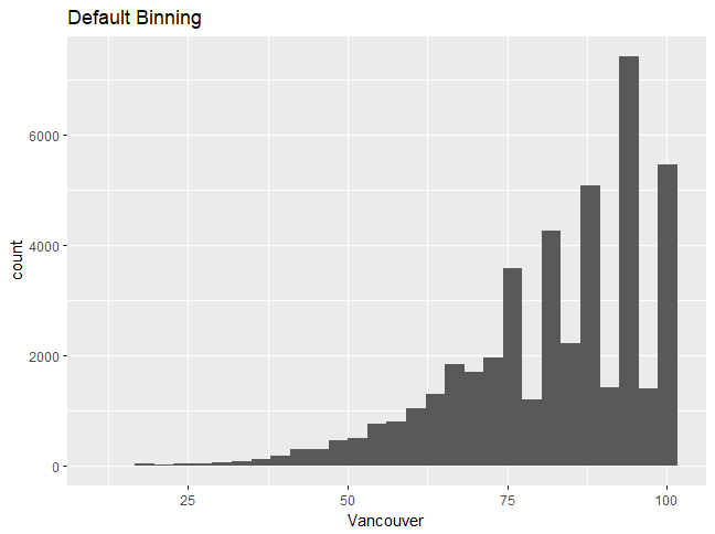
Let's use the humidity data and the first plot that we created. It looks like the humidity values are discrete, which is why you can see discrete peaks in the data. In this section, we'll analyze the differences between unbinned and binned histograms.

Let's begin by implementing the following steps:

  1. Choosing a different type of binning can make the distribution more continuous; use the following code:
ggplot(df_hum,aes(x=Vancouver))+geom_histogram(bins=15)

You'll get the following output. Graph 1:


Graph 2:

Note

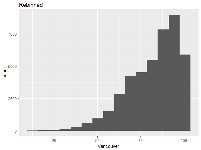
Choosing a different type of binning can make the distribution more continuous, and one can then better understand the distribution shape. We will now build upon the graph, changing some features and adding more layers.

  1. Change the fill color to white by using the following command:
ggplot(df_hum,aes(x=Vancouver))+geom_histogram(bins=15,fill="white",color=1) 
  1. Add a title to the histogram by using the following command:
+ggtitle("Humidity for Vancouver city")
  1. Change the x-axis label and label sizes, as follows:
+xlab("Humidity")+theme(axis.text.x=element_text(size = 12),axis.text.y=element_text(size=12))

You should see the following output:

Note

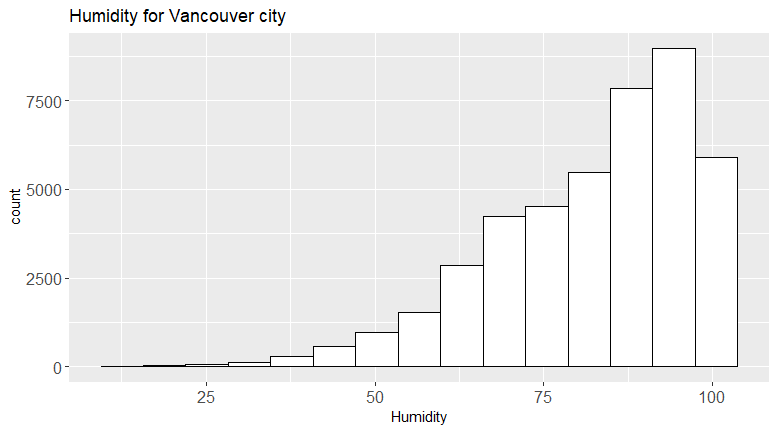
The full command should look as follows:ggplot(df_hum,aes(x=Vancouver))+geom_histogram(bins=15,fill="white",color=1)+ggtitle("Humidity for Vancouver city")+xlab("Humidity")+theme(axis.text.x=element_text(size= 12),axis.text.y=element_text(size=12))

We can see that the second plot is a visual improvement, due to the following factors:

  • There is a title
  • The font sizes are visible
  • The histogram looks more professional in white

To see what else can be changed, type ?theme.

Changing Boxplot Defaults Using the Grammar of Graphics

In this section, we'll use the Grammar of Graphics to change defaults and create a better visualization.

Let's begin by implementing the following steps:

  1. Use the humidity data to create the same boxplot seen in the previous section, for plotting monthly data.
  2. Change the x- and y-axis labels appropriately (the x-axis is the month and the y-axis is the humidity).
  3. Type ?geom_boxplot in the command line, then look for the aesthetics, including the color and the fill color.
  4. Change the color to black and the fill color to green (try numbers from 1-6).
  5. Type ?theme to find out how to change the label size to 15. Change thex- and y-axis titles to size 15 and the color to red.

The outcome will be the complete code and the graphic with the correct changes:

Note

Refer to the complete code at https://goo.gl/tu7t4y.

Activity: Improving the Default Visualization

Scenario

In the previous activity, you made a judicious choice of a geometric object (bar chart or histogram) for a given variable. In this activity, you will see how to improve a visualization. If you are producing plots to look at privately, you might be okay using the default settings. However, when you are creating plots for publication or giving a presentation, or if your company requires a certain theme, you will need to produce more professional plots that adhere to certain visualization rules and guidelines. This activity will help you to improve visuals and create a more professional plot.

Aim

To create improved visualizations by using the Grammar of Graphics.

Steps for Completion

  1. Create two of the plots from the previous activity.
  2. Use the Grammar of Graphics to improve your graphics by layering upon the base graphic.

Note

Refer to the complete code at https://goo.gl/tu7t4y.

Take a look at the following output, histogram 1:

Histogram 2:


Summary


In this chapter, we covered the basics of ggplot2, distinguishing between different types of variables and introducing the best practices for visualizing them. You created basic one- and two-dimensional plots, then analyzed the differences  between them. You used the Grammar of Graphics to change a basic visual into a better, more professional-looking visual.

In the next chapter, we will build upon these skills, uncovering correlations between variables and using statistical summaries to create more advanced plots.

About the Author
  • Dr. Tania Moulik

    Tania Moulik has a PhD in particle physics. She has worked at CERN, the European Organization for Nuclear Research, and on the Tevatron at Fermi National Accelerator Laboratory in IL, USA. She has years of programming experience in C++, Python, and R. She has also worked in the feld of big data and has worked with technologies such as grid computing. She has a passion for data analysis and would like to share her passion with others who would like to delve into the world of data analytics. She especially likes R and ggplot2 as a powerful analytics package.

    Browse publications by this author
Latest Reviews (3 reviews total)
Very reasonable price for the contents.
Great insight into producing clear, clean, informative data visualizations. This will be a go-to book for me using ggplot2. Clear and very helpful.
Excellent service and useful books.
Applied Data Visualization with R and ggplot2
Unlock this book and the full library FREE for 7 days
Start now