Download code from GitHub
Detecting Suspicious Activity
Many problems in cybersecurity are constructed as anomaly detection tasks, as attacker behavior is generally deviant from good actor behavior. An anomaly is anything that is out of the ordinary—an event that doesn’t fit in with normal behavior and hence is considered suspicious. For example, if a person has been consistently using their credit card in Bangalore, a transaction using the same card in Paris might be an anomaly. If a website receives roughly 10,000 visits every day, a day when it receives 2 million visits might be anomalous.
Anomalies are few and rare and indicate behavior that is strange and suspicious. Anomaly detection algorithms are unsupervised; we do not have labeled data to train a model. We learn what the normal expected behavior is and flag anything that deviates from it as abnormal. Because labeled data is very rarely available in security-related areas, anomaly detection methods are crucial in identifying attacks, fraud, and intrusions.
In this chapter, we will cover the following main topics:
- Basics of anomaly detection
- Statistical algorithms for intrusion detection
- Machine learning (ML) algorithms for intrusion detection
By the end of this chapter, you will know how to detect outliers and anomalies using statistical and ML methods.
Technical requirements
All of the implementation in this chapter (and the book too) is using the Python programming language. Most standard computers will allow you to run all of the code without any memory or runtime issues.
There are two options for you to run the code in this book, as follows:
- Jupyter Notebook: An interactive code and text notebook with a GUI that will allow you to run code locally. Real Python has a very good introductory tutorial on getting started at Jupyter Notebook: An Introduction (https://realpython.com/jupyter-notebook-introduction/).
- Google Colab: This is simply the online version of Jupyter Notebook. You can use the free tier as this is sufficient. Be sure to download any data or files that you create, as they disappear after the runtime is cleaned up.
You will need to install a few libraries that we need for our experiments and analysis. A list of libraries is provided as a text file, and all the libraries can be installed using the pip utility with the following command:
pip install –r requirements.txt
In case you get an error for a particular library not found or installed, you can simply install it with pip install <library_name>.
You can find the code files for this chapter on GitHub at https://github.com/PacktPublishing/10-Machine-Learning-Blueprints-You-Should-Know-for-Cybersecurity/tree/main/Chapter%202.
Basics of anomaly detection
In this section, we will look at anomaly detection, which forms the foundation for detecting intrusions and suspicious activity.
What is anomaly detection?
The word anomaly means something that deviates from what is standard, normal, or expected. Anomalies are events or data points that do not fit in with the rest of the data. They represent deviations from the expected trend in data. Anomalies are rare occurrences and, therefore, few in number.
For example, consider a bot or fraud detection model used in a social media website such as Twitter. If we examine the number of follow requests sent to a user per day, we can get a general sense of the trend and plot this data. Let’s say that we plotted this data for a month, and ended up with the following trend:

Figure 2.1 – Trend for the number of follow requests over a month
What do you notice? The user seems to have roughly 30-40 follow requests per day. On the 8th and 18th days, however, we see a spike that clearly stands out from the daily trend. These two days are anomalies.
Anomalies can also be visually observed in a two-dimensional space. If we plot all the points in the dataset, the anomalies should stand out as being different from the others. For instance, continuing with the same example, let us say we have a number of features such as the number of messages sent, likes, retweets, and so on by a user. Using all of the features together, we can construct an n-dimensional feature vector for a user. By applying a dimensionality reduction algorithm such as principal component analysis (PCA) (at a high level, this algorithm can convert data to lower dimensions and still retain the properties), we can reduce it to two dimensions and plot the data. Say we get a plot as follows, where each point represents a user, and the dimensions represent principal components of the original data. The points colored in red clearly stand out from the rest of the data—these are outliers:

Figure 2.2 – A 2D representation of data with anomalies in red
Note that anomalies do not necessarily represent a malicious event—they simply indicate that the trend deviates from what was normally expected. For example, a user suddenly receiving increased amounts of friend requests is anomalous, but this may have been because they posted some very engaging content. Anomalies, when flagged, must be investigated to determine whether they are malicious or benign.
Anomaly detection is considered an important problem in the field of cybersecurity. Unusual or abnormal events can often indicate security breaches or attacks. Furthermore, anomaly detection does not need labeled data, which is hard to come by in security problems.
Introducing the NSL-KDD dataset
Now that we have introduced what anomaly detection is in sufficient detail, we will look at a real-world dataset that will help us observe and detect anomalies in action.
The data
Before we jump into any algorithms for anomaly detection, let us talk about the dataset we will be using in this chapter. The dataset that is popularly used for anomaly and intrusion detection tasks is the Network Security Laboratory-Knowledge Discovery in Databases (NSL-KDD) dataset. This was originally created in 1999 for use in a competition at the 5th International Conference on Knowledge Discovery and Data Mining (KDD). The task in the competition was to develop a network intrusion detector, which is a predictive model that can distinguish between bad connections, called intrusions or attacks, and benign normal connections. This database contains a standard set of data to be audited, which includes a wide variety of intrusions simulated in a military network environment.
Exploratory data analysis (EDA)
This activity consists of a few steps, which we will look at in the next subsections.
Downloading the data
The actual NSL-KDD dataset is fairly large (nearly 4 million records). We will be using a smaller version of the data that is a 10% subset randomly sampled from the whole data. This will make our analysis feasible. You can, of course, experiment by downloading the full data and rerunning our experiments.
First, we import the necessary Python libraries:
import pandas as pd
import numpy as np
import os
from requests import get
Then, we set the paths for the locations of training and test data, as well as the paths to a label file that holds a header (names of features) for the data:
train_data_page = "http://kdd.ics.uci.edu/databases/kddcup99/kddcup.data_10_percent.gz"
test_data_page = "http://kdd.ics.uci.edu/databases/kddcup99/kddcup.testdata.unlabeled_10_percent.gz"
labels ="http://kdd.ics.uci.edu/databases/kddcup99/kddcup.names"
datadir = "data"
Next, we download the data and column names using the wget command through Python. As these files are zipped (compressed), we have to first extract the contents using the gunzip command. The following Python code snippet does that for us:
# Download training data
print("Downloading Training Data")
os.system("wget " + train_data_page)
training_file_name = train_data_page.split("/")[-1].replace(".gz","")
os.system("gunzip " + training_file_name )
with open(training_file_name, "r+") as ff:
  lines = [i.strip().split(",") for i in ff.readlines()]
ff.close()
# Download training column labels
print("Downloading Training Labels")
response = get(labels)
labels = response.text
labels = [i.split(",")[0].split(":") for i in labels.split("\n")]
labels = [i for i in labels if i[0]!='']
final_labels = labels[1::]
Finally, we construct a DataFrame from the downloaded streams:
data = pd.DataFrame(lines)
labels = final_labels
data.columns = [i[0] for i in labels]+['target']
for i in range(len(labels)):
  if labels[i][1] == ' continuous.':
    data.iloc[:,i] = data.iloc[:,i].astype(float)
This completes our step of downloading the data and creating a DataFrame from it. A DataFrame is a tabular data structure that will allow us to manipulate, slice and dice, and filter the data as needed.
Understanding the data
Once the data is downloaded, you can have a look at the DataFrame simply by printing the top five rows:
data.head()
This should give you an output just like this:

Figure 2.3 – Top five rows from the NSL-KDD dataset
As you can see, the top five rows of the data are displayed. The dataset has 42 columns. The last column, named target, identifies the kind of network attack for every row in the data. To examine the distribution of network attacks (that is, how many examples of each kind of attack are present), we can run the following statement:
data['target'].value_counts()
This will list all network attacks and the count (number of rows) for each attack, as follows:

Figure 2.4 – Distribution of data by label (attack type)
We can see that there are a variety of attack types present in the data, with the smurf and neptune types accounting for the largest part. Next, we will look at how to model this data using statistical algorithms.
Statistical algorithms for intrusion detection
Now that we have taken a look at the data, let us look at basic statistical algorithms that can help us isolate anomalies and thus identify intrusions.
Univariate outlier detection
In the most basic form of anomaly detection, known as univariate anomaly detection, we build a model that considers the trends and detects anomalies based on a single feature at a time. We can build multiple such models, each operating on a single feature of the data.
z-score
This is the most fundamental method to detect outliers and a cornerstone of statistical anomaly detection. It is based on the central limit theorem (CLT), which says that in most observed distributions, data is clustered around the mean. For every data point, we calculate a z-score that indicates how far it is from the mean. Because absolute distances would depend on the scale and nature of data, we measure how many standard deviations away from the mean the point falls. If the mean and standard deviation of a feature are μ and σ respectively, the z-score for a point x is calculated as follows:
z = x− μ _ σ
The value of z is the number of standard deviations away from the mean that x falls. The CLT says that most data (99%) falls within two standard deviations (on either side) of the mean. Thus, the higher the value of z, the higher the chances of the point being an anomaly.
Recall our defining characteristic of anomalies: they are rare and few in number. To simulate this setup, we sample from our dataset. We choose only those rows for which the target is either normal or teardrop. In this new dataset, the examples labeled teardrop are anomalies. We assign a label of 0 to the normal data points and 1 to the anomalous ones:
data_resampled = data.loc[data["target"].isin(["normal.","teardrop."])]
def map_label(target):
  if target == "normal.":
    return 0
  return 1
data_resampled["Label"] = data_resampled ["target"].apply(map_label)
As univariate outlier detection operates on only one feature at a time, let us choose wrong_fragment as the feature for demonstration. To calculate the z-score for every data point, we first calculate the mean and standard deviation of wrong_fragment. We then subtract the mean of the entire group from the wrong_fragment value in each row and divide it by the standard deviation:
mu = data_resampled ['wrong_fragment'].mean()
sigma = data_resampled ['wrong_fragment'].std()
data_resampled["Z"] = (data_resampled ['wrong_fragment'] – mu) / sigma
We can plot the distribution of the z-score to visually discern the nature of the distribution. The following line of code can generate a density plot:
data_resampled["Z"].plot.density()
It should give you something like this:
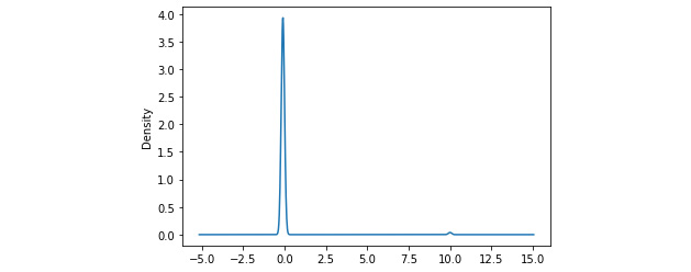
Figure 2.5 – Density plot of z-scores
We see a sharp spike in the density around 0, which indicates that most of the data points have a z-score around 0. Also, notice the very small blip around 10; these are the small number of outlier points that have high z-scores.
Now, all we have to do is filter out those rows that have a z-score of more than 2 or less than -2. We want to assign a label of 1 (predicted anomalies) to these rows, and 0 (predicted normal) to the others:
def map_z_to_label(z):
    if z > 2 or z < -2:
      return 1
    return 0
data_resampled["Predicted_Label"] = data_resampled["Z"].apply(map_z_to_label)
Now we have the actual and predicted labels for each row, we can evaluate the performance of our model using the confusion matrix (described earlier in Chapter 1, On Cybersecurity and Machine Learning). Fortunately, the scikit-learn package in Python provides a very convenient built-in method that allows us to compute the matrix, and another package called seaborn allows us to quickly plot it. The code is illustrated in the following snippet:
from sklearn.metrics import confusion_matrix
from matplotlib import pyplot as plt
import seaborn as sns
confusion = confusion_matrix(data_resampled["Label"],
                data_resampled["Predicted_Label"])
plt.figure(figsize = (10,8))
sns.heatmap(confusion, annot = True, fmt = 'd', cmap="YlGnBu")
This will produce a confusion matrix as shown:
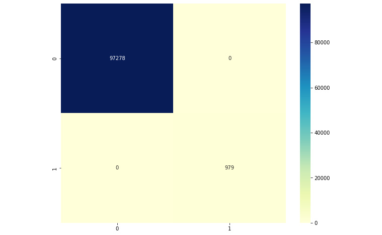
Figure 2.6 – Confusion matrix
Observe the confusion matrix carefully, and compare it with the skeleton confusion matrix from Chapter 1, On Cybersecurity and Machine Learning. We can see that our model is able to perform very well; all of the data points have been classified correctly. We have only true positives and negatives, and no false positives or false negatives.
Elliptic envelope
Elliptic envelope is an algorithm to detect anomalies in Gaussian data. At a high level, the algorithm models the data as a high-dimensional Gaussian distribution. The goal is to construct an ellipse covering most of the data—points falling outside the ellipse are anomalies or outliers. Statistical methods such as covariance matrices of features are used to estimate the size and shape of the ellipse.
The concept of elliptic envelope is easier to visualize in a two-dimensional space. A very idealized representation is shown in Figure 2.7. The points colored blue are within the boundary of the ellipse and hence considered normal or benign. Points in red fall outside, and hence are anomalies:
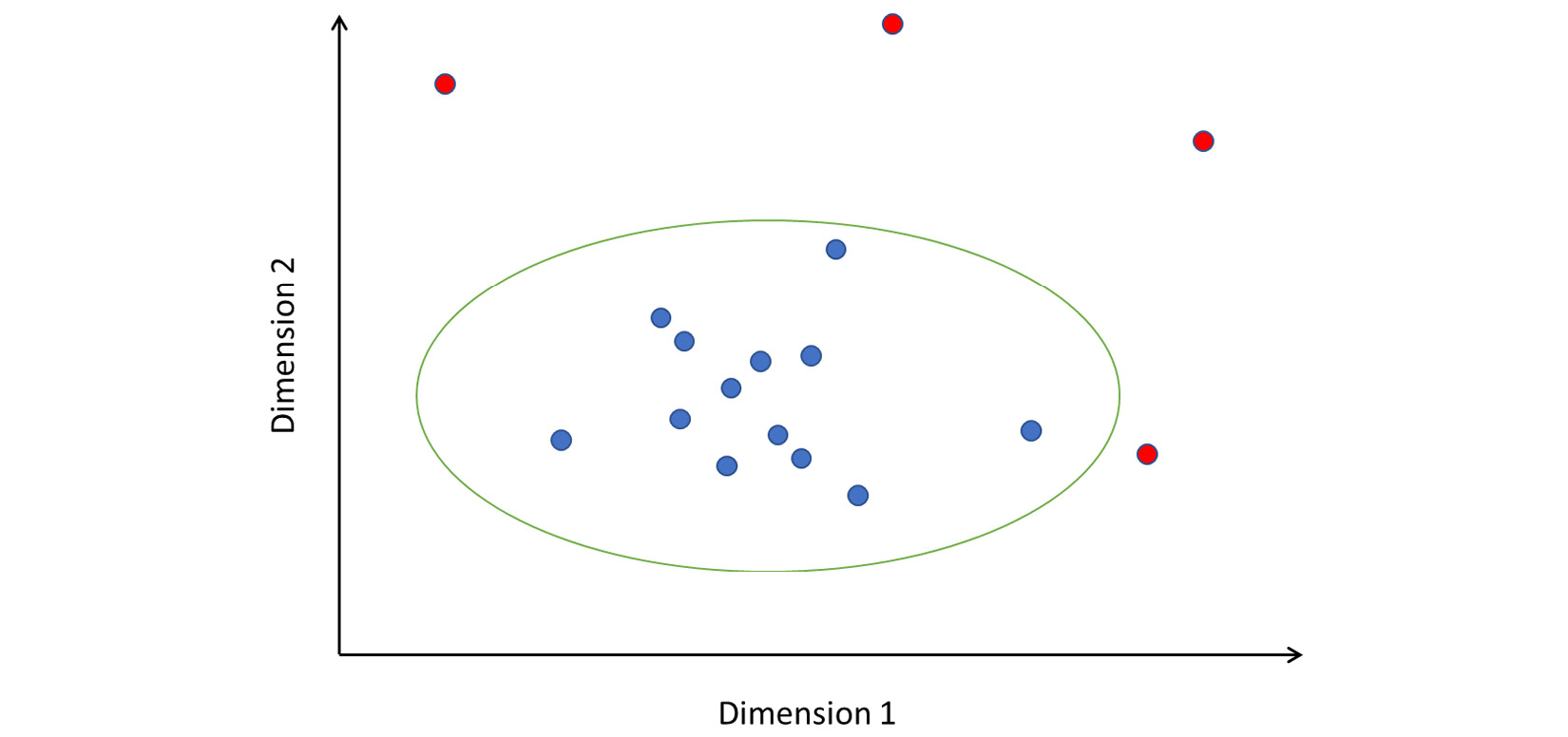
Figure 2.7 – How elliptic envelope detects anomalies
Note that the axes are labeled Dimension 1 and Dimension 2. These dimensions can be features you have extracted from your data; or, in the case of high-dimensional data, they might represent principal component features.
Implementing elliptic envelope as an anomaly detector in Python is straightforward. We will use the resampled data (consisting of only normal and teardrop data points) and drop the categorical features, as before:
from sklearn.covariance import EllipticEnvelope
actual_labels = data4["Label"]
X = data4.drop(["Label", "target",
                "protocol_type", "service",
                "flag"], axis=1)
clf = EllipticEnvelope(contamination=.1,random_state=0)
clf.fit(X)
predicted_labels = clf.predict(X)
The implementation of the algorithm is such that it produces -1 if a point is outside the ellipse, and 1 if it is within. To be consistent with our ground truth labeling, we will reassign -1 to 1 and 1 to 0:
predicted_labels_rescored =
[1 if pred == -1 else 0 for pred in predicted_labels]
Plot the confusion matrix as described previously. The result should be something like this:

Figure 2.8 – Confusion matrix for elliptic envelope
Note that this model has significant false positives and negatives. While the number may appear small, recall that our data had very few examples of the positive class (labeled 1) to begin with. The confusion matrix tells us that there were 931 false negatives and only 48 true positives. This indicates that the model has extremely low precision and is unable to isolate anomalies properly.
Local outlier factor
Local outlier factor (also known as LOF) is a density-based anomaly detection algorithm. It examines points in the local neighborhood of a point to detect whether that point is anomalous. While other algorithms consider a point with respect to the global data distribution, LOF considers only the local neighborhood and determines whether the point fits in. This is particularly useful to identify hidden outliers, which may be part of a cluster of points that is not an anomaly globally. Look at Figure 2.9, for instance:
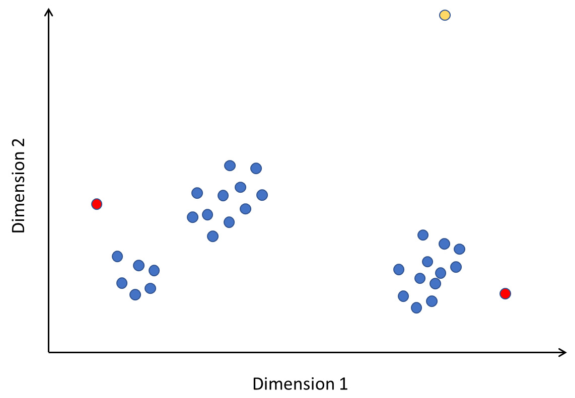
Figure 2.9 – Local outliers
In this figure, the yellow point is clearly an outlier. The points marked in red are not really outliers if you consider the entirety of the data. However, observe the neighborhood of the points; they are far away and stand apart from the local clusters they are in. Therefore, they are anomalies local to the area. LOF can detect such local anomalies in addition to global ones.
In brief, the algorithm works as follows. For every point P, we do the following:
- Compute the distances from P to every other point in the data. This distance can be computed using a metric called Manhattan distance. If (x1, y1) and (x2, y2) are two distinct points, the Manhattan distance between them is |x1 – x2| + |y1 – y2|. This can be generalized to multiple dimensions.
- Based on the distance, calculate the K closest points. This is the neighborhood of point P.
- Calculate the local reachability density, which is nothing but the inverse of the average distance between P and the K closest points. The local reachability density measures how close the neighborhood points are to P. A smaller value of density indicates that P is far away from its neighbors.
- Finally, calculate the LOF. This is the sum of distances from P to the neighboring points weighted by the sum of densities of the neighborhood points.
- Based on the LOF, we can determine whether P represents an anomaly in the data or not.
A high LOF value indicates that P is far from its neighbors and the neighbors have high densities (that is, they are close to their neighbors). This means that P is a local outlier in its neighborhood.
A low LOF value indicates that either P is far from the neighbors or that neighbors possibly have low densities themselves. This means that it is not an outlier in the neighborhood.
Note that the performance of our model here depends on the selection of K, the number of neighbors to form the neighborhood. If we set K to be too high, we would basically be looking for outliers at the global dataset level. This would lead to false positives because points that are in a cluster (so not locally anomalous) far away from the high-density regions would also be classified as anomalies. On the other hand, if we set K to be very small, our neighborhood would be very sparse and we would be looking for anomalies with respect to very small regions of points, which would also lead to misclassification.
We can try this out in Python using the built-in off-the-shelf implementation. We will use the same data and features that we used before:
from sklearn.neighbors import LocalOutlierFactor
actual_labels = data["Label"]
X = data.drop(["Label", "target",
                "protocol_type", "service",
                "flag"], axis=1)
k = 5
clf = LocalOutlierFactor(n_neighbors=k, contamination=.1)
predicted_labels = clf.fit_predict(X)
After rescoring the predicted labels for consistency as described before, we can plot the confusion matrix. You should see something like this:

Figure 2.10 – Confusion matrix for LOF with K = 5
Clearly, the model has an extremely high number of false negatives. We can examine how the performance changes by changing the value of K. Note that we first picked a very small value. If we rerun the same code with K = 250, we get the following confusion matrix:
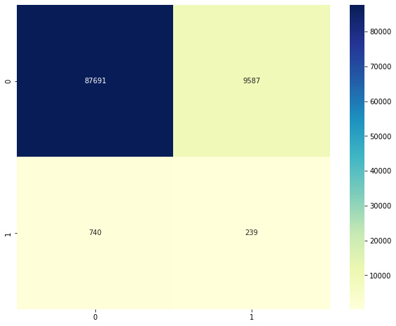
Figure 2.11 – Confusion matrix for LOF with K = 250
This second model is slightly better than the first. To find the best K value, we can try doing this over all possible values of K, and observe how our metrics change. We will vary K from 100 to 10,000, and for each iteration, we will calculate the accuracy, precision, and recall. We can then plot the trends in metrics with increasing K to check which one shows the best performance.
The complete code listing for this is shown next. First, we define empty lists that will hold our measurements (accuracy, precision, and recall) for each value of K that we test. We then fit an LOF model and compute the confusion matrix. Recall the definition of a confusion matrix from Chapter 1, On Cybersecurity and Machine Learning, and note which entries of the matrix define the true positives, false positives, and false negatives.
Using the matrix, we compute accuracy, precision, and recall, and record them in the arrays. Note the calculation of the precision and recall; we deviate from the formula slightly by adding 1 to the denominator. Why do we do this? In extreme cases, we will have zero true or false positives, and we do not want the denominator to be 0 in order to avoid a division-by-zero error:
from sklearn.neighbors import LocalOutlierFactor
actual_labels = data4["Label"]
X = data4.drop(["Label", "target","protocol_type", "service","flag"], axis=1)
all_accuracies = []
all_precision = []
all_recall = []
all_k = []
total_num_examples = len(X)
start_k = 100
end_k = 3000
for k in range(start_k, end_k,100):
  print("Checking for k = {}".format(k))
  # Fit a model
  clf = LocalOutlierFactor(n_neighbors=k, contamination=.1)
  predicted_labels = clf.fit_predict(X)
  predicted_labels_rescored = [1 if pred == -1 else 0 for pred in predicted_labels]
  confusion = confusion_matrix(actual_labels, predicted_labels_rescored)
  # Calculate metrics
  accuracy = 100 * (confusion[0][0] + confusion[1][1]) / total_num_examples
  precision = 100 * (confusion[1][1])/(confusion[1][1] + confusion[1][0] + 1)
  recall = 100 * (confusion[1][1])/(confusion[1][1] + confusion[0][1] + 1)
  # Record metrics
  all_k.append(k)
  all_accuracies.append(accuracy)
  all_precision.append(precision)
  all_recall.append(recall)
Once complete, we can plot the three series to show how the value of K affects the metrics. We can do this using matplotlib, as follows:
plt.plot(all_k, all_accuracies, color='green', label = 'Accuracy')
plt.plot(all_k, all_precision, color='blue', label = 'precision')
plt.plot(all_k, all_recall, color='red', label = 'Recall')
plt.show()
This is what the output looks like:
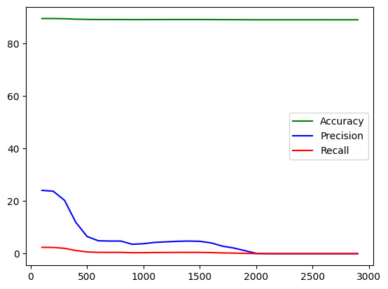
Figure 2.12 – Accuracy, precision, and recall trends with K
We see that while accuracy and recall have remained more or less similar, the value of precision shows a declining trend as we increase K.
This completes our discussion of statistical measures and methods for anomaly detection and their application to intrusion detection. In the next section, we will look at a few advanced unsupervised methods for doing the same.
Machine learning algorithms for intrusion detection
This section will cover ML methods such as clustering, autoencoders, SVM, and isolation forests, which can be used for anomaly detection.
Density-based scan (DBSCAN)
In the previous chapter where we introduced unsupervised ML (UML), we studied the concept of clustering via the K-Means clustering algorithm. However, recall that K is a hyperparameter that has to be set manually; there is no good way to know the ideal number of clusters in advance. DBSCAN is a density-based clustering algorithm that does not need a pre-specified number of clusters.
DBSCAN hinges on two parameters: the minimum number of points required to call a group of points a cluster and ξ (which specifies the minimum distance between two points to call them neighbors). Internally, the algorithm classifies every data point as being from one of the following three categories:
- Core points are those that have at least the minimum number of points in the neighborhood defined by a circle of radius ξ
- Border points, which are not core points, but in the neighborhood area or cluster of a core point described previously
- An anomaly point, which is neither a core point nor reachable from one (that is, not a border point either)
In a nutshell, the process works as follows:
- Set the values for the parameters, the minimum number of points, and ξ.
- Choose a starting point (say, A) at random, and find all points at a distance of ξ or less from this point.
- If the number of points meets the threshold for the minimum number of points, then A is a core point, and a cluster can form around it. All the points at a distance of ξ or less are border points and are added to the cluster centered on A.
- Repeat these steps for each point. If a point (say, B) added to a cluster also turns out to be a core point, we first form its own cluster and then merge it with the original cluster around A.
Thus, DBSCAN is able to identify high-density regions in the feature space and group points into clusters. A point that does not fall within a cluster is determined to be anomalous or an outlier. DBSCAN offers two powerful advantages over the K-Means clustering discussed earlier:
- We do not need to specify the number of clusters. Oftentimes, when analyzing data, and especially in unsupervised settings, we may not be aware of the number of classes in the data. We, therefore, do not know what the number of clusters should be for anomaly detection. DBSCAN eliminates this problem and forms clusters appropriately based on density.
- DBSCAN is able to find clusters that have arbitrary shapes. Because it is based on the density of regions around the core points, the shape of the clusters need not be circular. K-Means clustering, on the other hand, cannot detect overlapping or arbitrary-shaped clusters.
As an example of the arbitrary shape clusters that DBSCAN forms, consider the following figure. The color of the points represents the ground-truth labels of the classes they belong to. If K-Means is used, circularly shaped clusters are formed that do not separate the two classes. On the other hand, if we use DBSCAN, it is able to properly identify clusters based on density and separate the two classes in a much better manner:
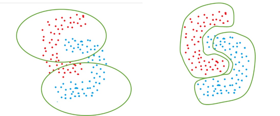
Figure 2.13 – How K-Means (left) and DBSCAN (right) would perform for irregularly shaped clusters
The Python implementation of DBSCAN is as follows:
from sklearn.neighbors import DBSCAN
actual_labels = data4["Label"]
X = data4.drop(["Label", "target","protocol_type", "service","flag"], axis=1)
epsilon = 0.2
minimum_samples = 5
clf = DBSCAN( eps = epsilon,  min_samples = minimum_samples)
predicted_labels = clf.fit_predict(X)
After rescoring the labels, we can plot the confusion matrix. You should see something like this:

Figure 2.14 – Confusion matrix for DBSCAN
This presents an interesting confusion matrix. We see that all of the outliers are being detected—but along with it, a large number of inliers are also being wrongly classified as outliers. This is a classic case of low precision and high recall.
We can experiment with how this model performs as we vary its two parameters. For example, if we run the same block of code with minimum_samples = 1000 and epsilon = 0.8, we will get the following confusion matrix:

Figure 2.15 – Confusion matrix for DBSCAN
This model is worse than the previous one and is an extreme case of low precision and high recall. Everything is predicted to be an outlier.
What happens if you set epsilon to a high value—say, 35? You end up with the following confusion matrix:

Figure 2.16 – Confusion matrix for improved DBSCAN
Somewhat better than before! You can experiment with other values of the parameters to find out what works best.
One-class SVM
Support vector machine (SVM) is an algorithm widely used for classification tasks. One-class SVM (OC-SVM) is the version used for anomaly detection. However, before we turn to OC-SVM, it would be helpful to have a primer into what SVM is and how it actually works.
Support vector machines
The fundamental goal of SVM is to calculate the optimal decision boundary between two classes, also known as the separating hyperplane. Data points are classified into a category depending on which side of the hyperplane or decision boundary they fall on.
For example, if we consider points in two dimensions, the orange and yellow lines as shown in the following figure are possible hyperplanes. Note that the visualization here is straightforward because we have only two dimensions. For 3D data, the decision boundary will be a plane. For n-dimensional data, the decision boundary will be an n-1-dimensional hyperplane:

Figure 2.17 – OC-SVM
We can see that in Figure 2.17, both the orange and yellow lines are possible hyperplanes. But how does the SVM choose the best hyperplane? It evaluates all possible hyperplanes for the following criteria:
- How well does this hyperplane separate the two classes?
- What is the smallest distance between data points (on either side) and the hyperplane?
Ideally, we want a hyperplane that best separates the two classes and has the largest distance to the data points in either class.
In some cases, points may not be linearly separable. SVM employs the kernel trick; using a kernel function, the points are projected to a higher-dimension space. Because of the complex transformations, points that are not linearly separable in their original low-dimensional space may become separable in a higher-dimensional space. Figure 2.18 (drawn from https://sebastianraschka.com/faq/docs/select_svm_kernels.html) shows an example of a kernel transformation. In the original two-dimensional space, the classes are not linearly separable by a hyperplane. However, when projected into three dimensions, they become linearly separable. The hyperplane calculated in three dimensions is mapped back to the two-dimensional space in order to make predictions:

Figure 2.18 – Kernel transformations
SVMs are effective in high-dimensional feature spaces and are also memory efficient since they use a small number of points for training.
The OC-SVM algorithm
Now that we have a sufficient background into what SVM is and how it works, let us discuss OC-SVM and how it can be used for anomaly detection.
OC-SVM has its foundations in the concepts of Support Vector Data Description (also known as SVDD). While SVM takes a planar approach, the goal in SVDD is to build a hypersphere enclosing the data points. Note that as this is anomaly detection, we have no labels. We construct the hypersphere and optimize it to be as small as possible. The hypothesis behind this is that outliers will be removed from the regular points, and will hence fall outside the spherical boundary.
For every point, we calculate the distance to the center of the sphere. If the distance is less than the radius, the point falls inside the sphere and is benign. If it is greater, the point falls outside the sphere and is hence classified as an anomaly.
The OC-SVM algorithm can be implemented in Python as follows:
from sklearn import svm
actual_labels = data4["Label"]
X = data4.drop(["Label", "target","protocol_type", "service","flag"], axis=1)
clf = svm.OneClassSVM(kernel="rbf")
clf.fit(X)
predicted_labels = clf.predict(X)
Plotting the confusion matrix, this is what we see:

Figure 2.19 – Confusion matrix for OC-SVM
Okay—this seems to be an improvement. While our true positives have decreased, so have our false positives—and by a lot.
Isolation forest
In order to understand what an isolation forest is, it is necessary to have an overview of decision trees and random forests.
Decision trees
A decision tree is an ML algorithm that creates a hierarchy of rules in order to classify a data point. The leaf nodes of a tree represent the labels for classification. All internal nodes (non-leaf) represent rules. For every possible result of the rule, a different child is defined. Rules are such that outputs are generally binary in nature. For continuous features, the rule compares the feature with some value. For example, in our fraud detection decision tree, Amount > 10,000 is a rule that has outputs as 1 (yes) or 0 (no). In the case of categorical variables, there is no ordering, and so a greater-than or less-than comparison is meaningless. Rules for categorical features check for membership in sets. For example, if there is a rule involving the day of the week, it can check whether the transaction fell on a weekend using the Day € {Sat, Sun} rule.
The tree defines the set of rules to be used for classification; we start at the root node and traverse the tree depending on the output of our rules.
A random forest is a collection of multiple decision trees, each trained on a different subset of data and hence having a different structure and different rules. While making a prediction for a data point, we run the rules in each tree independently and choose the predicted label by a majority vote.
The isolation forest algorithm
Now that we have set a fair bit of background on random forests, let us turn to isolation forests. An isolation forest is an unsupervised anomaly detection algorithm. It is based on the underlying definition of anomalies; anomalies are rare occurrences and deviate significantly from normal data points. Because of this, if we process the data in a tree-like structure (similar to what we do for decision trees), the non-anomalous points will require more and more rules (which means traversing more deeply into the tree) to be classified, as they are all similar to each other. Anomalies can be detected based on the path length a data point takes from the root of the tree.
First, we construct a set of isolation trees similar to decision trees, as follows:
- Perform a random sampling over the data to obtain a subset to be used for training an isolation tree.
- Select a feature from the set of features available.
- Select a random threshold for the feature (if it is continuous), or a random membership test (if it is categorical).
- Based on the rule created in step 3, data points will be assigned to either the left branch or the right branch of the tree.
- Repeat steps 2-4 recursively until each data point is isolated (in a leaf node by itself).
After the isolation trees have been constructed, we have a trained isolation forest. In order to run inferencing, we use an ensemble approach to examine the path length required to isolate a particular point. Points that can be isolated with the fewest number of rules (that is, closer to the root node) are more likely to be anomalies. If we have n training data points, the anomaly score for a point x is calculated as follows:
s(x, n) = 2 − E(h(x)) _ c(n)
Here, h(x) represents the path length (number of edges of the tree traversed until the point x is isolated). E(h(x)), therefore, represents the expected value or mean of all the path lengths across multiple trees in the isolation forest. The constant c(n) is the average path length of an unsuccessful search in a binary search tree; we use it to normalize the expected value of h(x). It is dependent on the number of training examples and can be calculated using the harmonic number H(n) as follows:
c(n) = 2H(n − 1) − 2(n − 1) / n
The value of s(x, n) is used to determine whether the point x is anomalous or not. Higher values closer to 1 indicate that the points are anomalies, and smaller values indicate that they are normal.
The scikit-learn package provides us with an efficient implementation for an isolation forest so that we don’t have to do any of the hard work ourselves. We simply fit a model and use it to make predictions. For simplicity of our analysis, let us use only the continuous-valued variables, and ignore the categorical string variables for now.
First, we will use the original DataFrame we constructed and select the columns of interest to us. Note that we must record the labels in a list beforehand since labels cannot be used during model training. We then fit an isolation forest model on our features and use it to make predictions:
from sklearn.ensemble import IsolationForest
actual_labels = data["Label"]
X = data.drop(["Label", "target","protocol_type", "service","flag"], axis=1)
clf = IsolationForest(random_state=0).fit(X)
predicted_labels = clf.predict(X)
The predict function here calculates the anomaly score and returns a prediction based on that score. A prediction of -1 indicates that the example is determined to be anomalous, and that of 1 indicates that it is not. Recall that our actual labels are in the form of 0 and 1, not -1 and 1. For an apples-to-apples comparison, we will recode the predicted labels, replacing 1 with 0 and -1 with 1:
predicted_labels_rescored =
[1 if pred == -1 else 0 for pred in predicted_labels]
Now, we can plot a confusion matrix using the actual and predicted labels, in the same way that we did before. On doing so, you should end up with the following plot:

Figure 2.20 – Confusion matrix for isolation forest
We see that while this model predicts the majority of benign classes correctly, it also has a significant chunk of false positives and negatives.
Autoencoders
Autoencoders (AEs) are deep neural networks (DNNs) that can be used for anomaly detection. As this is not an introductory book, we expect you to have some background and a preliminary understanding of deep learning (DL) and how neural networks work. As a refresher, we will present some basic concepts here. This is not meant to be an exhaustive tutorial on neural networks.
A primer on neural networks
Let us now go through a few basics of neural networks, how they are formed, and how they work.
Neural networks – structure
The fundamental building block of a neural network is a neuron. This is a computational unit that takes in multiple numeric inputs and applies a mathematical transformation on it to produce an output. Each input to a neuron has a weight associated with it. The neuron first calculates a weighted sum of the inputs and then applies an activation function that transforms this sum into an output. Weights represent the parameters of our neural network; training a model means essentially finding the optimum values of the weights such that the classification error is reduced.
A sample neuron is depicted in Figure 2.21. It can be generalized to a neuron with any number of inputs, each having its own weight. Here, σ represents the activation function. This determines how the weighted sum of inputs is transformed into an output:

Figure 2.21 – Basic structure of a neuron
A group of neurons together form a layer of neurons, and multiple such layers connected together form a neural network. The more the number of layers, the deeper the network is said to be. Input data (in the form of features) is fed to the first layer. In the simplest form of neural networks, every neuron in a layer is connected to every neuron in the next layer; this is known as a fully connected neural network (FCNN).
The final layer is the output layer. In the case of binary classification, the output layer has only one neuron with a sigmoid activation function. The output of this neuron indicates the probability of the data point belonging to the positive class. If it is a multiclass classification problem, then the final layer contains as many neurons as the number of classes, each with a softmax activation. The outputs are normalized such that each one represents the probability of the input belonging to a particular class, and they all add up to 1. All of the layers other than the input and output are not visible from the outside; they are known as hidden layers.
Putting all of this together, Figure 2.22 shows the structure of a neural network:

Figure 2.22 – A neural network
Let us take a quick look at four commonly used activation functions: sigmoid, tanh, rectified linear unit (ReLU), and softmax.
Neural networks – activation functions
The sigmoid function normalizes a real-valued input into a value between 0 and 1. It is defined as follows:
f(z) = 1 _ 1+ e −z
If we plot the function, we end up with a graph as follows:

Figure 2.23 – sigmoid activation
As we can see, any number is squashed into a range from 0 to 1, which makes the sigmoid function an ideal candidate for outputting probabilities.
The hyperbolic tangent function, also known as the tanh function, is defined as follows:
tanh(z) = 2 _ 1+ e −2z − 1
Plotting this function, we see a graph as follows:

Figure 2.24 – tanh activation
This looks very similar to the sigmoid graph, but note the subtle differences: here, the output of the function ranges from -1 to 1 instead of 0 to 1. Negative numbers get mapped to negative values, and positive numbers get mapped to positive values. As the function is centered on 0 (as opposed to sigmoid centered on 0.5), it provides better mathematical conveniences. Generally, we use tanh as an activation function for hidden layers and sigmoid for the output layer.
The ReLU activation function is defined as follows:
ReLU (z) = {max(0, z); z ≥ 0 0 ; z < 0
Basically, the output is the same as the input if it is positive; else, it is 0. The graph looks like this:

Figure 2.25 – ReLU activation
The softmax function can be considered to be a normalized version of sigmoid. While sigmoid operates on a single input, softmax will operate on a vector of inputs and produce a vector as output. Each value in the output vector will be between 0 and 1. If the vector Z is defined as [z1, z2, z3 ….. zK], softmax is defined as follows:
σ (z i) = e z i _ ∑ j=1 j=K e z j
Basically, we first calculate the sigmoid values for each element in the vector and form a sigmoid vector. Then, we normalize this vector by the total so that each element is between 0 and 1 and they add up to 1 (representing probabilities). This can be better illustrated with a concrete example.
Say that our output vector Z has three elements: Z = [2, 0.9, 0.1]. Then, we have z1= 2, z2 = 0.9, and z3 = 0.1; we therefore have e z 1 = e 2 = 7.3890, e z 2 = e 0.9 = 2.4596, and e z 3 = e 0.1 = 1.1051. Applying the previous equation, the denominator is the sum of these three, which is 10.9537. Now, the output vector is simply the ratio of each element to this summed-up value—that is, [ 7.3890 _ 10.9537, 2.4596 _ 10.9537, 1.1051 _ 10.9537], which comes out to be [0.6745, 0.2245, 0.1008]. These values represent probabilities of the input belonging to each class respectively (they do not add up to 1 because of rounding errors).
Now that we have an understanding of activation functions, let us discuss how a neural network actually functions from end to end.
Neural networks – operation
When a data point is passed through a neural network, it undergoes a series of transformations through the neurons in each layer. This phase is known as the forward pass. As the weights are assigned randomly at the beginning, the output at each neuron is different. The final layer will give us the probability of the point belonging to a particular class; we compare this with our ground-truth labels (0 or 1) and calculate a loss. Just as mean squared error (MSE) in linear regression is a loss function indicating the error, classification in neural networks uses binary cross-entropy and categorical cross-entropy as the loss for binary and multiclass classification respectively.
Once the loss is calculated, it is passed back through the network in a process called backpropagation. Every weight parameter is adjusted based on how it contributes to the loss. This phase is known as the backward pass. The same gradient descent that we learned before applies here too! Once all the data points have been passed through the network once, we say that a training epoch has completed. We continue this process multiple times, with the weights changing and the loss (hopefully) decreasing in each iteration. The training can be stopped either after a fixed number of epochs or if we reach a point where the loss changes only minimally.
Autoencoders – a special class of neural networks
While a standard neural network aims to learn a decision function that will predict the class of an input data point (that is, classification), the goal of autoencoders is to simply reconstruct a data point. While training autoencoders, both the input and output that we provide to the autoencoder are the same, which is the feature vector of the data point. The rationale behind it is that because we train only on normal (non-anomalous) data, the neural network will learn how to reconstruct it. On the anomalous data, however, we expect it to fail; remember—the model was never exposed to these data points, and we expect them to be significantly different than the normal ones. As a result, the error in reconstruction is expected to be high for anomalous data points, and we use this error as a metric to determine whether a point is an anomaly.
An autoencoder has two components: an encoder and a decoder. The encoder takes in input data and reduces it to a lower-dimensional space. The output of the encoder can be considered to be a dimensionally reduced version of the input. This output is fed to the decoder, which then projects it into a higher-dimensional subspace (similar to that of the input).
Here is what an autoencoder looks like:

Figure 2.26 – Autoencoder
We will implement this in Python using a framework known as keras. This is a library built on top of the TensorFlow framework that allows us to easily and intuitively design, build, and customize neural network models.
First, we import the necessary libraries and divide our data into training and test sets. Note that while we train the autoencoder only on normal or non-anomalous data, in the real world it is impossible to have a dataset that is 100% clean; there will be some contamination involved. To simulate this, we train on both the normal and abnormal examples, with the abnormal ones being very small in proportion. The stratify parameter ensures that the training and testing data has a similar distribution of labels so as to avoid an imbalanced dataset. The code is illustrated in the following snippet:
from tensorflow import keras
from tensorflow.keras import layers
from sklearn.model_selection import train_test_split
X_train, X_test, y_train, y_test = train_test_split(X,
                        actual_labels,
                        test_size=0.33,
                        random_state=42,
                        stratify=actual_labels)
X_train = np.array(X_train, dtype=np.float)
X_test = np.array(X_test, dtype=np.float)
We then build our neural network using keras. For each layer, we specify the number of neurons. If our feature vector has N dimensions, the input layer would have to have N layers. Similarly, because this is an autoencoder, the output layer would also have N layers.
We first build the encoder part. We start with an input layer, followed by three fully connected layers of decreasing dimensions. To each layer, we feed the output of the previous layer as input:
input = keras.Input(shape=(X_train.shape[1],))
encoded = layers.Dense(30, activation='relu')(input)
encoded = layers.Dense(16, activation='relu')(encoded)
encoded = layers.Dense(8, activation='relu')(encoded)
Now, we work our way back to higher dimensions and build the decoder part:
decoded = layers.Dense(16, activation='relu')(encoded)
decoded = layers.Dense(30, activation='relu')(decoded)
decoded = layers.Dense(X_train.shape[1], activation='sigmoid')(encoded)
Now, we put it all together to form the autoencoder:
autoencoder = keras.Model(input, decoded)
We also define the encoder and decoder models separately, to make predictions later:
# Encoder
encoder = keras.Model(input_img, encoded)
# Decoder
encoded_input = keras.Input(shape=(encoding_dim,))
decoder_layer = autoencoder.layers[-1]
decoder = keras.Model(encoded_input,decoder_layer(encoded_input))
If we want to examine the structure of the autoencoder, we can compile it and print out a summary of the model:
autoencoder.compile(optimizer='adam', loss='mse')
autoencoder.summary()
You should see which layers are in the network and what their dimensions are as well:

Figure 2.27 – Autoencoder model summary
Finally, we actually train the model. Normally, we provide features and the ground truth for training, but in this case, our input and output are the same:
autoencoder.fit(X_train, X_train,
                epochs=10,
                batch_size=256,
                shuffle=True)
Let’s see the result:

Figure 2.28 – Training phase
Now that the model is fit, we can use it to make predictions. To evaluate this model, we will predict the output for each input data point, and calculate the reconstruction error:
from sklearn.metrics import mean_squared_error
predicted = autoencoder.predict(X_test)
errors = [np.linalg.norm(X_test[idx] - k[idx]) for idx in range(X_test.shape[0])]
Now, we need to set a threshold for the reconstruction error, after which we will call data points as anomalies. The easiest way to do this is to leverage the distribution of the reconstruction error. Here, we say that when the error is above the 99th percentile, it represents an anomaly:
thresh = np.percentile(errors, 99)
predicted_labels = [1 if errors[idx] > thresh else 0 for idx in range(X_test.shape[0])]
When we generate the confusion matrix, we see something like this:

Figure 2.29 – Confusion matrix for Autoencoder
As we can see, this model is a very poor one; there are absolutely no true positives here.
Summary
This chapter delved into the details of anomaly detection. We began by learning what anomalies are and what their occurrence can indicate. Using NSL-KDD, a benchmark dataset, we first explored statistical methods used to detect anomalies, such as the z-score, elliptical envelope, LOF, and DBSCAN. Then, we examined ML methods for the same task, including isolation forests, OC-SVM, and deep autoencoders.
Using the techniques introduced in this chapter, you will be able to examine a dataset and detect anomalous data points. Identifying anomalies is key in many security problems such as intrusion and fraud detection.
In the next chapter, we will learn about malware, and how to detect it using state-of-the-art models known as transformers.