


 Download code from GitHub
Almost all the recipes in this chapter involve different interactive UI controls. Although there are different kinds of interactive UI controls, the basic way to work with them, as well as to have scripted actions respond to user actions, is all based on the same idea: events triggering the execution of object method functions.
Then, for fun, and as an example of a very different kind of UI, the final recipe will demonstrate how to add sophisticated, real-time communication for the relative positions of objects in the scene to your game (that is, radar!).
The UI can be used for three main purposes:
- To display static (unchanging) values, such as the name or logo image of the game, or word labels such as Level and Score, that tell us what the numbers next to them indicate (the recipes for these can be found in Chapter 1, Displaying Data with Core UI Elements).
- To display values that change due to our scripts, such as timers, scores, or the distance from our Player character to some other object (an example of this is the radar recipe at the end of this chapter, Displaying a radar to indicate the relative locations of objects).
- Interactive UI controls, whose purpose is to allow the player to communicate with the game scripts via their mouse or touchscreen. These are the ones we'll look at in detail in this chapter.
The core concept of working with Unity interactive UI controls is to register an object's public method so that we're informed when a particular event occurs. For example, we can add a UI dropdown to a scene named DropDown1, and then write a MyScript script class containing a NewValueAction() public method to perform an action. However, nothing will happen until we do two things:
- We need to add an instance of the script class as a component of a GameObject in the scene (which we'll name go1 for our example – although we can also add the script instance to the UI GameObject itself if we wish to).
- In the UI dropdown's properties, we need to register the GameObject's public method of its script component so that it responds to the On Value Changed event messages:
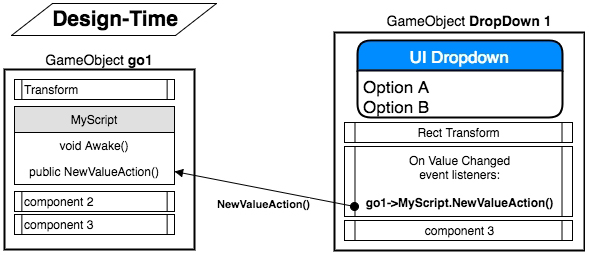
The NewValueAction() public method of the MyScript script will typically retrieve the value that's been selected by the user in the dropdown and do something with it – for example, confirm it to the user, change the music volume, or change the game's difficulty. The NewValueAction() method will be invoked (executed) each time the go1 GameObject receives the NewValueAction() message. In the properties of DropDown1, we need to register go1's scripted component – that is, MyScript's NewValueAction() public method – as an event listener for On Value Changed events. We need to do all this at design time (that is, in the Unity Editor before running the scene):
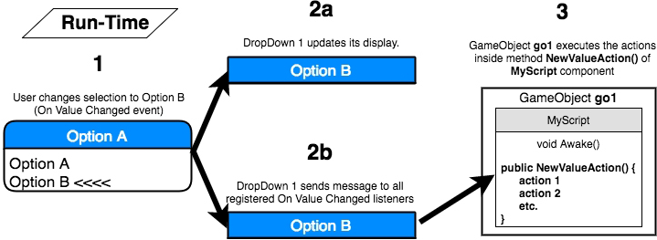
At runtime (when the scene in the application is running), we must do the following:
- If the user changes the value in the drop-down menu of the DropDown1 GameObject (step 1 in the preceding diagram), this will generate an On Value Changed event.
- DropDown1 will update its display on the screen to show the user the newly-selected value (step 2a). It will also send messages to all the GameObject components registered as listeners to On Value Changed events (step 2b).
- In our example, this will lead to the NewValueAction() method in the go1 GameObject's scripted component being executed (step 3).
Registering public object methods is a very common way to handle events such as user interaction or web communications, which may occur in different orders, may never occur, or may happen several times in a short period. Several software design patterns describe ways to work with these event setups, such as the Observer pattern and the Publisher-Subscriber design pattern.
Core GameObjects, components, and concepts related to interactive Unity UI development include the following:
- Visual UI controls: The visible UI controls themselves include Button, Image, Text, and Toggle. These are the UI controls the user sees on the screen and uses their mouse/touchscreen to interact with. These are the GameObjects that maintain a list of object methods that have subscribed to user-interaction events.
- Interaction UI controls: These are non-visible components that are added to GameObjects; examples include Input Field and Toggle Group.
- Panel: UI objects can be grouped together (logically and physically) with UI Panels. Panels can play several roles, including providing a GameObject parent in the Hierarchy window for a related group of controls. They can provide a visual background image to graphically relate controls on the screen, and they can also have scripted resize and drag interactions added if desired.
- Sibling Depth: The bottom-to-top display order (what appears on the top of what) for a UI element is determined initially by its place in the sequence in the Hierarchy window. At design time, this can be manually set by dragging GameObjects into the desired sequence in the Hierarchy window. At runtime, we can send messages to the Rect Transforms of GameObjects to dynamically change their Hierarchy position (and therefore, the display order) as the game or user interaction demands. This is illustrated in the Organizing images inside panels and changing panel depths via buttons recipe.
Often, a UI element exists with most of the components that you may need for something in your game, but you may need to adapt it somehow. An example of this can be seen in the Displaying a countdown timer graphically with a UI Slider recipe, which makes a UI Slider non-interactive, instead of using it to display a red-green progress bar for the status of a countdown timer.
In this chapter, we will cover the following recipes:
- Creating UI Buttons to move between scenes
- Animating UI Button properties on mouseover
- Organizing image panels and changing panel depths via UI Buttons
- Displaying the value of an interactive UI Slider
- Displaying a countdown timer graphically with a UI Slider
- Setting custom mouse cursors for 2D and 3D GameObjects
- Setting custom mouse cursors for UI controls
- Interactive text entry with Input Field
- Toggles and radio buttons via toggle groups
- Creating text and image icon UI Drop-down menus
- Displaying a radar to indicate the relative locations of objects
Technical requirements
For this chapter, you will need Unity 2021.1 or later, plus one of the following:
- Microsoft Windows 10 (64-bit)/GPU: DX10, DX11, and DX12-capable
- macOS Sierra 10.12.6+/GPU Metal-capable Intel or AMD
- Linux Ubuntu 16.04, Ubuntu 18.04, and CentOS 7/GPU: OpenGL 3.2+ or Vulkan-capable, NVIDIA or AMD
For each chapter, there is a folder that contains the asset files you will need in this book's GitHub repository at https://github.com/PacktPublishing/Unity-2021-Cookbook-Fourth-Edition.
Creating UI Buttons to move between scenes
The majority of games include a menu screen that displays messages to the user about instructions, high scores, the level they have reached so far, and so on. Unity provides UI Buttons to offer users a simple way to indicate their choices:
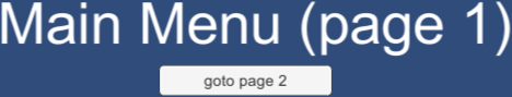
In this recipe, we'll create a very simple game consisting of two screens, each with a button to load the other one, as illustrated in the preceding screenshot.
How to do it...
To create a button-navigable multi-scene game, follow these steps:
- Create a new Unity 2D project.
- Save the current (empty) scene in a new folder called _Scenes, naming the scene page1.
- Add a UI Text object positioned at the top center of the scene containing large white text that says Main Menu (page 1).
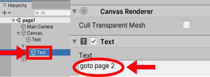
- Add a UI Button to the scene positioned in the middle-center of the screen. In the Hierarchy window, click on the show children triangle to display the Text child of this GameObject button. Select the Text GameObject and, in the Inspector window for the Text property of the Text (Script) component, enter the text goto page 2:
- Create a second scene, named page2, with UI Text = Instructions (page 2) and a UI Button with the goto page 1 text. You can either repeat the preceding steps or you can duplicate the page1 scene file, naming the duplicate page2, and then edit the UI Text and UI Button Text appropriately.
- Add both scenes to the build, which is the set of scenes that will end up in the actual application built by Unity. To add scene1 to the build, open the page1 scene and go to File | Build Settings.... Then, click on the Add Open Scenes button so that the page1 scene becomes the first scene in the list of Scenes in the build. Now open page2 and repeat this process so that both scenes have been added to the build.
- Ensure you have the page1 scene open.
- Create a C# script class called SceneLoader, in a new folder called _Scripts that contains the following code. Then, add an instance of the SceneLoader as a scripted component to Main Camera:
using UnityEngine;
using UnityEngine.SceneManagement;

public class SceneLoader : MonoBehaviour {
    public void LoadOnClick(int sceneIndex) {
        SceneManager.LoadScene(sceneIndex);
    }
}
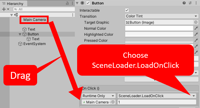
- Select Button in the Hierarchy window and click on the plus (+) button at the bottom of the Button (Script) component, in the Inspector window, to create a new OnClick event handler for this button (that is, an action to perform when the button is clicked).
- Drag Main Camera from the Hierarchy window over the Object slot immediately below the menu that says Runtime Only. This means that when the button receives an OnClick event, we can call a public method from a scripted object inside Main Camera.
- Select the LoadOnClick method from the SceneLoader drop-down list (initially showing No Function). Type 1 (the index of the scene we want to be loaded when this button is clicked) in the text box, below the method's drop-down menu. This integer, 1, will be passed to the method when the button receives an OnClick event message, as shown here:
- Save the current scene (page1).
- Open page2 and follow the same steps to make the page2 button load page1. That is, add an instance of the SceneLoader script class to Main Camera and then add an OnClick event action to the button that calls LoadOnClick and passes an integer of 0 so that page1 is loaded.
- Save page2.
- When you run the page1 scene, you will be presented with your Main Menu text and a button that, when clicked, makes the game load the page2 scene. On page2, you'll have a button to take you back to page1.
How it works...
In this recipe, you created two scenes and added both of these scenes to the game's build. You added a UI Button and some UI Text to each scene.
When a UI Button is added to the Hierarchy window, a child UI Text object is also automatically created, and the content of the Text property of this UI Text child is the text that the user sees on the button.
Here, you created a script class and added an instance as a component to Main Camera. In fact, it didn't really matter where this script instance was added, so long as it was in one of the GameObjects of the scene. This is necessary since the OnClick event action of a button can only execute a method (function) of a component in a GameObject in the scene.
For the buttons for each scene, you added a new OnClick event action that invokes (executes) the LoadOnClick method of the SceneLoader scripted component in Main Camera. This method inputs the integer index of the scene in the project's Build settings so that the button on the page1 scene gives integer 1 as the scene to be loaded and the button for page2 gives integer 0.
There's more...
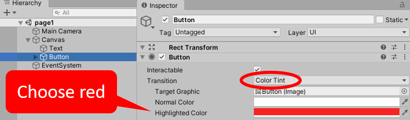
There are several ways in which we can visually inform the user that the button is interactive when they move their mouse over it. The simplest way is to add a Color Tint that will appear when the mouse is over the button – this is the default Transition. With Button selected in the Hierarchy window, choose a tint color (for example, red), for the Highlighted Color property of the Button (Script) component in the Inspector window:
Another form of visual Transition to inform the user of an active button is Sprite Swap. In this case, the properties of different images for Targeted/Highlighted/Pressed/Disabled are available in the Inspector window. The default Targeted Graphic is the built-in Unity Button (Image) – this is the gray rounded rectangle default when GameObject buttons are created. Dragging in a very different-looking image for the Highlighted sprite is an effective alternative to setting a Color Tint:

We have provided a rainbow.png image with the project for this recipe that can be used for the Button mouseover's Highlighted sprite. You will need to ensure this image asset has its Texture Type set to Sprite (2D and UI) in the Inspector window. The preceding screenshot shows the button with this rainbow background image.
Animating button properties on mouseover
At the end of the previous recipe, we illustrated two ways to visually communicate buttons to users. The animation of button properties can be a highly effective and visually interesting way to reinforce to the user that the item their mouse is currently over is a clickable, active button. One common animation effect is for a button to become larger when the mouse is over it, and then shrink back to its original size when the mouse is moved away. Animation effects are achieved by choosing the Animation option for the Transition property of a Button GameObject, and by creating an animation controller with triggers for the Normal, Highlighted, Pressed, and Disabled states.
How to do it...
To animate a button for enlargement when the mouse is over it (the Highlighted state), do the following:
- Create a new Unity 2D project.
- Create a UI Button.
- In the Inspector Button (Script) component, set the Transition property to Animation.
- Click the Auto Generate Animation button (just below the Disabled Trigger property) for the Button (Script) component:
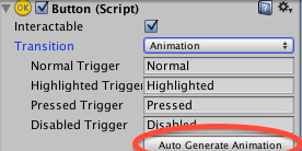
- Save the new controller (in a new folder called Animations), naming it button-animation-controller.
- Ensure that the Button GameObject is selected in the Hierarchy window. Open Window | Animation | Animation. In the Animation window, select the Highlighted clip from the drop-down menu:
- In the Animation window, click on the red record circle button, and then click on the Add Property button, choosing to record changes to the Rect Transform | Scale property.
- Two keyframes will have been created. Delete the second one at 1:00 (since we don't want a "bouncing" button):
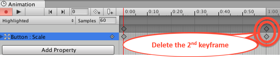
- Select the frame at 1:00 by clicking one of the diamonds (both turn blue when selected), and then press the Backspace/Delete key.
- Select the first keyframe at 0:00 (the only one now!). In the Inspector window, set the X and Y scale properties of the Rect Transform component to (1.2, 1.2).
- Click on the red record circle button for the second time to stop recording the animation changes.
- Save and run your scene. You will see that the button smoothly animates and becomes larger when the mouse is over it, and then smoothly returns to its original size when the mouse has moved away.
How it works...
In this recipe, you created a button and set its Transition mode to Animation. This makes Unity require an Animation Controller with four states: Normal, Highlighted, Pressed, and Disabled. You then made Unity automatically create an Animation Controller with these four states.
Then, you edited the animation for the Highlighted (mouseover) state, deleting the second keyframe, and making the only keyframe a version of the button that's larger so that its scale is 1.2.
When the mouse is not hovering over the button, it's unchanged, and the Normal state settings are used. When the mouse moves over the button, Animation Controller smoothly in-betweens the settings of the button to become those of its Highlighted state (that is, bigger). When the mouse is moved away from the button, Animation Controller smoothly in-betweens the settings of the button to become those of its Normal state (that is, its original size).
The following web pages offer video and web-based tutorials on UI animations:
- The Unity documentation about UI Button Animations: https://docs.unity3d.com/Packages/com.unity.ugui@1.0/manual/UIAnimationIntegration.html.
- Ray Wenderlich's great tutorial (part 2), including the available button animations, is available at http://www.raywenderlich.com/79031/unity-new-gui-tutorial-part-2.
Organizing image panels and changing panel depths via buttons
UI Panels are provided by Unity to allow UI controls to be grouped and moved together, and also to visually group elements with an image background (if desired). The sibling's depth is what determines which UI elements will appear above or below others. We can see the sibling depth explicitly in the Hierarchy window, since the top-to-bottom sequence of UI GameObjects in the Hierarchy window sets the sibling depth. So, the first item has a depth of 1, the second has a depth of 2, and so on. The UI GameObjects with larger sibling depths (further down the hierarchy, which means they're drawn later) appear above the UI GameObjects with lower sibling depths:
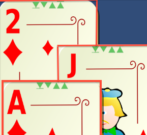
In this recipe, we'll create three UI Panels, each showing a different playing card image. We'll also add four triangle arrangement buttons to change the display order (move to bottom, move to top, move up one, and move down one).
Getting ready
For this recipe, we have prepared the images that you need in a folder named Images in the 02_03 folder.
How to do it...
To create the UI Panels whose layering can be changed by clicking buttons, follow these steps:
- Create a new Unity 2D project.
- Create a new UI Panel GameObject named Panel-jack-diamonds. Do the following to this panel:
- For the Image (Script) component, drag the jack_of_diamonds playing card image asset file from the Project window into the Source Image property. Select the Color property and increase the Alpha value to 255 (so that this background image of the panel is no longer partly transparent).
- For the Rect Transform property, position it in the middle-center part of the screen and set its Width to 200 and its Height to 300.
- Create a UI Button named Button-move-to-front. In the Hierarchy window, make this button a child of Panel-jack-diamonds. Delete the Text child GameObject of this button (since we'll use an icon to indicate what this button does).
- With the Button-move-to-front GameObject selected in the Hierarchy window, do the following in the Inspector window:
- In Rect Transform, position the button at the top-center of the player card image so that it can be seen at the top of the playing card. Size the image to Width = 16 and Height = 16. Move the icon image down slightly, by setting Pos Y = -5 (to ensure we can see the horizontal bar above the triangle).
- For the Source Image property of the Image (Script) component, select the arrangement triangle icon image; that is, icon_move_to_front.
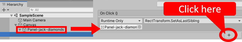
- Add an OnClick event handler by clicking on the plus (+) sign at the bottom of the Button (Script) component.
- Drag Panel-jack-diamonds from the Hierarchy window over to the Object slot (immediately below the menu saying Runtime Only).
- Select the RectTransform.SetAsLastSibling method from the drop-down function list (initially showing No Function):
- Repeat step 2 to create a second panel named Panel-2-diamonds with its own move-to-front button and a Source Image of 2_of_diamonds. Move and position this new panel slightly to the right of Panel-jack-diamonds, allowing both move-to-front buttons to be seen.
- Save your scene and run the game. You will be able to click the move-to-front button on either of the cards to move that card's panel to the front. If you run the game with the Game window not maximized, you'll actually see the panels changing the order in the list of the children of Canvas in the Hierarchy window.
How it works...
In this recipe, you created two UI Panels, each of which contains a background image of a playing card and a UI Button whose action will make its parent panel move to the front. You set the Alpha (transparency) setting of the background image's Color to 255 (no transparency).
You then added an OnClick event action to the button of each UI Panel. This action sends a SetAsLastSibling message to the button's Panel parent. When the OnClick message is received, the clicked Panel is moved to the bottom (end) of the sequence of GameObjects in Canvas, so this Panel is drawn last from the Canvas objects. This means that it appears visually in front of all the other GameObjects.
The button's action illustrates how the OnClick function does not have to be calling a public method of a scripted component of an object, but it can be sending a message to one of the non-scripted components of the targeted GameObject. In this recipe, we send the SetAsLastSibling message to the Rect Transform component of the panel where the button is located.
There's more...
There are some details you don't want to miss.
Moving up or down by just one position, using scripted methods
While Rect Transform offers SetAsLastSibling (move to front) and SetAsFirstSibling (move to back), and even SetSiblingIndex (if we knew exactly what position in the sequence to type in), there isn't a built-in way to make an element move up or down just one position in the sequence of GameObjects in the Hierarchy window. However, we can write two straightforward methods in C# to do this, and we can add buttons to call these methods, providing full control of the top-to-bottom arrangement of the UI controls on the screen. To implement four buttons (move-to-front/move-to-back/up one/down one), do the following:
- Create a C# script class called ArrangeActions containing the following code and add an instance as a scripted component to each of your UI Panels:
using UnityEngine;

public class ArrangeActions : MonoBehaviour {
   private RectTransform panelRectTransform;

   void Awake() {
         panelRectTransform = GetComponent<RectTransform>();
   }

   public void MoveDownOne() {
         int currentSiblingIndex = panelRectTransform.GetSiblingIndex();
         panelRectTransform.SetSiblingIndex( currentSiblingIndex - 1 );
   }

   public void MoveUpOne() {
         int currentSiblingIndex = panelRectTransform.GetSiblingIndex();
         panelRectTransform.SetSiblingIndex( currentSiblingIndex + 1 );
   }
}
- Add a second UI Button to each card panel, this time using the arrangement triangle icon image called icon_move_to_back, and set the OnClick event function for these buttons to SetAsFirstSibling.
- Add two more UI Buttons to each card panel with the up and down triangle icon images; that is, icon_up_one and icon_down_one. Set the OnClick event handler function for the down-one buttons to call the MoveDownOne() method, and set the functions for the up-one buttons to call the MoveUpOne() method.
- Copy one of the UI Panels to create a third card (this time showing the Ace of diamonds). Arrange the three cards so that you can see all four buttons for at least two of the cards, even when those cards are at the bottom (see the screenshot at the beginning of this recipe).
- Save the scene and run your game. You will now have full control over how to layer the three card UI Panels.
if(currentsiblingIndex > 0)
        panelRectTransform.SetSiblingIndex( currentSiblingIndex - 1 );
Displaying the value of an interactive UI Slider
A UI Slider is a graphical tool that allows a user to set the numerical value of an object:

This recipe illustrates how to create an interactive UI Slider and execute a C# method each time the user changes the UI Slider value.
How to do it...
To create a UI Slider and display its value on the screen, follow these steps:
- Create new Unity 2D project.
- Add a UI Text GameObject to the scene with a Font size of 30 and placeholder text, such as Slider value here (this text will be replaced with the slider value when the scene starts). Set Horizontal- and Vertical- Overflow to Overflow.
- In the Hierarchy window, add a UI Slider GameObject to the scene by going to GameObject | UI | Slider.
- In the Inspector window, modify the settings for the position of the UI Slider GameObject's Rect Transform to the top-middle part of the screen.
- In the Inspector window, modify the settings of Position for the UI Text's Rect Transform so that they're just below the slider (top, middle, then Pos Y = -30).
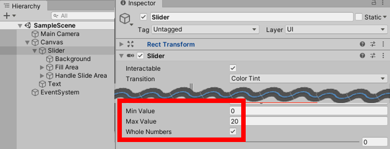
- In the Inspector window, set the UI Slider's Min Value to 0 and Max Value to 20. Then, check the Whole Numbers checkbox:
- Create a C# script class called SliderValueToText containing the following code and add an instance as a scripted component to the Text GameObject:
using UnityEngine;
using UnityEngine.UI;

public class SliderValueToText : MonoBehaviour {
   public Slider sliderUI;
   private Text textSliderValue;

   void Awake() {
         textSliderValue = GetComponent<Text>();
   }

   void Start() {
         ShowSliderValue();
   }

   public void ShowSliderValue () {
         string sliderMessage = "Slider value = " + sliderUI.value;
         textSliderValue.text = sliderMessage;
   }
}
- Ensure that the Text GameObject is selected in the Hierarchy window. Then, in the Inspector window, drag the Slider GameObject into the public Slider UI variable slot for the Slider Value To Text (Script) scripted component:
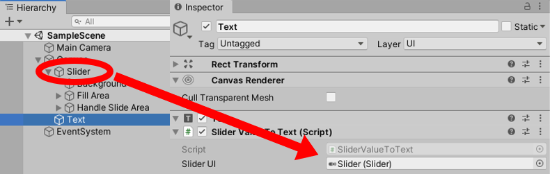
- Ensure that the Slider GameObject is selected in the Hierarchy window. Then, in the Inspector window, drag the Text GameObject from the Hierarchy window over to the Object slot (immediately below the menu that says Runtime Only, as shown in the following screenshot:
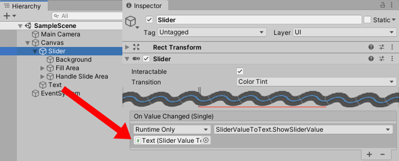
You have now told Unity which object a message should be sent to each time the slider is changed.
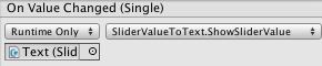
- From the drop-down menu, select SliderValueToText and the ShowSliderValue method, as shown in the following screenshot. This means that each time the slider is updated, the ShowSliderValue() method, in the scripted object in the Text GameObject, will be executed:
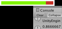
- When you run scene, you will see a UI Slider. Below it, you will see a text message in the form Slider value = <n>.
- Each time UI Slider is moved, the text value that's shown will be (almost) instantly updated. The values should range from 0 (the leftmost of the slider) to 20 (the rightmost of the slider).
How it works...
In this recipe, you created a UI Slider GameObject and set it to contain whole numbers in the range of 0 to 20.
You also added an instance of the SliderValueToText C# script class to the UI Text GameObject.
The Awake() method caches references to the Text component in the textSliderValue variable.
The Start() method invokes the ShowSliderValue() method so that the display is correct when the scene begins (that is, the initial slider value is displayed).
The ShowSliderValue() method gets the value of the slider and then updates the text that's displayed to be a message in the form of Slider value = <n>.
Finally, you added the ShowSliderValue() method of the SliderValueToText scripted component to the Slider GameObject's list of On Value Changed event listeners. So, each time the slider value changes, it sends a message to call the ShowSliderValue() method so that the new value is updated on the screen.
Displaying a countdown timer graphically with a UI Slider
There are many cases where we wish to inform the player of how much time is left in a game or how much longer an element will take to download; for example, a loading progress bar, the time or health remaining compared to the starting maximum, or how much the player has filled up their water bottle from the fountain of youth. In this recipe, we'll illustrate how to remove the interactive "handle" of a UI Slider, and then change the size and color of its components to provide us with an easy to use, general-purpose progress/proportion bar:
In this recipe, we'll use our modified UI Slider to graphically present to the user how much time remains on a countdown timer.
Getting ready
For this recipe, we have prepared the script and images that you need in the _Scripts and 02_05 folders, respectively.
How to do it...
To create a digital countdown timer with a graphical display, follow these steps:
- Create a new Unity 2D project.
- Import the CountdownTimer script and the red_square and green_square images into this project.
- Add a UI Text GameObject to the scene with a Font size of 30 and placeholder text such as a UI Slider value (this text will be replaced with the slider value when the scene starts). Set Horizontal- and Vertical- Overflow to Overflow.
- In the Hierarchy window, add a Slider GameObject to the scene by going to GameObject | UI | Slider.
- In the Inspector window, modify the settings for the position of the Slider GameObject's Rect Transform to the top-middle part of the screen.
- Ensure that the Slider GameObject is selected in the Hierarchy window.
- Deactivate the Handle Slide Area child GameObject (by unchecking it).
- You'll see the "drag circle" disappear in the Game window (the user will not be dragging the slider since we want this slider to be display-only):
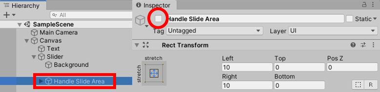
- Select the Background child and do the following:
- Drag the red_square image into the Source Image property of the Image (Script) component in the Inspector window.
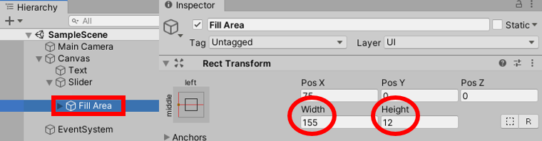
- Select the Fill child of the Fill Area child and do the following:
- Drag the green_square image into the Source Image property of the Image (Script) component in the Inspector window.
- Select the Fill Area child and do the following:
- In the Rect Transform component, use the Anchors preset position of left-middle.
- Set Width to 155 and Height to 12:
- Create a C# script class called SliderTimerDisplay that contains the following code and add an instance as a scripted component to the Slider GameObject:
using UnityEngine;
using UnityEngine.UI;

[RequireComponent(typeof(CountdownTimer))]
public class SliderTimerDisplay : MonoBehaviour {
   private CountdownTimer countdownTimer;
   private Slider sliderUI;

   void Awake() {
         countdownTimer = GetComponent<CountdownTimer>();
         sliderUI = GetComponent<Slider>();
   }

   void Start() {
         SetupSlider();
         countdownTimer.ResetTimer( 30 );
   }

   void Update () {
         sliderUI.value = countdownTimer.GetProportionTimeRemaining();
         print (countdownTimer.GetProportionTimeRemaining());
   }

   private void SetupSlider () {
         sliderUI.minValue = 0;
         sliderUI.maxValue = 1;
         sliderUI.wholeNumbers = false;
   }
}
Run your game. You will see the slider move with each second, revealing more and more of the red background to indicate the time remaining.
How it works...
In this recipe, you hid the Handle Slide Area child so that the UI Slider is for display only, which means it cannot be interacted with by the user. The Background color of the UI Slider was set to red so that, as the counter goes down, more and more red is revealed, warning the user that the time is running out.
The Fill property of the UI Slider was set to green so that the proportion remaining is displayed in green – the more green that's displayed, the greater the value of the slider/timer.
An instance of the provided CountdownTimer script class was automatically added as a component to the UI Slider via [RequireComponent(...)].
The Awake() method caches references to the CountdownTimer and Slider components in the countdownTimer and sliderUI variables.
The Start() method calls the SetupSlider() method and then resets the countdown timer so that it starts counting down from 30 seconds.
The SetupSlider() method sets up this slider for float (decimal) values between 0.0 and 1.0.
In each frame, the Update() method sets the slider value to the float that's returned by calling the GetProportionRemaining() method from the running timer. At runtime, Unity adjusts the proportion of red/green that's displayed in the UI Slider so that it matches the slider's value.
Setting custom mouse cursors for 2D and 3D GameObjects
Cursor icons are often used to indicate the nature of the interactions that can be done with the mouse. Zooming, for instance, might be illustrated by a magnifying glass; shooting, on the other hand, is usually represented by a stylized target:

The preceding screenshot shows an example of the Unity logo with the cursor represented as a stylized target. In this recipe, we will learn how to implement custom mouse cursor icons to better illustrate your gameplay – or just to escape the Windows, macOS, and Linux default UI.
Getting ready
For this recipe, we have prepared the folders that you'll need in the 02_06 folder.
How to do it...
To make a custom cursor appear when the mouse is over a GameObject, follow these steps:
- Create a new Unity 2D project.
- Import the provided folder, called Images. Select the unity_logo image in the Project window. Then, in the Inspector window, change Texture Type to Sprite (2D and UI). This is because we'll use this image for a 2D Sprite GameObject and it requires this Texture Type (it won't work with the Default type).
- Go to 2D Object | Sprite to add the necessary GameObject to the scene. Name this New Sprite, if this wasn't the default name when it was created:
- In the Inspector window, set the Sprite property of the Sprite Renderer component to the unity_logo image. In the GameObject's Transform component, set the scaling to (3,3,3) and, if necessary, reposition Sprite so that it's centered in the Game window when the scene runs.
- Go to Physics 2D | Box Collider to create a Box Collider and add it to the Sprite GameObject. This is needed for this GameObject to receive OnMouseEnter and OnMouseExit event messages.
- Import the provided folder called IconsCursors. Select all three images in the Project window and, in the Inspector window, change Texture Type to Cursor. This will allow us to use these images as mouse cursors without any errors occurring.
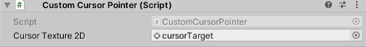
- Create a C# script class called CustomCursorPointer containing the following code and add an instance as a scripted component to the New Sprite GameObject:
using UnityEngine;

public class CustomCursorPointer : MonoBehaviour {
  public Texture2D cursorTexture2D;
  private CursorMode cursorMode = CursorMode.Auto;
  private Vector2 hotSpot = Vector2.zero;

  public void OnMouseEnter() {
    SetCustomCursor(cursorTexture2D);
  }

  public void OnMouseExit() {
    SetCustomCursor(null);
  }

  private void SetCustomCursor(Texture2D curText){
    Cursor.SetCursor(curText, hotSpot, cursorMode);
  }
}
- With the New Sprite item selected in the Hierarchy window, drag the CursorTarget image into the public Cursor Texture 2D variable slot in the Inspector window for the Custom Cursor Pointer (Script) component:
- Save and run the current scene. When the mouse pointer moves over the Unity logo sprite, it will change to the custom CursorTarget image that you chose.
How it works...
In this recipe, you created a Sprite GameObject and assigned it the Unity logo image. You imported some cursor images and set their Texture Type to Cursor so that they can be used to change the image for the user's mouse pointer. You also added a Box Collider to the Sprite GameObject so that it would receive OnMouseEnter and OnMouseExit event messages.
Then, you created the CustomCursorPointer script class and added an instance object of this class to the Sprite GameObject. This script tells Unity to change the mouse pointer when an OnMouseEnter message is received; that is, when the user's mouse pointer moves over the part of the screen where the Unity logo's sprite image is being rendered. When an OnMouseExit event is received (the user's mouse pointer is no longer over the cube part of the screen), the system is told to go back to the operating system's default cursor. This event should be received within a few milliseconds of the user's mouse exiting from the collider.
Finally, you selected the CursorTarget image to be the custom mouse cursor image the user sees when the mouse is over the Unity logo image.
Setting custom mouse cursors for UI controls
The previous recipe demonstrated how to change the mouse pointer for 2D and 3D GameObjects receiving OnMouseEnter and OnMouseExit events. Unity UI controls do not receive OnMouseEnter and OnMouseExit events. Instead, UI controls can be made to respond to PointerEnter and PointerExit events if we add a special Event Trigger component to the UI GameObject:
In this recipe, we'll change the mouse pointer to a custom magnifying glass cursor when it moves over a UI Button GameObject.
Getting ready
For this recipe, we'll use the same asset files as we did for the previous recipe, as well as the CustomCursorPointer C# script class from that recipe, all of which can be found in the 02_07 folder.
How to do it...
To set a custom mouse pointer when the mouse moves over a UI control GameObject, do the following:
- Create a new Unity 2D project.
- Import the provided IconsCursors folder. Select all three images in the Project window and, in the Inspector window, change Texture Type to Cursor. This will allow us to use these images as mouse cursors without any errors occurring.
- Import the provided _Scripts folder containing the CustomCursorPointer C# script class.
- Add a UI Button GameObject to the scene, leaving this named Button.
- Add an instance of the CustomCursorPointer C# script class to the Button GameObject.
- With the Button GameObject selected in the Hierarchy window, drag the CursorZoom image into the public Cursor Texture 2D variable slot in the Inspector window for the Customer Cursor Pointer (Script) component.
- In the Inspector window, add an Event Trigger component to the Button GameObject by going to Add Component | Event | Event Trigger.
- Add a PointerEnter event to your Event Trigger component, click on the plus (+) button to add an event handler slot, and drag the Button GameObject into the Object slot.
- From the Function drop-down menu, choose CustomCursorPointer and then choose the OnMouseEnter method:
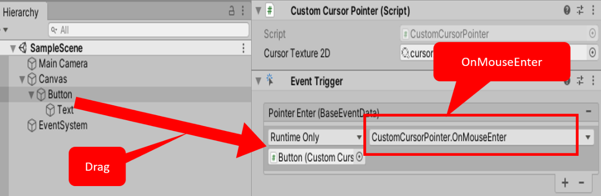
- Add a Pointer Exit event to your Event Trigger component, and make it call the OnMouseExit() method from CustomCursorPointer when this event is received.
- Save and run the current scene. When the mouse pointer moves over our UI Button, it will change to the custom CursorZoom image that you chose.
How it works...
In this recipe, you imported some cursor images and set their Texture Type to Cursor so that they could be used to change the image for the user's mouse pointer. You also created a UI Button GameObject and added to it an Event Trigger component.
You then added an instance of the CustomCursorPointer C# script class to the Button GameObject and selected the magnifying glass-style CursorZoom image.
After that, you created a PointerEnter event and linked it to invoke the OnMouseEnter method of the instance of the CustomCursorPointer script in the Button GameObject (which changes the mouse pointer image to the custom mouse cursor).
Finally, you created a PointerExit event and linked it to invoke the OnMouseExit method of the instance of the CustomCursorPointer C# script class to the Button GameObject (which resets the mouse cursor back to the system default).
Essentially, you have redirected PointerEnter/Exit events to invoke the OnMouseEnter/Exit methods of the CustomCursorPointer C# script class so that we can manage custom cursors for 2D, 3D, and UI GameObjects with the same scripting methods.
Interactive text entry with Input Field
While we often just wish to display non-interactive text messages to the user, there are times (such as name entry for high scores) where we want the user to be able to enter text or numbers into our game. Unity provides the UI Input Field component for this purpose. In this recipe, we'll create an Input Field that prompts the user to enter their name:

Having interactive text on the screen isn't of much use unless we can retrieve the text that's entered to be used in our game logic, and we may need to know each time the user changes the text's content and act accordingly. In this recipe, we'll add an event handler C# script that detects each time the user finished editing the text and updates an extra message onscreen, confirming the newly entered content.
How to do it...
To create an interactive text input box for the user, follow these steps:
- Create a new Unity 2D project.
- In the Inspector window, change the background of Main Camera to solid white.
- Add a UI Input Field to the scene. Position this at the top center of the screen.
- Add a UI Text GameObject to the scene, naming it Text-prompt. Position this to the left of Input Field. Change the Text property of this GameObject to Name:.
- Create a new UI Text GameObject named Text-display. Position this to the right of the Input Text control, and make its text red.
- Delete all of the content of the Text property of this new GameObject (so that, initially, the user won't see any text onscreen for this GameObject).
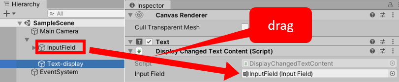
- Add an instance of the DisplayChangedTextContent C# script class to the Text-display GameObject:
using UnityEngine;
using UnityEngine.UI;

public class DisplayChangedTextContent : MonoBehaviour {
   public InputField inputField;
   private Text textDisplay;

   void Awake() {
         textDisplay = GetComponent<Text>();
   }

   public void DisplayNewValue () {
         textDisplay.text = "last entry = '" + inputField.text + "'";
   }
}
- With Text-display selected in the Hierarchy window, from the Project window, drag the InputField GameObject into the public Input Field variable of the Display Changed Content (Script) component:
- With Input Field selected in the Hierarchy window, add an End Edit (String) event to the list of event handlers for the Input Field (Script) component. Click on the plus (+) button to add an event handler slot and drag the Text-display GameObject into the Object slot.
- From the Function drop-down menu, choose DisplayChangedTextContent and then choose the DisplayNewValue method.
- Save and run the scene. Each time the user types in new text and then presses Tab or Enter, the End Edit event will fire, and you'll see a new content text message displayed in red on the screen.
How it works...
The core of interactive text input in Unity is the responsibility of the Input Field component. This needs a reference to a UI Text GameObject. To make it easier to see where the text can be typed, Text Input (similar to buttons) includes a default rounded rectangle image with a white background.
There are usually three Text GameObjects involved in user text input:
- The static prompt text, which, in our recipe, displays the text Name:.
- The faint placeholder text, reminding users where and what they should type.
- The editable text object (with the font and color settings) is actually displayed to the user, showing the characters as they type.
First, you created an InputField GameObject, which automatically provides two-child Text GameObjects, named Placeholder and Text. These represent the faint placeholder text and the editable text, which you renamed Text-input. You then added a third Text GameObject, Text-prompt, containing Name:.
The built-in scripting that is part of Input Field components does lots of work for us. At runtime, a Text-Input Input Caret GameObject is created, displaying the blinking vertical line to inform the user where their next letter will be typed. When there is no text content, the faint placeholder text will be displayed. As soon as any characters have been typed, the placeholder will be hidden and the characters typed will appear in black text. Then, if all the characters are deleted, the placeholder will appear again.
You then added a fourth Text GameObject called Text-display and made it red to tell the user what they last entered in Input Field. You created the DisplayChangedTextContent C# script class and added an instance as a component of the Text-display GameObject. You linked the InputField GameObject to the Input Field public variable of the scripted component (so that the script can access the text content entered by the user).
Finally, you registered an End Edit event handler of Input Field so that each time the user finished editing text (by pressing Enter), the DisplayNewValue() method of your DisplayChangedTextContent scripted object is invoked (executed), and the red text content of Text-display updated to tell the user what the newly edited text contained.
There's more...
Content Type of Input Field (Script) can be set (restricted) to several specific types of text input, including email addresses, integer or decimal numbers only, or password text (where an asterisk is displayed for each character that's entered). You can learn more about Input Fields by reading the Unity Manual page: https://docs.unity3d.com/Manual/script-InputField.html.
Toggles and radio buttons via toggle groups
Users make choices and, often, these choices have one of two options (for example, sound on or off), or sometimes one of several possibilities (for example, difficulty level as easy/medium/hard). Unity UI Toggles allows users to turn options on and off; when combined with toggle groups, they restrict choices to one of the groups of items. In this recipe, we'll explore the basic Toggle and a script to respond to a change in values:
Then, we'll extend the example to illustrate toggle groups and style these with round images to make them look more like traditional radio buttons. The preceding screenshot shows how the button's status changes are logged in the Console window when the scene is running.
Getting ready
For this recipe, we have prepared the images that you'll need in a folder named UI Demo Textures in the 02_09 folder.
How to do it...
To display an on/off UI Toggle to the user, follow these steps:
- Create a new Unity 2D project.
- In the Inspector window, change the Background color of Main Camera to white.
- Add a UI Toggle to the scene.
- For the Label child of the Toggle GameObject, set the Text property to First Class.
- Add an instance of the C# script class called ToggleChangeManager to the Toggle GameObject:
using UnityEngine;
using UnityEngine.UI;

public class ToggleChangeManager : MonoBehaviour {
   private Toggle toggle;

   void Awake () {
         toggle = GetComponent<Toggle>();
   }

   public void PrintNewToggleValue() {
         bool status = toggle.isOn;
         print ("toggle status = " + status);
   }
}
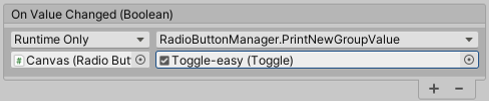
- With the Toggle GameObject selected, add an On Value Changed event to the list of event handlers for the Toggle (Script) component, click on the plus (+) button to add an event handler slot, and drag Toggle into the Object slot.
- From the Function drop-down menu, choose ToggleChangeManager and then choose the PrintNewToggleValue method.
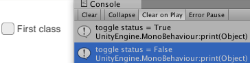
- Save and run the scene. Each time you check or uncheck the Toggle GameObject, the On Value Changed event will fire, and you'll see a new text message printed into the Console window by our script, stating the new Boolean true/false value of Toggle.
How it works...
When you create a Unity UI Toggle GameObject, it comes with several child GameObjects automatically – Background, Checkmark, and the text's Label. Unless we need to style the look of a Toggle in a special way, all we must do is simply edit the text's Label so that the user knows what option or feature this Toggle is going to turn on/off.
The Awake() method of the ToggleChangeManager C# class caches a reference to the Toggle component in the GameObject where the script instance is located. When the game is running, each time the user clicks on the Toggle component to change its value, an On Value Changed event is fired. Then, we register the PrintNewToggleValue() method, which is to be executed when such an event occurs. This method retrieves, and then prints out to the Console window, the new Boolean true/false value of Toggle.
There's more...
Unity UI Toggles are also the base components if we wish to implement a group of mutually exclusive options in the style of radio buttons. We need to group related radio buttons together (UI Toggles) to ensure that when one radio button turns on (is selected), all the other radio buttons in the group turn off (unselected).
We also need to change the visual look if we want to adhere to the usual style of radio buttons as circles, rather than the square UI Toggle default images:
To create a group of related toggles in the visual style of radio buttons, do the following to the project you just created:
- Import the UI Demo Textures folder into the project.
- Remove the C# script class's ToggleChangeManager component from the Toggle GameObject.
- Rename the Toggle GameObject Toggle-easy.
- Select the Canvas GameObject and, in the Inspector window, add a UI | Toggle Group component.
- With the Toggle-easy GameObject selected, in the Inspector window, drag the Canvas GameObject into the Toggle Group property of the Toggle (Script) component.
- Change the Label text to Easy and tag this GameObject with a new tag called Easy. Do this by selecting Add Tag from the Tag drop-down menu in the Inspector window, then typing in Easy, then selecting the GameObject again and setting its tag to Easy.
- Select the Background child GameObject of Toggle-easy and, in the Image (Script) component, drag the UIToggleBG image into the Source Image property (a circle outline).
- Ensure that the Is On property of the Toggle (Script) component is checked, and then select the Checkmark child GameObject of Toggle-easy. In the Image (Script) component, drag the UIToggleButton image into the Source Image property (a filled circle).
To make these toggles look more like radio buttons, the background of each is set to the circle outline image of UIToggleBG, and the checkmark (which displays the toggles that are on) is filled with the circle image called UIToggleButton.
- Duplicate the Toggle-easy GameObject, naming the copy Toggle-medium. Set its Rect Transform property's Pos Y to -25 (so that this copy is positioned below the easy option) and uncheck the Is On property of the Toggle (Script) component. Tag this copy with a new tag called Medium.
- Duplicate the Toggle-medium GameObject, naming the copy Toggle-hard. Set its Rect Transform property's Pos Y to -50 (so that this copy is positioned below the medium option). Tag this copy with a new tag called Hard.
- Add an instance of the RadioButtonManager C# script class to the Canvas GameObject:
using UnityEngine;
using System.Collections;
using UnityEngine.UI;

public class RadioButtonManager : MonoBehaviour {
  private string currentDifficulty = "Easy";

  public void PrintNewGroupValue(Toggle sender){
    // only take notice from Toggle just switched to On
    if(sender.isOn){
      currentDifficulty = sender.tag;
      print ("option changed to = " + currentDifficulty);
    }
  }
}
- Select the Toggle-easy GameObject in the Project window. Now, do the following:
- Since we based this on the First Class toggle, there is already an On Value Changed event for the list of event handlers for the Toggle (Script) component. Drag the Canvas GameObject in the target object slot (under the drop-down showing Runtime Only).
- From the Function drop-down menu, choose RadioButtonManager, and then choose the PrintNewGroupValue method.
- In the Toggle parameter slot, which is initially None (Toggle), drag the Toggle-easy GameObject. Your On Value Changed settings in the Inspector window should look as follows:
- Do the same for the Toggle-medium and Toggle-hard GameObjects so that each Toggle object calls the PrintNewGroupValue(...) method of a C# scripted component called RadioButtonManager in the Canvas GameObject, passing itself as a parameter.
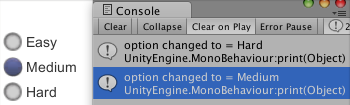
- Save and run the scene. Each time you check one of the three radio buttons, the On Value Changed event will fire, and you'll see a new text message printed into the Console window by our script, stating the tag of whichever Toggle (radio button) was just set to true (Is On).
By adding a Toggle Group component to Canvas, and having each Toggle GameObject link to it, the three radio buttons can tell Toggle Group when they have been selected. Then, the other members of the group are deselected. If you had several groups of radio buttons in the same scene, one strategy is to add the Toggle Group component to one of the toggles and have all the others link to that one.
Creating text and image icon UI Drop-down menus
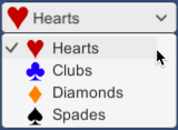
In the previous recipe, we created radio-style buttons with a toggle group to present the user with a choice of one of many options. Another way to offer a range of choices is with a drop-down menu. Unity provides the UI Dropdown control for such menus. In this recipe, we'll offer the user a drop-down choice for the suit of a deck of cards (hearts, clubs, diamonds, or spades):
Note that the UI Dropdown that's created by default includes a scrollable area, in case there isn't space for all the options. We'll learn how to remove such GameObjects and components to reduce complexity when such a feature is not required. Then, we'll learn how to add icon images with each menu option.
Getting ready
For this recipe, we have prepared the image that you need in a folder named Images in the 02_10 folder.
How to do it...
To create a UI Dropdown control GameObject, follow these steps:
- Create a new Unity 2D project.
- Add a UI Dropdown to the scene.
- In the Inspector window, for the Dropdown (Script) component, change the list of Options from Option A, Option B, and Option C to Hearts, Clubs, Diamonds, and Spades. You'll need to click the plus (+) button to add space for the fourth option; that is, Spades.
- Add an instance of the C# script class called DropdownManager to the Dropdown GameObject:
using UnityEngine;
using UnityEngine.UI;

public class DropdownManager : MonoBehaviour  {
    private Dropdown dropdown;

    private void Awake() {
        dropdown = GetComponent<Dropdown>();
    }

    public void PrintNewValue() {
        int currentValue = dropdown.value;
        print ("option changed to = " + currentValue);
   }
}
- With the Dropdown GameObject selected, add an On Value Changed event to the list of event handlers for the Dropdown (Script) component, click on the plus (+) button to add an event handler slot, and drag Dropdown into the Object slot.
- From the Function drop-down menu, choose DropdownManager and then choose the PrintNewValue method.
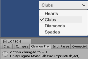
- Save and run the scene. Each time you change Dropdown, the On Value Changed event will fire, and you'll see a new text message being printed to the Console window by our script, stating the Integer index of the chosen Dropdown value (0 for the first item, 1 for the second item, and so on):
- Select the Template child GameObject of Dropdown in the Project window and, in its Rect Transform, reduce its height to 50. When you run the scene, you should see a scrollable area, since not all options fit within the template's height:
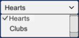
- Delete the Scrollbar child of the Template GameObject and remove the Scroll Rect (Script) component of it. When you run the scene now, you'll only see the first two options (Hearts and Clubs), with no way to access the other two options. When you are sure your template's height is sufficient for all its options, you can safely remove these scrollable options to simplify the GameObjects in your scene.
How it works...
When you create a Unity UI DropDown GameObject, it comes with several components and child GameObjects automatically – Label, Arrow, and Template (as well as ViewPort and Scrollbar, and so on). Dropdowns work by duplicating the Template GameObject for each of the options listed in the Dropdown (Script) component. Both the Text and Sprite image values can be given for each option. The properties of the Template GameObject are used to control the visual style and behavior of the dropdown's thousands of possible settings.
First, you replaced the default options (Option A, Option B, and so on) in the Dropdown (Script) component. You then created a C# script class called DropdownManager that, when attached to your Dropdown and having its PrintNewValue method registered for On Value Changed events, means that we can see the Integer index of the option each time the user changes their choice. Item index values start counting at zero (as with many computing items), so 0 for the first item, 1 for the second item, and so on.
Since the default Dropdown GameObject that was created includes a Scroll Rect (Script) component and a Scrollbar child GameObject, when you reduced the height of Template, you could still scroll through the options. You then removed these items so that your dropdown didn't have a scrolling feature anymore.
There's more...
There are some details you don't want to miss.
Adding images to a Dropdown control
There are two pairs of items Unity uses to manage how text and images are displayed:
- The Caption Text and Image GameObjects are used to control how the currently selected item for the dropdown is displayed – this is the part of the dropdown we always see, regardless of whether it is being interacted with.
- The Item Text and Image GameObjects are part of the Template GameObject, and they define how each option is displayed as a row when the Drop-down menu items are being displayed – the rows that are displayed when the user is actively working with the Dropdown GameObject.
So, we have to add an image in two places (the Caption and Template items), in order to get a dropdown working fully with image icons for each option.
To add a Sprite image to each Text item in the dropdown, do the following:
- Import the provided Images folder.
- In the Inspector window, for the Dropdown (Script) component, for each item in the Options list – Hearts, Clubs, Diamonds, and Spades – drag the associated Sprite image from the card_suits folder into the Project window (hearts.png for Hearts, and so on).
- Add a UI Image to the Project window and make this Image a child of the Dropdown GameObject.
- Drag the hearts.png image from the Project window into the Source Image property of Image (Script) for the Image GameObject. Set its size to 25 x 25 in Rect Transform and drag it over the letter H in Hearts in the Label GameObject.
- Move the Label GameObject to the right of the Hearts image.
- With Dropdown selected in the Project window, drag the Image GameObject into the Caption Image property of the Dropdown (Script) component.
- Enable the Template GameObject (usually, it is disabled).
- Duplicate the Image GameObject child of Dropdown and name the copy Item Image. Make this image a child of the Item Background and Item Checkmark GameObjects that are in Dropdown-Template-Content-Item (Item Image needs to appear below the white Item Background Image; otherwise, it will be covered by the background and not be visible).
- Since items in the dropdown are slightly smaller, resize Item Image to be 20 x 20 in its Rect Transform.
- Position Item Image over the letter O of Option A of Item Text, and then move Item Text to the right so that the icon and text are not on top of each other.
- With Dropdown selected in the Project window, drag the Item Image GameObject into the Item Image property of the Dropdown (Script) component:
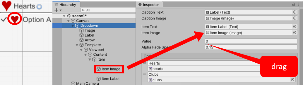
- Disable the Template GameObject and then run the scene to see your Dropdown with icon images for each menu option.
Displaying a radar to indicate the relative locations of objects
A radar displays the locations of other objects relative to the player, usually based on a circular display, where the center represents the player and each graphical blip indicates how far away and what relative direction objects are to the player. Sophisticated radar displays will display different categories of objects with different colored or shaped blip icons:
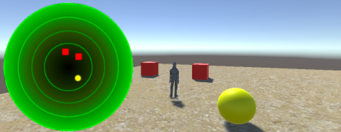
In the preceding screenshot, we can see two red square blips, indicating the relative position of the two red cube GameObjects tagged Cube near the player, and a yellow circle blip indicating the relative position of the yellow sphere GameObject tagged Sphere. The green circle radar background image gives the impression of an aircraft control tower radar or something similar.
Getting ready
For this recipe, we have prepared the images that you need in a folder named Images in 02_11.
How to do it...
To create a radar to show the relative positions of the objects, follow these steps:
- Create a new Unity 3D project with a textured Terrain. Download the Environment standard asset, which is part of the Standard Assets package contents, by going to Window | Asset Store | Search Online | Standard Assets.
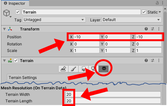
- Create a terrain by navigating to the Create | 3D Object | Terrain menu.
- Change the size of Terrain to 20 x 20 and position it at (-10, 0, -10) so that its center is at (0, 0, 0):
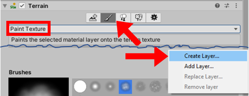
- Texture paint your Terrain with the SandAlbedo option, as shown in the following screenshot. You need to select the Paint Texture tool in the Terrain component, then click Edit Terrain Layers and select the Create Layers button. After that, you must select the SandAlbedo texture from the imported Environment assets:
- Import the provided folder; that is, Images.
- Create a 3D Cube GameObject at Position (2, 0.5, 2). Create a Cube tag and tag this GameObject with this new tag. Texture this GameObject with the yellow image called icon32_square_red by dragging the icon32_square_red image from the Project window over this GameObject in the Hierarchy window.
- Duplicate the cube GameObject and move it to Position (6, 0.5, 2).
- Create a 3D Sphere GameObject at Position (0, 0.5, 4). Create a tag called Sphere and tag this GameObject with this new tag. Texture this GameObject with the red image called icon32_square_yellow.
- Import the Characters standard asset package into your project.
- From the Standard Assets folder in the Project window, drag the ThirdPersonController prefab into the scene and position it at (0, 1, 0).
- Tag this ThirdPersonController GameObject as Player (selecting this built-in tag means that the camera we'll add will automatically track this player object, without us having to manually set the target for the camera).
- Remove the Main Camera GameObject.
- Import the Cameras standard asset package into your project.
- From the Standard Assets folder in the Project window, drag the Multi-PurposeCameraRig prefab into the scene.
- In the Hierarchy window, add a UI RawImage GameObject to the scene named RawImage-radar.
- Ensure that the RawImage-radar GameObject is selected in the Hierarchy window. From the Images folder in the Project window, drag the radarBackground image into the Raw Image (Script) public property's Texture.
- In Rect Transform, position RawImage-radar at the top left using the Anchor Presets item. Then, set both Width and Height to 200 pixels.
- Create a new UI RawImage named RawImage-blip. Assign it the yellowCircleBlackBorder texture image file from the Project window. Tag this GameObject as Blip. In the Project window, create a new empty prefab asset file named blip-sphere and drag the RawImage-blip GameObject into this prefab to store all its properties.
- Set the texture of the RawImage-blip GameObject to redSquareBlackBorder from the Project window. Tag this GameObject as Blip. In the Project window, create a new empty prefab asset file named blip-cube and drag the RawImage-blip GameObject into this prefab to store all its properties.
- Delete the RawImage-blip GameObject from the Hierarchy window.
- Create a C# script class called Radar containing the following code and add an instance as a scripted component to the RawImage-radar GameObject:
using UnityEngine;
using UnityEngine.UI;

public class Radar : MonoBehaviour {
   public float insideRadarDistance = 20;
   public float blipSizePercentage = 5;
   public GameObject rawImageBlipCube;
   public GameObject rawImageBlipSphere;
   private RawImage rawImageRadarBackground;
   private Transform playerTransform;
   private float radarWidth;
   private float radarHeight;
   private float blipHeight;
   private float blipWidth;

   void Start() {
         rawImageRadarBackground = GetComponent<RawImage>();
         playerTransform =
             GameObject.FindGameObjectWithTag("Player").transform;
         radarWidth = rawImageRadarBackground.rectTransform.rect.width;
         radarHeight = rawImageRadarBackground.rectTransform.rect.height;
         blipHeight = radarHeight * blipSizePercentage / 100;
         blipWidth = radarWidth * blipSizePercentage / 100;
   }

   void Update() {
         RemoveAllBlips();
         FindAndDisplayBlipsForTag("Cube", rawImageBlipCube);
         FindAndDisplayBlipsForTag("Sphere", rawImageBlipSphere);
   }

   private void FindAndDisplayBlipsForTag(string tag, GameObject prefabBlip) {
         Vector3 playerPos = playerTransform.position;
         GameObject[] targets = GameObject.FindGameObjectsWithTag(tag);
         foreach (GameObject target in targets) {
               Vector3 targetPos = target.transform.position;
               float distanceToTarget = Vector3.Distance(targetPos,
                   playerPos);
               if ((distanceToTarget <= insideRadarDistance))
                CalculateBlipPositionAndDrawBlip (playerPos, targetPos,
                    prefabBlip);
         }
   }

    private void CalculateBlipPositionAndDrawBlip (Vector3 playerPos, Vector3
        targetPos, GameObject prefabBlip) {
         Vector3 normalisedTargetPosition = NormalizedPosition(playerPos,
             targetPos);
         Vector2 blipPosition =
             CalculateBlipPosition(normalisedTargetPosition);
         DrawBlip(blipPosition, prefabBlip);
   }

   private void RemoveAllBlips() {
         GameObject[] blips = GameObject.FindGameObjectsWithTag("Blip");
         foreach (GameObject blip in blips)
               Destroy(blip);
   }

   private Vector3 NormalizedPosition(Vector3 playerPos, Vector3 targetPos) {
         float normalisedyTargetX = (targetPos.x - playerPos.x) /
             insideRadarDistance;
         float normalisedyTargetZ = (targetPos.z - playerPos.z) /
             insideRadarDistance;
         return new Vector3(normalisedyTargetX, 0, normalisedyTargetZ);
   }

   private Vector2 CalculateBlipPosition(Vector3 targetPos) {
         float angleToTarget = Mathf.Atan2(targetPos.x, targetPos.z) *
             Mathf.Rad2Deg;
         float anglePlayer = playerTransform.eulerAngles.y;
         float angleRadarDegrees = angleToTarget - anglePlayer - 90;
         float normalizedDistanceToTarget = targetPos.magnitude;
         float angleRadians = angleRadarDegrees * Mathf.Deg2Rad;
         float blipX = normalizedDistanceToTarget * Mathf.Cos(angleRadians);
         float blipY = normalizedDistanceToTarget * Mathf.Sin(angleRadians);
         blipX *= radarWidth / 2;
         blipY *= radarHeight / 2;
         blipX += radarWidth / 2;
         blipY += radarHeight / 2;
         return new Vector2(blipX, blipY);
   }

   private void DrawBlip(Vector2 pos, GameObject blipPrefab) {
         GameObject blipGO = (GameObject)Instantiate(blipPrefab);
         blipGO.transform.SetParent(transform.parent);
         RectTransform rt = blipGO.GetComponent<RectTransform>();
         rt.SetInsetAndSizeFromParentEdge(RectTransform.Edge.Left, pos.x,
             blipWidth);
         rt.SetInsetAndSizeFromParentEdge(RectTransform.Edge.Top, pos.y,
             blipHeight);
   }
}
- Run your game. You will see two red squares and one yellow circle on the radar, showing the relative positions of the red cubes and the yellow sphere. If you move too far away, the blips will disappear.
At the time of writing, the Standard Assets package has not been updated for Unity 2020.1. When using it in recipes, two errors will appear. These need to be resolved before playing your recipe. The solutions for resolving these are as follows:
In ForcedReset.cs, add the following code:
using UnityEngine.UI;
// change GUITexture to Image
[RequireComponent(typeof (Image))]
In SimpleActivatorMenu.cs, add the following code:
// change GUIText to TEXT
public Text camSwitchButton;
These solutions are based on a post at https://answers.unity.com/questions/1638555/guitexture-adn-guitext-are-obsolete-standard-asset.html, where a complete explanation can be found.
How it works...
A radar background is displayed on the screen. The center of this circular image represents the position of the player's character. In this recipe, you created two prefabs – one for red square images to represent each red cube found within the radar distance, and one for yellow circles to represent yellow sphere GameObjects.
The Radar C# script class has been added to the radar UI Image GameObject. This class defines four public variables:
- insideRadarDistance: This value defines the maximum distance in the scene that an object may be from the player so that it can still be included on the radar (objects further than this distance will not be displayed on the radar).
- blipSizePercentage: This public variable allows the developer to decide how large each blip will be, as a proportion of the radar's image.
- rawImageBlipCube and rawImageBlipSphere: These are references to the prefab UI RawImages that are to be used to visually indicate the relative distance and position of cubes and spheres on the radar.
Since there is a lot happening in the code for this recipe, each method will be described in its own section.
The Start() method
The Start() method caches a reference to the RawImage of the radar background image. Then, it caches a reference to the Transform component of the player's character (tagged as Player). This allows the scripted object to know about the position of the player's character in each frame. Next, the width and height of the radar image are cached so that the relative positions for blips can be calculated, based on the size of this background radar image. Finally, the size of each blip (blipWidth and blipHeight) is calculated using the blipSizePercentage public variable.
The Update() method
The Update() method calls the RemoveAllBlips() method, which removes any old UI RawImage GameObjects of cubes and spheres that might currently be displayed. If we didn't remove old blips before creating new ones, then you'd see "tails" behind each blip as new ones are created in different positions – which could actually be an interesting effect.
Next, the FindAndDisplayBlipsForTag(...) method is called twice. First, for the objects tagged Cube, to be represented on the radar with the rawImageBlipCube prefab, and then again for objects tagged Sphere, to be represented on the radar with the rawImageBlipSphere prefab. As you might expect, most of the hard work of the radar is to be performed by the FindAndDisplayBlipsForTag(...) method.
The FindAndDisplayBlipsForTag(...) method
This method inputs two parameters: the string tag for the objects to be searched for, and a reference to the RawImage prefab to be displayed on the radar for any such tagged objects within the range.
First, the current position of the player's character is retrieved from the cached player Transform variable. Next, an array is constructed, referring to all GameObjects in the scene that have the provided tag. This array of GameObjects is looped through, and for each GameObject, the following actions are performed:
- The position of the target GameObject is retrieved.
- The distance from this target's position to the player's position is calculated.
- If this distance is within the range (less than or equal to insideRadarDistance), then the CalculateBlipPositionAndDrawBlip(...) method is called.
The CalculateBlipPositionAndDrawBlip (...) method
This method inputs three parameters: the position of the player, the position of the target, and a reference to the prefab of the blip to be drawn.
Three steps are now required to get the blip for this object to appear on the radar:
- The normalized position of the target is calculated by calling NormalizedPosition(...).
- The position of the blip on the radar is calculated from this normalized position by calling CalculateBlipPosition(...).
- The RawImage blip is displayed by calling DrawBlip(...) and passing the blip's position and the reference to the RawImage prefab that is to be created there.
The NormalizedPosition(...) method
The NormalizedPosition(...) method inputs the player's character position and the target GameObject's position. It has the goal of outputting the relative position of the target to the player, returning a Vector3 object (actually, a C# struct – but we can think of it as a simple object) with a triplet of X, Y, and Z values. Note that since the radar is only 2D, we ignore the Y-value of the target GameObjects, so the Y-value of the Vector3 object that's returned by this method will always be 0. So, for example, if a target was at exactly the same location as the player, the X, Y, and Z of the returned Vector3 object would be (0, 0, 0).
Since we know that the target GameObject is no further from the player's character than insideRadarDistance, we can calculate a value in the -1 ... 0 ... +1 range for the X and Z axes by finding the distance on each axis from the target to the player, and then dividing it by insideRadarDistance. An X-value of -1 means that the target is fully to the left of the player (at a distance that is equal to insideRadarDistance), while +1 means it is fully to the right. A value of 0 means that the target has the same X position as the player's character. Likewise, for -1 ... 0 ... +1 values in the Z-axis (this axis represents how far, in front or behind us, an object is located, which will be mapped to the vertical axis in our radar).
Finally, this method constructs and returns a new Vector3 object with the calculated X and Z normalized values and a Y-value of zero.
The normalized value is one that has been simplified in some way so that its context has been abstracted away. In this recipe, what we are interested in is where an object is relative to the player. So, our normal form is to get a value of the X and Z position of a target in the -1 to +1 range for each axis. Since we are only considering the GameObjects within our insideRadarDistance value, we can map these normalized target positions directly onto the location of the radar image in our UI.
The CalculateBlipPosition(...) method
First, we calculate angleToTarget, which is the angle from (0, 0, 0) to our normalized target position.
Next, we calculate anglePlayer, which is the angle the player's character is facing. This recipe makes use of the yaw angle of the rotation, which is the rotation about the Y-axis; that is, the direction that a character controller is facing. This can be found in the Y component of a GameObject's eulerAngles component of its transform. You can imagine looking from above and down at the character controller and seeing what direction they are facing – this is what we are trying to display graphically with the radar.
Our desired radar angle (the angleRadarDegrees variable) is calculated by subtracting the player's direction angle from the angle between the target and player, since a radar displays the relative angle from the direction that the player is facing to the target object. In mathematics, an angle of zero indicates an east direction. To correct this, we need to also subtract 90 degrees from the angle.
The angle is then converted into radians since this is required for these Unity trigonometry methods. We then multiply the Sin() and Cos() results by our normalized distances to calculate the X and Y values, respectively (see the following diagram):
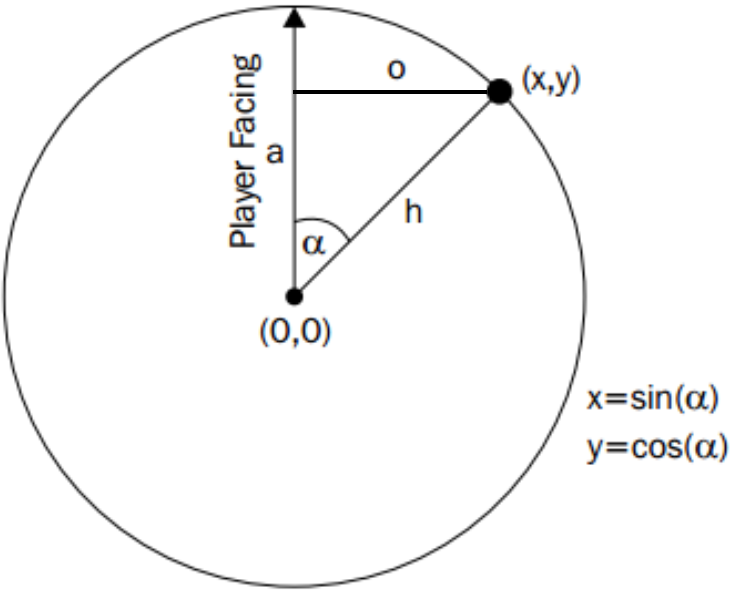
Our final position values need to be expressed as pixel lengths, relative to the center of the radar. So, we multiply our blipX and blipY values by half the width and the height of the radar; note that we only multiply with half the width since these values are relative to the center of the radar. We then add half the width and the height of the radar image to the blipX/Y values so that these values are now positioned relative to the center.
Finally, a new Vector2 object is created and returned, passing back these final calculated X and Y pixel values for the position of our blip icon.
The DrawBlip() method
The DrawBlip() method takes the input parameters of the position of the blip (as a Vector2 X, Y pair) and the reference to the RawImage prefab to be created at that location on the radar.
A new GameObject is created (instantiated) from the prefab and is parented to the radar GameObject (of which the scripted object is also a component). A reference is retrieved from the Rect Transform component of the new RawImage GameObject that has been created for the blip. Calls to the Unity RectTransform method,
SetInsetAndSizeFromParentEdge(...), result in the blip GameObject being positioned at the provided horizontal and vertical locations over the radar image, regardless of where in the Game window the background radar image has been located.
There's more...
This radar script scans 360 degrees all around the player and only considers straight-line distances on the X-Z plane. So, the distances in this radar are not affected by any height difference between the player and target GameObjects. The script can be adapted to ignore targets whose height is more than some threshold different from the player's height.
Also, as presented, this recipe's radar sees through everything, even if there are obstacles between the player and the target. This recipe can be extended to not show obscured targets by using raycasting techniques. See the Unity scripting reference for more details about raycasting: http://docs.unity3d.com/ScriptReference/Physics.Raycast.html.


