Search icon
Subscription
0
Cart icon
Close icon
You have no products in your basket yet
Arrow left icon
All Products
Best Sellers
New Releases
Books
Videos
Audiobooks
Learning Hub
Newsletters
Free Learning
Arrow right icon
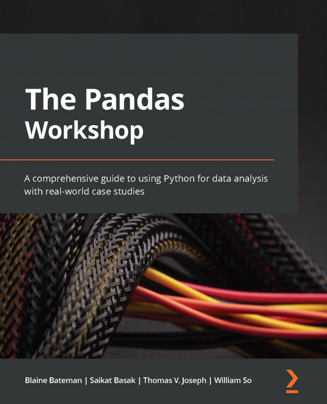
The Pandas Workshop

You're reading from  The Pandas Workshop

Product type Book
Published in Jun 2022
Publisher Packt
ISBN-13 9781800208933
Pages 744 pages
Edition 1st Edition
Languages
Authors (4):
Blaine Bateman Blaine Bateman
Profile icon Blaine Bateman
Saikat Basak Saikat Basak
Profile icon Saikat Basak
Thomas V. Joseph Thomas V. Joseph
Profile icon Thomas V. Joseph
William So William So
Profile icon William So
View More author details

Table of Contents (21) Chapters

Preface 1. Part 1 – Introduction to pandas
2. Chapter 1: Introduction to pandas 3. Chapter 2: Working with Data Structures 4. Chapter 3: Data I/O 5. Chapter 4: Pandas Data Types 6. Part 2 – Working with Data
7. Chapter 5: Data Selection – DataFrames 8. Chapter 6: Data Selection – Series 9. Chapter 7: Data Exploration and Transformation 10. Chapter 8: Understanding Data Visualization 11. Part 3 – Data Modeling
12. Chapter 9: Data Modeling – Preprocessing 13. Chapter 10: Data Modeling – Modeling Basics 14. Chapter 11: Data Modeling – Regression Modeling 15. Part 4 – Additional Use Cases for pandas
16. Chapter 12: Using Time in pandas 17. Chapter 13: Exploring Time Series 18. Chapter 14: Applying pandas Data Processing for Case Studies 19. Chapter 15: Appendix 20. Other Books You May Enjoy

Visualizing data of different types

In the previous section, we saw how to use pandas and matplotlib to create charts for data visualization. In a data analytics project, data visualization can be used either for data analysis or to communicate insights. Presenting results in a visual way that stakeholders can easily understand and interpret is definitely a must-have skill for any good data analyst. However, you cannot choose any random chart or plot to visualize all of the different types of data that an analyst may encounter. Different chart or plot types are suitable for communicating the insight for different types of data – that is, when communicating the reach of social media on different age groups, it is preferable to use a pie chart instead of a bar or a box. On the other hand, line plots are more suitable for visualizing gradual change. The trick of data visualization is to know exactly which type of plot is appropriate for each data type you will encounter. This is...

lock icon The rest of the chapter is locked
Register for a free Packt account to unlock a world of extra content!
A free Packt account unlocks extra newsletters, articles, discounted offers, and much more. Start advancing your knowledge today.
Unlock this book and the full library FREE for 7 days
Get unlimited access to 7000+ expert-authored eBooks and videos courses covering every tech area you can think of
Renews at $15.99/month. Cancel anytime}