

In this chapter, we will use a web interface to start creating basic views and dashboards that will help visualize the data we have been collecting and enhancing. Knowing what data you have and how it is arranged is paramount for quickly building views and dashboards. It also gives you a place to start, and shows which parts of your data get displayed on which dashboard. Yeah, you can go ahead and just start creating dashboards, views, and saved searches, but with a little bit of planning, you can avoid refactoring multiple times. As with any project, setting the scope of what your App is going to address is a key factor in its making. After we tackle the broad questions on what to include and how, we will cover the following topics: using a saved search in a panel and the different types of visualizations available by default in Splunk. We will use some of these saved searches and visualizations to create a SimpleXML dashboard, and then convert that...

Knowing your data is paramount when creating dashboards and views. Being familiar with your data gives you a deeper understanding of the context and a greater insight into the different nuances of data visualization. For example, you will never use time series data in a pie chart, right? Knowing that you have time series data before trying to create a chart will speed up the process of designing and creating the dashboards you will need in your App. Another very valid thought process entails you to think about which data fits which data visualization; it's more than just the typical pie versus time-based line charts. This can include such things as choosing between bar and column charts, when to use stacked bars, or whether you should use 100 percent stacked bars. Some of these will be answered only once you work with the visualization previews available in Splunk.
Let's start with a quick exercise. Let's assume that you are collecting Kbps metrics for your Internet connection...
Okay, so now we get to play around with some visualizations. Let's create a dashboard with some visualizations of our data from https://meh.com/. For now, we will limit ourselves to the native visualizations. We will start with the meh_products lookup that we have generated. Each product is listed as either New or Refurbished, so let's see how that makes a chart:
| inputlookup meh_products | top product_condition
This will be our basic search that pulls the meh_products lookup, which is kept populated by the saved search we had written earlier. We are only interested in knowing the distribution of product conditions over the entire time range, so we will choose a pie chart from the drop-down menu. This gives us a pie chart like this one:

As you can see, at the time of writing this book, and with the amount of data collected, the top condition at 90.909% is New. Now, let's save this as a panel in a new dashboard. We will call the dashboard Overview. We do this by clicking...
There will be times when you will want to integrate custom visualizations, custom CSS, or helper JavaScript into a SimpleXML dashboard. Thankfully, we have been provided a way to do so. At the very top of the dashboard/form source code, you will either see the <dashboard> or <form> tag. Within those tags, as attributes, is where you will declare what scripts should be included in your dashboard:
<dashboard script="my_script.js" stylesheet="my_style.css">
This allows the loading of custom scripts and CSS from the $APP_HOME/appserver/static folder. Placing these files into that folder gives the dashboard access to them. From here, you can interact with the dashboard using jQuery, or another framework, and make it bend to your will.
Another feature of SimpleXML is the ability to manipulate tokens. Let's take, for example, the text input. Let's define it like this in the source code:
<input type="text" token="foo">
  <label>Input<...
HTML dashboards are simply that. These are dashboards that have been either written from scratch in HTML and JavaScript, or converted from a SimpleXML dashboard. The primary purpose of an HTML dashboard is to give the developer the greatest degree of freedom possible. Anything that you can do in HTML with CSS and JavaScript can most likely be done in an HTML dashboard as well, with the added benefit of being able to use the entirety of Splunk information.
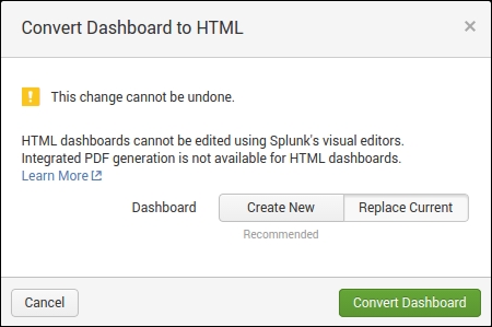
Let's go ahead and convert a SimpleXML dashboard into an HTML dashboard. Let's use the Overview dashboard we created earlier. To convert an existing dashboard, simply navigate to it in the web UI, then click on the Edit dropdown, and then click on Convert to HTML. A dialog will show up, and you will want to click on Replace Current in this instance. If you're creating HTML dashboards for the first time, you may want to use Create New until you feel comfortable with the process:
In this chapter, we covered some basic aspects of dashboards and view creation. Making sure you know your data is paramount for successful execution in data visualization. Splunk helps you discover your data, but you need to understand your data to display it properly. Not all data types and results fit into all chart types.
We also covered creating a SimpleXML dashboard and then converting that dashboard into a form. SimpleXML dashboards give you ease of creation and allow you to manipulate them within the web interface. This is an excellent option for quick displays of data, without diving too deep into the code. We also briefly introduced HTML dashboards. There are several advantages of HTML dashboards, especially the added benefits of using the entire HTML, CSS, and JavaScript stacks.
In our next chapter, we will start the joys of HTML dashboarding and see how to use the SplunkJS Stack effectively.