


Customizing your axes
In R, you can create your own designer axes. The following is another example in which we create designer axes and calculate the vertical axis limits. Let's define three vectors:
Y1 <- c(2, 4, 5, 7, 12, 14, 16)
Y2 <- c(3, 6, 7, 8, 9, 11, 12)
Y3 <- c(1, 7, 3, 2, 2, 7, 9)
Now, we calculate the maximum value of Y1, Y2, and Y3. Performing this calculation helps us to set the axis limits before we start. Otherwise, the first vector you plot will set the default axis limits, but any other data you read may exceed those limits. The syntax to find the maximum value from the three vectors is as follows:
yaxismax <- max(Y1, Y2, Y3)
Let's see what the maximum value really is using the following command:
yaxismax
The output is as follows:
[1] 16
We want to plot on a vertical axis from 0 to yaxismax. First, we disable the default axes and their annotations, using the arguments axes = FALSE and ann=FALSE, so that we can create our own axes. The approach of disabling the default axes is very important when creating graphs in R.
The argument axes=FALSE suppresses both x and y axes. The arguments xaxt="n" and yaxt="n" suppress the x and y axes individually. The argument ann = FALSE suppresses the axis labels. Now enter the following code:
plot(Y1, pch = 15, type="o", col="blue", ylim=c(0, yaxismax),
axes=FALSE, ann=FALSE)

axis(1, at=1:7, lab=c("A","B","C","D","E","F","G"))
What does our graph look like at this stage? It looks like this:
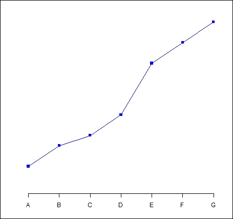
Clearly, we still have work to do to complete the graph by including a vertical axis and title. In the following sections, we will learn how to complete our graph.


