Highcharts – a quick tutorial
In this section, you will see how to implement your first Highcharts graph. First, download the latest version from the Highcharts website.
Directories structure
When you unpack the downloaded ZIP file, you should see the following directories' structure under the Highcharts-2.x.x top-level directory:
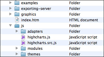
The following is what each directory contains and is used for:
index.html: This is the demo HTML page, which is the same as the demo page on the Highcharts website, so that you can still experiment with Highcharts offline.examples: This contains all the source files for the examples.graphics: This contains image files used by the examples.exporting-server: This is a directory for the server-side function to export charts into an image file using Batik, which is a Java-based toolkit for managing SVG content, and exporting the server is one of its usages.js: This is the main directory with Highcharts code. Each JavaScript filename has two suffixes,.src.js, which contains the source code with comments in it, and.js, which is the minification of JavaScript source files.adapters: This has the adapter facility for using with MooTools or Prototype modules. It contains the following files:exporting.jsfor client-side exporting and printing functionscanvas-tools.js– we need to use a third-party tool, canvg, to support Android 2.x, as the native browser has no SVG support but can display the canvas
themes: This has a set of JavaScript files pre-built with settings such as background colors, font styles, axis layouts, and so on. Users can load one of these files in their charts for different styles.
All you need to do is move the top-level Highcharts-2.x.x/js directory inside your web server document's root directory.
To use Highcharts, you need to include Highcharts-2.x.x/js/highcharts.js and a jQuery library in your HTML file. The following is an example showing the percentage of web browsers' usage for a public website. The example uses the minimal configuration settings for getting you started quickly. The following is the top half of the example:
<!DOCTYPE HTML>
<html>
  <head>
    <meta http-equiv="Content-Type"
          content="text/html; charset=utf-8">
    <title>Highcharts First Example</title>
    <script src="//ajax.googleapis.com/ajax/libs/jquery/1.7.1/jquery.min.js"></script>
    <script type="text/javascript"
        src="Highcharts-2.2.2/js/highcharts.js"></script>
We use the Google public library service to load the jQuery library Version 1.7.1 before loading the Highcharts library.
The second half of the example is the main Highcharts code, as follows:
<script type="text/javascript">
    $(document).ready(function() {
        var chart = new Highcharts.Chart({
            chart: {
                renderTo: 'container',
                type: 'spline'
            },
            title: {
                text: 'Web browsers statistics'
            },
            subtitle: {
                text: 'From 2008 to present'
            },
            xAxis: {
                categories: [ 'Jan 2008', 'Feb', .... ],
                tickInterval: 3
            },
            yAxis: {
                title: {
                    text: 'Percentage %'
                },
                min: 0
            },
            plotOptions: {
                series: {
                    lineWidth: 2
                }
            },
            series: [{
                name: 'Internet Explorer',
                data: [54.7, 54.7, 53.9, 54.8, 54.4, ... ]
            }, {
                name: 'FireFox',
                data: [36.4, 36.5, 37.0, 39.1, 39.8, ... ]
            }, {
                // Chrome started until late 2008
                name: 'Chrome',
                data: [ null, null, null, null, null, null,
                        null, null, 3.1, 3.0, 3.1, 3.6, ... ]
            }, {
                name: 'Safari',
                data: [ 1.9, 2.0, 2.1, 2.2, 2.4, 2.6, ... ]
            }, {
                name: 'Opera',
                data: [ 1.4, 1.4, 1.4, 1.4, 1.5, 1.7, ... ]
            }]
        });
    });
</script>
  </head>
  <body>
  <div>
    <!-- Highcharts rendering takes place inside this DIV -->
    <div id="container"></div>
  </div>
</body>
</html>
The spline graph is created via an object specifier that contains all the properties and series data required. Once the chart object is created, the graph is displayed in the browser. Within this object specifier, there are major components corresponding to the structure of the chart.
var chart = new Highcharts.Chart({
    chart: {
        ...
    },
    title: '...'
    ...
});
The renderTo option instructs Highcharts to display the graph onto the HTML <div> element with 'container' as the ID value, which is defined in the HTML <body> section. The type option is set to the default presentation type as 'spline' for any series data, as follows:
chart: {
    renderTo: 'container',
    type: 'spline'
}
Next is to set title and subtitle, which appears at the center part at the top of the chart:
title: {
   text: 'Web browsers ... '
},
subtitle: {
   text: 'From 2008 to present'
},
The
categories option in the
xAxis property contains an array of x axis labels for each data point. Since the graph has at least 50 data points, printing each x axis label will make the text overlap each other. Rotating the labels still results in the axis looking very packed. The best compromise is to print every third label, (tickIntervals: 3) which causes the labels to be nicely spaced out from each other.
Note
For the sake of simplicity, we use 50 entries in xAxis.categories to represent the time. However, we will see a more optimal and logical way to display date time data in the next chapter.
xAxis: {
   categories: [ 'Jan 2008', 'Feb', .... ],
   tickInterval: 3
},
The options in yAxis are to assign the title of the y axis and set the minimum possible value to zero, otherwise Highcharts will display a negative percentage range along the y axis, which is unwanted for this dataset.
yAxis: {
     title: {
         text: 'Percentage %'
     },
     min: 0
},
The
plotOptions property is to control how each series is displayed according to its type (line, pie, bar, and so on). The
plotOptions.series option is the general configuration applied to all the series type instead of defining each setting inside the series array. In this example, the default lineWidth for all the series is set to 2 pixels wide, as follows:
 plotOptions: {
    series: {
        lineWidth: 2
    }
},
The series property is the heart of the whole configuration object, which defines all the series data. It is an array of the series configuration objects. For this example, the name option is the name of the series that appears in the chart legend and tooltip. The data is an array of y axis values, which has the same length as the xAxis.categories array to form (x,y) data points.
series: [{
name: 'Internet Explorer',
data: [54.7, 54.7, 53.9, 54.8, 54.4, ... ]
}, {
name: 'FireFox',
data: [36.4, 36.5, 37.0, 39.1, 39.8, ... ]
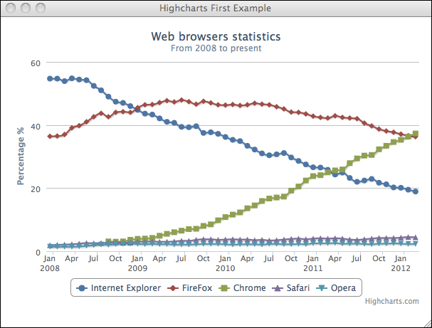
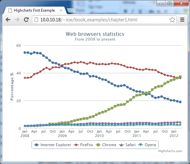
}, {The following screenshot shows how the final Highcharts should look on a Safari browser:
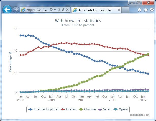
The following screenshot shows how it should look on an Internet Explorer 9 browser:
The following screenshot shows how it should look on a Chrome browser:
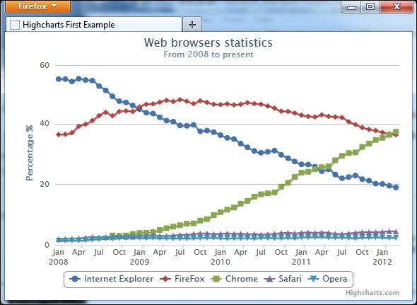
The following screenshot shows how it should look on a Firefox browser: