Statistical foundations
When we want to make observations about the data we are analyzing, we often, if not always, turn to statistics in some fashion. The data we have is referred to as the sample, which was observed from (and is a subset of) the population. Two broad categories of statistics are descriptive and inferential statistics. With descriptive statistics, as the name implies, we are looking to describe the sample. Inferential statistics involves using the sample statistics to infer, or deduce, something about the population, such as the underlying distribution.
Important note
Sample statistics are used as estimators of the population parameters, meaning that we have to quantify their bias and variance. There is a multitude of methods for this; some will make assumptions on the shape of the distribution (parametric) and others won't (non-parametric). This is all well beyond the scope of this book, but it is good to be aware of.
Often, the goal of an analysis is to create a story for the data; unfortunately, it is very easy to misuse statistics. It's the subject of a famous quote:
This is especially true of inferential statistics, which is used in many scientific studies and papers to show the significance of the researchers' findings. This is a more advanced topic and, since this isn't a statistics book, we will only briefly touch upon some of the tools and principles behind inferential statistics, which can be pursued further. We will focus on descriptive statistics to help explain the data we are analyzing.
Sampling
There's an important thing to remember before we attempt any analysis: our sample must be a random sample that is representative of the population. This means that the data must be sampled without bias (for example, if we are asking people whether they like a certain sports team, we can't only ask fans of the team) and that we should have (ideally) members of all distinct groups from the population in our sample (in the sports team example, we can't just ask men).
When we discuss machine learning in Chapter 9, Getting Started with Machine Learning in Python, we will need to sample our data, which will be a sample to begin with. This is called resampling. Depending on the data, we will have to pick a different method of sampling. Often, our best bet is a simple random sample: we use a random number generator to pick rows at random. When we have distinct groups in the data, we want our sample to be a stratified random sample, which will preserve the proportion of the groups in the data. In some cases, we don't have enough data for the aforementioned sampling strategies, so we may turn to random sampling with replacement (bootstrapping); this is called a bootstrap sample. Note that our underlying sample needs to have been a random sample or we risk increasing the bias of the estimator (we could pick certain rows more often because they are in the data more often if it was a convenience sample, while in the true population these rows aren't as prevalent). We will see an example of bootstrapping in Chapter 8, Rule-Based Anomaly Detection.
Important note
A thorough discussion of the theory behind bootstrapping and its consequences is well beyond the scope of this book, but watch this video for a primer: https://www.youtube.com/watch?v=gcPIyeqymOU.
You can read more about sampling methods, along with their strengths and weaknesses, at https://www.khanacademy.org/math/statistics-probability/designing-studies/sampling-methods-stats/a/sampling-methods-review.
Descriptive statistics
We will begin our discussion of descriptive statistics with univariate statistics; univariate simply means that these statistics are calculated from one (uni) variable. Everything in this section can be extended to the whole dataset, but the statistics will be calculated per variable we are recording (meaning that if we had 100 observations of speed and distance pairs, we could calculate the averages across the dataset, which would give us the average speed and average distance statistics).
Descriptive statistics are used to describe and/or summarize the data we are working with. We can start our summarization of the data with a measure of central tendency, which describes where most of the data is centered around, and a measure of spread or dispersion, which indicates how far apart values are.
Measures of central tendency
Measures of central tendency describe the center of our distribution of data. There are three common statistics that are used as measures of center: mean, median, and mode. Each has its own strengths, depending on the data we are working with.
Mean
Perhaps the most common statistic for summarizing data is the average, or mean. The population mean is denoted by μ (the Greek letter mu), and the sample mean is written as  (pronounced X-bar). The sample mean is calculated by summing all the values and dividing by the count of values; for example, the mean of the numbers 0, 1, 1, 2, and 9 is 2.6 (
(0 + 1 + 1 + 2 + 9)/5):
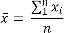
We use xi to represent the ith observation of the variable X. Note how the variable as a whole is represented with a capital letter, while the specific observation is lowercase. Σ (the Greek capital letter sigma) is used to represent a summation, which, in the equation for the mean, goes from 1 to n, which is the number of observations.
One important thing to note about the mean is that it is very sensitive to outliers (values created by a different generative process than our distribution). In the previous example, we were dealing with only five values; nevertheless, the 9 is much larger than the other numbers and pulled the mean higher than all but the 9. In cases where we suspect outliers to be present in our data, we may want to instead use the median as our measure of central tendency.
Median
Unlike the mean, the median is robust to outliers. Consider income in the US; the top 1% is much higher than the rest of the population, so this will skew the mean to be higher and distort the perception of the average person's income. However, the median will be more representative of the average income because it is the 50th percentile of our data; this means that 50% of the values are greater than the median and 50% are less than the median.
Tip
The ith percentile is the value at which i% of the observations are less than that value, so the 99th percentile is the value in X where 99% of the x's are less than it.
The median is calculated by taking the middle value from an ordered list of values; in cases where we have an even number of values, we take the mean of the middle two values. If we take the numbers 0, 1, 1, 2, and 9 again, our median is 1. Notice that the mean and median for this dataset are different; however, depending on the distribution of the data, they may be the same.
Mode
The mode is the most common value in the data (if we, once again, have the numbers 0, 1, 1, 2, and 9, then 1 is the mode). In practice, we will often hear things such as the distribution is bimodal or multimodal (as opposed to unimodal) in cases where the distribution has two or more most popular values. This doesn't necessarily mean that each of them occurred the same amount of times, but rather, they are more common than the other values by a significant amount. As shown in the following plots, a unimodal distribution has only one mode (at 0), a bimodal distribution has two (at -2 and 3), and a multimodal distribution has many (at -2, 0.4, and 3):
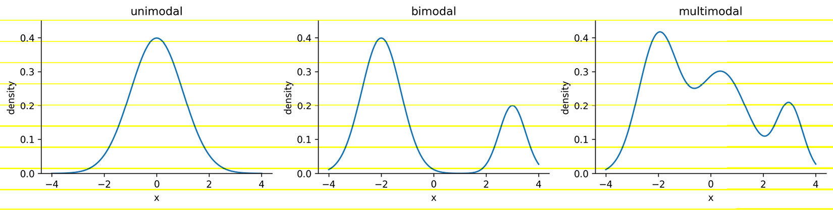
Figure 1.3 – Visualizing the mode with continuous data
Understanding the concept of the mode comes in handy when describing continuous distributions; however, most of the time when we're describing our continuous data, we will use either the mean or the median as our measure of central tendency. When working with categorical data, on the other hand, we will typically use the mode.
Measures of spread
Knowing where the center of the distribution is only gets us partially to being able to summarize the distribution of our data—we need to know how values fall around the center and how far apart they are. Measures of spread tell us how the data is dispersed; this will indicate how thin (low dispersion) or wide (very spread out) our distribution is. As with measures of central tendency, we have several ways to describe the spread of a distribution, and which one we choose will depend on the situation and the data.
Range
The range is the distance between the smallest value (minimum) and the largest value (maximum). The units of the range will be the same units as our data. Therefore, unless two distributions of data are in the same units and measuring the same thing, we can't compare their ranges and say one is more dispersed than the other:

Just from the definition of the range, we can see why it wouldn't always be the best way to measure the spread of our data. It gives us upper and lower bounds on what we have in the data; however, if we have any outliers in our data, the range will be rendered useless.
Another problem with the range is that it doesn't tell us how the data is dispersed around its center; it really only tells us how dispersed the entire dataset is. This brings us to the variance.
Variance
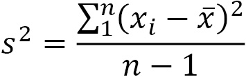
The variance describes how far apart observations are spread out from their average value (the mean). The population variance is denoted as σ2 (pronounced sigma-squared), and the sample variance is written as s2. It is calculated as the average squared distance from the mean. Note that the distances must be squared so that distances below the mean don't cancel out those above the mean.
If we want the sample variance to be an unbiased estimator of the population variance, we divide by n - 1 instead of n to account for using the sample mean instead of the population mean; this is called Bessel's correction (https://en.wikipedia.org/wiki/Bessel%27s_correction). Most statistical tools will give us the sample variance by default, since it is very rare that we would have data for the entire population:
The variance gives us a statistic with squared units. This means that if we started with data on income in dollars ($), then our variance would be in dollars squared ($2). This isn't really useful when we're trying to see how this describes the data; we can use the magnitude (size) itself to see how spread out something is (large values = large spread), but beyond that, we need a measure of spread with units that are the same as our data. For this purpose, we use the standard deviation.
Standard deviation
We can use the standard deviation to see how far from the mean data points are on average. A small standard deviation means that values are close to the mean, while a large standard deviation means that values are dispersed more widely. This is tied to how we would imagine the distribution curve: the smaller the standard deviation, the thinner the peak of the curve (0.5); the larger the standard deviation, the wider the peak of the curve (2):
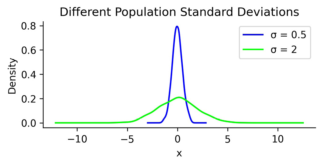
Figure 1.4 – Using standard deviation to quantify the spread of a distribution
The standard deviation is simply the square root of the variance. By performing this operation, we get a statistic in units that we can make sense of again ($ for our income example):
Note that the population standard deviation is represented as σ, and the sample standard deviation is denoted as s.
Coefficient of variation
When we moved from variance to standard deviation, we were looking to get to units that made sense; however, if we then want to compare the level of dispersion of one dataset to another, we would need to have the same units once again. One way around this is to calculate the coefficient of variation (CV), which is unitless. The CV is the ratio of the standard deviation to the mean:
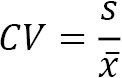
We will use this metric in Chapter 7, Financial Analysis – Bitcoin and the Stock Market; since the CV is unitless, we can use it to compare the volatility of different assets.
Interquartile range
So far, other than the range, we have discussed mean-based measures of dispersion; now, we will look at how we can describe the spread with the median as our measure of central tendency. As mentioned earlier, the median is the 50th percentile or the 2nd quartile (Q2). Percentiles and quartiles are both quantiles—values that divide data into equal groups each containing the same percentage of the total data. Percentiles divide the data into 100 parts, while quartiles do so into four (25%, 50%, 75%, and 100%).
Since quantiles neatly divide up our data, and we know how much of the data goes in each section, they are a perfect candidate for helping us quantify the spread of our data. One common measure for this is the interquartile range (IQR), which is the distance between the 3rd and 1st quartiles:
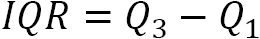
The IQR gives us the spread of data around the median and quantifies how much dispersion we have in the middle 50% of our distribution. It can also be useful when checking the data for outliers, which we will cover in Chapter 8, Rule-Based Anomaly Detection. In addition, the IQR can be used to calculate a unitless measure of dispersion, which we will discuss next.
Quartile coefficient of dispersion
Just like we had the coefficient of variation when using the mean as our measure of central tendency, we have the quartile coefficient of dispersion when using the median as our measure of center. This statistic is also unitless, so it can be used to compare datasets. It is calculated by dividing the semi-quartile range (half the IQR) by the midhinge (midpoint between the first and third quartiles):
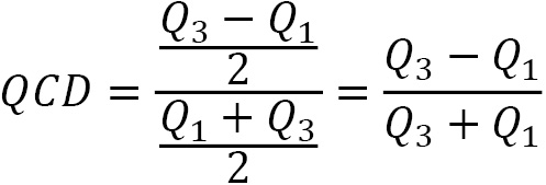
We will see this metric again in Chapter 7, Financial Analysis – Bitcoin and the Stock Market, when we assess stock volatility. For now, let's take a look at how we can use measures of central tendency and dispersion to summarize our data.
Summarizing data
We have seen many examples of descriptive statistics that we can use to summarize our data by its center and dispersion; in practice, looking at the 5-number summary and visualizing the distribution prove to be helpful first steps before diving into some of the other aforementioned metrics. The 5-number summary, as its name indicates, provides five descriptive statistics that summarize our data:
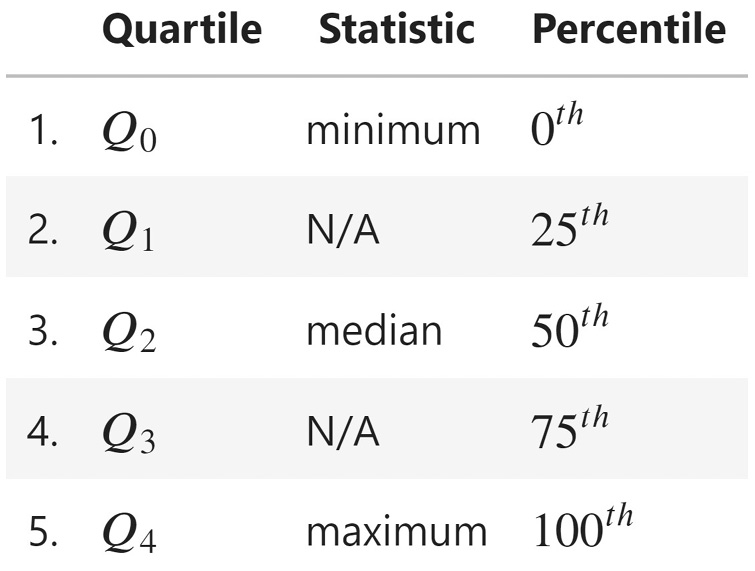
Figure 1.5 – The 5-number summary
A box plot (or box and whisker plot) is a visual representation of the 5-number summary. The median is denoted by a thick line in the box. The top of the box is Q3 and the bottom of the box is Q1. Lines (whiskers) extend from both sides of the box boundaries toward the minimum and maximum. Based on the convention our plotting tool uses, though, they may only extend to a certain statistic; any values beyond these statistics are marked as outliers (using points). For this book in general, the lower bound of the whiskers will be Q1 – 1.5 * IQR and the upper bound will be Q3 + 1.5 * IQR, which is called the Tukey box plot:
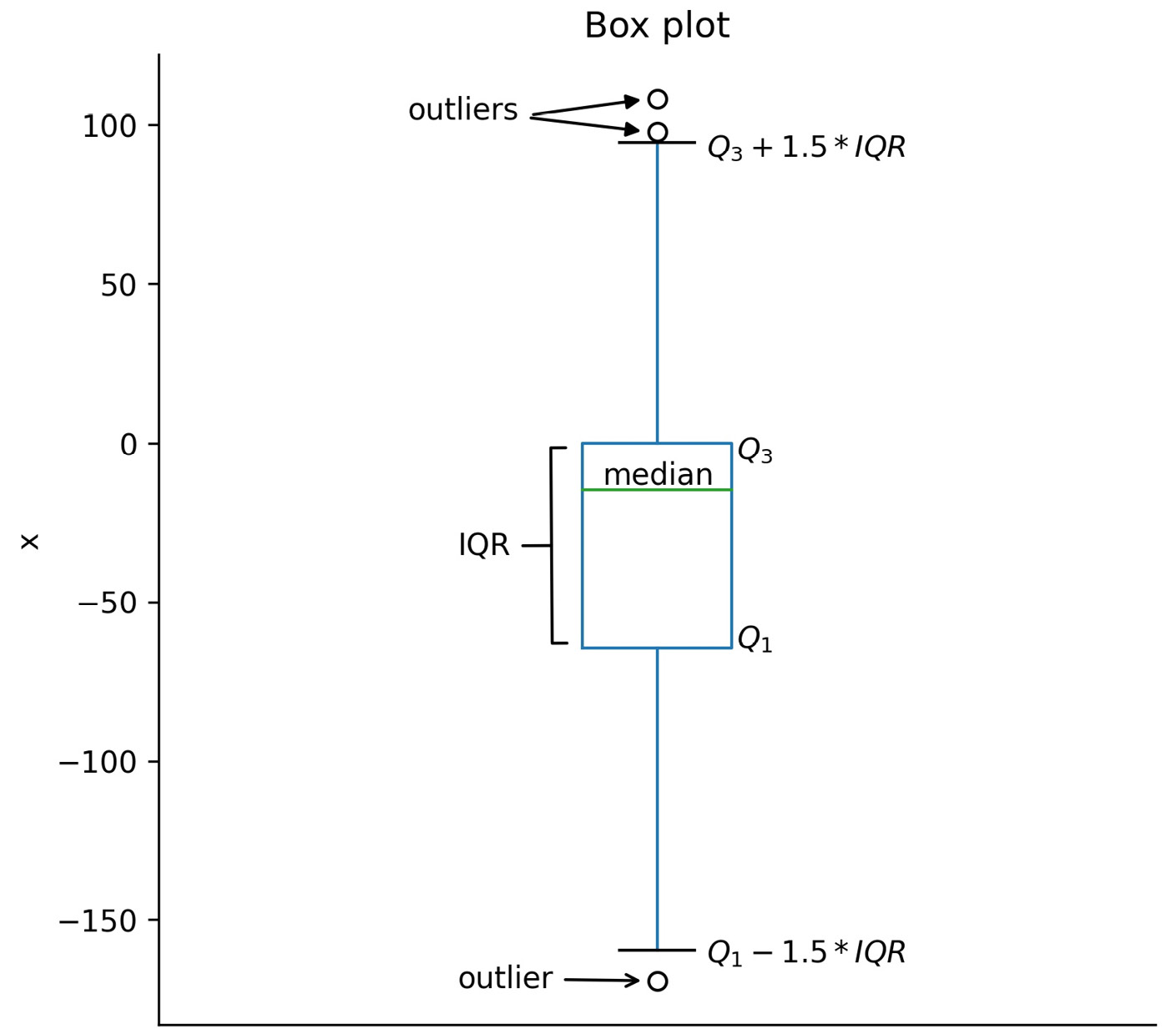
Figure 1.6 – The Tukey box plot
While the box plot is a great tool for getting an initial understanding of the distribution, we don't get to see how things are distributed inside each of the quartiles. For this purpose, we turn to histograms for discrete variables (for instance, the number of people or books) and kernel density estimates (KDEs) for continuous variables (for instance, heights or time). There is nothing stopping us from using KDEs on discrete variables, but it is easy to confuse people that way. Histograms work for both discrete and continuous variables; however, in both cases, we must keep in mind that the number of bins we choose to divide the data into can easily change the shape of the distribution we see.
To make a histogram, a certain number of equal-width bins are created, and then bars with heights for the number of values we have in each bin are added. The following plot is a histogram with 10 bins, showing the three measures of central tendency for the same data that was used to generate the box plot in Figure 1.6:
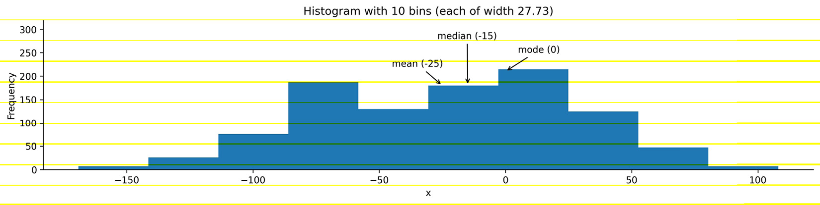
Figure 1.7 – Example histogram
Important note
In practice, we need to play around with the number of bins to find the best value. However, we have to be careful as this can misrepresent the shape of the distribution.
KDEs are similar to histograms, except rather than creating bins for the data, they draw a smoothed curve, which is an estimate of the distribution's probability density function (PDF). The PDF is for continuous variables and tells us how probability is distributed over the values. Higher values for the PDF indicate higher likelihoods:
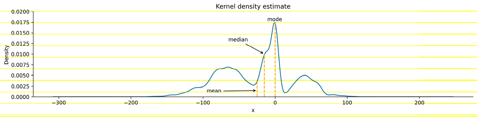
Figure 1.8 – KDE with marked measures of center
When the distribution starts to get a little lopsided with long tails on one side, the mean measure of center can easily get pulled to that side. Distributions that aren't symmetric have some skew to them. A left (negative) skewed distribution has a long tail on the left-hand side; a right (positive) skewed distribution has a long tail on the right-hand side. In the presence of negative skew, the mean will be less than the median, while the reverse happens with a positive skew. When there is no skew, both will be equal:
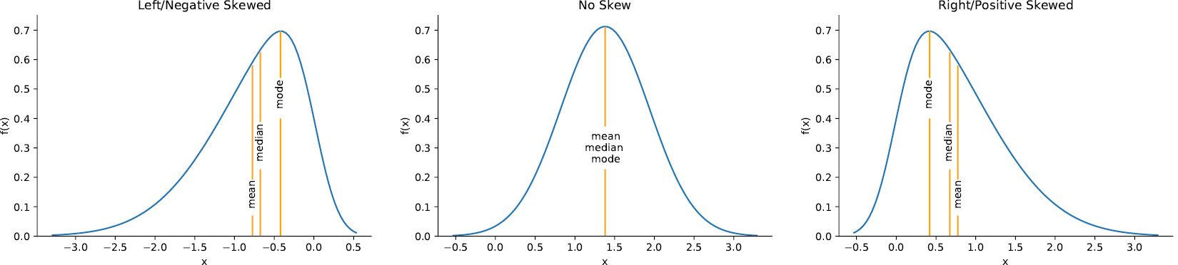
Figure 1.9 – Visualizing skew
Important note
There is also another statistic called kurtosis, which compares the density of the center of the distribution with the density at the tails. Both skewness and kurtosis can be calculated with the SciPy package.
Each column in our data is a random variable, because every time we observe it, we get a value according to the underlying distribution—it's not static. When we are interested in the probability of getting a value of x or less, we use the cumulative distribution function (CDF), which is the integral (area under the curve) of the PDF:
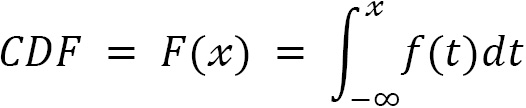
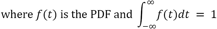
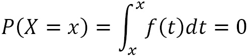
The probability of the random variable X being less than or equal to the specific value of x is denoted as P(X ≤ x). With a continuous variable, the probability of getting exactly x is 0. This is because the probability will be the integral of the PDF from x to x (area under a curve with zero width), which is 0:
In order to visualize this, we can find an estimate of the CDF from the sample, called the empirical cumulative distribution function (ECDF). Since this is cumulative, at the point where the value on the x-axis is equal to x, the y value is the cumulative probability of P(X ≤ x). Let's visualize P(X ≤ 50), P(X = 50), and P(X > 50) as an example:
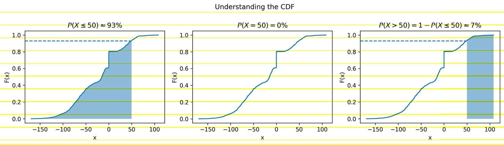
Figure 1.10 – Visualizing the CDF
In addition to examining the distribution of our data, we may find the need to utilize probability distributions for uses such as simulation (discussed in Chapter 8, Rule-Based Anomaly Detection) or hypothesis testing (see the Inferential statistics section); let's take a look at a few distributions that we are likely to come across.
Common distributions
While there are many probability distributions, each with specific use cases, there are some that we will come across often. The Gaussian, or normal, looks like a bell curve and is parameterized by its mean (μ) and standard deviation (σ). The standard normal (Z) has a mean of 0 and a standard deviation of 1. Many things in nature happen to follow the normal distribution, such as heights. Note that testing whether a distribution is normal is not trivial—check the Further reading section for more information.
The Poisson distribution is a discrete distribution that is often used to model arrivals. The time between arrivals can be modeled with the exponential distribution. Both are defined by their mean, lambda (λ). The uniform distribution places equal likelihood on each value within its bounds. We often use this for random number generation. When we generate a random number to simulate a single success/failure outcome, it is called a Bernoulli trial. This is parameterized by the probability of success (p). When we run the same experiment multiple times (n), the total number of successes is then a binomial random variable. Both the Bernoulli and binomial distributions are discrete.
We can visualize both discrete and continuous distributions; however, discrete distributions give us a probability mass function (PMF) instead of a PDF:
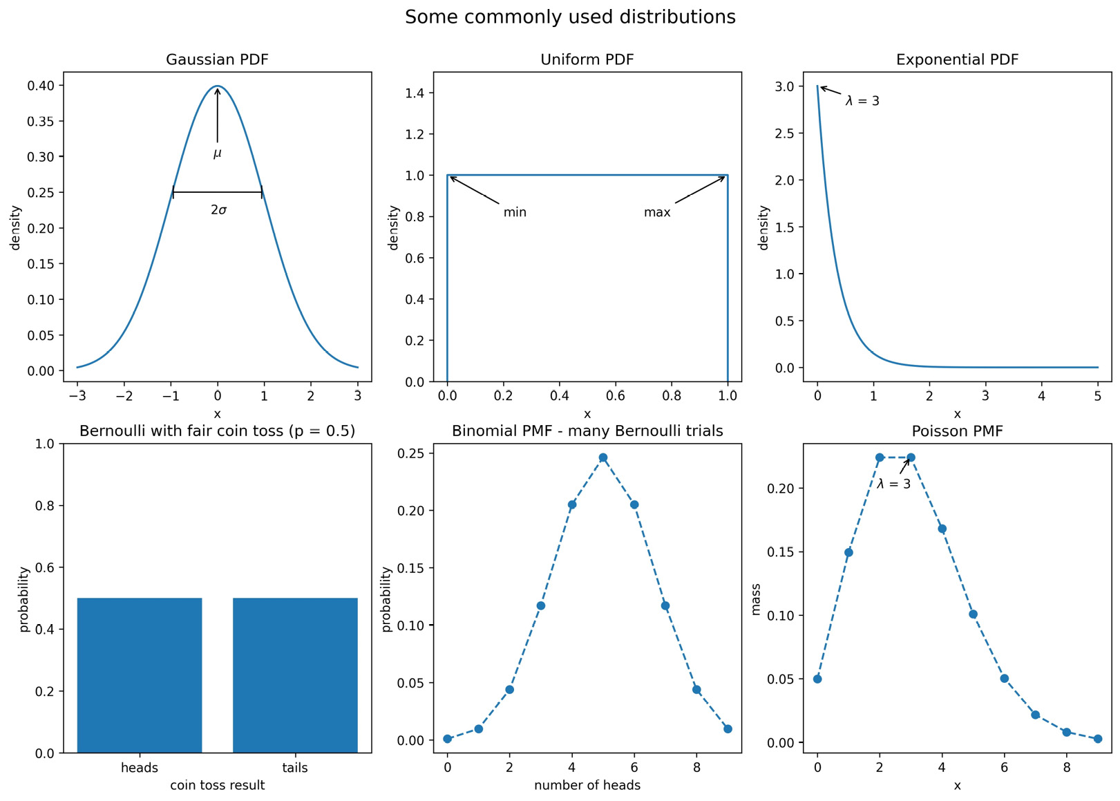
Figure 1.11 – Visualizing some commonly used distributions
We will use some of these distributions in Chapter 8, Rule-Based Anomaly Detection, when we simulate some login attempt data for anomaly detection.
Scaling data
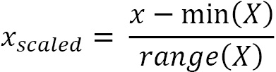
In order to compare variables from different distributions, we would have to scale the data, which we could do with the range by using min-max scaling. We take each data point, subtract the minimum of the dataset, then divide by the range. This normalizes our data (scales it to the range [0, 1]):
This isn't the only way to scale data; we can also use the mean and standard deviation. In this case, we would subtract the mean from each observation and then divide by the standard deviation to standardize the data. This gives us what is known as a Z-score:
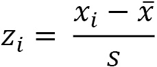
We are left with a normalized distribution with a mean of 0 and a standard deviation (and variance) of 1. The Z-score tells us how many standard deviations from the mean each observation is; the mean has a Z-score of 0, while an observation of 0.5 standard deviations below the mean will have a Z-score of -0.5.
There are, of course, additional ways to scale our data, and the one we end up choosing will be dependent on our data and what we are trying to do with it. By keeping the measures of central tendency and measures of dispersion in mind, you will be able to identify how the scaling of data is being done in any other methods you come across.
Quantifying relationships between variables
In the previous sections, we were dealing with univariate statistics and were only able to say something about the variable we were looking at. With multivariate statistics, we seek to quantify relationships between variables and attempt to make predictions for future behavior.
The covariance is a statistic for quantifying the relationship between variables by showing how one variable changes with respect to another (also referred to as their joint variance):

Important note
E[X] is a new notation for us. It is read as the expected value of X or the expectation of X, and it is calculated by summing all the possible values of X multiplied by their probability—it's the long-run average of X.
The magnitude of the covariance isn't easy to interpret, but its sign tells us whether the variables are positively or negatively correlated. However, we would also like to quantify how strong the relationship is between the variables, which brings us to correlation. Correlation tells us how variables change together both in direction (same or opposite) and magnitude (strength of the relationship). To find the correlation, we calculate the Pearson correlation coefficient, symbolized by ρ (the Greek letter rho), by dividing the covariance by the product of the standard deviations of the variables:
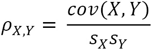
This normalizes the covariance and results in a statistic bounded between -1 and 1, making it easy to describe both the direction of the correlation (sign) and the strength of it (magnitude). Correlations of 1 are said to be perfect positive (linear) correlations, while those of -1 are perfect negative correlations. Values near 0 aren't correlated. If correlation coefficients are near 1 in absolute value, then the variables are said to be strongly correlated; those closer to 0.5 are said to be weakly correlated.
Let's look at some examples using scatter plots. In the leftmost subplot of Figure 1.12 (ρ = 0.11), we see that there is no correlation between the variables: they appear to be random noise with no pattern. The next plot with ρ = -0.52 has a weak negative correlation: we can see that the variables appear to move together with the x variable increasing, while the y variable decreases, but there is still a bit of randomness. In the third plot from the left (ρ = 0.87), there is a strong positive correlation: x and y are increasing together. The rightmost plot with ρ = -0.99 has a near-perfect negative correlation: as x increases, y decreases. We can also see how the points form a line:
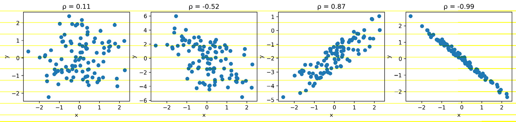
Figure 1.12 – Comparing correlation coefficients
To quickly eyeball the strength and direction of the relationship between two variables (and see whether there even seems to be one), we will often use scatter plots rather than calculating the exact correlation coefficient. This is for a couple of reasons:
- It's easier to find patterns in visualizations, but it's more work to arrive at the same conclusion by looking at numbers and tables.
- We might see that the variables seem related, but they may not be linearly related. Looking at a visual representation will make it easy to see if our data is actually quadratic, exponential, logarithmic, or some other non-linear function.
Both of the following plots depict data with strong positive correlations, but it's pretty obvious when looking at the scatter plots that these are not linear. The one on the left is logarithmic, while the one on the right is exponential:
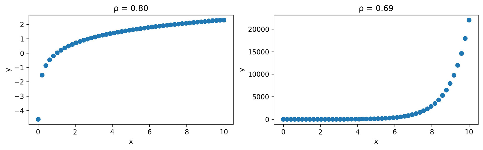
Figure 1.13 – The correlation coefficient can be misleading
It's very important to remember that while we may find a correlation between X and Y, it doesn't mean that X causes Y or that Y causes X. There could be some Z that actually causes both; perhaps X causes some intermediary event that causes Y, or it is actually just a coincidence. Keep in mind that we often don't have enough information to report causation—correlation does not imply causation.
Tip
Be sure to check out Tyler Vigen's Spurious Correlations blog (https://www.tylervigen.com/spurious-correlations) for some interesting correlations.
Pitfalls of summary statistics
There is a very interesting dataset illustrating how careful we must be when only using summary statistics and correlation coefficients to describe our data. It also shows us that plotting is not optional. Anscombe's quartet is a collection of four different datasets that have identical summary statistics and correlation coefficients, but when plotted, it is obvious they are not similar:
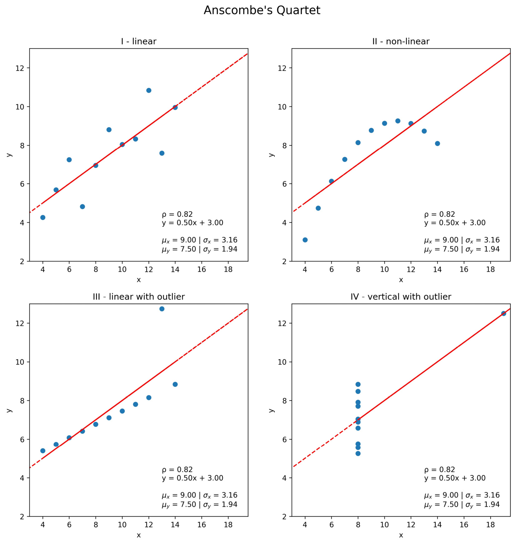
Figure 1.14 – Summary statistics can be misleading
Notice that each of the plots in Figure 1.14 has an identical best-fit line defined by the equation y = 0.50x + 3.00. In the next section, we will discuss, at a high level, how this line is created and what it means.
Important note
Summary statistics are very helpful when we're getting to know the data, but be wary of relying exclusively on them. Remember, statistics can be misleading; be sure to also plot the data before drawing any conclusions or proceeding with the analysis. You can read more about Anscombe's quartet at https://en.wikipedia.org/wiki/Anscombe%27s_quartet. Also, be sure to check out the Datasaurus Dozen, which are 13 datasets that also have the same summary statistics, at https://www.autodeskresearch.com/publications/samestats.
Prediction and forecasting
Say our favorite ice cream shop has asked us to help predict how many ice creams they can expect to sell on a given day. They are convinced that the temperature outside has a strong influence on their sales, so they have collected data on the number of ice creams sold at a given temperature. We agree to help them, and the first thing we do is make a scatter plot of the data they collected:
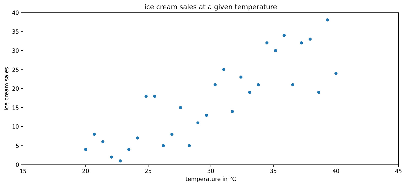
Figure 1.15 – Observations of ice cream sales at various temperatures
We can observe an upward trend in the scatter plot: more ice creams are sold at higher temperatures. In order to help out the ice cream shop, though, we need to find a way to make predictions from this data. We can use a technique called regression to model the relationship between temperature and ice cream sales with an equation. Using this equation, we will be able to predict ice cream sales at a given temperature.
Important note
Remember that correlation does not imply causation. People may buy ice cream when it is warmer, but warmer temperatures don't necessarily cause people to buy ice cream.
In Chapter 9, Getting Started with Machine Learning in Python, we will go over regression in depth, so this discussion will be a high-level overview. There are many types of regression that will yield a different type of equation, such as linear (which we will use for this example) and logistic. Our first step will be to identify the dependent variable, which is the quantity we want to predict (ice cream sales), and the variables we will use to predict it, which are called independent variables. While we can have many independent variables, our ice cream sales example only has one: temperature. Therefore, we will use simple linear regression to model the relationship as a line:
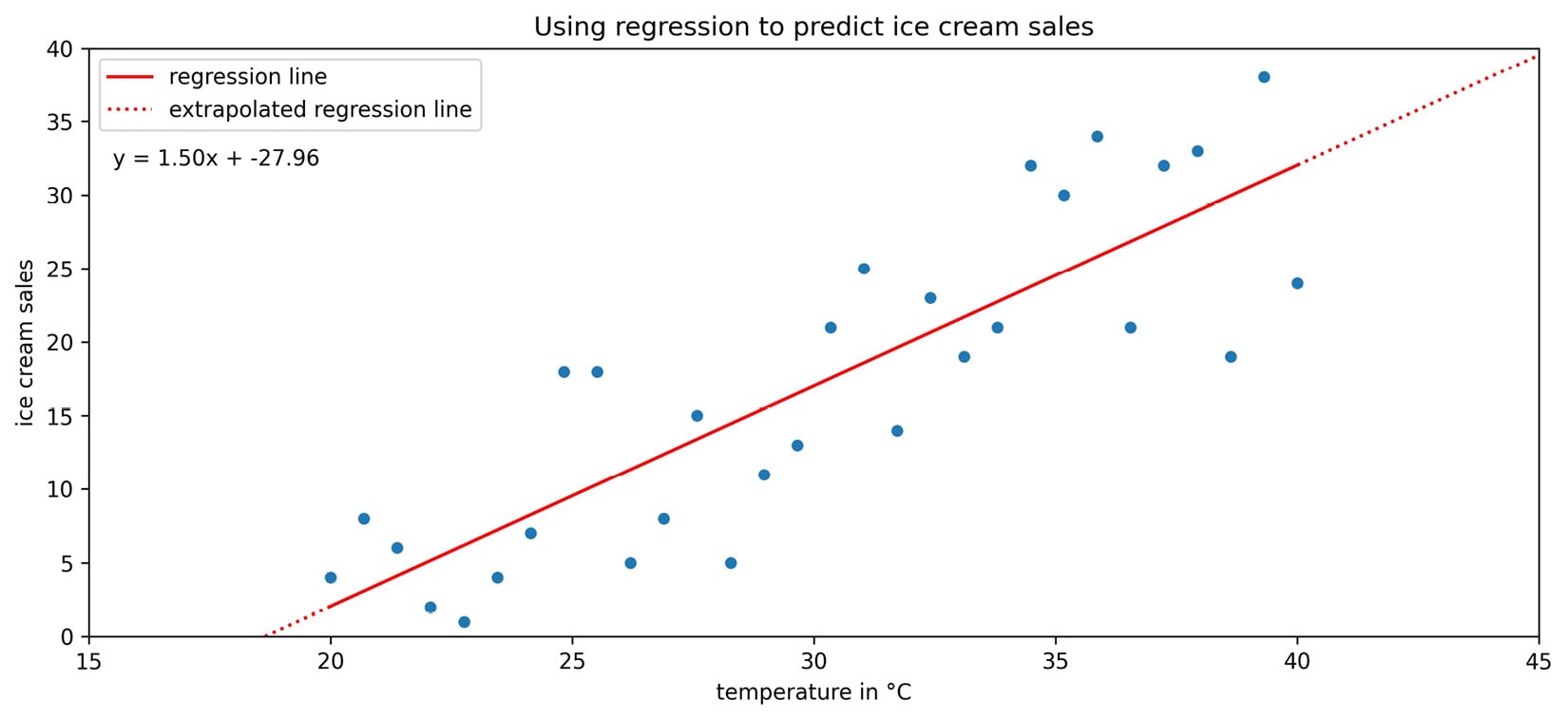
Figure 1.16 – Fitting a line to the ice cream sales data
The regression line in the previous scatter plot yields the following equation for the relationship:

Suppose that today the temperature is 35°C—we would plug that in for temperature in the equation. The result predicts that the ice cream shop will sell 24.54 ice creams. This prediction is along the red line in the previous plot. Note that the ice cream shop can't actually sell fractions of ice cream.
Before leaving the model in the hands of the ice cream shop, it's important to discuss the difference between the dotted and solid portions of the regression line that we obtained. When we make predictions using the solid portion of the line, we are using interpolation, meaning that we will be predicting ice cream sales for temperatures the regression was created on. On the other hand, if we try to predict how many ice creams will be sold at 45°C, it is called extrapolation (the dotted portion of the line), since we didn't have any temperatures this high when we ran the regression. Extrapolation can be very dangerous as many trends don't continue indefinitely. People may decide not to leave their houses because it is so hot. This means that instead of selling the predicted 39.54 ice creams, they would sell zero.
When working with time series, our terminology is a little different: we often look to forecast future values based on past values. Forecasting is a type of prediction for time series. Before we try to model the time series, however, we will often use a process called time series decomposition to split the time series into components, which can be combined in an additive or multiplicative fashion and may be used as parts of a model.
The trend component describes the behavior of the time series in the long term without accounting for seasonal or cyclical effects. Using the trend, we can make broad statements about the time series in the long run, such as the population of Earth is increasing or the value of a stock is stagnating. The seasonality component explains the systematic and calendar-related movements of a time series. For example, the number of ice cream trucks on the streets of New York City is high in the summer and drops to nothing in the winter; this pattern repeats every year, regardless of whether the actual amount each summer is the same. Lastly, the cyclical component accounts for anything else unexplained or irregular with the time series; this could be something such as a hurricane driving the number of ice cream trucks down in the short term because it isn't safe to be outside. This component is difficult to anticipate with a forecast due to its unexpected nature.
We can use Python to decompose the time series into trend, seasonality, and noise or residuals. The cyclical component is captured in the noise (random, unpredictable data); after we remove the trend and seasonality from the time series, what we are left with is the residual:
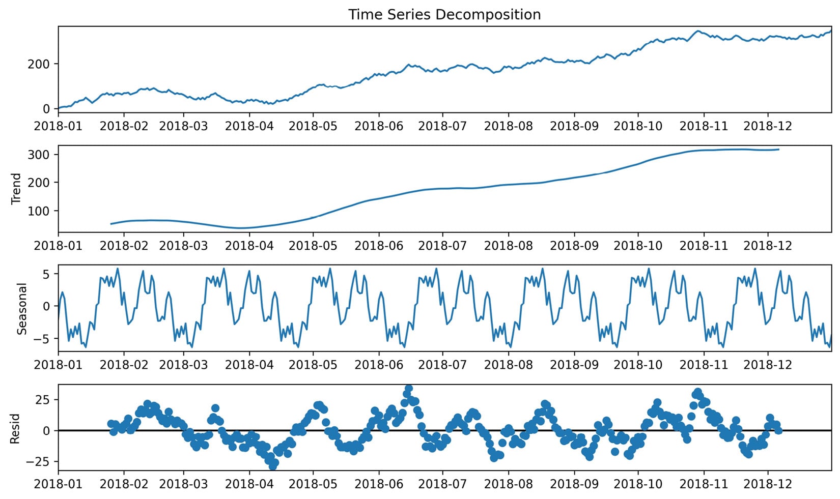
Figure 1.17 – An example of time series decomposition
When building models to forecast time series, some common methods include exponential smoothing and ARIMA-family models. ARIMA stands for autoregressive (AR), integrated (I), moving average (MA). Autoregressive models take advantage of the fact that an observation at time t is correlated to a previous observation, for example, at time t - 1. In Chapter 5, Visualizing Data with Pandas and Matplotlib, we will look at some techniques for determining whether a time series is autoregressive; note that not all time series are. The integrated component concerns the differenced data, or the change in the data from one time to another. For example, if we were concerned with a lag (distance between times) of 1, the differenced data would be the value at time t subtracted by the value at time t - 1. Lastly, the moving average component uses a sliding window to average the last x observations, where x is the length of the sliding window. If, for example, we have a 3-period moving average, by the time we have all of the data up to time 5, our moving average calculation only uses time periods 3, 4, and 5 to forecast time 6. We will build an ARIMA model in Chapter 7, Financial Analysis – Bitcoin and the Stock Market.
The moving average puts equal weight on each time period in the past involved in the calculation. In practice, this isn't always a realistic expectation of our data. Sometimes, all past values are important, but they vary in their influence on future data points. For these cases, we can use exponential smoothing, which allows us to put more weight on more recent values and less weight on values further away from what we are predicting.
Note that we aren't limited to predicting numbers; in fact, depending on the data, our predictions could be categorical in nature—things such as determining which flavor of ice cream will sell the most on a given day or whether an email is spam or not. This type of prediction will be introduced in Chapter 9, Getting Started with Machine Learning in Python.
Inferential statistics
As mentioned earlier, inferential statistics deals with inferring or deducing things from the sample data we have in order to make statements about the population as a whole. When we're looking to state our conclusions, we have to be mindful of whether we conducted an observational study or an experiment. With an observational study, the independent variable is not under the control of the researchers, and so we are observing those taking part in our study (think about studies on smoking—we can't force people to smoke). The fact that we can't control the independent variable means that we cannot conclude causation.
With an experiment, we are able to directly influence the independent variable and randomly assign subjects to the control and test groups, such as A/B tests (for anything from website redesigns to ad copy). Note that the control group doesn't receive treatment; they can be given a placebo (depending on what the study is). The ideal setup for this is double-blind, where the researchers administering the treatment don't know which treatment is the placebo and also don't know which subject belongs to which group.
Important note
We can often find reference to Bayesian inference and frequentist inference. These are based on two different ways of approaching probability. Frequentist statistics focuses on the frequency of the event, while Bayesian statistics uses a degree of belief when determining the probability of an event. We will see an example of Bayesian statistics in Chapter 11, Machine Learning Anomaly Detection. You can read more about how these methods differ at https://www.probabilisticworld.com/frequentist-bayesian-approaches-inferential-statistics/.
Inferential statistics gives us tools to translate our understanding of the sample data to a statement about the population. Remember that the sample statistics we discussed earlier are estimators for the population parameters. Our estimators need confidence intervals, which provide a point estimate and a margin of error around it. This is the range that the true population parameter will be in at a certain confidence level. At the 95% confidence level, 95% of the confidence intervals that are calculated from random samples of the population contain the true population parameter. Frequently, 95% is chosen for the confidence level and other purposes in statistics, although 90% and 99% are also common; the higher the confidence level, the wider the interval.
Hypothesis tests allow us to test whether the true population parameter is less than, greater than, or not equal to some value at a certain significance level (called alpha). The process of performing a hypothesis test starts with stating our initial assumption or null hypothesis: for example, the true population mean is 0. We pick a level of statistical significance, usually 5%, which is the probability of rejecting the null hypothesis when it is true. Then, we calculate the critical value for the test statistic, which will depend on the amount of data we have and the type of statistic (such as the mean of one population or the proportion of votes for a candidate) we are testing. The critical value is compared to the test statistic from our data and, based on the result, we either reject or fail to reject the null hypothesis. Hypothesis tests are closely related to confidence intervals. The significance level is equivalent to 1 minus the confidence level. This means that a result is statistically significant if the null hypothesis value is not in the confidence interval.
Important note
There are many things we have to be aware of when picking the method to calculate a confidence interval or the proper test statistic for a hypothesis test. This is beyond the scope of this book, but check out the link in the Further reading section at the end of this chapter for more information. Also, be sure to look at some of the mishaps with the p-values used in hypothesis testing, such as p-hacking, at https://en.wikipedia.org/wiki/Misuse_of_p-values.
Now that we have an overview of statistics and data analysis, we are ready to get started with the Python portion of this book. Let's start by setting up a virtual environment.