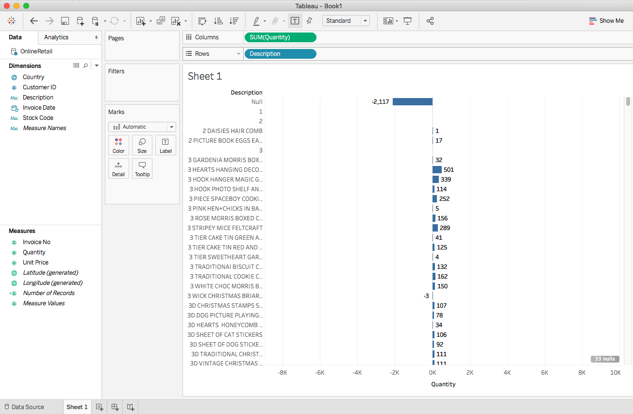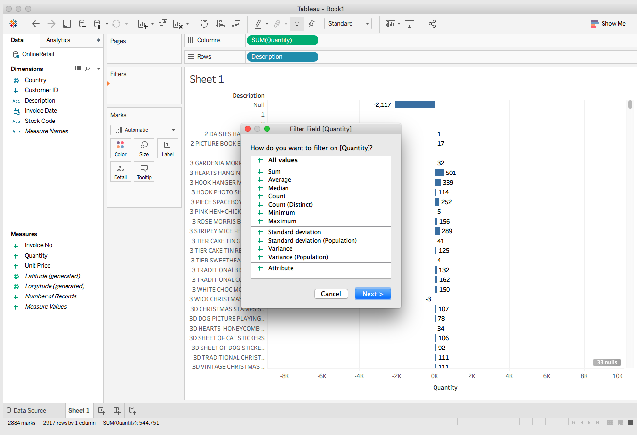
This chapter explores one of the most important activities in big data processing and analysis, which is creating a powerful visualization of data and insights. We tend to understand anything graphical better than anything textual or numerical. During the analytical process, you will need to constantly make sense of data and manipulate its usage and interpretation; this will be much easier if you can visualize the data instead of reading it from tables, columns, or text files. When you have used one of the many ways of analyzing data and generated insights that we have seen so far (such as through Python, R, Spark, Flink, Hive, MapReduce, and so on), anyone trying to make sense of the insights will want to understand those in the context of the data. For this purpose, you need some pictorial representation for that as well.
In a nutshell, the following topics will be covered throughout this chapter:
- Introduction
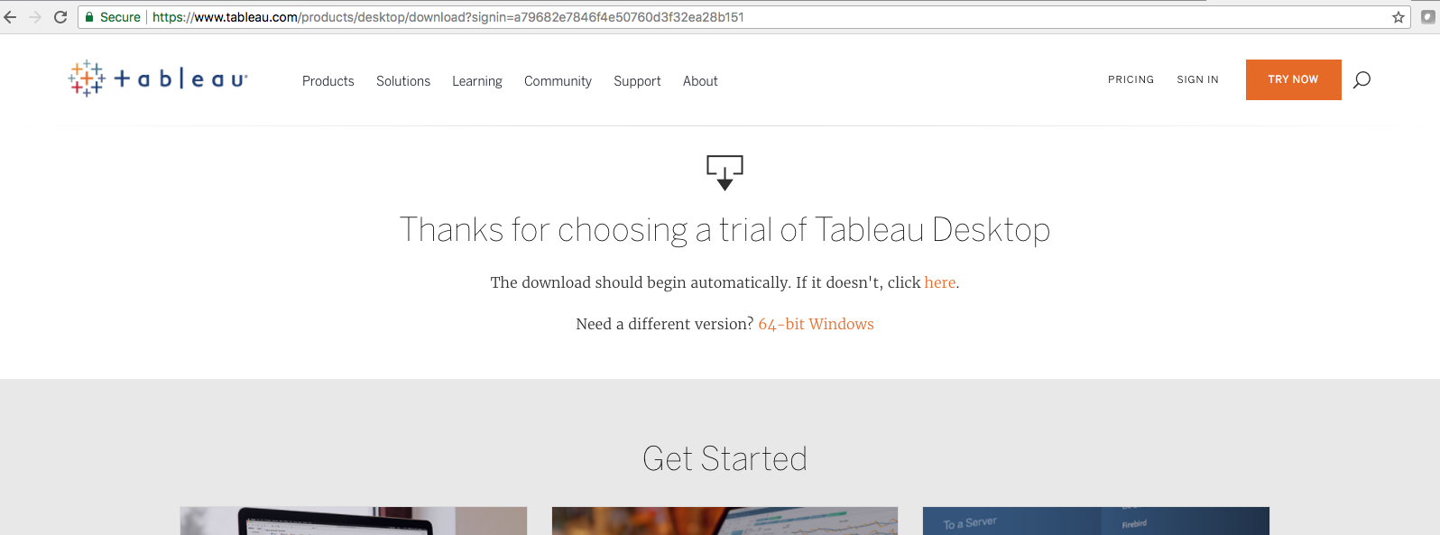
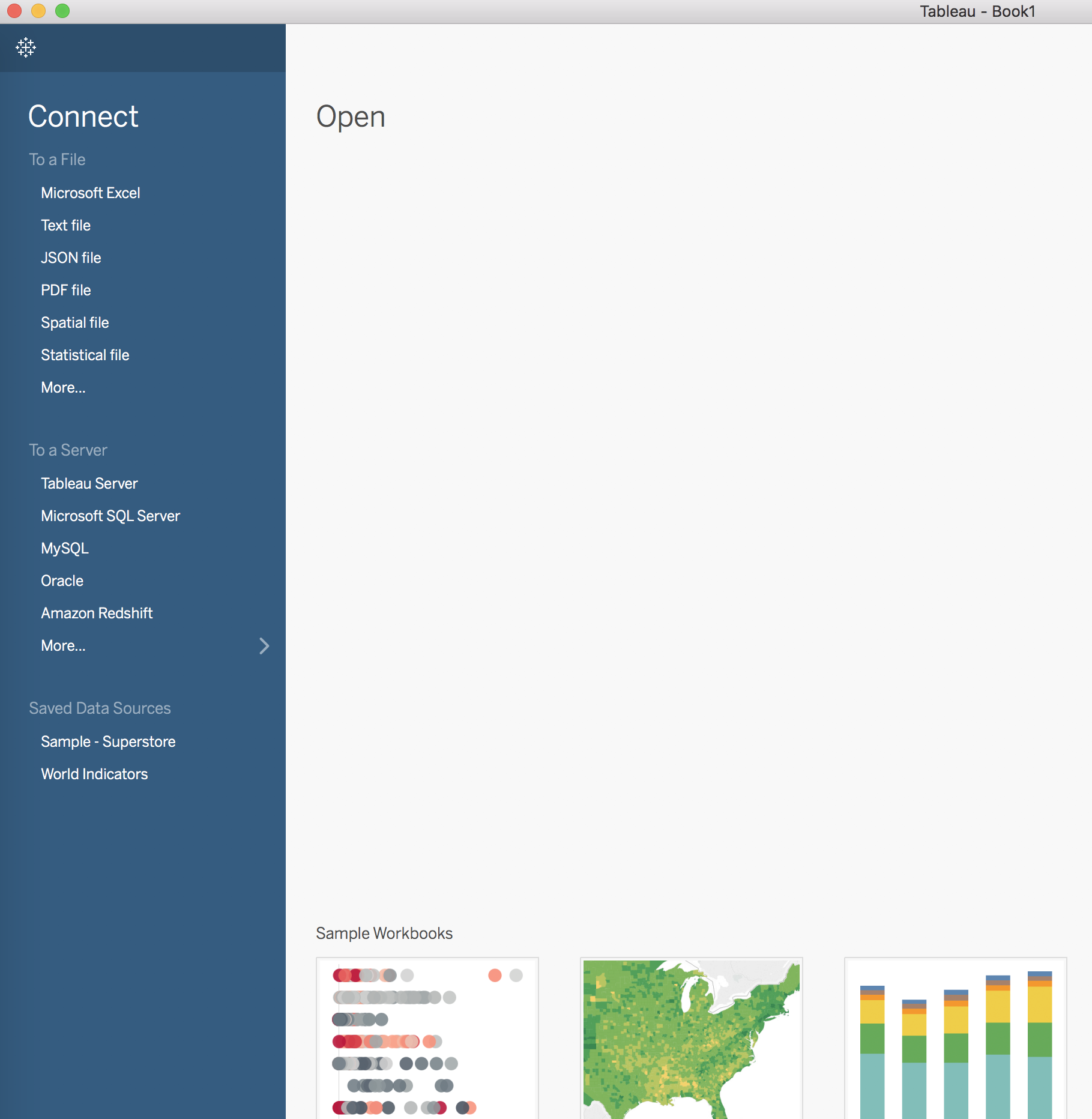
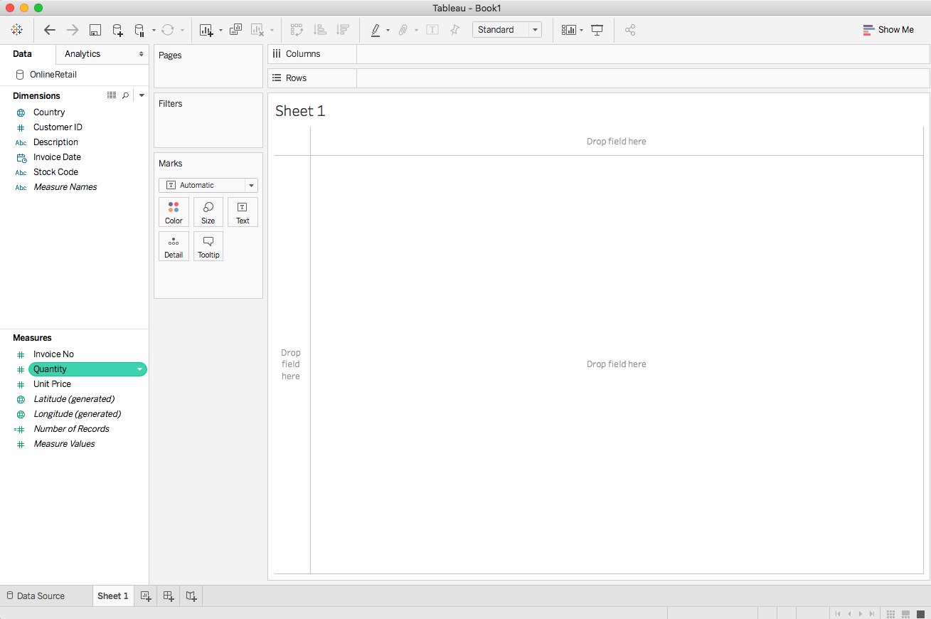
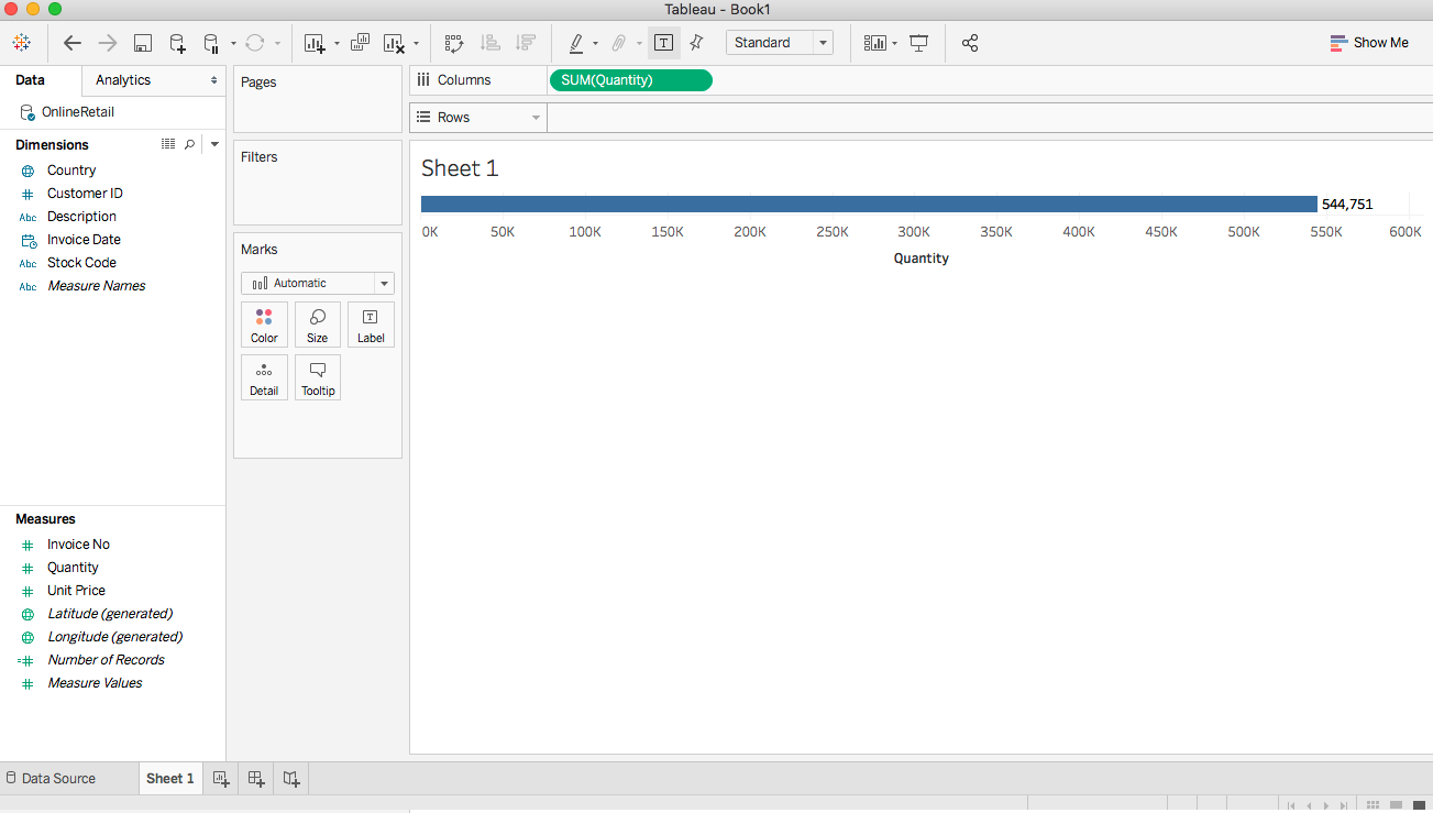
- Tableau
- Chart types
- Using Python
- Using R
- Data visualization...