


Line charts connect the related marks in a visualization to show movement or relationship between connected marks. The position of the marks and the lines that connect them are the primary means of communicating the data. Additionally, you can use size and color to visually communicate additional information.
The most common kind of line chart is a time series chart. Time series show the movement of values over time. They are very easy to create in Tableau and require only a date and a measure.
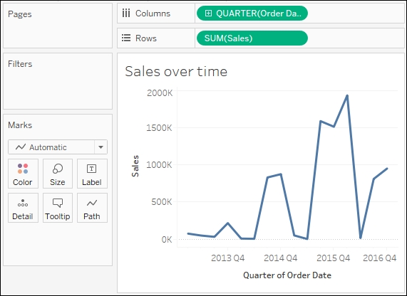
Continue your analysis of Superstore sales using the Chapter 01 Starter workbook that you saved earlier. The following are the steps to get the output of the Sales over time graph:
Navigate to the Sales over time sheet.
Drag the Sales field from Measures to Rows. This will give you a single, vertical bar representing the sum of all the sales in the data source.
To turn this into a time series, you must introduce a date. Drag the Order Date field from Dimensions in the data pane on the left and drop it on Columns. Tableau has a built-in date hierarchy and the default level of year has given you a line chart connecting four years. Notice that you can clearly see an increase in sales year after year:

Use the drop-down menu of the YEAR(Order Date) field on Columns (or right-click the field) and switch the date field to use the Quarter. You may observe that Quarter is listed twice in the drop-down menu. We'll explore the various options for date parts, values, and hierarchies in the Visualizing dates and times section of Chapter 3, Moving from Foundational to More Advanced Visualizations. For now, select the second option:

Observe the cyclical pattern that is quite evident when looking at the sales by quarter:
Right now you are looking at the overall sales over time. Let's do some analysis at a slightly deeper level:
Navigate to the Sales over time (overlapping lines) sheet where you will find a view identical to the one you just created.
Drag the Region field from Dimensions to Color. Now, you have a line per region with each line being a different color and a legend indicating which color is used for which region. As with the bars, adding a dimension to color splits the marks. However, unlike the bars where the segments were stacked, the lines are not stacked. Instead, the lines are drawn at the exact value for the sum of sales for each region and quarter. This allows for easy and accurate comparison. It is interesting to note that the cyclical pattern can be observed for each region, as shown:

With only four regions, it's fairly easy to keep the lines separate. What about dimensions that have more than four or five distinct values?
Navigate to the Sales over time (multiple rows) sheet, where you will find a view identical to the one you just created.
Drag the Category field from Dimensions and drop it directly on top of the Region field currently on the Marks card. This replaces the Region field with Category. You now have 17 overlapping lines. Often you'll want to avoid more than two to four overlapping lines. However, clicking an item in the color legend will highlight the associated line in the view. Highlighting can be a good way to pick out a single item and compare it to all others.
Drag the Category field from Color on the Marks card and drop it on Rows. You now have a line chart for each category. Now you have a way to compare each product over time without overwhelming the overlap function. You can still compare trends and patterns over time. This is the start of a sparklines visualization that will be developed fully in the Advanced visualizations section of Chapter 10, Advanced Visualizations, Techniques, Tips, and Tricks.


