Search icon CANCEL
Subscription
0
Cart icon
Your Cart (0 item)
Close icon
You have no products in your basket yet
Save more on your purchases now! discount-offer-chevron-icon
Savings automatically calculated. No voucher code required
Arrow left icon
Explore Products
Best Sellers
New Releases
Books
Videos
Audiobooks
Learning Hub
Conferences
Free Learning
Arrow right icon
Arrow up icon
GO TO TOP
Python Machine Learning (Wiley)

You're reading from   Python Machine Learning (Wiley) Python makes machine learning easy for beginners and experienced developers

Arrow left icon
Product type Book
Published in Apr 2019
Publisher Wiley
ISBN-13 9781119545637
Pages 320 pages
Edition 1st Edition
Languages
Arrow right icon
Author (1):
Arrow left icon
Wei-Meng Lee Wei-Meng Lee
Author Profile Icon Wei-Meng Lee
Wei-Meng Lee
Arrow right icon
View More author details
Toc

Table of Contents (16) Chapters Close

1. Cover FREE CHAPTER
2. Introduction
3. CHAPTER 1: Introduction to Machine Learning 4. CHAPTER 2: Extending Python Using NumPy 5. CHAPTER 3: Manipulating Tabular Data Using Pandas 6. CHAPTER 4: Data Visualization Using matplotlib 7. CHAPTER 5: Getting Started with Scikit‐learn for Machine Learning 8. CHAPTER 6: Supervised Learning—Linear Regression 9. CHAPTER 7: Supervised Learning—Classification Using Logistic Regression 10. CHAPTER 8: Supervised Learning—Classification Using Support Vector Machines 11. CHAPTER 9: Supervised Learning—Classification Using K‐Nearest Neighbors (KNN) 12. CHAPTER 10: Unsupervised Learning—Clustering Using K‐Means 13. CHAPTER 11: Using Azure Machine Learning Studio 14. CHAPTER 12: Deploying Machine Learning Models 15. Index
16. End User License Agreement

Plotting Scatter Plots

A scatter plot is a two‐dimensional chart that uses dots (or other shapes) to represent the values for two different variables. Scatter plots are often used to show how much the value of one variable is affected by another.

The following code snippet shows a scatter plot with the x‐axis containing a list of numbers from 1 to 4, and the y‐axis showing the cube of the x‐axis values:

%matplotlib inline
import matplotlib.pyplot as plt
 
plt.plot([1,2,3,4],        # x-axis
         [1,8,27,64],      # y-axis
         'bo')             # blue circle marker
plt.axis([0, 4.5, 0, 70])  # xmin, xmax, ymin, ymax
plt.show() 

Figure 4.16 shows the scatter plot.
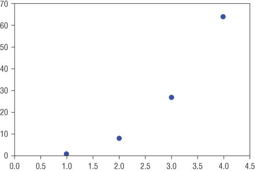
“Illustration depicting the plotting of a scatterplot that uses dots to represent the values for two different variables.”

Figure 4.16: Plotting a scatter plot

Combining Plots

You can combine multiple scatter plots into one chart as follows:

%matplotlib inline
import matplotlib.pyplot as plt
 
import numpy as np
 
a = np.arange(1,4.5,0.1)   # 1.0, 1.1, 1.2, 1.3…4.4
plt.plot(a, a**2, 'y...
lock icon The rest of the chapter is locked
Register for a free Packt account to unlock a world of extra content!
A free Packt account unlocks extra newsletters, articles, discounted offers, and much more. Start advancing your knowledge today.
Unlock this book and the full library FREE for 7 days
Get unlimited access to 7000+ expert-authored eBooks and videos courses covering every tech area you can think of
Renews at $19.99/month. Cancel anytime