


Using Umi UI
Umi UI is a visual extension of Umi to interact with the project. You can run commands to install dependencies, verify and test code, build the project, and add components through a graphical user interface.
Before using Umi UI, we need to add the @umijs/preset-ui package. You can do that by running the following command:
$ yarn add @umijs/preset-ui -D
Now, when you start the project, you should see the following console log:
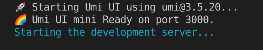
Figure 1.7 – Umi UI starting log
Navigate to http://localhost:8000, and you will notice that the UmiJS logo appears in a bubble in the bottom-right corner. Clicking on this bubble will open Umi UI (you can also access Umi UI at http://localhost:3000).
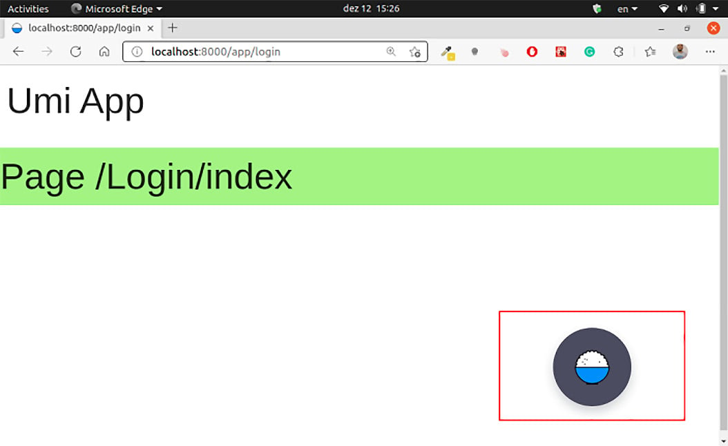
Figure 1.8 – Umi UI bubble in the bottom-right corner
Let's see what we can do using Umi UI, beginning with tasks:
- BUILD: This option will create the application bundle in the
distfolder. You can also click on ENVS to select compilation options, such as CSS compression. - LINT: This option will execute linters in your project. You need to configure the
lintscript to use this option. - TEST: This option will test the project. You need to write tests first.
- INSTALL: This option will install all project dependencies.
The following screenshot shows the Umi UI Task tab:
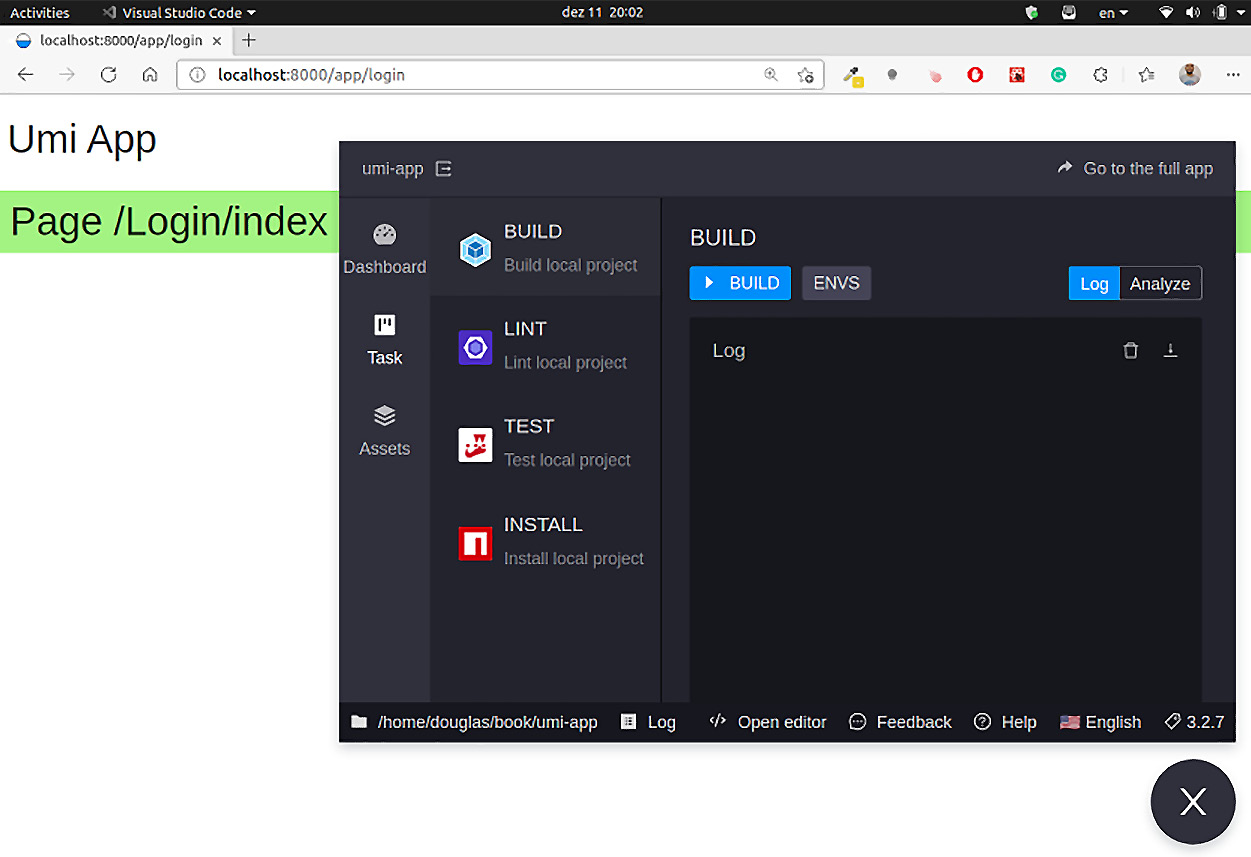
Figure 1.9 – Umi UI Task tab
Next, let's add Ant Design components to our project.
Adding Ant Design components
Ant Design is a design system created by Ant Financial's user experience design team to meet the high demands of enterprise application development and fast changes in these applications. They also created a React UI library of components for building interfaces.
In the Assets tab, we can add Ant Design components to our pages as blocks:
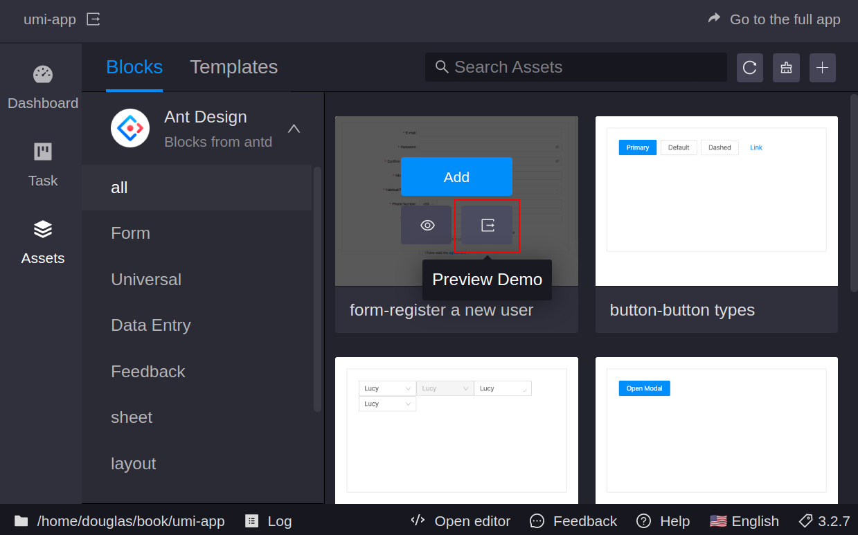
Figure 1.10 – Umi UI Preview Demo button
Tip
The Umi UI Assets tab is almost entirely in Chinese at the moment. Still, you can always refer to the Ant Design documentation by clicking on Preview Demo and changing the website language to English.
Let's add a login form to experiment with this feature:
- Navigate to
http://localhost:8000and open the Umi UI Assets tab. - Click on Add in the form-login box component.
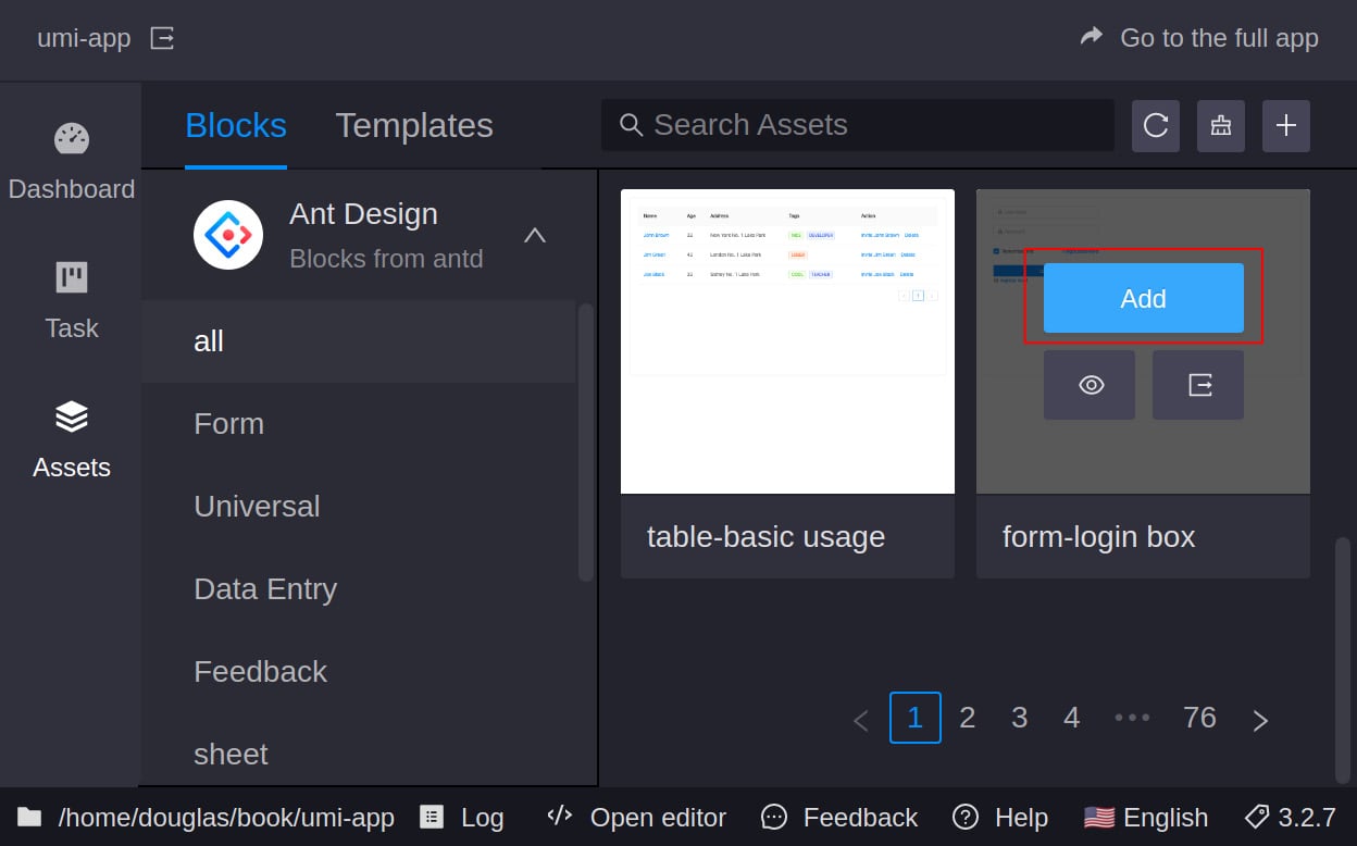
Figure 1.11 – form-login box component Add button
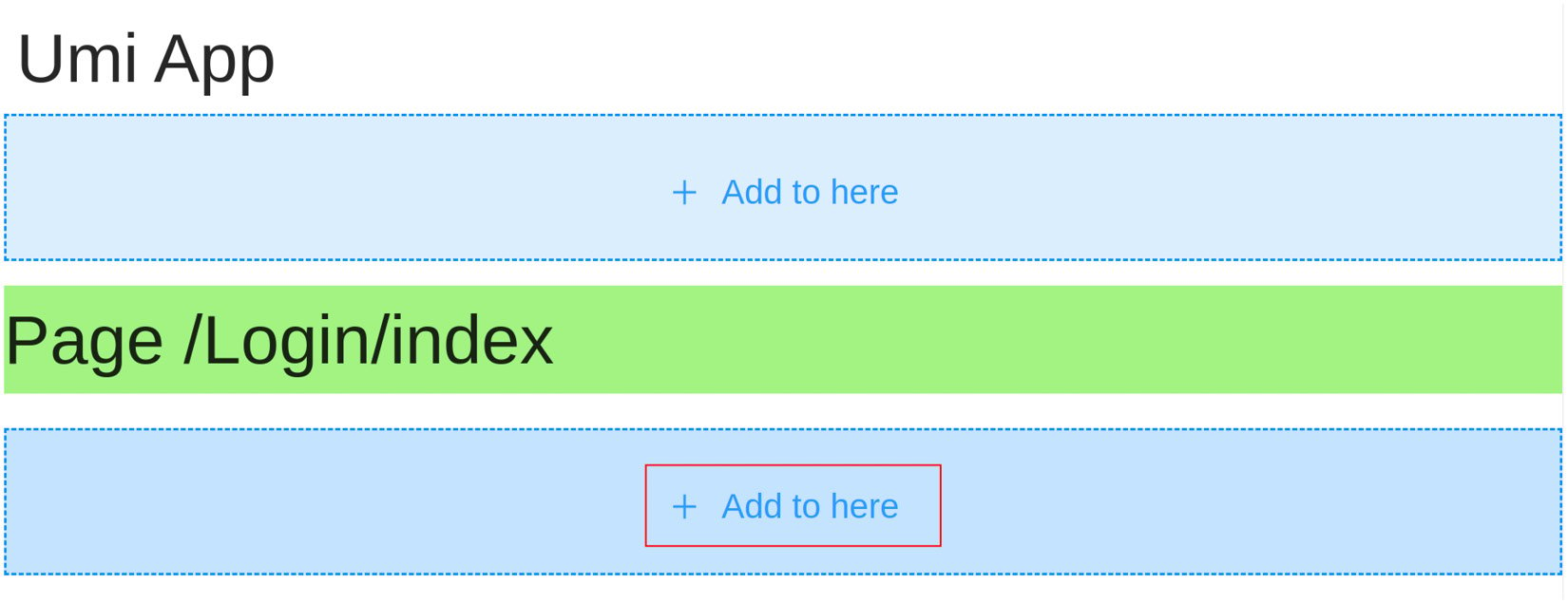
Figure 1.12 – Selecting where to add the component
- Now, in the Variable Name field, type
LoginForm, make sure the package manager client selected is yarn, and click on OK.
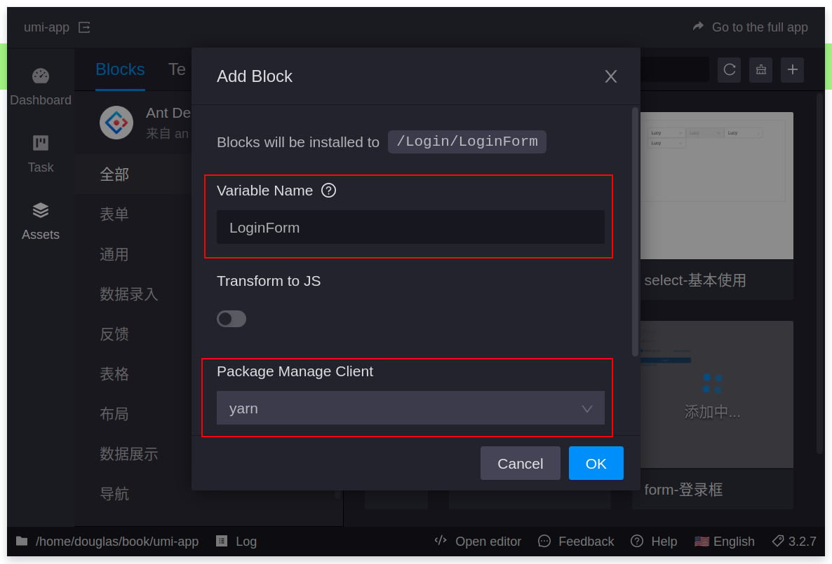
Figure 1.13 – Add Block options
Wait until the block is added and we are done. Umi UI will reload the page, and the component is already there!
If you want, you can add some styles to the login page, as follows:
- Add this code to the Login page's
index.lessfile:.container { display: flex; flex-direction: column; align-items: center; } - Add the
containerCSS class to the login component:import React from 'react'; import styles from './index.less'; import LoginForm from './LoginForm'; export default function Page() { return ( <div className={styles.container}> <h1 className={styles.title}> Welcome! Access your account.</h1> <LoginForm /> </div> ); }
The result should look like this:
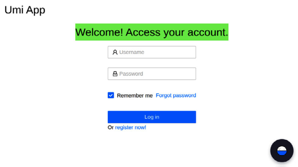
Figure 1.14 – Login page with login form block
And that's it! Now you know how to use Umi UI to interact with your project. If you like this option, I recommend experimenting with it by adding more components and styling them to get you used to it.


