Search icon
Arrow left icon
All Products
Best Sellers
New Releases
Books
Videos
Audiobooks
Learning Hub
Newsletters
Free Learning
Arrow right icon
Drupal 10 Development Cookbook - Third Edition

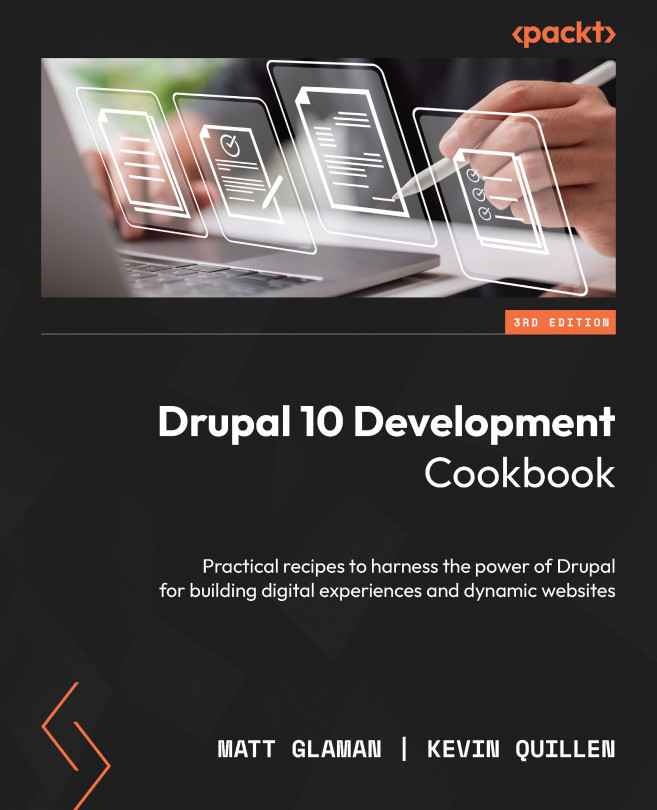
Drupal 10 Development Cookbook: Practical recipes to harness the power of Drupal for building digital experiences and dynamic websites, Third Edition

By Matt Glaman , Kevin Quillen
₱2,040.99 ₱1,427.99
Book Feb 2023 442 pages 3rd Edition
eBook
₱2,040.99 ₱1,427.99
Print
₱2,551.99
Subscription
Free Trial
eBook
₱2,040.99 ₱1,427.99
Print
₱2,551.99
Subscription
Free Trial

What do you get with eBook?

Product feature icon Instant access to your Digital eBook purchase
Product feature icon Download this book in EPUB and PDF formats
Product feature icon Access this title in our online reader with advanced features
Product feature icon DRM FREE - Read whenever, wherever and however you want
Buy Now

Product Details


Publication date : Feb 10, 2023
Length 442 pages
Edition : 3rd Edition
Language : English
ISBN-13 : 9781803234960
Category :
Concepts :
Table of content icon View table of contents Preview book icon Preview Book

Drupal 10 Development Cookbook - Third Edition

Content Building Experience

As you know, Drupal is a content management system that excels in its editorial capabilities and content modeling. In this chapter, we will cover how to set up your content editing experience and add an editorial review workflow.

This chapter dives into creating custom types and harnessing different fields to create advanced structured content. We will walk through customizing the forms used for creating content and learn how to customize the content’s display. The next thing we will learn is how to build custom landing pages using the Layout Builder module. We’ll also learn how to add and manage content and utilize menus for linking to content. At the end of this chapter, you will be able to create a custom authoring experience for your Drupal site.

So, let’s take a look at what topics we will cover in this chapter:

  • Configuring the WYSIWYG editor
  • Creating an editorial workflow with content moderation
  • Creating a custom content type with custom fields
  • Customizing the form display for editing content
  • Customizing the display output of content
  • Using layouts to build landing pages
  • Creating menus and linking content
  • Using Workspaces to create content staging areas

Configuring the WYSIWYG editor

Drupal is integrated with CKEditor 5 as the default What You See Is What You Get (WYSIWYG) editor. The Editor module provides an API to integrate WYSIWYG editors, although CKEditor (the default editor) contributed modules can provide integrations with other WYSIWYG editors.

Text formats control the formatting of content and the WYSIWYG editor configuration for content authors. The standard Drupal installation profile provides a fully configured text format with the enabled CKEditor. We will walk through the steps of recreating this text format.

In this recipe, we will create a new text format with a custom CKEditor WYSIWYG configuration.

Getting ready

Before getting started, make sure the CKEditor module is installed. This module is automatically installed with Drupal’s standard installation.

How to do it…

Let’s create a new text format with a custom CKEditor WYSIWYG configuration:

  1. Visit Configuration from the administrative toolbar and head to Text formats and editors under the Content Authoring heading.
  2. Click on Add text format to begin creating the next text format.
  3. Enter a name for the text format, such as the Editor format.
  4. Select which roles have access to this format – this allows you to have granular control over what users can use when authoring content.
  5. Select CKEditor from the Text editor select list. The configuration form for CKEditor will then be loaded.
  6. You may now use an in-place editor to drag buttons onto the provided toolbar to configure your CKEditor toolbar:
Figure 2.1 – The text format edit form

Figure 2.1 – The text format edit form

  1. Select any of the Enabled filters options, as shown in Figure 2.2, except for Display any HTML as plain text. That would be counterintuitive to using a WYSIWYG editor:
Figure 2.2 – The Enabled filters checkboxes

Figure 2.2 – The Enabled filters checkboxes

  1. Once you’re satisfied, click on Save configuration to save your configuration and create the text filter. It will now be available to users when adding content to rich text fields.

How it works…

The Filter modules provide text formats that control how rich text fields are presented to the user. Drupal will render rich text saved in a text area based on the defined text format for the field. Text fields with “formatted” in their title will respect text format settings; others will render in plain text.

Important note

The text formats and editor’s screen warns of a security risk due to improper configuration. This is because you could grant an anonymous user access to a text format that allows full HTML or allows image sources to be from remote URLs. This may leave your site open to Cross-Site Scripting (XSS) attacks. A cross-site scripting attack is when attackers can inject malicious client-side scripts into your site.

The Editor module provides a bridge to WYSIWYG editors and text formats. It alters the text format form and rendering to allow the integration of WYSIWYG editor libraries. This allows each text format to have a configuration for its WYSIWYG editor.

Out of the box, the Editor module alone does not provide an editor. The CKEditor module works with the Editor API to enable the usage of the WYSIWYG editor.

Contributed modules can provide support for other WYSIWYG editors. For instance, the TinyMCE module (https://www.drupal.org/project/tinymce) integrates Drupal with the TinyMCE editor (https://www.tiny.cloud/tinymce).

There’s more…

Drupal provides granular control of how rich text is rendered and in extensible ways, which we will discuss further.

Filter module

When string data is added to a field that supports text formats, the data is saved and preserved as it was originally entered. Enabled filters for a text format will not be applied until the content is viewed. Drupal works in such a way that it saves the original content and only filters on display.

With the Filter module enabled, you can specify how text is rendered based on the roles of the user who created the text. It is important to understand the filters that are applied to a text format that uses a WYSIWYG editor. For example, if you selected the Display any HTML as plain text option, the formatting done by the WYSIWYG editor would be stripped out when viewed.

Improved links

A major component of WYSIWYG editing is the ability to insert links into other pieces of content or external sites. The default link button integrated with CKEditor allows for basic link embedding. This means that your content editors must know their internal content URLs ahead of time to link to them. A solution to this issue is the Linkit module at https://www.drupal.org/project/linkit.

The LinkIt module can be installed with the following Composer and Drush commands:

dd  /path/to/drupal
composer require drupal/linkit
php vendor/bin/drush en linkit –yes

The Linkit module provides a drop-in replacement for the default link functionality. It adds an auto-complete search for internal content and adds additional options for displaying the field. Linkit works by creating different profiles that allow you to control what content can be referenced, what attributes can be managed, and which users and roles can use a Linkit profile.

CKEditor plugins

The CKEditor module provides a plugin type called CKEditorPlugin. Plugins are small pieces of swappable functionality within Drupal. Plugins and plugin development will be covered in Chapter 8, Plug and Play With Plugins. This type provides integration between CKEditor and Drupal.

The image and link capabilities are plugins defined within the CKEditor module. Additional plugins can be provided through contributed projects or custom development.

Refer to the \Drupal\ckeditor5\Annotation\CKEditor5Plugin class (https://git.drupalcode.org/project/drupal/-/blob/10.0.x/core/modules/ckeditor5/src/Annotation/CKEditor5Plugin.php) for the plugin definition and the \Drupal\ckeditor5\Plugin\CKEditor5Plugin\ImageUpload class (https://git.drupalcode.org/project/drupal/-/blob/10.0.x/core/modules/ckeditor5/src/Plugin/CKEditor5Plugin/ImageUpload.php) as a working example.

See also

Refer to Chapter 8, Plug and Play With Plugins, for the CKEditor 5 documentation (https://www.drupal.org/docs/core-modules-and-themes/core-modules/ckeditor-5-module).

Creating an editorial workflow with content moderation

Many organizations have an editorial workflow that must be followed before content can be published on the website. The Content Moderation module allows content created in Drupal to go through an editorial process before it is published. In this recipe, we will create a content moderation workflow that puts content in a draft state and then reviews, approves, and publishes it. The content remains in a draft state and is hidden from site visitors until it is published.

Getting ready

In this recipe, we will be using the standard installation, which provides the Article content type. Any content type will suffice.

How to do it…

  1. Begin by installing the Content Moderation module and its dependent module, Workflows:
    php vendor/bin/drush en content_moderation –yes
  2. Visit Configuration and then Workflows. This page lists all configured content moderation workflows. Click Add workflow to create a new workflow.
  3. In the Label field, give it a label of Approval workflow and select Content moderation for Workflow type.
  4. The workflow has two default states of Draft and Published. We need to add Review and Approval states. For each of our new states, click the Add a new state link. Fill in the State label and press Save. Leave the Published and Default revision checkboxes unchecked. Those should only be used for a published state.
  5. Rearrange the states’ ordering so that it is Draft, Review, Approval, Published. Press Save at the bottom of the form so that our ordering is saved.
  6. Next, we need to create a transition to move a Draft to Review. Click Add a new transition. Set the Transition label to Ready for review. Select Draft as a From state. Then, select Review as the To state and press Save.
  7. Now, we will create the Review to Approval transition. Click Add a new transition. Set the Transition label to Needs approval. Select Review as a From state. Then, select Approval as the To state and press Save.
  8. We must edit the default Publish transition. Uncheck Draft from the From checkboxes and select Approval.
  9. Finally, we must assign this workflow to content entities. Under This workflow applies to, look for Content types. Press Select and a dialog will open. Check Article, then press Save in the dialog.
  10. Press Save at the bottom of the form. Our content moderation workflow is now complete!

How it works…

Without Content Moderation, publishable content entities only have two states: unpublished or published. There also are no permissions to control who can make an unpublished piece of content published or vice versa. Content Moderation solves this problem.

The Workflows module provides an API for defining states and transitions. It is up to modules such as Content Moderation to provide Workflow Type plugins to bring meaningful functionality. The Content Moderation module integrates with the revision capabilities of Drupal content entities.

When editing a content entity that uses Content Moderation, there will be a Moderation State field. This field contains the states that a piece of content can transition to, based on the current user’s permissions.

See also

Creating a custom content type with custom fields

Drupal excels in the realm of content management by allowing different types of content. In this recipe, we will walk you through creating a custom content type. We will create a Services type that has some basic fields and can be used in a scenario that brings attention to a company’s provided services.

You will also learn how to add fields to a content type in this recipe, which generally goes hand in hand with making a new content type on a Drupal site.

How to do it…

  1. Go to Structure and then Content types. Click on Add content type to begin creating a new content type.
  2. Enter Services as the name, and an optional description.
  3. Select Display settings and uncheck the Display author and date information checkbox. This will hide the author and submitted time from services pages.
  4. Click on the Save and manage fields button to save the new content type and manage its fields.
  5. By default, new content types have a Body field automatically added to them. We will keep this field in place.
  6. We will add a field that will provide a way to enter a marketing headline for the service. Click on Add field.
  7. Select Text (plain) from the dropdown and enter Marketing headline as the label.

Important note

The Text (plain) option is a regular text field. The Text (formatted) option will allow you to use text formats on the displayed text in the field.

  1. Click on Save field settings on the next form. On the following form, click on Save settings to finish adding the field.
  2. The field has now been added, and content of this type can be created.

How it works…

In Drupal, content entities can have different bundles. A bundle refers to a different type of that entity type. The word bundle comes from it being a bundle of fields since each bundle of a content entity type can have different fields. When working with nodes, they are synonymous with content, and bundles for nodes are referred to as content types.

When a content type is created, a default body field is created for it. This is performed by calling the node_add_body_field() function in the node.module file. It is a great reference point for those who wish to see the steps for programmatically defining a bundle field outside of the user interface.

Fields can only be managed or added if the Field UI module is enabled. The Field UI module exposes the Manage Fields, Manage Form Display, and Manage Display options for entities, such as Nodes, Blocks, and Taxonomy Terms.

Customizing the form display for editing content

Form modes allow a site administrator to customize the edit form when modifying a content entity. In the case of nodes, you can rearrange the order of fields and change the form elements used for a fields node edit form. There is also the Field Group module. The Field Group module allows you to group fields into fieldsets.

In this recipe, we will install Field Group and modify the form display to create an Article content type.

How to do it…

  1. First, we must add the Field Group module to the Drupal site using Composer and then install it with Drush:
    composer require drupal/field_group
    php vendor/bin/drush en field_group –yes
  2. To customize the form’s display mode, go to Structure and then Content Types.
  3. We will modify the Article content type’s form. Click on and expand the Operations button and select Manage form display.
  4. Click Add field group to begin adding a new field group.
  5. Select Details Sidebar from Add a new group, give this a Label of Metadata, and click Save and continue.
  6. Press Create group on the next form and use the default values to finish creating the group.
  7. Drag the newly created Metata group (as shown in Figure 2.3) up from the Disabled section so that is it enabled. Directly above the Disabled label is fine.
  8. Take the Tags field and drag it so that it is nested under the Metadata group – below it, and slightly to the right:
Figure 2.3 – The Manage Display form with the Tags widget moved underneath the Metadata field group component

Figure 2.3 – The Manage Display form with the Tags widget moved underneath the Metadata field group component

  1. Click on the Save button at the bottom of the page to save your changes.
  2. Go to Create a New Article; you will find the Metadata tab in the sidebar, which contains the Tags field:
Figure 2.4 – The Article edit form, with the Tags element in the sidebar

Figure 2.4 – The Article edit form, with the Tags element in the sidebar

How it works…

When a content entity form is built, the form is aware of the display mode to be used. Then, it invokes the display mode to build the components for each field using the specified field widgets.

This allows you to customize specific parts of the form without having to replace the entire form. Developers can create new field widgets or leverage ones from contributed modules to enhance the functionality of forms.

Field Group does not create field widgets, but a new structure inside of the form display. It will then arrange field widgets into groupings. This provides a more organized content editing experience.

There’s more…

We will discuss more items for managing the form of a content entity in the following section.

Managing form display modes

Additional form display modes can be added by visiting Structure and then Display Modes under Form Modes. Each content entity type has a hidden default form mode that always exists. Additional form display modes can be added and configured using the display management form.

On their own, these forms and their configured field widgets are not directly integrated with Drupal. Using custom code, or even contributed projects, they can be used to embed for special uses.

For instance, there is the Register form mode for users. The user registration form is built using this display mode and the configured widgets instead of what is normally available when editing an existing user.

Customizing the display output of content

Drupal provides display view modes that allow you to customize the fields and other properties attached to an entity. In this recipe, we will adjust the teaser display mode of an Article content type. Each field or property has controls for displaying the label, the format to display the information in, and additional settings for the format.

Harnessing view displays allows you to have full control over how content is viewed on your Drupal site.

How to do it…

  1. Now, it is time to customize the form display mode by navigating to Structure and then Content Types.
  2. We will modify the Article content type’s display. Click on the drop button arrow and select Manage display.
  3. Click on the Teaser view mode option to modify it. Teaser view mode is used in node listings, such as the default home page.
  4. Drag the Tags field to the hidden section. The tags on an article will no longer be displayed when viewing a Teaser view mode.
  5. Click on the settings cog icon for the Body field to adjust the trimmed limit. The trim limit is a fallback for the summary or trimmed format when the summary of a text-area field is not provided. Modify this by changing it from 600 to 300.
  6. Click on Save to save all the changes that you have made.
  7. View the home page and review the changes that have taken effect.

How it works…

The default rendering system for an entity uses view displays. View display modes are configuration entities. Since view display modes are configuration entities, they can be exported using configuration management.

When a content entity is rendered, the view display goes through each field formatter configured in the display. The field formatter is the option chosen from the Format property of the Manage Display form and identifies what code should be used to render the field value. The field value is retrieved from the entity and passed to the field formatter plugin that has been instantiated with the configuration provided to the view display. This collection of render data is then passed through the rest of Drupal’s render pipeline.

There’s more…

We will discuss more items for managing the form of a content entity in the following section.

Managing view display modes

Additional form display modes can be added by visiting Structure and then Display Modes under View Modes. Each content entity type has a hidden default view mode that always exists. Additional view display modes can be added and configured using the display management form.

These view modes can then be leveraged when displaying content with views, the Rendered entity field formatter for entity references, or when rendering entities with custom code.

Using layouts to build landing pages

The Layout Builder module allows content creators to use a drag-and-drop interface to customize how content is displayed on a page. Unlike using field formatters in view display modes, this does not require a developer and can be customized for individual pieces of content. With Layout Builder, content creators select from different layouts available in the system and place blocks in them to build the page’s content. In this recipe, we will walk through installing Layout Builder and setting up the layout for the Article content type.

Getting ready

In this recipe, we will be using the standard installation, which provides the Article content type. Any content type will suffice.

How to do it…

  1. Begin by installing the Layout Builder module and its dependent module, Layout Discovery:
    php vendor/bin/drush en layout_builder –yes
  2. We must opt into using Layout Builder for the display mode of our content type. Visit Structure and then Content Types and use the drop button for Article to click Manage Display.
  3. Find the section labeled Layout options and check the Use Layout Builder checkbox.
  4. Click Save to enable Layout Builder.
  5. The Manage Display form should now show a Manage layout button.
  6. Click the Manage layout button to enter the Layout Builder user interface to customize the Article layout.
  7. By default, the Show content preview checkbox is turned on. Uncheck this checkbox to turn off the generated sample preview content.
  8. Click Add section to create a new section and select Two column layout.
  9. Select 33%/67% for the Column width and click Add section, leaving the administrative label empty.
  10. Now that we have added our two-column section, we can move fields into those layout parts. Drag the Image field to the left part and the Body field to the right part of the new section.
  11. Click Save layout to save the changes.
  12. Without using code, we have now created a layout for Articles that places the image in a sidebar next to the article content.

How it works…

The Layout Builder module provides an alternative render system for entity types. Using Layout Builder is an opt-in process for each display mode of a content entity type. If the entity type’s display mode is not managed by Layout Builder, it falls back to the regular render system using field formatters.

Layouts are provided by layout plugins, which have matching Twig templates. Modules and themes can define new templates that can be used. Layout Builder leverages blocks to display content. The kinds of blocks available to be embedded in Layout Builder are based on blocks available to the system.

Layout Builder also exposes each field on the content entity as a block, allowing you to place each field in a different section.

Like custom nodes or other entity templates, if you make changes to the layout plugin or nested elements without updating the corresponding Twig templates for the layout, you may see things render incorrectly. Be sure to review the Twig template accordingly when making such changes.

There’s more…

Layout Builder was an exciting addition to Drupal when it first arrived and has many more features and customizations far beyond what was covered in this recipe.

Accessible

The Layout Builder user interface went through rigorous accessibility testing. The entire Layout Builder user interface can be navigated using a keyboard or other accessibility devices.

Custom layouts for each piece of content

When configuring the layout options, the Allow each content item to have its layout customized option allows content editors to override the default layout for their content. When a piece of content is created, it will use the default layout. Content editors will see a Layout tab that allows them to customize the display of their content in the Layout Builder user interface.

The layout override is also stored in field data attached to the content entity, making it tracked with revisions! That means new drafts can be created for a piece of content with layout changes and they can be published through Content Moderation workflows.

Additional modules to extend Layout Builder

There are a copious number of modules that extend Layout Builder to customize its experience and provide default layouts. For instance, if you use the Bootstrap front-end framework, the Bootstrap Layout Builder (https://www.drupal.org/project/bootstrap_layout_builder) module provides a user interface for building layouts that use Bootstrap’s styling.

A list of modules that extend Layout Builder can be found on Drupal.org: https://www.drupal.org/docs/8/core/modules/layout-builder/additional-modules.

See also

Creating menus and linking content

Drupal allows you to link content being authored to a specified menu on the website, generally the main menu. You can, however, create a custom menu to provide links to content. In this recipe, we will show you how to create a custom menu and link content to it. We will then place the menu as a block on the page, in the sidebar.

Getting ready

This recipe assumes that you have installed the standard installation profile and have the default node content types available for use. You should have some content created to create a link.

How to do it…

  1. Visit Structure and click on Menus.
  2. Click on Add menu.
  3. Provide a title of Sidebar menu and an optional summary and then click on Save.
  4. Once the menu has been saved, click on the Add link button.
  5. Enter a link title and then type in the title for a piece of content. The form will provide autocomplete suggestions for linkable content.
  6. Click on Save to save the menu link.
  7. With the menu link saved, go to Structure, and then Block layout.
  8. Click on Place block next to Sidebar first. In the model, search for Sidebar menu and click on Place block.
  9. In the following form, click on Save block.
  10. View your Drupal site by clicking on Home in the administration menu.

How it works…

Menus and links are part of Drupal core. The ability to make custom menus and menu links is provided through the Menu UI module. This module is enabled on the standard installation but may not be in others.

The Link input of the menu link form allows you to begin typing content titles and easily link them to existing content. It will automatically convert the title into the internal path for you. Link input also accepts a regular path, such as /node/1 or an external path. You may use <front> to link to the home page, <nolink> to render a non-linked anchor tag, and <button> for a keyboard-accessible text-only link.

There’s more…

Links can be managed through the content edit form itself, which will be covered next.

Managing a contents menu link from its form

A piece of content can be added to a menu from the add or edit form. The menu settings section allows you to toggle the availability of a menu link. The menu link title will reflect the content’s title by default.

The parent item allows you to decide which menu and which item it will appear under. By default, content types only have the main menu allowed. Editing a content type can allow for multiple menus or only choosing a custom menu.

This allows you to populate the main menu or complimentary menu without having to visit the menu management screens.

Using Workspaces to create content staging areas

The Workspaces module provides a new way of working with content on your Drupal site. It allows you to have a live version of your site’s content and parallel draft versions. Normal content workflows involve multiple pieces of content that may be drafted and published at various times. The Workspaces module provides a way to create and prepare published drafts that release at the same time.

For example, during a big sporting event, articles are prepared based on whichever team wins. Once the winner is announced, that version of the site’s content can be published. In this recipe, we will install the Workspaces module and walk through using site versions.

Important note

At the time of writing, the Workspaces module is an Experimental module. Modules that are marked as experimental are under active development and not considered stable. Experimental modules provide a way of adding new functionality to Drupal core more easily. You can read more about the experimental module policy on Drupal.org: https://www.drupal.org/about/core/policies/core-change-policies/experimental/policy-and-list.

Getting ready

In this recipe, we will be using the Standard installation, which provides the Basic Page content type. Any content type will suffice.

How to do it…

  1. Begin by installing the Workspaces module:
    php vendor/bin/drush en workspaces --yes
  2. Visit your Drupal site; you will notice the Live tab on the right of the toolbar; this is the current workspace identifier.
  3. Click on Live to open the Workspaces menu.
  4. Click on the Stage workspace’s name and then click Confirm in the modal asking if we would like to activate and switch to the Stage workspace.
  5. Create three or four new basic pages while using the Stage workspace and be sure to check Promoted to front page in the Promotion options group.
  6. When you visit the front page of your Drupal site, you should see the pages you created in the front page list.
  7. Now, open your Drupal site in another browser, or private mode, where you are not logged in. You will see that the home page shows No front-page content has been created yet. This shows that the content is only published in the Stage workspace, not the live site.
  8. Back in your Drupal site, click on the Stage tab in your toolbar to open the workspace menu.
  9. Click Publish content to begin publishing your Stage content into the Live site.
  10. A confirmation form will appear. Click Publish items to Live to finish the process.
  11. If you test your site in another browser, or private mode, again, you will see the home page now lists all your new pages!

How it works…

The Workspace module uses the existing revision capabilities of content entities. Revisions are then tracked against a workspace until they are published to the Live workspace. The Workspace module also adds safeguards. Forms that manipulate site configuration cannot be saved unless in the Live workspace; the module displays a warning and disables the Submit button. When using multiple workspaces, the Workspace module only allows a piece of content to be edited in one workspace.

Workspaces also have a user account associated with them. This allows segmented workspaces for specific users. This allows content creators to create a new workspace, but not view or modify another content creator’s workspace.

There’s more…

The Workspaces module provides other user interfaces not covered in this recipe, and there is another way to use a workspace beyond just content.

When will Workspaces become a stable module?

Effort is being made to make the Workspaces module stable. These issues are tagged in the Drupal core issue queue as WI critical (short for Workflow Initiative Critical). The list of issues can be found here: https://www.drupal.org/project/issues/search/drupal?status%5B%5D=Open&issue_tags_op=%3D&issue_tags=WI+critical.

Managing content changes in a workspace

When the workspace menu is open in the toolbar, you can click the Manage workspace link to see all of the active changes in the workspace. This makes it easier for a content manager to review what content has been modified in a workspace. It also allows for deleting those changes to revert to the original content.

This overview is useful for reviewing all the changes that may be published to the Live workspace.

Creating child workspaces

A workspace may also have a parent workspace. This allows you to maintain a centralized Stage workspace but forces content creators to have their child workspace under Stage. All content modifications can then merge into Stage instead of each contributor’s workspace publishing to Live.

Using a workspace to test a new site redesign

Drupal has a mechanism for determining the active theme, which, by default, is the default theme. Code can be written to override the current theme based on specific conditions. The Workspace Theme module (https://www.drupal.org/project/workspace_theme) does just that.

It adds a new field to a workspace that allows you to specify a different theme to be used when that workspace is active. This allows you to preview a site’s redesign with a new theme without making it the default theme on the production site, or purely relying on a test server.

See also

Left arrow icon Right arrow icon
Download code icon Download Code

Key benefits

  • Design your digital experience platform with robust content management and editorial workflows
  • Write custom modules to extend Drupal to meet your requirements by creating customized plugins, entity types, and pages
  • Enhance your Drupal site using modern frontend development build tools

Description

This new and improved third edition cookbook is packed with the latest Drupal 10 features such as a new, flexible default frontend theme - Olivero, and improved administrative experience with a new theme - Claro. This comprehensive recipe book provides updated content on the WYSIWYG (What You See Is What You Get) editing experience, improved core code performance, and code cleanup. Drupal 10 Development Cookbook begins by helping you create and manage a Drupal site. Next, you’ll get acquainted with configuring the content structure and editing content. You’ll also get to grips with all new updates of this edition, such as creating custom pages, accessing and working with entities, running and writing tests with Drupal, migrating external data into Drupal, and turning Drupal into an API platform. As you advance, you’ll learn how to customize Drupal’s features with out-of-the-box modules, contribute extensions, and write custom code to extend Drupal. By the end of this book, you’ll be able to create and manage Drupal sites, customize them to your requirements, and build custom code to deliver your projects.

What you will learn

Create and manage a Drupal site’s codebase Design tailored content creator experiences Leverage Drupal by creating customized pages and plugins Turn Drupal into an API platform for exposing content to consumers Import data into Drupal using the data migration APIs Advance your Drupal site with modern frontend tools using Laravel Mix

What do you get with eBook?

Product feature icon Instant access to your Digital eBook purchase
Product feature icon Download this book in EPUB and PDF formats
Product feature icon Access this title in our online reader with advanced features
Product feature icon DRM FREE - Read whenever, wherever and however you want
Buy Now

Product Details


Publication date : Feb 10, 2023
Length 442 pages
Edition : 3rd Edition
Language : English
ISBN-13 : 9781803234960
Category :
Concepts :

Table of Contents

17 Chapters
Preface Chevron down icon Chevron up icon
Chapter 1: Up and Running with Drupal Chevron down icon Chevron up icon
Chapter 2: Content Building Experience Chevron down icon Chevron up icon
Chapter 3: Displaying Content through Views Chevron down icon Chevron up icon
Chapter 4: Extending Drupal with Custom Code Chevron down icon Chevron up icon
Chapter 5: Creating Custom Pages Chevron down icon Chevron up icon
Chapter 6: Accessing and Working with Entities Chevron down icon Chevron up icon
Chapter 7: Creating Forms with the Form API Chevron down icon Chevron up icon
Chapter 8: Plug and Play with Plugins Chevron down icon Chevron up icon
Chapter 9: Creating Custom Entity Types Chevron down icon Chevron up icon
Chapter 10: Theming and Frontend Development Chevron down icon Chevron up icon
Chapter 11: Multilingual and Internationalization Chevron down icon Chevron up icon
Chapter 12: Building APIs with Drupal Chevron down icon Chevron up icon
Chapter 13: Writing Automated Tests in Drupal Chevron down icon Chevron up icon
Chapter 14: Migrating External Data into Drupal Chevron down icon Chevron up icon
Index Chevron down icon Chevron up icon
Other Books You May Enjoy Chevron down icon Chevron up icon

Customer reviews

Filter icon Filter
Top Reviews
Rating distribution
Empty star icon Empty star icon Empty star icon Empty star icon Empty star icon 0
(0 Ratings)
5 star 0%
4 star 0%
3 star 0%
2 star 0%
1 star 0%

Filter reviews by


No reviews found
Get free access to Packt library with over 7500+ books and video courses for 7 days!
Start Free Trial

FAQs

How do I buy and download an eBook? Chevron down icon Chevron up icon

Where there is an eBook version of a title available, you can buy it from the book details for that title. Add either the standalone eBook or the eBook and print book bundle to your shopping cart. Your eBook will show in your cart as a product on its own. After completing checkout and payment in the normal way, you will receive your receipt on the screen containing a link to a personalised PDF download file. This link will remain active for 30 days. You can download backup copies of the file by logging in to your account at any time.

If you already have Adobe reader installed, then clicking on the link will download and open the PDF file directly. If you don't, then save the PDF file on your machine and download the Reader to view it.

Please Note: Packt eBooks are non-returnable and non-refundable.

Packt eBook and Licensing When you buy an eBook from Packt Publishing, completing your purchase means you accept the terms of our licence agreement. Please read the full text of the agreement. In it we have tried to balance the need for the ebook to be usable for you the reader with our needs to protect the rights of us as Publishers and of our authors. In summary, the agreement says:

  • You may make copies of your eBook for your own use onto any machine
  • You may not pass copies of the eBook on to anyone else
How can I make a purchase on your website? Chevron down icon Chevron up icon

If you want to purchase a video course, eBook or Bundle (Print+eBook) please follow below steps:

  1. Register on our website using your email address and the password.
  2. Search for the title by name or ISBN using the search option.
  3. Select the title you want to purchase.
  4. Choose the format you wish to purchase the title in; if you order the Print Book, you get a free eBook copy of the same title. 
  5. Proceed with the checkout process (payment to be made using Credit Card, Debit Cart, or PayPal)
Where can I access support around an eBook? Chevron down icon Chevron up icon
  • If you experience a problem with using or installing Adobe Reader, the contact Adobe directly.
  • To view the errata for the book, see www.packtpub.com/support and view the pages for the title you have.
  • To view your account details or to download a new copy of the book go to www.packtpub.com/account
  • To contact us directly if a problem is not resolved, use www.packtpub.com/contact-us
What eBook formats do Packt support? Chevron down icon Chevron up icon

Our eBooks are currently available in a variety of formats such as PDF and ePubs. In the future, this may well change with trends and development in technology, but please note that our PDFs are not Adobe eBook Reader format, which has greater restrictions on security.

You will need to use Adobe Reader v9 or later in order to read Packt's PDF eBooks.

What are the benefits of eBooks? Chevron down icon Chevron up icon
  • You can get the information you need immediately
  • You can easily take them with you on a laptop
  • You can download them an unlimited number of times
  • You can print them out
  • They are copy-paste enabled
  • They are searchable
  • There is no password protection
  • They are lower price than print
  • They save resources and space
What is an eBook? Chevron down icon Chevron up icon

Packt eBooks are a complete electronic version of the print edition, available in PDF and ePub formats. Every piece of content down to the page numbering is the same. Because we save the costs of printing and shipping the book to you, we are able to offer eBooks at a lower cost than print editions.

When you have purchased an eBook, simply login to your account and click on the link in Your Download Area. We recommend you saving the file to your hard drive before opening it.

For optimal viewing of our eBooks, we recommend you download and install the free Adobe Reader version 9.