Chapter 7. Telling a Data Story with Dashboards
As you engage in data discovery and analysis, you will create numerous data visualizations. Each of these visualizations gives a snapshot of a story within the data. Each view into the data answers one, or maybe a couple of questions. At times, the discovery and analysis are enough to make a key decision and the cycle is complete. Many times, however, you will need to bring these visualizations together so that they communicate a comprehensive story to your intended audience.
Tableau allows you to bring together related data visualizations into a single dashboard. This dashboard could be a static view of various aspects of the data or a fully interactive environment, allowing users to dynamically filter, drill-down, and interact with the data visualizations.
This chapter will cover the following topics:
Every dashboard seeks to tell a story by giving a clear picture of a certain set of information. Before designing a dashboard, you should understand what story the data tells. How you tell the story will depend on numerous factors such as your audience, the way the audience will access the dashboard, and what response you want to elicit from your audience.
Stephen Few defines a dashboard as a visual display of the most important information needed to achieve one or more objectives; consolidated and arranged on a single screen so the information can be monitored at a glance. This definition is helpful to consider because it places some key boundaries around the data story and the way we will seek to tell it in Tableau. In general, your data story should follow these guidelines:
Example - is least profitable always unprofitable?
Let's say you've been tasked with helping Management for the superstore chain find which items are the least profitable. Management feels that the least profitable items should be eliminated from the inventory. However, as you've done your analysis, you've discovered that certain items, while not profitable overall, have made profit at times in various locations. Your primary objective is to give management the ability to quickly see an analysis of the least profitable items to identify whether an item has always been unprofitable. This example will combine aspects of a guided analytics dashboard and an exploratory tool.
Let's start by creating the individual views that will comprise your dashboard:
Create a bar chart showing profit by category. Sort the categories in descending order by the sum of profit.
Add the Department field to Filters and show a filter. To accomplish this, use the drop-down menu of the Department field...
Designing for different displays and devices
When designing a dashboard, some of the first questions you'll often ask yourself are: How will my audience view this dashboard? What kind of device will they use? With the wide adoption of mobile devices, this question becomes very important because what looks great on a large flat screen monitor doesn't always look great on a tablet or phone.
Previous versions of Tableau have given you the ability to set sizes for dashboards, but Tableau 10 gives you even greater flexibility by allowing you to define layouts for different devices.
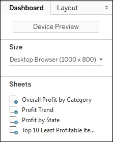
The top of the Dashboard tab on the left sidebar reveals a button to preview the dashboard on various devices as well as a drop-down menu for Size options.
Clicking the Device Preview button not only allows you to see how your dashboard will look with various device types (and even specific models), but also allows you to add a layout for each device type that you can customize:
You can not only see how your dashboard...
In Tableau, an action is a user-initiated event that triggers a response from Tableau. You've seen a few examples of actions used in dashboards. We'll now consider some details of how actions work in Tableau.
Tableau supports three kinds of action:
Filter actions: The user's action causes one or more filters to be applied to one or more views
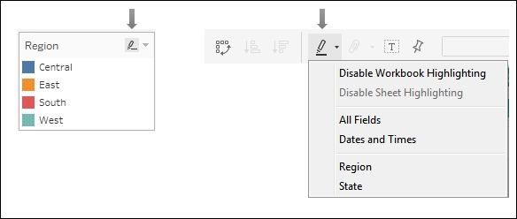
Highlight actions: The user's action causes specific marks and headers to be highlighted in one or more views
URL actions:The user's action causes a specific URL to be opened (either in a browser, a new tab, or in an embedded web object)
Certain actions are automatically generated by Tableau based on shortcuts. For example, you can select Use as Filter from the drop-down menu of a view on a dashboard, resulting in an automatically generated filter action. Enabling highlighting using the button on a discrete color legend or from the toolbar will automatically generate a highlight action:
You can also create or edit dashboard actions by...
Example - regional scorecard
We'll consider another example dashboard which demonstrates slightly different objectives. Let's say everyone in the organization has agreed upon a key performance indicator of Profit Ratio KPI. Furthermore, there is consensus that the cut-off between an acceptable and poor profit ratio is 15.00% but management would like to have the option of adjusting the value dynamically to see if other targets might be better.
Consider the following dashboard:
This dashboard allows your audience to very quickly evaluate the performance of each region over the last 6 months. Executive management could very quickly pull this dashboard up on their mobile device and take appropriate action as needed.
The dashboard provides interactivity with the KPI target parameter. Additional means of drilling down into other dashboards or views could be provided if desired. If this view were published on Tableau Server, it is not unreasonable to think that regional managers might subscribe...
The stories feature allows you to tell a story using interactive snapshots of dashboards and views. The snapshots become points in a story. This allows you to construct a guided narrative or even an entire presentation.
Let's consider an example in which story points might be useful. Executive managers are pleased with the regional scorecard dashboard you developed above. Now, they want you to make a presentation to the board and highlight some specific issues for the South region. With minimal effort, you can take your simple scorecard, add a few additional views, and tell an entire story:
First we'll build a couple of additional views. Create a simple geographic view named Profit Ratio KPI by State. Make this a filled map with the AGG (KPI - Profit Ratio) field defining the color.
Add Profit Ratio to the Detail of the Marks card so it is available for later use:
Create one additional view named Profit Ratio by Quarter. Use Order Date as a continuous date value on Columns and Profit...
When you are ready to share your discovery and analysis you will likely use dashboards to relate the story to your audience. The way in which you tell the story will depend on your objectives as well as your audience and the mode of delivery. Using a combination of views, objects, parameters, filters, and legends, you can create an incredible framework for telling a data story. Tableau allows you to specifically design layouts for different devices to ensure your audience has the best experience. By introducing actions and interactivity, you can invite your audience to participate in the story. Story points will allow you to bring together many snapshots of dashboards and views to craft and present entire narratives.
Next we'll turn our attention to some deeper analysis with trends, distributions, forecasting, and clustering.