Chapter 3. Using Bootstrap Components
Bootstrap provides over a dozen components, such as input groups, drop-down menus, navigation, alerts, and iconography. By using these components in your web application, you can offer a consistent and easy-to-use interface for your users.
Bootstrap components are essentially made by combining various existing Bootstrap elements, adding a number of unique class names, and representing a number of the common metaphors used on many websites.
In this chapter, we will cover the following topics:
Using the Bootstrap navigation bar
How to implement button groups and drop-down menus
Exploring the different input groups
Using the different Navs (navbars, pills, and so on)
Implementing alerts, progress bars, and badges
Introduction to cards
The Bootstrap navigation bar
The Bootstrap navigation bar is one of the components that is used on the majority of sites using the Bootstrap framework. The navbar functions as a navigation header in your sites and will collapse on smaller devices showing only an icon menu, using the Bootstrap Collapse plugin. It is ideally suited to include site branding and navigation.
A basic navigation bar consists of the website logo or brand name, navigation menu, and options for toggling behavior on smaller devices. A basic Bootstrap navigation bar might look similar to this:
The preceding navigation bar consists of an <a> element containing the site logo, with a class name of .navbar-brand. It also contains a <ul> element, whose class name is set to .nav navbar-nav. Each <li> child element's class name is set to .nav-item. The full HTML markup required to create the navigation bar is listed here:
<nav class="navbar navbar-full navbar-dark bg-primary">
    <...
List groups are flexible components that either display simple lists of elements or can be combined with other elements to create complex lists with custom content. As an example, we'll create a sample search page that will display the search results in a Bootstrap list group.
Start by completing the following steps:
Add a new controller called SearchController.cs to your project.
Change the Index action to the following:
        public IActionResult Index(string query)
        {
            ViewBag.SearchQuery = query;
            var products = GetProducts();
            if (!string.IsNullOrEmpty(query))
            {
              var results = products.Where(p => p.Name.Contains(query));
              return View(results);
            }
            return View(products);
        }
The preceding code retrieves a list of all products using the GetProducts method. It will then filter the list of products if the...
Badges are used to highlight items. You would normally see badges to indicate the number of new or unread items depending on the type of application. We used badges on the product search result page to indicate the number of units currently in stock:
<li class="list-group-item">
    <span class="tag tag-default tag-pill pull-xs-right">@item.UnitsInStock</span>
    @item.Name
</li>
Adding a badge to an element is as simple as adding a <span> element and setting its class name to .tag. You'll also notice that you can set the color of the badge using the default Bootstrap context classes. For example, to change the badge color to red, change the .tag-default class name to .tag-danger.
The media object component can be used to build hierarchical style lists such as blog comments or tweets. In the following example application, we'll use it to return a search result view when the user searches for employees. Our model will have a 'ReportsTo' field indicating which employee other employees report to; the media object component would be ideal to indicate this visually.
The method located in SearchController that searches for the employees and returns the results to the view is as follows:
public IActionResult SearchEmployees(string query)
{
    ViewBag.SearchQuery = query;
    var employees = GetEmployees();
    if (!string.IsNullOrEmpty(query))
    {
        var results = employees.Where(p => p.Name.Contains(query));
        return View(results);
    }
    return View(employees);
}
The preceding code will retrieve a list of employees using the GetEmployees method and, if the query parameter is...
Breadcrumbs are a common metaphor used in web design to indicate to the user what their current location is inside a navigation tree. It is similar to a file path inside Windows Explorer. Breadcrumbs are ideal for a site with many sub-navigation levels, and they allow the user to navigate between the various parent and child pages.
In the following markup, we'll use a combination of Razor and HTML to build a breadcrumb component with which the user can navigate back to the Home page or the Manage page:
<ol class="breadcrumb">
    <li class="breadcrumb-item"><a href="#">Home</a></li>
    <li class="breadcrumb-item"><a href="#">Search</a></li>
    <li class="breadcrumb-item active">Employees</li>
</ol>
The preceding markup contains an ordered list <ol> element with a class name of .breadcrumb. Each child element of the breadcrumb is added as a list item <li> element...
Pagination is used to divide content, usually lists, into separate pages. For example, when scaffolding a List view, the default scaffolding template generates a table that contains a row for each item in the collection you pass into the view. This is fine for small amounts of data, but if the list contains hundreds of items, your page will take a very long time to load. Ideally, you would like to split your list view into a manageable 5 to 10 items per page view.
In the first edition of this book we used the PagedList.Mvc NuGet package to make paging using Bootstrap 3 easier. This package is no longer maintained, but there is a drop-in replacement library available on NuGet called X.PagedList.
Unfortunately, neither NuGet Packages would work, because of their dependencies on System.Web, which was removed from ASP.NET Core. In the following example we'll use an open source library called cloudscribe.Web.Pagination to create a paged list using Bootstrap 4.
To create the paged list...
Input groups are another way to provide the user with additional information about the data you expect them to enter in a specific form element. Bootstrap provides classes to add sections either before or after an input element. These sections can contain either text or an icon.
To create a text input element to indicate to the user that we require them to enter a phone number into the field, we'll use the following markup:
@model Chapter3.Models.PersonModel
<div class="container">
    <div class="row">
        <div class="col-md-6">
            <label asp-for="Phonenumber" class="col-md-4 control-label">
            </label>
            <div class="input-group">
                <span class="input-group-addon" id="PhoneNumber">
                <i class="fa fa-phone"></i></span>
                <input asp-for="Phonenumber" class="form-control"
               ...
Button dropdowns are useful when you need a button that can perform multiple related actions. For example, you could have a save button that saves a record, but you would also like to give the user an option to save the record and automatically show a new empty form to create another record. This will be beneficial to the user when they need to create multiple records of the same type.
For example, the following code creates a button dropdown menu inside a form that will create a save button with two additional actions:
<div class="dropdown">
<button class="btn btn-primary dropdown-toggle" type="button"
data-toggle="dropdown" aria-haspopup="true" aria-expanded="false">
Save
</button>
<div class="dropdown-menu" aria-labelledby="dropdownMenu2">
<button class="dropdown-item" type="submit">Save & New</button>
<div class="dropdown-divider"></div...
The alert component is used to provide visual feedback to the user. This can be used to provide the user with either confirmation messages that a record has been saved, warning messages that an error has occurred, or an information message based on a system event.
Bootstrap provides four differently styled alerts. For instance, the following markup generates green, blue, orange, and red alert boxes:
<div class="alert alert-success" role="alert">
    <strong>Success!</strong> You have successfully saved the file.
</div>
<div class="alert alert-info" role="alert">
    <strong>Info.</strong> Something has just happened.
</div>
<div class="alert alert-warning" role="alert">
    <strong>Warning!</strong> The file size is too big.
</div>
<div class="alert alert-danger" role="alert">
    <strong>Danger!</strong> The file could not be saved &...
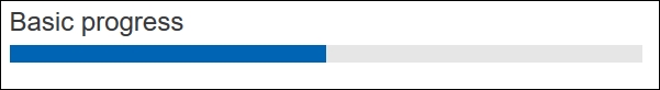
Progress bars are a metaphor used with traditional desktops as well as web development to provide visual feedback to a user on the progress of a task or action. Bootstrap provides a number of different styled progress bars.
The basic Bootstrap progress bar displays a plain blue colored progress bar. Bootstrap 4 uses the HTML 5 <progress> element, with a class name of .progress, to display progress bars. The following markup generates a basic progress bar with a maximum value of 100 and current value of 50:
<progress class="progress" value="50" max="100"></progress>
The result of the markup is shown in the following screenshot:
You can use the same button and alert style classes to generate different colored progress bars. This is accomplished by setting the progress bar's class name to one of the following:
The result...
With Bootstrap 4, wells, panels, and thumbnails have been replaced by cards. A card is a flexible container for many kinds of content. It includes customization options for headers, footers, and colors.
An example of a Bootstrap card component that contains an image, a title, and text content is illustrated in the following screenshot:
The markup required to generate the Bootstrap card is as follows:
<div class="card">
    <img class="card-img-top" src="~/img/skyline.jpg" alt="Card image cap">
    <div class="card-block">
        <h4 class="card-title">Chicago Skyline</h4>
        <p class="card-text">Chicago Skyline At Night from Hotel 71 on Wacker
         Drive.</p>
        <a href="http://publicdomainarchive.com/free-stock-photos-chicago-
         skyline-night-hotel-71-wacker-drive/"
           class="btn btn-primary">Visit Source</a>
    </div>
</div>
...
In this chapter, we've explored the many different Bootstrap components, as well as how to use them inside your ASP.NET MVC projects. We also looked at external libraries that can help with creating paged lists.
In the next chapter, we'll delve deeper into the Bootstrap components by investigating how to add further interactivity to your site using the Bootstrap JavaScript plugins.


