Search icon
Arrow left icon
All Products
Best Sellers
New Releases
Books
Videos
Audiobooks
Learning Hub
Newsletters
Free Learning
Arrow right icon
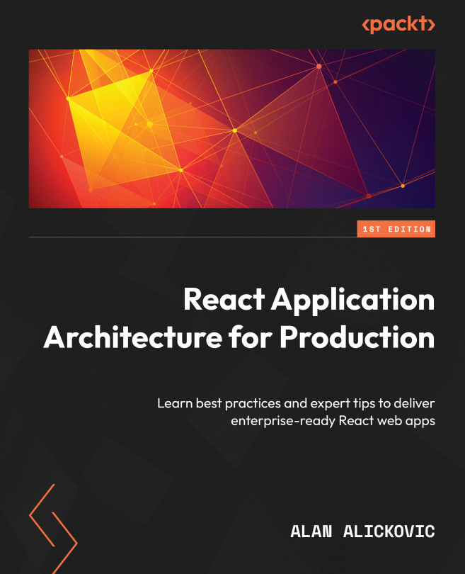
React Application Architecture for Production

You're reading from  React Application Architecture for Production

Product type Book
Published in Jan 2023
Publisher Packt
ISBN-13 9781801070539
Pages 230 pages
Edition 1st Edition
Languages
Author (1):
Alan Alickovic Alan Alickovic
Profile icon Alan Alickovic

Table of Contents (13) Chapters

Preface 1. Chapter 1: Understanding the Architecture of React Applications 2. Chapter 2: Setup and Project Structure Overview 3. Chapter 3: Building and Documenting Components 4. Chapter 4: Building and Configuring Pages 5. Chapter 5: Mocking the API 6. Chapter 6: Integrating the API into the Application 7. Chapter 7: Implementing User Authentication and Global Notifications 8. Chapter 8: Testing 9. Chapter 9: Configuring CI/CD for Testing and Deployment 10. Chapter 10: Going Beyond 11. Index 12. Other Books You May Enjoy

Building and Documenting Components

In React, everything is a component. This paradigm allows us to split user interfaces into smaller parts, thus making it easier to develop applications. It also enables component reusability since we can reuse the same components in multiple places.

In this chapter, we will build some components that we will use as the application’s user interface base. This will make the application UI more consistent and easier to understand and maintain. We will also learn how to document the components with Storybook, a great tool that can serve as a catalog of common application components.

In this chapter, we will cover the following topics:

  • Chakra UI
  • Building components
  • Storybook
  • Documenting components

By the end of this chapter, we will learn how to create and document reusable components that we can use for the application.

Technical requirements

Before we get started, we need to set up the project. To be able to develop the project, you will need the following things installed on your computer:

  • Node.js version 16 or above and npm version 8 or above.

There are multiple ways to install Node.js and npm. Here is a great article that goes into more detail:

https://www.nodejsdesignpatterns.com/blog/5-ways-to-install-node-js

  • VSCode (optional) is currently the most popular editor/IDE for JavaScript/TypeScript, so we will be using it. It is open source, has great integration with TypeScript, and you can extend its features via extensions. It can be downloaded from here: https://code.visualstudio.com/.

The code files for this chapter can be found here: https://github.com/PacktPublishing/React-Application-Architecture-for-Production.

The repository can be cloned locally with the following command:

git clone https://github.com/PacktPublishing/React-Application-Architecture...

Chakra UI

Whenever we build a UI for an application, we must decide what to use for styling our components. In addition, we must also consider whether we want to make all components from scratch or use a component library with pre-made components.

The advantage of using a component library is that it gives us a productivity boost as we don’t have to implement components that have already been implemented, such as buttons, dialogs, and tabs. Also, some libraries come with great accessibility defaults out of the box, so we don’t have to think about it as much as we would if we built everything from scratch. These libraries can come with costs, such as difficult customizability or a significant impact on the final bundle size. On the other hand, they save us a lot of development time.

For our application, we will use Chakra UI, a component library built on top of a combination of emotion and styled-system, which will allow us to write CSS in JavaScript in a consistent...

Building components

Now that the Chakra UI setup is in place, we can build the components. In the starting files for this chapter, we already have some default components exported. For now, we can render them on the landing page defined in src/pages/index.tsx as follows:

import { Button } from '@/components/button';
import { InputField } from '@/components/form';
import { Link } from '@/components/link';
const LandingPage = () => {
  return (
    <>
      <Button />
      <br />
      <InputField />
      <br />
      <Link />
    </>
  );
};
export default LandingPage;

To start the application development server, we need to run the following:

npm run dev

This will make the newly created page...

Storybook

Storybook is a tool that allows us to develop and test UI components in isolation. We can think of it as a tool for making catalogs of all the components we have. It is great for documenting components. A couple of benefits of using Storybook include the following:

  • Storybook allows developing components in isolation without the need to reproduce the exact state of the application, allowing developers to focus on the things they are building
  • Storybook serves as a catalog of UI components allowing all stakeholders to try out the components without using them in the application

Storybook is configured by using the following command:

npx storybook init

This command will install all required dependencies and set up the configuration that resides in the .storybook folder at the root of the project.

Storybook configuration

We already have Storybook installed, so let’s look at the configuration, which has two files.

The first file contains...

Documenting components

If we recall from the previous section, the configuration in .storybook/main.js has the stories property as follows:

stories: ['../src/**/*.stories.tsx']

This means that any file in the src folder that ends with .stories.tsx should be picked by Storybook and treated as a story. With that said, we will co-locate stories next to the components, so the structure for every component will look something like this:

components
  my-component
    my-component.stories.tsx
    my-component.tsx
    index.ts

We will create our stories based on Component Story Format (CSF), an open standard for writing component examples.

But first, what is a story? According to the CSF standard, a story should represent a single source of truth for a component. We can think of a story as a user story where a component is presented in the corresponding state.

CSF requires the following:

    ...

Summary

In this chapter, our focus was on building base components that we will reuse in our application.

We started by configuring the Chakra UI provider and theming. Then we displayed the components on the landing page for testing purposes. They were not doing much, so we implemented them. The point of defining shared components is that we can reuse them anywhere, which makes development easier in the long run. What the components are doing here is not very important. The important thing is to think about creating shared components as a base for the application.

We then needed to preview the components somewhere and since doing that on a page is not a very elegant solution, we chose Storybook. We covered its configuration, and then we defined a couple of stories for the Button component. The stories are written in Component Story Format (CSF), which is a standard for how to write component examples.

As an exercise at the end of this chapter, there were further stories to...

lock icon The rest of the chapter is locked
You have been reading a chapter from
React Application Architecture for Production
Published in: Jan 2023 Publisher: Packt ISBN-13: 9781801070539
Register for a free Packt account to unlock a world of extra content!
A free Packt account unlocks extra newsletters, articles, discounted offers, and much more. Start advancing your knowledge today.
Unlock this book and the full library FREE for 7 days
Get unlimited access to 7000+ expert-authored eBooks and videos courses covering every tech area you can think of
Renews at €14.99/month. Cancel anytime}