Search icon
Arrow left icon
All Products
Best Sellers
New Releases
Books
Videos
Audiobooks
Learning Hub
Newsletters
Free Learning
Arrow right icon
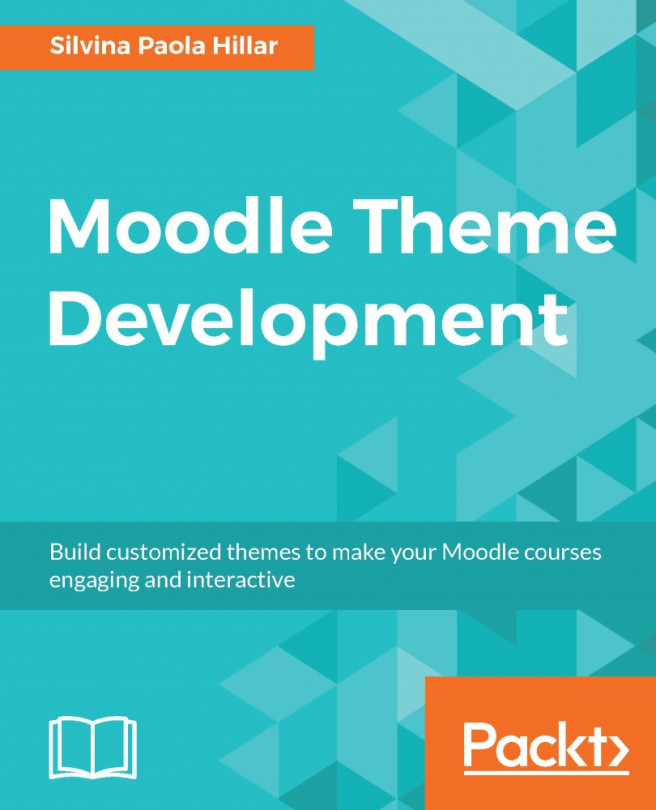
Moodle Theme Development

Moodle Theme Development: Build customized themes to make your Moodle courses engaging and interactive

By Silvina Paola Hillar
£28.99 £19.99
Book Dec 2016 302 pages 1st Edition
eBook
£28.99 £19.99
Print
£37.99
Subscription
£13.99 Monthly
eBook
£28.99 £19.99
Print
£37.99
Subscription
£13.99 Monthly

What do you get with eBook?

Product feature icon Instant access to your Digital eBook purchase
Product feature icon Download this book in EPUB and PDF formats
Product feature icon Access this title in our online reader with advanced features
Product feature icon DRM FREE - Read whenever, wherever and however you want
Buy Now

Product Details


Publication date : Dec 7, 2016
Length 302 pages
Edition : 1st Edition
Language : English
ISBN-13 : 9781786463210
Vendor :
Moodle
Category :
Table of content icon View table of contents Preview book icon Preview Book

Moodle Theme Development

Chapter 1.  An Introduction to Moodle 3 and MoodleCloud

In this chapter, we will introduce e-learning and virtual learning environments: Moodle and MoodleCloud, explaining their similarities and differences. Apart from that, we will learn and understand screen resolution and aspect ratio, which is the information we need in order to develop Moodle themes in the next chapters. We will also cover sizing the screen resolution, aspect ratio, and use Moodle in different types of devices. Furthermore, we will also deal with images and text. So, in this chapter, we shall learn the following topics:

  • Understanding what e-learning is

  • Learning about virtual learning environments

  • Introducing Moodle and MoodleCloud

  • Learning what Moodle and MoodleCloud are

  • Using Moodle on different devices

  • Sizing the screen resolution

  • Calculating the aspect ratio

  • Learning about sharp and soft images

  • Learning about crisp and sharp text

  • Understanding what anti-aliasing is

Understanding what e-learning is


E-learning is electronic learning, meaning that it is not traditional learning in a classroom with a teacher and students, plus the board. e-learning involves using a computer to deliver classes or a course.

When delivering classes or a course, there is an online interaction between the student and the teacher. There might also be some offline activities when a student is asked to create a piece of writing or something else. Another option is that there are collaboration activities involving the interaction of several students and the teacher.

When creating course content, there is the option of video conferencing as well. So there is virtual face-to-face interaction within the e-learning process. The time and the date should be set beforehand. In this way, e-learning is trying to imitate traditional learning to not lose human contact or social interaction.

The course may be full distance or not. If the course is full distance, there is online interaction only. All the resources and activities are delivered online and there might be some interaction through messages, chats, or e-mails between the student and the teacher.

If the course is not full distance and is delivered face to face but involving the use of computers, we are referring to blended learning. Blended learning means using e-learning within the classroom, and is a mixture of traditional learning and computers.

The use of blended learning with little children is very important because they get the social element, which is essential at a very young age. Apart from that, they also come into contact with technology while they are learning. It is advisable to use Interactive Whiteboards (IWBs) at an early stage.

IWBs are the right tool to choose when dealing with blended learning. IWBs are motivational gadgets, which are prominent in integrating technology into the classroom. IWBs are considered a symbol of innovation and a key element of teaching students.

IWBs offer interactive projections for class demonstrations; we can usually project resources from computer software as well as from our Moodle platform. Students can interact with them by touching or writing on them, that is to say, through blended learning. Apart from that, teachers can make presentations on different topics within a subject and these topics become much more interesting and captivating for students, since IWBs allow changes to be made in the interactive elements and we can insert those into the presentation of any subject. There are several types of technology used in IWBs, such as touch technology, laser scanning, and electromagnetic writing tools. Therefore, we have to bear in mind which to choose when we get an IWB.

On the other hand, the widespread use of mobile devices nowadays has turned e-learning into mobile learning. Smartphones and tablets allow students to learn anywhere at any time. Therefore, it is important to design course material that is usable by students on such devices.

Moodle is a learning platform through which we can design, build, and create e-learning environments. It is possible to create online interaction and have video conferencing sessions with students. Distance learning is another option if blended learning cannot be carried out.

We can also choose Moodle mobile. We can download the app from the App Store, Google Play, Windows Store, or Windows Phone Store. We can browse the content of courses, receive messages, contact people from the courses, upload different types of file, and view course grades, among other actions.

Learning about Virtual Learning Environments


A Virtual Learning Environment (VLE) is a type of virtual environment that supports both resources and learning activities; therefore, students can have both passive and active roles. There is also social interaction, which can take place through collaborative work as well as video conferencing. Students can also be actors since they can also construct the VLE.

VLEs can be used for both distance and blended learning since they can enrich courses. Mobile learning is also possible because mobile devices have access to the Internet, allowing teachers and students to log in to their courses.

VLEs are designed in such a way that they can carry out the following functions or activities:

  • Design, create, store, access, and use course content

  • Deliver or share course content

  • Communicate, interact, and collaborate with students and teachers

  • Assess and personalize the learning experience

  • Modularize both activities and resources

  • Customize the interface

We are going to deal with each of these functions and activities and see how useful they might be when designing our VLE for our class. When using Moodle, we can perform all the functions and activities mentioned here, because Moodle is a VLE.

Designing, creating, storing, accessing, and using course content

If we use the Moodle platform to create the course, we have to deal with course content. Therefore, when we add a course, we have to add its content. We can choose the weekly outline section or the topic under which we want to add the content. We click on Add an activity or resource and two options appear, resources and activities; therefore, the content can be passive or active for the student. When we create or design activities in Moodle, the options are shown in the following screenshot:

Another option for creating course content is to reuse content that has already been created and used before in another VLE. In other words, we can import or export course materials, since most VLEs have specific tools designed for such purposes. This is very useful and saves time.

There are a variety of ways for teachers to create course materials, due to the fact that the teacher thinks of the methodology, as well as how to meet the student's needs when creating the course. Moodle is designed in such a way that it offers a variety of combinations that can fit any course content.

Delivering or sharing course content

Before using VLEs, we have to log in, because all the content is protected and is not open to the general public. In this way, we can protect property rights, as well as the course itself. All participants must be enrolled in the course unless it has been opened to the public.

Teachers can gain remote access in order to create and design their courses. This is quite profitable since they can build the content at home, rather than in their workplace. They need login access and they need to switch roles to course creator in order to create the content. Follow this to switch roles to course creator:

Under Administration, click on Switch role to... | Course creator, as shown in the following screenshot:

When the role has been changed, the teacher can create content that students can access. Once logged in, students have access to the already created content, either activities or resources. The content is available over the Internet or the institution's intranet connection. Students can access the content anywhere if any of these connections are available.

If MoodleCloud is being used, there must be an Internet connection, otherwise it is impossible for both students and teachers to log in.

Communicating, interacting, and collaborating with students and teachers

Communication, interaction, and collaborative working are the key factors to social interaction and learning through interchanging ideas. VLEs let us create course content activities, because these actions give our class a social element. There is no need to be an isolated learner, because learners have the ability to communicate between themselves and with the teachers.

Moodle offers the possibility of video conferencing through the Big Blue Button. In order to install the Big Blue Button plugin in Moodle, visit the following link: https://moodle.org/plugins/browse.php?list=set&id=2 . This is shown in the following screenshot:

If you are using MoodleCloud, the Big Blue Button is enabled by default, so when we click on Add an activity or resource, it appears in the list of activities, as shown in the following screenshot:

Assessing and personalizing the learning experience

Moodle allows the teacher to follow the progress of students so that they can assess and grade their work, as long as they complete the activities. Resources cannot be graded, since they are passive content for students, but teachers can also check when a participant last accessed the site.

Badges are another element used to personalize the learning experience. We can create badges for students when they complete an activity or a course; they are homework rewards. Badges are quite good at motivating young learners.

Modularizing both activities and resources

Moodle offers the ability to build personalized activities and resources. There are several ways to present both, with all the options Moodle offers. Activities can be molded according to the methodology the teacher uses.

In Moodle 3, there are new question types within the Quiz activity. The question types are as follows:

  • Select missing words

  • Drag and drop into text

  • Drag and drop onto image

  • Drag and drop markers

The question types are shown after we choose Quiz in the Add an activity or resource menu, in the weekly outline section or topic that we have chosen. The types of question are shown in the following screenshot:

Customizing the interface

Moodle allows us to customize the interface in order to develop the look and feel that we require; we can add a logo for the school or institution that the Moodle site belongs to.

We can also add another theme relevant to the subject or course that we have created. The main purpose in customizing the interface is to avoid all subjects and courses looking the same. Later in the chapter, we will learn how to customize the interface.

Learning Moodle and MoodleCloud


Modular Object-Oriented Dynamic Learning Environment (Moodle) is a learning platform designed in such a way that we can create VLEs. Moodle can be downloaded, installed and run on any web server software using Hypertext Preprocessor (PHP). It can support a SQL database and can run on several operating systems. We can download Moodle 3.0.3 (the latest version at the time of writing this book) from the following URL: https://download.moodle.org/ . This URL is shown in the following screenshot:

MoodleCloud, on the other hand, does not need to be downloaded since, as its name suggests, is in the cloud. Therefore, we can get our own Moodle site with MoodleCloud within minutes and for free. It is Moodle's hosting platform, designed and run by the people who make Moodle. In order to get a MoodleCloud site, we need to go to the following URL: https://moodle.com/cloud/ . This is shown in the following screenshot:

MoodleCloud was created in order to cater for users with fewer requirements and small budgets. In order to create an account, you need to add your cell phone number to receive an SMS which we must be input when creating your site.

As it is free, there are some limitations to MoodleCloud, unless we contact Moodle Partners and pay for an expanded version of it. The limitations are as follows:

  • No more than 50 users

  • 200 MB disk space

  • Core themes and plugins only

  • One site per phone number

  • Big Blue Button sessions are limited to six people, with no recordings

  • There are advertisements

There is another option for MoodleCloud which is paid and grants more benefits, but throughout the book, we will deal with the free version of MoodleCloud.

When creating a Moodle site, we want to change the look and functionality of the site or individual course. We may also need to customize themes for Moodle, in order to give the course the desired look.

Therefore, this chapter will explain the basic concepts that we have to bear in mind when dealing with themes, due to the fact that themes are shown in different devices. In the past, Moodle ran only on desktops or laptops, but nowadays Moodle can run on many different devices, such as smartphones, tablets, iPads, and smart TVs, and the list goes on.

Using Moodle on different devices


Moodle can be used on different devices, at different times, in different places. Therefore, there are factors that we need to be aware of when designing courses and themes.

Therefore, hereafter in this chapter, there are several aspects and concepts that we need to look into in more detail in order to understand what we need to take into account when we design our courses and build our themes.

Devices change in many ways, not only in size but also in the way they display our Moodle course. Moodle courses can be used on anything from a tiny device that fits into the palm of a hand to a huge IWB or smart TV, and plenty of other devices in between. Therefore, such differences have to be taken into account when choosing images, text, and other components of our course.

We are going to deal with sizing screen resolution, calculating the aspect ratio, types of images such as sharp and soft, and crisp and sharp text. Finally, but importantly, the anti-aliasing method is explained.

Sizing the screen resolution


A number of pixels the display of device has, horizontally and vertically, and the color depth measuring the number of bits representing the color of each pixel makes up the screen resolution. The higher the screen resolution, the higher the productivity we get.

In the past, the screen resolution of a display was important since it determined the amount of information displayed on the screen. The lower the resolution, the fewer items would fit on the screen; the higher the resolution, the more items would fit on the screen. The resolution varies according to the hardware in each device.

Nowadays, the screen resolution is considered a pleasant visual experience, since we would rather see more quality than more stuff on the screen. That is the reason why the screen resolution matters. There might be different display sizes where the screen resolutions are the same, that is to say, the total number of pixels is the same. If we compare a laptop (13'' screen with a resolution of 1280 x 800) and a desktop (with a 17'' monitor with the same 1280 x 800 resolution), although the monitor is larger, the number of pixels is the same; the only difference is that we will be able to see everything bigger on the monitor. Therefore, instead of seeing more stuff, we see higher quality.

Screen resolution chart

Code

Width

Height

Ratio

Description

QVGA

320

240

4:3

Quarter Video Graphics Array

FHD

1920

1080

~16:9

Full High Definition

HVGA

640

240

8:3

Half Video Graphics Array

HD

1360

768

~16:9

High Definition

HD

1366

768

~16:9

High Definition

HD+

1600

900

~16:9

High Definition plus

VGA

640

480

4:3

Video Graphics Array

SVGA

800

600

4:3

Super Video Graphics Array

XGA

1024

768

4:3

Extended Graphics Array

XGA+

1152

768

3:2

Extended Graphics Array plus

XGA+

1152

864

4:3

Extended Graphics Array plus

SXGA

1280

1024

5:4

Super Extended Graphics Array

SXGA+

1400

1050

4:3

Super Extended Graphics Array plus

UXGA

1600

1200

4:3

Ultra Extended Graphics Array

QXGA

2048

1536

4:3

Quad Extended Graphics Array

WXGA

1280

768

5:3

Wide Extended Graphics Array

WXGA

1280

720

~16:9

Wide Extended Graphics Array

WXGA

1280

800

16:10

Wide Extended Graphics Array

WXGA

1366

768

~16:9

Wide Extended Graphics Array

WXGA+

1280

854

3:2

Wide Extended Graphics Array plus

WXGA+

1440

900

16:10

Wide Extended Graphics Array plus

WXGA+

1440

960

3:2

Wide Extended Graphics Array plus

WQHD

2560

1440

~16:9

Wide Quad High Definition

WQXGA

2560

1600

16:10

Wide Quad Extended Graphics Array

WSVGA

1024

600

~17:10

Wide Super Video Graphics Array

WSXGA

1600

900

~16:9

Wide Super Extended Graphics Array

WSXGA

1600

1024

16:10

Wide Super Extended Graphics Array

WSXGA+

1680

1050

16:10

Wide Super Extended Graphics Array plus

WUXGA

1920

1200

16:10

Wide Ultra Extended Graphics Array

WQXGA

2560

1600

16:10

Wide Quad Extended Graphics Array

WQUXGA

3840

2400

16:10

Wide Quad Ultra Extended Graphics Array

4K UHD

3840

2160

16:9

Ultra High Definition

4K UHD

1536

864

16:9

Ultra High Definition

Considering that 3840 x 2160 displays (also known as 4K, QFHD, Ultra HD, UHD, or 2160p) are already available for laptops and monitors, a pleasant visual experience with high DPI displays can be a good long-term investment for your desktop applications.

The DPI setting for the monitor causes another common problem: the change in the effective resolution. Consider the 13.3" display that offers a 3200 x1800 resolution and is configured with an OS DPI of 240 DPI. The high DPI setting makes the system use both larger fonts and UI elements; therefore, the elements consume more pixels to render than the same elements displayed in the resolution configured with an OS DPI of 96 DPI. The effective resolution of a display that provides 3200 x1800 pixels configured at 240 DPI is 1280 x 720. The effective resolution can become a big problem because an application that requires a minimum resolution of the old standard 1024 x 768 pixels with an OS DPI of 96 would have problems with a 3200 x 1800-pixel display configured at 240 DPI, and it wouldn't be possible to display all the necessary UI elements. It may sound crazy, but the effective vertical resolution is 720 pixels, lower than the 768 vertical pixels required by the application to display all the UI elements without problems.

The formula to calculate the effective resolution is simple: divide the physical pixels by the scale factor (OS DPI / 96). For example, the following formula calculates the horizontal effective resolution of my previous example: 3200 / (240 / 96) = 3200 / 2.5 = 1280; and the following formula calculates the vertical effective resolution: 1800 / (240 / 96) = 1800 / 2.5 = 720.

The effective resolution would be of 1800 x 900 pixels if the same physical resolution were configured at 192 DPI. Effective horizontal resolution: 3200 / (192 / 96) = 3200 / 2 = 1600; and vertical effective resolution: 1800 / (192 / 96) = 1800 / 2 = 900.

Calculating the aspect ratio

The aspect radio is the proportional relationship between the width and the height of an image. It is used to describe the shape of a computer screen or a TV. The aspect ratio of a standard-definition (SD) screen is 4:3, that is to say, a relatively square rectangle. The aspect ratio is often expressed in W:H format, where W stands for width and H stands for height. 4:3 means four units wide to three units high. With regards to high-definition TV (HDTV), they have a 16:9 ratio, which is a wider rectangle.

Why do we calculate the aspect ratio? The answer to this question is that the ratio has to be well defined because the rectangular shape that every frame, digital video, canvas, image, or responsive design has, makes shapes fit into different and distinct devices.

Learning about sharp and soft images


Images can be either sharp or soft. Sharp is the opposite of soft. A soft image has less pronounced details, while a sharp image has more contrast between pixels. The more pixels the image has, the sharper it is. We can soften the image, in which case it loses information, but we cannot sharpen one; in other words, we can't add more information to an image.

In order to compare sharp and soft images, we can visit the following website, where we can convert bitmaps to vector graphics. We can convert a bitmap images such as .png, .jpeg, or .gif into a .svg in order to get an anti-aliased image. We can do this with a simple step. We work with an online tool to vectorize the bitmap using http://vectormagic.com/home . There are plenty of features to take into account when vectorizing.

We can design a bitmap using an image editor and upload the bitmap image from the clipboard, or upload the file from our computer. Once the image is uploaded to the application, we can start working. Another possibility is to use the sample images on the website, which we are going to use in order to see that anti-aliasing effect.

We convert bitmap images, which are made up of pixels, into vector images, which are made up of shapes. The shapes are mathematical descriptions of images and do not become pixelated when scaling up. Vector graphics can handle scaling without any problems. Vector images are the preferred type to work with in graphic design on paper or clothes.

Go to http://vectormagic.com/home   and click on Examples, as shown in the following screenshot:

After clicking on Examples, the bitmap appears on the left and the vectorized image on the right. The bitmap is blurred and soft; the SVG has an anti-aliasing effect, therefore the image is sharp. The result is shown in the following screenshot:

Learning about crisp and sharp text


There are sharp and soft images, and there is also crisp and sharp text, so it is now time to look at text. What is the main difference between these two? When we say that the text is crisp, we mean that there is more anti-aliasing, in other words it has more grey pixels around the black text. The difference is shown when we zoom in to 400%. On the other hand, sharp mode is superior for small fonts because it makes each letter stronger.

There are four options in Photoshop to deal with text: sharp, crisp, strong, and smooth. Sharp and crisp have already been mentioned in the previous paragraphs. Strong is notorious for adding unnecessary weight to letter forms, and smooth looks closest to the untinted anti-aliasing, and it remains similar to the original.

The following screenshot displays crisp text:

Windows 10, high-dpi screen, 3200 x 1800 resolution, also known as WQXGA+, landscape view.

Another example of crisp text is the following:

High-dpi retina display on OS X, Safari, 2560 x 1600.

Understanding what anti-aliasing is


The word anti-aliasing means the technique used in order to minimize the distortion artifacts. It applies intermediate colors in order to eliminate pixels, that is to say the saw-tooth or pixelated lines. Therefore, we need to look at a lower resolution so that the saw-tooth effect does not appear when we make the graphic bigger.

Test your knowledge


Before we delve deeper into more content, let's test your knowledge about all the information that we have dealt with in this chapter:

A. Moodle is a learning platform with which ...

  1. ...we can design, build and create e-learning environments.

  2. ...we can learn.

  3. ...we can download content for students.

B. BigBlueButtonBN ...

  1. ...is a way to log in to Moodle.

  2. ...lets you create links to real-time online classrooms from within Moodle.

  3. ...works only in MoodleCloud.

C. MoodleCloud ...

  1. ...is not open source.

  2. ...does not allow more than 50 users.

  3. ...works only for universities.

D. The number of pixels the display of the device has horizontally and vertically, and the color depth measuring the number of bits representing the color of each pixel, make up ...

  1. ...screen resolution.

  2. ...aspect ratio.

  3. ...the size of a device.

E. Anti-aliasing can be applied to ...

  1. ...only text.

  2. ...only images.

  3. ...both images and text.

Summary


In summary, in this first chapter, we have covered most of what needs to be known about e-learning, VLEs, and Moodle and MoodleCloud. There is a slight difference between Moodle and MoodleCloud especially if you don't have access to a Moodle course in the institution where you are working and want to design a Moodle course. Moodle is used in different devices and there are several aspects to take into account when designing a course and building a Moodle theme, which will be covered in the following chapters.

We have dealt with screen resolution, aspect ratio, types of images and text, and anti-aliasing effects.

In the next chapter, we will cover the basics of Moodle theming, including theme types, priority, the location of the theme directory, and the concept of parent themes. We will also cover browsing and changing a theme within Moodle and MoodleCloud, and search for, downloading, and installing custom themes. We will cover how to do these in different OSes, including Mac, Windows, and Android. We will then finish off by changing the theme settings in the Moodle theme settings page, both in Moodle and MoodleCloud.

Left arrow icon Right arrow icon

Key benefits

  • Leverage the power of Moodle 3 to create interactive and engaging themes for your courses
  • Experience and integrate the power of Bootstrap and CSS into your Moodle app
  • Implement your plans with illustrative examples to become a top notch designer

Description

Theming is one of the main features of Moodle, and it can be used to customize your online courses and make them look exactly how you want them to,according to your target audience. If you have been looking for a book that will help you develop Moodle themes that you are proud of, and that your students will enjoy, then this is the book for you. We start off by introducing Moodle 3 and explaining what it is, how it works, and what tools you might need to create a stunning Moodle theme. We then show you how to choose and change the pre-installed Moodle themes in detailed steps, and explain what Moodle themes are and how they work. Next, we show you how to change an existing theme and test the changes that you have made. You can not only plan the customization of theme, but also tailor it using advanced Moodle theming processes; this book is your one-stop guide to creating your own personalized Moodle 3 theme.

What you will learn

[*] Plan a personalized Moodle theme from start to finish [*] Install a Moodle theme in different operating systems and change Moodle's theme settings [*] Add your own customized logo and test your changes in several web browsers [*] Customize the Moodle site to fit in with other elements such as websites and social networks, among others [*] Create a design mock-up using graphics software [*] Design themes that are capable of working with a huge number of different resolutions, screen sizes, screen orientations, and pixel densities [*] Work with code to adjust the theme to users requirements [*] Create new custom icons for your theme

What do you get with eBook?

Product feature icon Instant access to your Digital eBook purchase
Product feature icon Download this book in EPUB and PDF formats
Product feature icon Access this title in our online reader with advanced features
Product feature icon DRM FREE - Read whenever, wherever and however you want
Buy Now

Product Details


Publication date : Dec 7, 2016
Length 302 pages
Edition : 1st Edition
Language : English
ISBN-13 : 9781786463210
Vendor :
Moodle
Category :

Table of Contents

19 Chapters
Moodle Theme Development Chevron down icon Chevron up icon
Credits Chevron down icon Chevron up icon
About the Author Chevron down icon Chevron up icon
Acknowledgements Chevron down icon Chevron up icon
About the Reviewer Chevron down icon Chevron up icon
www.PacktPub.com Chevron down icon Chevron up icon
Dedication Chevron down icon Chevron up icon
Preface Chevron down icon Chevron up icon
An Introduction to Moodle 3 and MoodleCloud Chevron down icon Chevron up icon
Themes in Moodle 3 on-premises and MoodleCloud Chevron down icon Chevron up icon
Setting Up Logos in Moodle Themes Chevron down icon Chevron up icon
Customizing the Header and the Footer Chevron down icon Chevron up icon
Customizing Elements with CSS Chevron down icon Chevron up icon
Locating, Editing, and Using New Icons Chevron down icon Chevron up icon
Optimizing Themes for Mobile Devices Chevron down icon Chevron up icon
Exploring Layouts Chevron down icon Chevron up icon
Course Formats Chevron down icon Chevron up icon
Extending Moodle Theming to Specific Sections Chevron down icon Chevron up icon
Test Your Knowledge Answers Chevron down icon Chevron up icon

Customer reviews

Filter icon Filter
Top Reviews
Rating distribution
Empty star icon Empty star icon Empty star icon Empty star icon Empty star icon 0
(0 Ratings)
5 star 0%
4 star 0%
3 star 0%
2 star 0%
1 star 0%

Filter reviews by


No reviews found
Get free access to Packt library with over 7500+ books and video courses for 7 days!
Start Free Trial

FAQs

How do I buy and download an eBook? Chevron down icon Chevron up icon

Where there is an eBook version of a title available, you can buy it from the book details for that title. Add either the standalone eBook or the eBook and print book bundle to your shopping cart. Your eBook will show in your cart as a product on its own. After completing checkout and payment in the normal way, you will receive your receipt on the screen containing a link to a personalised PDF download file. This link will remain active for 30 days. You can download backup copies of the file by logging in to your account at any time.

If you already have Adobe reader installed, then clicking on the link will download and open the PDF file directly. If you don't, then save the PDF file on your machine and download the Reader to view it.

Please Note: Packt eBooks are non-returnable and non-refundable.

Packt eBook and Licensing When you buy an eBook from Packt Publishing, completing your purchase means you accept the terms of our licence agreement. Please read the full text of the agreement. In it we have tried to balance the need for the ebook to be usable for you the reader with our needs to protect the rights of us as Publishers and of our authors. In summary, the agreement says:

  • You may make copies of your eBook for your own use onto any machine
  • You may not pass copies of the eBook on to anyone else
How can I make a purchase on your website? Chevron down icon Chevron up icon

If you want to purchase a video course, eBook or Bundle (Print+eBook) please follow below steps:

  1. Register on our website using your email address and the password.
  2. Search for the title by name or ISBN using the search option.
  3. Select the title you want to purchase.
  4. Choose the format you wish to purchase the title in; if you order the Print Book, you get a free eBook copy of the same title. 
  5. Proceed with the checkout process (payment to be made using Credit Card, Debit Cart, or PayPal)
Where can I access support around an eBook? Chevron down icon Chevron up icon
  • If you experience a problem with using or installing Adobe Reader, the contact Adobe directly.
  • To view the errata for the book, see www.packtpub.com/support and view the pages for the title you have.
  • To view your account details or to download a new copy of the book go to www.packtpub.com/account
  • To contact us directly if a problem is not resolved, use www.packtpub.com/contact-us
What eBook formats do Packt support? Chevron down icon Chevron up icon

Our eBooks are currently available in a variety of formats such as PDF and ePubs. In the future, this may well change with trends and development in technology, but please note that our PDFs are not Adobe eBook Reader format, which has greater restrictions on security.

You will need to use Adobe Reader v9 or later in order to read Packt's PDF eBooks.

What are the benefits of eBooks? Chevron down icon Chevron up icon
  • You can get the information you need immediately
  • You can easily take them with you on a laptop
  • You can download them an unlimited number of times
  • You can print them out
  • They are copy-paste enabled
  • They are searchable
  • There is no password protection
  • They are lower price than print
  • They save resources and space
What is an eBook? Chevron down icon Chevron up icon

Packt eBooks are a complete electronic version of the print edition, available in PDF and ePub formats. Every piece of content down to the page numbering is the same. Because we save the costs of printing and shipping the book to you, we are able to offer eBooks at a lower cost than print editions.

When you have purchased an eBook, simply login to your account and click on the link in Your Download Area. We recommend you saving the file to your hard drive before opening it.

For optimal viewing of our eBooks, we recommend you download and install the free Adobe Reader version 9.