


Adding and formatting charts
Next up are charts. In this dashboard, we are going to insert two popular charts. We will add some formats to enhance how they appear in our dashboard.
The first chart is the area chart. This chart falls into the group of charts that are useful for visualizing trends. We are going to use this chart to show the trend of profits for the period that we select.
We will go through these steps:
- Create a PivotTable in the Calculations sheet in cell Q10.
- Put Months in the Row section and the Profit measure in the Values section.
This should give us the following PivotTable:
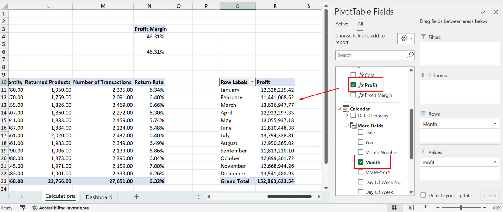
Figure 8.35 – Creating a PivotTable report on monthly profit
From here, we will select any cell in the PivotTable we just created and insert a PivotChart. In the chart options, we will select the Area chart:
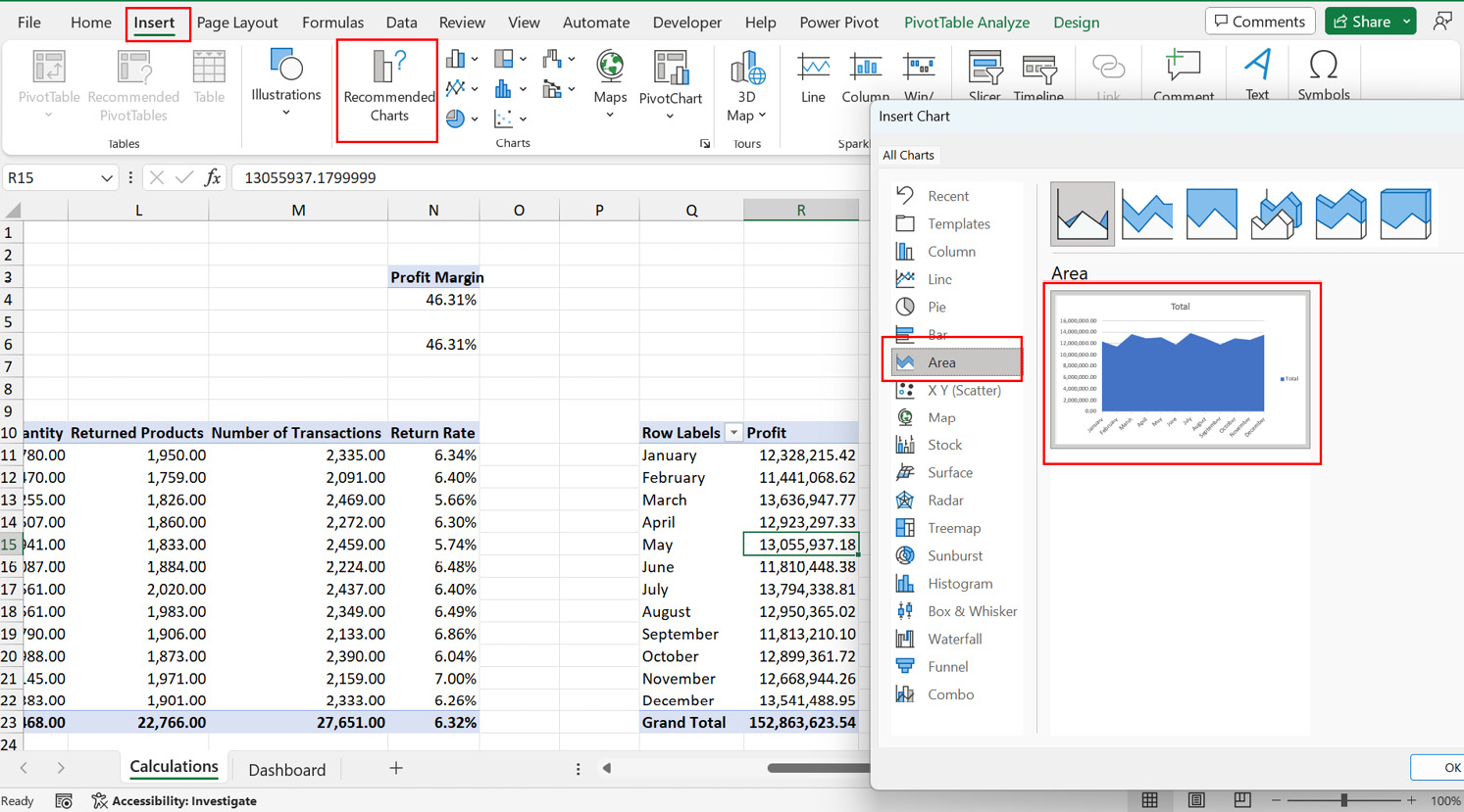
Figure 8.36 – Inserting an area chart
We will reduce the clutter on the PivotChart by removing...


