


Now we are all set for the framework. Replace the Hello World! line in the body tag with this:
<!DOCTYPE html>
<html>
  <head>
    <meta charset="utf-8">
    <meta http-equiv="X-UA-Compatible" content="IE=edge">
    <meta name="viewport" content="width=device-width, initial-scale=1">
    <title>Hello World!</title>

    <link rel="stylesheet" href="css/bootstrap.css">

    <!--[if lt IE 9]>
      <script src="https://oss.maxcdn.com/html5shiv/3.7.2/html5shiv.min.js">
</script>
      <script src="https://oss.maxcdn.com/respond/1.4.2/respond.min.js">
</script>
    <![endif]-->
  </head>
  <body>

    <div class="jumbotron">
      <h1>Hello, world!</h1>
      <p>This is our first sample example that will be more awesome in the next chapters!</p>
      <a class="btn btn-primary btn-lg" href="#" role="button">
        Bootstrap by Example, Chapter 1
      </a>
    </div>


    <script src="js/jquery-1.11.3.js"></script>
    <script src="js/bootstrap.js"></script>
  </body>
</html>
Open the
hello_world.html file in the browser, and it must appear like what is shown in the following screenshot:
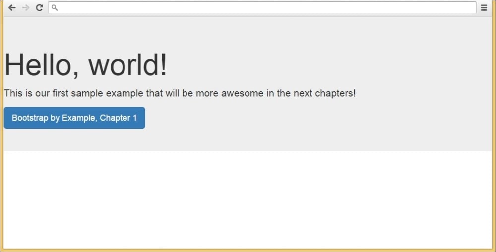
Congratulations! You have created your first Bootstrap web page. It is simple but very important to understand the details of how to set the framework correctly to keep the recommendation pattern.
Furthermore, we added some components in this example that will be explained in future chapters, but you can start becoming familiar with the CSS classes used and the placement of the elements.
You may notice that in our example, the page content is too close to the left-hand side and without a margin/padding. This is because Bootstrap has a required element called container that we have not added in the example.
The container tag must be placed to wrap the site content and nest the grid system (we will present the grid system, called scaffolding, in the next chapter). There are two options for using the container element.
The first one is for creating a web page responsive with a fixed-width container. This one will add responsive margins depending on the device viewport:
<div class="container">
    ...
</div>
In case you want a full-width container, covering the entire width of the viewport, use container-fluid:
<div class="container-fluid">
    ...
</div>
In our example, we will create a fixed-width responsive website. So, our code will be like this:
<!DOCTYPE html>
<html>
  <head>
    <meta charset="utf-8">
    <meta http-equiv="X-UA-Compatible" content="IE=edge">
    <meta name="viewport" content="width=device-width, initial-scale=1">
    <title>Hello World!</title>

    <link rel="stylesheet" href="css/bootstrap.css">

    <!--[if lt IE 9]>
      <script src="https://oss.maxcdn.com/html5shiv/3.7.2/html5shiv.min.js">
</script>
      <script src="https://oss.maxcdn.com/respond/1.4.2/respond.min.js">
</script>
    <![endif]-->
  </head>
  <body>
    <div class="container">
        <div class="jumbotron">
            <h1>Hello, world!</h1>
            <p>This is our first sample example that will be more awesome in the next chapters!</p>
            <a class="btn btn-primary btn-lg" href="#" role="button">
              Bootstrap by Example, Chapter 1
            </a>
        </div>
    </div>

    <script src="js/jquery-1.11.3.js"></script>
    <script src="js/bootstrap.js"></script>
  </body>
</html>
The next screenshot shows what our example looks like with the addition of the container class. I recommend for practicing and complete understanding, that you change the container class to .container-fluid and see what happens. Change your viewport by resizing your browser window and see how Bootstrap adapts your page visualization:
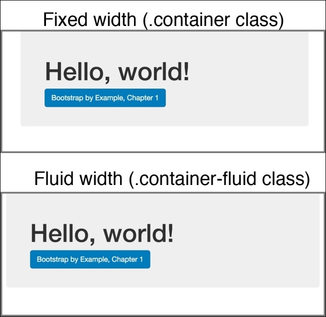
The preceding image shows the differences between using .container and .container-fluid. See the differences of the margins in the sides.
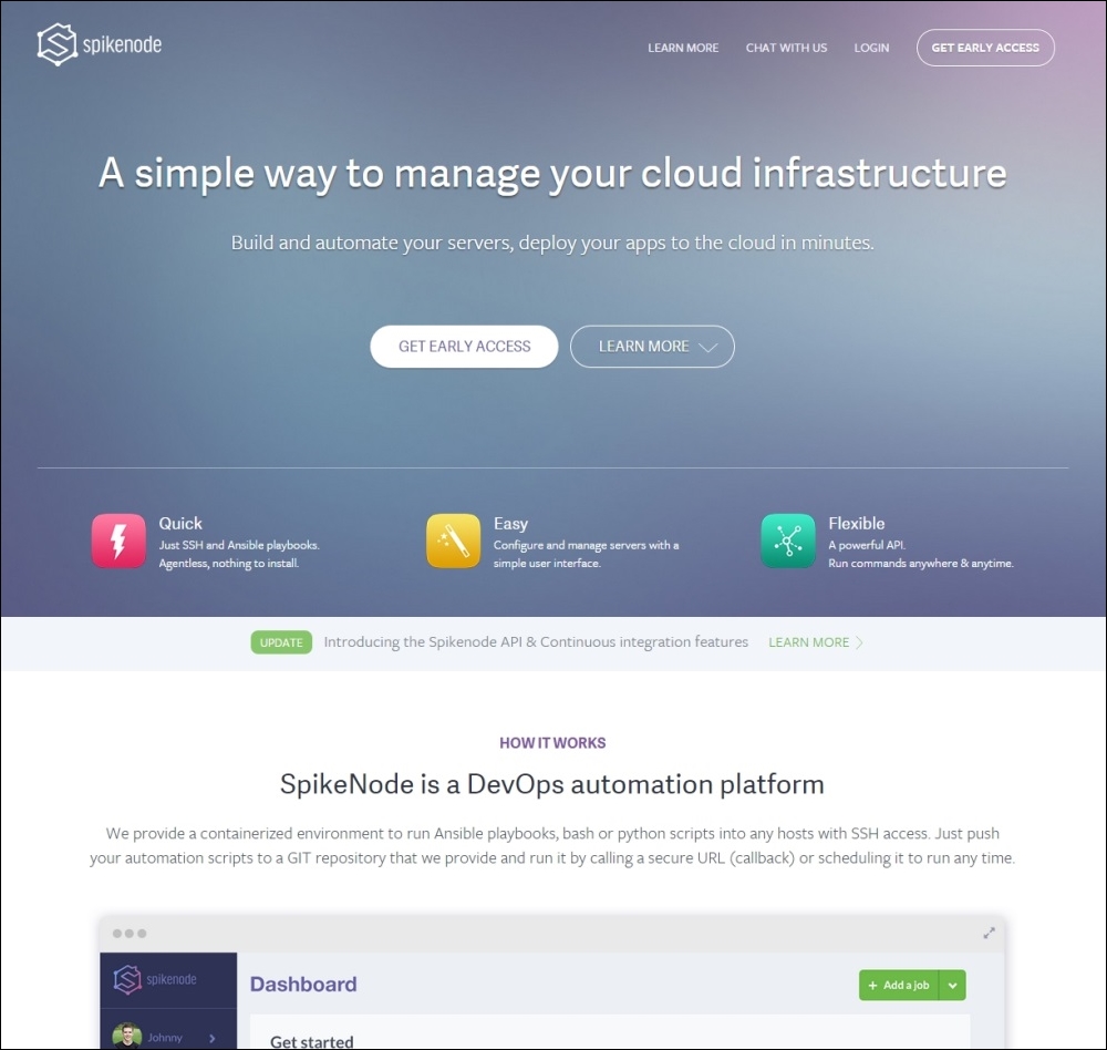
Soon during this book, you will be able to create more complex and beautiful websites, using more advanced Bootstrap components such as the show case shown in the following screenshot, which is an example of a landing page.
Do not worry. We will start at a slow pace to reveal the basics of Bootstrap and how to use it properly on our web page. The following example is our first goal when we develop a landing page example. Just keep in mind that we will always use the same basis presented in this chapter.


