


Styling components
When using Vue components, the Vite compiler allows you to use almost any frontend templating language style. The easiest way to enable these expressive library plugins in your Vue templates is to install them when you initialize your project, or by using npm install (or yarn add) for the package.
When using the style tag inside of a Vue component, you can specify a language using the lang attribute, provided that you have installed that specific language plugin.
For example, if you chose to install the Stylus preprocessor, first you need to install the stylus package in your project as a dependency by performing the following command:
npm add -D stylus
#OR
yarn add -d stylus
Then, you can add the lang="stylus" attribute to the style tag to begin using Stylus:
<style lang="stylus">
ul
  color: #2c3e50;
  > h2
  color: #22cc33;
</style>
Another benefit of using Vue is scoping the style with the scoped attribute. This is a useful way to create isolated and component-specific CSS stylings. It also overrides any other CSS global rules, according to the CSS rule of specificity.
It is not recommended to scope global styles. A common method for defining global styling is to separate these styles into another style sheet and import them into your App.vue file.
Now, let’s practice importing SCSS, a pre-processor plugin for CSS, to use in your application, and write some scoped stylings with the following exercise.
Exercise 1.11 – importing SCSS into a scoped component
In this exercise, we will be utilizing the style tag to add SCSS preprocessed styles to a component and importing external stylesheets.
To access the code file for this exercise, refer to https://github.com/PacktPublishing/Frontend-Development-Projects-with-Vue.js-3/tree/v2-edition/Chapter01/Exercise1.11.
Let’s start by performing the following steps:
- Use the application generated with
npm init vue@3as a starting point, or within the root folder of the code repository, navigate into theChapter01/Exercise1.11folder by using the following commands in order:> cd Chapter01/Exercise1.11/
> yarn
- Run the application using the following command:
yarn dev
- Open the exercise project in VS Code (by using the
code .command within the project directory) or your preferred IDE. - Create a new Vue component file named
Exercise1-11.vuein thesrc/componentsdirectory. - Inside
Exercise1-11.vue, let’s write some HTML that can be styled using SCSS. Let’s keep practicing the interpolation method:<template>
<div>
<h1>{{ title }}</h1><h2>{{ subtitle }}</h2><ul>
<li>{{ items[0] }}</li><li>{{ items[1] }}</li><li>{{ items[2] }}</li></ul>
</div>
</template>
<script>
export default {data() {return {title: 'My list component!',
subtitle: 'Vue JS basics',
items: ['Item 1', 'Item 2', 'Item 3']
}
},
}
</script>
- Add the
sassSCSS package as a project dependency:npm add -D sass
- Add the
langattribute to thestyletag and add thescssvalue to enable SCSS syntax inside thestyleblock:<style lang="scss"></style>
- Create a folder inside the
src/directory calledstyles. Inside this new folder, create a file calledtypography.scss:src/styles/typography.scss
- Inside
typography.scss, add some styling for the template you composed in your component, such as defining color variables (green,grey, andblue) to reuse in different areas of related CSS rules, and some CSS styles forh1,h2, and the list elements:/* typography.scss */
$color-green: #4fc08d;
$color-grey: #2c3e50;
$color-blue: #003366;
h1 {margin-top: 60px;
text-align: center;
color: $color-grey;
+ h2 {text-align: center;
color: $color-green;
}
}
ul {display: block;
margin: 0 auto;
max-width: 400px;
padding: 30px;
border: 1px solid rgba(0,0,0,0.25);
> li {color: $color-grey;
margin-bottom: 4px;
}
}
In SCSS, you can use standard CSS selectors to select elements in your component.
ul > li will select every <li> element inside of an <ul> element for styling. Similarly, using the addition symbol (+) means that the elements placed after the first element will be styled if they match the condition. For example, h1 + h2 will dictate that all h2 elements after h1 will be styled in a certain way, but h3 will not. You can understand this better through the following example:
In CSS, you would present this code as follows:
h1 + h2 {
  /* Add styling */
}
ul > li {
  /* Add styling */
}
In SCSS, the same code can be represented as follows:
h1 {
  + h2 {
      // Add styling
  }
}
ul {
  > li {
      // Add styling
  }
}
- In your component, import these styles by using the SCSS
@importmethod:<style lang="scss">
@import '../styles/typography.scss';
</style>
This will generate an output as follows:
Figure 1.40 – When you save and reload, your project should have the style imported
- Add the
scopedattribute to your<style>tag to only apply these styles to this component instance. Use the variable from the$color-blueimported stylesheet:<style lang="scss" scoped>
@import '../styles/typography';
h1 {font-size: 50px;
color: $color-blue; // Use variables from imported stylesheets
}
</style>
The output of the preceding code is as follows:
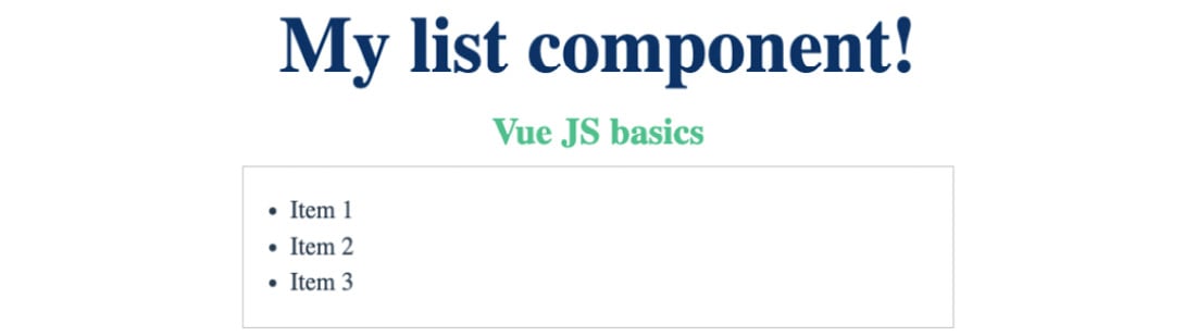
Figure 1.41 – The outcome of scoping styles
- Inspect the DOM and you will notice that at runtime, that scoping has applied
v-data-*attributes to your DOM elements specifying these specific rules.
The Elements tab of your browser Devtools also shows the following after expanding the <head> and <style> tags:
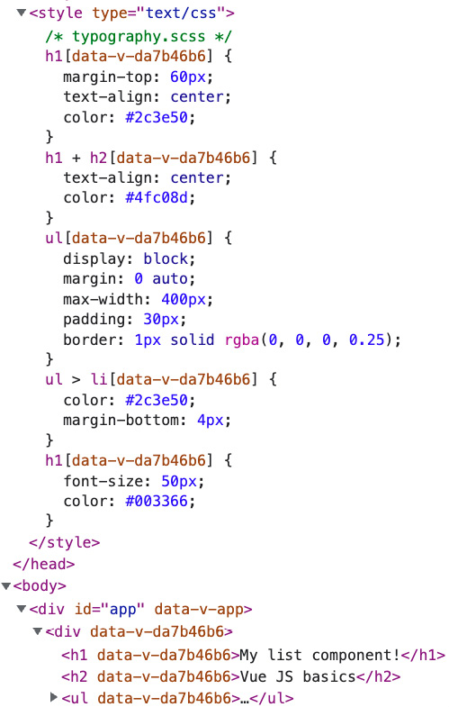
Figure 1.42 – How the virtual DOM uses data attributes to assign scoped styles
- Create a new style sheet called
global.scssin thestylesfolder, containing only stylings for the mainbodyelement:/* /src/styles/global.scss */
body {font-family: 'Avenir', Helvetica, Arial,
sans-serif;
margin: 0;
}
- Import this stylesheet into your
App.vue:<style lang="scss">
@import './styles/global.scss';
</style>
Our app should render the same as before; only the font family for all elements should change to Avenir and there should be no margin for the main body, as follows:
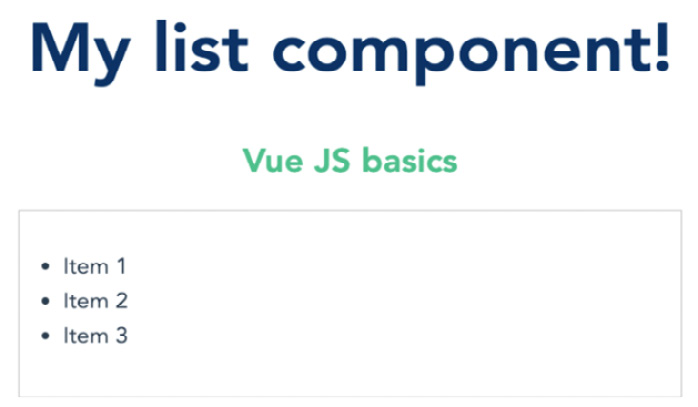
Figure 1.43 – Properly scoped styles for Exercise 1.03
In this exercise, we interpolated data that originated from an array and learned about some basic SCSS syntax. Then, we styled our component using forms of scoped SCSS, which can either exist inside the <style> tag or be imported from another directory into our project.
In the next section, we are going to experiment with how to write dynamic CSS for a component using Vue 3 features.
Setting up state-driven dynamic CSS in Vue 3
Vue 3.x introduces a new CSS function, v-bind(), to use within the style section of a Vue SFC. We use this function to create a one-way link between local data and a CSS value.
Under the hood, the Vue engine uses CSS custom properties (or CSS variables) to compute the dynamic stylings received from v-bind(). For each v-bind(), it generates a hashed custom property (with the -- prefix) and adds it to the component’s root element. All the custom properties are added as inline static styles and will be updated whenever the linked local data’s value changes.
For example, let’s have a component that prints out a title and contains a local data property, headingStyles. The headingStyles data object contains several fields such as marginTop, textAlign, and color, indicating the relevant CSS properties:
<template>
<h1>{{ title }}</h1>
</template>
<script>
export default {
  data() {
    return {
      title: 'Binding with v-bind example',
        headingStyles: {
          marginTop: '10px',
          textAlign: 'center',
          : '#4fc08d',
        }
    }
  }
}
</script>
At this point, the output does not have a custom style and will be as follows:

Figure 1.44 – Displaying the title without using v-bind() and custom CSS
We now can bind headingStyles to the CSS stylings of h1 in the <style> section, by applying v-bind() accordingly:
<style>
h1 {
  margin-top: v-bind(headingStyles.marginTop);
  text-align: v-bind(headingStyles.textAlign);
  color: v-bind(headingStyles.color);
}
</style>
The output will now have custom CSS enabled:

Figure 1.45 – Output with v-bind() and custom CSS applied
If you open Developer Tools and inspect this h1 element in the Elements tab, you will see it has inline styles, as shown in Figure 1.47:
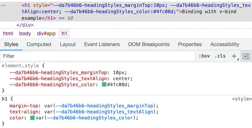
Figure 1.46 – Devtools inspection shows the inline styles with hashed custom properties generated
Since v-bind() is a Vue 3.x feature, it also supports local variables defined using script setup out of the box. You can re-write the code in the script setup standards, and the outputs stay the same.
v-bind() also support JavaScript expressions. To use JavaScript expressions, you need to wrap them in quotes. For example, we can take headingStyles from the previous example and re-define marginTop as a number only:
headingStyles: {
  marginTop: 10,
  textAlign: 'center',
  color: '#4fc08d',
}
In the <style> section, let’s compute margin-top for the h1 selector with the addition of 5px and add the px suffix:
<style>
h1 {
  margin-top: v-bind('`${headingStyles.marginTop + 5}px`');
  text-align: v-bind(headingStyles.textAlign);
  color: v-bind(headingStyles.color);
}
</style>
The output now has a margin top of 15px as shown in Figure 1.48:
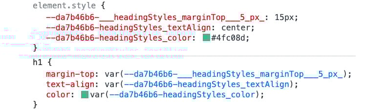
Figure 1.47 – Generated custom property for margin-top is 15px
Using v-bind() is very beneficial for defining theming dynamically and programmatically. However, it provides only one-way binding from the local data to the styling, not vice versa. In the next section, we will explore the opposite binding direction using CSS modules.


