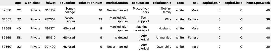
In this section, we are going to explore each variable separately. We are going to summarize the data for each feature and analyze the pattern present in it.
Univariate analysis is an analysis using individual features. We will also perform a bivariate analysis later in this section.
Univariate analysis
Now, let us do a univariate analysis for the age, education, work class, hours per week, and occupation features.
First, let’s get the counts of unique values for each column using the following code snippet:
df.nunique()
Figure 1.14 – Unique values for each column
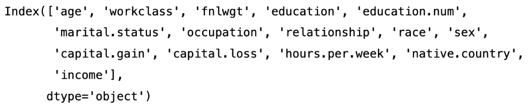
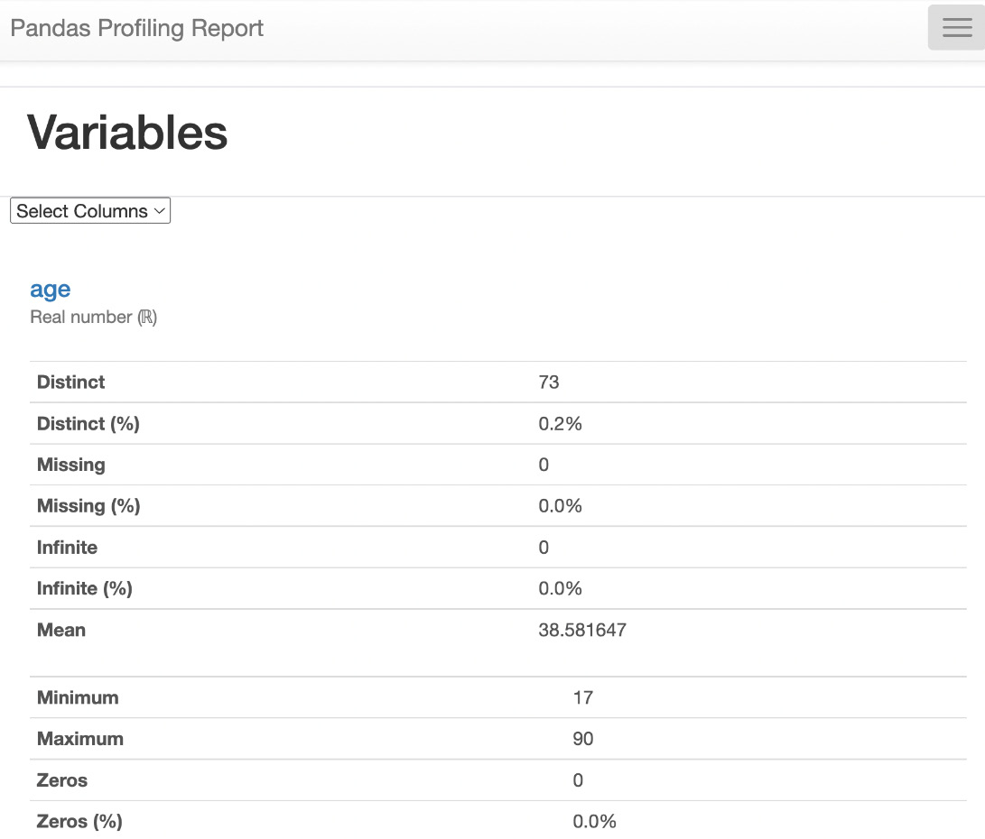
As shown in the results, there are 73 unique values for age, 9 unique values for workclass, 16 unique values for education, 15 unique values for occupation, and so on.
Now, let us see the unique values count for age in the DataFrame:
df["age"].value_counts()
The result is as follows:
Figure 1.15 – Value counts for age
We can see in the results that there are 898 observations (rows) with the age of 36. Similarly, there are 6 observations with the age of 83.
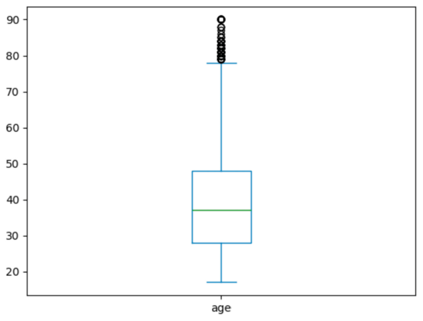
Histogram of age
Histograms are used to visualize the distribution of continuous data. Continuous data is data that can take on any value within a range (e.g., age, height, weight, temperature, etc.).
Let us plot a histogram using Seaborn to see the distribution of age in the dataset:
#univariate analysis
sns.histplot(data=df['age'],kde=True)
We get the following results:
Figure 1.16 – The histogram of age
As we can see in the age histogram, there are many people in the age range of 23 to 45 in the given observations in the dataset.
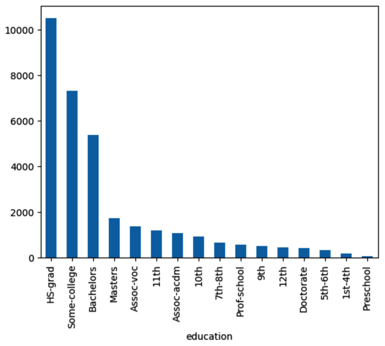
Bar plot of education
Now, let us check the distribution of education in the given dataset:
df['education'].value_counts()
Let us plot the bar chart for education.
colors = ["white","red", "green", "blue", "orange", "yellow", "purple"]
df.education.value_counts().plot.bar(color=colors,legend=True)
Figure 1.17 – The bar chart of education
As we see, the HS.grad count is higher than that for the Bachelors degree holders. Similarly, the Masters degree holders count is lower than the Bachelors degree holders count.
Bar chart of workclass
Now, let’s see the distribution of workclass in the dataset:
df['workclass'].value_counts()
Let’s plot the bar chart to visualize the distribution of different values of workclass:
Figure 1.18 – Bar chart of workclass
As shown in the workclass bar chart, there are more private employees than other kinds.
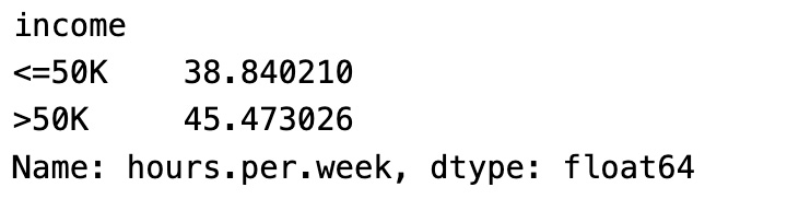
Bar chart of income
Let’s see the unique value for the income target variable and see the distribution of income:
df['income'].value_counts()
The result is as follows:
Figure 1.19 – Distribution of income
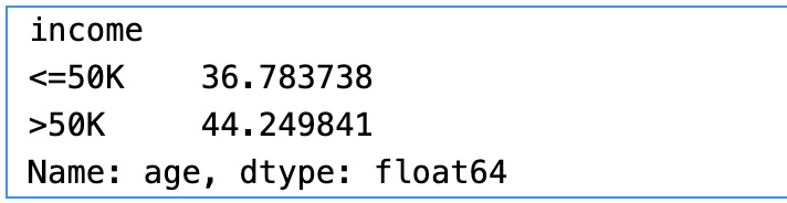
As shown in the results, there are 24,720 observations with an income greater than $50K and 7,841 observations with an income of less than $50K. In the real world, more people have an income greater than $50K and a small portion of people have less than $50K income, assuming the income is in US dollars and for 1 year. As this ratio closely reflects the real-world scenario, we do not need to balance the minority class dataset using synthetic data.
Figure 1.20 – Bar chart of income
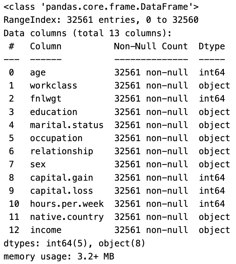
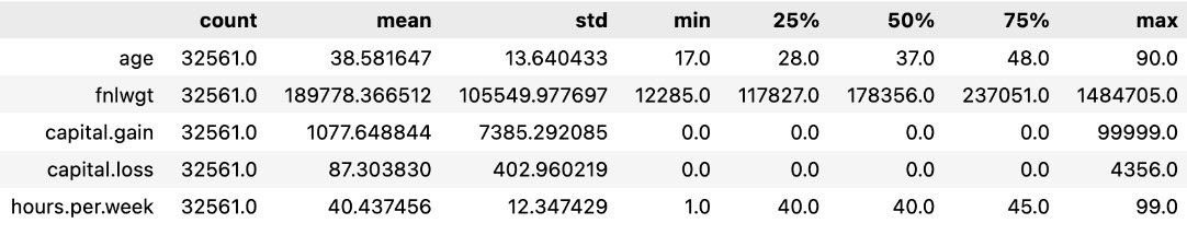
In this section, we have seen the size of the data, column names, and data types, and the first and last five rows of the dataset. We also dropped some unnecessary columns. We performed univariate analysis to see the unique value counts and plotted the bar charts and histograms to understand the distribution of values for important columns.
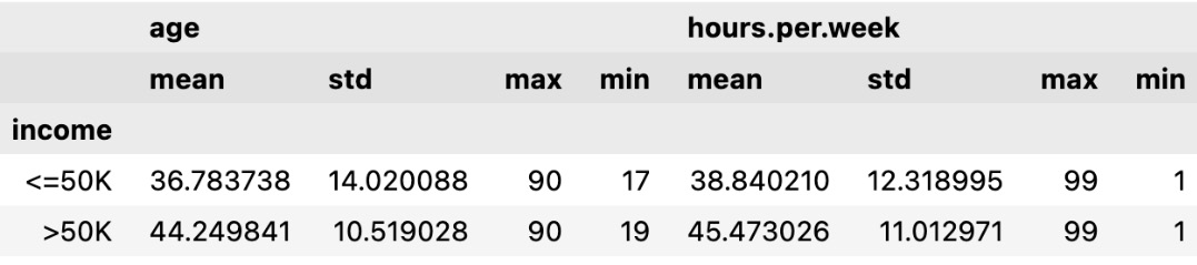
Bivariate analysis
Let’s do a bivariate analysis of age and income to find the relationship between them. Bivariate analysis is the analysis of two variables to find the relationship between them. We will plot a histogram using the Python Seaborn library to visualize the relationship between age and income:
#Bivariate analysis of age and income
sns.histplot(data=df,kde=True,x='age',hue='income')
The plot is as follows:
Figure 1.21 – Histogram of age with income
From the preceding histogram, we can see that income is greater than $50K for the age group between 30 and 60. Similarly, for the age group less than 30, income is less than $50K.
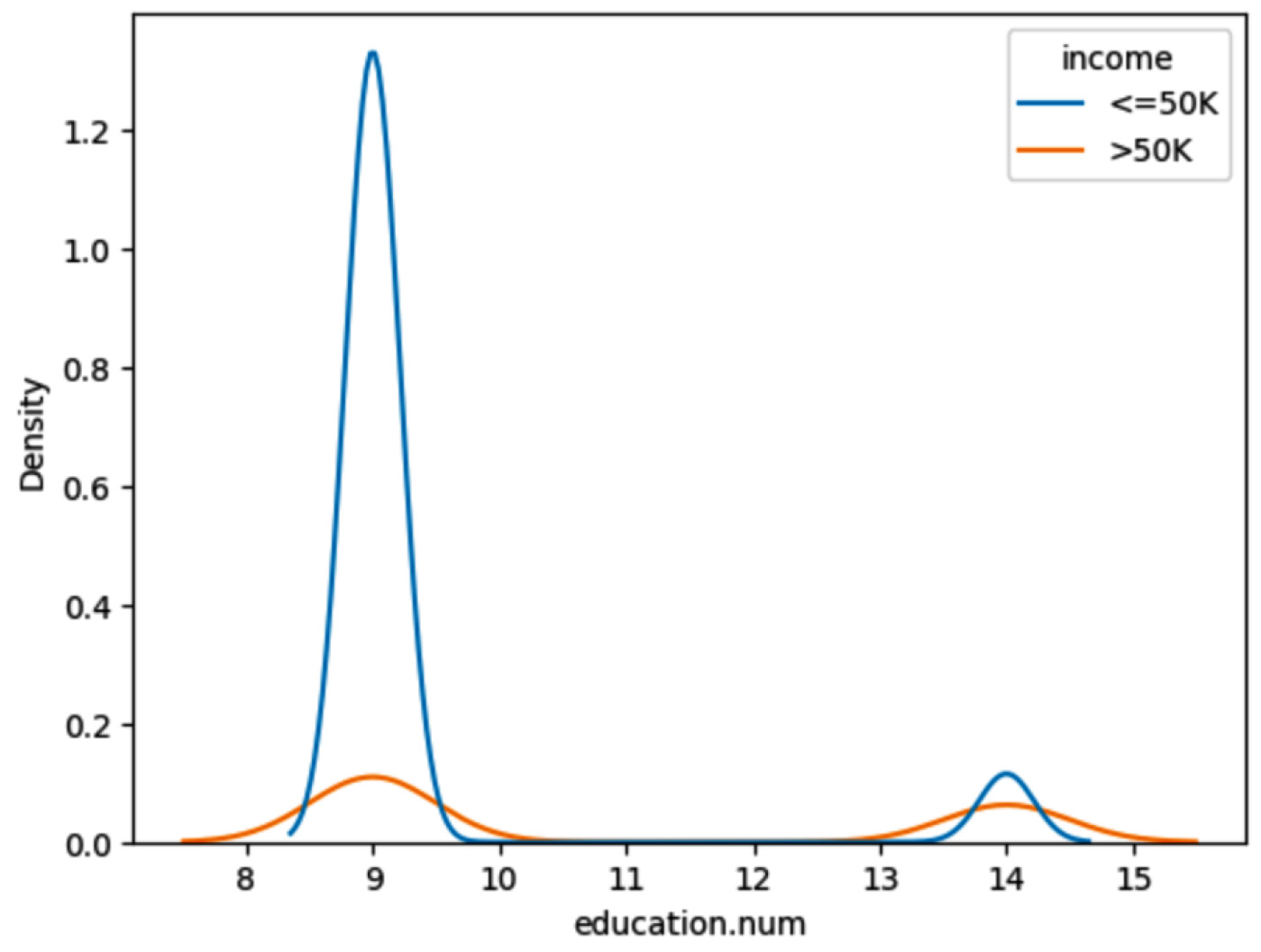
Now let’s plot the histogram to do a bivariate analysis of education and income:
#Bivariate Analysis of  education and Income
sns.histplot(data=df,y='education', hue='income',multiple="dodge");
Here is the plot:
Figure 1.22 – Histogram of education with income
From the preceding histogram, we can see that income is greater than $50K for the majority of the Masters education adults. On the other hand, income is less than $50K for the majority of HS-grad adults.
Now, let’s plot the histogram to do a bivariate analysis of workclass and income:
#Bivariate Analysis of work class and Income
sns.histplot(data=df,y='workclass', hue='income',multiple="dodge");
We get the following plot:
Figure 1.23 – Histogram of workclass and income
From the preceding histogram, we can see that income is greater than $50K for Self-emp-inc adults. On the other hand, income is less than $50K for the majority of Private and Self-emp-not-inc employees.
Now let’s plot the histogram to do a bivariate analysis of sex and income:
#Bivariate Analysis of  Sex and Income
sns.histplot(data=df,y='sex', hue='income',multiple="dodge");
Figure 1.24 – Histogram of sex and income
From the preceding histogram, we can see that income is more than $50K for male adults and less than $50K for most female employees.
In this section, we have learned how to analyze data using Seaborn visualization libraries.
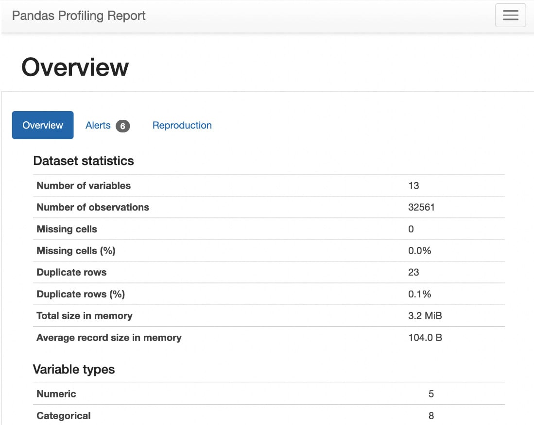
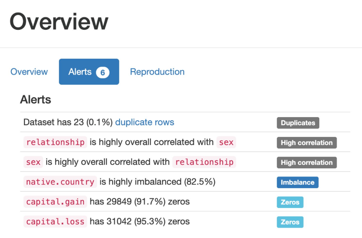
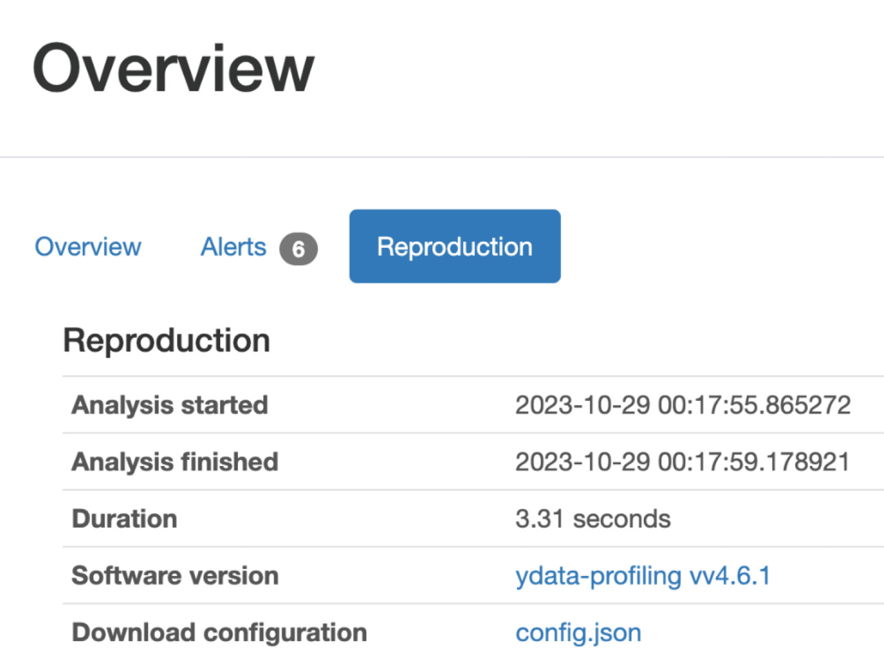
Alternatively, we can explore data using the ydata-profiling library with a few lines of code.
 Argentina
 Australia
 Austria
 Belgium
 Brazil
 Bulgaria
 Canada
 Chile
Chile
 Colombia
 Cyprus
 Czechia
 Denmark
 Ecuador
 Egypt
Egypt
 Estonia
 Finland
 France
 Germany
 Great Britain
 Greece
 Hungary
 India
India
 Indonesia
 Ireland
 Italy
Italy
 Japan
Japan
 Latvia
 Lithuania
 Luxembourg
 Malaysia
 Malta
Malta
 Mexico
 Netherlands
 New Zealand
 Norway
 Philippines
 Poland
 Portugal
 Romania
 Russia
 Singapore
 Slovakia
 Slovenia
 South Africa
 South Korea
 Spain
Spain
 Sweden
 Switzerland
 Taiwan
 Thailand
 Turkey
 Ukraine
 United States