Search icon CANCEL
Subscription
0
Cart icon
Your Cart (0 item)
Close icon
You have no products in your basket yet
Save more on your purchases! discount-offer-chevron-icon
Savings automatically calculated. No voucher code required.
Arrow left icon
Explore Products
Best Sellers
New Releases
Books
Videos
Audiobooks
Learning Hub
Newsletter Hub
Free Learning
Arrow right icon
timer SALE ENDS IN
0 Days
:
00 Hours
:
00 Minutes
:
00 Seconds
Arrow up icon
GO TO TOP
Python 3 and Data Visualization

You're reading from   Python 3 and Data Visualization Mastering Graphics and Data Manipulation with Python

Arrow left icon
Product type Paperback
Published in Aug 2024
Publisher Mercury_Learning
ISBN-13 9781836645719
Length 281 pages
Edition 1st Edition
Languages
Arrow right icon
Authors (2):
Arrow left icon
Mercury Learning and Information Mercury Learning and Information
Author Profile Icon Mercury Learning and Information
Mercury Learning and Information
Oswald Campesato Oswald Campesato
Author Profile Icon Oswald Campesato
Oswald Campesato
Arrow right icon
View More author details
Toc

Table of Contents (9) Chapters Close

Preface
1. Chapter 1: Introduction to Python 3 2. Chapter 2: NumPy and Data Visualization FREE CHAPTER 3. Chapter 3: Pandas and Data Visualization 4. Chapter 4: Pandas and SQL 5. Chapter 5: Matplotlib for Data Visualization 6. Chapter 6: Seaborn for Data Visualization 7. Index
Appendix: SVG and D3

PLOT BAR CHARTS Matplotlib

Listing 5.19 displays the contents of barchart1.py that illustrates how to plot a bar chart in Matplotlib.

LISTING 5.19: barchart1.py

import matplotlib.pyplot as plt

x = [3, 1, 3, 12, 2, 4, 4]
y = [3, 2, 1, 4, 5, 6, 7]

plt.bar(x, y)

plt.title("Bar Chart")
plt.legend(["bar"])
plt.show()

Listing 5.19 contains an import statement followed by the variables x and y that are initialized as a list of numbers. Next, the bar chart is generated by invoking the bar() method of the plt class. The final block of code sets the title and legend for the bar chart and then displays the bar chart. Launch the code in Listing 5.19 and you will see the pie chart displayed in Figure 5.16.

Images

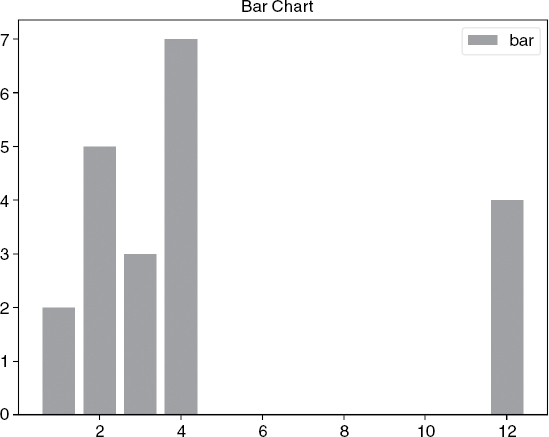
FIGURE 5.16 A bar chart.

Listing 5.20 displays the contents of barchart2.py that illustrates how to plot a bar chart in Matplotlib.

LISTING 5.20: barchart2.py

import matplotlib.pyplot as plt

plt.bar([0.25,1.25,2.25,3.25,4.25],
        [50,40,70,80,20],
        label...
lock icon The rest of the chapter is locked
CONTINUE READING
83
Tech Concepts
36
Programming languages
73
Tech Tools
Icon Unlimited access to the largest independent learning library in tech of over 8,000 expert-authored tech books and videos.
Icon Innovative learning tools, including AI book assistants, code context explainers, and text-to-speech.
Icon 50+ new titles added per month and exclusive early access to books as they are being written.
Python 3 and Data Visualization
Register for a free Packt account to unlock a world of extra content!
A free Packt account unlocks extra newsletters, articles, discounted offers, and much more. Start advancing your knowledge today.
Unlock this book and the full library FREE for 7 days
Get unlimited access to 7000+ expert-authored eBooks and videos courses covering every tech area you can think of
Renews at $19.99/month. Cancel anytime
Modal Close icon
Modal Close icon