Search icon CANCEL
Subscription
0
Cart icon
Your Cart (0 item)
Close icon
You have no products in your basket yet
Arrow left icon
Explore Products
Best Sellers
New Releases
Books
Events
Videos
Audiobooks
Packt Hub
Free Learning
Arrow right icon
timer SALE ENDS IN
0 Days
:
00 Hours
:
00 Minutes
:
00 Seconds
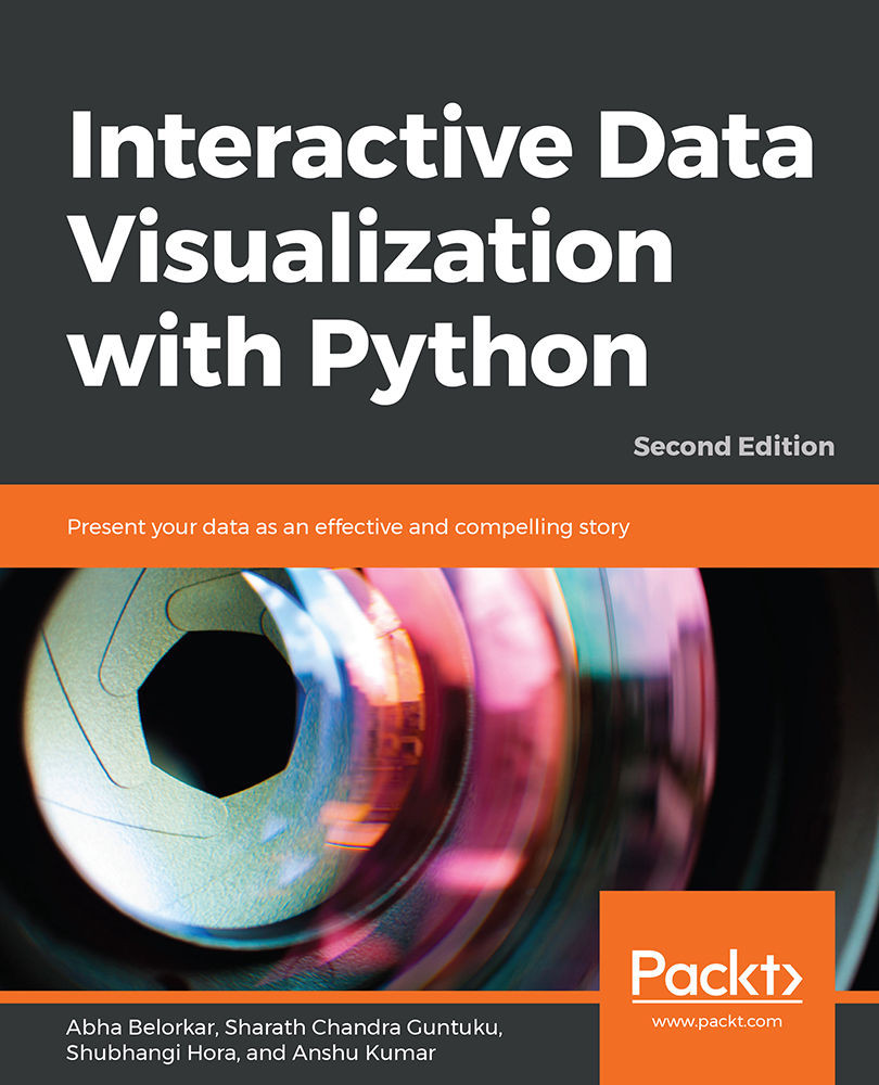
Interactive Data Visualization with Python

Interactive Data Visualization with Python: Present your data as an effective and compelling story , Second Edition

Arrow left icon
Profile Icon Abha Belorkar Profile Icon Sharath Chandra Guntuku Profile Icon Shubhangi Hora Profile Icon Anshu Kumar
Arrow right icon
€27.89 €30.99
Full star icon Full star icon Full star icon Full star icon Half star icon 4.3 (3 Ratings)
eBook Apr 2020 362 pages 2nd Edition
eBook
€27.89 €30.99
Paperback
€38.99
eBook + Subscription
€24.99 Monthly
Arrow left icon
Profile Icon Abha Belorkar Profile Icon Sharath Chandra Guntuku Profile Icon Shubhangi Hora Profile Icon Anshu Kumar
Arrow right icon
€27.89 €30.99
Full star icon Full star icon Full star icon Full star icon Half star icon 4.3 (3 Ratings)
eBook Apr 2020 362 pages 2nd Edition
eBook
€27.89 €30.99
Paperback
€38.99
eBook + Subscription
€24.99 Monthly
eBook
€27.89 €30.99
Paperback
€38.99
eBook + Subscription
€24.99 Monthly

What do you get with eBook?

Product feature icon Instant access to your Digital eBook purchase
Product feature icon Download this book in EPUB and PDF formats
Product feature icon Access this title in our online reader with advanced features
Product feature icon DRM FREE - Read whenever, wherever and however you want
Product feature icon AI Assistant (beta) to help accelerate your learning
Modal Close icon
Payment Processing...
tick Completed

Billing Address

Table of content icon View table of contents Preview book icon Preview Book

Interactive Data Visualization with Python

2. Static Visualization – Global Patterns and Summary Statistics

Learning Objectives

By the end of this chapter, you will be able to:

  • Explain various visualization techniques for different contexts
  • Identify global patterns of one or more features in a dataset
  • Create plots to represent global patterns in data: scatter plots, hexbin plots, contour plots, and heatmaps
  • Create plots that present summary statistics of data: histograms (revisited), box plots, and violin plots

In this chapter, we'll explore different visualization techniques for presenting global patterns and summary statistics of data.

Introduction

In the previous chapter, we learned how to handle pandas DataFrames as inputs for data visualization, how to plot with pandas and seaborn, and how to refine plots to increase their aesthetic appeal. The intent of this chapter is to acquire practical knowledge about the strengths and limitations of various visualization techniques. We'll practice creating plots for a variety of different contexts. However, you will notice that the variety in existing plot types and visualization techniques is huge, and choosing the appropriate visualization becomes confusing. There are times when a plot shows too much information for the reader to grasp or too little for the reader to get the necessary intuition regarding the data. There are times when a visualization is too esoteric for the reader to appreciate properly, and other times when an over-simplistic visualization just doesn't have the right impact. All these scenarios can be avoided by being armed with practical knowledge about the interpretation of different kinds of visualization techniques and their strengths and limitations.

This chapter is a primer on the different types of static visualization and the contexts in which they are most effective. Using seaborn, you will learn how to create a variety of plots and become proficient in selecting the right kind of visualization for the most suitable representation of your data. Combining these skills with the techniques learned in Chapter 1, Introduction to Visualization with Python – Basic and Customized Plotting, will help you make stellar plots that are both meaningful and attractive.

Let's first explore the right kind of visualization technique or plot to represent global patterns in data.

Note

Some of the images in this chapter have colored notations, you can find high-quality color images used in this chapter at: https://github.com/TrainingByPackt/Interactive-Data-Visualization-with-Python/tree/master/Graphics/Lesson2.

Creating Plots that Present Global Patterns in Data

In this section, we will study the context of plots that present global patterns in data, such as:

  • Plots that show the variance in individual features in data, such as histograms
  • Plots that show how different features present in data vary with respect to each other, such as scatter plots, line plots, and heatmaps

Most data scientists prefer to see such plots because they give an idea of the entire spectrum of values taken by the features of interest. Plots depicting global patterns are also useful because they make it easier to spot anomalies in data.

We will work with a dataset called mpg. It was published by the StatLib library, maintained at Carnegie Mellon University, and is available in the seaborn library. It was originally used to study the relationship of mileage – Miles Per Gallon (MPG) – with other features in the dataset; hence the name mpg. Since the dataset contains 3 discrete features and 5 continuous features, it is a good fit for illustrating multiple concepts in this chapter.

You can see what the dataset looks like using:

import seaborn as sns
# load a seaborn dataset
mpg_df = sns.load_dataset("mpg")
print(mpg_df.head())

The output is as follows:

Figure 2.1: mpg dataset

Now, let's take a look at a few different kinds of plots to present this data and derive statistical insights from it.

Scatter Plots

The first type of plot that we will generate is a scatter plot. A scatter plot is a simple plot presenting the values of two features in a dataset. Each datapoint is represented by a point with the x coordinate as the value of the first feature and the y coordinate as the value of the second feature. A scatter plot is a great tool to learn more about two such numerical attributes.

Scatter plots can help excavate relationships among different features in data such as weather and sales, nutrition intake, and health statistics in several contexts.

We will learn how to create a scatter plot with the help of an exercise.

Exercise 13: Creating a Static Scatter Plot

In this exercise, we will generate a scatter plot to examine the relationship between weight and mileage (mpg) of the vehicles from the mpg dataset. To do so, let's go through the following steps:

  1. Open a Jupyter notebook and import the necessary Python modules:
    import seaborn as sns
  2. Import the dataset from seaborn:
    mpg_df = sns.load_dataset("mpg")
  3. Generate a scatter plot using the scatterplot() function:
    # seaborn ('version 0.9.0 is required')
    ax = sns.scatterplot(x="weight", y="mpg", data=mpg_df)

    The output is as follows:

Figure 2.2: Scatter plot

Notice that the scatter plot shows a decline in mileage (mpg) with an increase in weight. That's a useful insight into the relationships between different features in the dataset.

Hexagonal Binning Plots

There's also a fancier version of scatter plots, called a hexagonal binning plot (hexbin plot) – this can be used when both rows and columns correspond to numerical attributes. Where there are lots of data points, the plotted points on a scatter plot can end up overlapping, resulting in a messy graph. It can be hard to infer trends in such cases. With a hexbin plot, a lot of data points in the same area can be shown using a darker shade. Hexbin plots use hexagons to represent clusters of data points. The darker bins indicate that there is a larger number of points in the corresponding ranges of features on the x and y axes. The lighter bins indicate fewer points. The white space corresponds to no points.This way, we end up with a cleaner graph that's clearer to read.

Let's see how to create a hexbin plot in the next exercise.

Exercise 14: Creating a Static Hexagonal Binning Plot

In this exercise, we will generate a hexagonal binning plot to get a better understanding of the relationship between weight and mileage (mpg). Let's go through the following steps:

  1. Import the necessary Python modules:
    import seaborn as sns
  2. Import the dataset from seaborn:
    mpg_df = sns.load_dataset("mpg")
  3. Plot a hexbin plot using jointplot with kind set to hex:
    ## set the plot style to include ticks on the axes.  
    sns.set(style="ticks")
    ## hexbin plot
    sns.jointplot(mpg_df.weight, mpg_df.mpg, kind="hex", color="#4CB391")

    Note the jointplot function of seaborn mentioned in the above code. It is defined where we provide the values for the x axis and y axis along with specifying the kind argument, which is set to hex here, to build the plot.

    The output is as follows:

Figure 2.3: Hexagonal binning plot of weight versus mpg

As you might notice, the histogram on the top and right axes depict the variance in the features represented by the x and y axes respectively (mpg and weight, in this example). Also, you might have noticed in the previous scatter plot that data points overlapped heavily in certain areas, obscuring the actual distribution of the features. Hexbin plots are quite a nice data visualization tool when data points are very dense.

Contour Plots

Another alternative to scatter plots when data points are densely populated in specific region(s) is a contour plot. The advantage of using contour plots is the same as hexbin plots – accurately depicting the distribution of features in the visualization in cases where data points are likely to overlap heavily. Contour plots are commonly used to show the distribution of weather indicators such as temperature, rainfall, and others on maps of geographical regions.

Let's look at a contour plot in the following exercise.

Exercise 15: Creating a Static Contour Plot

In this exercise, we'll create a contour plot to show the relationship between weight and mileage in the mpg dataset. We'll be able to see that the relationship between weight and mileage is strongest when there are more data points. Let's go through the following steps:

  1. Import the necessary Python modules:
    import seaborn as sns
  2. Import the dataset from seaborn:
    mpg_df = sns.load_dataset("mpg")
  3. Create a contour plot using the set_style method:
    # contour plot
    sns.set_style("white")
  4. Generate a Kernel Density Estimate (KDE) (see Chapter 1, Introduction to Visualization with Python-Basic and Customized Plotting) plot:
    # generate KDE plot: first two parameters are arrays of X and Y coordinates of data points
    # parameter shade is set to True so that the contours are filled with a color gradient based on number of data points
    sns.kdeplot(mpg_df.weight, mpg_df.mpg, shade=True)

    The output is as follows:

Figure 2.4: Contour plot showing weight versus mpg

Notice that the interpretation of contour plots is similar to that of hexbin plots – darker regions indicate more data points and lighter regions indicate fewer data points.

In our example of weight versus mileage (mpg), the hexbin plot and the contour plot indicate that there is a certain curve along which the negative relationship between weight and mileage is strongest, as is evident by the larger number of data points. The negative relationship becomes relatively weaker as we move away from the curve (fewer data points).

Line Plots

Another kind of plot for presenting global patterns in data is a line plot.

Line plots represent information as a series of data points connected by straight-line segments. They are useful for indicating the relationship between a discrete numerical feature (on the x axis), such as model_year, and a continuous numerical feature (on the y axis), such as mpg from the mpg dataset.

Let's look at the succeeding exercise on creating a line plot with model_year versus mpg.

Exercise 16: Creating a Static Line Plot

In this exercise, we will create a scatter plot for a different pair of features, model_year and mpg. Then, we'll generate a line plot based on those discrete attributes – model_year and mpg. To do so, let's go through the following steps:

  1. Import the necessary Python modules:
    import seaborn as sns
  2. Import the dataset from seaborn:
    mpg_df = sns.load_dataset("mpg")
  3. Create a contour plot:
    # contour plot
    sns.set_style("white")
  4. Create a two dimensional scatter plot:
    # seaborn 2-D scatter plot 
    ax1 = sns.scatterplot(x="model_year", y="mpg", data=mpg_df)

    The output is as follows:

    Figure 2.5: Two-dimensional line plot
    Figure 2.5: Two-dimensional line plot

    In this example, we see that the model_year feature only takes discrete values between 70 and 82. Now, when we have a discrete numerical feature like this (model_year), drawing a line plot joining the data points is a good idea. We can draw a simple line plot showing the relationship between model_year and mileage with the following code.

  5. Draw a simple line plot to show the relationship between model_year and mileage:
    # seaborn ('version 0.9.0 is required') line plot code
    ax = sns.lineplot(x="model_year", y="mpg", data=mpg_df)

    The output is as follows:

    Figure 2.6: Line plot showing the relationship between model_year and mileage
    Figure 2.6: Line plot showing the relationship between model_year and mileage

    As we can see, the points connected by the solid line represent the mean of the y axis feature at the corresponding x coordinate. The shaded area around the line plot shows the confidence interval for the y axis feature (by default, seaborn sets this to a 95% confidence interval). The ci parameter can be used to change to a different confidence interval. The phrase x% confidence interval translates to a range of feature values where x% of the data points are present. An example of changing to a confidence interval of 68% is shown in the code that follows.

  6. Change the confidence interval to 68:
    sns.lineplot(x="model_year", y="mpg", data=mpg_df, ci=68)

    The output is as follows:

Figure 2.7: Line plot where ci = 68

As we can see from the preceding plot, the 68% confidence interval translates to a range of feature values where 68% of the data points are present. Line plots are great visualization techniques for scenarios where we have data that changes over time – the x axis could represent date or time, and the plot would help to visualize how a value varies over that period.

Speaking of presenting data across time using line plots, let's consider the example of the flights dataset from seaborn. The dataset is used to study a comparison between airlines, delay distribution, predicting flight delays, and more (this open source dataset is hosted on Packt's GitHub repository). Through the following example, we'll see how to generate line plots to represent this dataset.

Exercise 17: Presenting Data across Time with multiple Line Plots

In this example, we'll see how to present data across time with multiple line plots. We are using the flights dataset:

  1. Import the necessary Python modules:
    import seaborn as sns
  2. Load the flights dataset:
    flights_df = sns.load_dataset("flights")
    print(flights_df.head())

    The output is as follows:

    Figure 2.8: Flights dataset
    Figure 2.8: Flights dataset

    Suppose you want to look at how the number of passengers varies between months in different years. How would you display this information?

    One option is to draw multiple line plots in a single figure. For example, let's look at the line plots for the months of December and January across different years. We can do this with the code that follows.

  3. Create multiple plots for the months of December and January:
    #flights_df = flights_df.pivot("month", "year", "passengers")
    #ax = sns.heatmap(flights_df)
    # line plots for the planets dataset
    ax = sns.lineplot(x="year", y="passengers", data=flights_df[flights_df['month']=='January'], color='green')
    ax = sns.lineplot(x="year", y="passengers", data=flights_df[flights_df['month']=='February'], color='red')
    ax = sns.lineplot(x="year", y="passengers", data=flights_df[flights_df['month']=='March'], color='blue')
    ax = sns.lineplot(x="year", y="passengers", data=flights_df[flights_df['month']=='April'], color='cyan')
    ax = sns.lineplot(x="year", y="passengers", data=flights_df[flights_df['month']=='May'], color='pink')
    ax = sns.lineplot(x="year", y="passengers", data=flights_df[flights_df['month']=='June'], color='black')
    ax = sns.lineplot(x="year", y="passengers", data=flights_df[flights_df['month']=='July'], color='grey')
    ax = sns.lineplot(x="year", y="passengers", data=flights_df[flights_df['month']=='August'], color='yellow')
    ax = sns.lineplot(x="year", y="passengers", data=flights_df[flights_df['month']=='September'], color='turquoise')
    ax = sns.lineplot(x="year", y="passengers", data=flights_df[flights_df['month']=='October'], color='orange')
    ax = sns.lineplot(x="year", y="passengers", data=flights_df[flights_df['month']=='November'], color='darkgreen')
    ax = sns.lineplot(x="year", y="passengers", data=flights_df[flights_df['month']=='December'], color='darkred')

    The output is as follows:

Figure 2.9: Multiple line plots for year versus passengers

With this example of 12 line plots, we can see how a figure with too many line plots quickly begins to get crowded and confusing. Thus, for certain scenarios, line plots are neither appealing nor useful.

So, what is the alternative for our use case?

Heatmaps

Enter heatmaps.

A heatmap is a visual representation of a specific continuous numerical feature as a function of two other discrete features (either a categorical or a discrete numerical) in the dataset. The information is presented in grid form – each cell in the grid corresponds to a specific pair of values taken by the two discrete features and is colored based on the value of the third numerical feature. A heatmap is a great tool to visualize high-dimensional data and even to tease out features that are particularly variable across different classes.

Let's go through a concrete exercise.

Exercise 18: Creating and Exploring a Static Heatmap

In this exercise, we will explore and create a heatmap. We will use the flights dataset from the seaborn library to generate a heatmap depicting the number of passengers per month across the years 1949-1960:

  1. Start by importing the seaborn module and loading the flights dataset:
    import seaborn as sns
    flights_df = sns.load_dataset('flights')
  2. Now we need to pivot the dataset on the required variables using the pivot() function before generating the heatmap. The pivot function first takes as arguments the feature that will be displayed in rows, then the one displayed in columns, and finally the feature whose variation we are interested in observing. It uses unique values from specified indexes/columns to form axes of the resulting DataFrame:
    df_pivoted = flights_df.pivot("month", "year", "passengers")
    ax = sns.heatmap(df_pivoted)

    The output is as follows:

    Figure 2.10: Generated heatmap
    Figure 2.10: Generated heatmap

    Here, we can note that the total number of yearly flights increased steadily from 1949 to 1960. Moreover, the months of July and August seem to have the largest number of flights (compared to other months) across the years in observation. Now, that's an interesting trend to find from a simple visualization!

    Plotting heatmaps is a very fun thing to explore, and there are lots of options available to tweak the parameters. You can learn more about them at https://seaborn.pydata.org/generated/seaborn.clustermap.html and https://seaborn.pydata.org/generated/seaborn.heatmap.html. However, we will only mention a few important aspects here – the clustering option and the distance metric.

    Rows or columns in a heatmap can also be clustered based on the extent of their similarity. To do this in seaborn, use the clustermap option.

    Exercise18 continued

  3. Use clustermap option to cluster rows and columns:
    ax = sns.clustermap(df_pivoted, col_cluster=False, row_cluster=True)

    The output is as follows:

    Figure 2.11: Heatmap using clustermap
    Figure 2.11: Heatmap using clustermap

    Did you notice how the order of months got rearranged in the plots but some months (for example, July and August) stuck together because of their similar trends? In both July and August, the number of flights increased relatively more drastically in the last few years till 1960.

    Note

    We can cluster the data by year by switching the parameter values (row_cluster=False, col_cluster=True) or cluster both by row and column (row_cluster=True, col_cluster=True).

    At this point, you may be thinking, But wait, how is the similarity between rows and columns computed? The answer is that it depends on the distance metric – that is, how the distance between two rows or two columns is computed. The rows/columns with the least distance between them are clustered closer together than the ones with a greater distance between them. The user can set the distance metric to one of the many available options (manhattan, euclidean, correlation, and others) simply using the metric option as follows. You can read more about the distance metric options here: https://scikit-learn.org/stable/modules/generated/sklearn.neighbors.DistanceMetric.html.

    Note

    seaborn sets the metric to euclidean by default.

    Exercise18 continued:

  4. Set metric to euclidean:
    # equivalent to ax = sns.clustermap(df_pivoted, row_cluster=False, metric='euclidean')
    ax = sns.clustermap(df_pivoted, col_cluster=False) 

    The output is as follows:

    Figure 2.12: Heatmap with distance metric as euclidean
    Figure 2.12: Heatmap with distance metric as euclidean
  5. Change metric to correlation:
    # change distance metric to correlation
    ax = sns.clustermap(df_pivoted, row_cluster=False, metric='correlation')

    The output is as follows:

Figure 2.13:Heatmap with distance metric is correlation
Figure 2.13: Heatmap with distance metric is correlation

On reading about distance metric, we learn that it defines the distance between two rows/columns. However, if we look carefully, we see that the heatmap also clusters not just individual rows or columns, but also groups of rows and columns. This is where linkage comes into the picture. But hold your breath for a moment before we come to that!

The Concept of Linkage in Heatmaps

The clustering seen in heatmaps is called agglomerative hierarchical clustering because it involves the sequential grouping of rows/columns until all of them belong to a single cluster, resulting in a hierarchy. Without loss of generality, let's assume we are clustering rows. The first step in hierarchical clustering is to compute the distance between all possible pairs of rows, and to select two rows, say, A and B, with the least distance between them. Once these rows are grouped, they are said to be merged into a single cluster. Once this happens, we need a rule that not only determines the distance between two rows but also the distance between any two clusters (even if the cluster contains a single point):

  • If we define the distance between two clusters as the distance between the two points across the clusters closest to each other, the rule is called single linkage.
  • If the rule is to define the distance between two clusters as the distance between the points farthest from each other, it is called complete linkage.
  • If the rule is to define the distance as the average of all possible pairs of rows in the two clusters, it is called average linkage.

The same holds for clustering columns, too.

Exercise 19: Creating Linkage in Static Heatmaps

In this exercise, we'll generate a heatmap and understand the concept of single, complete, and average linkage in heatmaps using the flights dataset. We'll use the cluster map method and set the method parameter to different values, such as average, complete, and single. To do so, let's go throughout the following steps:

  1. Start by importing the seaborn module and loading the flights dataset:
    import seaborn as sns
    flights_df = sns.load_dataset('flights')
  2. Now we need to pivot the dataset on the required variables using the pivot() function before generating the heatmap:
    df_pivoted = flights_df.pivot("month", "year", "passengers")
    ax = sns.heatmap(df_pivoted)

    The output is as follows:

    Figure 2.14: Generated heatmap for the flights dataset
    Figure 2.14: Generated heatmap for the flights dataset
  3. Link the heatmaps using the code that follows:
    ax = sns.clustermap(df_pivoted, col_cluster=False, metric='correlation', method='average')
    ax = sns.clustermap(df_pivoted, row_cluster=False, metric='correlation', method='complete')
    ax = sns.clustermap(df_pivoted, row_cluster=False, metric='correlation', method='single')

    The output is as follows:

Figure 2.15a: Heatmap showing average linkage
Figure 2.15b: Heatmap showing complete linkage
Figure 2.15c: Heatmap showing single linkage

Heatmaps are also a good way to visualize what happens in a 2D space. For example, they can be used to show where the most action is on the pitch in a soccer game. Similarly, for a website, heatmaps can be used to show the areas that are most frequently moussed over by users.

In this section, we have studied plots that present the global patterns of one or more features in a dataset. The following plots were specifically highlighted in the section:

  • Scatter plots: Useful for observing the relationship between two potentially related features in a dataset
  • Hexbin plots and contour plots: A good alternative for scatter plots when data is too dense in some parts of a feature space
  • Line plots: Useful for indicating the relationship between a discrete numerical feature (on the x axis) and a continuous numerical feature (on the y axis)
  • Heatmaps: Useful for examining the relationship between a continuous numerical feature of interest and two other features that are either a categorical or a discrete numerical

Creating Plots That Present Summary Statistics of Your Data

It's now time for a switch to our next section. When datasets are huge, it is sometimes useful to look at the summary statistics of a range of different features and get a preliminary idea of the dataset. For example, the summary statistics for any numerical feature include measures of central tendency, such as the mean, and measures of dispersion, such as the standard deviation.
When a dataset is too small, plots presenting summary statistics may actually be misleading because summary statistics are meaningful only when the dataset is big enough to draw statistical conclusions. For example, if somebody reports the variance of a feature using five data points, we cannot make any concrete conclusions regarding the dispersion of the feature.

Histogram Revisited

Let's revisit histograms from Chapter 1, Introduction to Visualization with Python – Basic and Customized Plotting. Although histograms show the distribution of a given feature in data, we can make a plot a little more informative by showing some summary statistics in the same plot. Let's go back to our mpg dataset and draw a histogram to analyze the spread of vehicle weights in the dataset.

Example 1: Histogram Revisited

We'll go through a histogram plot to revisit the concept we have learned in Chapter 1, Introduction to Visualization with Python – Basic and Customized Plotting. Let's go through the following:

Import the necessary Python modules; load the dataset; choose number of bins and whether the kernel density estimate should be shown or not; Use red color to show mean using a straight line on the x axis (parallel to y axis); define the location of legend:

# histogram using seaborn
import matplotlib.pyplot as plt
import seaborn as sns
import numpy as np
mpg_df = sns.load_dataset("mpg")
ax = sns.distplot(mpg_df.weight, bins=50, kde=False)
# `label` defines the name used in legend
plt.axvline(x=np.mean(mpg_df.weight), color='red', label='mean')
plt.axvline(x=np.median(mpg_df.weight), color='orange', label='median')
plt.legend(loc='upper right')

The output is as follows:

<matplotlib.legend.Legend at 0x1a24a60358>

Figure 2.16: Histogram revisited

This histogram shows the distribution of the weight feature along with the mean and median. Notice that the mean is not equal to the median, which means that the feature is not normally distributed. Read more on this here: http://mathworld.wolfram.com/NormalDistribution.html.

Let's explore a few other plots to represent the summary statistics of data.

Box Plots

Box plots are an excellent way to examine the relationship between the summary statistics of a numerical feature in relation to other categorical features. Now, suppose we want to see the summary statistics of the mpg feature (mileage) classified by another feature – the number of cylinders. A popular way to show such information is to use box plots. This is very easy to do with the seaborn library.

Exercise 20: Creating and Exploring a Static Box Plot

In this exercise, we will create a box plot to analyze the relationship between model_year and mileage using the mpg dataset. We'll analyze manufacturing efficiency and the mileage of vehicles over a period of years. To do so, let's go through the following steps:

  1. Import seaborn library:
    import seaborn as sns
  2. Load the dataset:
    mpg_df = sns.load_dataset("mpg")
  3. Create a box plot:
    # box plot: mpg(mileage) vs model_year
    sns.boxplot(x='model_year', y='mpg', data=mpg_df)

    The output is as follows:

    Figure 2.17: Box plot
    Figure 2.17: Box plot

    As we can see, the box boundaries indicate the interquartile range, the upper boundary marks the 25% quartile, and the lower boundary marks the 75% quartile. The horizontal line inside the box indicates the median. Any solo points outside of the whiskers (the T-shaped bars above and below the box) mark outliers, while the whiskers themselves show the minimum and maximum values that are not outliers.

    Apparently, mileage improved substantially in the 80s compared to the 70s. Let's add another feature to our mpg DataFrame that denotes whether the car was manufactured in the 70s or 80s.

  4. Modify the mpg DataFrame by creating a new feature, model_decade:
    import numpy as np
    # creating a new feature 'model_decade'
    mpg_df['model_decade'] = np.floor(mpg_df.model_year/10)*10
    mpg_df['model_decade'] = mpg_df['model_decade'].astype(int)
    mpg_df.tail()

    The output is as follows:

    Figure 2.18:Modified mpg DataFrame
    Figure 2.18:Modified mpg DataFrame
  5. Now, let's redraw our box plot to look at mileage distribution for the two decades:
    # a boxplot with multiple classes
    sns.boxplot(x='model_decade', y='mpg', data=mpg_df)

    The output is as follows:

    Figure 2.19: Redrawn Box plot
    Figure 2.19: Redrawn Box plot

    But wait – more can be done with boxplots. We can also add another feature, say, region of origin, and see how that affects the relationship between mileage and manufacturing time, the two features we have been considering so far.

  6. Use the hue parameter to group by origin:
    # boxplot: mpg (mileage) vs model_decade
    # parameter hue is used to group by a specific feature, in this case 'origin'
    sns.boxplot(x='model_decade', y='mpg', data=mpg_df, hue='origin')

    The output is as follows:

Figure 2.20: Box plot where hue=origin

As we can see, according to the mpg dataset, in the 70s and early 80s, Europe and Japan produced cars with better mileage than the USA. Interesting!

Violin Plots

Now let's consider a different scenario. What if we could get a hint regarding the entire distribution of a specific numerical feature grouped by other categorical features? The right kind of visualization technique here is a violin plot. A violin plot is similar to a box plot, but it includes more detail about variations in the data. The shape of a violin plot tells you the shape of the data distribution –where the data points cluster around a common value, the plot is fatter, and where there are fewer data points, the plot is thinner. We will look at a concrete example with the help of an exercise.

Exercise 21: Creating a Static Violin Plot

In this exercise, we will use the mpg dataset and generate a violin plot depicting the detailed variation of mileage (mpg) based on model_decade and region of origin:

  1. Import the necessary Python modules:
    import seaborn as sns
  2. Load the dataset:
    mpg_df = sns.load_dataset("mpg")
  3. Generate the violin plot using the violinplot function in seaborn:
    # creating the feature 'model_decade'
    import numpy as np
    mpg_df['model_decade'] = np.floor(mpg_df.model_year/10)*10
    mpg_df['model_decade'] = mpg_df['model_decade'].astype(int)
    # code for violinplots
    # parameter hue is used to group by a specific feature, in this case 'origin', while x represents the model year and y represent mileage
    sns.violinplot(x='model_decade', y='mpg', data=mpg_df, hue='origin')

    The output is as follows:

    Figure 2.21: Violin plot
Figure 2.21: Violin plot

We can see here that, during the 70s, while most vehicles in the US had a median mileage of 19 mpg, vehicles in Japan and Europe had median mileages of around 27 and 25 mpg. While the mileages of vehicles in Europe and Japan jumped by 7 to 8 points in the 80s, the median mileage of vehicles in the US was still similar to that of the vehicles in Japan and Europe in the previous decade.

As we can see from the preceding plot, the fatter sections of the plot indicate ranges of higher probability of the y-axis feature, while the thinner sections indicate areas of lower probability. The thick solid line at the center of each distribution represents the interquartile range – the two ends are the 25% and 75% quantiles and the dot is the median. The thinner solid line shows 1.5 times the interquartile range.

Note

Since violin plots estimate a probability distribution based on the existing data, plots sometimes assign data points to negative values of the feature on the y axis. This may cause confusion and make readers doubt your results.

In this section, we have studied some plots that present summary statistics of various features in the dataset. These plots are especially useful representations of data when datasets are huge and it would be computationally expensive and time-intensive to generate plots that depict global patterns in the data. We learned how to add mean and median markers in the histogram of a given feature in the dataset. We also studied box plots and violin plots – while box plots depict summary statistics alone (with median and quartiles), violin plots also show the probability distribution of the feature across different value ranges.

Activity 2: Design Static Visualization to Present Global Patterns and Summary Statistics

We'll continue to work with the 120 years of Olympic History dataset acquired by Randi Griffin from https://www.sports-reference.com/ and made available on the GitHub repository of this book. As a visualization specialist, your task is to create two plots for the 2016 medal winners of five sports – athletics, swimming, rowing, football, and hockey:

  • Create a plot using an appropriate visualization technique that best presents the global pattern of the height and weight features of the 2016 medal winners of the five sports.
  • Create a plot using an appropriate visualization technique that best presents the summary statistic for the height and weight of the players that won each type of medal (gold/silver/bronze) in the data.

You are encouraged to use your creativity and skills in bringing out important insights from the data.

High-Level Steps

  1. Download the dataset and format it as a pandas DataFrame.
  2. Filter the DataFrame to only include the rows corresponding to medal winners from 2016 for the sports mentioned in the activity description.
  3. Look at the features in the dataset and note their data type – are they categorical or numerical?
  4. Evaluate what the appropriate visualization(s) would be for a global pattern to depict the height and weight features.
  5. Evaluate what the appropriate visualization(s) would be for depicting the medal-wise summary statistics of the weight and height features, further segregated by athlete gender.

The expected output should be:

After Step 1:

Figure 2.22: Olympic History dataset

After Step 2:

Figure 2.23: Olympics history dataset with the medal winners

After Step 3:

Figure 2.24: Olympics history dataset with the top sport winners

After Step 4:

Scatter plot-

Figure 2.25: Scatter plot

Hexbin plot-

Figure 2.26: Hexagonal binning plot

After Step 5:

First Plot-

Figure 2.27: Violin plot showing medal versus weight

Second plot-

Figure 2.28: Violin plot showing medal versus height

Note

The solution steps can be found on page 259.

Summary

In this chapter, we learned how choosing the most appropriate visualization(s) depends on four key elements:

  • The nature of the features in a dataset: categorical/discrete, numerical/continuous numerical
  • The size of the dataset: small/medium/large
  • The density of the data points in the chosen feature space: whether too many or too few data points are set to certain feature values
  • The context of the visualization: the source of the dataset and frequently used visualizations for the given application

For the purpose of explaining the concepts clearly and defining certain general guidelines, we classified visualizations into two categories:

  • Plots representing the global patterns of the chosen features (for example, histograms, scatter plots, hexbin plots, contour plots, line plots,and heatmaps)
  • Plots representing the summary statistics of the specific features (box plots and violin plots)

We are not implying that a single best visualization must be determined right away for any given application; for most datasets, the best visualizations will likely emerge from testing different kinds of plots and carefully examining the insights derived from each of them. This chapter provided the necessary resources to understand the interpretation and usage of various popular and less-used informative visualization types. In the next chapter, we will build on this foundation to introduce interactivity into our visualizations.

Left arrow icon Right arrow icon
Download code icon Download Code

Key benefits

  • Study and use Python interactive libraries, such as Bokeh and Plotly
  • Explore different visualization principles and understand when to use which one
  • Create interactive data visualizations with real-world data

Description

With so much data being continuously generated, developers, who can present data as impactful and interesting visualizations, are always in demand. Interactive Data Visualization with Python sharpens your data exploration skills, tells you everything there is to know about interactive data visualization in Python. You'll begin by learning how to draw various plots with Matplotlib and Seaborn, the non-interactive data visualization libraries. You'll study different types of visualizations, compare them, and find out how to select a particular type of visualization to suit your requirements. After you get a hang of the various non-interactive visualization libraries, you'll learn the principles of intuitive and persuasive data visualization, and use Bokeh and Plotly to transform your visuals into strong stories. You'll also gain insight into how interactive data and model visualization can optimize the performance of a regression model. By the end of the course, you'll have a new skill set that'll make you the go-to person for transforming data visualizations into engaging and interesting stories.

Who is this book for?

This book intends to provide a solid training ground for Python developers, data analysts and data scientists to enable them to present critical data insights in a way that best captures the user's attention and imagination. It serves as a simple step-by-step guide that demonstrates the different types and components of visualization, the principles, and techniques of effective interactivity, as well as common pitfalls to avoid when creating interactive data visualizations. Students should have an intermediate level of competency in writing Python code, as well as some familiarity with using libraries such as pandas.

What you will learn

  • Explore and apply different interactive data visualization techniques
  • Manipulate plotting parameters and styles to create appealing plots
  • Customize data visualization for different audiences
  • Design data visualizations using interactive libraries
  • Use Matplotlib, Seaborn, Altair and Bokeh for drawing appealing plots
  • Customize data visualization for different scenarios

Product Details

Country selected
Publication date, Length, Edition, Language, ISBN-13
Publication date : Apr 14, 2020
Length: 362 pages
Edition : 2nd
Language : English
ISBN-13 : 9781800201064
Category :
Languages :
Tools :

What do you get with eBook?

Product feature icon Instant access to your Digital eBook purchase
Product feature icon Download this book in EPUB and PDF formats
Product feature icon Access this title in our online reader with advanced features
Product feature icon DRM FREE - Read whenever, wherever and however you want
Product feature icon AI Assistant (beta) to help accelerate your learning
Modal Close icon
Payment Processing...
tick Completed

Billing Address

Product Details

Publication date : Apr 14, 2020
Length: 362 pages
Edition : 2nd
Language : English
ISBN-13 : 9781800201064
Category :
Languages :
Tools :

Packt Subscriptions

See our plans and pricing
Modal Close icon
€18.99 billed monthly
Feature tick icon Unlimited access to Packt's library of 7,000+ practical books and videos
Feature tick icon Constantly refreshed with 50+ new titles a month
Feature tick icon Exclusive Early access to books as they're written
Feature tick icon Solve problems while you work with advanced search and reference features
Feature tick icon Offline reading on the mobile app
Feature tick icon Simple pricing, no contract
€189.99 billed annually
Feature tick icon Unlimited access to Packt's library of 7,000+ practical books and videos
Feature tick icon Constantly refreshed with 50+ new titles a month
Feature tick icon Exclusive Early access to books as they're written
Feature tick icon Solve problems while you work with advanced search and reference features
Feature tick icon Offline reading on the mobile app
Feature tick icon Choose a DRM-free eBook or Video every month to keep
Feature tick icon PLUS own as many other DRM-free eBooks or Videos as you like for just €5 each
Feature tick icon Exclusive print discounts
€264.99 billed in 18 months
Feature tick icon Unlimited access to Packt's library of 7,000+ practical books and videos
Feature tick icon Constantly refreshed with 50+ new titles a month
Feature tick icon Exclusive Early access to books as they're written
Feature tick icon Solve problems while you work with advanced search and reference features
Feature tick icon Offline reading on the mobile app
Feature tick icon Choose a DRM-free eBook or Video every month to keep
Feature tick icon PLUS own as many other DRM-free eBooks or Videos as you like for just €5 each
Feature tick icon Exclusive print discounts

Frequently bought together


Stars icon
Total 140.97
The Data Visualization Workshop
€38.99
Interactive Data Visualization with Python
€38.99
Hands-On Exploratory Data Analysis with Python
€62.99
Total 140.97 Stars icon

Table of Contents

7 Chapters
1. Introduction to Visualization with Python – Basic and Customized Plotting Chevron down icon Chevron up icon
2. Static Visualization – Global Patterns and Summary Statistics Chevron down icon Chevron up icon
3. From Static to Interactive Visualization Chevron down icon Chevron up icon
4. Interactive Visualization of Data across Strata Chevron down icon Chevron up icon
5. Interactive Visualization of Data across Time Chevron down icon Chevron up icon
6. Interactive Visualization of Geographical Data Chevron down icon Chevron up icon
7. Avoiding Common Pitfalls to Create Interactive Visualizations Chevron down icon Chevron up icon

Customer reviews

Rating distribution
Full star icon Full star icon Full star icon Full star icon Half star icon 4.3
(3 Ratings)
5 star 66.7%
4 star 0%
3 star 33.3%
2 star 0%
1 star 0%
Robert Johnson May 15, 2020
Full star icon Full star icon Full star icon Full star icon Full star icon 5
I'm fairly new to Python. I bought this book to learn data visualization techniques with Python. It's well laid out with step by step instructions and explanations. There were a few sections that I couldn't get to work (Bokeh and Altair) but for the most part everything works and is correct. The Bokeh and Altair examples don't work for me but I suspect it's something to do with my setup (versions). I tried the author's downloaded code with the same result in case I had some weird syntax problem that I wasn't able to figure out. The other issue is more a problem with the Kindle version of the book. Depending on where it splits the page, it can make indentations hard to spot. But that's not really the fault of the author. Just something to be aware of.Using the techniques in the book, I was able to take some US COVID data and plot out maps with different visualizations (infections by county, infections per capita by county, time series tracking of growth by county). It was pretty cool to see it match up the professional sites. I did a per capita plot that showed a huge bubble in Tennessee, which I thought might have been a defect in the data. I googled the county and it turned out the data was correct due to a prison located in a sparse county which resulted in 1 in 9 people showing as infected.
Amazon Verified review Amazon
Dr. Bernd M. Feb 25, 2021
Full star icon Full star icon Full star icon Full star icon Full star icon 5
Ich mag das Buch, schaue immer wieder rein, wenn ich schnell mal paar Plots mit Seaborn, Bokeh, Plotly oder Altair erstellen möchte. Mich selber hat am Anfang vor allem die klare Beschreibung der Clustermaps von Seaborn beeindruckt, gibt es zwar auch im Internet, aber da wird man meistens von Details regelrecht erschlagen. Ich mag auch das Einführungskapitel zu Pandas, da ich bei der Bearbeitung/Umwandlung von Data-Frames immer wieder irgendwo was nachschlagen muss. Meiner Meinung nach ist es eine wirklich gute Mischung aus Lehrbuch und Nachschlagewerk.
Amazon Verified review Amazon
Yifu Jan 13, 2021
Full star icon Full star icon Full star icon Empty star icon Empty star icon 3
This book is only good for complete beginners who have little or no experience in data visualizations with Python. The book covers basic usage of matplotlib, altair, bokeh and plotly but the topics covered are too simple. You could easily get better explanations or examples by searching online.If you have some or intermediate knowledge in data visualization, you could learn much more by just searching for tutorials or example gallery of those packages online.
Amazon Verified review Amazon
Get free access to Packt library with over 7500+ books and video courses for 7 days!
Start Free Trial

FAQs

How do I buy and download an eBook? Chevron down icon Chevron up icon

Where there is an eBook version of a title available, you can buy it from the book details for that title. Add either the standalone eBook or the eBook and print book bundle to your shopping cart. Your eBook will show in your cart as a product on its own. After completing checkout and payment in the normal way, you will receive your receipt on the screen containing a link to a personalised PDF download file. This link will remain active for 30 days. You can download backup copies of the file by logging in to your account at any time.

If you already have Adobe reader installed, then clicking on the link will download and open the PDF file directly. If you don't, then save the PDF file on your machine and download the Reader to view it.

Please Note: Packt eBooks are non-returnable and non-refundable.

Packt eBook and Licensing When you buy an eBook from Packt Publishing, completing your purchase means you accept the terms of our licence agreement. Please read the full text of the agreement. In it we have tried to balance the need for the ebook to be usable for you the reader with our needs to protect the rights of us as Publishers and of our authors. In summary, the agreement says:

  • You may make copies of your eBook for your own use onto any machine
  • You may not pass copies of the eBook on to anyone else
How can I make a purchase on your website? Chevron down icon Chevron up icon

If you want to purchase a video course, eBook or Bundle (Print+eBook) please follow below steps:

  1. Register on our website using your email address and the password.
  2. Search for the title by name or ISBN using the search option.
  3. Select the title you want to purchase.
  4. Choose the format you wish to purchase the title in; if you order the Print Book, you get a free eBook copy of the same title. 
  5. Proceed with the checkout process (payment to be made using Credit Card, Debit Cart, or PayPal)
Where can I access support around an eBook? Chevron down icon Chevron up icon
  • If you experience a problem with using or installing Adobe Reader, the contact Adobe directly.
  • To view the errata for the book, see www.packtpub.com/support and view the pages for the title you have.
  • To view your account details or to download a new copy of the book go to www.packtpub.com/account
  • To contact us directly if a problem is not resolved, use www.packtpub.com/contact-us
What eBook formats do Packt support? Chevron down icon Chevron up icon

Our eBooks are currently available in a variety of formats such as PDF and ePubs. In the future, this may well change with trends and development in technology, but please note that our PDFs are not Adobe eBook Reader format, which has greater restrictions on security.

You will need to use Adobe Reader v9 or later in order to read Packt's PDF eBooks.

What are the benefits of eBooks? Chevron down icon Chevron up icon
  • You can get the information you need immediately
  • You can easily take them with you on a laptop
  • You can download them an unlimited number of times
  • You can print them out
  • They are copy-paste enabled
  • They are searchable
  • There is no password protection
  • They are lower price than print
  • They save resources and space
What is an eBook? Chevron down icon Chevron up icon

Packt eBooks are a complete electronic version of the print edition, available in PDF and ePub formats. Every piece of content down to the page numbering is the same. Because we save the costs of printing and shipping the book to you, we are able to offer eBooks at a lower cost than print editions.

When you have purchased an eBook, simply login to your account and click on the link in Your Download Area. We recommend you saving the file to your hard drive before opening it.

For optimal viewing of our eBooks, we recommend you download and install the free Adobe Reader version 9.

Modal Close icon
Modal Close icon