


A practical note on providing alternate image formats and sizes
Writing a picture element every time you want to include alternate versions of an image on a page is an awful lot of boilerplate code. As such, many content management systems and static site generator tools will add responsive image code for you behind the scenes. For example, when you upload an image into WordPress for use in a blog post, it automatically makes alternate sizes and serves those up as options in a srcset attribute inside an img tag:
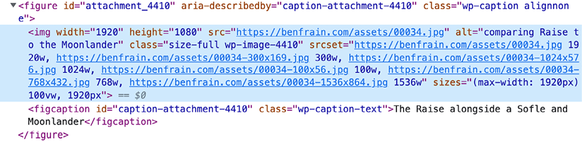
Figure 10.2: The kind of markup WordPress adds when I insert an image into my blog
My advice would be to avoid “hand-writing” the picture element and srcset code as much as possible. If you are using a content management system that can do it for you, great. If not, at least defer it to a modern AI assistant, which can spit the relevant code out for you easily, and likely with less errors.


