Home Data R Graphs Cookbook

R Graphs Cookbook

By Jaynal Abedin , Jaynal Abedin , Hrishi Mittal
books-svg-icon Book
eBook $36.99 $24.99
Print $60.99
Subscription $15.99 $10 p/m for three months
$10 p/m for first 3 months. $15.99 p/m after that. Cancel Anytime!
What do you get with a Packt Subscription?
This book & 7000+ ebooks & video courses on 1000+ technologies
60+ curated reading lists for various learning paths
50+ new titles added every month on new and emerging tech
Early Access to eBooks as they are being written
Personalised content suggestions
Customised display settings for better reading experience
50+ new titles added every month on new and emerging tech
Playlists, Notes and Bookmarks to easily manage your learning
Mobile App with offline access
What do you get with a Packt Subscription?
This book & 6500+ ebooks & video courses on 1000+ technologies
60+ curated reading lists for various learning paths
50+ new titles added every month on new and emerging tech
Early Access to eBooks as they are being written
Personalised content suggestions
Customised display settings for better reading experience
50+ new titles added every month on new and emerging tech
Playlists, Notes and Bookmarks to easily manage your learning
Mobile App with offline access
What do you get with eBook + Subscription?
Download this book in EPUB and PDF formats, plus a monthly download credit
This book & 6500+ ebooks & video courses on 1000+ technologies
60+ curated reading lists for various learning paths
50+ new titles added every month on new and emerging tech
Early Access to eBooks as they are being written
Personalised content suggestions
Customised display settings for better reading experience
50+ new titles added every month on new and emerging tech
Playlists, Notes and Bookmarks to easily manage your learning
Mobile App with offline access
What do you get with a Packt Subscription?
This book & 6500+ ebooks & video courses on 1000+ technologies
60+ curated reading lists for various learning paths
50+ new titles added every month on new and emerging tech
Early Access to eBooks as they are being written
Personalised content suggestions
Customised display settings for better reading experience
50+ new titles added every month on new and emerging tech
Playlists, Notes and Bookmarks to easily manage your learning
Mobile App with offline access
What do you get with eBook?
Download this book in EPUB and PDF formats
Access this title in our online reader
DRM FREE - Read whenever, wherever and however you want
Online reader with customised display settings for better reading experience
What do you get with video?
Download this video in MP4 format
Access this title in our online reader
DRM FREE - Watch whenever, wherever and however you want
Online reader with customised display settings for better learning experience
What do you get with video?
Stream this video
Access this title in our online reader
DRM FREE - Watch whenever, wherever and however you want
Online reader with customised display settings for better learning experience
What do you get with Audiobook?
Download a zip folder consisting of audio files (in MP3 Format) along with supplementary PDF
What do you get with Exam Trainer?
Flashcards, Mock exams, Exam Tips, Practice Questions
Access these resources with our interactive certification platform
Mobile compatible-Practice whenever, wherever, however you want
BUY NOW $10 p/m for first 3 months. $15.99 p/m after that. Cancel Anytime!
eBook $36.99 $24.99
Print $60.99
Subscription $15.99 $10 p/m for three months
What do you get with a Packt Subscription?
This book & 7000+ ebooks & video courses on 1000+ technologies
60+ curated reading lists for various learning paths
50+ new titles added every month on new and emerging tech
Early Access to eBooks as they are being written
Personalised content suggestions
Customised display settings for better reading experience
50+ new titles added every month on new and emerging tech
Playlists, Notes and Bookmarks to easily manage your learning
Mobile App with offline access
What do you get with a Packt Subscription?
This book & 6500+ ebooks & video courses on 1000+ technologies
60+ curated reading lists for various learning paths
50+ new titles added every month on new and emerging tech
Early Access to eBooks as they are being written
Personalised content suggestions
Customised display settings for better reading experience
50+ new titles added every month on new and emerging tech
Playlists, Notes and Bookmarks to easily manage your learning
Mobile App with offline access
What do you get with eBook + Subscription?
Download this book in EPUB and PDF formats, plus a monthly download credit
This book & 6500+ ebooks & video courses on 1000+ technologies
60+ curated reading lists for various learning paths
50+ new titles added every month on new and emerging tech
Early Access to eBooks as they are being written
Personalised content suggestions
Customised display settings for better reading experience
50+ new titles added every month on new and emerging tech
Playlists, Notes and Bookmarks to easily manage your learning
Mobile App with offline access
What do you get with a Packt Subscription?
This book & 6500+ ebooks & video courses on 1000+ technologies
60+ curated reading lists for various learning paths
50+ new titles added every month on new and emerging tech
Early Access to eBooks as they are being written
Personalised content suggestions
Customised display settings for better reading experience
50+ new titles added every month on new and emerging tech
Playlists, Notes and Bookmarks to easily manage your learning
Mobile App with offline access
What do you get with eBook?
Download this book in EPUB and PDF formats
Access this title in our online reader
DRM FREE - Read whenever, wherever and however you want
Online reader with customised display settings for better reading experience
What do you get with video?
Download this video in MP4 format
Access this title in our online reader
DRM FREE - Watch whenever, wherever and however you want
Online reader with customised display settings for better learning experience
What do you get with video?
Stream this video
Access this title in our online reader
DRM FREE - Watch whenever, wherever and however you want
Online reader with customised display settings for better learning experience
What do you get with Audiobook?
Download a zip folder consisting of audio files (in MP3 Format) along with supplementary PDF
What do you get with Exam Trainer?
Flashcards, Mock exams, Exam Tips, Practice Questions
Access these resources with our interactive certification platform
Mobile compatible-Practice whenever, wherever, however you want
  1. Free Chapter
    R Graphics
About this book
Publication date:
October 2014
Publisher
Packt
Pages
368
ISBN
9781783988785


Chapter 1. R Graphics

R provides a number of well-known facilities that produce a variety of graphs to meaningfully visualize data. It has low-level facilities where we deal with basic shapes to draw graphs and high-level facilities. There are functions available here to produce quality graphs; these functionalities are usually developed using certain combinations of basic shapes. Using R, we can produce traditional plots, the trellis plot, and very high-level graphs inspired by the Grammar of Graphics implemented in the ggplot2 package. The default graphics package is useful for traditional plots, lattice provides facilities to produce trellis graphs, and the ggplot2 package is the most powerful high-level graphical tool in R. Other than these, there are low-level facilities that draw basic shapes, and arranging the shapes in their relative position is an important step in order to create meaningful data visualization. In this chapter, we will introduce both low-level graphics (also known as base graphics) and high-level graphics using different packages. Particularly, the content of this chapter will be as follows:

  • Base graphics using the default package

  • Trellis graphs using lattice

  • Graphs inspired by Grammar of Graphics


Base graphics using the default package


It is well known that R has very powerful data visualization capabilities. The primary reason behind the powerful graphical utility of R is the low-level graphical environment. The grid graphic system of R makes data visualization much more flexible and intuitive. With the help of the grid package, we can draw very basic shapes that can be arranged to produce interesting data visualizations. There are functions in the grid graphics system that draw very basic shapes of a high-level data visualization, including lines, rectangles, circles, and texts along with some other functions that specify where to put which part of the visualization. Through the use of the basic function, we can easily produce components of high-level graphs, such as a rectangle, rounded rectangle, circle, line, and arrow. We will now see how we can produce these basic shapes. In a single visualization, we will show you all the output from the following code snippet:

# Calling grid library
library(grid)

# Creating a rectangle
grid.rect(height=0.25,width=0.25)

# A rounded rectangle
grid.roundrect(height=0.2,width=0.2) 

# A circle
grid.circle(r=0.1)

# Inserting text within the shape
grid.text("R Graphics")
# Drawing a polygon
grid.polygon()

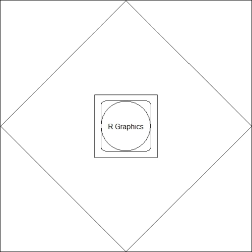
Basic shapes using the grid package

For any high-level visualization, we can use the basic shapes and arrange them as required. Now, we will list some of the functions for high-level data visualization where the basic shapes have been used:

  • plot: This is a generic function that is used to plot any kind of objects. Most commonly, we use this function for x-y plotting

  • barplot: This function is used to produce a horizontal or vertical bar plot

  • boxplot: This is used to produce a box-whisker plot

  • pie: This is used to produce a pie chart

  • hist: This is used to produce a histogram

  • dotchart: This is used to produce cleveland dot plots

  • image, heatmap, contour, and persp: These functions are used to generate image-like plots

  • qqnorm, qqline, and qqplot: These functions are used to produce plots in order to compare distributions

We will provide specific recipes for each of these functions in the subsequent chapters.


Trellis graphs using lattice


Though grid graphics have much more flexibility than trellis graphs, it is a bit difficult to use them from the point of view of general users. The lattice package enhances the data visualization capability of R through relatively easy code in order to produce much more complex graphs. This allows the user to produce multivariate visualization. The lattice package could be considered as a high-level data visualization tool that is able to produce structured graphics with the flexibility to adjust the graphs as required.

The traditional R graphics system has much more flexibility to produce any kind of data visualization with control over each and every component. However, it is still a difficult task for an inexperienced R programmer to produce efficient graphs. In other words, we can say that the traditional graphic system of R is not so user friendly. It would be good if the user could have complete high-level graphics with the use of minimal written code. To address this shortcoming, Trellis graphics have been implemented in S. The inspired lattice add-on package is the add-on package that provides similar capabilities for R users. One of the important features of the lattice graphics system is the formula interface. During data visualization, we can intuitively use the formula interface to produce conditional plots, which is difficult in a traditional graphics system.

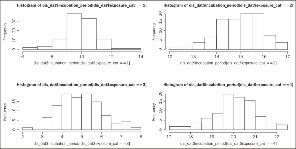
For example, say we have a dataset with two variables, an incubation period, and the exposure category of a certain disease. This dataset contains one numeric variable, the incubation period itself, and another discrete variable with four possible values: 1, 2, 3, or 4. We want to produce a histogram for each exposure category. The following code snippet shows you the traditional code:

# data generation

# Set the seed to make the example reproducible
set.seed(1234)
incubation_period <- c(rnorm(100,mean=10),rnorm(100,mean=15),rnorm(100,mean=5),rnorm(100,mean=20))
exposure_cat <- sort(rep(c(1:4),100))
dis_dat<-data.frame(incubation_period,exposure_cat)

# Producing histogram for each of the exposure category 1, 2, 3, and 4 
# using traditional visualization code. The code below for 
# panel histogram for different values of the variable
# exposure_cat. This code will produce a 2 x 2 matrix where 
# we will have four different histograms.
op<-par(mfrow=c(2,2))
hist(dis_dat$incubation_period[dis_dat$exposure_cat==1])
hist(dis_dat$incubation_period[dis_dat$exposure_cat==2])
hist(dis_dat$incubation_period[dis_dat$exposure_cat==3])
hist(dis_dat$incubation_period[dis_dat$exposure_cat==4])
par(op)

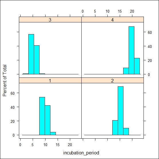
The following code snippet shows you the lattice implementation for the same histogram:

library(lattice)
histogram(~incubation_period | factor(exposure_cat), data=dis_dat)

In this lattice version of the code, it is much more intuitive to write the entire code to produce a histogram using the formula interface. The code that follows the ~ symbol contains the name of the variable that we are interested in to produce the histogram, and then we specify the grouping variable. The ~ symbol acts like the of preposition, for example, the histogram of the incubation period. The vertical bar is used to represent the panel variable over which we are going to repeat the histogram. Notice that we have used the factor command here to specify the grouping variable. If we do not specify the factor, then we will not be able to distinguish which plot corresponds to which category. The factor()command creates text labels. If the variable was left as a numeric value, it would show low to high values as though it were a continuous scale rather than discrete categories, as shown in the following figure:

Now, if we change the code's formula part and use a plot generic function instead of the histogram, then the visualization will be changed as follows:

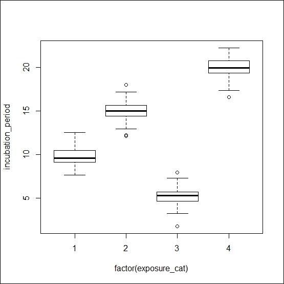
plot(incubation_period ~ factor(exposure_cat), data=dis_dat)

Tip

Downloading the example code

You can download the example code files for all Packt books you have purchased from your account at http://www.packtpub.com. If you purchased this book elsewhere, you can visit http://www.packtpub.com/support and register to have the files e-mailed directly to you.

If we change the code further and just omit the factor function, then the same visualization will be turned into a scatter plot as follows:

plot(incubation_period ~ exposure_cat, data=dis_dat)

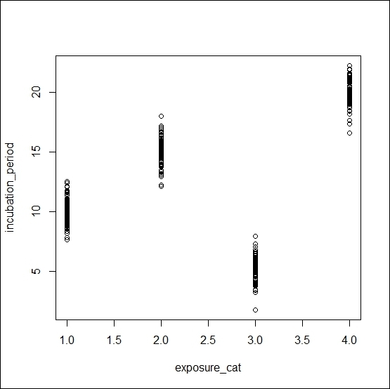
The plot()function is a generic function. If we put two numeric variables inside this function, it produces a scatter. On the other hand, if we use one numeric variable and another factor variable, then it produces a boxplot of the numeric variable for each unique value of the factor variable.


Graphs inspired by Grammar of Graphics


The ggplot2 R package is based on The Grammar of Graphics by Leland Wilkinson, Springer). Using this package, we can produce a variety of traditional graphics, and the user can produce their customized graphs as well. The beauty of this package is in its layered graphics facilities; through the use of layered graphics utilities, we can produce almost any kind of data visualization. Recently, ggplot2 has become the most searched keyword in the R community, including the most popular R blog (www.r-bloggers.com). The comprehensive theme system allows the user to produce publication quality graphs with a variety of themes of their choice. If we want to explain this package in a single sentence, then we can say that if whatever we can think about data visualization can be structured in a data frame, the visualization is a matter of few seconds.

In Chapter 12, Data Visualization Using ggplot2, on ggplot2 , we will see different examples and use themes to produce publication quality graphs. However, in this introductory chapter, we will show you one of the important features of the ggplot2 package that produces various types of graphs. The main function is ggplot(), but with the help of a different geom function, we can easily produce different types of graphs, such as the following:

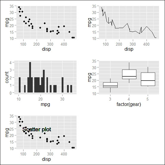
  • geom_point(): This will create a scatter plot

  • geom_line(): This will create a line chart

  • geom_bar(): This will create a bar chart

  • geom_boxplot(): This will create a box plot

  • geom_text(): This will write certain text inside the plot area

Now, we will see a simple example of the use of different geom functions with the default mtcars dataset in R:

# loading ggplot2 library
library(ggplot2)
# creating a basic ggplot object
p <- ggplot(data=mtcars)
# Creating scatter plot of mpg and disp variable
p1 <- p+geom_point(aes(x=disp,y=mpg))
# creating line chart from the same ggplot object but different
# geom function
p2 <- p+geom_line(aes(x=disp,y=mpg))
# creating bar chart of mpg variable
p3 <- p+geom_bar(aes(x=mpg))
# creating boxplot of mpg over gear
p4 <- p+geom_boxplot(aes(x=factor(gear),y=mpg))
# writing certain text into the scatter plot 
p5 <- p1+geom_text(x=200,y=25,label="Scatter plot")

The visualization of the preceding five plots will look like the following figure:

About the Authors
  • Jaynal Abedin

    Jaynal Abedin currently holds the position of Statistician at the Centre for Communicable Diseases (CCD) at icddr,b ( www.icddrb.org). He attained his Bachelor's and Master's degrees in Statistics from the University of Rajshahi, Rajshahi, Bangladesh. He has vast experience in R programming and Stata and has efficient leadership qualities. He is currently leading a team of statisticians. He has hands-on experience in developing training material and facilitating training in R programming and Stata along with statistical aspects in public health research. His primary area of interest in research includes causal inference and machine learning. He is currently involved in several ongoing public health research projects and is a co-author of several work-in-progress manuscripts. In the useR! Conference 2013, he presented a poster—edeR: Email Data Extraction using R, available at http://www.edii.uclm.es/~useR-2013/abstracts/files/34_edeR_Email_Data_Extraction_using_R.pdf—and obtained the best application poster award. He is also involved in reviewing scientific manuscripts for the Journal of Applied Statistics (JAS) and the Journal of Health Population and Nutrition (JHPN). He is also a successful freelance statistician on online platforms and has an excellent reputation through his high-quality work, especially in R programming. He can be contacted at joystatru@gmail.com, http://bd.linkedin.com/in/jaynal; his Twitter handle is @jaynal83.

    Browse publications by this author
  • Jaynal Abedin

    Jaynal Abedin is currently doing research as a PhD student at Unit for Biomedical Data Analytics (BDA) of INSIGHT at the National University of Ireland Galway. His research work is focused on the sports science and sports medicine area in a targeted project with ORRECO --an Irish startup company that provides evidence-based advice to individual athletes through biomarker and GPS data. Before joining INSIGHT as a PhD student he was leading a team of statisticians at an international public health research organization (icddr,b). His primary role there was to develop internal statistical capabilities for researchers who come from various disciplines. He was involved in designing and delivering statistical training to the researchers. He has a bachelors and masters degree in statistics, and he has written two books in R programming: Data Manipulation with R and R Graphs Cookbook (Second Edition) with Packt. His current research interests are predictive modeling to predict probable injury of an athlete and scoring extremeness of multivariate data to get an early signal of an anomaly. Moreover, he has an excellent reputation as a freelance R programmer and statistician in an online platform such as upwork.

    Browse publications by this author
  • Hrishi Mittal

    Hrishi V. Mittal has been working with R for a few years in different capacities. He was introduced to the exciting world of data analysis with R when he was working as a senior air quality scientist at King's College, London, where he used R extensively to analyze large amounts of air pollution and traffic data for London's Mayor's Air Quality Strategy. He has experience in various other programming languages but prefers R for data analysis and visualization. He is also actively involved in various R mailing lists, forums, and the development of some R packages.

    Browse publications by this author
Latest Reviews (9 reviews total)
Okay, but luttele outdated
Service good , but coupon avail option is not there. when i applied coupon, its allowed me.
It's a great book about data analysis using R programming language
R Graphs Cookbook
Unlock this book and the full library FREE for 7 days
Start now