


If you are into mobile web or application development, it's essential to learn about the basics of mobile and how it has evolved over the last few decades. By learning about these topics, you will gain basic knowledge about mobiles, which will help you to understand the concepts that we are going to discuss in later chapters. Also, in the context of mobile web optimization, you can't ever forget the three main constraints that mobile devices have, and you are going to learn about these three constraints later.
In this chapter, we will discuss the following topics:
Brief history of mobile development
Three main pillars
Available browsers
Mobile OS
It is said that:
"The Apollo 11 mission's computers were less powerful than today's mobile phones."
In 1970, a year after the human race set foot on the moon, Martin Cooper of Motorola conceived the idea of the first handheld mobile phone. Since then, the mobile phone has evolved at a rapid rate, and evidence showed that it's not going to stop any sooner. It's difficult to imagine how we made such an advance in mobile technology in such a short period, and reached a point where today, most of us use mobile devices to complete many activities in our day-to-day life.
I still remember the day I bought my first mobile phone. It didn't have any fancy stuff that you find in today's mobile phones. The only advanced feature that it had was the Short Message Service (SMS). It didn't have a camera, all the applications were pre-installed, the user couldn't install any applications, and there was no Internet browsing.
However, nowadays, we use mobile devices for many things because communication through a mobile device is faster, cheaper, and can connect to anyone from anywhere. According to surveys, the number of active mobile devices and human beings crossed over somewhere around the 7.19 billion mark. It means that each and every person in the world most likely has a mobile device. Because of this large consumer group, many organizations and consumers invested and made their marketing campaigns to cater to mobile users and as a result, each and every day thousands of new mobile applications and mobile websites have been introduced into the market.
However, today mobile applications and mobile websites have a fatal flow. Websites' sizes are getting bigger at an alarming rate, and we are quickly heading towards the wrong way. We never notice it as it happens, and when we do, it's often too late.
I had the privilege to work with excellent internal developers to complete a website a couple of months back, and our initial goal was to build the website in such a manner that it loads at top speed. Although we planned everything upfront to achieve our goal, we made a fundamental mistake. When we saw the designs, it was already approved by the top management and we never saw the designs upfront before they were sent to the client. Then we got the internal deadline defined by the management, and it was too tight. Then, Make it fast turned into Make it work and we thought we can make it faster later; of course that later never came.
After a couple of months' hard work, we managed to launch the website, but it was a disaster. The site looked great in frontend, but it took more than 20 seconds to load the home page. The website was responsive, and when we came into a mobile breakpoint, it loaded a lot of unwanted elements that shouldn't be there. Once we saw this flaw, we had to work very hard even at night to tweak the website, and after a massive effort, we managed to load the website within 7 seconds.
That day we promised ourselves to check and plan everything upfront, and never leave anything behind to damage the site's performance. So, in this book, I am going to discuss a few tips, tricks, and tools that I have learned in the past couple of years. I hope it will help you to improve your website's loading time by at least a couple of seconds.
Remember, many studies and surveys have shown how a website's performance has a direct impact on the user's interaction with the website. I've listed a few of these as follows:
4 percent of mobile phone users visiting a mobile site will abandon a site that takes longer than five seconds to load. (Source of this information: https://blog.kissmetrics.com/loading-time/.)
Every additional second added to the site's load time results in a 7 percent loss in conversions.
Similarly, shaving two seconds off of Mozilla's landing pages led to a 15.4 percent increase in conversions, which meant 60 million more downloads per year. This is just a two-second difference, so any impact that you can make will have the potential to improve your business. (Source of this information: http://www.yottaa.com/blog/application-optimization/marketing-web-performance-101-how-site-speed-impacts-your-metrics-.)
46 percent of the people who abandon their shopping carts cite slow website speeds to be the reason to do so.
79 percent of shoppers who are dissatisfied with the website's performance are less likely to buy from the same site again. (Source of this information: http://conversionxl.com/11-low-hanging-fruits-for-increasing-website-speed-and-conversions/.)
It's true that the mobile phone has come a long way since 1970. Today, we use the mobile phone for navigation, communication, and entertainment. We even use it as an electronic valet. Although, we use mobile devices for hundreds of different tasks, it has a few limitations. Mobile devices have a limited screen size, so whatever you do, you have to build your application or website in a way that it fits into that limited space. Also, if your device is truly a portable device, you will be able to carry it around. As a result, mobile manufacturers have to compact everything into a smaller size.
Finally, when you develop mobile websites or applications, you have to consider the features that mobile users actually expect from their devices, which are as follows:
Speed
64 percent of mobile users expect pages or apps to load in less than 4 seconds. (Source: https://econsultancy.com/blog/10936-site-speed-case-studies-tips-and-tools-for-improving-your-conversion-rate/)
Battery
Reasonable data usage
Users don't want to exceed their datacap
The following chart explains the significance of the three main features for any mobile device:

Out of these three factors, our primary focus will always be on the mobile's battery because unlike personal computers, mobile phones do not have an unlimited power source. Most of the time, users have to charge their mobile phones daily. It's a known fact that when you turn on the mobile's Wi-Fi, 3G, or 4G data connections, your battery starts to drain. This is because once you turn on Wi-Fi, 3G, or 4G data connections, your mobile phone begins to exchange data, thereby consuming more power.
No one will want to visit your website or use your application if they feel that your website or application is draining their battery. So, you should always optimize your website or application in such a way that it uses minimum power. To do that, you need to have a better understanding about energy consumption in mobile phones.
In the following diagram, you can see how a 3G wireless state machine works:

Learning about this will give you an idea about how mobile devices consume power when they start to exchange data using 3G:
As the preceding diagram indicates, the mobile device is initially on standby mode (A).
As number 1 indicates, when we start the 3G connection, it will have a 2 second latency. The mobile device will push to its maximum state and begin to consume maximum power (A to B).
The mobile device will continue to be in this state as long as it receives data. As long as it is connected to your website or app it will use battery power at a higher rate (B).
If your device didn't get data from the website or app, it will keep the connection for another 5 seconds, after which it will go to a lower power state (460mw) – number 2 (B to C).
If the device makes a connection with the website or app at this stage again, it will take 1.5 seconds to go to a higher level of power consumption – (C to B).
If the device didn't succeed to make the connection with the website or app (C state ), it would remain there for another 12 seconds and after that it will come to a standby mode (C to A).
Assuming that you have gained the basic knowledge about how 3G wireless state machine works, let's now see how the 4G Long-Term Evolution (LTE) wireless state machine works.
In the following image, you can see how a 4G LTE wireless state machine works:

Following is a description of the preceding figure:
In the idle state, the radio is off and uses low power (<15mW) (A)
In the connected state, the radio is on and uses high power (1000 — 3500 mW) while it either transmits data or waits for data (B)
When data is received, the machine goes to the Short DRX mode (T1)
In the Long DRX state, the radio prepares to switch to the idle state but it's still using high power and waiting for data
If more data arrives, then the radio returns to the continuous transmission state
If it does not receive any more data, it switches to the low power (<15mW) idle state and switches off (T3)
In the context of both 3G and 4G data connections, as long as we keep the connection open to receive data, the mobile goes to full power and starts to consume more battery power.
For example, take a person who is supposed to bring goods from a supermarket and they use their vehicles to bring them in. If they didn't get any request to bring anything, then they are in an idle state, and do not waste any energy. Suddenly, someone comes up to them and asks them to bring a pack of sugar from the supermarket. So, now they have to start the car and go to the supermarket to bring that item. In this particular event, they have consumed some energy. Once they deliver the goods, the same person asks them to bring another thing from the supermarket. Now, they again have to proceed with the same routine, which again leads to consumption of energy.
Imagine a situation where they have to go through the same routine a couple of times. Apparently, it wastes both the person's time and money, and it could have been easily avoided if the task was planned properly and all the items were requested at the same time.
The same situation holds true for mobiles as well. So, keep in mind that when you develop a website or app, you have to think about these little details to build an optimized website or app.
As you can see, mobile devices drain more battery power as long as they go to the 3G and 4G mode. So, in order to minimize power consumption, the developer should always remember to close the connection as soon as possible. The main reason for this is that the device goes to higher state, stays there for a longer period, leaves a connection open long after data has been transmitted, and the files are requested by the users in lengthy stretches of time.
However, as developers, we can minimize this issue by taking the following measures:
Downloading the content as quickly as possible
Grouping the TCP packets together when opening a connection
Prefetching the content
Closing the connection quickly after data is transmitted
By following these methods the developer can reduce energy consumption and network latency, and can load the website or application faster, which will lead to happier users. The following image shows the issue of a connection that was closed inefficiently. In the Bursts row of this image, the bursts (in green and red) between 10 and 40 seconds on the timeline were used to download data. While the burst (in blue) around the 80 second mark represents a request to close the earlier connection. Notice that the radio, represented on the RRC States row below the Bursts row, is turned back on just to close the connection. This can be seen at the 80 second mark below the narrow burst (in blue). The RRC States row also shows that the radio is not just simply turned on and off. It remains on for a set period, including time in a high energy state, then low energy, and all the related tail time (wasted energy) before it turns off.

When a customer enters the supermarket, they always seek and expect a fast and friendly service from the staff. If they got a good service from the store, chances are really high that they shared that experience with their friends and family, which will lead to more customers going to the supermarket. Also, if they have to wait for a long period in a queue to get clarification for something or if the support staff didn't offer a friendly service to them, they will share these bad experience with their friends. This will damage the store's reputation, which is very hard to restore. This is why many companies nowadays spend millions and billions of dollars on customer services. They will always try to keep the customer happy.
This is true for your website or app as well. If you want to attract more clients or users to your product, you should give 100 percent speed to the visitors all the time. This is why you should always provide an optimized website or app to the client. So, once they visit your application, they will get a smooth and fast experience that will generate more revenue. Also, unlike desktop users, mobile users don't stick to one place for a long period of time. They won't wait until your website gets loaded, they will just ignore your website and will visit your competitor's website. This is why speed matters.
According to researchers, a fast browsing experience will increase the following:
Minimum bounce rates: The percentage of visitors to a particular website who navigate away from the site after viewing only one page
Order size : Customers will order more products from your website
Customer satisfaction: Customer will love to browser your website
SEO rankings: Your website will get a better ranking from the search engines
In Google site rankings, loading time is given more weight (source: http://googlewebmastercentral.blogspot.com/2010/04/using-site-speed-in-web-search-ranking.html). If you expect your website to have an increase in the rankings, you should consider your application's performance, and this is why optimization is necessary.
When I was in school, I used a dial-up connection to connect to the Internet. It was a 56 K connection, and I still remember that it took ages to download a 3 MB file. Since then, Internet service providers have come a long way, and now many of us can download a complete movie in less than 5 minutes.
Although now we have faster connections, in many countries, the Internet is still not that cheap. Users have to pay a premium to get a connection, and they have to pay a monthly payment to sustain it.
In many countries, now it's easy to get a connection; with mobiles, it's just following a few steps and within 30 minutes, most of us can obtain a 3G or 4G connection. However, many of these packages have a bandwidth constraint. For an example, users will get faster connection with X GB but, once the user exceeds it, they have to pay extra.
So, when developing a website or app, you should always keep in mind that consuming their bandwidth immensely will result in them ignoring your website or app and moving on to an alternate website.
Managing the bandwidth is not that difficult, go through a few simple steps and you will be able to save a few extra MBs of your site, which will help you to increase revenue.
When building a mobile website, you should always identify the sort of browser that the end user uses. These days, looking at analytics data, the developer can easily find out what type of customers they have and their needs. By having those data upfront, the developer can easily use browser features more effectively. In this section, we will discuss some of the major browsers available in the market.

Analytic data
You can find the top browser share trend of mobile/tablet in the following screenshot and the source to this data is https://www.netmarketshare.com/browser-market-share.aspx?qprid=1&qpcustomb=1:

Mobile/Tablet Top Browser Share Trend
Known for its natural ease of use, Safari is Apple's lightweight and smooth web browser. Since 2007, Safari has become the most favorite browser in the mobile world. The Safari browser is quick and simple to use. However, it does not have the customization option that a large number of clients look for in a browser nowadays.
Each and every browser has some unique features, and Safari does too. Safari is amazingly quick. It takes less than two seconds for the program to load and even less time to navigate interfaces on the site. Safari offers various features to users, such as tabs, spellcheck, and a secret key administrator. However, customizing the browser is a bit difficult. Also, Safari additionally needs parental and zoom controls.
One other main benefit that Safari has is its security features. The browser provides security from a wide range of malware and phishing sites.
Since 2008, after the first release, Chrome has gradually gained the largest market share in global Internet usage. The browser upholds Google's reputation for innovation and industry dominance. In the beginning, the Chrome browser got many ideas from other browsers, but now, other browsers are inspired by Chrome.
Google Chrome's best features are simplicity and speed, which is better than other browsers. The browser has earned many awards for its minimum loading time and seamless navigation.
Google Chrome offers many security features to its users to keep them safe from malware and phishing. Its auto-update feature ensures the installation of all the latest security fixes with ease. When a user navigates to a website that contains malware or phishing, this browser displays a warning.
When compared to other browsers, Internet Explorer has been the longest in the run. It was the most popular browser in the past, but it was suppressed by others because of its lack of security and features. However, recently Microsoft has placed a heavy focus on enhancing the security and features to give more options to users.
Internet Explorer may be not the fastest browser on the market, but Internet Explorer has many new features such as tabbed browsing and most visited sites based on browsing history that works great with the touchscreen. Also, the browser provides a variety of add-ons for a fully customized browsing experience. The add-ons are categorized into four groups such as accelerators, search providers, Web Slices, and toolbars. In each category, the user can find many downloads, and most of them are free.
Internet Explorer has had an awful run in the past; many hackers attacked Windows OS because of its larger market share, and it has affected Internet Explorer very badly. However, the latest version of the browser had included effective updates and patches to reduce those loopholes, and the browser provides a very user-friendly interface.
Mozilla developers are always offering products that represent the open web concept. They always try to keep the standards of their product and versions. Firefox, Mozilla's web browser, has always upheld these standards and has given a true mobile experience to its users.
All the features in Firefox are fairly standard, and their security features always keep the users in a safe place. Also, the user can easily sync this mobile browser with their desktop versions of Firefox and the home panel for the app is customizable with the user's choice. Adding to this, the swiping gestures and simple interfaces that Firefox has work well in smartphones and tablets, which gives a very pleasant experience to its users.
As I have mentioned in the previous section, if you have a limited mobile data package, every byte you download is really important. If that person is you and, if you don't care about the fancy features that conventional browsers offer, you should go with Opera Mini.
In the context of Opera Mini, the browser has a best image compression mechanism, and auto-play videos are disabled by default. This will save you 90 percent data compared to other browsers.
On the surface, Opera mini doesn't have a lot of variations compared to Opera's main version or any other browser. However, when you try to download an image-heavy site such as Facebook or Tumblr, you will notice the difference. The images that you are downloading from these sites look blurry compared to other browsers, but you will save a massive amount of mobile data.
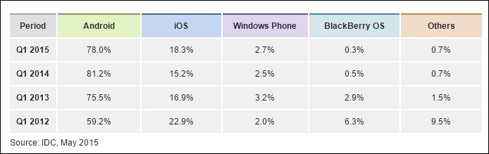
Choosing a mobile OS is not an easy task. The mobile world is divided into Google Android, Apple iOS, Windows and a few up and coming players. The OS you choose will define the kind of app or website that you are going to build. The good news is when it comes to the mobile web, there isn't much difference from those players.

Smartphone OS Market Share
However, the difference between mobile browsers always comes down to three factors: hardware, application, and customizability. At the moment, Google Android has the highest market share, iOS has the most popular apps, while Windows Phone 8 and Blackberry OS 10 lag behind.
Style and simplicity are the main indicators of iOS, which comes with iPhones and tabs. iOS has a very simple, logical, and consistent design throughout the OS, and the home screen contains a grid of movable icons. The built-in applications of iOS are well designed and user-friendly, the new iOS version includes Facebook and Twitter integration, built-in video chat, and the Passbook virtual wallet.
The best strength of iOS is the massive collection of apps and most probably it has the best app store in the market. Most of the time app developers choose their primary target as iOS, and Apple offers the industry's best collection of books, music and TV to its users.
Google Android's best strength is that the OS is available on more phones and more carriers than any other mobile operating system. As an Android user, people have a wide range of device selection, and they can pick whatever they like, touchscreen to the physical keyboard, and any shape to any size.
The latest Android OS has the same or more number of features than iOS, and the OS can be easily customized. Compared to iOS, the user can easily edit the home screen and can add widgets, favorite contacts, or usual arrays of apps with ease, which makes the Android home screen experience really powerful than iOS.
The user can find and download hundreds and thousands of applications for every possible scenario in Google Play Store, and most of them are free. Also, many developers use Google Android as their playground, so sometimes it may contain some security issues as well.
Microsoft's mobile OS has the balance between iOS' simplicity and Android's customizability. The main feature of this OS is live tiles, which are preprogrammed squares that the user can easily rearrange it as they desire. Windows Phone 8 has inbuilt Facebook and Twitter and works brilliantly with Microsoft Exchange, MS Office, and XBOX live to game.
However, compared to iOS and Android, Windows mobile OS gets a lower score. This is because of limited hardware options and limited applications availability than iOS and Android. The operating system uses the Bing search engine, which scores well behind Google's on accuracy and features.
With Blackberry's new OS, the user can access a universal inbox that has all the e-mails and social-network messages with ease. It has an efficient and clean interface in the OS, mainly focusing on communication and messaging, and it already has more than 100,000 apps. However, some of the popular and useful apps from iOS and Android are still missing.
The OS home screen, customizable to some extent, is similar to Android and Windows mobile OS, but the user cannot add widgets or contacts as icons the way the user can on Windows and Android. Blackberry has the best touch keyboard in the market, and their design is much easier to type on.
Blackberry has a Web kit-based web browser, and it uses technology from Torch Mobile. The browser has a private browsing mode, desktop mode, and it uses Bing as the default search engine, but the user can change it.
In this chapter, we have discussed the history of mobiles and why mobile web optimization is necessary. Also, we have discussed the three main pillars that are important in the mobile world, and you have seen how 3G and 4G data connections can drain the user's battery. After this, we went through the major browsers and popular OSs in the market, and we have discussed negatives and positives in those.
In the next chapter, we will take a look at the essential components in mobile web optimization. The chapter will help you learn about the differences between mobile sites and responsive websites, and you will also learn some of the image optimization tools and more.