


The best way to understand data is to visualize it and explore it using an interactive visualization. In this book, we are going to build such an interactive visualization (actually many of them) using the latest techniques and web technologies. To make the information accessible across all devices, we are going to make the visualizations responsive. However, before we can start, we need to understand what this actually means. We also want to reuse some existing frameworks to not just do a great job but also work in an efficient way.
This chapter serves as an introduction to the methods, technologies, and frameworks that we will use throughout the book, and it will help you understand why we are using them to create data visualizations and how they work together.
In this chapter you will learn the following:
What exactly is Responsive Design and how can it be applied to create visualizations that work across all different screen sizes and resolutions
What is a Media Query and how it can be used to design visualizations for various devices
Why and how we use Bootstrap to build the visualization on existing components
Why we use vector graphics, such as SVG, for the web
Why we use
D3.jsfor data manipulation and graphics creation
First, you will learn about Responsive Design and how it can be used to design a visualization for various screen sizes and resolutions. Then, we will discuss the importance of some key technologies such as CSS3 (especially Media Queries) and HTML5 (especially the viewport meta tag).
In the following chapter, we will get acquainted to the popular CSS and HTML framework called Bootstrap. Don't worry if you have never heard about it; it helps us to build the application on the existing and well-tested components, such as grids and LESS Media Queries.
In the last section of this chapter, you will learn about Scalable Vector Graphics (SVG) in the browser; and you will understand why and when it is great to use vector graphics for visualizations. Then, we will see a brief introduction to D3.js, which is a versatile JavaScript library for data transformations and graphics generation. At the end of this chapter, you will understand why SVG is a great choice for designing interactive responsive visualizations for the web.
Responsive Design is a method for designing applications that can adapt their appearance and behavior to the user's device. It makes the application look and feel good across all different devices, and most often, it makes them usable on all devices.
An important paradigm in Responsive Design is to use relative dimensions instead of fixed widths, heights, margins, paddings, and font sizes throughout all the application to adapt the design to the various types of devices.
For web browsers, Responsive Design was enabled through CSS3 and HTML5 features, such as Media Queries, the viewport meta tag, and new dimension units.
Media Queries were introduced in CSS3 as a more flexible extension of Media Types. They allow the developer to apply conditional CSS styles only when a statement (a so-called query) matches a certain CSS property (so-called Media Features) and a Media Type. A typical Media Query has the following structure:
@media [Media Type [and|not|only]] (Media Feature) {
   ...
}
Here is a small selection of properties that can be used as Media Features:
width,min-width, andmax-widthheight,min-height, andmax-heightdevice-width,min-device-width, andmax-device-widthdevice-height,min-device-height, andmax-device-heightresolution,min-resolution, andmax-resolution
Note
A complete list of Media Features and Types can be found on MDN at https://developer.mozilla.org/de/docs/Web/CSS/Media_Queries/Using_media_queries.
In Responsive Design, we are mostly interested in querying the min-width or max-width property to apply different styles to devices that have different widths.
Let's see an example where we can apply a different background color depending on the minimal width of the browser window:
div {
  background-color: blue;
}
@media screen and (min-width: 992px) {
  div {
    background-color: red;
  }
}
In the preceding example, all the div elements in the page have the background color red as long as the browser window's width is larger or equal to, 992 px (see the following figure):
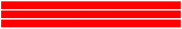
Browser window width larger than 992px
Once the window width is smaller than 992 px, the background color of the div elements jumps to blue (see the following figure):
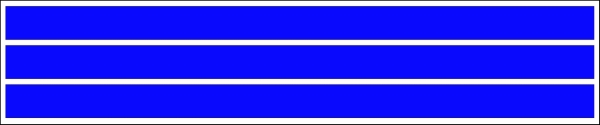
Browser window with width smaller than 992px
As we can see in the following figure, Media Queries are supported across all major browsers and Internet Explorer starting from version 9:
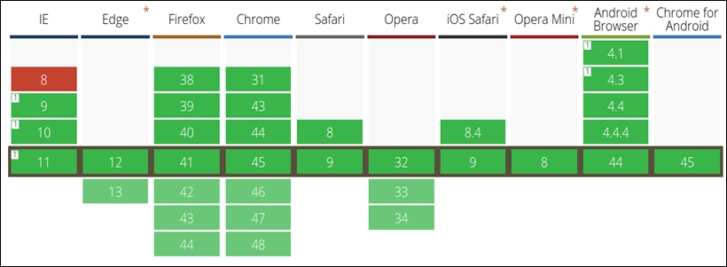
Cross-browser compatibility Media Queries from http://caniuse.com/#feat=css-mediaqueries
In Responsive Design, we call a state when a certain layout and Media Query is active, and we call a breakpoint the transition from one state to another.
Let's look at an example. First, we define some screen dimensions for the following devices:
<768pxis for phones768px-992pxis for tablets992px-1200pxis for desktops≥1200pxis for large devices and TVs
Create a CSS snippet using Media Queries for these device dimensions:
/* phones, default no query */
/* tablets */
@media (min-width: 768px) { ... }
/* desktops */
@media (min-width: 992px) { ...}
/* large devices */
@media (min-width: 1200px) { ... }
In the preceding code, we defined four states with three breakpoints between these states where each state corresponds to a typical screen dimension and device type.
We can also see these breakpoints by reducing the size of a browser window while looking at a responsive web page; we observe how the design breaks at a certain width of the browser window. In the following figure, the breakpoint is visualized as a dashed line, showing the moment when one state breaks into a new one:
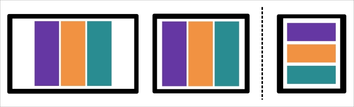
Breakpoint in Responsive Design
We can observe the same effect when we look at the Google Plus web page in the following figure. In the first two figures, the size of browser window changes, but the three-column layout stays the same. In the third image, the design breaks into a new layout with only two columns:
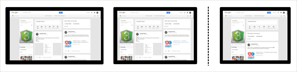
Breakpoints of the Google Plus page
Across mobile and desktop devices, there exists a vast variety of different pixel densities and screen resolutions. Displays with much higher resolution would render pages much smaller than displays with a lower resolution; this immediately leads to readability problems. To prevent this effect and fit bigger pages into smaller screens, a virtual window—the so-called viewport (the visible area of a web page)—was introduced. This allowed websites to render in the correct pixel resolution and scale to the full device width for maximal accessibility; however, developers had no control over this device-specific setting. Later, in HTML5, the viewport meta tag was introduced in order to give developers full control over these viewport settings.
Today, a mobile-optimized application usually defines the following viewport tag in the head section of the web page to render the website normally and scale the content to the width of the device:
<meta name="viewport" content="width=device-width, initial-scale=1">
Note
More information about all the valid viewport options can be found on MDN at https://developer.mozilla.org/en-US/docs/Mozilla/Mobile/Viewport_meta_tag.
When dealing with Responsive Design, it is always a good idea to use relative units to describe the element's dimensions based on its parent element. Thus, when the parent container changes the size, all children elements adapt their sizes accordingly.
The most popular unit for relative dimensions is %, which defines the dimension based on a certain percent of the next absolute positioned parent element.
However, there are more useful units to describe relative dimensions; for example, the following two are based on the font-size:
em: This is relative to the font size of the elementrem: This is relative to the font size of the root element
These units have a big advantage; they are affected by the changes of the font-size setting in the browser. A simple example can be the adaption of the paddings when the user increases the font size of the browser.
Note
A short summary and explanation of all different CSS units can be found on MDN at https://developer.mozilla.org/de/docs/Web/CSS/length.
Responsive applications should look and feel great (or work at all) on a huge number of devices with a huge number of different screen sizes and resolutions; they usually run on mobile devices as well as big TV screens. Thus, in the beginning of a project, every developer has to choose an approach to design the responsive application to master this transition; in general, we distinguish between the following methods:
Mobile first
Desktop first
In the desktop first method, we design for desktop devices and mouse input first, then we adjust and scale the design down for mobile devices and touch interactions. This often results in a web application with a reduced functionality for mobile devices due to a much smaller screen dimension and the lack of touch support.
In the mobile first method, we design for mobile devices and touch interactions first, and then we adjust and scale the design up for bigger devices and mouse interactions. This approach makes sure that mobile devices support a complete set of features, which can even be used on desktop clients.
Both methods are equally correct, accepted, and popular nowadays. The only exception is that mobile first became a buzzword due to an increase of mobile devices accessing the web during the previous years. Throughout the book, we will choose a mobile first approach and design for mobile devices and touch support. However, we will, of course, extend the visualizations to support mouse input and bigger screens. That's what the responsive design is all about.
If we want to create responsive mobile first web applications, we usually don't want to start from zero and re-implement common patterns and components; we would rather want to reuse some well-tested, existing components.
Bootstrap is a very popular HTML and CSS framework built by former Twitter employees for easy, fast, and modern frontend development; it provides loads of responsive CSS and LESS layouts as well as a huge collection of HTML and JavaScript components. Thanks to its MIT license, it can be used in open source and commercial software.
The current stable version 3.3.5 includes LESS styling with these features:
Containers and grids (static and fluid)
Responsive helpers (hiding and showing elements on different breakpoints)
LESS mixins and variable declarations
Styles for common components such as forms, input fields, and tables
Icons, HTML, and JavaScript components
Note
A complete list of features can be found on the Bootstrap website at http://getbootstrap.com/.
The new version 4 (which is currently in the alpha stage) will be shipped with SASS layouts and loads of other great features and improvements:
Note
There also exists an official fork for the SASS precompiler on GitHub at https://github.com/twbs/bootstrap-sass.
All units are in
remanemA new
xlgrid tier is addedOptional flexbox support
A Reboot module is available to reset default browser styles
Note
A complete list of new features can be found on the Bootstrap blog at http://blog.getbootstrap.com/2015/08/19/bootstrap-4-alpha/.
Throughout this book, we will use Bootstrap 3.3.5 version (with LESS) for all the examples and explanations if they are not stated differently. We will also give some hints about the latest version where it is appropriate.
Make sure you have the Bower package manager installed; this can be done by running the following command from the terminal:
npm install -g bower
Note
More information about the Bower package manager can be found on its website at http://bower.io/.
Throughout this book, we will make use of only the CSS components of Bootstrap and thus we only need to include the bootstrap.css file to our project. There are multiple ways of doing so:
Use the package manager called
bower(recommended)—First, fetch the library by running the following command from the terminal—bower install bootstrap#3.3.5. Then, link the minified CSS file from the bower_components/ directory in theheadsection of the web page:<link rel="stylesheet" href="bower_components/bootstrap/dist/css/bootstrap.min.css">.Use a Content Delivery Network (CDN), such as MaxCDN (this requires an active Internet connection while developing). Simply include the minified CSS file from the CDN in the
headsection of the web page:<link rel="stylesheet" href="https://maxcdn.bootstrapcdn.com/bootstrap/3.3.5/css/bootstrap.min.css">.Manually, download the 3.3.5 release from GitHub (https://github.com/twbs/bootstrap/releases) and unzip it into the libs/ directory. Then, link the minified CSS file from the libs/ directory in the
headsection of the web page:<link rel="stylesheet" href="libs/bootstrap/dist/css/bootstrap.min.css">.
I strongly recommend using the bower package manager to manage your frontend dependencies (or similar ones, such as npm or component). However, in the examples of this book, we will link Bootstrap directly from MaxCDN for simplicity reasons; therefore, all examples in the source of the book require an active Internet connection.
The ultimate resource for Bootstrap is the documentation that can be found at http://getbootstrap.com/getting-started/. Here, you will also find examples and templates using the Bootstrap framework.
For more detailed information and examples, I recommend reading the Unraveling Bootstrap 3.3 book by Istvan Novak.
A popular component to organize elements in an application or visualization is a grid layout. For responsive design in particular, we are mostly interested in grid layouts that adapt their columns to the screen resolution of the client. In the following figure, there's an example of a responsive grid layout with three columns per row on a desktop device and one column per row on a mobile device:

Simple Responsive grid, left: desktop, right: mobile
We then distinguish two different types of responsive grids that adapt the number of columns to the screen resolution of the client:
Normal grids with a fixed width per breakpoint (see following figure on the left)
Fluid grids that always scale to the full width of the current breakpoint (see the following figure on the right)

Grid types—left: grid with fixed width, right: fluid grid
It's actually quite simple to build a grid system yourself; let's first take a look at how to create a fluid grid layout, and afterwards, we will better understand how we can use Bootstrap components to get things done quickly and properly.
If we think about a grid as a (flexible) table layout, we need two basic components: rows and columns. A popular approach is to use the 12-column grid where we divide the width of a row into 12 columns and define column combinations that sum up to the full width of 12. The following figure illustrates some of these combinations: 12 columns of width 1, 6 columns of width 2, 4 columns of width 3, and so on. Also other combinations that sum up to 12 are allowed, such as 2, 6 and 4 or 1, 10 and 1 and many more.

Grid layout with 12 columns
Let's start and build the .row class that spans to the full width of the parent element:
.row {
  position: relative;
  width: 100%;
}
Next, we want to create column classes .col-1, .col-2, .…, and .col-12 that define the width of the column in the percent relative to the width of the row. We define a text wrap with the float attribute and add padding for the cells. The float attribute indicates that the block element should not appear in the original flow but "float" on the left side. By doing so, we align the elements in the same line instead of placing them into the normal text flow:
[class*="col-"] {
  float: left;
  padding: 1em;
}
.col-1 {
  width: 8.33333333%;
}
.col-2 {
  width: 16.66666667%;
}
.col-3 {
  width: 25%;
}
.col-4 {
  width: 33.33333333%;
}
.col-5 {
  width: 41.66666667%;
}
.col-6 {
  width: 50%;
}
.col-7 {
  width: 58.33333333%;
}
.col-8 {
  width: 66.66666667%;
}
.col-9 {
  width: 75%;
}
.col-10 {
  width: 83.33333333%;
}
.col-11 {
  width: 91.66666667%;
}
.col-12 {
  width: 100%;
}
In the preceding code, we see that we can use the wildcard attribute selector called [class*="col-"] to select all the columns at once (all the classes that contain the col- letters). The widths have to be defined as per column type.
The only problem in the previous example is that, by default (box-sizing: content-box), the padding size of the columns adds up with the width property to determine the computed width of the element. The total width of all elements plus the padding sizes would give a number bigger than 100% of the parent element. Using the box-sizing: border-box property, we can disable this behavior and the computed width of the element equals the width property:
[class*="col-"] {
  -webkit-box-sizing: border-box;
  -moz-box-sizing: border-box;
  box-sizing: border-box;
}
Finally, we need to clear the text-wrapping property of the columns after each row. We can do this by adding a clearfix pseudo element after each .row class:
.row:after {
  content: " ";
  display: block;
  clear: both;
}
This is already a nice implementation of a basic grid system. Let's test this layout and create an HTML page with the following content:
<div class="row">
  <div class="col-1">.col-1</div>
  <div class="col-1">.col-1</div>
  <div class="col-1">.col-1</div>
  <div class="col-1">.col-1</div>
  <div class="col-1">.col-1</div>
  <div class="col-1">.col-1</div>
  <div class="col-1">.col-1</div>
  <div class="col-1">.col-1</div>
  <div class="col-1">.col-1</div>
  <div class="col-1">.col-1</div>
  <div class="col-1">.col-1</div>
  <div class="col-1">.col-1</div>
</div>
<div class="row">
  <div class="col-2">.col-2</div>
  <div class="col-2">.col-2</div>
  <div class="col-2">.col-2</div>
  <div class="col-2">.col-2</div>
  <div class="col-2">.col-2</div>
  <div class="col-2">.col-2</div>
</div>
<div class="row">
  <div class="col-3">.col-3</div>
  <div class="col-3">.col-3</div>
  <div class="col-3">.col-3</div>
  <div class="col-3">.col-3</div>
</div>
<div class="row">
  <div class="col-4">.col-4</div>
  <div class="col-4">.col-4</div>
  <div class="col-4">.col-4</div>
</div>
<div class="row">
  <div class="col-6">.col-6</div>
  <div class="col-6">.col-6</div>
</div>
<div class="row">
  <div class="col-12">.col-12</div>
</div>
If we add a little bit of coloring (the complete example can be found in the code files of the book) and open the HTML page in the browser, we get a layout similar to the following figure:

Browser output of simple grid layout
Let's take a look at the responsive grid system provided by Bootstrap, which looks very similar to the one that we have just created. Bootstrap defines Media Queries for four device types (the so-called grid tiers) and their corresponding typical viewport widths (in pixel) for the responsive breakpoints:
Default for extra small devices (
xs) such as phones≥768pxfor small devices (sm) such as tablets and phones in landscape mode≥992pxfor medium devices (md) such as desktops≥1200pxfor large devices (lg) such as large desktops and TVs
Note
In Bootstrap 4, the breakpoints are now defined in em units:
Default for extra small devices
≥34emfor small devices≥48emfor medium devices≥62emfor large devices≥75emfor extra large devices
The grid requires three different components:
It requires a
containerelement with the class called.containerfor fixed widths or.container-fluidfor fluid containersIt requires a
rowelement with the class.rowIt requires one or more
columnelements:.col-xs-1,.col-xs-2, …,.col-xs-12.col-sm-1,.col-sm-2, …,.col-sm-12.col-md-1,.col-md-2, …,.col-md-12.col-lg-1,.col-lg-2, …,.col-lg-12
Let's take a look at some code. First, we need to include the Bootstrap CSS to the header of the web page:
 <!DOCTYPE html>
<html>
  <head>
    <link rel="stylesheet" href="https://maxcdn.bootstrapcdn.com/bootstrap/3.3.5/css/bootstrap.min.css">
    <title>Simple Grid System</title>
    ...
  </head>
  <body>
    ...
  </body>
</html>
Now, we can add the grid layout according to the previous example, but this time, we need to wrap it in a fluid container:
<div class="container-fluid">
  <div class="row">
    <div class="col-lg-1">.col-lg-1</div>
    <div class="col-lg-1">.col-lg-1</div>
    ...
  </div>
  <div class="row">
    ...
  </div>
</div>
If we open the web page and look at the output of the web browser, we see an example similar to the following figure:

Browser output of grid layout with Bootstrap
We remark that the preceding figure looks very similar to the grid layout that we created in the beginning of this section. The only small difference in the code was the .container element to wrap the rows and the usage of the .col-lg-* classes. However, Bootstrap's grid is responsive, and the columns are arranged according to the breakpoints and the browser width. If we reduce the size of the browser window smaller than 1200px, we see that the grid jumps into a different layout. We can see this effect in the following figure:

Browser output of grid layout with window size smaller than 1200px
The reason for this is that the browser window is no longer in the state of a very large device (greater than 1200px) and has jumped to a smaller state. Therefore, the col-lg-* columns are not applied anymore, and they appear in the full width of the row. We can now start to define certain column combinations to create a flexible responsive grid:
<div class="container-fluid">
  <div class="row">
    <div class="col-lg-3 col-md-6 col-sm-12"></div>
    <div class="col-lg-3 col-md-6 col-sm-12"></div>
    <div class="col-lg-3 col-md-6 col-sm-12"></div>
    <div class="col-lg-3 col-md-6 col-sm-12"></div>
  </div>
  <div class="row">
    ...
  </div>
</div>
Bootstrap also provides very handy and responsive utility classes to hide elements on certain browser widths. The classes are named according to the Media Query breakpoints:
.hidden-xs.hidden-sm.hidden-md.hidden-lg
Hiding an element on a phone in portrait mode is as simple as adding a class to the element; let's take a look at the following example:
<ul class="nav">
  <li><a href="#menu">Menu</a></li>
  <li class="hidden-xs"><a href="#link">Link</a></li>
</ul>
The classes for showing elements on certain browser widths come for each breakpoint in three different variations depending on the CSS display property of the element:
.visible-*-block.visible-*-inline.visible-*-inline-block
Note
The reason for these additional types is undesired line breaks and behaviors that occur when the display mode changes from none to block. Therefore, Bootstrap forces the user to specify the display property via the class name.
For these three blocks, all the breakpoint classes are available:
.visible-xs-*.visible-sm-*.visible-md-*.visible-lg-*
Displaying an element only on a specific device width is also very simple:
<ul class="nav">
  <li><a href="#menu">Menu</a></li>
  <li class="visible-xs-block"><a href="#link">Link</a></li>
</ul>Bootstrap's stylesheet is written in LESS and we can make use of the predefined breakpoints and Media Queries easily.
Note
LESS is a CSS-like preprocessor language used to write stylesheets that support nesting, variables, functions, mixins, and much more. LESS files are compiled to CSS files during the development via the LESS compiler. If you've never heard about LESS, it is a good time to check it out via http://lesscss.org/.
Make sure you have the LESS compiler installed; this can be done by running the following command from the terminal:
npm install -g less
First, we create a style.less file and import Bootstrap's variables.less file at the beginning of the file. This enables us to reuse Bootstrap's declarations for colors, dimensions, and configurations throughout this file:
/* style.less */
@import "bower_components/bootstrap/less/variables.less";
Now, we can use Bootstrap's Media Query breakpoints in our LESS file. Let's add some device-specific padding to all the div containers:
/* Extra small devices */
/* No media query since this is the default in Bootstrap */
div {
  padding: 4em;
}

/* Small devices */
@media (min-width: @screen-sm-min) {
  div {
    padding: 8em;
  }
}

/* Medium devices */
@media (min-width: @screen-md-min) {
  div {
    padding: 16em;
  }
}

/* Large devices */
@media (min-width: @screen-lg-min) {
  div {
    padding: 24em;
  }
}
Now, we use the LESS compiler to compile the stylesheet with CSS by running the following command in the terminal:
lessc style.less style.css
The resulting CSS looks similar to this:
/* Extra small devices */
/* No media query since this is the default in Bootstrap */
div {
  padding: 4em;
}
/* Small devices */
@media (min-width: 768px) {
  div {
    padding: 8em;
  }
}
/* Medium devices */
@media (min-width: 992px) {
  div {
    padding: 16em;
  }
}
/* Large devices */
@media (min-width: 1200px) {
  div {
    padding: 24em;
  }
}
Perfect! This means that we can now use the predefined breakpoints in our LESS styles.
Sometimes, it is also necessary to limit your styles to a narrow set of devices. Therefore, one can also use the max-width Media Queries in LESS. Again, the following code snippet is taken from the Bootstrap documentation at http://getbootstrap.com/css/#grid-media-queries:
@media (max-width: @screen-xs-max) { ... }
@media (min-width: @screen-sm-min) and (max-width: @screen-sm-max) { ... }
@media (min-width: @screen-md-min) and (max-width: @screen-md-max) { ... }
@media (min-width: @screen-lg-min) { ... }
This can be useful when we want to define styles for a single device type rather than all the devices with a screen width greater than or equal to the defined one.
Now, it is time to create our first visualization. In HTML5, we have plenty of options to create graphics in the browser itself:
Canvas API (or using, for example,
Paper.js,Processing.js, and more)WebGL API (or using, for example,
Three.js,Pixi.js, and more)SVG specification (or using for example
RaphaëlJS,D3.js, and more)
To better understand which technology suits the best for our purpose of implementing responsive visualizations, we need to take a closer look and discuss their advantages and disadvantages.
Canvas is a JavaScript API used to create Raster Graphics (often called Pixel Graphics) in the browser. As we can see in the following figure, it is supported in all major browsers and Internet Explorer starting from version 9:
Note
You can find detailed information about the Canvas API on MDN at https://developer.mozilla.org/en/docs/Web/API/Canvas_API.

Cross-browser compatibility Canvas from http://caniuse.com/#feat=canvas
A Pixel Graphic is an image that contains all the information about the color of each pixel of the image for a certain resolution. Let's assume we have an image with 8 x 8 pixels where each of these 64 pixels contains the information about its color; we draw a circle in this image:
<canvas id="canvas"></canvas>
<script>
  var canvas = document.getElementById("canvas");
  var ctx = canvas.getContext("2d");
  var centerX = 10, centerY = 10, radius = 10;
  ctx.beginPath();
  ctx.arc(centerX, centerY, radius, 0, 2 * Math.PI, false);
  ctx.fillStyle = "red";
  ctx.fill();
</script>
In the following figure, one can see how the so-called rasterization process defines which pixels of this image gets colored (pixels in the blue region) for the circle shape and which pixels stays transparent (pixels in the white region):
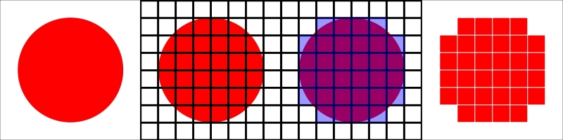
Rasterization of a 8 x 8 pixel circle shape
If we display this image with a high resolution (see the following figure at the left), we see a small circle with crisp edges. On the other hand, if we zoom into the image, we see a very pixelated 8 x 8 pixel image (see the following figure on the right); this effect is the direct cause of the resolution-dependent rasterization process:
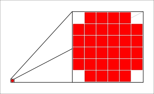
Pixel graphic, left: high resolution, right: zoomed
This effect makes it really difficult to use Pixel Graphics for Responsive Design; we have to always generate and reload our visualization for the current resolution and screen size.
Another drawback is that the final image is composed of pixels, which make it very difficult to attach event listeners, such as mouseover or click events, to certain components of the image. The reason for this is that there are no shapes or components encoded in the image but only color values for each pixel.
WebGL is a JavaScript API based on OpenGL ES 2 to create hardware-accelerated 3D Pixel Graphics in the browser. This technology is very powerful and allows access to the client's GPUs via so-called Shaders; the final visualization is exposed in the browser via the Canvas element. However, browser support is not very good, as we can see in the following figure; mobile devices support the API only partially and Internet Explorer only from version 11.
Note
You can find more detailed information about the WebGL API on MDN at https://developer.mozilla.org/en/docs/Web/API/WebGL_API.

Cross-browser compatibility WebGL from http://caniuse.com/#feat=webgl
Due to WebGL's use of the Canvas element, it doesn't solve any of the limitations of Pixel Graphics that we discussed in the Canvas section. Thus, we will look at a different type of image representation next.
SVG is an XML specification used to create and compose Vector Graphics. Thanks to HTML5, these graphics can simply be embedded into an HTML page, rendered and displayed perfectly sharp by the browser in every screen resolution. As we can see in the following figure, cross-browser compatibility is very good across all the major browsers and Internet Explorer starting from version 9:

Cross-browser compatibility SVG from http://caniuse.com/#feat=svg
Vector Graphics are images where all the information about the image is encoded as numerical expressions of geometric shapes (such as rectangles, circles, ellipses, paths, and texts) of the elements of the image. The browser always uses this information to draw and render the graphic in the best resolution possible. In the following figure, we can see a Vector Graphic of a circle with a high resolution, whereas on the right, we see a zoom of the image. It's easy to see that the zoomed image is displayed with perfectly crisp edges; this effect of lossless scaling results from the resolution-dependent rendering of the browser.
Note
You can find detailed information about the SVG specification on the W3 website: http://www.w3.org/Graphics/SVG/.
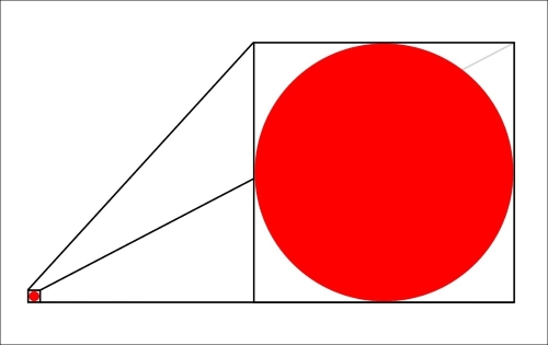
Vector Graphic, left: high resolution, right: zoomed
More advantages result from the fact that the visualization's elements are simply embedded in the HTML page. Now, we can easily attach native JavaScript event listeners, such as the mouseover or click events, on every component of the graphic and use CSS to style them together with the rest of the application.
Another great benefit is that we can simply look into the Developer Console of the web browser, play around, and debug the visualization. We can click on each element of the image to see its attached event handlers, and we can modify the CSS styling in real time. Anyone who has ever dealt with OpenGL or WebGL debugging will agree that this is a comfort that you can't miss while developing visualizations for the web.
Now, we already have many arguments in favor of using SVG for responsive cross-browser visualizations:
Simple debugging because the source code of the graphic is simply embedded in the HTML document
Sharp rendering on all screen resolutions because the browser renders the graphic according to the client's screen resolution
Cross-browser compatibility in all major browsers
Styling the visualization with CSS
Native JavaScript event handlers can be attached to all elements of the image
Debugging and live editing of the visualization in the Developer Tools
D3.js (abbreviation for Data-Driven Documents) is a JavaScript library built by Mike Bostock and other members of the Stanford Visualization Group for DOM manipulation, data transformation, and graphic creation. It uses a jQuery-like, data-driven approach and leverages all the capabilities of modern browsers and underlying web standards (such as HTML, CSS, and SVG).
D3.js is open source and hosted on GitHub (https://github.com/mbostock/d3) under a slightly modified BSD 3-clause license; therefore, it can be used in open source and commercial products without being required to release any modifications. GitHub itself uses D3.js to visualize the contribution history of repositories.
Throughout this book, we will use the stable version 3.5.6, but most examples should also work with different minor versions.
There are multiple ways to include D3.js to your project:
Using the package manager called
bower(recommended), fetch the library by running the bower install d3#3.5.6 command from the terminal. Then, link the minified CSS file from the bower_components/ directory in theheadsection of the web page:<link rel="stylesheet" href="bower_components/d3/d3.min.css">.Using a CDN, such as
cdnjs(this requires an active Internet connection while developing), include the minified CSS file from the CDN in theheadsection of the web page:<link rel="stylesheet" href="https://cdnjs.cloudflare.com/ajax/libs/d3/3.5.6/d3.min.js">.Manually download the 3.5.6 release from GitHub (https://github.com/mbostock/d3/releases) and unzip it into the libs/ directory. Then, link the minified CSS file from the libs/ directory in the
headsection of the web page<link rel="stylesheet" href="libs/d3/d3.min.css">.
I strongly recommend using the package manager called bower to manage your frontend dependencies. However, in the examples of the book, we will link D3.js directly from cdnjs for simplicity reasons; therefore, all the examples in the source of the book require an active Internet connection.
The ultimate resource for
D3.js is the WIKI page of the GitHub project, which can be found at https://github.com/mbostock/d3/wiki. Here, you will also find examples and a detailed description of the API.
Another great resource for examples is Mike Bostock's page at http://bl.ocks.org/mbostock and his blog at http://bost.ocks.org/mike/.
For more detailed information and examples, I recommend reading the Mastering D3.js book by Pablo Navarro Castillo.
In this chapter, we saw a brief introduction to Responsive Design, Media Queries, and Viewport settings. You learned about relative units and the mobile first design approach for responsive applications.
Later, we introduced Bootstrap and implemented a simple grid system ourselves. This helped us to understand how the responsive fluid grid in Bootstrap works. We saw built-in responsive utilities as well as Media Queries in LESS.
In the last section of this book, we discussed the difference between Pixel and Vector Graphics by comparing the advantages of Canvas, WebGL, and SVG for Responsive Design. We realized that SVG suits very well to implementing responsive visualizations. In the end, we saw a brief introduction to D3.js.
In the next chapter, we will get started with D3.js and implement a simple graphic using data joins, dynamic properties, and simple transformations.
Tip
Downloading the example code
You can download the example code files for this book from your account at http://www.packtpub.com. If you purchased this book elsewhere, you can visit http://www.packtpub.com/support and register to have the files e-mailed directly to you.
You can download the code files by following these steps:
Log in or register to our website using your e-mail address and password.
Hover the mouse pointer on the SUPPORT tab at the top.
Click on Code Downloads & Errata.
Enter the name of the book in the Search box.
Select the book for which you're looking to download the code files.
Choose from the drop-down menu where you purchased this book from.
Click on Code Download.
Once the file is downloaded, please make sure that you unzip or extract the folder using the latest version of:
WinRAR / 7-Zip for Windows
Zipeg / iZip / UnRarX for Mac
7-Zip / PeaZip for Linux