Beginning R and Shiny
R is free and open source, and is the pre-eminent tool for statisticians and data scientists. It has more than 6,000 user-contributed packages, which help users working in fields as diverse as chemistry, biology, physics, finance, psychology, and medical science. R's extremely powerful and flexible statistical graphics greatly help these users in their work.
In recent years, R has become more and more popular, and there are an increasing number of packages for R that make cleaning, analyzing, and presenting data on the web easy for everybody. The Shiny package in particular makes it incredibly easy to deliver interactive data summaries and queries to end users through any modern web browser. You're reading this book because you want to use these powerful and flexible tools for your own content.
This book will show you how, right from when you just start with R, you can build your own interfaces with Shiny and integrate them with your own websites. In this chapter, we're going to cover the following topics:
- Downloading and installing R
- Choosing a code-editing environment/IDE
- Looking at the power of R
- Learning about how RStudio and contributed packages can make writing code, managing projects, and working with data easier
- Installing Shiny and running the examples
- How to use some of Shiny's awesome applications, and some of the elements of the Shiny application that we will build over the course of this book
R is a big subject, and this is a whistle-stop tour, so if you get a little lost along the way, don't worry. This chapter is really all about showing you what's out there, and will both encourage you to delve deeper into the bits that interest you and show you places you can go for help if you want to learn more on a particular subject.
Installing R
R is available for Windows, Mac OS X, and Linux at cran.r-project.org. The source code is also available at the same address. It is also included in many Linux package management systems; Linux users are advised to check before downloading from the web. Details on installing from source or binary for Windows, Mac OS X, and Linux are all available at cran.r-project.org/doc/manuals/R-admin.html.
The R console
Windows and Mac OS X users can run the R application to launch the R console. Linux and Mac OS X users can also run the R console straight from the Terminal by typing R.
In either case, the R console itself will look something like the following screenshot:
R will respond to your commands right from the Terminal. Let's have a go. Run the following command in the R console:
> 2 + 2
[1] 4
The [1] phrase tells you that R returned one result, in this case, 4. The following command shows you how to print Hello world:
> print("Hello world!")
[1] "Hello world!"
The following command shows the multiples of pi:
> 1:10 * pi
[1]  3.141593  6.283185  9.424778 12.566371 15.707963 18.849556
[7] 21.991149 25.132741 28.274334 31.415927
This example illustrates vector-based programming in R. The 1:10 phrase generates the numbers 1:10 as a vector, and each is then multiplied by pi, which returns another vector, the elements each being pi times larger than the original. Operating on vectors is an important part of writing simple and efficient R code. As you can see, R again indexes the values it returns at the console, with the seventh value being 21.99.
One of the big strengths of using R is the graphics capability, which is excellent, even in a vanilla installation of R (these graphics are referred to as the base graphics because they ship with R). When adding packages such as ggplot2 and some of the JavaScript-based packages, R becomes a graphical tour de force, whether producing statistical, mathematical, or topographical figures, or indeed any other type of graphical output. To get a flavor of the power of the base graphics, simply type the following in the Console and see the types of plots that can be made using R:
> demo(graphics)
You can also type the following command:
> demo(persp)
There will be more on ggplot2 and base graphics later in the chapter.
Enjoy! There are many more examples of R graphics at r-graph-gallery.com.
Code editors and IDEs
The Windows and OS X versions of R both come with built-in code editors, which allow code to be edited, saved, and sent to the R console. It's hard to recommend that you use this because it is rather primitive. Most users would be best served by RStudio (found at rstudio.com/), which includes project management and version control (including support for Git, which is covered in Chapter 9, Persistent Storage and Sharing Shiny Applications), the viewing of data and graphics, code completion, package management, and many other features. The following is an illustrative screenshot of an RStudio session:
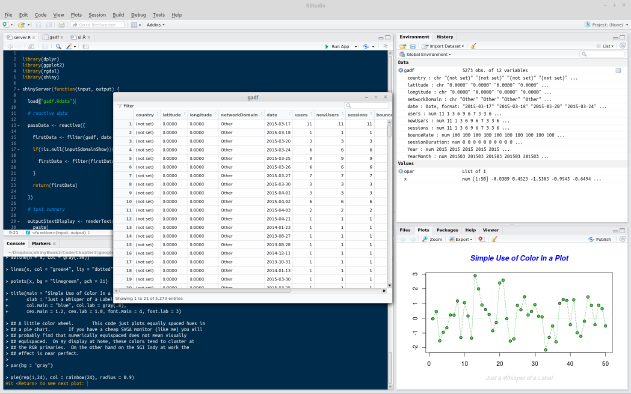
As can be seen, in the top-left corner, there is the code-editing pane (with syntax highlighting). Moving clockwise from there will take you to the environment pane (in which you can see the different objects that are loaded into the session), which is the viewing pane containing various options such as Files, Plots, Build, Help, and finally, at the bottom left, the Console. In the middle, there is one of the most useful features of RStudio, the ability to view dataframes. This view can be created by clicking a dataframe in the Environment panel at the top right. This function also enables sorting and filtering by column.
However, if you already use an IDE for other types of code, it is quite likely that R can be well integrated into it. Examples of IDEs with good R integration include the following:
- Emacs with the Emacs Speaks Statistics plugin
- Vim with the Vim-R plugin
- Eclipse with the StatET plugin
Learning R
There are almost as many uses for R as there are people using it. It is not possible that your specific needs will be covered in this book. However, you probably want to use R to process, query, and visualize data, such as sales figures, satisfaction surveys, concurrent users, sporting results, or whatever types of data your organization processes. For now, let's just take a look at the basics.
Getting help
There are many books and online materials that cover all aspects of R. The name R can make it difficult to come up with useful web search hits (substituting CRAN for R can sometimes help); nonetheless, searching for R tutorial brings up useful results. Some useful resources include the following:
- An excellent introduction to syntax and data structures in R (at goo.gl/M0RQ5z)
- Videos on using R from Google (at goo.gl/A3uRsh)
- Swirl (at swirlstats.com)
- Quick-R (at statmethods.net)
At the R console, the code phrase ?functionname can be used to show the help file for a function. For example, ?help brings up help materials, and using ??help will bring up a list of potentially relevant functions from installed packages.
Subscribing to and asking questions on the R-help mailing list at stat.ethz.ch/mailman/listinfo/r-help allows you to communicate with some of the leading figures in the R community, as well as many other talented enthusiasts. Read the posting guide and do your research before you ask any questions, because it's a busy and sometimes unforgiving list.
There are two Stack Exchange communities that can provide further help at stats.stackexchange.com/ (for questions about statistics and visualization with R) and stackoverflow.com/ (for questions about programming with R).
There are many ways to learn R and related subjects online; RStudio has a very useful list on their website at goo.gl/8tX7FP.
Loading data
The simplest way of loading data into R is probably using a comma-separated value (.csv) spreadsheet file, which can be downloaded from many data sources and loaded and saved in all spreadsheet software (such as Excel or LibreOffice). The read.table() command imports data of this type by specifying the separator as a comma, or using read.csv(), a function specifically for .csv files, as shown in the following command:
> analyticsData = read.table("~/example.csv", sep = ",")
Otherwise, you can use the following command:
> analyticsData = read.csv("~/example.csv")
Note that unlike other languages, R uses <- for assignment as well as =. Assignment can be made the other way using ->. The result of this is that y can be told to hold the value of 4 in a y <- 4 or 4 -> y format. There are some other, more advanced things that can be done with assignment in R, but don't worry about them now. In this book, I will prefer the = operator, since I use this in my own code. Just be aware of both methods so that you can understand the code you come across in forums and blog posts.
Either of the preceding code examples will assign the contents of the example.csv file to a dataframe named analyticsData, with the first row of the spreadsheet providing the variable names. A dataframe is a special type of object in R, which is designed to be useful for the storage and analysis of data.
RStudio will even take care of loading .csv files for you, if you click on them in the file selector pane (in the bottom right by default) and select Import dataset.... This can be useful to help you get started, but as you get more confident it's really better to do everything with code rather than pointing and clicking. RStudio will, to its great credit, show you the code that makes your pointing and clicking work, so take a note of it and use it to load the data the next time yourself.
Data types and structures
There are many data types and structures of data within R. The following topics summarize some of the main types and structures that you will use when building Shiny applications.
Dataframes, lists, arrays, and matrices
Dataframes have several important features that make them useful for data analysis:
- Rectangular data structures, with the typical use being cases (for example, the days in one month) listed down the rows and variables (page views, unique visitors, or referrers) listed along the columns
- A mix of data types is supported. A typical data frame might include variables containing dates, numbers (integers or floats), and text
- With subsetting and variable extraction, R provides a lot of built-in functionality to select rows and variables within a dataframe
- Many functions include a data argument, which makes it very simple to pass dataframes into functions and process only the variables and cases that are relevant, which makes for cleaner and simpler code
We can inspect the first few rows of the dataframe using the head(analyticsData) command. The following screenshot shows the output of this command:

As you can see, there are four variables within the dataframe: one contains dates, two contain integer variables, and one contains a numeric variable.
Variables can be extracted from dataframes very simply using the $ operator, as follows:
> analyticsData$pageViews
[1] 836 676 940 689 647 899 934 718 776 570 651 816
[13] 731 604 627 946 634 990 994 599 657 642 894 983
[25] 646 540 756 989 965 821
Variables can also be extracted from dataframes using [], as shown in the following command:
> analyticsData[, "pageViews"]
Note the use of a comma with nothing before it to indicate that all rows are required. In general, dataframes can be accessed using dataObject[x,y], with x being the number(s) or name(s) of the rows required and y being the number(s) or name(s) of the columns required. For example, if the first 10 rows were required from the pageViews column, it could be achieved like this:
> analyticsData[1:10,"pageViews"]
[1] 836 676 940 689 647 899 934 718 776 570
Leaving the space before the comma blank returns all rows, and leaving the space after the comma blank returns all variables. For example, the following command returns the first three rows of all variables:
> analyticsData[1:3,]
The following screenshot shows the output of this command:

Dataframes are a special type of list. Lists can hold many different types of data, including lists. As with many data types in R, their elements can be named, which can be useful to write code that is easy to understand. Let's make a list of the options for dinner, with drink quantities expressed in milliliters.
In the following example, please also note the use of the c() function, which is used to produce vectors and lists by giving their elements separated by commas. R will pick an appropriate class for the return value, string for vectors that contain strings, numeric for those that only contain numbers, logical for Boolean values, and so on:
> dinnerList <- list("Vegetables" =
  c("Potatoes", "Cabbage", "Carrots"),
  "Dessert" = c("Ice cream", "Apple pie"),
  "Drinks" = c(250, 330, 500)
  )
Indexing is similar to dataframes (which are, after all, just a special instance of a list). They can be indexed by number, as shown in the following command:
> dinnerList[1:2]
$Vegetables
[1] "Potatoes" "Cabbage"  "Carrots"

$Dessert
[1] "Ice cream" "Apple pie"
This returns a list. Returning an object of the appropriate class is achieved using [[]]:
> dinnerList[[3]]
[1] 250 330 500
In this case, a numeric vector is returned. They can also be indexed by name, as shown in the following code:
> dinnerList["Drinks"]
$Drinks
[1] 250 330 500
Note that this also returns a list.
Matrices and arrays, which, unlike dataframes, only hold one type of data, also make use of square brackets for indexing, with analyticsMatrix[, 3:6] returning all rows of the third to sixth columns, analyticsMatrix[1, 3] returning just the first row of the third column, and analyticsArray[1, 2, ] returning the first row of the second column across all of the elements within the third dimension.
Variable types
R is a dynamically typed language, and you are not required to declare the type of your variables when using it. Of course, it is worth knowing about the different types of variable that you might read or write using R. The different types of variable can be stored in a variety of structures, such as vectors, matrices, and dataframes, although some restrictions apply as mentioned previously (for example, matrices must contain only one variable type). The following bullet list contains the specifics of using these variable types:
- Declaring a variable with at least one string in it will produce a vector of strings (in R, the character data type), as shown in the following code:
    > c("First", "Third", 4, "Second")
    [1] "First"  "Third"  "4"  "Second"
- You will notice that the numeral 4 is converted to a string, "4". This is as a result of coercion, in which elements of a data structure are converted to other data types in order to fit within the types that are allowed within the data structure. Coercion occurs automatically, as in this case, or with an explicit call to the as() function—for example, as.numeric(), or as.Date().
- Declaring a variable that contains only numbers will produce a numeric vector, as shown in the following code:
    > c(15, 10, 20, 11, 0.4, -4)
    [1] 15.0 10.0 20.0 11.0  0.4 -4.0
- R, of course, also includes a logical data type, as shown in the following code:
    > c(TRUE, FALSE, TRUE, TRUE, FALSE)
    [1]  TRUE FALSE  TRUE  TRUE FALSE
- A data type exists for dates, which are often a source of problems for beginners, as shown in the following code:
    > as.Date(c("2013/10/24", "2012/12/05", "2011/09/02"))
    [1] "2013-10-24" "2012-12-05" "2011-09-02"
- The use of the factor data type tells R all of the possible values of a categorical variable, such as gender or species, as shown in the following code:
    > factor(c("Male", "Female", "Female", "Male", "Male"),
      levels = c("Female", "Male"))
    [1] Male   Female Female Male   Male
    Levels: Female Male
Functions
As you grow in confidence with R, you will want to begin writing your own functions. This is achieved very simply, and in a manner quite similar to many other languages. You will no doubt want to read more about writing functions in R in more detail, but just to give you an idea, the following code is a function called the sumMultiply function that adds together x and y and multiplies the result by z:
sumMultiply <- function(x, y, z){
  final = (x+y) * z
  return(final)
}
This function can now be called using sumMultiply(2, 3, 6), which will return 2 plus 3 times 6, which gives 30.
Objects
There are many special object types within R that are designed to make it easier to analyze data. Functions in R can be polymorphic—that is to say, they can respond to different data types in different ways in order to produce the output that the user desires. For example, the plot() function in R responds to a wide variety of data types and objects, including single-dimension vectors (each value of y plotted sequentially) and two-dimensional matrices (producing a scatterplot), as well as specialized statistical objects, such as regression models and time series data. In the latter case, plots that are specialized for these purposes are produced.
As with the rest of this introduction, don't worry if you haven't written functions before, or don't understand object concepts and aren't sure what this all means. You can produce great applications without understanding all these things, but as you do more and more with R, you will start to want to learn more details about how R works and how experts produce R code. This introduction is designed to give you a jumping-off point to learn more about how to get the best out of R (and Shiny).
Base graphics and ggplot2
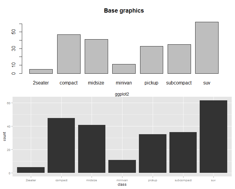
There are lots of user-contributed graphics packages in R that can produce some wonderful graphics. You may wish to take a look for yourself at the CRAN task view at cran.r-project.org/web/views/Graphics.html. We will have a very quick look at two approaches: base graphics, so called because they form the default graphical environment within a vanilla installation of R, and ggplot2, a highly popular user-contributed package produced by Hadley Wickham, which is a little trickier to master than base graphics, but can very rapidly produce a wide range of graphical data summaries. We will cover two graphs that are familiar to everyone: the bar chart and the line chart.
Bar chart
Useful when comparing quantities across categories, bar charts are very simple in base graphics, particularly when combined with the table() command. We will use the mpg dataset, which comes with the ggplot2 package; it summarizes the different characteristics of a range of cars. First, let's install the ggplot2 package. You can do this straight from the console using the following code:
> install.packages("ggplot2")
Alternatively, you can use the built-in package functions in IDEs such as RStudio or RKWard. We'll need to load the package at the beginning of each session in which we want to use this dataset, or in the ggplot2 package itself. From the console, type the following command:
> library(ggplot2)
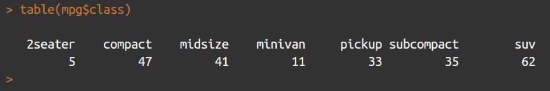
We will use the table() command to count the number of each type of car featured in the dataset, as shown in the following code:
> table(mpg$class)
This returns a table object (another special object type within R) that contains the columns shown in the following screenshot:
Producing a bar chart of this object is achieved simply using the following code:
> barplot(table(mpg$class), main = "Base graphics")
The barplot function takes a vector of frequencies. Where they are named, as is the case in our example (the table() command returning named frequencies in table form), names are automatically included on the x axis. The defaults for this graph are rather plain. Explore ?barplot and ?par to learn more about fine-tuning your graphics.
We've already loaded the ggplot2 package in order to use the mpg dataset, but if you have shut down R in between these two examples, you will need to reload it by using the following command:
> library(ggplot2)
The same graph is produced in ggplot2 as follows:
> ggplot(data = mpg, aes(x = class)) + geom_bar() +
 ggtitle("ggplot2")
This ggplot call shows the three fundamental elements of ggplot calls: the use of a dataframe (data = mpg); the setup of aesthetics (aes(x = class)), which determines how variables are mapped onto axes, colors, and other visual features; and the use of + geom_xxx(). A ggplot call sets up the data and aesthetics, but does not plot anything. Functions such as geom_bar() (there are many others; see ??geom) tell ggplot what type of graph to plot, as well as instructing it to take optional arguments—for example, geom_bar() optionally takes a position argument, which defines whether the bars should be stacked, offset, or stretched to a common height to show proportions instead of frequencies.
These elements are the key to the power and flexibility that ggplot2 offers. Once the data structure is defined, ways of visualizing that data structure can be added and taken away easily, not only in terms of the type of graphic (bar, line, or scatter graph) but also the scales and coordinates system (log10, polar coordinates, and so on) and statistical transformations (smoothing data, summarizing over spatial coordinates, and so on). The appearance of plots can be easily changed with preset and user-defined themes, and multiple plots can be added in layers (that is, adding them to one plot) or facets (that is, drawing multiple plots with one function call).
The base graphics and ggplot versions of the bar chart are shown in the following screenshot for the purposes of comparison:
Line chart
Line charts are most often used to indicate change, particularly over time. This time, we will use the longley dataset, featuring economic variables from between 1947 and 1962, as shown in the following code:
> plot(x = 1947 : 1962, y = longley$GNP, type = "l",
  xlab = "Year", main = "Base graphics")
The x axis is given very simply by the 1947 : 1962 phrase, which enumerates all the numbers between 1947 and 1962, and the type = "l" argument specifies the plotting of the lines, as opposed to points or both.
The ggplot call looks a lot like the bar chart, except with an x and y dimension in the aesthetics this time. The command looks as follows:
> ggplot(longley, aes(x = 1947 : 1962, y = GNP)) + geom_line() +
      xlab("Year") + ggtitle("ggplot2")
Introduction to the tidyverse
The tidyverse is, according to its homepage, "an opinionated collection of R packages designed for data science" (see https://www.tidyverse.org/). All of the packages are installed using install.packages("tidyverse"), and calling library(tidyverse) loads a subset of these packages, those considered to have the most value in day-to-day data science. Calling library(tidyverse) loads the following packages:
- ggplot2: For plotting
- dplyr: For data wrangling
- tidyr: For tidying (and untidying!) data
- readr: Better functions for reading comma- and tab-delimited data and other types of flat files
- purrr: For iterating
- tibble: Better dataframes
- stringr: For dealing with strings
- forcats: Better handling of factors, an R property used to describe the categories of a variable, described briefly earlier in the chapter
Installing the tidyverse also installs the following packages, which then need to be loaded separately with their own library() instruction: readxl, haven, jsonlite, xml2, httr, rvest, DBI, lubridate, hms, blob, rlang, magrittr, glue, and broom. For more details on these packages, consult the documentation at tidyverse.org/.
The key word in this description is opinionated. The tidyverse is a set of R packages that work with tidy data, either producing it, or consuming it, or both. Tidy data was described by Hadley Wickham in the Journal of Statistical Software, Vol 59, Issue 10 (https://www.jstatsoft.org/article/view/v059i10/v59i10.pdf). Tidy data obeys three principles:
- Each variable forms a column
- Each observation forms a row
- Each type of observational unit forms a table
For many R users, their first introduction to tidy data will have been ggplot2, which consumes tidy data and requires other types of data to be munged into this form. In order to explain what this means, we will look at a simple example. For the purposes of this discussion, we will ignore the last principle, which is more about organizing groups of datasets rather than individual datasets.
Let's have a look at a simple example of a messy dataset. In the real world, you will find datasets that are a lot messier than this, but this will serve to illustrate the principles we are using here. The following are the first three rows of the medal table for the Pyeongchang Winter Olympics, which took place in 2018, as an R dataframe:
medals = data.frame(country = c("Norway", "Germany", "Canada"),
 gold = c(14, 14, 11),
 silver = c(14, 10, 8),
 bronze = c(11, 7, 10)
 )
If we print it at the console, it looks like the following screenshot:
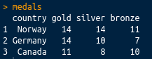
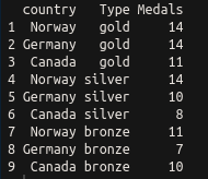
This is perhaps the most common sort of messy data you will come across: great as a summary, certainly intelligible to people watching the Winter Olympics, but not tidy. There are medals in three different columns. A tidy dataset would contain only one column for the medal tallies. Let's tidy it up using the tidyr package, which is loaded with library(tidyverse), or you can load it separately with library(tidyr). We can tidy the data very simply using the gather() function. The gather() function takes a dataframe as an argument, along with key and value column names (which you can set to what you like), and the column names that you wish to be gathered (all other columns will be duplicated as appropriate). In this case, we want to gather everything except the country, so we can use -variableName to indicate that we wish to gather everything except variableName. The final code looks like the following:
library(tidyr)
gather(medals, key = Type, value = Medals, -country)
This has a nice tidy output, as shown in the following screenshot:
Ceci n'est pas une pipe
Now that we've covered tidy data, there is one more concept that is very common in the tidyverse that we should discuss. This is the pipe (%>%) from the magrittr package. This is similar to the Unix pipe, and it takes the left-hand side of the pipe and applies the right-hand side function to it. Take the following code:
mpg %>% summary()
The preceding code is equivalent to the following code:
summary(mpg)
As another example, look at the following code:
gapminder %>% filter(year > 1960)
The preceding code is equivalent to the following code:
filter(gapminder, year > 1960)
Piping greatly enhances the readability of code that requires several steps to execute. Take the following code:
x %>% f %>% g %>% h
The preceding code is equivalent to the following code:
h(g(f(x)))
To demonstrate with a real example, take the following code:
groupedData = gapminder %>%
   filter(year > 1960) %>%
   group_by(continent, year) %>%
   summarise(meanLife = mean(lifeExp))
The preceding code is equivalent to the following code:
summarise(
  group_by(
    filter(gapminder, year > 1960),
  continent, year),
meanLife = mean(lifeExp))
Hopefully, it should be obvious which is the easier to read of the two.
Gapminder
Now we've looked at tidying data, let's have a quick look at using dplyr and ggplot to filter, process, and plot some data. In this section, and throughout this book, we're going to be using the Gapminder data that was made famous by Hans Rosling and the Gapminder foundation. An excerpt of this data is available from the gapminder package, as assembled by Jenny Bryan, and it can be installed and loaded very simply using install.packages("gapminder"); library(gapminder). As the package description indicates, it includes, for each of the 142 countries that are included, the values for life expectancy, GDP per capita, and population, every five years, from 1952 to 2007.
In order to prepare the data for plotting, we will make use of dplyr, as shown in the following code:
groupedData = gapminder %>%
 filter(year > 1960) %>%
 group_by(continent, year) %>%
 summarise(meanLife = mean(lifeExp))
This single block of code, all executed in one line, produces a dataframe suitable for plotting, and uses chaining to enhance the simplicity of the code. Three separate data operations, filter(), group_by(), and summarise(), are all used, with the results from each being sent to the next instruction using the %>% operator. The three instructions carry out the following tasks:
- filter(): This is similar to subset(). This operation only keeps rows that meet certain requirements—in this case, years beyond 1960.
- group_by(): This allows operations to be carried out on subsets of data points—in this case, each continent for each of the years within the dataset.
- summarise(): This carries out summary functions, such as sum and mean, on several data points—in this case the mean life expectancy within each continent and available year.
So, to summarize, the preceding code filters the data to select only years beyond 1960, groups it by the continent and year, and finds the mean life expectancy within that continent or year. Printing the output from the preceding code yields the following:

As you can see, the output is a tibble, which has a nice print method that only prints the first several rows. Tibbles are very similar to dataframes, and are often produced by default instead of dataframes within the tidyverse. There are some nice differences, but they are fairly interchangeable with dataframes for our purposes, so we will not get sidetracked by the differences here.
Now we have mentioned tibbles, you can see that the dataframe is a nice summary of the mean life expectancy by year and continent.
A simple Shiny-enabled line plot
We have already seen how easy it is to draw line plots in ggplot2. Let's add some Shiny magic to a line plot now. This can be achieved very easily indeed in RStudio by just navigating to File | New File | R Markdown | New Shiny document and installing the dependencies when prompted. Once a title has been added, this will create a new R Markdown document with interactive Shiny elements. R Markdown is an extension of Markdown (see daringfireball.net/projects/markdown/), which is itself a markup language, such as HTML or LaTeX, which is designed to be easy to use and read. R Markdown allows R code chunks to be run within a Markdown document, which renders the contents dynamic. There is more information about Markdown and R Markdown in Chapter 2, Shiny First Steps. This section gives a very rapid introduction to the type of results possible using Shiny-enabled R Markdown documents.
For more details on how to run interactive documents outside RStudio, refer to goo.gl/Ngubdo. By default, a new document will have placeholder code in it which you can run to demonstrate the functionality. We will add the following:
---
title: "Gapminder"
author: "Chris Beeley"
output: html_document
runtime: shiny
---

```{r, echo = FALSE, message = FALSE}

library(tidyverse)
library(gapminder)

inputPanel(
  checkboxInput("linear", label = "Add trend line?", value = FALSE)
)

# draw the plot
renderPlot({

  thePlot = gapminder %>%
    filter(year > 1960) %>%
    group_by(continent, year) %>%
    summarise(meanLife = mean(lifeExp)) %>%
    ggplot(aes(x = year, y = meanLife,
      group = continent, colour = continent)) +
    geom_line()

  if(input$linear){
    thePlot = thePlot + geom_smooth(method = "lm")
  }

  print(thePlot)
})

```
The first part between the --- is the YAML, which performs the setup of the document. In the case of producing this document within RStudio, this will already be populated for you.
R chunks are marked as shown, with ```{r} to begin and ``` to close. The echo and message arguments are optional—we use them here to suppress output of the actual code and any messages from R in the final document.
We'll go into more detail about how Shiny inputs and outputs are set up later on in the book. For now, just know that the input is set up with a call to checkboxInput(), which, as the name suggests, creates a checkbox. It's given a name ("linear") and a label to display to the user ("Add trend line?"). The output, being a plot, is wrapped in renderPlot(). You can see the checkbox value being accessed on the if(input$linear){...} line. Shiny inputs are always accessed with input$ and then their name, so, in this case, input$linear. When the box is clicked—that is, when it equals TRUE—we can see a trend line being added with geom_smooth(). We'll go into more detail about how all of this code works later in the book; this is a first look so that you can start to see how different tasks are carried out using R and Shiny.
You'll have an interactive graphic once you run the document (click on Run document in RStudio or use the run() command from the rmarkdown package), as shown in the following screenshot:

As you can see, Shiny allows us to turn on or off a trend line courtesy of geom_smooth() from the ggplot2 package.
Installing Shiny and running the examples
Shiny can be installed using standard package management functions, as described previously (using the GUI or running install.packages("shiny") at the console).
Let's run some of the examples, as shown in the following code:
> library(shiny)
> runExample("01_hello")
Your web browser should launch and display the following screenshot (note that I clicked on the show below button on the app to better fit the graphic on the page):
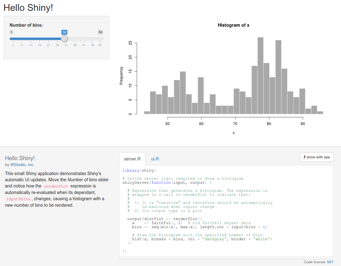
The graph shows the frequency of a set of random numbers drawn from a statistical distribution known as the normal distribution, and the slider allows users to select the size of the draw, from 0 to 1,000. You will note that when you move the slider, the graph updates automatically. This is a fundamental feature of Shiny, which makes use of a reactive programming paradigm.
This is a type of programming that uses reactive expressions, which keep track of the values on which they are based. These values can change (they are known as reactive values) and update themselves whenever any of their reactive values change. So, in this example, the function that generates the random data and draws the graph is a reactive expression, and the number of random draws that it makes is a reactive value on which the expression depends. So, whenever the number of draws changes, the function re-executes.
Also, note the layout and style of the web page. Shiny is based by default on the Bootstrap theme (see getbootstrap.com/). However, you are not limited by the styling at all, and can build the whole UI using a mix of HTML, CSS, and Shiny code.
Let's look at an interface that is made with bare-bones HTML and Shiny. Note that in this and all subsequent examples, we're going to assume that you run library(shiny) at the beginning of each session. You don't have to run it before each example, except at the beginning of each R session. So, if you have closed R and have come back, then run it on the console. If you can't remember, run it again to be sure, as follows:
library(shiny)
runExample("08_html")
And here it is, in all its customizable glory:
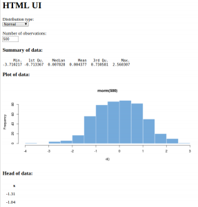
Now, there are a few different statistical distributions to pick from and a different method of selecting the number of observations. By now, you should be looking at the web page and imagining all the possibilities there are to produce your own interactive data summaries and style them just how you want, quickly and simply. By the end of the next chapter, you'll have made your own application with the default UI, and by the end of the book, you'll have complete control over the styling and be pondering where else you can go.
There are lots of other examples included with the Shiny library; just type runExample() in the console to be provided with a list.
To see some really powerful and well-featured Shiny applications, take a look at the showcase at shiny.rstudio.com/gallery/.
Summary
In this chapter, we installed R and explored the different options for GUIs and IDEs, and looked at some examples of the power of R. We saw how R makes it easy to manage and reformat data and produce beautiful plots with a few lines of code. You also learned a little about the coding conventions and data structures of R. We saw how to format a dataset and produce an interactive plot in a document quickly and easily. Finally, we installed Shiny, ran the examples included in the package, and were introduced to a couple of basic concepts in Shiny.
In the next chapter, we will go on to build our own Shiny application using the default UI.