Download code from GitHub
2. Data Preparation: Using Tableau Desktop
Overview
In this chapter, you will learn to use various tools for data preparation in Tableau Desktop and join different data sources using various options. This will equip you with the knowledge required to perform data manipulation activities, data transformation, and data blending, and provide options to manage various data sources. By the end of this chapter, you will be able to extract and filter data and use aliases for the clean presentation of data.
Introduction
Often, the data sources required for Tableau visualizations are stored in separate tables or files. A very common example is that of an online order on an e-commerce website. The order information and the customer information are stored separately within the website database. However, when suggestions are provided based on previous purchases, the website might combine the information to show a unified view. This is a very simple example of a data join, which is one of the most common scenarios that can be fulfilled using data preparation techniques. In addition to data joining, there is often a need to perform data manipulation activities such as grouping and adding calculations on the data being used. In this chapter, you will learn about using all such techniques to pull the data into Tableau for effective analysis and visualization.
Connecting to a Data Source
For any visualization, you need to have an underlying data source that contains all the information you wish to show. This is the first step of any data visualization task.
The very first thing that you will see when you open Tableau Desktop is the Connect pane. Here, you can connect to a variety of data sources and perform various tasks related to data handling, which you will study in this chapter. The following figure shows the screen that comes up when you start Tableau Desktop:
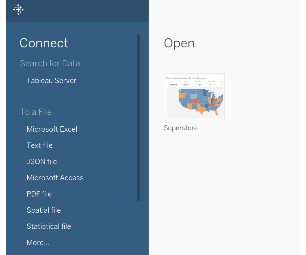
Figure 2.1: Start screen on launching Tableau Desktop
Depending on the version, this screen might look slightly different, but it should remain this way for the most part: you can observe that you can connect to multiple file options such as Excel, text, and JSON files. You can also connect to server-based data sources such as MySQL and Oracle. Saved Data Sources provides sample data sources that are available with Tableau Desktop.
In the following exercise, you will connect to an Excel file named Sample - Superstore, which is available with Tableau Desktop. This file contains an Orders sheet, which consists of information for various orders, based on attributes such as order ID, order category, ship mode, and customer details. It also has a Returns sheet, which consists of orders that were returned. You will use all of this data to perform various operations throughout this chapter, and visualize the data in Tableau Desktop.
Exercise 2.01: Connecting to an Excel File
In this exercise, you will connect to your very first data source in Tableau, the Sample - Superstore Excel file. This file is automatically accessible to you if you have installed Tableau as mentioned in Chapter 1, Introduction to Tableau. It contains three sheets, comprising order-level information stored in the Orders sheet, customer information stored in the People sheet, and order returns stored in the Returns sheet, and can be quickly downloaded from the GitHub repository for this chapter at https://packt.link/14u86. Make sure to download this file on your system before proceeding with the exercise.
Perform the following steps to complete this exercise:
- Under the
Connectpane, select theMicrosoft Exceloption.
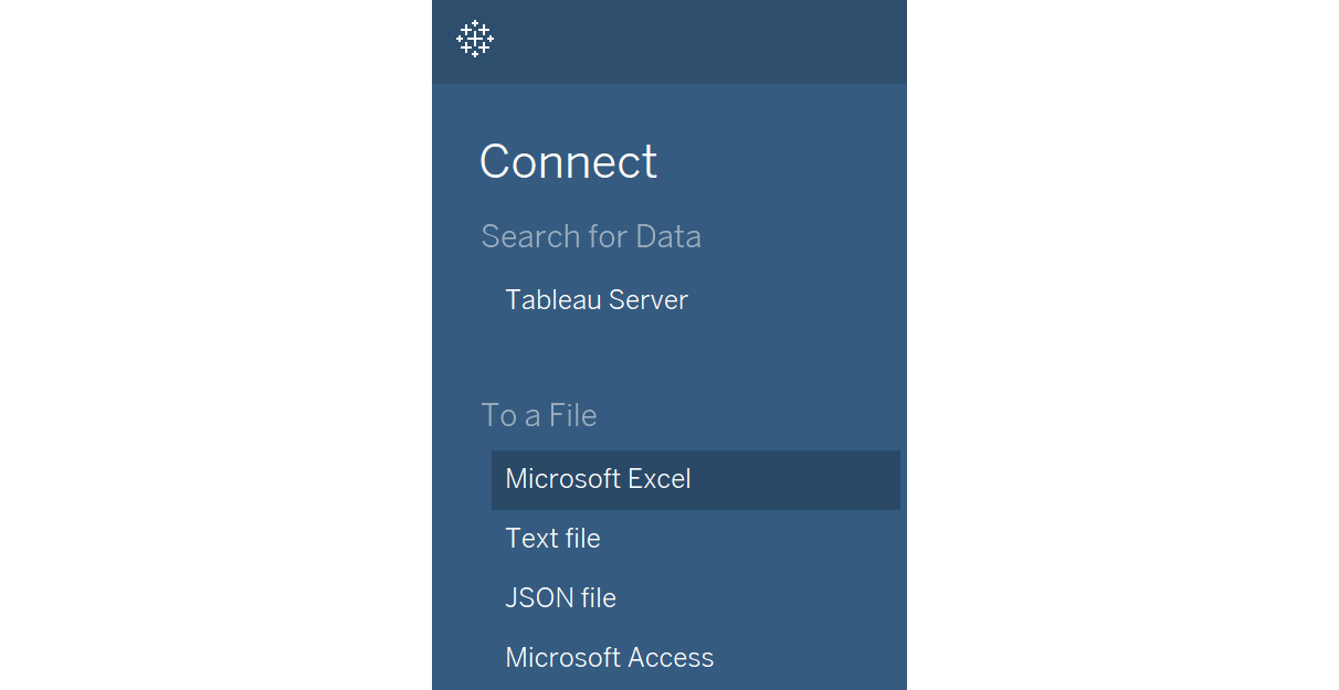
Figure 2.2: Connecting to Microsoft Excel
- This will open up the file menu where you can select the Excel file from the file explorer. Navigate to the location where you have saved this file locally and then select to open the
Sample-Superstore.xlsfile. You will see the following screen once the file is loaded:
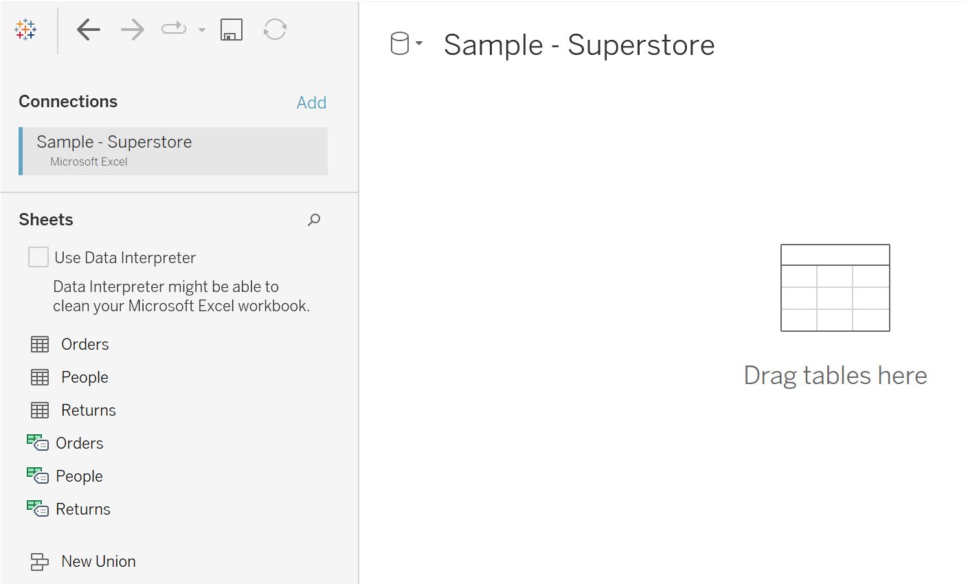
Figure 2.3: File import screen
- Hover over the table to get the
View dataoption (as highlighted in the following figure) and preview the data:
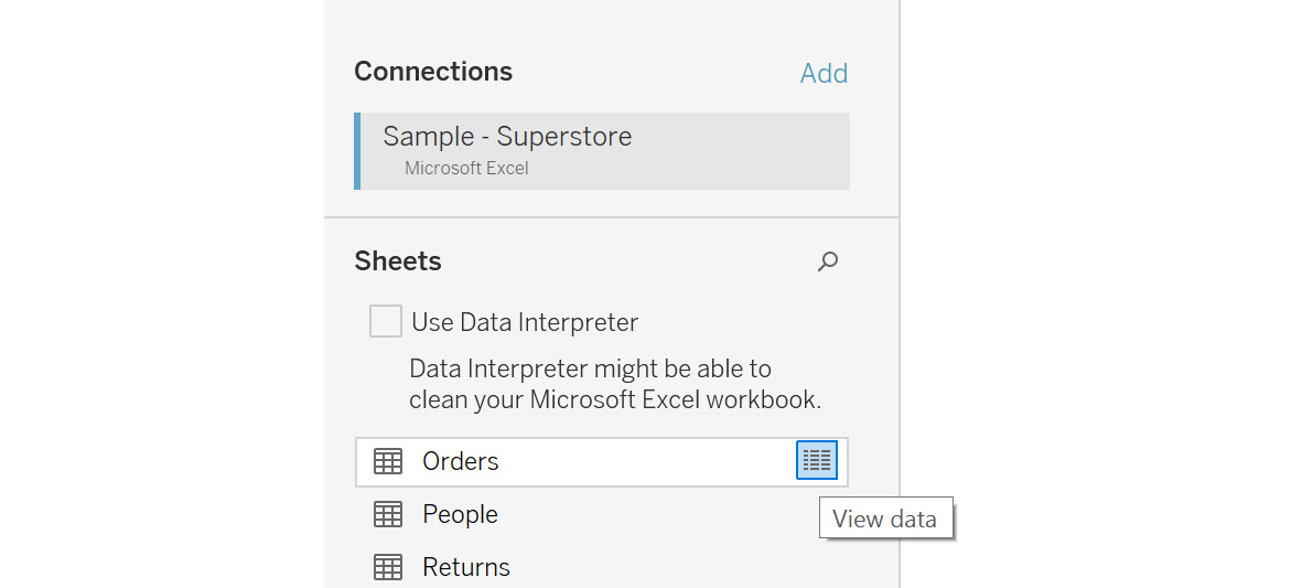
Figure 2.4: View data for the underlying sheet
The following figure shows the data preview:
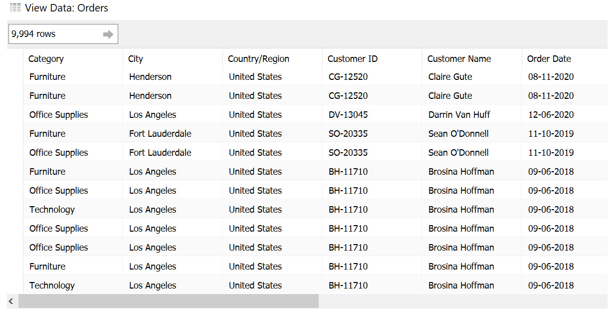
Figure 2.5: View Data window showing the data preview
- Now, drag the
Orderssheet onto theDrag sheets herearea. This is also known as the canvas. - The sheet should now have been imported into Tableau. Preview the data, as shown in the following figure:
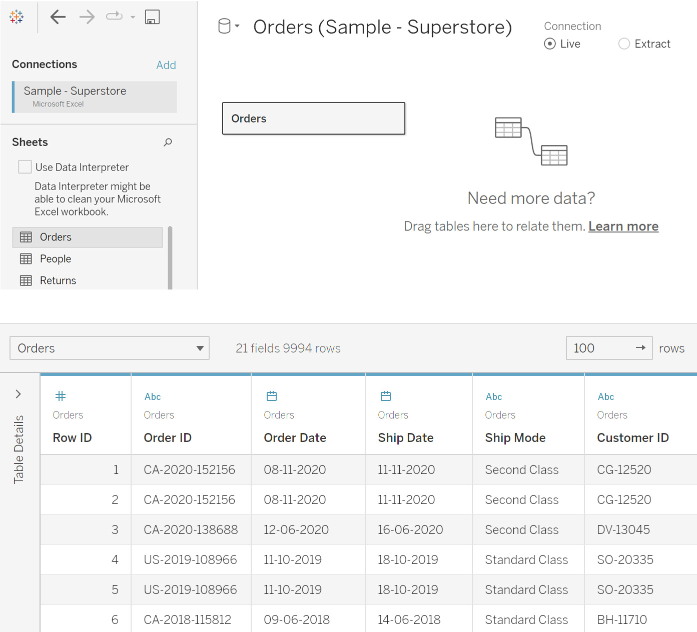
Figure 2.6: Data preview of the imported sheet
You have thus connected and imported the data in Tableau.
- Hovering over
Sheet 1, you can see the activeGo to Worksheetoption, which means that you can navigate toSheet 1and start creating visualizations.

Figure 2.7: Go to Worksheet popup
Once the data is imported, you can start the visualization development by clicking on that option, as you will see later in the course.
In this exercise, you saw how you can connect to an Excel file. Tableau also allows you to connect to data that is stored on servers. In the next section, you will learn how this can be done.
Connecting to a Server Data Source
Here, you will be connecting with Microsoft SQL Server, available under the server-based data sources. Note that the concept of installing and maintaining server-based data sources is beyond the scope of this chapter. However, ideally, in a business project, data would mostly be stored on servers. For this reason, it is important to know how to connect to these data sources.
The following steps will help you connect to a server-based data source:
- Under the
Connectpane, select theMicrosoft SQL Serveroption, as can be seen in the following figure:
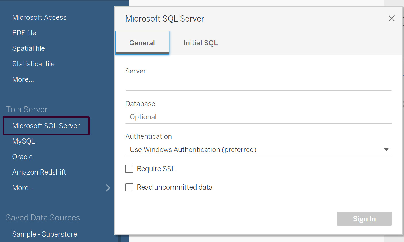
Figure 2.8: Server connection input screen
Here, you need to enter the information required, such as the server name and the authentication method. These details would be available from your database administrator.
- Click
Sign In. You will get a similar preview screen as you saw in Figure 2.5. All the steps afterward are the same as you do for an Excel-based connection.Note
One of the most commonly occurring issues here is that sometimes the drivers to connect to the data source are not installed. This can be easily resolved by downloading and installing the drivers from https://www.tableau.com/support/drivers.
In this section, you connected to a server-based data source. The next section covers the different kinds of joins in Tableau to combine the data from multiple data sources.
Various Joins in Tableau
Quite often, the data that you're using will be stored as separate tables for efficiency purposes. There might be some fields that are common between tables and can be used to join the data sources together.
For example, suppose you, as a bank loan manager, would like to evaluate the best-suited customer profiles for granting a loan. Here, based on the customer-provided information, such as salary details and work experience, you would also need to access their financial history information, such as previous loans, outstanding loans, or any defaults. This kind of information can be fetched from their Experian score using the customer PAN as common information between the various data sources. This is how joins are commonly used in a lot of daily scenarios. You will learn about these joins and the different types in Tableau.
Different Types of Joins
Tableau offers four types of joins, which are listed as follows:
- Inner: In an inner join between two tables, you can combine only the values that match among the two tables into the resulting table. For example, consider the following tables. When you join table A and table B using an inner join, only the common values will be a part of the resulting table:
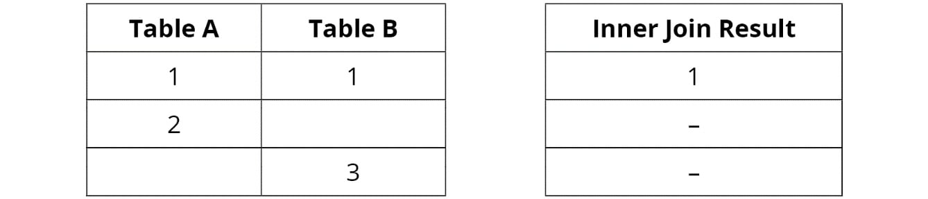
Figure 2.9: Inner Join Between Tables A and B
- Left: A left join combines all the values from the left table along with only the matching values from the right table. If there are no matching values, those rows will contain null values in the resulting table. In the following example, when you join table A and table B using a left join, all the values from table A and only the common values of table B will be a part of the resulting table:
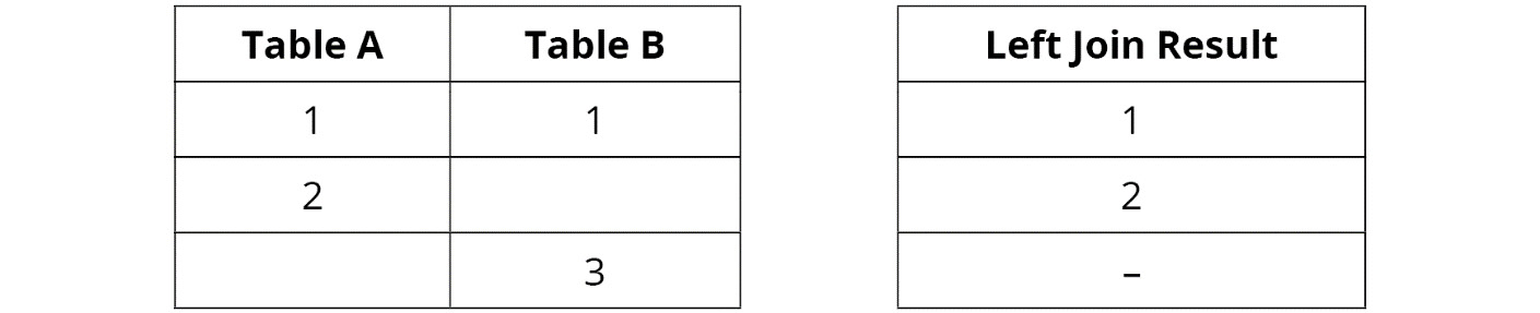
Figure 2.10: Left Join Between Tables A and B
- Right: This is the opposite of the left join. A right join combines all the values from the right table along with only the matching values from the left table. If there are no matching values, those rows will contain null values in the resulting table. Consider the following tables. When you join table A and table B using a right join, all the values from table B and only the common value from table A will be part of the resulting table:
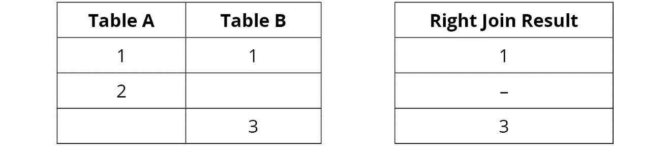
Figure 2.11: Right Join Between Tables A and B
- Full outer: In a full outer join between two tables, you can combine all the values from the left and right tables into one resulting table. If values don't match in any of the tables, those rows will contain null values in the resulting table.
Consider the following tables. Here, when you join table A and table B using an inner join, only the common values will be a part of the resulting table:
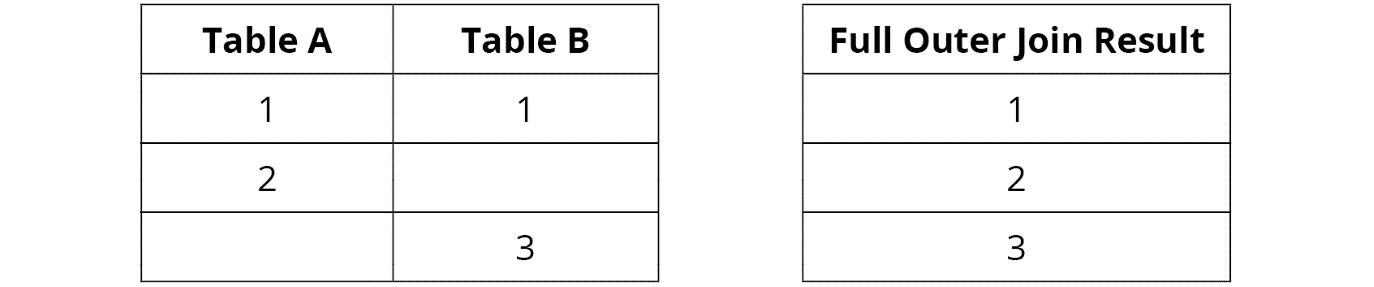
Figure 2.12: Full Outer Join Between Tables A and B
- Union: In a union, you combine two or more tables with similar column structures into a single resulting table. Union is performed when instead of joining you just want to append the data below other data with similar columns. A very common example of union is when you have two tables containing similar columns but maintained separately in different years, for example, combining order information for multiple years into a consolidated dataset.
- Consider the following tables, for example. Here, when you create a union of tables A and A1, you get a single table that will contain values for both A and A1:
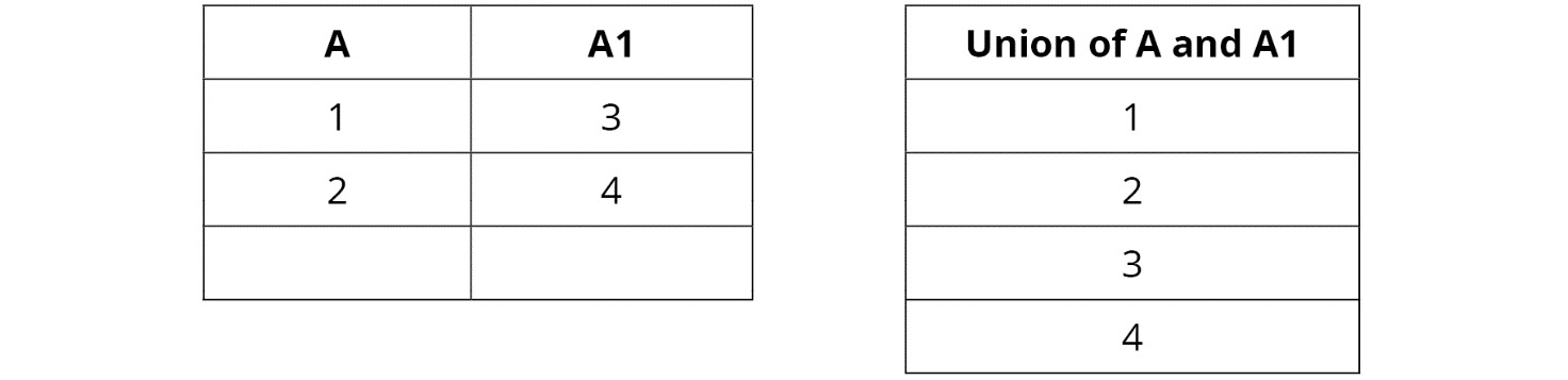
Figure 2.13: Union Between Tables A and B
You will learn more about these join types in detail in the following exercises.
Exercise 2.02: Creating an Inner Join Dataset
As an analyst, you might come across scenarios in which you need to display the common records between two tables. This exercise aims to show how to join two different sheets into a single data source in Tableau.
You will join the Orders table with the People table using an inner join. By doing so, you will be able to identify the customer records present in the People table along with the order information from the Orders table, which will help you to understand customers' buying preferences.
Perform the following steps to complete this exercise:
- Load the
Sample – Superstoredataset into your Tableau instance as you did in Exercise 2.01. - Drag the
Orderstable first, followed by thePeopletable, from theSheetsarea to theDrag Sheets herearea. Alternatively, to add these sheets, you can double-click on them, and they will be added automatically to the canvas area. Tableau will auto-join the two tables using an inner join, as shown in the following figure:
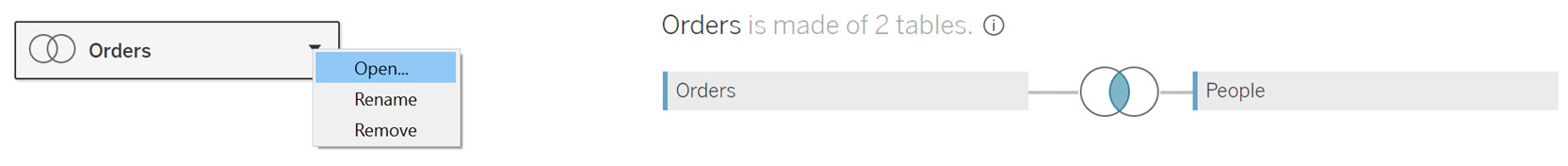
Figure 2.14: Data joining using an inner join
- Click on the
Joinsymbol to open theJoinmenu:
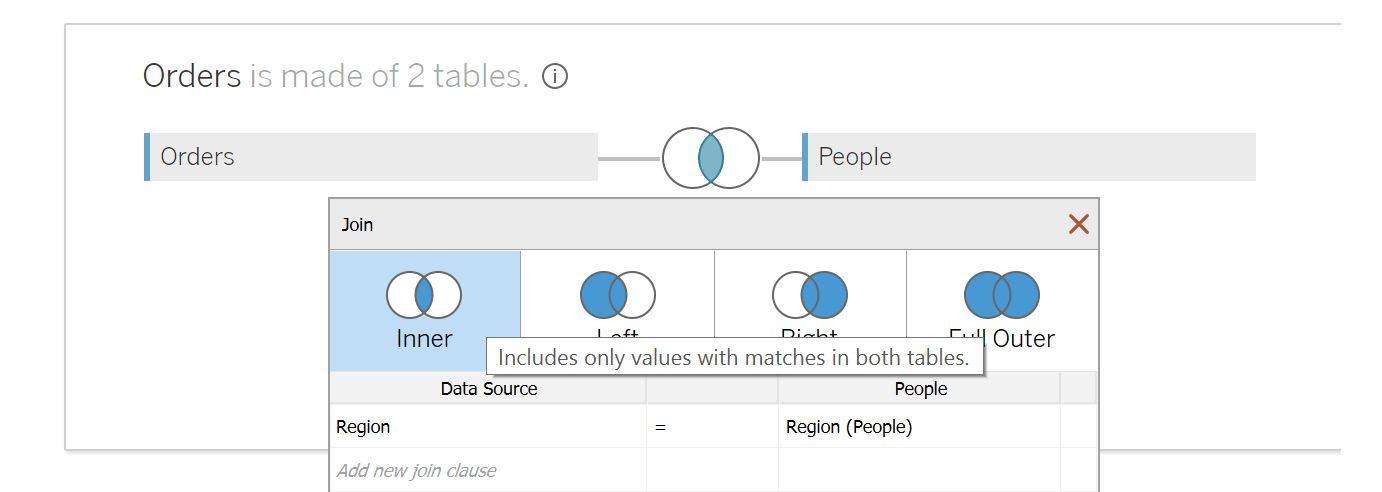
Figure 2.15: Inner join properties
Note the various ways to join data. By default, Tableau performs an inner join on the common field names:
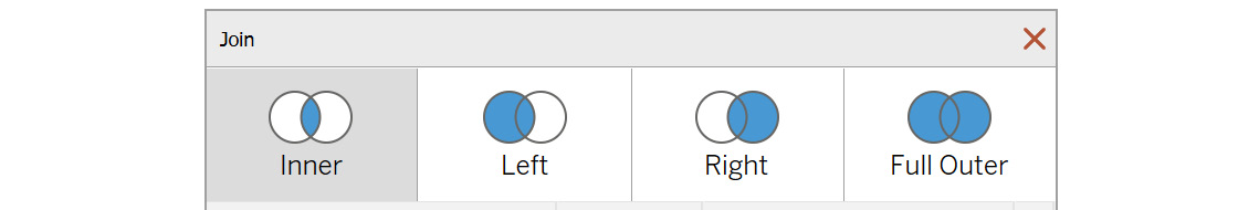
Figure 2.16: Various join options
Note
These instructions and images are based on Tableau version 2020.1. If you are using a later version of Tableau, such as 2021.4, this process may look quite different and even require an extra step. You can find additional guidance for this at the following URL: https://help.tableau.com/v2021.4/pro/desktop/en-gb/datasource_relationships_learnmorepage.htm
- If there are no common names, select the columns manually to enable the join. Since you are joining the
OrdersandPeopletables, join onCustomer NamefromOrdersandPersonfromPeople. First, de-selectRegion, which is auto-selected by Tableau. To do this, click onRegionand selectCustomer Namefrom the dropdown, as you can see in the following figure:
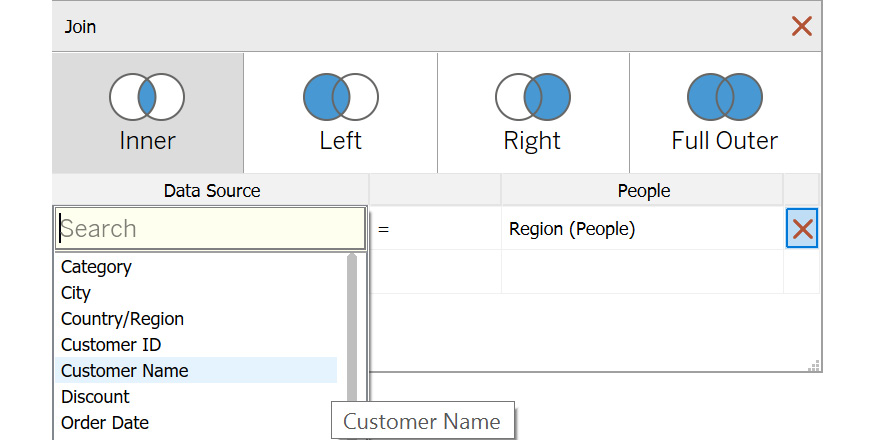
Figure 2.17: Changing the join column
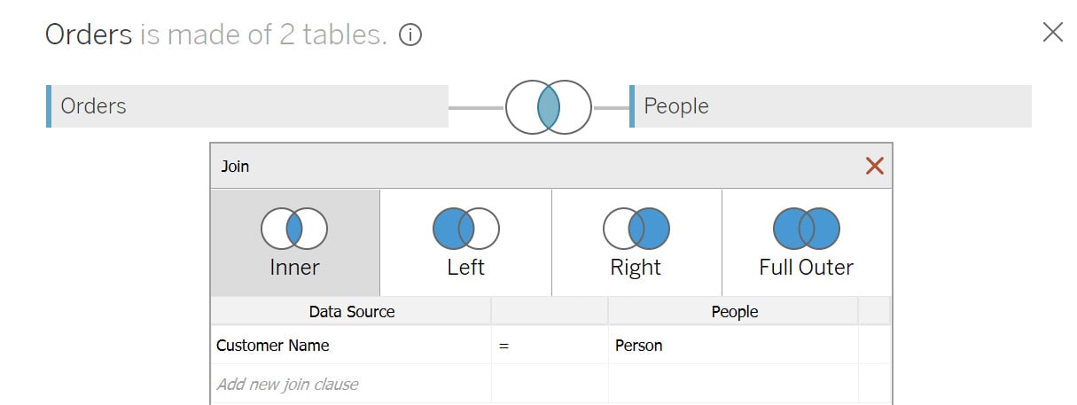
Figure 2.18: Final result of the inner join
- Repeat the same for the
Peopletable and selectPersonas the joining column. Your joined columns should be as follows:
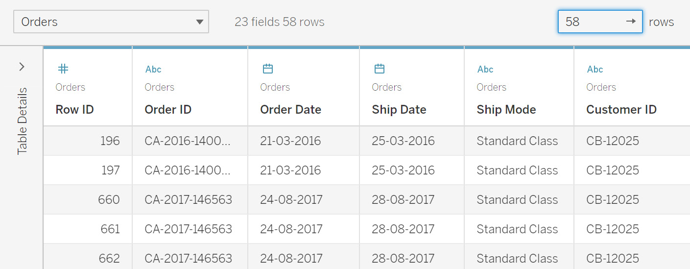
Figure 2.19: Data preview of the Order and People tables
Now it's time to validate the results. This can be observed in the data grid screen in the bottom section.
You can see that you get only 58 rows in the joined dataset. Here, only the values from the Orders table's Customer Name column that match with values from the People table's Person column will be returned in the final dataset. Since the Person table has only four values, only those values from the Customer Name column that match these four are returned from the Orders table.
In this exercise, you used inner join and analyzed the results returned by using this join type. Next, you will learn about the left join type.
Exercise 2.03: Creating a Left Join Dataset
In this exercise, you will join the Orders table with the People table in a left join. The objective of the left join is to verify how much customer information is present in the People table. This will help identify and update the People table so that you can expand the customer database, to drive better sales:
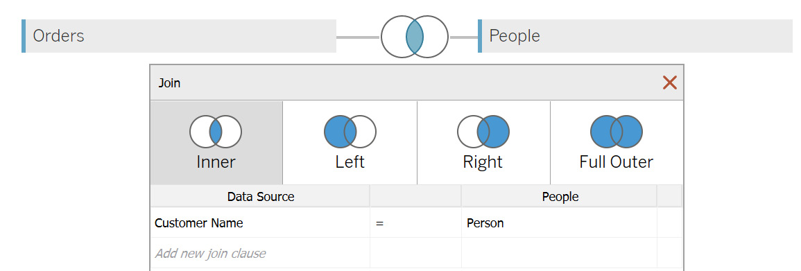
Figure 2.20: Join screen for the Orders and People tables
- Repeat the same step from the previous exercise of dragging the
OrdersandPeopletables to the canvas. Once done, you should see the join options, as follows: - Change the join type to
Left:
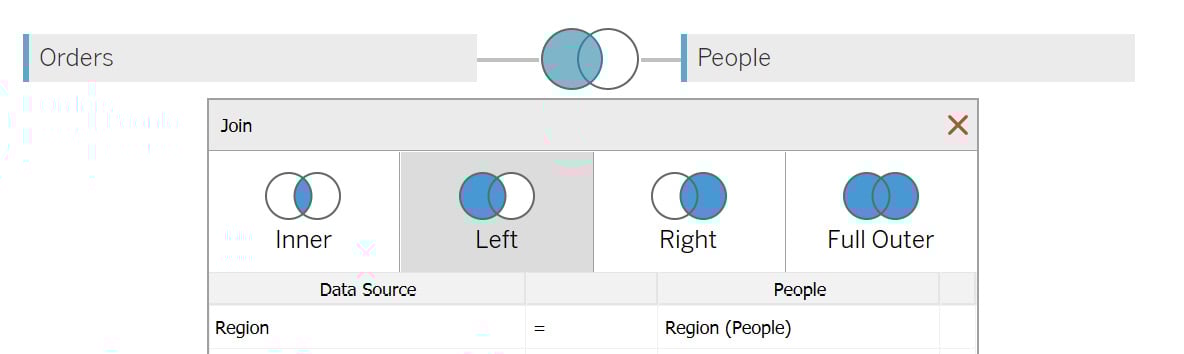
Figure 2.21: Selecting the Left join
- Now, in the data preview (as shown in the following figure), scroll toward the right side. You will see two columns from the
Peopletable,PersonandRegion. Use theSorticon to sort the values, as highlighted in the following figure:
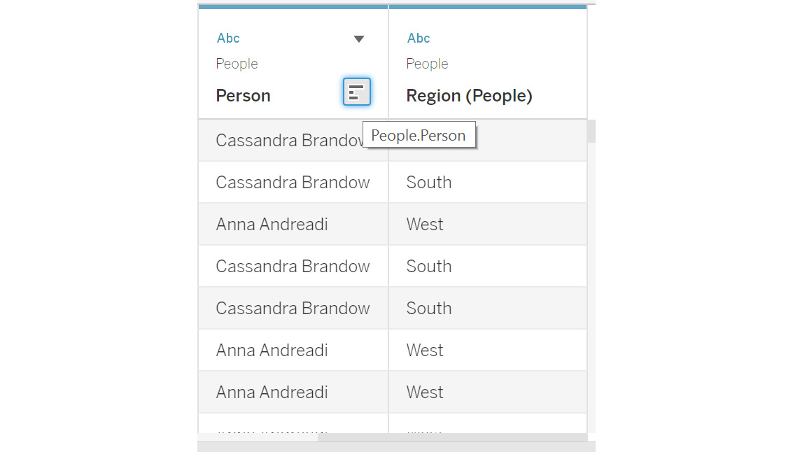
Figure 2.22: Analyzing the left join results
- Scroll down to see what happens if the
Customernames do not match any values in thePersoncolumn.
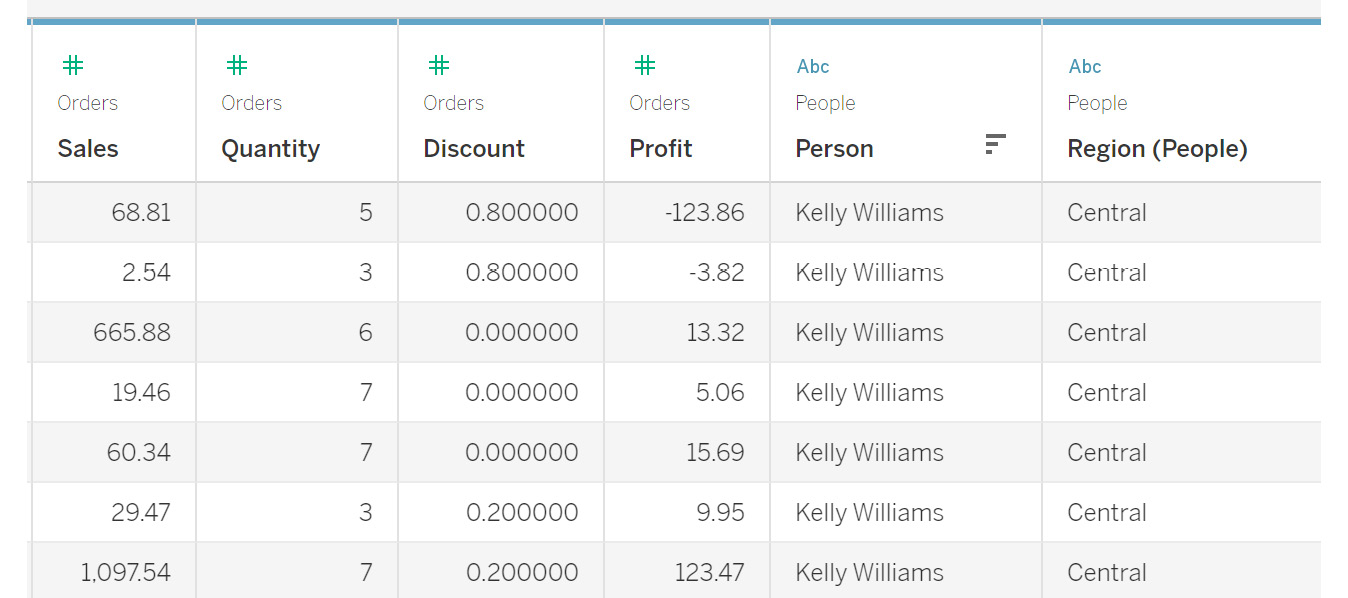
Figure 2.23: Nulls in the join result
You will observe that the rows where a match is not found are replaced by a null value, which means the Person table does not contain information for these customers. This means that you can add this customer information to the People table to improve the data quality.
In this exercise, you learned how to perform a left join and how data is matched between the two tables. Next, you will learn about the right join type.
Exercise 2.04: Creating a Right Join Dataset
In this exercise, you will join the Orders table with the People table in a right join. Consider a scenario wherein the People table consists of all the customers who have previously bought your company's products, and you want to fetch a complete list of the products a customer has bought, using information from the Orders table. This will help you understand the buying habits of customers based on their past purchases.
The steps to complete this exercise are as follows:
- Drag the
OrdersandPeopletables similar to how you did in the previous exercises so that you can see the following on your screen:
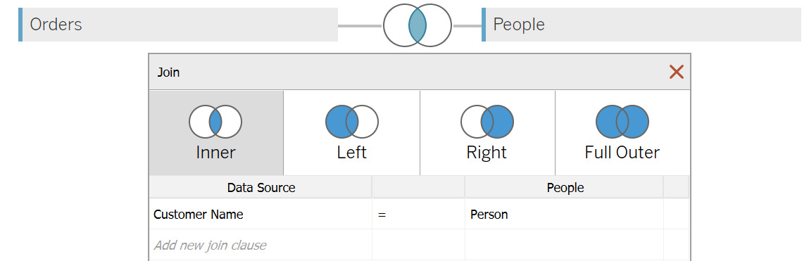
Figure 2.24: Join screen for the Orders and People tables
- Select the
Rightjoin, as shown in the following figure:
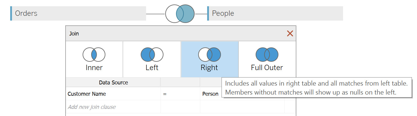
Figure 2.25: Selecting the Right join
- Now, in the data preview, scroll toward the right side. You will see the
PersonandRegioncolumns from thePeopletable. Use theSorticon to sort the values, as highlighted in the following figure: 
Figure 2.26: Analyzing the right join results
You will observe that the rows from the People table contain information about customers with past orders. This can now help you to analyze what products a person tends to buy often, and accordingly, you can suggest similar products to them, for a better-targeted sales strategy.
In this exercise, you performed a right join on two tables and saw how to use the right join results to analyze data. Next, you will learn about a full outer join.
A full outer join would combine the results of both the joining tables into a single dataset. To do that in Tableau, you can use the join properties and change the join type to Full Outer.
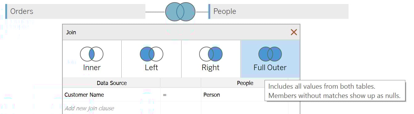
Figure 2.27: Selecting the Full Outer join
The next thing to cover is the union operation. In a union, the new table will be appended below the previous table in the final dataset. Usually, unions are used when you want to combine datasets with a common structure of columns. For example, order information for 2021 can be combined using a union with the order information for 2020 to get a unified dataset.
In the next exercise, you will learn how to implement a union in Tableau.
Exercise 2.05: Creating a Combined Dataset Using Union
Consider a scenario related to a large retailer such as Walmart or Amazon, operating in multiple regions. In such a case, it makes more sense to store the data at the regional level so that it can contain products customized to that specific region. If you were to compare how the different regions perform among each other, you would need to combine these different data sources into one. This is where the concept of a union comes into play.
In this exercise, you will use the Orders table, which is split by region. The files for different regions follow a similar column structure as the Orders table but are segregated into different sheets based on their regions, as you can see from the following figure:

Figure 2.28: Input data for the Orders table preview stored as different tabs
You have the data for two regions: Central and West. You can implement a union to combine these two regions into a single dataset, as outlined in the following steps:
- Save the files on your local machine. Load the
UnionExcel file using theConnectoption from the location where the files are saved, as done for the previous exercises. Once the file is imported, you should see the following screen:
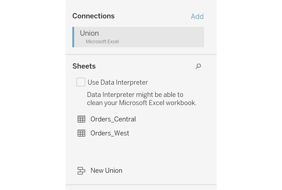
Figure 2.29: Orders table for the Central and West regions
- Double-click on the
New Unionoption to open theUnionpopup, as shown in the following figure:
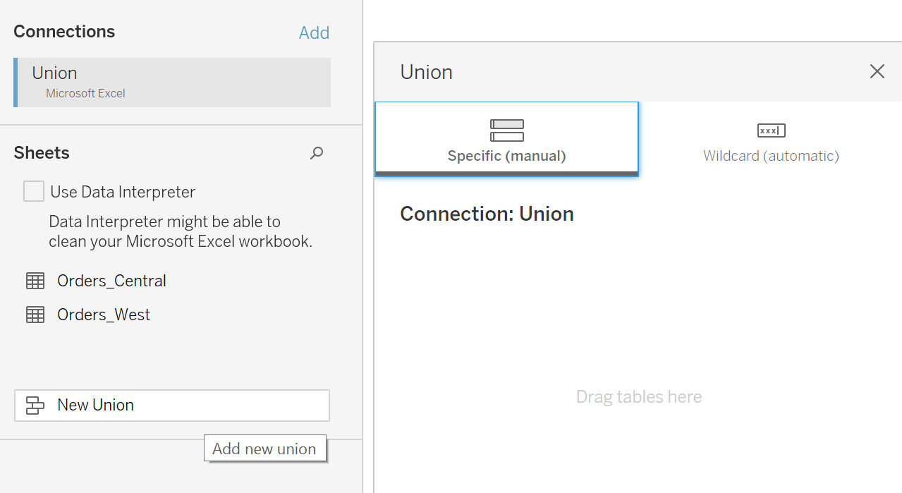
Figure 2.30: New Union popup
- Drag the two order tables onto the
Unionpopup, as follows:
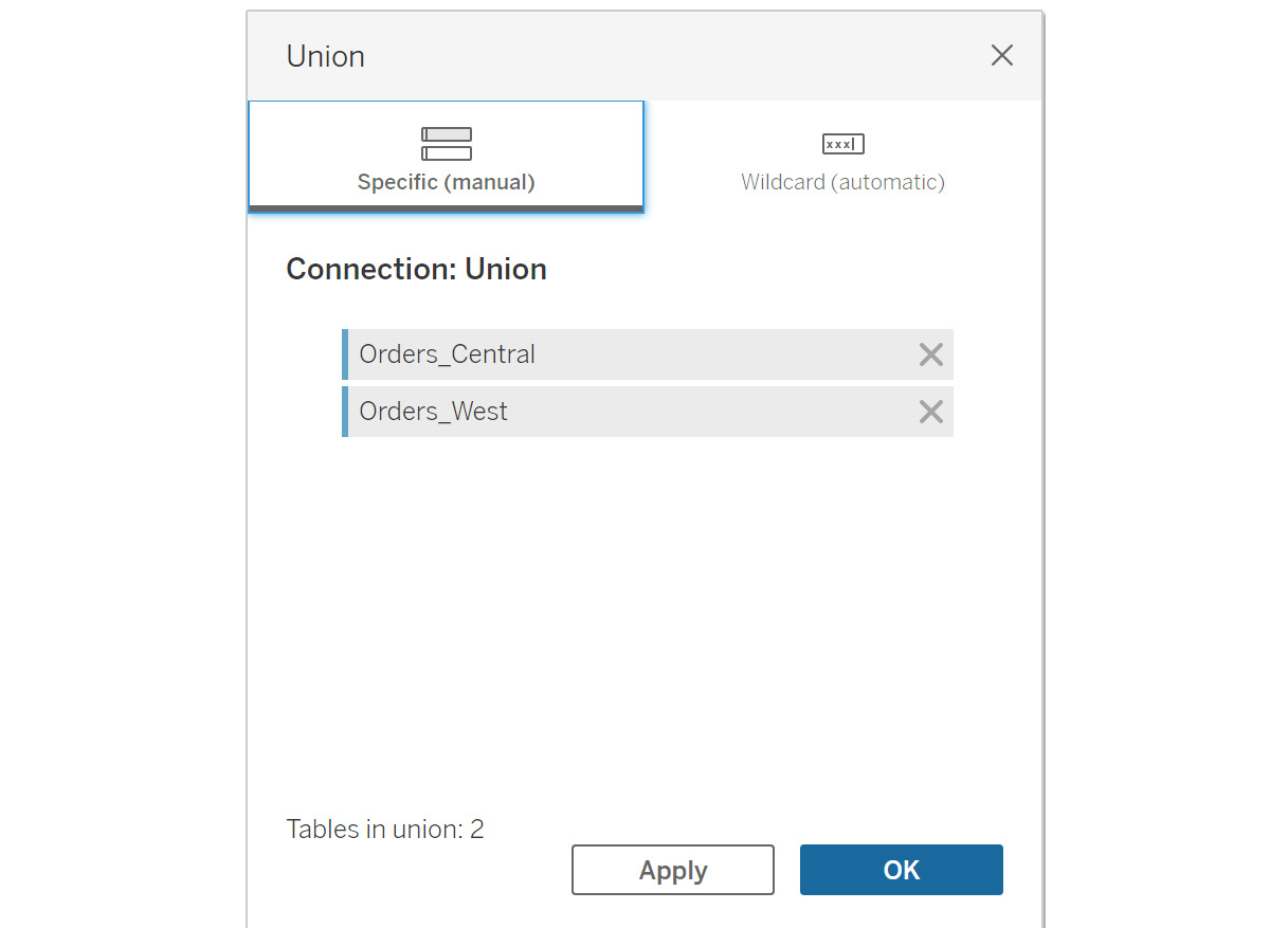
Figure 2.31: Adding tables in a union
- Click on
OKto add the union to the data grid.
You can now preview the data in the bottom section. Tableau will combine the data from both tables into a single data source.
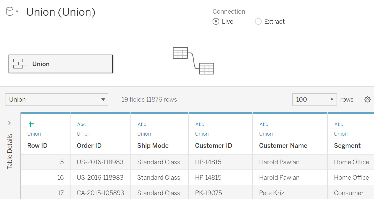
Figure 2.32: Union data preview
- Scroll to the right side of the data preview. You will see two additional columns—namely
SheetandTable Name.Sheetsignifies which Excel file sheet this data belongs to andTable Namerefers to the table names in Tableau. This can be used to quickly identify which columns come from which sheets and tables.
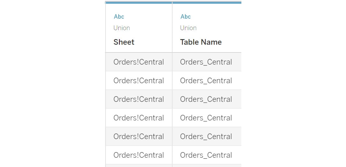
Figure 2.33: Table identification columns in the union result
In this exercise, you learned how to perform a union of multiple data sources.
In all the preceding exercises, you joined on only two data sources. It is possible to add more than two data sources. You will just need to specify in the join connection how the tables join to each other.
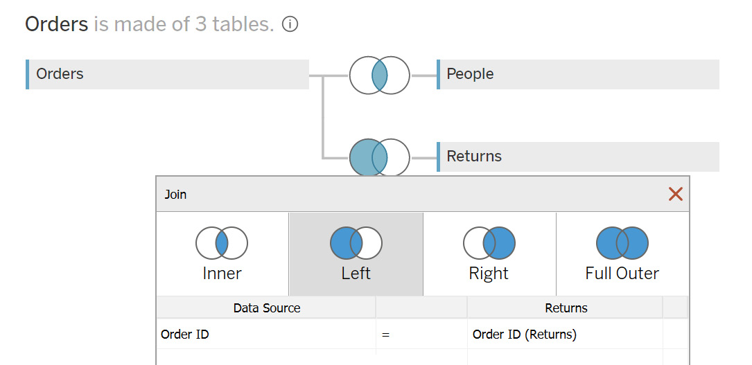
Figure 2.34: Joining with more than two tables
The preceding figure shows an example join on the Orders table with the People and Returns tables. If there were a common field between the Returns and People tables, you could also join these two tables as per your requirements.
This completes the various ways you can join multiple tables in Tableau and concludes the discussion on the various ways to combine data from multiple sources together. The following sections will deal with preparing your data for your desired task.
Data Transformation in the Data Pane
Once you finish combining the data, you may also need to make some data adjustments, such as renaming certain columns or limiting the data to use in your visualizations. These are some common examples of data transformation.
Data transformations are a key step in preparing data for effective visualization. In this section, you will learn about some commonly used ways of transforming data. In particular, you will learn about the following:
- Data Interpreter
- Renaming data sources
- Live and extract connections
- Filters
- Data grid options
- Custom SQL
The following sections will define these one by one.
Data Interpreter
Data Interpreter is an option available within Tableau that extracts only the actual rows and columns by removing titles, headers, and extra empty rows from the Excel data source.
You may sometimes add extra rows describing what kind of data the sheet contains, or some empty columns to improve the readability of the sheet. Consider the following example. Suppose you add certain comments to your Sample - Superstore file, as follows:
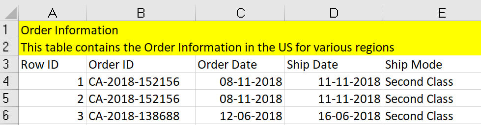
Figure 2.35: Understanding Data Interpreter
From a data visualization point of view, rows 1 to 3 are meaningless as they don't belong to the actual data and are simply headers. Tableau can automatically remove these rows by using Data Interpreter.
Data Interpreter can be enabled by selecting the Use Data Interpreter option.:
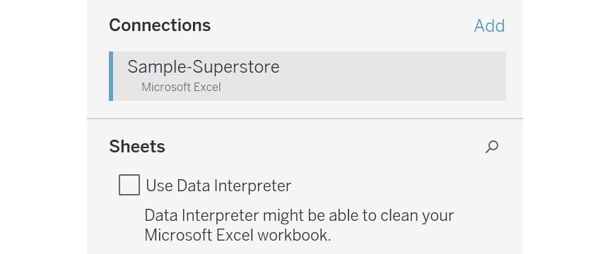
Figure 2.36: Enabling Data Interpreter
Once enabled, Data Interpreter will give you an option, Review the results. Clicking on Review the results will open up an Excel sheet of all the changes made by Data Interpreter, as can be seen in the following figure:
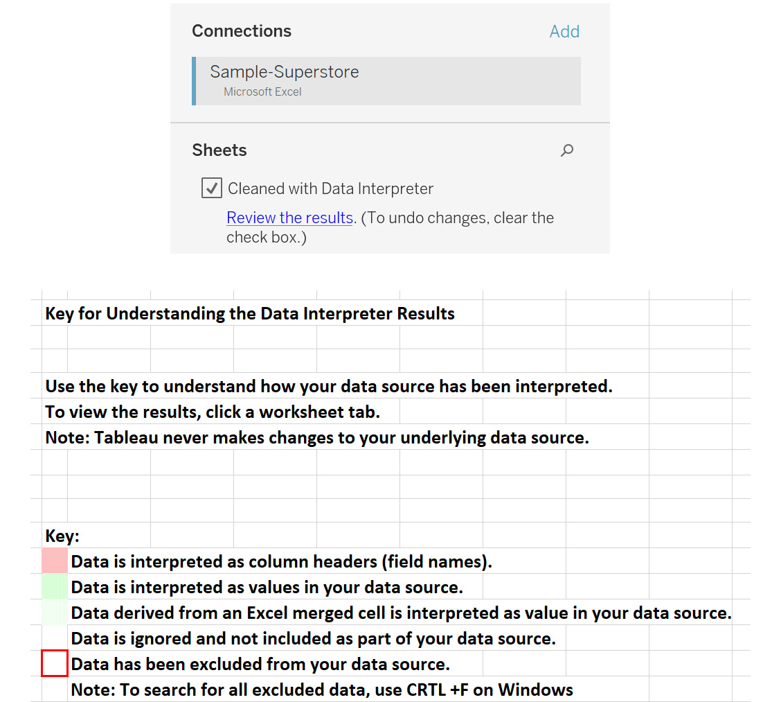
Figure 2.37: Reviewing the results of Data Interpreter
Renaming the Data Source
The data source can be renamed on the Connect screen just by clicking on it and entering the name of your choice.

Figure 2.38: Renaming a data source
When working with data sources, you want to quickly identify the tables you are working with. Renaming tables allows you to give custom names so that it becomes easier to work with them.
Live and Extract Connections
This is a very important concept for data visualization in Tableau. This option decides how the data is connected to the visualizations.
Live connections allow Tableau worksheets to be updated in real time based on any changes made in the underlying data sources. This may be a good solution when the data must be updated on a real-time basis, such as stock market data.
However, when developing the visualizations in a live connection, the database will be queried for any changes performed in the view related to the data. This may consume more time.
Tableau Data Extracts (TDEs), or extracts, are a compressed and optimized way to bring all the source data into Tableau's memory. TDEs improve the efficiency of the data query, which tends to increase the speed of executions while working with the data in the visualizations and performing user interactive activities such as filtering and sorting over the data.
When developing the visualizations in an extract connection, the database is also extracted into Tableau's local memory. Thus, any visualization development will be much faster compared to a live connection.
Exercise 2.06: Creating an Extract for Data
In the preceding exercises, you connected to the data using a live connection. Now, you will create an extract for it. The following steps should be performed to create a data extract for the Orders table:
- Load the
Sample – Superstoredataset in your Tableau instance as done in the previous exercises. - Drag the
Orderstable to the canvas. - Choose the
Extractoption, as shown in the following figure:
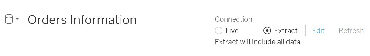
Figure 2.39: Creating an extract
- Once done, click on
Sheet 1at the bottom of the page to navigate to that sheet.
Figure 2.40: Navigating to a worksheet
- This will open a popup to save the extract locally. Select a destination of your choice to save the extract.
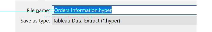
Figure 2.41: Extract creation and save
Clicking on Save will create the extract and save it at the specified location. There is also the Edit option, which can be used to edit the properties of the extract. You will study these in the next section.
- Refresh your extracts using the
EditorRefreshoption if your data changes, as shown in the following figure:

Figure 2.42: Extract Edit and Refresh options
In this exercise, you created an extract using Tableau Desktop.
Extract Properties
To access the extract properties, you can click on the Edit option next to Extract, as shown in Figure 2.42, to open the following window:
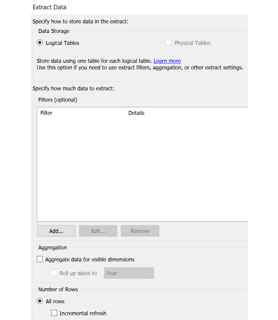
Figure 2.43: Extract edit properties
The following sections will describe this window and its fields in detail.
The Data Storage field
If you have multiple tables, the Multiple tables option will be enabled. For now, since you have a single table, the Single table option is enabled.
The Filters field
You can restrict the data in the extract using filters. For example, suppose you want only the data for the Central and East regions; you can easily do that using the Add… option. Select Region as the column to filter and select the Central and East values to add them as the filter condition.
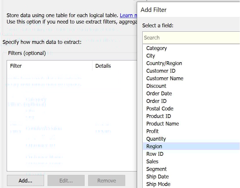
Figure 2.44: Adding a filter condition
As shown in the following figure, Central and East regions should be selected:
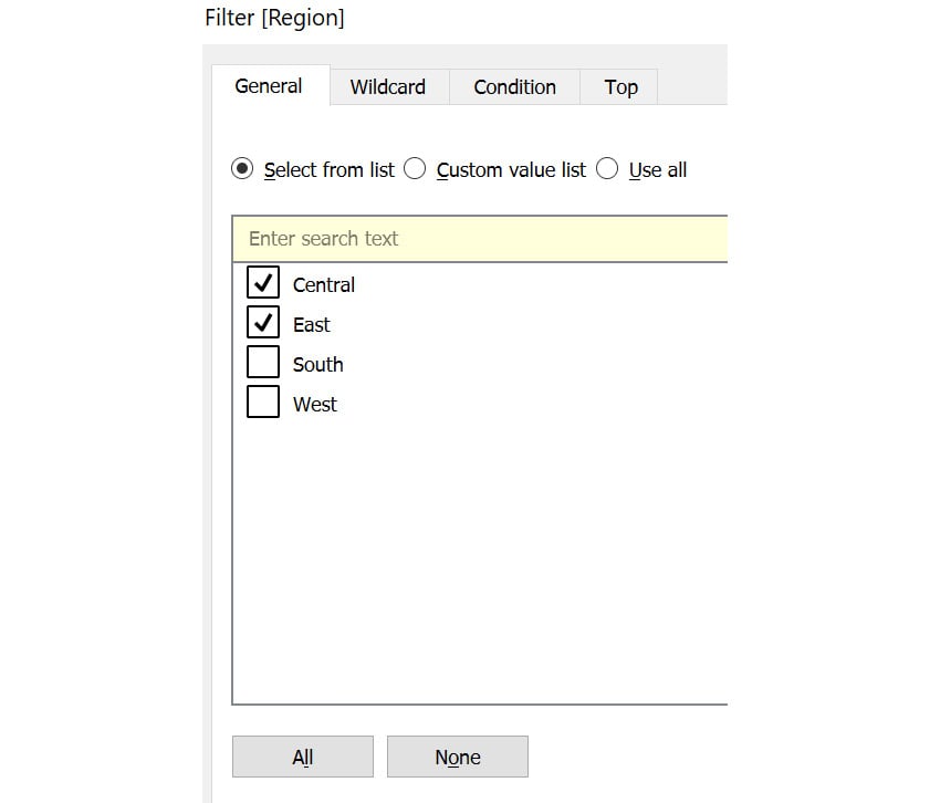
Figure 2.45: Selecting Central and East regions
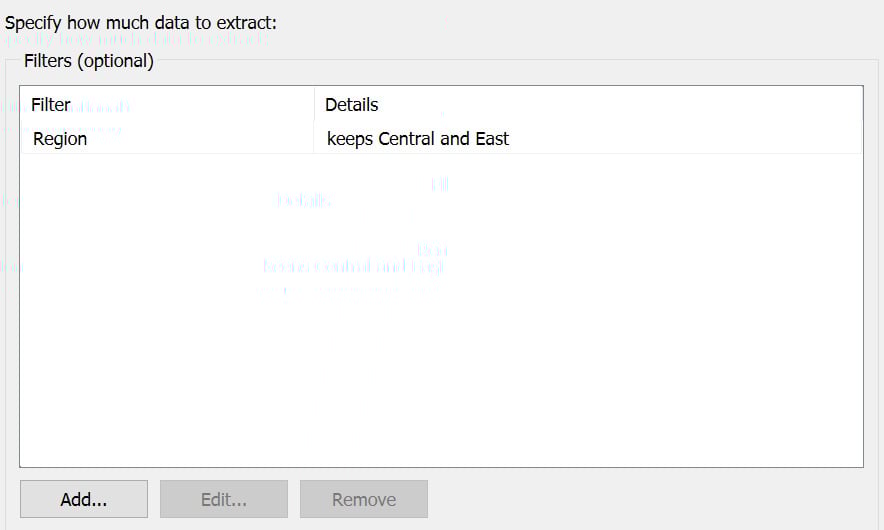
Figure 2.46: Creating extract filters using the Region column
You will learn more about these filters as you progress through this chapter.
The Aggregation Field
You can also change the granularity of the data using this option. If you have dates in the dataset on a Day level, you can roll them up or aggregate them to a higher level using a different option, such as Month or Year. You will learn more about aggregations later in the book.
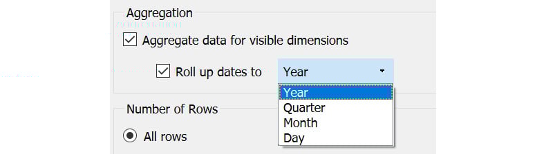
Figure 2.47: Transforming the data aggregation level
The Number of Rows Field
Using this option, you can choose the number of rows the extract should contain. All rows will include all the rows, Top will include only the specified number of rows, and Sample will contain a sample of specified rows. This is useful when you are working on a very large dataset, but for development purposes, you just need a sample of the data.
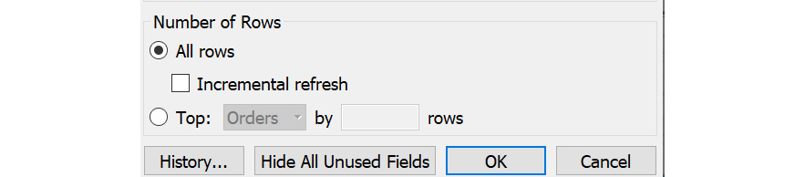
Figure 2.48: Sample selection using the number of rows
On selecting All rows, you will also get an option called Incremental refresh. Instead of refreshing the data every day, you can use this option to specify which field can be used to identify new rows so that only the specified section of the data is refreshed. This option is helpful when you have a very large dataset that updates at regular intervals wherein the old data does not change.
Consider the case of banking transactions. The bank will never modify the old data but would keep adding new data to maintain the historic data. In this case, an incremental refresh would be very helpful during extract refreshes.
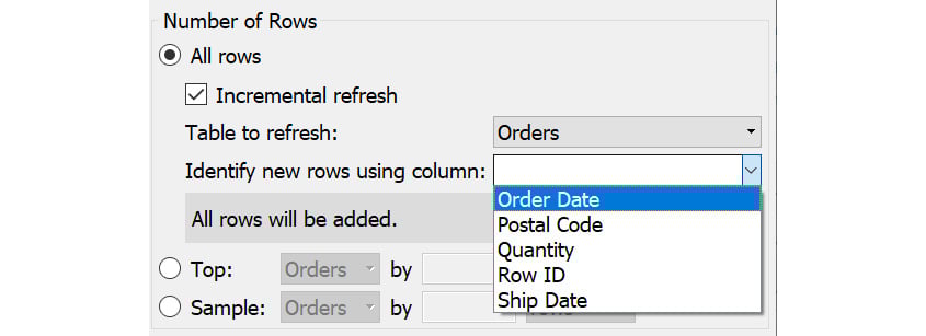
Figure 2.49: Identifying the column for performing refresh
Now that you understand what values to add in these fields, you'll review what factors to determine when choosing the type of connection.
Which Connection Is Better – Live or Extract?
Ideally, in most projects, an extract is the ideal approach, but there may be a need to showcase live data as in the example you saw before. The following points should be considered before choosing an extract or a live connection:
- Updated or delayed data: If you have a requirement for which you need the most up-to-date information whenever you view the dashboard, you would need a live connection. Otherwise, if you are comfortable with some delay in the latest data, an extract is a better choice.
- Data volume: If your data volume is very large, it is ideal to use a data extract instead of a live connection as it might take a lot of time to develop dashboards on live connections.
With these points in mind, you can choose the right type of connection for your project.
Filters
This option is similar to the Extract Filter property you learned about before. These filters are also known as data source filters because they filter data at the source. You will further study various filters later in the book.
Consider the example of a large retailer such as Amazon, where the data has a large volume. Suppose you want to analyze the data for a specific region. In this case, it is not prudent to pull the whole data in Tableau as it would make the dashboard slower, and also, you would not have any use for the data other than that for your target region.
For such a case, you can use the Data Source Filter option. This would restrict the data at the source itself and only bring in the required data based on the filtering criterion specified.
Exercise 2.07: Adding a Region Filter on the Orders Table
Consider that you want to add a Region filter on the Orders table, to bring the data for the Central and East regions only. You can do so by following these steps:
- Load the
Sample - Superstoredataset in your Tableau instance. - Drag the
Orderstable onto the canvas. - To add a filter, click on the
Filters|Addoption to open the popup:
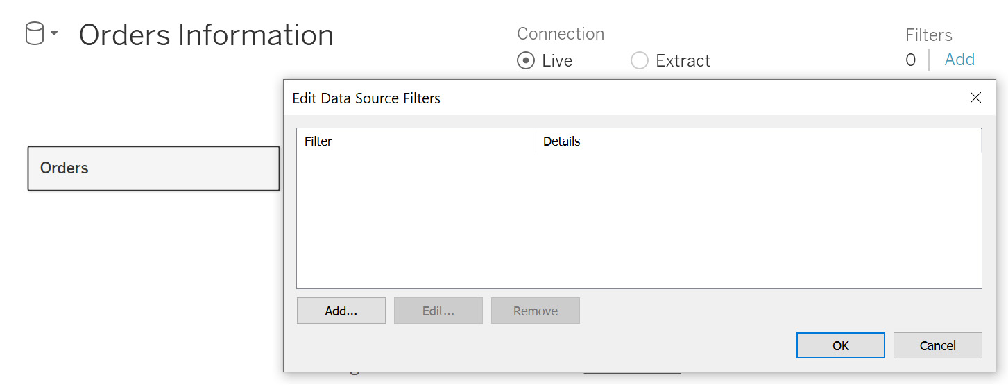
Figure 2.50: Data source filter properties
- Click on
Add…to open the columns list. SelectRegionas the column:
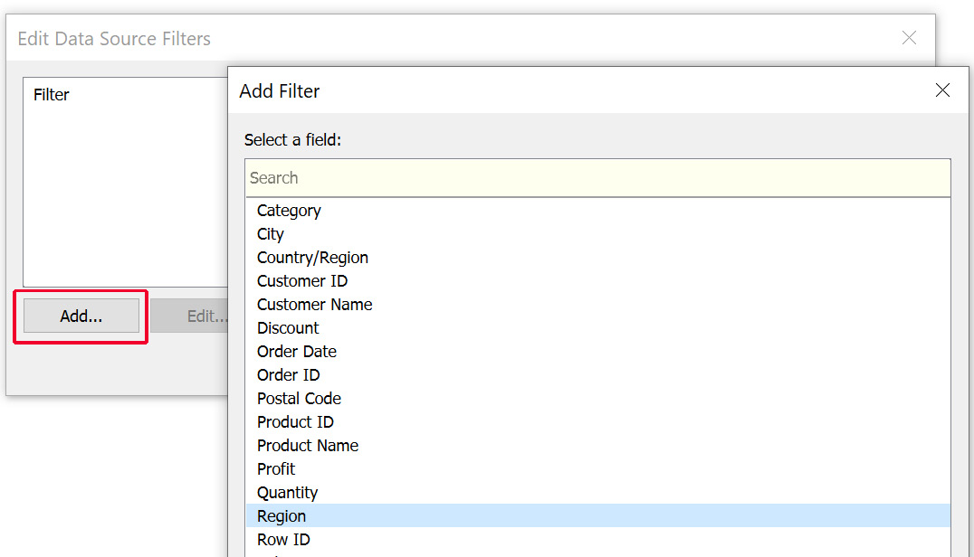
Figure 2.51: Column filter selection
- Select
CentralandEastas the regions that will be kept in the data. ClickOKto add the filter, as follows:
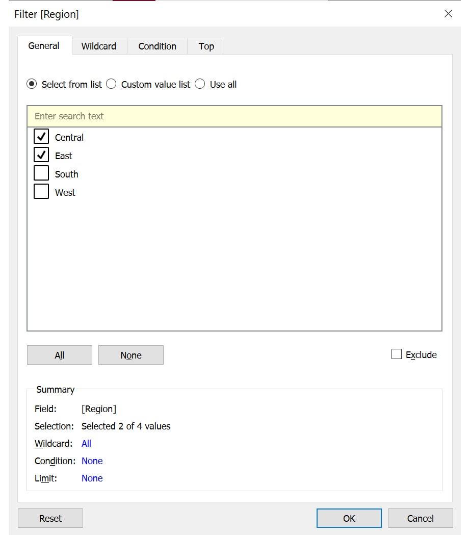
Figure 2.52: Selecting the filter values
You can similarly add more filters by clicking on the Add… option and repeating the previous steps.
- You can also edit and remove the existing filters. To do that, select the filter you want to edit or remove and then select the required option, as shown in the following figure:
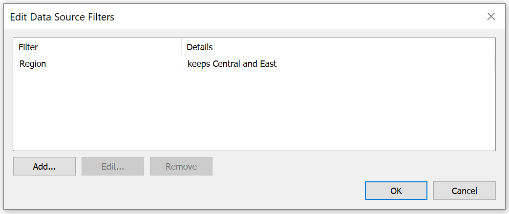
Figure 2.53: Filter preview
- Once you have added the filter, preview the data in the data grid. You will observe that you only have data for the
CentralandEastregions, as expected.
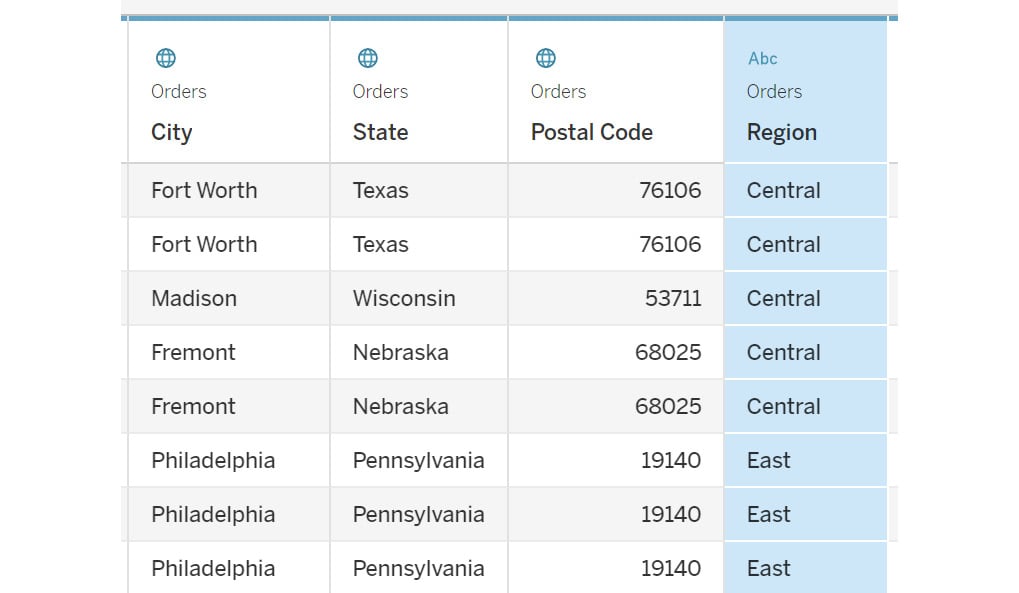
Figure 2.54: Data preview post filter application
In this exercise, you learned how to apply a filter and the various properties associated with a data source filter. In the next section, you will learn how to transform data using the data grid.
Data Grid Options
The data grid allows you to preview data. You have been using it so far just to check the number of rows the data contains, but it also contains several other options to transform data before you start with the visualization development. In this section, you will learn about these options and how to use them to better understand the data transformations.
Data preview: You can use this to preview the data. You can also select the number of rows to be displayed, by specifying the number in the box on the right, as can be seen in the following figure:

Figure 2.55: Data preview toggle
Metadata: Metadata provides information about the source, such as the table name. Toggling to the metadata view, you can see all the metadata about the data. You can view the various columns, the table they come from, and the remote field name.
If you rename a field here, the remote field name will show the original field name pulled from the data.
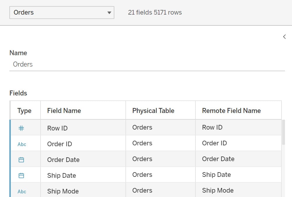
Figure 2.56: Changing to the list view representation to show input data source metadata properties
Note
In Tableau version 2021.4, the metadata is automatically available beside the preview, and you will not have to choose between these options.
The Sort fields option will sort the data as per the option you select. You can try changing these options and observe how the data preview changes.
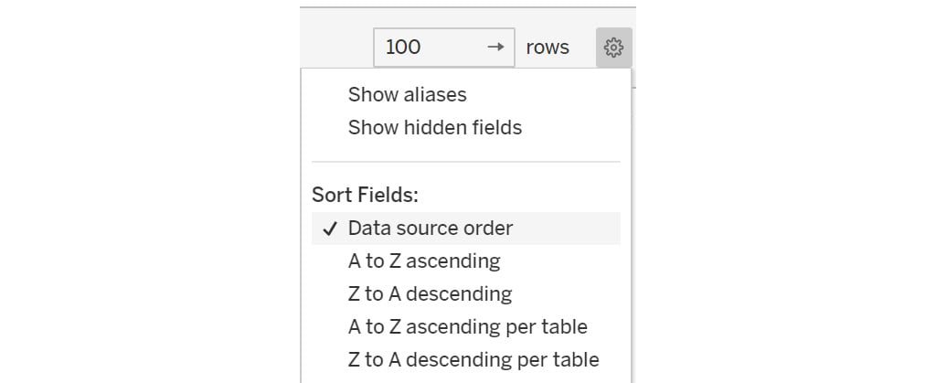
Figure 2.57: Sorting the data grid column values
Now, consider the following data transformation options.
Change data type: Using this option, you can change the data type of a column. By clicking on the Abc icon (see the following figure), you can select the required data type from the drop-down box for the column. A common example is the Customer ID field being stored as a number where you might want it to be a string:
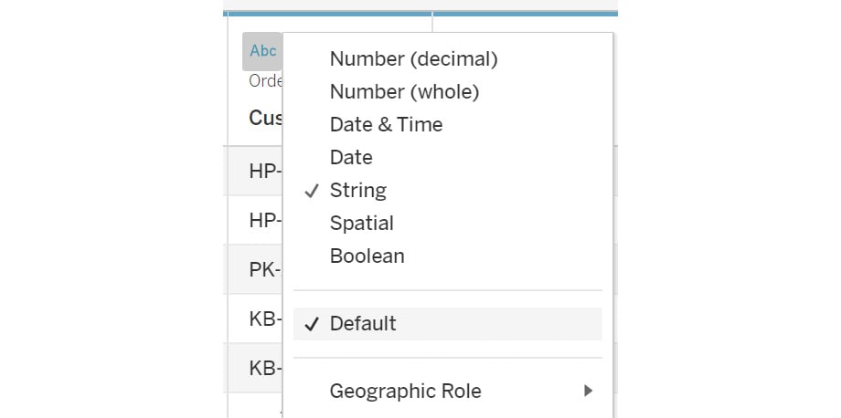
Figure 2.58: Data type change options
Data transformation: When you click on the drop-down icon, as shown in the following figure, you can see the options to transform the data, such as creating calculated fields on existing columns and creating groups. All these options are also available after you load the data. These will be covered in detail later in the book:
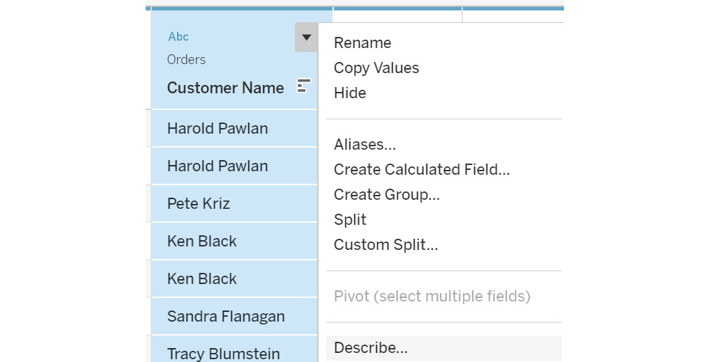
Figure 2.59: Data transformation menu options
The Rename option allows you to rename the column. You can also hide a column if it's not required in the data visualization. You can select the Show hidden fields checkbox to view any hidden columns. Hidden columns are grayed out in the view, as indicated in the following figure:
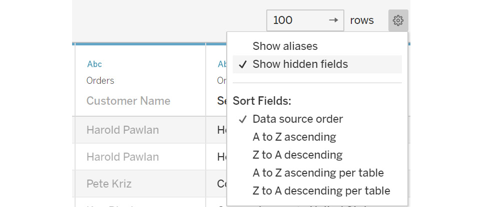
Figure 2.60: Show hidden fields
Hidden columns cannot be used in the visualization. If you want to use a column after hiding it, you need to first unhide the column to use it in the visualization. This can be done by clicking on the dropdown and selecting the Unhide option.
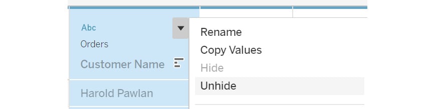
Figure 2.61: Hiding/unhiding columns from the input data source
Aliases: Aliases are a very effective way to present data in the visualization with a different name.
Observe the Ship Mode column in the data preview. You can see that the word Class is repeated for the different Ship Mode values, and it does not add any value; so you can exclude this word from all the values. This can be done using the Aliases option, which will help you to display the values as a different name. To add aliases on the column, click on the dropdown and select Aliases…, as shown in the following figure:
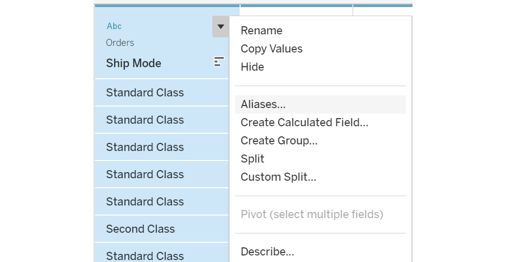
Figure 2.62: Setting a column value alias
This will open the popup to rename the values. Remove the word Class. Click on OK to add it to the data. You can also clear the aliases using the Clear Aliases option.
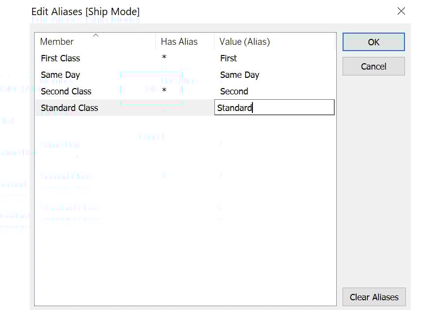
Figure 2.63: Edit Aliases properties
You can use the Show aliases toggle to switch between the original names and the aliases. Aliases are generally used to rename null records to blank or columns containing long value names.
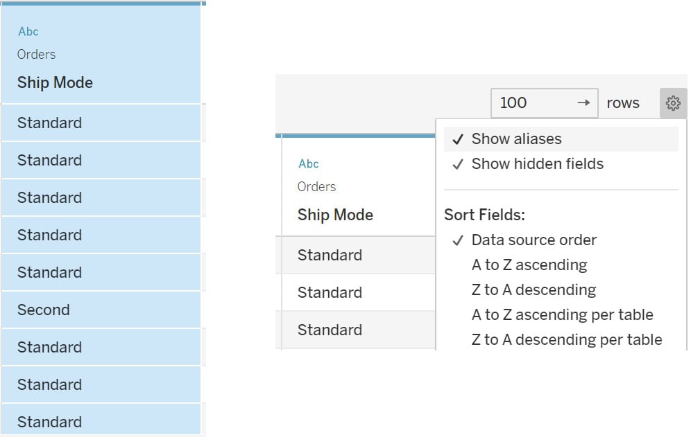
Figure 2.64: Enabling aliases in the data preview using the Show aliases option
All these options are also accessible after you load the data in the worksheet.
In this view, you learned how to perform data transformations before pulling the data in the worksheets.
In all the exercises previously, you just joined on two data sources. But it is also possible to add more than two data sources. You will just need to specify in the join connection how the tables join to each other.
This completes the various ways you can join multiple tables in Tableau. Next, you will learn about the custom SQL option.
Custom SQL
Custom SQL, as the name suggests, is used for writing custom SQL queries to pull only the selected columns based on the conditions applied instead of pulling the entire database. This option is not available with Excel and text files, so you might not see this option.
This option will appear in the Connect pane once the database is connected. When you connect a database, you will see the New Custom SQL option below all the tables listed.
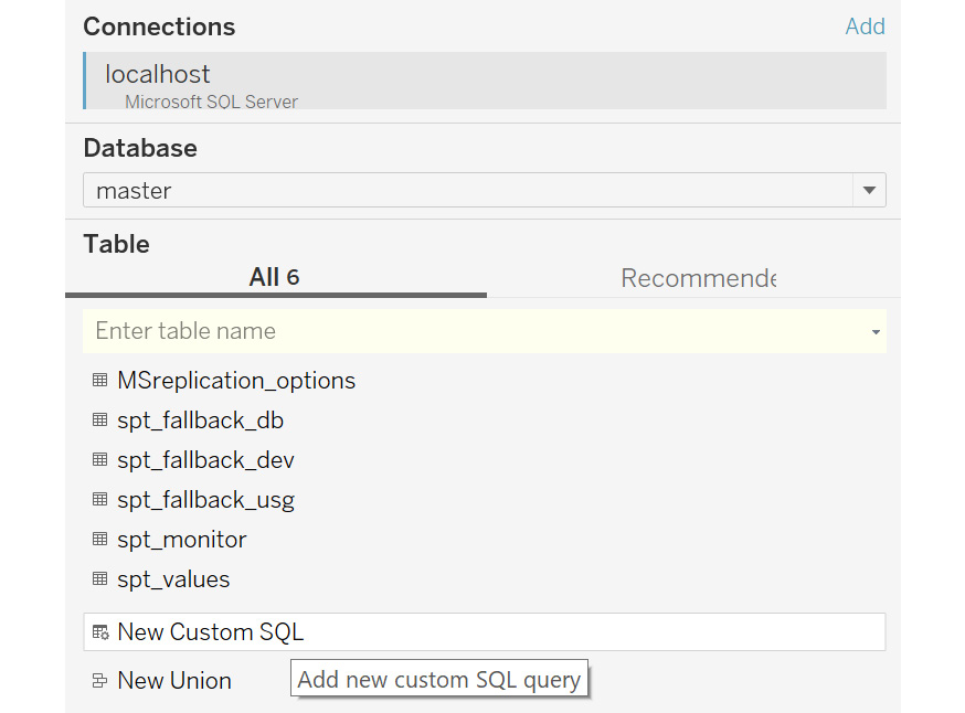
Figure 2.65: New Custom SQL option
You can drag this option onto the canvas, type in your query, and click OK. Once done, Tableau will pull the required data based on the query specified.
Custom SQL can be used to reduce the size of data by adding only the required columns in the data source, adding a union across the tables, and recasting fields to join multiple data sources together.
Until now, you have learned about the various data transformation steps that can be performed before pulling the data in the worksheet. In the next section, you will learn about data blending, which is another way of joining the data but with a difference.
Data Blending
There might be times when the linking fields vary between the different worksheets. Also, if the data sources are too large, joining them with the conventional joins might be very time consuming. In that case, you can perform a data blend instead of joining the data.
In data blending, you query the data between the two data sources and then combine the result at the aggregation level defined in the worksheet of the primary data source. The primary data source will be the one from which the first dimension or measure is added in the view. Also, the results would be similar to a left join since all the records from the primary data will appear in the worksheet.
Exercise 2.08: Creating a Data Blend Using the Orders and People Tables
In this exercise, you will learn how to create a data blend for the Orders table with the People table. The following steps will help you complete this exercise:
- Load the
Sample – Superstoredataset in your Tableau instance. - Connect to the
Orderstable and go toSheet 1.
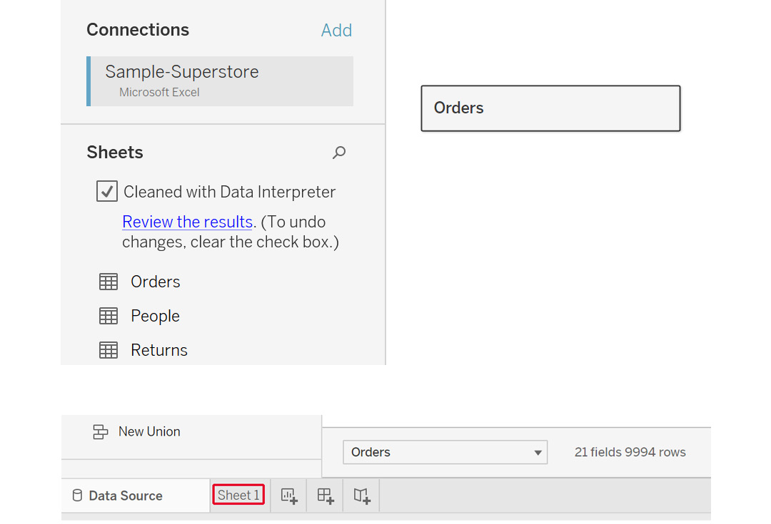
Figure 2.66: Adding the Orders table in Tableau
- In a data blend, create the linking at the worksheet level and not at the data source level. Inside the worksheet, you will be able to see the
Orderstable and its columns. Add a new data source, as follows (see the highlighted option):
Figure 2.67: Adding data option inside a worksheet
- This should lead to the same menu that you get for connecting to a data source. Click on
Microsoft Excel, navigate to the location of theSample – Superstore.xlsExcel file, and click onOpento open theConnectpane.
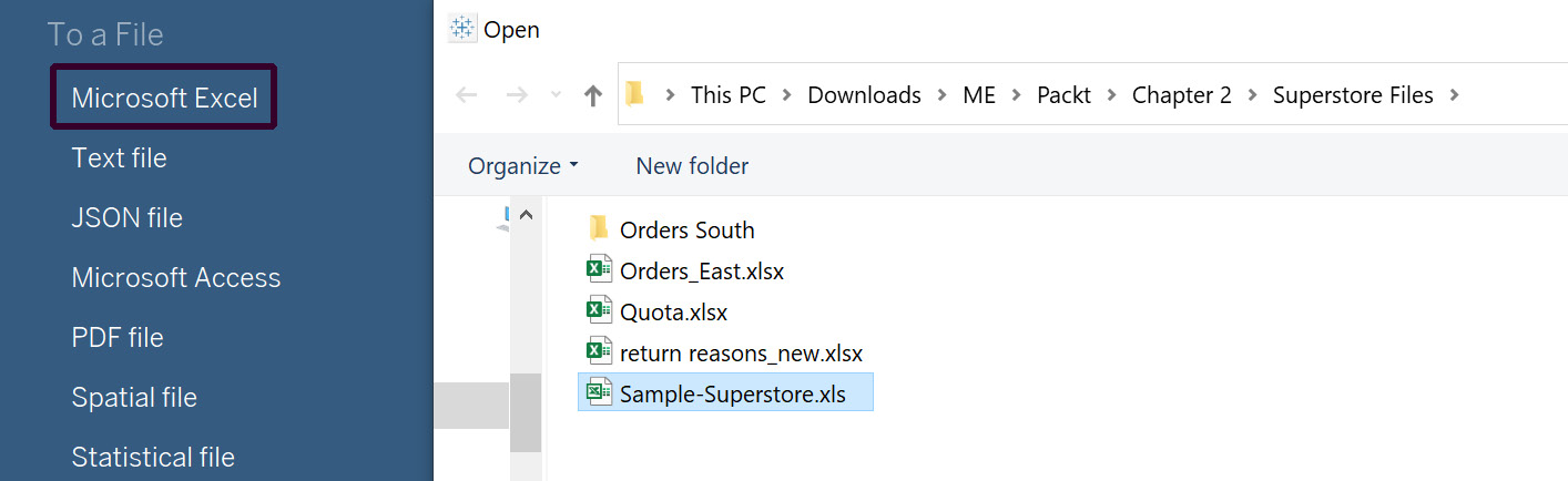
Figure 2.68: Adding another data source in Tableau
- Now, drag the
Peopletable to the canvas and go toSheet 1like before:
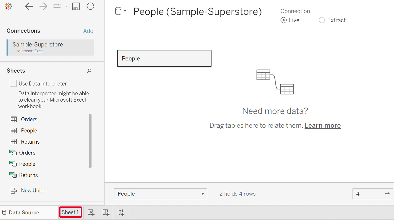
Figure 2.69: Adding the People data to Tableau
Now, you will be able to see the two data sources, as follows:

Figure 2.70: Data sources listed inside the worksheet
- Add a relationship between these data sources to use them. To do that, click on
Data|Edit Relationships…to open the popup.Note
If you are using a Tableau version later than 2020.1, this may be called
Edit Blend Relationships...to differentiate between relationships made directly in theData Sourcetab.
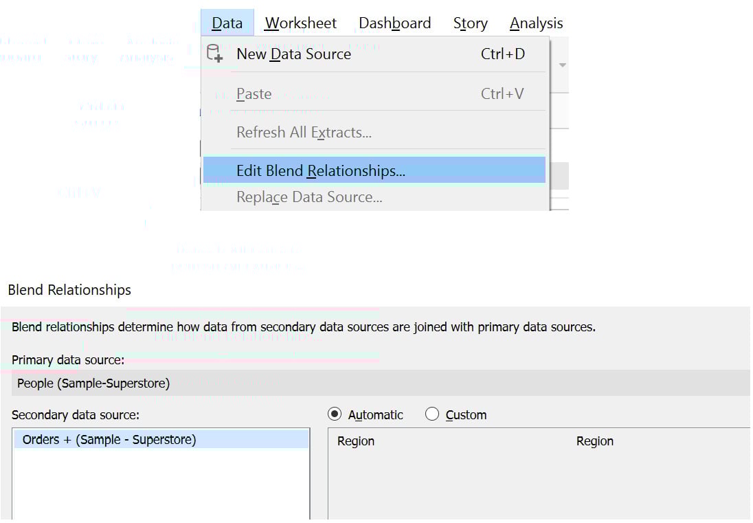
Figure 2.71: Edit data properties window
- Based on the field names, the relationship can be set to
Automaticby default. To change it, click onCustomand add the relationship. Edit the relationship toCustomer NameandPerson, as highlighted in the following figure. SelectRegionand thenEdit…before making the selections in the popup. ClickOKto add the relationship:
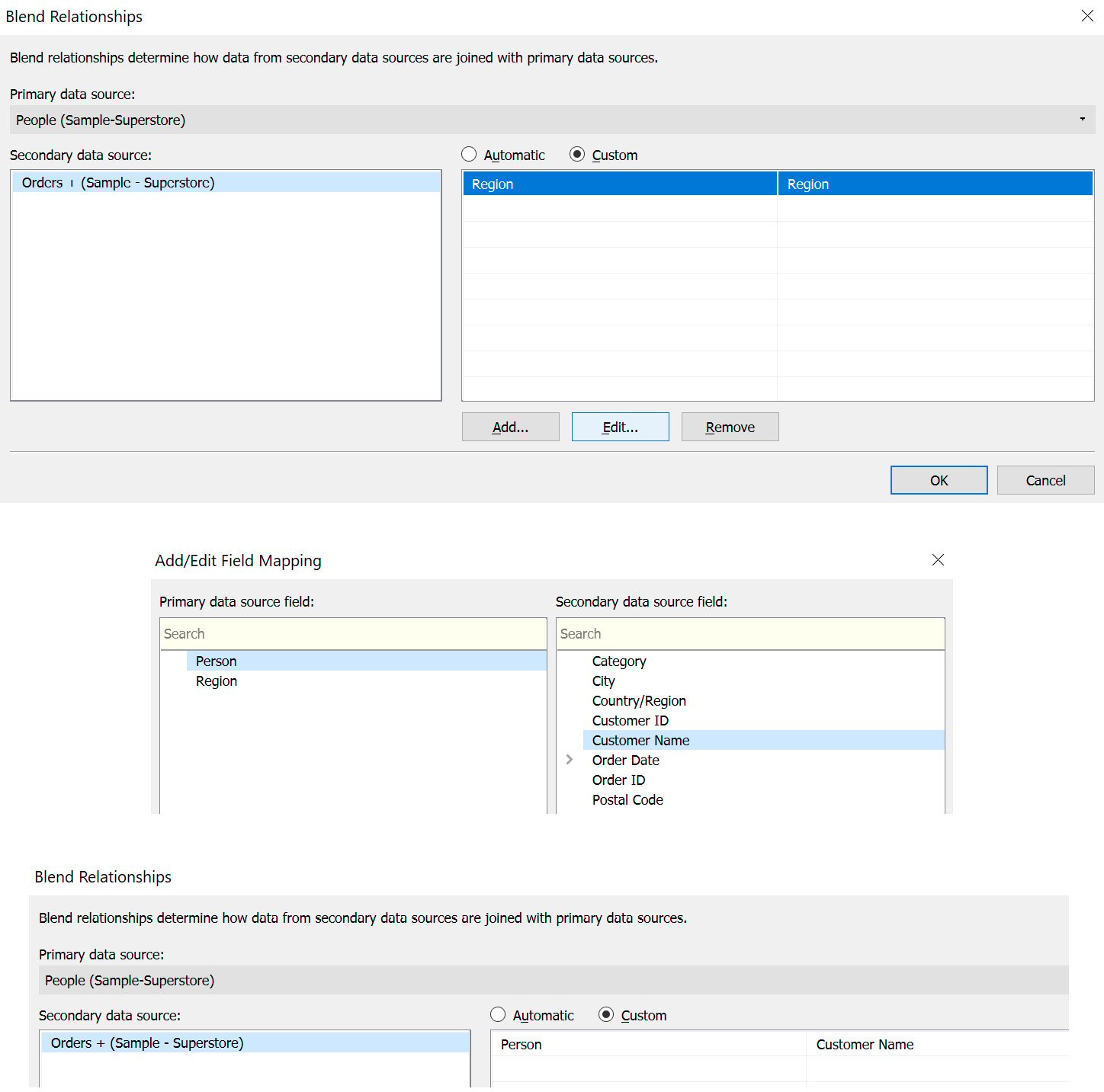
Figure 2.72: Selecting the matching columns between the two data sources
Thus, you have successfully blended the two data sources and can visualize your data in the next exercise.
Exercise 2.09: Visualizing Data Created from a Data Blend
In the previous exercise, you learned how to perform data blending between two data sources. In this exercise, you will create a visualization on the blended data to understand the application of a data blend – again, you will continue using the Orders table and the People table for this purpose. Note that a blend will only be active if you use the fields from these two data sources; otherwise, it will remain inactive.
Perform the following steps to complete this exercise:
- On the
Ordersdata, click and dragCustomer NametoRows.Note
Tableau versions later than 2020.1 may give a warning at this step that the field may contain more than 1000 rows. If this is the case, select
Add all membersto proceed.
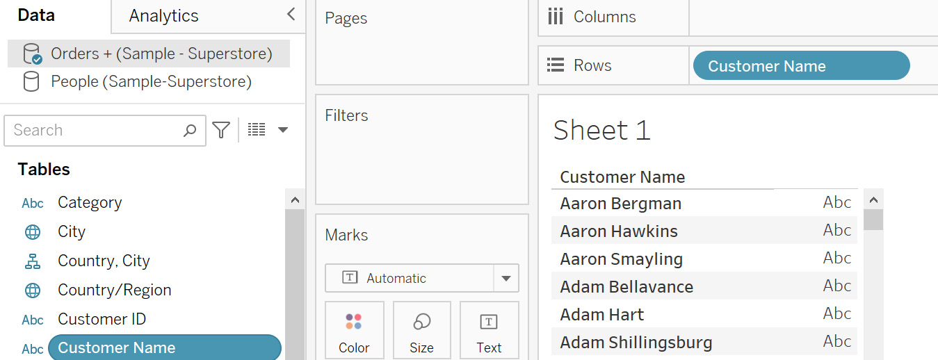
Figure 2.73: Adding the primary data source
This will now become your primary data source, indicated by the blue tick on the data source.
- Repeat the step for the
Peopledata source.
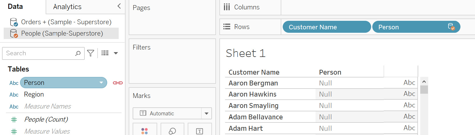
Figure 2.74: Adding the secondary data source
This will become your secondary data source, indicated by the orange tick on the data source. Also, notice the red linking icon that is used to link the two data sources.
Figure 2.75: Primary and secondary data source icons
- When you filter on
Personfor the four people that you have in thePeopledata, you will see that you have linked these values between these data sources. Click on thePersoncolumn dropdown and thenFilter…, uncheck theNullvalue, and clickOKto add the filter.
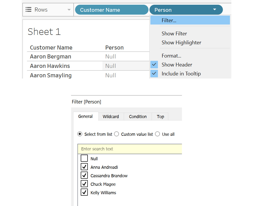
Figure 2.76: Filtering to remove unmatched values
You will get the following output, which shows the customer name matching Person:
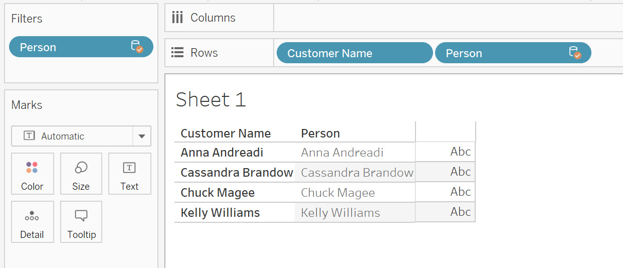
Figure 2.77: Data blend output
Using data blending, you can display data from various sources at multiple aggregation levels in different sheets. For instance, in one sheet, you can blend the data at the Year aggregation level, while in the other you can blend at the Month level.
This is possible because, in a data blend, the data sources are not joined at the input source. This provides the flexibility to have large data sources and blend only in certain sheets where required. This can help make the dashboard render faster.
Limitations of Data Blending
Data blending does not work with certain aggregation levels, such as MEDIAN and COUNTD (count distinct).
You cannot publish the blended data sources on Tableau Server directly. First, you need to publish the data sources individually on the server and then blend the published data sources in your Tableau Desktop instance. Publishing data sources means uploading your data and directly storing it on Tableau Server.
Another limitation is that the data used from the secondary data source must be at a higher aggregation level compared to the primary data source. If the aggregation level is not correct, an asterisk (*) will appear in the visualizations, indicating a one-to-many join aggregation level. You can swap the data sources to resolve this error.
This concludes the theory sections of this lesson. Next, you will put all you have learned into practice in the following activities.
Activity 2.01: Identifying the Returned Orders
As an analyst, you may encounter a situation where you would like to assess business performance by sales. It is therefore important to understand how many orders are fulfilled and how many are returned. If certain products are being returned frequently, it is a point of investigation as it can have serious consequences on the business.
Usually, order information is kept separate from returns information. Hence, to bring this information together, you need to join the two data sources.
For this activity, you will use the Orders and Returns tables from the Sample - Superstore Excel file. You are already aware of the Orders table.
The Returns table consists of the Order ID and Returned columns. Order ID is the ID that would match with the Orders table. The Returned column indicates Yes for the order ID.
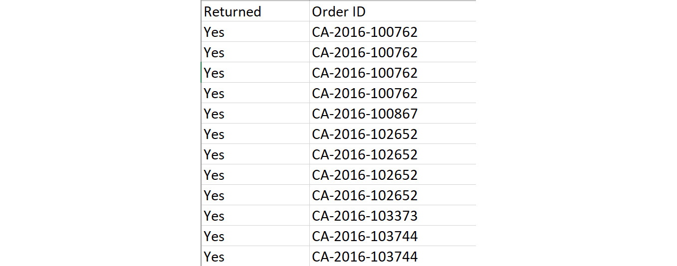
Figure 2.78: Returns sheet columns
The objective is to identify the returned orders after combining them with the main Orders table so that you may determine which orders were both fulfilled and returned.
The steps are as follows:
- Open the
Sample - Superstoredataset in your Tableau instance. - Rename the data source to
Activity 1. - Drag the
Orderstable onto the canvas. - Repeat the same steps for the
Returnstable. - You need to bring all the
OrdersandReturnstable values into the combined dataset. Can you identify the correct join based on the requirement? Remember that for an order to be returned, it should always be completed first. What can be interpreted if you change the join types to left, right, or full outer in this case? - Identify how many products were returned from the data grid. (An order can have multiple products clubbed in it.)
Final Output Expected:
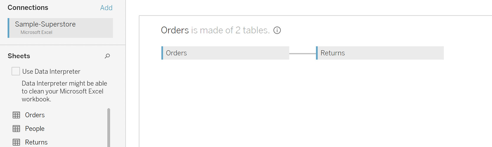
Figure 2.79: Choose the correct join
In this activity, you strengthened your knowledge of various joins and their outputs. You also learned how to interpret the results by changing the join types.
Note
The solution to this activity can be found here: https://packt.link/CTCxk.
Activity 2.02: Preparing Data for Visualization
Now that you have joined the data, the next step is to make sure that the data is ready for visualization. This involves performing data transformation activities such as cleaning the data by removing the null values. You may also be required to rename certain columns or add aliases, split the columns, and so on.
In this activity, you will perform some data transformation steps based on the left join output of the previous activity.
This activity will help you to strengthen the concepts of data transformation in Tableau. This is a very important process in any Tableau project. Hence, it becomes crucial that you are well experienced in doing these in Tableau.
The objective of this activity is to transform the data into a cleaned form for visualization. You need to first create an extract for this data source. Then you need to display the data only for the Furniture and Office Supplies categories. Is there a way to do this using the extract properties? You will also clean up the final data by changing any nulls to blanks. Let's also remove repeated terms such as Class from the Ship Mode column.
Once done, your data should be ready for visualization.
Continuing from Activity 2.01, the following steps will help you complete this activity:
- Open the
Sample - Superstoredataset in your Tableau instance. - Create a data extract for this data.
- Add a filter on the data to pull the
FurnitureandOffice Suppliescategories. Check the row count. - Transform the data by aliasing a few columns.
- Alias the null values from the columns of the
Returnstable to blanks. - Remove the word
Classfrom theShip Modecolumn.
Once completed, you should get the following output:
Final Output Expected:
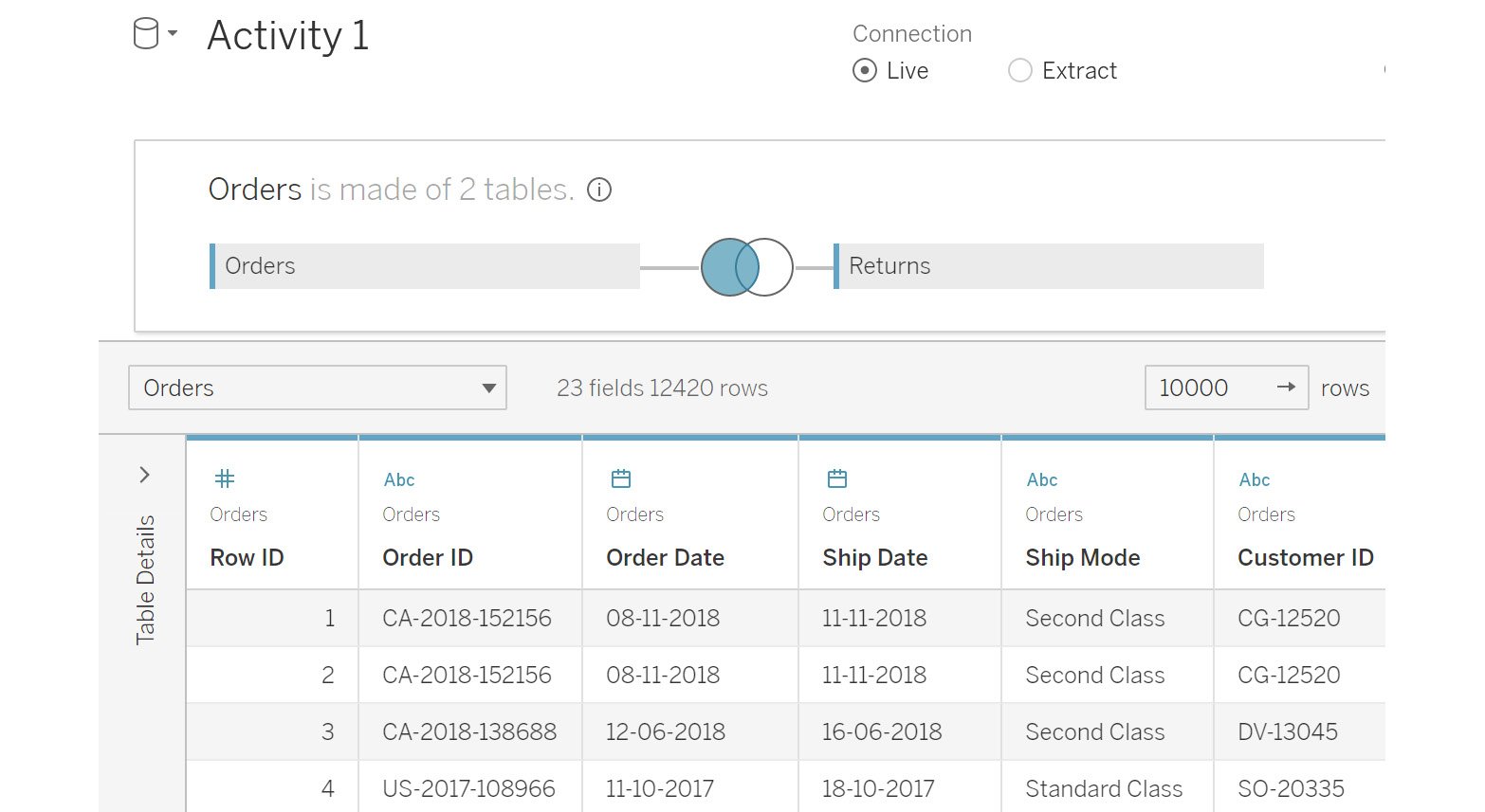
Figure 2.80: Final output for the activity
In this activity, you learned how to extract the data. You also added filters for the Category column to just pull the selected categories. Many times, you will work on projects that require the data to be segregated at the beginning, such as regional data. These filters help you to achieve exactly this. You also transformed the data using aliases, making it much cleaner by removing repeated words and nulls.
Note
The solution to this activity can be found here: https://packt.link/CTCxk.
Summary
In this chapter, you learned how to connect to various data sources, which is the foremost step in data analysis in Tableau. Next, you learned about the various join options that Tableau provides and data transformation options to optimize the data for the final visualization. Joining tables is one of the most common requirements in practical data analysis. For instance, if you have two tables for employee details and department details, to find the number of employees per department, you would use a join key to get the required information.
You also learned about some advanced data joining options of blending and custom SQL. The key takeaway from this chapter is how to connect data most efficiently based on the requirements and also how to transform the data so that it becomes more suitable for the visualization activity. The next chapter continues with the topic of data preparation in Tableau Prep.