


 Download code from GitHub
2. Unsupervised Learning – Real-Life Applications
Overview
This chapter explains the concept of clustering in machine learning. It explains three of the most common clustering algorithms, with a hands-on approximation to solve a real-life data problem. By the end of this chapter, you should have a firm understanding of how to create clusters out of a dataset using the k-means, mean-shift, and DBSCAN algorithms, as well as the ability to measure the accuracy of those clusters.
Introduction
In the previous chapter, we learned how to represent data in a tabular format, created features and target matrices, pre-processed data, and learned how to choose the algorithm that best suits the problem at hand. We also learned how the scikit-learn API works and why it is easy to use, as well as the difference between supervised and unsupervised learning.
This chapter focuses on the most important task in the field of unsupervised learning: clustering. Consider a situation in which you are a store owner wanting to make a targeted social media campaign to promote selected products to certain customers. Using clustering algorithms, you would be able to create subgroups of your customers, allowing you to profile those subgroups and target them accordingly. The main objective of this chapter is to solve a case study, where you will implement three different unsupervised learning solutions. These different applications serve to demonstrate the uniformity of the scikit-learn API, as well as to explain the steps taken to solve machine learning problems. By the end of this chapter, you will be able to understand the use of unsupervised learning to comprehend data in order to make informed decisions.
Clustering
Clustering is a type of unsupervised learning technique where the objective is to arrive at conclusions based on the patterns found within unlabeled input data. This technique is mainly used to segregate large data into subgroups in order to make informed decisions.
For instance, from a large list of restaurants in a city, it would be useful to segregate the data into subgroups (clusters) based on the type of food, quantity of clients, and style of experience, in order to be able to offer each cluster a service that's been configured to its specific needs.
Clustering algorithms divide the data points into n number of clusters so that the data points in the same cluster have similar features, whereas they differ significantly from the data points in other clusters.
Clustering Types
Clustering algorithms can classify data points using a methodology that is either hard or soft. The former designates data points completely to a cluster, whereas the latter method calculates the probability of each data point belonging to each cluster. For example, for a dataset containing customer's past orders that are divided into eight subgroups (clusters), hard clustering occurs when each customer is placed inside one of the eight clusters. On the other hand, soft clustering assigns each customer a probability of belonging to each of the eight clusters.
Considering that clusters are created based on the similarity between data points, clustering algorithms can be further divided into several groups, depending on the set of rules used to measure similarity. Four of the most commonly known sets of rules are explained as follows:
- Connectivity-based models: This model's approach to similarity is based on proximity in a data space. The creation of clusters can be done by assigning all data points to a single cluster and then partitioning the data into smaller clusters as the distance between data points increases. Likewise, the algorithm can also start by assigning each data point an individual cluster, and then aggregating data points that are close by. An example of a connectivity-based model is hierarchical clustering.
- Density-based models: As the name suggests, these models define clusters by their density in the data space. This means that areas with a high density of data points will become clusters, which are typically separated from one another by low-density areas. An example of this is the DBSCAN algorithm, which will be covered later in this chapter.
- Distribution-based models: Models that fall into this category are based on the probability that all the data points from a cluster follow the same distribution, such as a Gaussian distribution. An example of such a model is the Gaussian Mixture algorithm, which assumes that all data points come from a mixture of a finite number of Gaussian distributions.
- Centroid-based models: These models are based on algorithms that define a centroid for each cluster, which is updated constantly by an iterative process. The data points are assigned to the cluster where their proximity to the centroid is minimized. An example of such a model is the k-means algorithm, which will be discussed later in this chapter.
In conclusion, data points are assigned to clusters based on their similarity to each other and their difference from data points in other clusters. This classification into clusters can be either absolute or variably distributed by determining the probability of each data point belonging to each cluster.
Moreover, there is no fixed set of rules to determine similarity between data points, which is why different clustering algorithms use different rules. Some of the most commonly known sets of rules are connectivity-based, density-based, distribution-based, and centroid-based.
Applications of Clustering
As with all machine learning algorithms, clustering has many applications in different fields, some of which are as follows:
- Search engine results: Clustering can be used to generate search engine results containing keywords that are approximate to the keywords searched by the user and ordered as per the search result with greater similarity. Consider Google as an example; it uses clustering not only for retrieving results but also for suggesting new possible searches.
- Recommendation programs: It can also be used in recommendation programs that cluster together, for instance, people that fall into a similar profile, and then make recommendations based on the products that each member of the cluster has bought. Consider Amazon, for example, which recommends more items based on your purchase history and the purchases of similar users.
- Image recognition: This is where clusters are used to group images that are considered to be similar. For instance, Facebook uses clustering to help suggest who is present in a picture.
- Market segmentation: Clustering can also be used for market segmentation to divide a list of prospects or clients into subgroups in order to provide a customized experience or product. For example, Adobe uses clustering analysis to segment customers in order to target them differently by recognizing those who are more willing to spend money.
The preceding examples demonstrate that clustering algorithms can be used to solve different data problems in different industries, with the primary purpose of understanding large amounts of historical data that, in some cases, can be used to classify new instances.
Exploring a Dataset – Wholesale Customers Dataset
As part of the process of learning the behavior and applications of clustering algorithms, the following sections of this chapter will focus on solving a real-life data problem using the Wholesale Customers dataset, which is available at the UC Irvine Machine Learning Repository.
Note
Datasets in repositories may contain raw, partially pre-processed, or pre-processed data. To use any of these datasets, ensure that you read the specifications of the data that's available to understand the process that needs to be followed to model the data effectively, or whether it is the right dataset for your purpose.
For instance, the current dataset is an extract from a larger dataset, as per the following citation:
The dataset originates from a larger database referred on: Abreu, N. (2011). Analise do perfil do cliente Recheio e desenvolvimento de um sistema promocional. Mestrado em Marketing, ISCTE-IUL, Lisbon.
In the following section, we will analyze the contents of the dataset, which will then be used in Activity 2.01, Using Data Visualization to Aid the Pre-processing Process. To download a dataset from the UC Irvine Machine Learning Repository, perform the following steps:
- Access the following link: http://archive.ics.uci.edu/ml/datasets/Wholesale+customers.
- Below the dataset's title, find the download section and click on
Data Folder. - Click on the
Wholesale Customers data.csvfile to trigger the download and save the file in the same path as that of your current Jupyter Notebook.Note
You can also access it by going to this book's GitHub repository: https://packt.live/3c3hfKp
Understanding the Dataset
Each step will be explained generically and will then be followed by an explanation of its application in the current case study (the Wholesale Customers dataset):
- First of all, it is crucial to understand the way in which data is presented by the person who's responsible for gathering and maintaining it.
Considering that the dataset of the case study was obtained from an online repository, the format in which it is presented must be understood. The Wholesale Customers dataset consists of a snippet of historical data of clients from a wholesale distributor. It contains a total of 440 instances (each row) and eight features (each column).
- Next, it is important to determine the purpose of the study, which is dependent on the data that's available. Even though this might seem like a redundant statement, many data problems become problematic because the researcher does not have a clear view of the purpose of the study, and hence the pre-processing methodology, the model, and the performance metrics are chosen incorrectly.
The purpose of using clustering algorithms on the Wholesale Customers dataset is to understand the behavior of each customer. This will allow you to group customers with similar behaviors into one cluster. The behavior of a customer will be defined by how much they spent on each category of product, as well as the channel and the region where they bought products.
- Subsequently explore all the features that are available. This is mainly done for two reasons: first, to rule out features that are considered to be of low relevance based on the purpose of the study or that are considered to be redundant, and second, to understand the way the values are presented to determine some of the pre-processing techniques that may be needed.
The current case study has eight features, each one of which is considered to be relevant to the purpose of the study. Each feature is explained in the following table:
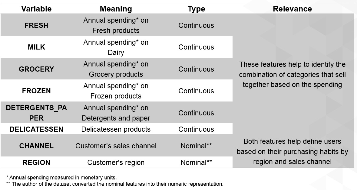
Figure 2.1: A table explaining the features in the case study
In the preceding table, no features are to be dismissed, and nominal (categorical) features have already been handled by the author of the dataset.
As a summary, the first thing to do when choosing a dataset or being handed one is to understand the characteristics that are visible at first glance, which involves recognizing the information available, then determining the purpose of the project, and finally revising the features to select those that will be part of the study. After this, the data can be visualized so that it can be understood before it's pre-processed.
Data Visualization
Once data has been revised to ensure that it can be used for the desired purpose, it is time to load the dataset and use data visualization to further understand it. Data visualization is not a requirement for developing a machine learning project, especially when dealing with datasets with hundreds or thousands of features. However, it has become an integral part of machine learning, mainly for visualizing the following:
- Specific features that are causing trouble (for example, those that contain many missing or outlier values) and how to deal with them.
- The results from the model, such as the clusters that have been created or the number of predicted instances for each labeled category.
- The performance of the model, in order to see the behavior along different iterations.
Data visualization's popularity in the aforementioned tasks can be explained by the fact that the human brain processes information easily when it is presented as charts or graphs, which allows us to have a general understanding of the data. It also helps us to identify areas that require attention, such as outliers.
Loading the Dataset Using pandas
One way of storing a dataset to easily manage it is by using pandas DataFrames. These work as two-dimensional size-mutable matrices with labeled axes. They facilitate the use of different pandas functions to modify the dataset for pre-processing purposes.
Most datasets found in online repositories or gathered by companies for data analysis are in Comma-Separated Values (CSV) files. CSV files are text files that display the data in the form of a table. Columns are separated by commas (,) and rows are on separate lines:
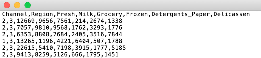
Figure 2.2: A screenshot of a CSV file
Loading a dataset stored in a CSV file and placing it into a DataFrame is extremely easy with the pandas read_csv() function. It receives the path to your file as an argument.
Note
When datasets are stored in different forms of files, such as in Excel or SQL databases, use the pandas read_xlsx() or read_sql() function, respectively.
The following code shows how to load a dataset using pandas:
import pandas as pd
file_path = "datasets/test.csv"
data = pd.read_csv(file_path)
print(type(data))
First of all, pandas is imported. Next, the path to the file is defined in order to input it into the read_csv() function. Finally, the type of the data variable is printed to verify that a Pandas DataFrame has been created.
The output is as follows:
<class 'pandas.core.frame.DataFrame'>
As shown in the preceding snippet, the variable named data is of a pandas DataFrame.
Visualization Tools
There are different open source visualization libraries available, from which seaborn and matplotlib stand out. In the previous chapter, seaborn was used to load and display data; however, from this section onward, matplotlib will be used as our visualization library of choice. This is mainly because seaborn is built on top of matplotlib with the sole purpose of introducing a couple of plot types and to improve the format of the displays. Therefore, once you've learned about matplotlib, you will also be able to import seaborn to improve the visual quality of your plots.
Note
For more information about the seaborn library, visit the following link: https://seaborn.pydata.org/.
In general terms, matplotlib is an easy-to-use Python library that prints 2D quality figures. For simple plotting, the pyplot model of the library will suffice.
Some of the most commonly used plot types are explained in the following table:
Figure 2.3: A table listing the commonly used plot types (*)
The functions in the third column can be used after importing matplotlib and its pyplot model.
Note
Access matplotlib's documentation regarding the type of plot that you wish to use at https://matplotlib.org/ so that you can play around with the different arguments and functions that you can use to edit the result of your plot.
Exercise 2.01: Plotting a Histogram of One Feature from the Circles Dataset
In this exercise, we will be plotting a histogram of one feature from the circles dataset. Perform the following steps to complete this exercise:
Note
Use the same Jupyter Notebook for all the exercises within this chapter. The circles.csv file is available at https://packt.live/2xRg3ea.
For all the exercises and activities within this chapter, you will need to have Python 3.7, matplotlib, NumPy, Jupyter, and pandas installed on your system.
- Open a Jupyter Notebook to implement this exercise.
- First, import all of the libraries that you are going to be using by typing the following code:
import pandas as pd
import numpy as np
import matplotlib.pyplot as plt
The
pandaslibrary is used to save the dataset into a DataFrame,matplotlibis used for visualization, and NumPy is used in later exercises of this chapter, but since the same Notebook will be used, it has been imported here. - Load the circles dataset by using Pandas'
read_csvfunction. Type in the following code:data = pd.read_csv("circles.csv") plt.scatter(data.iloc[:,0], data.iloc[:,1]) plt.show()A variable named
datais created to store the circles dataset. Finally, a scatter plot is drawn to display the data points in a data space, where the first element is the first column of the dataset and the second element is the second column of the dataset, creating a two-dimensional plot:Note
The Matplotlib's
show()function is used to trigger the display of the plot, considering that the preceding lines only create it. When programming in Jupyter Notebooks, using theshow()function is not required, but it is good practice to use it since, in other programming environments, it is required to use the function to be able to display the plots. This will also allow flexibility in the code. Also, in Jupyter Notebooks, this function results in a much cleaner output.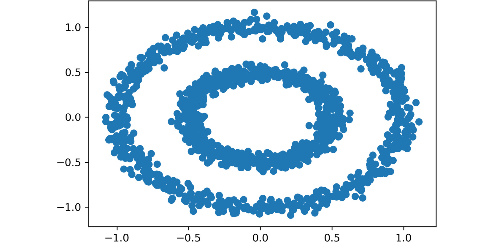
Figure 2.4: A scatter plot of the circles dataset
The final output is a dataset with two features and 1,500 instances. Here, the dot represents a data point (an observation), where the location is marked by the values of each of the features of the dataset.
- Create a histogram out of one of the two features. Use slicing to select the feature that you wish to plot:
plt.hist(data.iloc[:,0])
plt.show()
The plot will look similar to the one shown in the following graph:
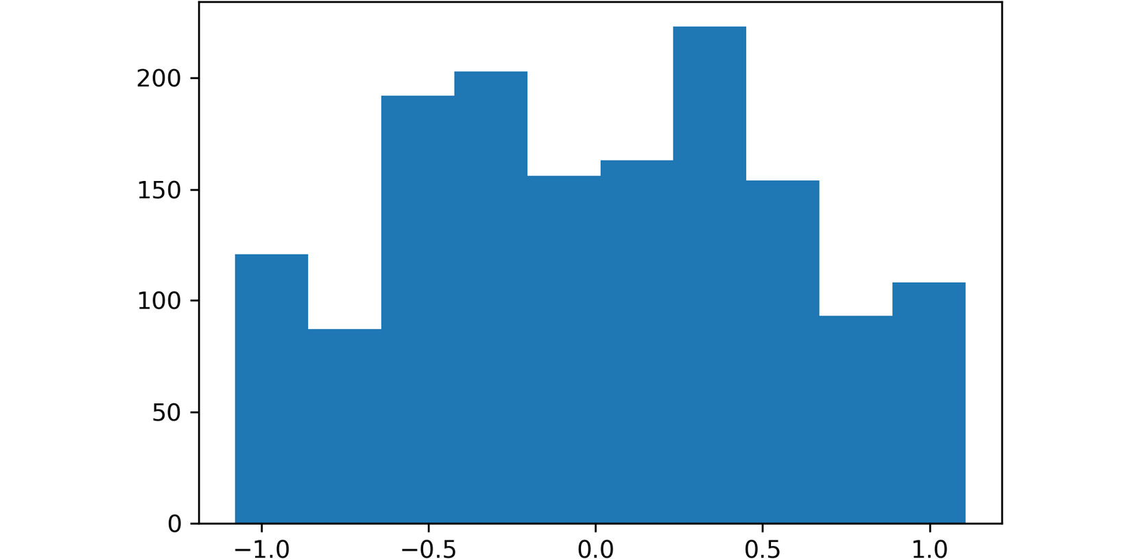
Figure 2.5: A screenshot showing the histogram obtained using data from the first feature
Note
To access the source code for this specific section, please refer to https://packt.live/2xRg3ea.
You can also run this example online at https://packt.live/2N0L0Rj. You must execute the entire Notebook in order to get the desired result.
You have successfully created a scatter plot and a histogram using matplotlib. Similarly, different plot types can be created using matplotlib.
In conclusion, visualization tools help you better understand the data that's available in a dataset, the results from a model, and the performance of the model. This happens because the human brain is receptive to visual forms, instead of large files of data.
Matplotlib has become one of the most commonly used libraries to perform data visualization. Among the different plot types that the library supports, there are histograms, bar charts, and scatter plots.
Activity 2.01: Using Data Visualization to Aid the Pre-processing Process
The marketing team of your company wants to know about the different profiles of the clients so that it can focus its marketing effort on the individual needs of each profile. To do so, it has provided your team with a list of 440 pieces of previous sales data. Your first task is to pre-process the data. You will present your findings using data visualization techniques in order to help your colleagues understand the decisions you took in that process. You should load a CSV dataset using pandas and use data visualization tools to help with the pre-processing process. The following steps will guide you on how to do this:
- Import all the required elements to load the dataset and pre-process it.
- Load the previously downloaded dataset by using Pandas'
read_csv()function, given that the dataset is stored in a CSV file. Store the dataset in a pandas DataFrame nameddata. - Check for missing values in your DataFrame. If present, handle the missing values and support your decision with data visualization.
Note
Use
data.isnull().sum()to check for missing values in the entire dataset at once, as we learned in the previous chapter. - Check for outliers in your DataFrame. If present, handle the outliers and support your decision with data visualization.
Note
Mark all the values that are three standard deviations away from the mean as outliers.
- Rescale the data using the formula for normalization or standardization.
Note
Standardization tends to work better for clustering purposes. The solution for this activity can be found via this link.
Expected output: Upon checking the DataFrame, you should find no missing values in the dataset and six features with outliers.
k-means Algorithm
The k-means algorithm is used to model data without a labeled class. It involves dividing the data into K number of subgroups. The classification of data points into each group is done based on similarity, as explained previously (refer to the Clustering Types section), which, for this algorithm, is measured by the distance from the center (centroid) of the cluster. The final output of the algorithm is each data point linked to the cluster it belongs to and the centroid of that cluster, which can be used to label new data in the same clusters.
The centroid of each cluster represents a collection of features that can be used to define the nature of the data points that belong there.
Understanding the Algorithm
The k-means algorithm works through an iterative process that involves the following steps:
- Based on the number of clusters defined by the user, the centroids are generated either by setting initial estimates or by randomly choosing them from the data points. This step is known as initialization.
- All the data points are assigned to the nearest cluster in the data space by measuring their respective distances from the centroid, known as the assignment step. The objective is to minimize the squared Euclidean distance, which can be defined by the following formula:
min dist(c,x)2Here,
crepresents a centroid,xrefers to a data point, anddist()is the Euclidean distance. - Centroids are calculated again by computing the mean of all the data points belonging to a cluster. This step is known as the update step.
Steps 2 and 3 are repeated in an iterative process until a criterion is met. This criterion can be as follows:
- The number of iterations defined.
- The data points do not change from cluster to cluster.
- The Euclidean distance is minimized.
The algorithm is set to always arrive at a result, even though this result may converge to a local or a global optimum.
The k-means algorithm receives several parameters as inputs to run the model. The most important ones to consider are the initialization method (init) and the number of clusters (K).
Note
To check out the other parameters of the k-means algorithm in the scikit-learn library, visit the following link: http://scikit-learn.org/stable/modules/generated/sklearn.cluster.KMeans.html.
Initialization Methods
An important input of the algorithm is the initialization method to be used to generate the initial centroids. The initialization methods allowed by the scikit-learn library are explained as follows:
k-means++: This is the default option. Centroids are chosen randomly from the set of data points, considering that centroids must be far away from one another. To achieve this, the method assigns a higher probability of being a centroid to those data points that are farther away from other centroids.random: This method chooses K observations randomly from the data points as the initial centroids.
Choosing the Number of Clusters
As we discussed previously, the number of clusters that the data is to be divided into is set by the user; hence, it is important to choose the number of clusters appropriately.
One of the metrics that's used to measure the performance of the k-means algorithm is the mean distance of the data points from the centroid of the cluster that they belong to. However, this measure can be counterproductive as the higher the number of clusters, the smaller the distance between the data points and its centroid, which may result in the number of clusters (K) matching the number of data points, thereby harming the purpose of clustering algorithms.
To avoid this, you can plot the average distance between the data points and the cluster centroid against the number of clusters. The appropriate number of clusters corresponds to the breaking point of the plot, where the rate of decrease drastically changes. In the following diagram, the dotted circle represents the ideal number of clusters:
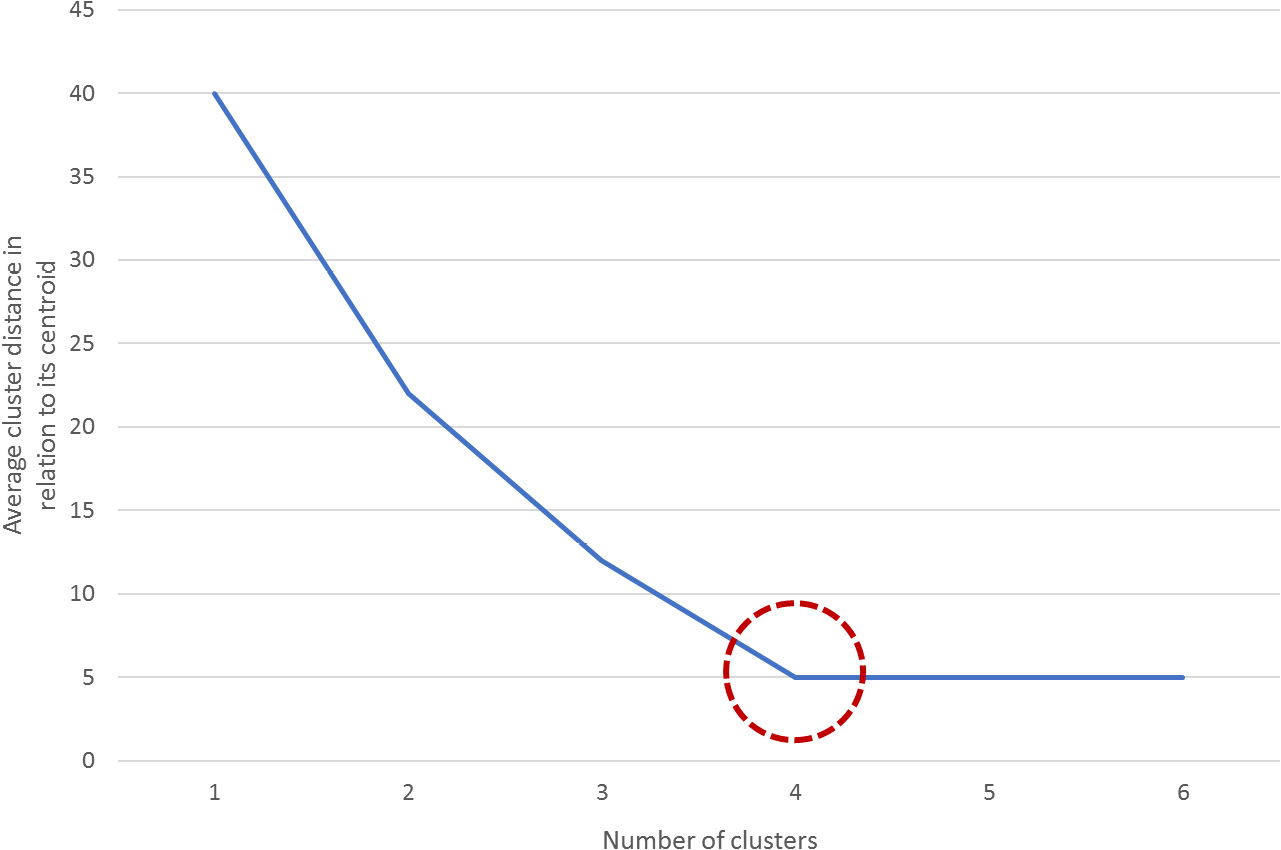
Figure 2.6: A graph demonstrating how to estimate the breaking point
Exercise 2.02: Importing and Training the k-means Algorithm over a Dataset
The following exercise will be performed using the same dataset from the previous exercise. Considering this, use the same Jupyter Notebook that you used to develop the previous exercise. Perform the following steps to complete this exercise:
- Open the Jupyter Notebook that you used for the previous exercise. Here, you should have imported all the required libraries and stored the dataset in a variable named
data. - Import the k-means algorithm from scikit-learn as follows:
from sklearn.cluster import KMeans
- To choose the value for K (that is, the ideal number of clusters), calculate the average distance of data points from their cluster centroid in relation to the number of clusters. Use 20 as the maximum number of clusters for this exercise. The following is a snippet of the code for this:
ideal_k = []
for i in range(1,21):
    est_kmeans = KMeans(n_clusters=i, random_state=0)
    est_kmeans.fit(data)
    ideal_k.append([i,est_kmeans.inertia_])
Note
The
random_stateargument is used to ensure reproducibility of results by making sure that the random initialization of the algorithm remains constant.First, create the variables that will store the values as an array and name it
ideal_k. Next, perform aforloop that starts at one cluster and goes as high as desired (considering that the maximum number of clusters must not exceed the total number of instances).For the previous example, there was a limitation of a maximum of 20 clusters to be created. As a consequence of this limitation, the
forloop goes from 1 to 20 clusters.Note
Remember that
range()is an upper bound exclusive function, meaning that the range will go as far as one value below the upper bound. When the upper bound is 21, the range will go as far as 20.Inside the
forloop, instantiate the algorithm with the number of clusters to be created, and then fit the data to the model. Next, append the pairs of data (number of clusters, average distance to the centroid) to the list namedideal_k.The average distance to the centroid does not need to be calculated as the model outputs it under the
inertia_attribute, which can be called out as[model_name].inertia_. - Convert the
ideal_klist into a NumPy array so that it can be plotted. Use the following code snippet:ideal_k = np.array(ideal_k)
- Plot the relations that you calculated in the preceding steps to find the ideal K to input to the final model:
plt.plot(ideal_k[:,0],ideal_k[:,1])
plt.show()
The output is as follows:
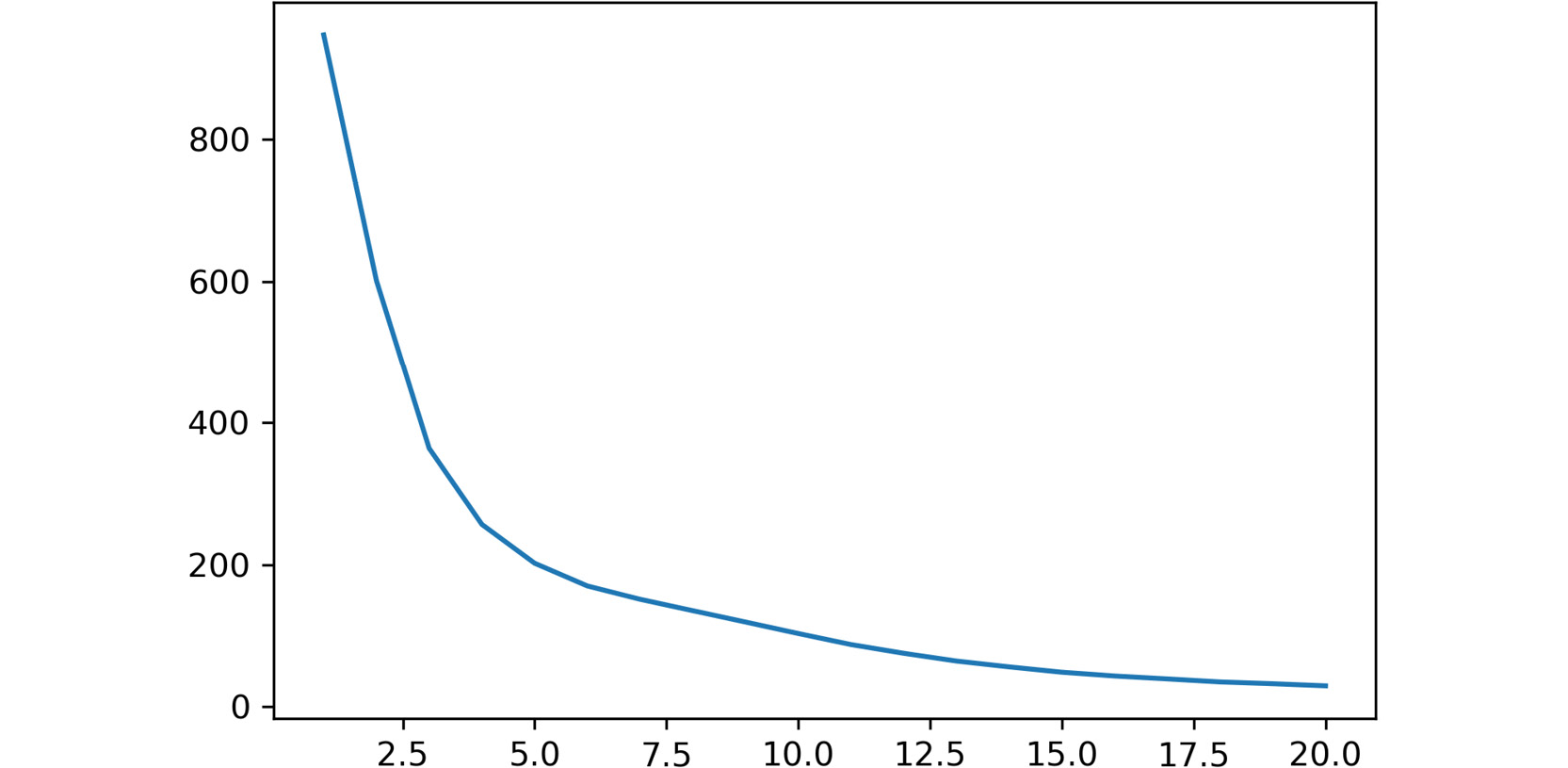
Figure 2.7: A screenshot showing the output of the plot function used
In the preceding plot, the x-axis represents the number of clusters, while the y-axis refers to the calculated average distance of each point in a cluster from their centroid.
The breaking point of the plot is around
5. - Train the model with
K=5. Use the following code:est_kmeans = KMeans(n_clusters=5, random_state=0) est_kmeans.fit(data) pred_kmeans = est_kmeans.predict(data)
The first line instantiates the model with
5as the number of clusters. Then, the data is fit to the model. Finally, the model is used to assign a cluster to each data point. - Plot the results from the clustering of data points into clusters:
plt.scatter(data.iloc[:,0], data.iloc[:,1], c=pred_kmeans)
plt.show()
The output is as follows:
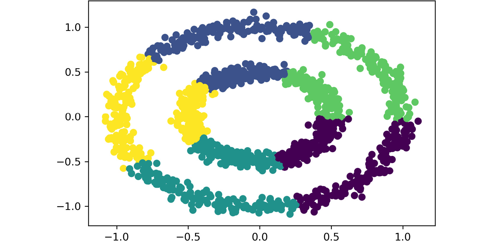
Figure 2.8: A screenshot showing the output of the plot function used
Since the dataset only contains two features, each feature is passed as input to the scatter plot function, meaning that each feature is represented by an axis. Additionally, the labels that were obtained from the clustering process are used as the colors to display the data points. Thus, each data point is located in the data space based on the values of both features, and the colors represent the clusters that were formed.
Note
For datasets with over two features, the visual representation of clusters is not as explicit as that shown in the preceding screenshot. This is mainly because the location of each data point (observation) in the data space is based on the collection of all of its features, and visually, it is only possible to display up to three features.
You have successfully imported and trained the k-means algorithm.
Note
To access the source code for this exercise, please refer to https://packt.live/30GXWE1.
You can also run this example online at https://packt.live/2B6N1c3. You must execute the entire Notebook in order to get the desired result.
In conclusion, the k-means algorithm seeks to divide the data into K number of clusters, K being a parameter set by the user. Data points are grouped together based on their proximity to the centroid of a cluster, which is calculated by an iterative process.
The initial centroids are set according to the initialization method that's been defined. Then, all the data points are assigned to the clusters with the centroid closer to their location in the data space, using the Euclidean distance as a measure. Once the data points have been divided into clusters, the centroid of each cluster is recalculated as the mean of all data points. This process is repeated several times until a stopping criterion is met.
Activity 2.02: Applying the k-means Algorithm to a Dataset
Ensure that you have completed Activity 2.01, Using Data Visualization to Aid the Pre-processing Process, before you proceed with this activity.
Continuing with the analysis of your company's past orders, you are now in charge of applying the k-means algorithm to the dataset. Using the previously loaded Wholesale Customers dataset, apply the k-means algorithm to the data and classify the data into clusters. Perform the following steps to complete this activity:
- Open the Jupyter Notebook that you used for the previous activity. There, you should have imported all the required libraries and performed the necessary steps to pre-process the dataset.
- Calculate the average distance of the data points from their cluster centroid in relation to the number of clusters. Based on this distance, select the appropriate number of clusters to train the model.
- Train the model and assign a cluster to each data point in your dataset. Plot the results.
Note
You can use the
subplots()function from Matplotlib to plot two scatter graphs at a time. To learn more about this function, visit Matplotlib's documentation at the following link: https://matplotlib.org/api/_as_gen/matplotlib.pyplot.subplots.html.The solution for this activity can be found via this link.
The visualization of clusters will differ based on the number of clusters (k) and the features to be plotted.
Mean-Shift Algorithm
The mean-shift algorithm works by assigning each data point a cluster based on the density of the data points in the data space, also known as the mode in a distribution function. Contrary to the k-means algorithm, the mean-shift algorithm does not require you to specify the number of clusters as a parameter.
The algorithm works by modeling the data points as a distribution function, where high-density areas (high concentration of data points) represent high peaks. Then, the general idea is to shift each data point until it reaches its nearest peak, which becomes a cluster.
Understanding the Algorithm
The first step of the mean-shift algorithm is to represent the data points as a density distribution. To do so, the algorithm builds upon the idea of Kernel Density Estimation (KDE), which is a method that's used to estimate the distribution of a set of data:
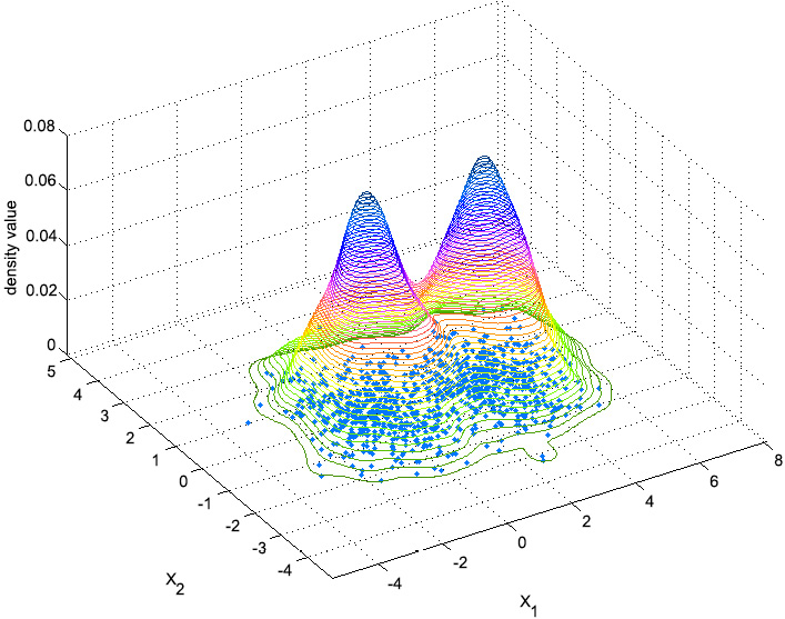
Figure 2.9: An image depicting the idea behind Kernel Density Estimation
In the preceding diagram, the dots at the bottom of the shape represent the data points that the user inputs, while the cone-shaped lines represent the estimated distribution of the data points. The peaks (high-density areas) will be the clusters. The process of assigning data points to each cluster is as follows:
- A window of a specified size (bandwidth) is drawn around each data point.
- The mean of the data inside the window is computed.
- The center of the window is shifted to the mean.
Steps 2 and 3 are repeated until the data point reaches a peak, which will determine the cluster that it belongs to.
The bandwidth value should be coherent with the distribution of the data points in the dataset. For example, for a dataset normalized between 0 and 1, the bandwidth value should be within that range, while for a dataset with all values between 1,000 and 2,000, it would make more sense to have a bandwidth between 100 and 500.
In the following diagram, the estimated distribution is represented by the lines, while the data points are the dots. In each of the boxes, the data points shift to the nearest peak. All the data points in a certain peak belong to that cluster:
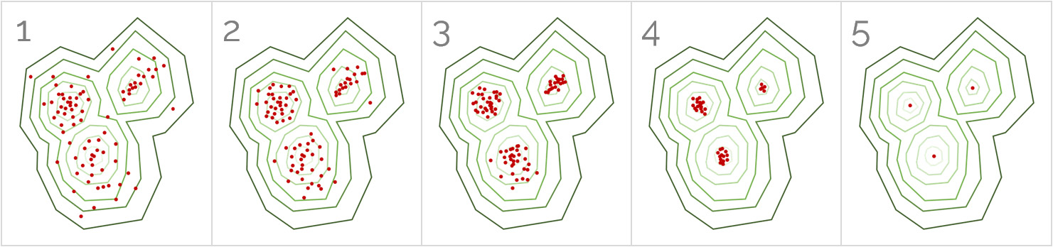
Figure 2.10: A sequence of images illustrating the working of the mean-shift algorithm
The number of shifts that a data point has to make to reach a peak depends on its bandwidth (the size of the window) and its distance from the peak.
Note
To explore all the parameters of the mean-shift algorithm in scikit-learn, visit http://scikit-learn.org/stable/modules/generated/sklearn.cluster.MeanShift.html.
Exercise 2.03: Importing and Training the Mean-Shift Algorithm over a Dataset
The following exercise will be performed using the same dataset that we loaded in Exercise 2.01, Plotting a Histogram of One Feature from the Circles Dataset. Considering this, use the same Jupyter Notebook that you used to develop the previous exercises. Perform the following steps to complete this exercise:
- Open the Jupyter Notebook that you used for the previous exercise.
- Import the k-means algorithm class from scikit-learn as follows:
from sklearn.cluster import MeanShift
- Train the model with a bandwidth of
0.5:est_meanshift = MeanShift(0.5) est_meanshift.fit(data) pred_meanshift = est_meanshift.predict(data)
First, the model is instantiated with a bandwidth of
0.5. Next, the model is fit to the data. Finally, the model is used to assign a cluster to each data point.Considering that the dataset contains values ranging from −1 to 1, the bandwidth value should not be above 1. The value of
0.5was chosen after trying out other values, such as 0.1 and 0.9.Note
Take into account the fact that the bandwidth is a parameter of the algorithm and that, as a parameter, it can be fine-tuned to arrive at the best performance. This fine-tuning process will be covered in Chapter 3, Supervised Learning – Key Steps.
- Plot the results from clustering the data points into clusters:
plt.scatter(data.iloc[:,0], data.iloc[:,1], c=pred_meanshift)
plt.show()
The output is as follows:
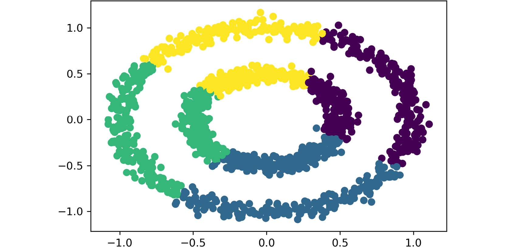
Figure 2.11: The plot obtained using the preceding code
Again, as the dataset only contains two features, both are passed as inputs to the scatter function, which become the values of the axes. Also, the labels that were obtained from the clustering process are used as the colors to display the data points.
The total number of clusters that have been created is four.
Note
To access the source code for this exercise, please refer to https://packt.live/37vBOOk.
You can also run this example online at https://packt.live/3e6uqM2. You must execute the entire Notebook in order to get the desired result.
You have successfully imported and trained the mean-shift algorithm.
In conclusion, the mean-shift algorithm starts by drawing the distribution function that represents the set of data points. This process consists of creating peaks in high-density areas, while leaving the areas with a low density flat.
Following this, the algorithm proceeds to classify the data points into clusters by shifting each point slowly and iteratively until it reaches a peak, which becomes its cluster.
Activity 2.03: Applying the Mean-Shift Algorithm to a Dataset
In this activity, you will apply the mean-shift algorithm to the dataset to see which algorithm fits the data better. Therefore, using the previously loaded Wholesale Consumers dataset, apply the mean-shift algorithm to the data and classify the data into clusters. Perform the following steps to complete this activity:
- Open the Jupyter Notebook that you used for the previous activity.
Note
Considering that you are using the same Jupyter Notebook, be careful not to overwrite any previous variables.
- Train the model and assign a cluster to each data point in your dataset. Plot the results.
The visualization of clusters will differ based on the bandwidth and the features that have been chosen to be plotted.
Note
The solution for this activity can be found via this link.
DBSCAN Algorithm
The density-based spatial clustering of applications with noise (DBSCAN) algorithm groups together points that are close to each other (with many neighbors) and marks those points that are further away with no close neighbors as outliers.
According to this, and as its name states, the algorithm classifies data points based on the density of all data points in the data space.
Understanding the Algorithm
The DBSCAN algorithm requires two main parameters: epsilon and the minimum number of observations.
Epsilon, also known as eps, is the maximum distance that defines the radius within which the algorithm searches for neighbors. The minimum number of observations, on the other hand, refers to the number of data points required to form a high-density area (min_samples). However, the latter is optional in scikit-learn as the default value is set to 5:
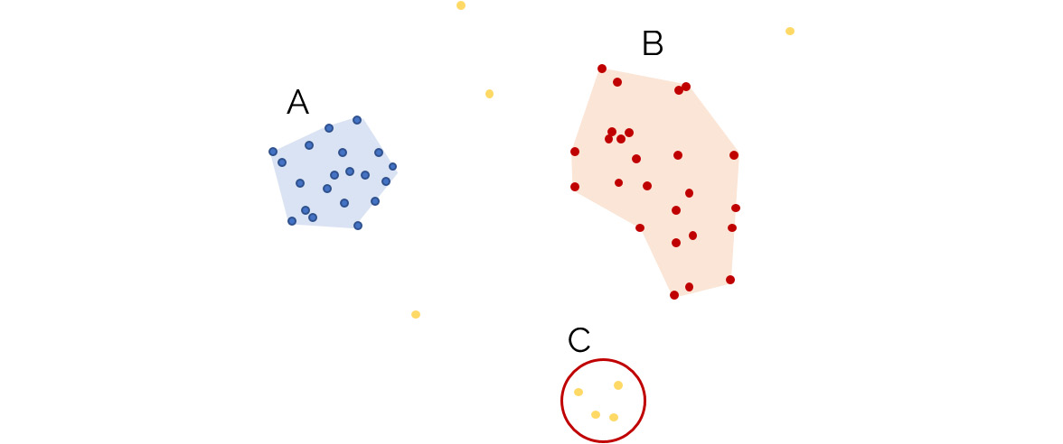
Figure 2.12: An illustration of how the DBSCAN algorithm classifies data into clusters
In the preceding diagram, the dots to the left are assigned to cluster A, while the dots to the upper right are assigned to cluster B. Moreover, the dots at the bottom right (C) are considered to be outliers, as well as any other data point in the data space, as they do not meet the required parameters to belong to a high-density area (that is, the minimum number of samples is not met, which, in this example, was set to 5).
Note
Similar to the bandwidth parameter, the epsilon value should be coherent with the distribution of the data points in the dataset, considering that it represents a radius around each data point.
According to this, each data point can be classified as follows:
- A core point: A point that has at least the minimum number of data points within its
epsradius. - A border point: A point that is within the eps radius of a core point, but does not have the required number of data points within its own radius.
- A noise point: All points that do not meet the preceding descriptions.
Note
To explore all the parameters of the DBSCAN algorithm in scikit-learn, visit http://scikit-learn.org/stable/modules/generated/sklearn.cluster.DBSCAN.html.
Exercise 2.04: Importing and Training the DBSCAN Algorithm over a Dataset
This exercise discusses how to import and train the DBSCAN algorithm over a dataset. We will be using the circles dataset from the previous exercises. Perform the following steps to complete this exercise:
- Open the Jupyter Notebook that you used for the previous exercise.
- Import the DBSCAN algorithm class from scikit-learn as follows:
from sklearn.cluster import DBSCAN
- Train the model with epsilon equal to
0.1:est_dbscan = DBSCAN(eps=0.1) pred_dbscan = est_dbscan.fit_predict(data)
First, the model is instantiated with
epsof0.1. Then, we use thefit_predict()function to fit the model to the data and assign a cluster to each data point. This bundled function, which includes both thefitandpredictmethods, is used because the DBSCAN algorithm in scikit-learn does not contain apredict()method alone.Again, the value of
0.1was chosen after trying out all other possible values. - Plot the results from the clustering process:
plt.scatter(data.iloc[:,0], data.iloc[:,1], c=pred_dbscan)
plt.show()
The output is as follows:
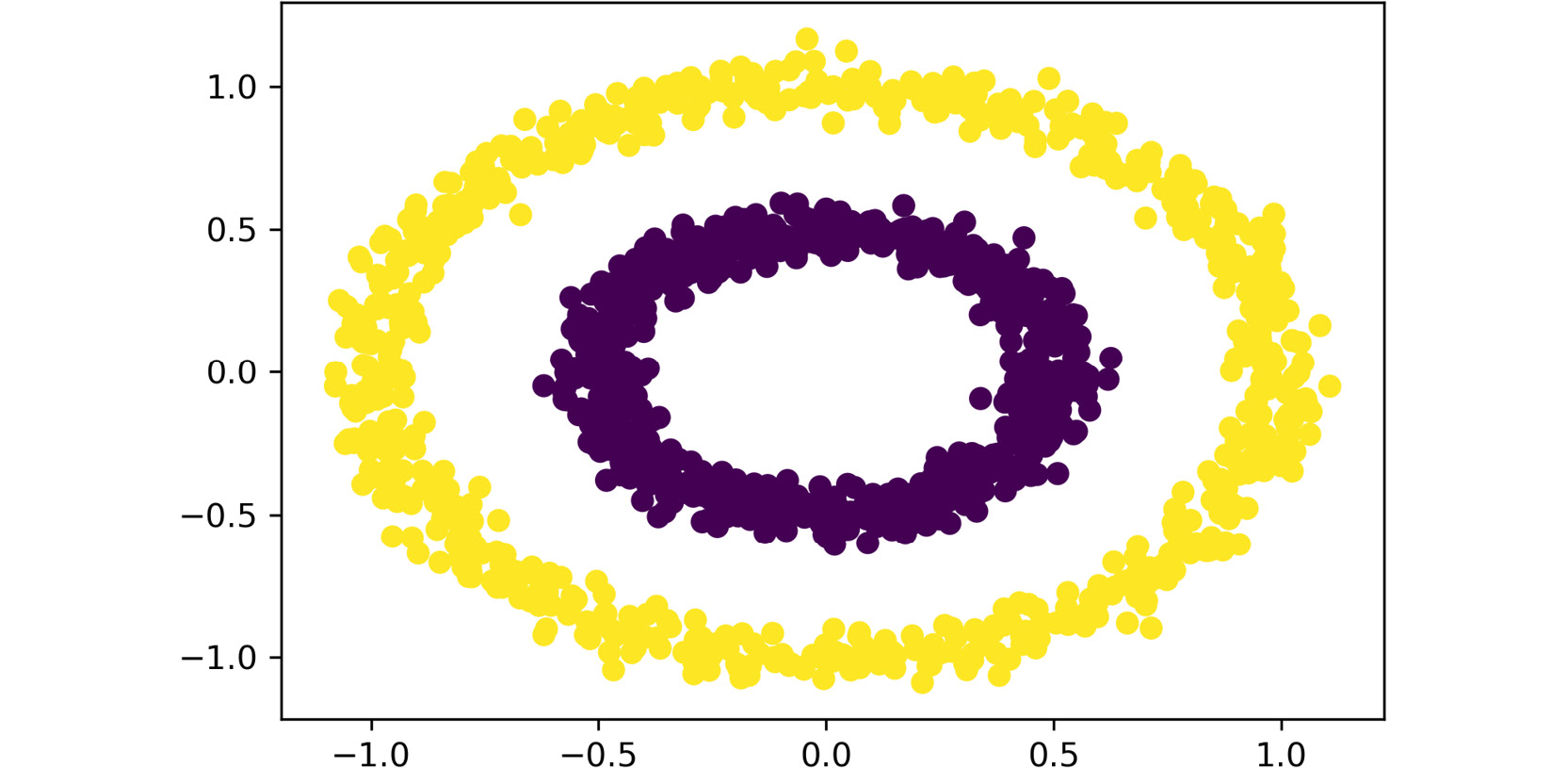
Figure 2.13: The plot obtained with the preceding code
As before, both features are passed as inputs to the scatter function. Also, the labels that were obtained from the clustering process are used as the colors to display the data points.
The total number of clusters that have been created is two.
As you can see, the total number of clusters created by each algorithm is different. This is because, as mentioned previously, each of these algorithms defines similarity differently and, as a consequence, each interprets the data differently.
Due to this, it is crucial to test different algorithms over the data to compare the results and define which one generalizes better to the data. The following topic will explore some methods that we can use to evaluate performance to help choose an algorithm.
Note
To access the source code for this exercise, please refer to https://packt.live/2Bcanxa.
You can also run this example online at https://packt.live/2UKHFdp. You must execute the entire Notebook in order to get the desired result.
You have successfully imported and trained the DBSCAN algorithm.
In conclusion, the DBSCAN algorithm bases its clustering classification on the density of data points in the data space. This means that clusters are formed by data points with many neighbors. This is done by considering that core points are those that contain a minimum number of neighbors within a set radius, border points are those that are located inside the radius of a core point but do not have the minimum number of neighbors within their own radius, and noise points are those that do not meet any of the specifications.
Activity 2.04: Applying the DBSCAN Algorithm to the Dataset
You will apply the DBSCAN algorithm to the dataset as well. This is basically because it is good practice to test out different algorithms when solving a data problem in order to choose the one that best fits the data, considering that there is no one model that performs well for all data problems. Using the previously loaded Wholesale Consumers dataset, apply the DBSCAN algorithm to the data and classify the data into clusters. Perform the following steps:
- Open the Jupyter Notebook that you used for the previous activity.
- Train the model and assign a cluster to each data point in your dataset. Plot the results.
Note
The solution for this activity can be found via this link.
The visualization of clusters will differ based on the epsilon and the features chosen to be plotted.
Evaluating the Performance of Clusters
After applying a clustering algorithm, it is necessary to evaluate how well the algorithm has performed. This is especially important when it is difficult to visually evaluate the clusters; for example, when there are several features.
Usually, with supervised algorithms, it is easy to evaluate their performance by simply comparing the prediction of each instance with its true value (class). On the other hand, when dealing with unsupervised models (such as clustering algorithms), it is necessary to pursue other strategies.
In the specific case of clustering algorithms, it is possible to evaluate performance by measuring the similarity of the data points that belong to the same cluster.
Available Metrics in Scikit-Learn
Scikit-learn allows its users to use three different scores for evaluating the performance of unsupervised clustering algorithms. The main idea behind these scores is to measure how well-defined the cluster's edges are, instead of measuring the dispersion within a cluster. Hence, it is worth mentioning that the scores do not take into account the size of each cluster.
The two most commonly used scores for measuring unsupervised clustering tasks are explained as follows:
- The Silhouette Coefficient Score calculates the mean distance between each point and all the other points of a cluster (a), as well as the mean distance between each point and all the other points of its nearest clusters (b). It relates both of them according to the following equation:
s = (b - a) / max(a,b)
The result of the score is a value between -1 and 1. The lower the value, the worse the performance of the algorithm. Values around 0 will imply overlapping of clusters. It is also important to clarify that this score does not work very well when using density-based algorithms such as DBSCAN.
- The Calinski–Harabasz Index was created to measure the relationship between the variance of each cluster and the variance of all clusters. More specifically, the variance of each cluster is the mean square error of each point with respect to the centroid of that cluster. On the other hand, the variance of all clusters refers to the overall inter-cluster variance.
The higher the value of the Calinski–Harabasz Index, the better the definition and separation of the clusters. There is no acceptable cut-off value, so the performance of the algorithms using this index is evaluated through comparison, where the algorithm with the highest value is the one that performs best. As with the Silhouette Coefficient, this score does not perform well on density-based algorithms such as DBSCAN.
Unfortunately, the scikit-learn library does not contain other methods for effectively measuring the performance of density-based clustering algorithms, and although the methods mentioned here may work in some cases to measure the performance of these algorithms, when they do not, there is no other way to measure this other than via manual evaluation.
However, it is worth mentioning that there are additional performance measures in scikit-learn for cases where a ground truth label is known, known as supervised clustering; for instance, when performing clustering over a set of observations of journalism students who have already signed up for a major or a specialization area. If we were to use their demographic information as well as some student records to categorize them into clusters that represent their choice of major, it would be possible to compare the predicted classification with the actual classification.
Some of these measures are as follows:
- Homogeneity score: This score is based on the premise that a clustering task is homogenous if all clusters only contain data points that belong to a single class label. The output from the score is a number between 0 and 1, with 1 being a perfectly homogeneous labeling. The score is part of scikit-learn's
metricsmodule, and it receives the list of ground truth clusters and the list of predicted clusters as inputs, as follows:from sklearn.metrics import homogeneity_score score = homogeneity_score(true_labels, predicted_labels)
- Completeness score: Opposite to the homogeneity score, a clustering task satisfies completeness if all data points that belong to a given class label belong to the same cluster. Again, the output measure is a number between 0 and 1, with 1 being the output for perfect completeness. This score is also part of scikit-learn's metrics modules, and it also receives the ground truth labels and the predicted ones as inputs, as follows:
from sklearn.metrics import completeness_score
score = completeness_score(true_labels, predicted_labels)
Note
To explore other measures that evaluate the performance of supervised clustering tasks, visit the following URL, under the clustering section: https://scikit-learn.org/stable/modules/classes.html#module-sklearn.metrics.
Exercise 2.05: Evaluating the Silhouette Coefficient Score and Calinski–Harabasz Index
In this exercise, we will learn how to calculate the two scores we discussed in the previous section that are available in scikit-learn. Perform the following steps to complete this exercise:
- Import the Silhouette Coefficient score and the Calinski-Harabasz Index from the scikit-learn library:
from sklearn.metrics import silhouette_score
from sklearn.metrics import calinski_harabasz_score
- Calculate the Silhouette Coefficient score for each of the algorithms we modeled in all of the previous exercises. Use the Euclidean distance as the metric for measuring the distance between points.
The input parameters of the
silhouette_score()function are the data, the predicted values of the model (the clusters assigned to each data point), and the distance measure:Note
The code snippet shown here uses a backslash (
\) to split the logic across multiple lines. When the code is executed, Python will ignore the backslash, and treat the code on the next line as a direct continuation of the current line.kmeans_score = silhouette_score(data, pred_kmeans, \ metric='euclidean') meanshift_score = silhouette_score(data, pred_meanshift, \ metric='euclidean') dbscan_score = silhouette_score(data, pred_dbscan, \ metric='euclidean') print(kmeans_score, meanshift_score, dbscan_score)
The first three lines call the
silhouette_score()function over each of the models (the k-mean, the mean-shift, and the DBSCAN algorithms) by inputting the data, the predictions, and the distance measure. The last line of code prints out the score for each of the models.The scores come to be around
0.359,0.3705, and0.1139for the k-means, mean-shift, and DBSCAN algorithms, respectively.You can observe that both k-means and mean-shift algorithms have similar scores, while the DBSCAN score is closer to zero. This can indicate that the performance of the first two algorithms is much better, and hence, the DBSCAN algorithm should not be considered to solve the data problem.
Nevertheless, it is important to remember that this type of score does not perform well when evaluating the DBSCAN algorithm. This is basically because as one cluster is surrounding the other one, the score can interpret that as an overlap when, in reality, the clusters are very well-defined, as is the case of the current dataset.
- Calculate the Calinski-Harabasz index for each of the algorithms we modeled in the previous exercises in this chapter. The input parameters of the
calinski_harabasz_score()function are the data and the predicted values of the model (the clusters assigned to each data point):kmeans_score = calinski_harabasz_score(data, pred_kmeans) meanshift_score = calinski_harabasz_score(data, pred_meanshift) dbscan_score = calinski_harabasz_score(data, pred_dbscan) print(kmeans_score, meanshift_score, dbscan_score)
Again, the first three lines apply the
calinski_harabasz_score()function over the three models by passing the data and the prediction as inputs. The last line prints out the results.The values come to approximately
1379.7,1305.14, and0.0017for the k-means, mean-shift, and DBSCAN algorithms, respectively. Once again, the results are similar to the ones we obtained using the Silhouette Coefficient score, where both the k-means and mean-shift algorithms performed similarly well, while the DBSCAN algorithm did not.Moreover, it is worth mentioning that the scale of each method (the Silhouette Coefficient score and the Calinski-Harabasz index) differs significantly, so they are not easily comparable.
Note
To access the source code for this specific section, please refer to https://packt.live/3e3YIif.
You can also run this example online at https://packt.live/2MXOQdZ. You must execute the entire Notebook in order to get the desired result.
You have successfully measured the performance of three different clustering algorithms.
In conclusion, the scores presented in this topic are a way of evaluating the performance of clustering algorithms. However, it is important to consider that the results from these scores are not definitive as their performance varies from algorithm to algorithm.
Activity 2.05: Measuring and Comparing the Performance of the Algorithms
You might find yourself in a situation in which you are not sure about the performance of the algorithms as it cannot be evaluated graphically. Therefore, you will have to measure the performance of the algorithms using numerical metrics that can be used to make comparisons. For the previously trained models, calculate the Silhouette Coefficient score and the Calinski-Harabasz index to measure the performance of the algorithms. The following steps provide hints regarding how you can do this:
- Open the Jupyter Notebook that you used for the previous activity.
- Calculate both the Silhouette Coefficient score and the Calinski-Harabasz index for all of the models that you trained previously.
The results may differ based on the choices you made during the development of the previous activities and how you initialized certain parameters in each algorithm. Nevertheless, the following results can be expected for a k-means algorithm set to divide the dataset into six clusters, a mean-shift algorithm with a bandwidth equal to 0.4, and a DBSCAN algorithm with an epsilon score of 0.8:
Silhouette Coefficient
K-means = 0.3515
mean-shift = 0.0933
DBSCAN = 0.1685
Calinski-Harabasz Index
K-means = 145.73
mean-shift = 112.90
DBSCAN = 42.45
Note
The solution for this activity can be found via this link.
Summary
Data problems where the input data is unrelated to the labeled output are handled using unsupervised learning models. The main objective of such data problems is to understand the data by finding patterns that, in some cases, can be generalized to new instances.
In this context, this chapter covered clustering algorithms, which work by aggregating similar data points into clusters, while separating data points that differ significantly.
Three different clustering algorithms were applied to the dataset and their performance was compared so that we can choose the one that best fits the data. Two different metrics for performance evaluation, the Silhouette Coefficient metric and the Calinski-Harabasz index, were also discussed in light of the inability to represent all of the features in a plot, and thereby graphically evaluate performance of the algorithms. However, it is important to understand that the result from the metric's evaluation is not absolute as some metrics perform better (by default) for some algorithms than for others.
In the next chapter, we will understand the steps involved in solving a data problem using supervised machine learning algorithms and learn how to perform error analysis.