


Data visualization has always been an integral part of an application, because of its power to quickly disseminate information. It is no different for an application developed using Sencha Ext JS or Sencha Touch frameworks. Recently, with the launch of Ext JS 5, Sencha has created a separate charting package—Sencha Charts—to add charting capability to an application. The beauty is that the same Sencha Charts library works inside desktop applications that run Ext JS, as well as in touch- or mobile-based applications that run Sencha Touch.
There are two ways to draw in a browser—Scalable Vector Graphics (SVG) and Canvas API. Though VML also exists for older IE browsers, we have excluded it for brevity. All the JavaScript charting libraries use SVG and Canvas API to offer charting capability to their users—for rendering as well as interactions. Understanding them will provide the foundation that is needed to understand Sencha Charts and its capabilities, and more importantly, reasons to use it.
SVG and Canvas are supported by browsers to render graphics. SVG was introduced in 1999 to render vector graphics, which can scale up or down, based on the screen resolution, without any visual distortion, as compared to raster one. SVG works similar to XML where you work with elements, attributes, and styles. SVG is a retained mode graphics model that is persisted in browser memory and we can manipulate it through code. This manipulation leads to automatic re-rendering where the user sees the updated drawing.
Canvas was a new specification brought to us by Apple in 2004. It follows an immediate mode graphics model, where it renders the drawing and forgets it. It does not have a built-in scene graph that SVG has, where it retains the graphics in memory and allows its manipulation. So, to recreate the same drawing, you will have to call the APIs to redraw it on the canvas.
In this chapter, we will do the following:
Create a chart using SVG
Create a chart using the HTML5 Canvas API
Create a chart using the Sencha Charts API
Compare the three to understand the advantages of using Sencha Charts
For demonstration and comparison, we will create a chart using Canvas API and SVG, and then we will create the same using Sencha Charts APIs.
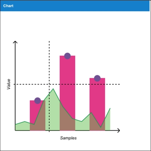
Our sample chart, as shown in the following figure, will have:
x (horizontal) and y (vertical) axes with labels
A column chart with circular markers in the middle of each bar
An area chart
A crosshair that appears on
mousemove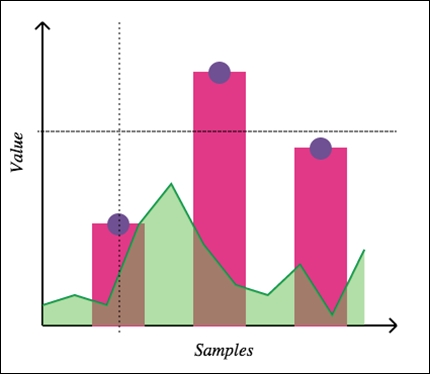
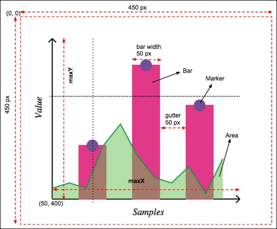
In our implementation, we will use a few terms, coordinates, and calculations. They are highlighted in the following diagram:
In this section, we will see how we can create the sample chart, described earlier, using Canvas API and SVG. Each of these technologies has their own advantages and context in which they will be used. Their discussion is not in the scope of this book. You may refer to the W3 specifications for their detailed documentation.
First of all, let's prepare our HTML to draw the chart. The Canvas APIs work with the <canvas> element, whereas SVG APIs work with the <svg> element.
The following table shows the HTML page for Canvas-based and SVG-based drawing approaches. The ch01_01.html code, which is on the left-hand side, contains the implementation using Canvas APIs, whereas ch01_02.html contains the implementation based on SVG APIs.
|
|
|
|---|---|
<!DOCTYPE HTML>
<html>
    <head>
    </head>
<body>
<canvas id="my-canvas" width="450" height="450" style="position: absolute; left: 0; top: 0; z-index: 1;"></canvas>
<canvas id="overlay" width="450" height="450" style="position: absolute; left: 0; top: 0; z-index: 2;"></canvas>

<script>
   //code will go here
</script>
</body>
</html> |
<!DOCTYPE html>
<html>
    <head>
    </head>
<body>
<svg id="my-drawing" width="450" height="450" xmlns="http://www.w3.org/2000/svg"
      xmlns:xlink="http://www.w3.org/1999/xlink"></svg>

<script>
   //code will go here
</script>
</body>

</html> |
All the JavaScript code that we will be writing will go inside the <script> tag.
Let's start by creating some helper methods for our chart, which we will use later to create the actual chart. We will have the Canvas and SVG code side by side for easier comparison.
Tip
Downloading the example code
You can download the example code files for all Packt books you have purchased from your account at http://www.packtpub.com. If you purchased this book elsewhere, you can visit http://www.packtpub.com/support and register to have the files e-mailed directly to you.
To create a line, Canvas provides path APIs—moveTo and lineTo—whereas SVG provides the <line> element. The following screenshot shows the code to create a line, which we will use to create the chart axis, and crosshair lines:
|
|
|
|---|---|
<script>
  function createLine(ctx, x1, y1, x2, y2, sw) {
    ctx.beginPath();
    ctx.moveTo(x1, y1);
    ctx.lineTo(x2, y2);
    ctx.lineWidth = sw ? sw : 2;
    ctx.strokeStyle = 'black';
    ctx.stroke();
    ctx.closePath();
} |
<script>
  var NS = "http://www.w3.org/2000/svg";
  function createLine(x1, y1, x2, y2, sw) {
    var line = document.createElementNS(NS, 'line');
    line.setAttribute('x1', x1);
    line.setAttribute('y1', y1);
    line.setAttribute('x2', x2);
    line.setAttribute('y2', y2);
    line.style.stroke = 'black';
    line.style["stroke-width"] = sw ? sw : 2;

    return line;
} |
An axis is a combination of a line and an arrow head. In the following code, the createAxis method can create an axis and the arrow head based on the line coordinates and the axis
direction value, which will be "v" to indicate vertical axis; or "h" to indicate horizontal axis. The direction value is used to calculate the path for drawing the arrow head.
In the following table, the code in the first column shows the implementation using the Canvas API, whereas the code in the second column shows the SVG equivalent of it:
|
|
|
|---|---|
  function createAxis(ctx, x1, y1, x2, y2, direction) {
    createLine(ctx, x1, y1, x2, y2);

    //draw arrow head
    if (direction === "v") {
      ctx.beginPath();
      ctx.moveTo(x1, y2);
      ctx.lineTo(x1 - 10*Math.sin(Math.PI/4), y2 + 10*Math.cos(Math.PI/4));
      ctx.moveTo(x1, y2);
      ctx.lineTo(x1 + 10*Math.sin(Math.PI/4), y2 + 10*Math.cos(Math.PI/4));
      ctx.lineWidth = 2,
      ctx.strokeStyle = 'black',
      ctx.stroke();
      ctx.closePath();
    }

    if (direction === "h") {
      ctx.beginPath();
      ctx.moveTo(x2, y1);
      ctx.lineTo(x2 - 10*Math.cos(Math.PI/4), x2 - 10*Math.sin(Math.PI/4));
      ctx.moveTo(x2, y1);
      ctx.lineTo(x2 - 10*Math.cos(Math.PI/4), x2 + 10*Math.sin(Math.PI/4));
      ctx.lineWidth = 2;
      ctx.strokeStyle = 'black';
      ctx.stroke();
      ctx.closePath();
    }
} |
  function createPath(p, stroke, fill) {
    var path = document.createElementNS(NS, 'path');

    path.setAttribute('d', p);
    path.style.stroke = stroke ? stroke : 'black';
    path.style["stroke-width"] = 2;
    path.style.fill = fill ? fill : 'none'


    return path;
  }

  function createAxis(x1, y1, x2, y2, direction) {
    var axis = document.createElementNS(NS, 'g');

    var line = createLine(x1, y1, x2, y2);
    var ah;

    //draw arrow head
    if (direction === "v") {
      var p = 'M' + x1 + ',' + y2 + ' L' + (x1 - 10*Math.sin(Math.PI/4)) + ',' + (maxY + 10*Math.cos(Math.PI/4));
      p += ' M' + x1 + ',' + y2 + ' L' + (x1 + 10*Math.sin(Math.PI/4)) + ',' + (maxY + 10*Math.cos(Math.PI/4));
      ah = createPath(p);
    }

    if (direction === "h") {
      var p = 'M' + x2 + ',' + y1 + ' L' + (x2 - 10*Math.cos(Math.PI/4)) + ',' + (x2 - 10*Math.sin(Math.PI/4));
      p += ' M' + x2 + ',' + y1 + ' L' + (x2 - 10*Math.cos(Math.PI/4)) + ',' + (x2 + 10*Math.sin(Math.PI/4));
      ah = createPath(p);
    }

    axis.appendChild(line);
    axis.appendChild(ah);

    return axis;
} |
The createLabel method creates a text label for an axis based on the specified direction. The Canvas approach uses transformation—translate and rotate—to render the vertical label, whereas the SVG approach uses the writing-mode style attribute of the <text> element. You may also use <tspan> with transformations to show the vertical axis label.
In the following table, the code in the first column shows the implementation of the method using the Canvas API, whereas the code in the second column shows the equivalent implementation using SVG specification:
|
|
|
|---|---|
  function createLabel(ctx, x, y, txt, direction) {

    ctx.font = 'Italic 1.1em Aerial';

    if (direction === 'v') {
      ctx.translate(x, y);
      ctx.rotate(-Math.PI/2);
      ctx.fillText(txt, 0, 0);

      //reset transformation
      ctx.setTransform(1, 0, 0, 1, 0, 0);
    } else {
      ctx.fillText(txt, x, y);
    }
} |
  function createLabel(x, y, txt, direction) {
    var text = document.createElementNS(NS, 'text');

    text.setAttribute('x', x);
    text.setAttribute('y', y);
    text.style.font = 'Italic 1.1em Aerial';
    if (direction === 'v') {
      text.style['writing-mode'] = 'tb';
    }

    var node = document.createTextNode(txt);
    text.appendChild(node);

    return text;
} |
To create a bar for our column chart, the createBar method draws a rectangle using the rect API of Canvas and the <rect> element of SVG.
|
|
|
|---|---|
  function createBar(ctx, x, y, w, h) {
    ctx.beginPath();
    ctx.moveTo(x, y);
    ctx.rect(x, y, w, h);

    ctx.fillStyle = '#E13987';
    ctx.lineWidth = 2;
    ctx.strokeStyle = '#E13987';
    ctx.stroke();
    ctx.fill();
    ctx.closePath();
  }
|
  function createBar(x, y, w, h) {
    var rect = document.createElementNS(NS, 'rect');

    rect.setAttribute('x', x);
    rect.setAttribute('y', y);
    rect.setAttribute('width', w);
    rect.setAttribute('height', h);
    rect.style.fill = '#E13987';
    rect.style.stroke = '#E13987';
    rect.style['stroke-width'] = 2;

    return rect;
  }
|
In our chart, we want to show circular markers on the top of the bars. The createMarker method will help us add markers to our drawing based on the location of its center and radius.
|
|
|
|---|---|
  function createMarker(ctx, cx, cy, r) {
    ctx.beginPath();

    ctx.arc(cx, cy, r, 0, 2*Math.PI, false);
    ctx.fillStyle = '#6F5092';
    ctx.lineWidth = 2;
    ctx.strokeStyle = '#6F5092';
    ctx.stroke();
    ctx.fill();

    ctx.closePath();
  }
|
  function createMarker(cx, cy, r) {
    var circle = document.createElementNS(NS, 'circle');

    circle.setAttribute('cx', cx);
    circle.setAttribute('cy', cy);
    circle.setAttribute('r', r);
    circle.style.fill = '#6F5092';
    circle.style.stroke = '#6F5092';
    circle.style['stroke-width'] = 2;

    return circle;
  }
|
This ends the list of helper methods that we need to create our chart. Let's see how we can use them to create the final output.
Now, we will enhance our script to create the chart in a step-by-step approach. We will start with the axis.
Before we start, we first need access to our drawing surface, either the canvas or <svg> element. Since we have already set the ID on the element, we can use the document.getElementById method to access them. Canvas API, however, requires us to additionally get the drawing context and use it for the drawing.
Once we have access to the drawing surface, we use the createAxis method to create the x and y axes, as shown in the following table:
|
|
|
|---|---|
  var canvas = document.getElementById('my-canvas');
  var ctx = canvas.getContext('2d');

  var samples = [100, 250, 175],
    gutter = 50,
    barWidth = 50,
    x0 = 50,
    y0 = 400,
    markerRadius = 10;


  //draw axes
  var maxX = x0 + samples.length*(barWidth + gutter) + gutter;
  var maxY = y0 - 250 - 50;
  createAxis(ctx, x0, y0, maxX, y0, 'h');
  createAxis(ctx, x0, y0, x0, maxY, 'v');
|
  var svg = document.getElementById('my-drawing');

  var samples = [100, 250, 175],
        gutter = 50,
        barWidth = 50,
        x0 = 50,
        y0 = 400,
        markerRadius = 10;

  //draw axes
  var maxX = x0 + samples.length*(barWidth + gutter) + gutter;
  var maxY = y0 - 250 - 50;
  var xAxis = createAxis(x0, y0, maxX, y0, 'h');
  var yAxis = createAxis(x0, y0, x0, maxY, 'v');

  svg.appendChild(xAxis);
  svg.appendChild(yAxis);
|
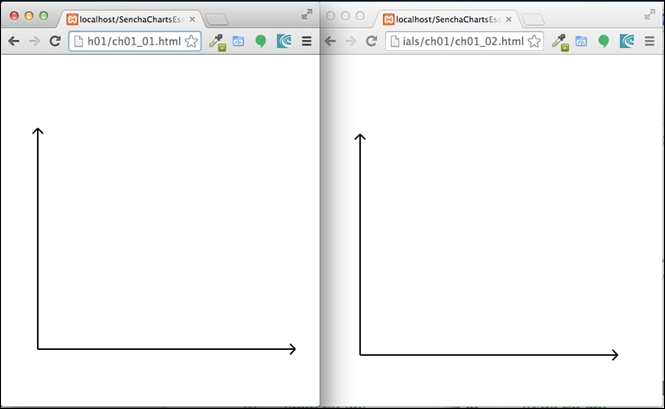
The following screenshot shows the output with x and y axes. Each axis has an arrowhead as well:
To draw a label on an axis, use the createLabel method, as shown in the following table:
|
|
|
|---|---|
  //create axis label
  createLabel(ctx, maxX/2, y0 + 30, 'Samples');
  createLabel(ctx, x0 - 20, y0 - (y0 - maxY)/2, 'Value', 'v');
|
  //create axis label
  var xLabel = createLabel(maxX/2, y0 + 30, 'Samples');
  var yLabel = createLabel(x0 - 20, y0 - (y0 - maxY)/2, 'Value', 'v');

  svg.appendChild(xLabel);
  svg.appendChild(yLabel);
|
The following output is produced to show the axis label:
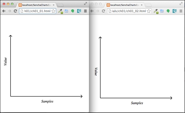
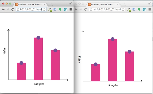
To create the bar for each sample data, we will use the createBar method and createMarker to show the marker on the top of each bar, as shown in the following table:
|
|
|
|---|---|
  //draw bars
  for (var i=0; i<samples.length; i++) {
    var x, y, w = barWidth, h = samples[i];
    x = x0 + gutter + i*(w + gutter);
    y = y0 - h;

    createBar(ctx, x, y, w, h);
    createMarker(ctx, x + w/2, y, markerRadius);
  }
|
  //draw bars
 for (var i=0; i<samples.length; i++) {
    var x, y, w = barWidth, h = samples[i];
    x = x0 + gutter + i*(w + gutter);
    y = y0 - h;

    var bar = createBar(x, y, w, h);
    var marker = createMarker(x + w/2, y, markerRadius);

    svg.appendChild(bar);
    svg.appendChild(marker);

  }
|
You may refer to the second figure in the Introducing the sample chart section for the barWidth and
gutter values. The following screenshot shows the output produced from the two applications:
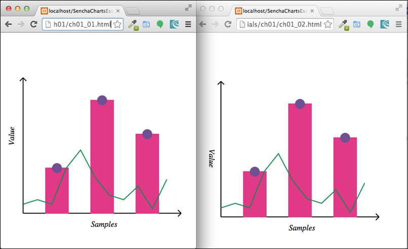
Our next step is to create an area chart. First, we will show the line and then we will fill the area.
The following code shows how to create the area chart with line stroke using a different sample—areaSamples:
|
|
|
|---|---|
  //draw area chart
  var areaSamples = [20, 30, 20, 100, 140, 80, 40, 30, 60, 10, 75];
  var n = areaSamples.length;
  var d = (maxX - x0)/n;
  //distance between the points
  var start = true;
  for (var i=0; i<n; i++) {
    var x = x0 + i*d , y = y0 - areaSamples[i];

    if (start) {
      ctx.beginPath();
      ctx.moveTo(x, y);
      start = false;
    }
    ctx.lineTo(x, y);
  }
  ctx.lineWidth = 2,
  ctx.strokeStyle = '#00904B',
  ctx.stroke();
  ctx.closePath();
|
  //draw area chart
  var areaSamples = [20, 30, 20, 100, 140, 80, 40, 30, 60, 10, 75];
  var n = areaSamples.length;
  var d = (maxX - x0)/n;
  //distance between the points
  var start = true;
  var p = '';
  for (var i=0; i<n; i++) {
    var x = x0 + i*d , y = y0 - areaSamples[i];

    if (start) {
      p += 'M' + x + ',' + y;
      start = false;
    }

    p += ' L' + x + ',' + y;
  }

  //area - with border
  var area = createPath(p, '#00904B');
  svg.appendChild(area);
|
We have used path APIs to create the line chart, which we will fill in the next section to make it an area chart. Run the two codes and you will see the following output:
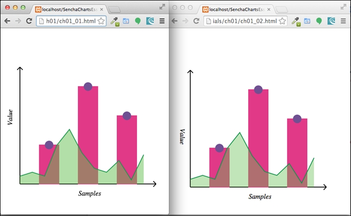
Now, let's fill the area under the line chart that we drew earlier to make it an area chart. To fill the area, we will have to end the path at its starting point.
Since we have added the area chart after the bar, the bar would be hidden behind the area chart. So, we will set the transparency when we fill the area. This way, the user can see the bar behind the area. To set the transparency in Canvas, we set the globalAlpha parameter, whereas in SVG, it is a bit more involved. We have to create a mask element with transparency level and use it to fill the area.
In the following table, the code in the first column shows the implementation using the Canvas API, whereas, the code in the second column shows the corresponding implementation using SVG:
|
|
|
|---|---|
  //fill the area chart
  start = true;
  ctx.globalAlpha = 0.5;
  ctx.fillStyle = '#64BD4F';
  for (var i=0; i<n; i++) {
    var x = x0 + i*d , y = y0 - areaSamples[i];

    if (start) {
      ctx.beginPath();
      ctx.moveTo(x, y0);
      start = false;
    }
    ctx.lineTo(x, y);

    if (i === (n - 1)) {
      ctx.lineTo(x, y0);
    }
  }
  ctx.fill();
  ctx.closePath();
|
  //fill the area chart
  p += ' L' + x + ',' + y0 + ' L' + x0 + ',' + y0 + ' Z';
  var fillArea = createPath(p, 'none', '#64BD4F');

  //transparency for the fill area
  var defs = document.createElementNS(NS, 'defs');
  var mask = document.createElementNS(NS, 'mask');
  mask.setAttribute('id', 'areamask');
  mask.setAttribute('x', 0);
  mask.setAttribute('y', 0);
  mask.setAttribute('width', 450);
  mask.setAttribute('height', 450);
  var fillArea1 = document.createElementNS(NS, 'path');
  fillArea1.setAttribute('d', p);
  fillArea1.style.fill = '#666666';
  mask.appendChild(fillArea1);
  defs.appendChild(mask);
  svg.appendChild(defs);

  fillArea.style.fill = '#64BD4F';
  fillArea.setAttribute('mask', 'url(#areamask)');
  svg.appendChild(fillArea);
|
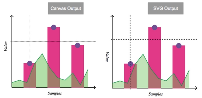
The following screenshot shows the output produced by these two codes:
The last item we are left with is crosshair lines. To show the crosshair line on mousemove in the Canvas approach, we will add one more <canvas> element on top (that is, higher z-index) of the existing one as an overlay layer. It is this overlay canvas that we will use to render crosshair lines. Here is the code snippet showing an additional overlay <canvas> element added to the document body:
<body>
    <canvas id="my-canvas" width="450" height="450" style="position: absolute; left: 0; top: 0; z-index: 1;"></canvas>
    <canvas id="overlay" width="450" height="450" style="position: absolute; left: 0; top: 0; z-index: 2;"></canvas>
<script>
...
We register the handler for mousemove on the overlay canvas. The handler clears the canvas using the clearRect API so that old lines get cleared before adding the crosshair lines.
In the SVG approach, we will use the same <svg> element. The lines are added beforehand and the handler code moves them to the new location based on mouse position by setting their coordinate related attributes.
There is a check we can make to ensure that we don't show the crosshair if the mouse is outside of the chart area.
The following table shows the code related to crosshair for Canvas as well as SVG:
|
|
|
|---|---|
  //show cross-hair
  var overlay = document.getElementById('overlay');
  var overCtx = overlay.getContext('2d');

  var lineDash = overCtx.getLineDash();
  overCtx.setLineDash([5,5]);
  overlay.addEventListener('mousemove', function(evt) {
    overCtx.clearRect(0, 0, overlay.width, overlay.height);
    var rect = overlay.getBoundingClientRect();
    var x = evt.clientX - rect.left,
    y = evt.clientY - rect.top;
    //don't show the cross-hair if we are outside the chart area
    if (x < x0 || x > maxX || y < maxY || y > y0) {
      return;
    }

    overCtx.beginPath();
    overCtx.moveTo(x0 - 5, y);
    overCtx.lineTo(maxX, y);
    overCtx.moveTo(x, maxY);
    overCtx.lineTo(x, y0 + 10);
    overCtx.strokeStyle = 'black',
    overCtx.stroke();
    overCtx.closePath();
  }, false);
|
  //show cross-hair
    var hl = createLine(-x0, -y0, -maxX, -y0);
    var vl = createLine(-x0, -y0, -x0, -maxY);
    hl.style['stroke-dasharray'] = [5,5];
    vl.style['stroke-dasharray'] = [5,5];
    svg.appendChild(hl);
    svg.appendChild(vl);
    svg.addEventListener('mousemove', function(evt) {
    var x = evt.offsetX || evt.clientX,
    y = evt.offsetY || evt.clientY;
    //don't show the cross-hair if we are outside the chart area
    if (x < x0 || x > maxX || y < maxY || y > y0) {
      return;
    }

    hl.setAttribute('x1', x0 - 5);
    hl.setAttribute('y1', y);
    hl.setAttribute('x2', maxX);
    hl.setAttribute('y2', y);

    vl.setAttribute('x1', x);
    vl.setAttribute('y1', maxY);
    vl.setAttribute('x2', x);
    vl.setAttribute('y2', y0 + 10);

  });
|
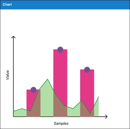
Here is the output of the two codes showing the crosshair lines when a user moves the mouse in the chart area:
So, we have our final output. Great! But wait! Imagine that you are a charts library developer or someone who wants to add charting capability to your application and has to support different browsers; some of them support SVG (for example, older ones), whereas some of them support Canvas. You can visit http://caniuse.com/ to review specific browser-related support. To ensure that your charts render on both types of browser, you will have to implement your code in SVG as well as Canvas, and then, based on the browser support, your code has to use one of them. The problem becomes even bigger if you have to support old IE browsers that support VML, as the APIs and approaches differ.
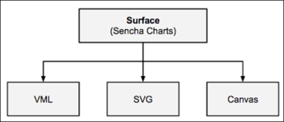
This is exactly the kind of problem we can solve using an abstraction called Surface, which is offered by Sencha Charts. Let's look at the Surface abstraction, what mechanism it offers for drawing, and how we can use them to create the same chart that we have created using the SVG and Canvas APIs.
Sencha Charts offers complete charting capability with built-in charts to serve your data visualization needs. While we will look at the different out-of-box charts and their extensions in subsequent chapters, here we will look at their abstraction class—Ext.draw.Surface—which abstracts the underlying API differences across browsers and provides a single consistent API, which renders drawings on SVG, Canvas, or VML based on what the underlying browser supports. The following diagram depicts the Surface class that translates its APIs to the underlying VML, SVG, or Canvas APIs based on the browser support:
To demonstrate the Surface API and its benefits, let's create a project using Sencha Cmd by running the following command:
sencha generate app SCE /path/to/application/folder
Modify your app.json file to add Sencha Charts support to your project by adding sencha-charts to the requires config. After this, refresh the application by running the following command so that Sencha Charts package is included into the application:
sencha app refresh
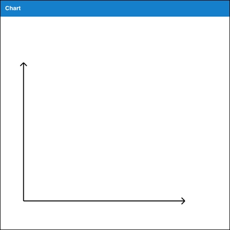
Sencha Cmd will generate a Main view class inside the app/view/main folder, which is the initial view rendered on the screen. Replace the content of the file with the following code to show the axes:
Ext.define('SCE.view.main.Main', {
   extend: 'Ext.container.Container',

   xtype: 'app-main',

   height: 850,
   width: 850,

   items: [{
       xtype: 'draw',
       title: 'Chart',
       height: 500,
       width: 500
   }],

   createLine: function(x1, y1, x2, y2, sw) {
       return {
           type: 'path',
           stroke: 'black',
           path: 'M' + x1 + ',' + y1 + ' L' + x2 + ',' + y2,
           lineWidth: sw ? sw : 2
       };

   },

   createPath: function(p, stroke, fill, opacity) {
       return {
           type: 'path',
           path: p,
           stroke: stroke ? stroke : 'black',
           lineWidth: 2,
           fillStyle: fill ? fill : 'none',
           fillOpacity: opacity ? opacity : 1
       };
   },

   createAxis: function(x1, y1, x2, y2, direction) {
       var line = this.createLine(x1, y1, x2, y2);
       var ah;

       //draw arrow head
       if (direction === "v") {
           var p = 'M' + x1 + ',' + y2 + ' L' + (x1 - 10*Math.sin(Math.PI/4)) + ',' + (this.maxY + 10*Math.cos(Math.PI/4));
           p += ' M' + x1 + ',' + y2 + ' L' + (x1 + 10*Math.sin(Math.PI/4)) + ',' + (this.maxY + 10*Math.cos(Math.PI/4));

           ah = this.createPath(p);
       }

       if (direction === "h") {
           var p = 'M' + x2 + ',' + y1 + ' L' + (this.maxX - 10*Math.cos(Math.PI/4)) + ',' + (this.maxX - 10*Math.sin(Math.PI/4));
           p += ' M' + x2 + ',' + y1 + ' L' + (this.maxX - 10*Math.cos(Math.PI/4)) + ',' + (this.maxX + 10*Math.sin(Math.PI/4));

           ah = this.createPath(p);
       }

       var axis = Ext.create('Ext.draw.sprite.Composite', {});
       axis.add(line);
       axis.add(ah);

       return axis;
   },

   afterRender: function() {
       var samples = [100, 250, 175],
           gutter = 50,
           barWidth = 50,
           x0 = 50,
           y0 = 400,
           markerRadius = 10;

       var drawCt = this.down('draw');

       var surface = drawCt.getSurface();

      //draw axes
       this.maxX = x0 + samples.length*(barWidth + gutter) + gutter;
       this.maxY = y0 - 250 - 50;
       surface.add(this.createAxis(x0, y0, this.maxX, y0, 'h'));
       surface.add(this.createAxis(x0, y0, x0, this.maxY, 'v'));

       this.callParent(arguments);
   }
});
The preceding code creates a container with a draw component that shows the x and y axes. The draw component contains the surface object that offers drawing APIs.
The createLine method creates a line using the path sprite. The createPath method creates a path using the path sprite. This is used to create the arrowhead of the axis.
The following code snippet creates two axes and adds them to the surface. The Surface class internally and uses VML/SVG/Canvas APIs to render the drawing on the screen:
surface.add(this.createAxis(x0, y0, this.maxX, y0, 'h'));
surface.add(this.createAxis(x0, y0, x0, this.maxY, 'v'));
The following screenshot shows the output produced by the preceding code:
Let's add a member method to the SCE.view.main.Main class to create the axis label. The following method uses the text sprite to create a label:
createLabel: function(x, y, txt) {

       return {
           type: 'text',
           x: x,
           y: y,
           text: txt,
           font: '1.1em arial italic'
       };

   }
The createBar member method uses a rectangle sprite to create a bar for our bar chart.
   createBar: function(x, y, w, h) {
       return {
           type: 'rect',
           x: x,
           y: y,
           width: w,
           height: h,
           fillStyle: '#E13987',
           stroke: '#E13987',
           lineWidth: 2
       };
   }
The following member method creates a marker at the specified coordinate:
   createMarker: function(cx, cy, r) {
       return {
           type: 'circle',
           cx: cx,
           cy: cy,
           r: r,
           fillStyle: '#6F5092',
           stroke: '#6F5092',
           lineWidth: 2
       };
   }
Now, let's add the following code to the afterRender method, before the this.callParent() call, to draw the axis label and bars with markers:
//create axis label
var xLabel = this.createLabel(this.maxX/2, y0 + 30, 'Samples');
var yLabel = this.createLabel(x0 - 40, y0 - (y0 - this.maxY)/2, 'Value');
yLabel.rotationRads = -Math.PI/2;
surface.add(xLabel);
surface.add(yLabel);
//draw bars
for (var i=0; i<samples.length; i++) {
var x, y, w = barWidth, h = samples[i];
x = x0 + gutter + i*(w + gutter);
y = y0 - h;
var bar = this.createBar(x, y, w, h);
var marker = this.createMarker(x + w/2, y, markerRadius);
surface.add(bar);
surface.add(marker);
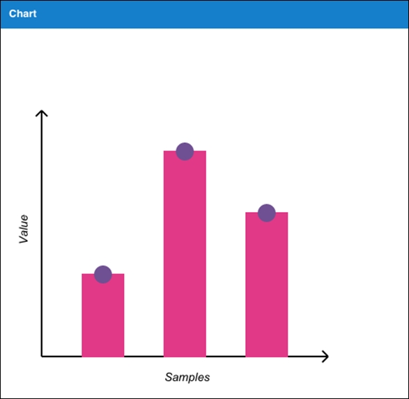
}Refreshing the URL in the browser, the code will produce the following output:
To create the area chart, add the following code to the afterRender member method before the this.callParent() call:
//draw area chart
var areaSamples = [20, 30, 20, 100, 140, 80, 40, 30, 60, 10, 75];
var n = areaSamples.length;
var gutter = (this.maxX - x0)/n;
var start = true;
var p = '';
for (var i=0; i<n; i++) {
   var x = x0 + i*gutter , y = y0 - areaSamples[i];

   if (start) {
       p += 'M' + x + ',' + y;
       start = false;
   }

   p += ' L' + x + ',' + y;
}

//area - with border
var area = this.createPath(p, '#00904B');
surface.add(area);

//fill the area chart
p += ' L' + x + ',' + y0 + ' L' + x0 + ',' + y0 + ' Z';
var fillArea = this.createPath(p,'none','#64BD4F', 0.5);
surface.add(fillArea);
The following screenshot shows the output produced after the preceding code is added:
The last item is creating the crosshair. The following code adds two lines to the overlay surface and then the mousemove handler changes its position by setting its path attributes:
//show cross-hair
var overlay = drawCt.getSurface('overlay');
var hl, vl, headerOffset;

hl = this.createLine(-x0, -y0, -x0, -y0);
vl = this.createLine(-x0, -y0, -x0, -y0);
hl.lineDash = [5,5];
vl.lineDash = [5,5];
hl = overlay.add(hl);
vl = overlay.add(vl);
this.getEl().addListener('mousemove', function(evt, target) {
   var x = evt.getX(),
       y = evt.getY();

   //don't show the cross-hair if we are outside the chart area
   if (x < x0 || x > this.maxX || y < this.maxY || y > y0) {
       return;
   }

   headerOffset = drawCt.getHeader().getHeight();

   hl.setAttributes({
       path: 'M' + (x0 - 5) + ',' + (y - headerOffset) + ' L' + this.maxX + ',' + (y - headerOffset)
   });

   vl.setAttributes({
       path: 'M' + x + ',' + this.maxY + ' L' + x + ',' + (y0 + 10)
   });

   overlay.renderFrame();
}, this);
The overlay surface sits on top of the main surface that we used earlier to draw the axes, bar, area chart, and so on. We will discuss in more detail the different types of surfaces when we get to Chapter 3, Sencha Charts Architecture.
In this chapter, we reviewed the supported browser drawing formats—Canvas and SVG—to create a drawing and we used them to create a basic chart. These are basic building blocks of any JavaScript charting library, such as Sencha Charts, FusionCharts, HighCharts, amCharts, and so on. In the second half of the chapter, we looked at the issues that these different APIs present when it comes to creating charts that work on different browsers and platforms, and how we can use the Surface APIs of Sencha Charts to address them. In the subsequent chapters, we will build on top of these fundamentals to understand more about Sencha Charts.
