


 Download code from GitHub
Grids - Placing Components on the Page
In this chapter, we'll cover the following recipes:
- Understanding breakpoints
- Filling space
- Abstracting containers and items
- Fixed column layout
- Column direction
Introduction
Material-UI grids are used to control the layout of screens in your app. Rather then implement your own styles to manage the layout of your Material-UI components, you can leverage the Grid component. Behind the scenes, it uses CSS flexbox properties to handle flexible layouts.
Applying breakpoints
A breakpoint is used by Material-UI to determine at what point to break the flow of content on the screen and continue it on the next line. Understanding how to apply breakpoints with Grid components is fundamental to implementing layouts in Material-UI applications.
How to do it...
Let's say that you have four elements that you want to lay out on the screen so that they're evenly spaced and occupy all available horizontal space. The code for this is as follows:
import React from 'react';
import { withStyles } from '@material-ui/core/styles';
import Paper from '@material-ui/core/Paper';
import Grid from '@material-ui/core/Grid';

const styles = theme => ({
  root: {
    flexGrow: 1
  },
  paper: {
    padding: theme.spacing(2),
    textAlign: 'center',
    color: theme.palette.text.secondary
  }
});

const UnderstandingBreakpoints = withStyles(styles)(({ classes }) => (
  <div className={classes.root}>
    <Grid container spacing={4}>
      <Grid item xs={12} sm={6} md={3}>
        <Paper className={classes.paper}>xs=12 sm=6 md=3</Paper>
      </Grid>
      <Grid item xs={12} sm={6} md={3}>
        <Paper className={classes.paper}>xs=12 sm=6 md=3</Paper>
      </Grid>
      <Grid item xs={12} sm={6} md={3}>
        <Paper className={classes.paper}>xs=12 sm=6 md=3</Paper>
      </Grid>
      <Grid item xs={12} sm={6} md={3}>
        <Paper className={classes.paper}>xs=12 sm=6 md=3</Paper>
      </Grid>
    </Grid>
  </div>
));

export default UnderstandingBreakpoints;
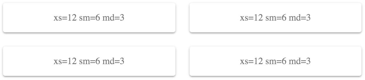
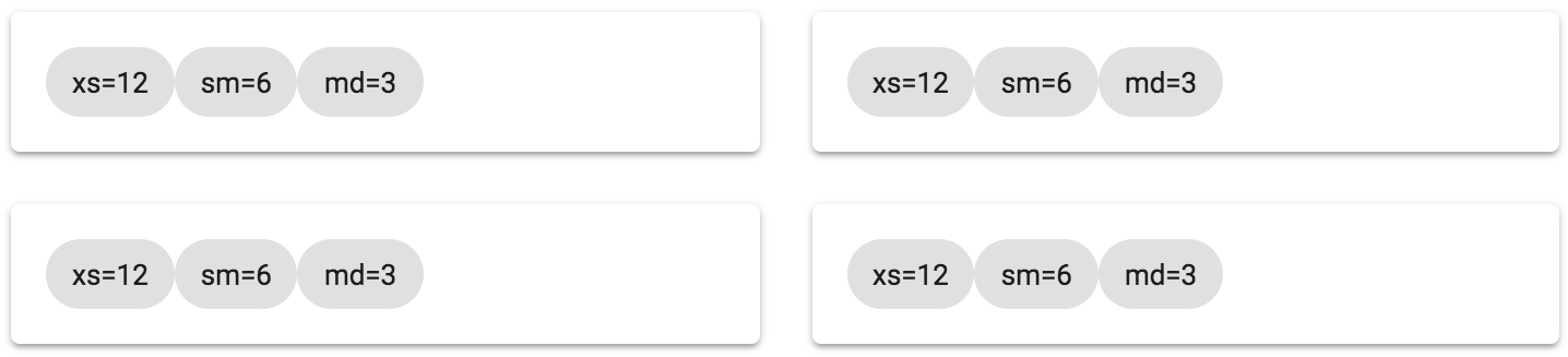
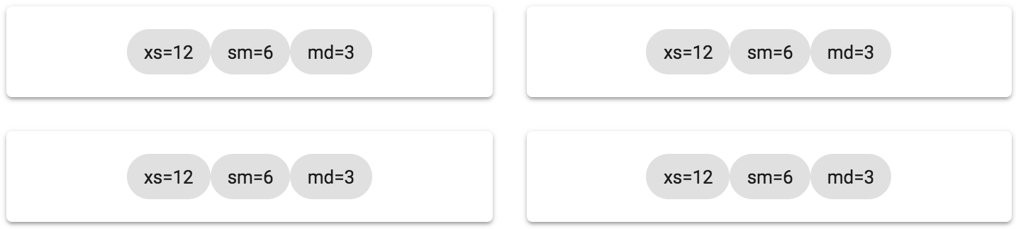
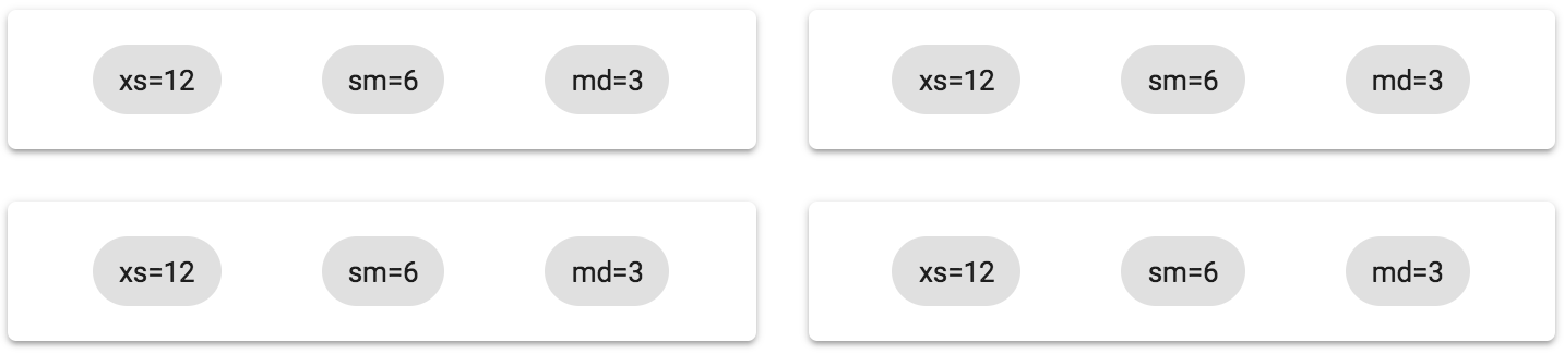
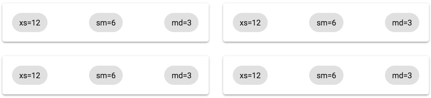
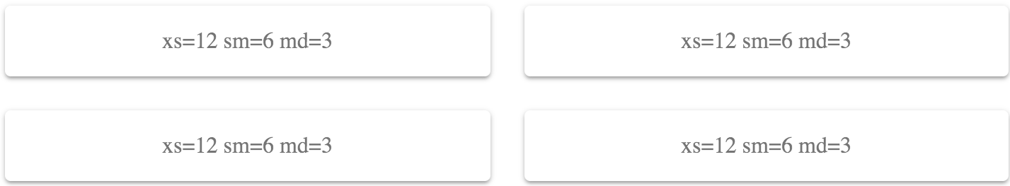
This renders four Paper components. The labels indicate the values used for the xs, sm, and md properties. Here's what the result looks like:
How it works...
Each of the breakpoint properties that you can pass to Grid components correspond to screen widths, as follows:
- xs >= 0px
- sm >= 600px
- md >= 960px
- lg >= 1280px
- xl >= 1920px
The screen shown previously had a pixel width of 725, which means that the Grid components used the sm breakpoint. The value passed to this property was 6. This can be a number from 1 to 12 and defines how many items will fit into the grid. This can be confusing, so it's helpful to think of these numbers in terms of percentages. For example, 6 would be 50% and, as the preceding screenshot shows, the Grid items take up 50% of the width.
For example, let's say that you want the width of each Grid item to take up 75% of the screen width when the small breakpoint is active. You could set the sm value to 9 (9/12 = 0.75), as follows:
<div className={classes.root}>
  <Grid container spacing={4}>
    <Grid item xs={12} sm={9} md={3}>
      <Paper className={classes.paper}>xs=12 sm=9 md=3</Paper>
    </Grid>
    <Grid item xs={12} sm={9} md={3}>
      <Paper className={classes.paper}>xs=12 sm=9 md=3</Paper>
    </Grid>
    <Grid item xs={12} sm={9} md={3}>
      <Paper className={classes.paper}>xs=12 sm=9 md=3</Paper>
    </Grid>
    <Grid item xs={12} sm={9} md={3}>
      <Paper className={classes.paper}>xs=12 sm=9 md=3</Paper>
    </Grid>
  </Grid>
</div>
Here's the result when the screen width is still at 725 pixels:
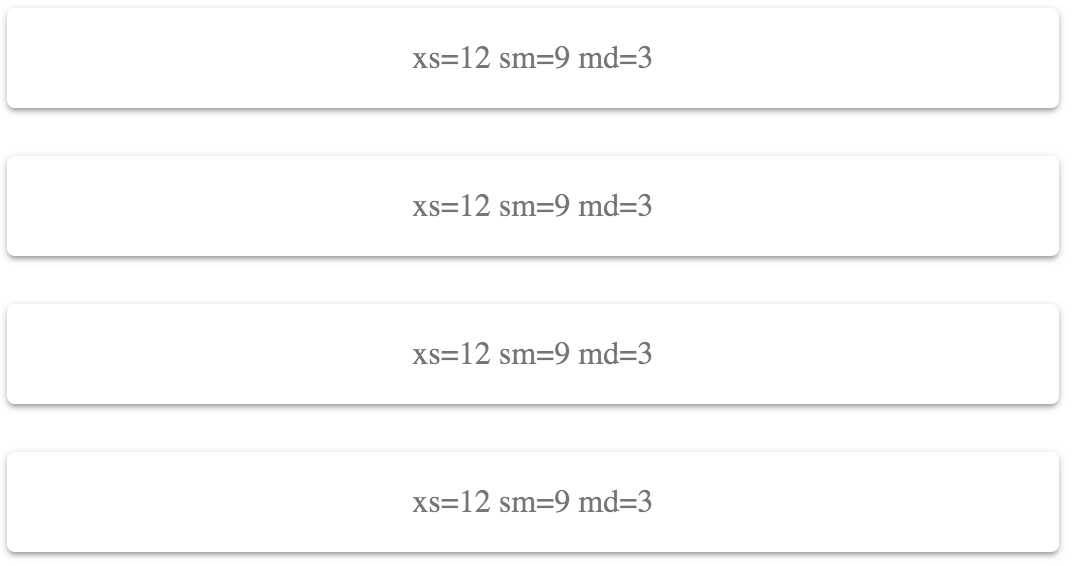
This combination of screen width and breakpoint value isn't optimal – there's a lot of wasted space to the right. By experimenting, you could make the sm value greater so that there's less wasted space, or you could make the value smaller so that more items fit on the row. For example, 6 looked better because exactly 2 items fit on the screen.
Let's take the screen width down to 575 pixels. This will activate the xs breakpoint with a value of 12 (100%):
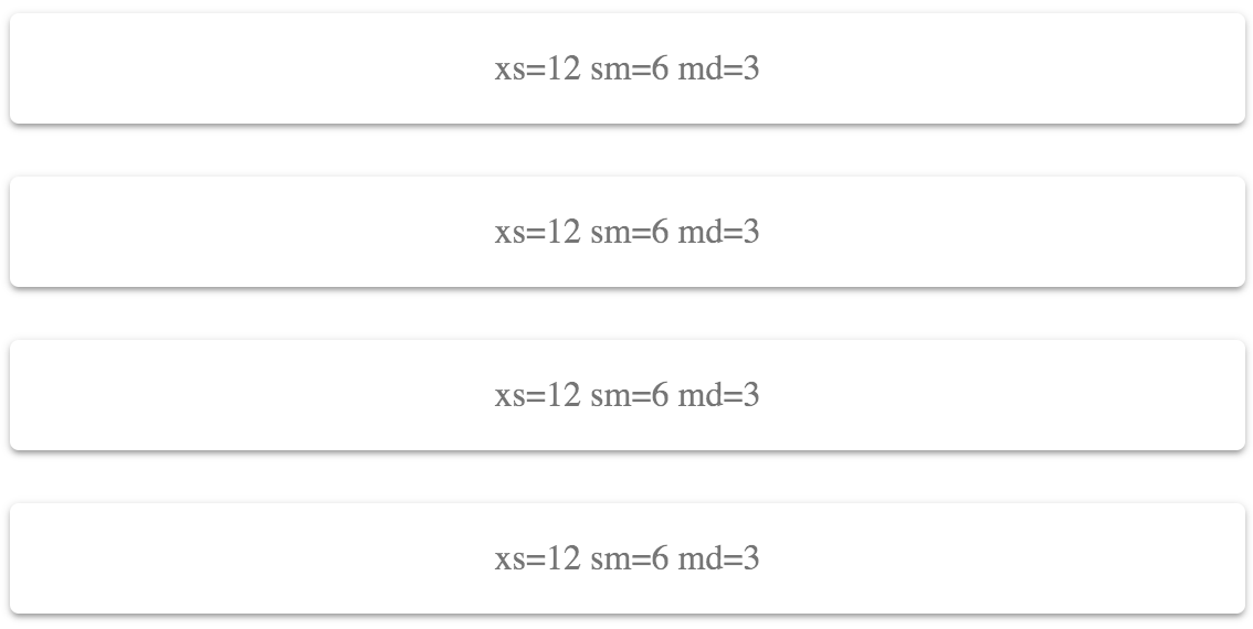
This layout works on smaller screens, because it doesn't try to fit too many grid items on one row.
There's more...
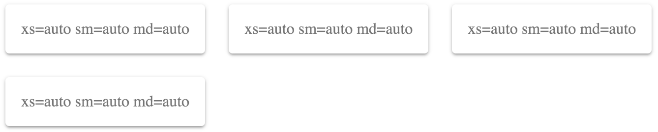
You can use the auto value for every breakpoint value if you're unsure of which value to use:
<div className={classes.root}>
  <Grid container spacing={4}>
    <Grid item xs="auto" sm="auto" md="auto">
      <Paper className={classes.paper}>
        xs=auto sm=auto md=auto
      </Paper>
    </Grid>
    <Grid item xs="auto" sm="auto" md="auto">
      <Paper className={classes.paper}>
        xs=auto sm=auto md=auto
      </Paper>
    </Grid>
    <Grid item xs="auto" sm="auto" md="auto">
      <Paper className={classes.paper}>
        xs=auto sm=auto md=auto
      </Paper>
    </Grid>
    <Grid item xs="auto" sm="auto" md="auto">
      <Paper className={classes.paper}>
        xs=auto sm=auto md=auto
      </Paper>
    </Grid>
  </Grid>
</div>
This will try to fit as many items as possible on each row. As the screen size changes, items are rearranged so that they fit on the screen accordingly. Here's what this looks like at a screen width of 725 pixels:
I would recommend replacing auto with a value from 1–12 at some point. The auto value is good enough that you can get started on other things without worrying too much about layout, but it's far from perfect for your production app. At least by setting up auto this way, you have all of your Grid components and breakpoint properties in place. You just need to play with the numbers until everything looks good.
See also
- Grid API documentation: https://material-ui.com/api/grid/
- Grid demos: https://material-ui.com/layout/grid/
- Breakpoint documentation: https://material-ui.com/layout/breakpoints/
Filling space
With some layouts, it is impossible to have your grid items occupy the entire width of the screen. Using the justify property, you can control how grid items fill the available space in the row.
How to do it...
Let's say that you have four Paper components to render in a grid. Inside each of these Paper components, you have three Chip components, which are nested grid items.
Here's what the code looks like:
import React from 'react';

import { withStyles } from '@material-ui/core/styles';
import Paper from '@material-ui/core/Paper';
import Grid from '@material-ui/core/Grid';
import Chip from '@material-ui/core/Chip';

const styles = theme => ({
  root: {
    flexGrow: 1
  },
  paper: {
    padding: theme.spacing(2),
    textAlign: 'center',
    color: theme.palette.text.secondary
  }
});

const FillingSpace = withStyles(styles)(({ classes, justify }) => (
  <div className={classes.root}>
    <Grid container spacing={4}>
      <Grid item xs={12} sm={6} md={3}>
        <Paper className={classes.paper}>
          <Grid container justify={justify}>
            <Grid item>
              <Chip label="xs=12" />
            </Grid>
            <Grid item>
              <Chip label="sm=6" />
            </Grid>
            <Grid item>
              <Chip label="md=3" />
            </Grid>
          </Grid>
        </Paper>
      </Grid>
    </Grid>
  </div>
));

export default FillingSpace;
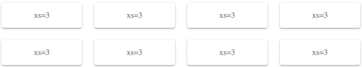
The justify property is specified on container Grid components. In this example, it's the container that contains the Chip components as items. Each container is using the flex-start value, which will align the Grid items at the start of the container. The result is as follows:
How it works...
The flex-start value of the justify property aligns all of the Grid items at the start of the container. In this case, the three Chip components in each of the four containers are all crammed to the left of the row. None of the space to the left of the items is filled. Instead of changing the breakpoint property values of these items, which results in changed widths, you can change the justify property value to tell the Grid container how to fill empty spaces.
For example, you could use the center value to align Grid items in the center of the container as follows:
<div className={classes.root}>
  <Grid container spacing={4}>
    <Grid item xs={12} sm={6} md={3}>
      <Paper className={classes.paper}>
        <Grid container justify="center">
          <Grid item>
            <Chip label="xs=12" />
          </Grid>
          <Grid item>
            <Chip label="sm=6" />
          </Grid>
          <Grid item>
            <Chip label="md=3" />
          </Grid>
        </Grid>
      </Paper>
    </Grid>
  </Grid>
</div>
The following screenshot shows what this change to the justify property value results in:
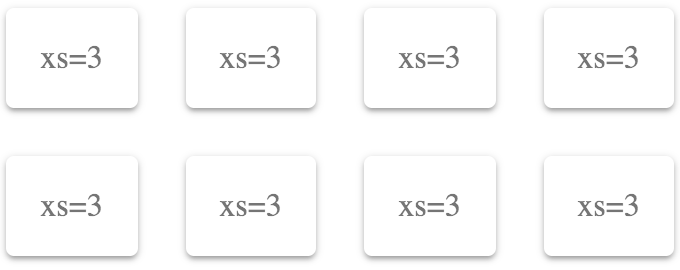
This does a good job of evenly distributing the empty space to the left and right of the Grid items. But the items still feel crowded because there's no space in between them. Here's what it looks like if you use the space-around value of the justify property:
This value does the best job of filling all the available space in the Grid container, without having to change the width of the Grid items.
There's more...
A variation on the space-around value is the space-between value. The two are similar in that they're effective at filling all of the space in the row. Here's what the example in the preceding section looks like using space-between:
All of the excess space in the row goes in between the Grid items instead of around them. In other words, use this value when you want to make sure that there's no empty space to the left and right of each row.
See also
- Grid demos: https://material-ui.com/layout/grid/
- Grid API documentation: https://material-ui.com/api/grid/
Abstracting containers and items
You have lots of screens in your app, each with lots of Grid components, used to create complex layouts. Trying to read source code that has a ton of <Grid> elements in it can be daunting. Especially when a Grid component is used for both containers and for items.
How to do it...
The container or the item property of Grid components determines the role of the element. You can create two components that use these properties and create an element name that's easier to read when you have lots of layout components:
import React from 'react';

import { withStyles } from '@material-ui/core/styles';
import Paper from '@material-ui/core/Paper';
import Grid from '@material-ui/core/Grid';

const styles = theme => ({
  root: {
    flexGrow: 1
  },
  paper: {
    padding: theme.spacing(2),
    textAlign: 'center',
    color: theme.palette.text.secondary
  }
});

const Container = props => <Grid container {...props} />;
const Item = props => <Grid item {...props} />;

const AbstractingContainersAndItems = withStyles(styles)(
  ({ classes }) => (
    <div className={classes.root}>
      <Container spacing={4}>
        <Item xs={12} sm={6} md={3}>
          <Paper className={classes.paper}>xs=12 sm=6 md=3</Paper>
        </Item>
        <Item xs={12} sm={6} md={3}>
          <Paper className={classes.paper}>xs=12 sm=6 md=3</Paper>
        </Item>
        <Item xs={12} sm={6} md={3}>
          <Paper className={classes.paper}>xs=12 sm=6 md=3</Paper>
        </Item>
        <Item xs={12} sm={6} md={3}>
          <Paper className={classes.paper}>xs=12 sm=6 md=3</Paper>
        </Item>
      </Container>
    </div>
  )
);

export default AbstractingContainersAndItems;
Here's what the resulting layout looks like:
How it works...
Let's take a closer look at the Container and Item components:
const Container = props => <Grid container {...props} />;
const Item = props => <Grid item {...props} />;
The Container component renders a Grid component with the container property set to true, and the Item component does the same, except with the item property set to true. Each component passes any additional properties to the Grid component, such as xs and sm breakpoints.
When you have lots of Grid containers and items that make up your layout, being able to see the difference between <Container> and <Item> elements makes your code that much easier to read. Contrast this with having <Grid> elements everywhere.
There's more...
If you find that you're using the same breakpoints over and over in your layouts, you can include them in in your higher-order Item component. Let's rewrite the example so that, in addition to the Item property, the xs, sm, and md properties are included as well:
const Container = props => <Grid container {...props} />;
const Item = props => <Grid item xs={12} sm={6} md={3} {...props} />;

const AbstractingContainersAndItems = withStyles(styles)(
  ({ classes }) => (
    <div className={classes.root}>
      <Container spacing={4}>
        <Item>
          <Paper className={classes.paper}>xs=12 sm=6 md=3</Paper>
        </Item>
        <Item>
          <Paper className={classes.paper}>xs=12 sm=6 md=3</Paper>
        </Item>
        <Item>
          <Paper className={classes.paper}>xs=12 sm=6 md=3</Paper>
        </Item>
        <Item>
          <Paper className={classes.paper}>xs=12 sm=6 md=3</Paper>
        </Item>
      </Container>
    </div>
  )
);
Now, instead of four instances of <Item xs={12} sm={6} md={3}>, you have four instances of <Item>. Component abstractions are a great tool for removing excess syntax from your JavaScript XML (JSX) markup.
See also
- Grid demos: https://material-ui.com/layout/grid/
- Grid API documentation: https://material-ui.com/api/grid/
Fixed column layout
When you use Grid components to build your layout, they often result in changes to your layout, depending on your breakpoint settings and the width of the screen. For example, if the user makes the browser window smaller, your layout might change from two columns to three. There might be times, however, when you would prefer a fixed number of columns, and that the width of each column changes in response to the screen size.
How to do it...
Let's say that you have eight Paper components that you want to render, but you also want to make sure that there are no more than four columns. Use the following code to do this:
import React from 'react';

import { withStyles } from '@material-ui/core/styles';
import Paper from '@material-ui/core/Paper';
import Grid from '@material-ui/core/Grid';

const styles = theme => ({
  root: {
    flexGrow: 1
  },
  paper: {
    padding: theme.spacing(2),
    textAlign: 'center',
    color: theme.palette.text.secondary
  }
});

const FixedColumnLayout = withStyles(styles)(({ classes, width }) => (
  <div className={classes.root}>
    <Grid container spacing={4}>
      <Grid item xs={width}>
        <Paper className={classes.paper}>xs={width}</Paper>
      </Grid>
      <Grid item xs={width}>
        <Paper className={classes.paper}>xs={width}</Paper>
      </Grid>
      <Grid item xs={width}>
        <Paper className={classes.paper}>xs={width}</Paper>
      </Grid>
      <Grid item xs={width}>
        <Paper className={classes.paper}>xs={width}</Paper>
      </Grid>
      <Grid item xs={width}>
        <Paper className={classes.paper}>xs={width}</Paper>
      </Grid>
      <Grid item xs={width}>
        <Paper className={classes.paper}>xs={width}</Paper>
      </Grid>
      <Grid item xs={width}>
        <Paper className={classes.paper}>xs={width}</Paper>
      </Grid>
      <Grid item xs={width}>
        <Paper className={classes.paper}>xs={width}</Paper>
      </Grid>
    </Grid>
  </div>
));

export default FixedColumnLayout;
Here's what the result looks like with a pixel width of 725:
Here's what the result looks like with a pixel width of 350:
How it works...
If you want a fixed number of columns, you should only specify the xs breakpoint property. In this example, 3 is 25% of the screen width – or 4 columns. This will never change because xs is the smallest breakpoint there is. Anything larger is applied to xs as well, unless you specify a larger breakpoint.
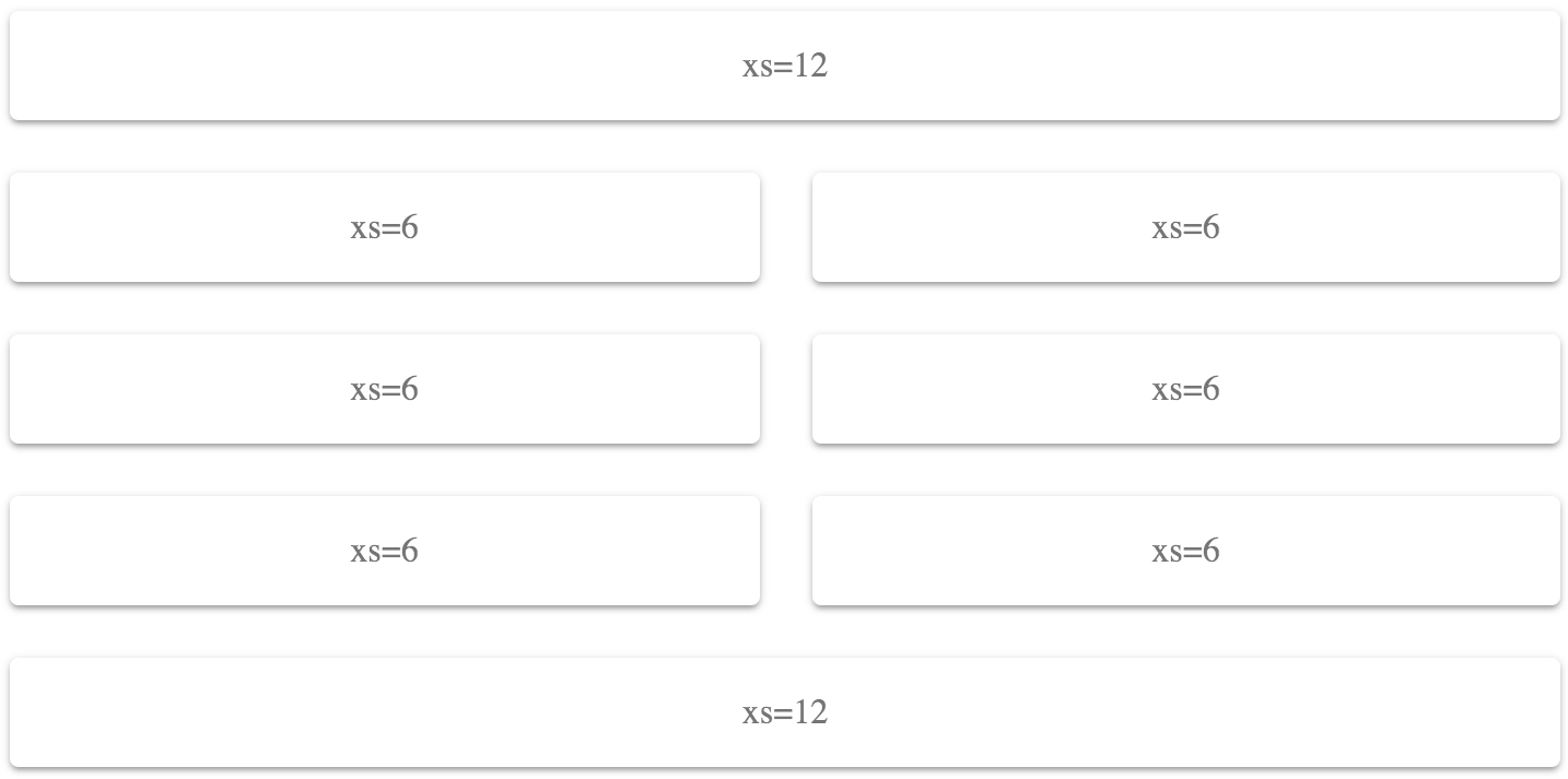
Let's say that you want two columns. You can set the xs value to 6 as follows:
<div className={classes.root}>
  <Grid container spacing={4}>
    <Grid item xs={6}>
      <Paper className={classes.paper}>xs=6</Paper>
    </Grid>
    <Grid item xs={6}>
      <Paper className={classes.paper}>xs=6</Paper>
    </Grid>
    <Grid item xs={6}>
      <Paper className={classes.paper}>xs=6</Paper>
    </Grid>
    <Grid item xs={6}>
      <Paper className={classes.paper}>xs=6</Paper>
    </Grid>
    <Grid item xs={6}>
      <Paper className={classes.paper}>xs=6</Paper>
    </Grid>
    <Grid item xs={6}>
      <Paper className={classes.paper}>xs=6</Paper>
    </Grid>
    <Grid item xs={6}>
      <Paper className={classes.paper}>xs=6</Paper>
    </Grid>
    <Grid item xs={6}>
      <Paper className={classes.paper}>xs=6</Paper>
    </Grid>
  </Grid>
</div>
Here's what the result looks like at a pixel screen width of 960:
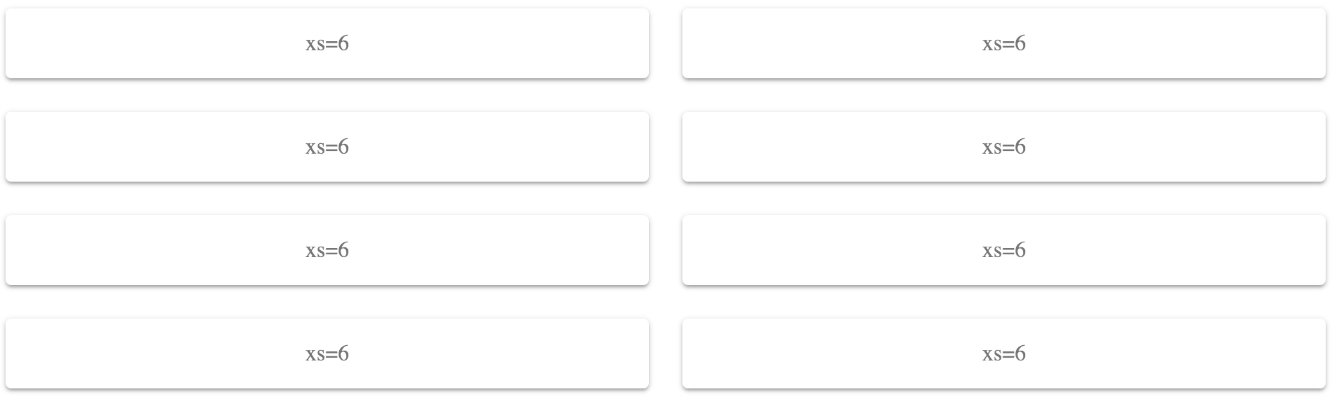
Because you've set the xs value to 6 (50%), these Grid items will only ever use two columns. The items themselves will change their width to accommodate the screen width, rather than changing the number of items per row.
There's more...
You can combine different widths in a fixed way. For example, you could have header and footer Grid items that use a full-width layout, while the Grid items in between use two columns:
<div className={classes.root}>
  <Grid container spacing={4}>
    <Grid item xs={12}>
      <Paper className={classes.paper}>xs=12</Paper>
    </Grid>
    <Grid item xs={6}>
      <Paper className={classes.paper}>xs=6</Paper>
    </Grid>
    <Grid item xs={6}>
      <Paper className={classes.paper}>xs=6</Paper>
    </Grid>
    <Grid item xs={6}>
      <Paper className={classes.paper}>xs=6</Paper>
    </Grid>
    <Grid item xs={6}>
      <Paper className={classes.paper}>xs=6</Paper>
    </Grid>
    <Grid item xs={6}>
      <Paper className={classes.paper}>xs=6</Paper>
    </Grid>
    <Grid item xs={6}>
      <Paper className={classes.paper}>xs=6</Paper>
    </Grid>
    <Grid item xs={12}>
      <Paper className={classes.paper}>xs=12</Paper>
    </Grid>
  </Grid>
</div>
The first and last Grid components have an xs value of 12 (100%), while the other Grid items have xs values of 6 (50%) for a two-column layout. Here's what the result looks like at a pixel width of 725:
See also
- Grid demos: https://material-ui.com/layout/grid/
- Grid API documentation: https://material-ui.com/api/grid/
Changing column direction
When using a fixed number of columns for your layout, content flows from left to right. The first grid item goes in the first column, the second item in the second column, and so on. There could be times when you need better control over which grid items go into which columns.
How to do it...
Let's say that you have a four-column layout, but you want the first and second items to go in the first column, the third and fourth items in the second, and so on. This involves using nested Grid containers, and changing the direction property, as follows:
import React from 'react';

import { withStyles } from '@material-ui/core/styles';
import Paper from '@material-ui/core/Paper';
import Grid from '@material-ui/core/Grid';
import Hidden from '@material-ui/core/Hidden';
import Typography from '@material-ui/core/Typography';

const styles = theme => ({
  root: {
    flexGrow: 1
  },
  paper: {
    padding: theme.spacing(2),
    textAlign: 'center',
    color: theme.palette.text.secondary
  }
});

const ColumnDirection = withStyles(styles)(({ classes }) => (
  <div className={classes.root}>
    <Grid container justify="space-around" spacing={4}>
      <Grid item xs={3}>
        <Grid container direction="column" spacing={2}>
          <Grid item>
            <Paper className={classes.paper}>
              <Typography>One</Typography>
            </Paper>
          </Grid>
          <Grid item>
            <Paper className={classes.paper}>
              <Typography>Two</Typography>
            </Paper>
          </Grid>
        </Grid>
      </Grid>
      <Grid item xs={3}>
        <Grid container direction="column" spacing={2}>
          <Grid item>
            <Paper className={classes.paper}>
              <Typography>Three</Typography>
            </Paper>
          </Grid>
          <Grid item>
            <Paper className={classes.paper}>
              <Typography>Four</Typography>
            </Paper>
          </Grid>
        </Grid>
      </Grid>
      <Grid item xs={3}>
        <Grid container direction="column" spacing={2}>
          <Grid item>
            <Paper className={classes.paper}>
              <Typography>Five</Typography>
            </Paper>
          </Grid>
          <Grid item>
            <Paper className={classes.paper}>
              <Typography>Six</Typography>
            </Paper>
          </Grid>
        </Grid>
      </Grid>
      <Grid item xs={3}>
        <Grid container direction="column" spacing={2}>
          <Grid item>
            <Paper className={classes.paper}>
              <Typography>Seven</Typography>
            </Paper>
          </Grid>
          <Grid item>
            <Paper className={classes.paper}>
              <Typography>Eight</Typography>
            </Paper>
          </Grid>
        </Grid>
      </Grid>
    </Grid>
  </div>
));

export default ColumnDirection;
Here's what the result looks like at a pixel width of 725:
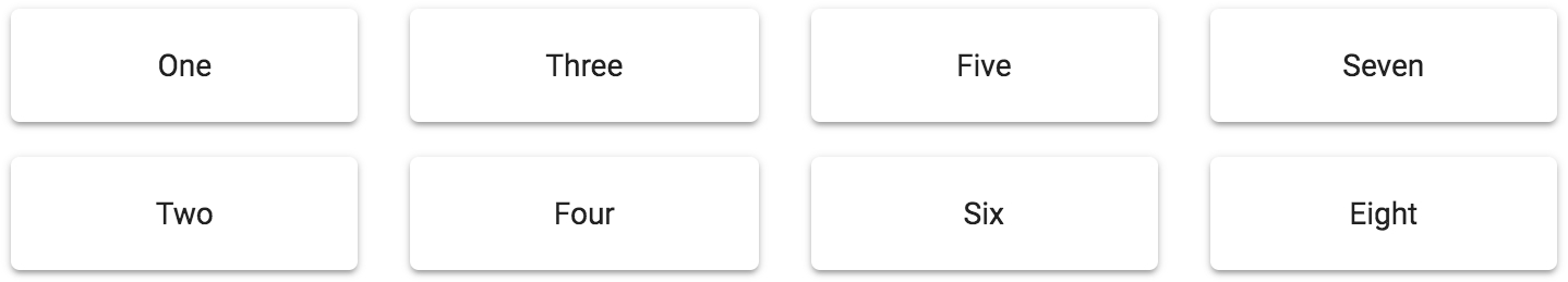
Instead of values flowing from left to right, you have complete control over which column the item is placed in.
How it works...
There's a lot going on with this example, so let's start by taking a look at just the first item in the Grid code:
<Grid item xs={3}>
  <Grid container direction="column" spacing={2}>
    <Grid item>
      <Paper className={classes.paper}>
        <Typography>One</Typography>
      </Paper>
    </Grid>
    <Grid item>
      <Paper className={classes.paper}>
        <Typography>Two</Typography>
      </Paper>
    </Grid>
  </Grid>
</Grid>
The Grid item is using an xs value of 4, to create the four-column layout. Essentially, these items are columns. Next, you have a nested Grid container. This container has a direction property value of column. This is where you can place the Grid items that belong in this column, and they'll flow from top to bottom, instead of from left to right. Each column in this grid follows this pattern.
There's more...
There might be times when hiding the rightmost column makes more sense than trying to accommodate it with the screen width. You can use the Hidden component for this. It's already imported in the example, as follows:
import Hidden from '@material-ui/core/Hidden';
To use it, you wrap the last column with it. For example, here's what the last column looks like now:
<Grid item xs={3}>
  <Grid container direction="column" spacing={2}>
    <Grid item>
      <Paper className={classes.paper}>
        <Typography>Seven</Typography>
      </Paper>
    </Grid>
    <Grid item>
      <Paper className={classes.paper}>
        <Typography>Eight</Typography>
      </Paper>
    </Grid>
  </Grid>
</Grid>
If you want to hide this column at a certain breakpoint, you can wrap the column with Hidden, like this:
<Hidden smDown>
  <Grid item xs={3}>
    <Grid container direction="column" spacing={2}>
      <Grid item>
        <Paper className={classes.paper}>
          <Typography>Seven</Typography>
        </Paper>
      </Grid>
      <Grid item>
        <Paper className={classes.paper}>
          <Typography>Eight</Typography>
        </Paper>
      </Grid>
    </Grid>
  </Grid>
</Hidden>
The smDown property tells the Hidden component to hide its children when the sm breakpoint or lower is reached. Here's what the result looks like at a pixel width of 1000:
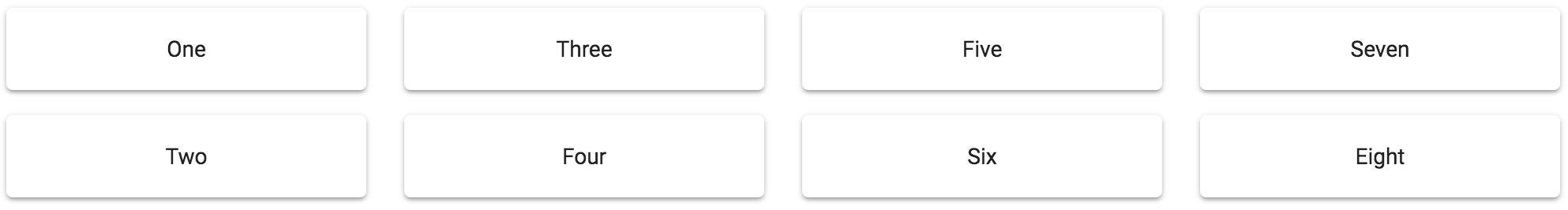
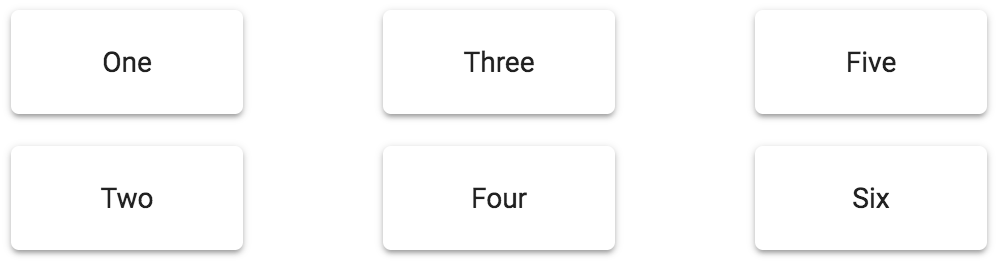
The last column is displayed because the sm breakpoint is smaller than the screen size. Here's the result at a pixel screen width of 550, without the last column displayed:
See also
- Grid demos: https://material-ui.com/layout/grid/
- Grid API documentation: https://material-ui.com/api/grid/
- Hidden API documentation: https://material-ui.com/api/hidden/


