Download code from GitHub
Anatomy of Matplotlib
This chapter begins with an introduction to Matplotlib, including the architecture of Matplotlib and the elements of a figure, followed by the recipes. The following are the recipes that will be covered in this chapter:
- Working in interactive mode
- Working in non-interactive mode
- Reading from external files and plotting
- How to change and reset default environment variables
Introduction
Matplotlib is a cross-platform Python library for plotting two-dimensional graphs (also called plots). It can be used in a variety of user interfaces such as Python scripts, IPython shells, Jupyter Notebooks, web applications, and GUI toolkits. It can be used to develop professional reporting applications, interactive analytical applications, complex dashboard applications or embed into web/GUI applications. It supports saving figures into various hard-copy formats as well. It also has limited support for three-dimensional figures. It also supports many third-party toolkits to extend its functionality.
Architecture of Matplotlib
Matplotlib has a three-layer architecture: backend, artist, and scripting, organized logically as a stack. Scripting is an API that developers use to create the graphs. Artist does the actual job of creating the graph internally. Backend is where the graph is displayed.
Backend layer
This is the bottom-most layer where the graphs are displayed on to an output device. This can be any of the user interfaces that Matplotlib supports. There are two types of backends: user interface backends (for use in pygtk, wxpython, tkinter, qt4, or macosx, and so on, also referred to as interactive backends) and hard-copy backends to make image files (.png, .svg, .pdf, and .ps, also referred to as non-interactive backends). We will learn how to configure these backends in later Chapter 9, Developing Interactive Plots and Chapter 10, Embedding Plots in a Graphical User Interface.
Artist layer
This is the middle layer of the stack. Matplotlib uses the artist object to draw various elements of the graph. So, every element (see elements of a figure) we see in the graph is an artist. This layer provides an object-oriented API for plotting graphs with maximum flexibility. This interface is meant for seasoned Python programmers, who can create complex dashboard applications.
Scripting layer
This is the topmost layer of the stack. This layer provides a simple interface for creating graphs. This is meant for use by end users who don't have much programming expertise. This is called a pyplot API.
Elements of a figure
The high-level Matplotlib object that contains all the elements of the output graph is called a figure. Multiple graphs can be arranged in different ways to form a figure. Each of the figure's elements is customizable.
Figure
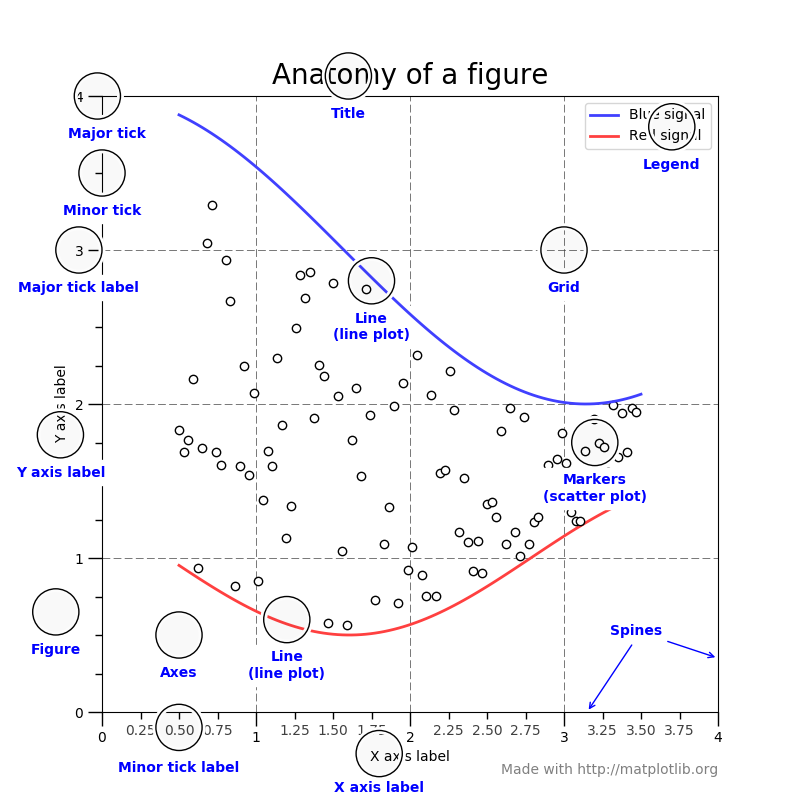
The following diagram is the anatomy of a figure, containing all its elements:
Axes
axes is a sub-section of the figure, where a graph is plotted. axes has a title, an x-label and a y-label. A figure can have many such axes, each representing one or more graphs. In the preceding figure, there is only one axes, two line graphs in blue and red colors.
Axis
These are number lines representing the scale of the graphs being plotted. Two-dimensional graphs have an x axis and a y axis, and three-dimensional graphs have an x axis, a y axis, and a z axis.
Label
This is the name given to various elements of the figure, for example, x axis label, y axis label, graph label (blue signal/red signal in the preceding figure Anatomy of a figure), and so on.
Legend
When there are multiple graphs in the axes (as in the preceding figure Anatomy of a figure), each of them has its own label, and all these labels are represented as a legend. In the preceding figure, the legend is placed at the top-right corner of the figure.
Title
It is the name given to each of the axes. The figure also can have its own title, when the figure has multiple axes with their own titles. The preceding figure has only one axes, so there is only one title for the axes as well as the figure.
Ticklabels
Each axis (x, y, or z) will have a range of values that are divided into many equal bins. Bins are chosen at two levels. In the preceding figure Anatomy of a figure, the x axis scale ranges from 0 to 4, divided into four major bins (0-1, 1-2, 2-3, and 3-4) and each of the major bins is further divided into four minor bins (0-0.25, 0.25-0.5, and 0.5-0.75). Ticks on both sides of major bins are called major ticks and minor bins are called minor ticks, and the names given to them are major ticklabels and minor ticklabels.
Spines
Boundaries of the figure are called spines. There are four spines for each axes(top, bottom, left, and right).
Grid
For easier readability of the coordinates of various points on the graph, the area of the graph is divided into a grid. Usually, this grid is drawn along major ticks of the x and y axis. In the preceding figure, the grid is shown in dashed lines.
Working in interactive mode
Matplotlib can be used in an interactive or non-interactive modes. In the interactive mode, the graph display gets updated after each statement. In the non-interactive mode, the graph does not get displayed until explicitly asked to do so.
Getting ready
You need working installations of Python, NumPy, and Matplotlib packages.
Using the following commands, interactive mode can be set on or off, and also checked for current mode at any point in time:
- matplotlib.pyplot.ion() to set the interactive mode ON
- matplotlib.pyplot.ioff() to switch OFF the interactive mode
- matplotlib.is_interactive() to check whether the interactive mode is ON (True) or OFF (False)
How to do it...
Let's see how simple it is to work in interactive mode:
- Set the screen output as the backend:
%matplotlib inline
- Import the matplotlib and pyplot libraries. It is common practice in Python to import libraries with crisp synonyms. Note plt is the synonym for the matplotlib.pyplot package:
import matplotlib as mpl
import matplotlib.pyplot as plt
- Set the interactive mode to ON:
plt.ion()
- Check the status of interactive mode:
mpl.is_interactive()
- You should get the output as True.
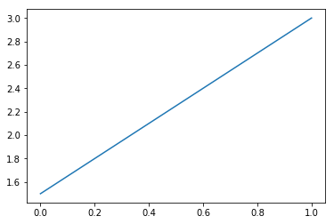
- Plot a line graph:
plt.plot([1.5, 3.0])
You should see the following graph as the output:
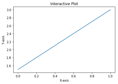
- Now add the axis labels and a title to the graph with the help of the following code:
# Add labels and title
plt.title("Interactive Plot") #Prints the title on top of graph
plt.xlabel("X-axis")         # Prints X axis label as "X-axis"
plt.ylabel("Y-axis")         # Prints Y axis label as "Y-axis"
After executing the preceding three statements, your graph should look as follows:
How it works...
So, this is how the explanation goes:
- plt.plot([1.5, 3.0]) plots a line graph connecting two points (0, 1.5) and (1.0, 3.0).
- The plot command expects two arguments (Python list, NumPy array or pandas DataFrame) for the x and y axis respectively.
- If only one argument is passed, it takes it as y axis co-ordinates and for x axis co-ordinates it takes the length of the argument provided.
- In this example, we are passing only one list of two points, which will be taken as y axis coordinates.
- For the x axis, it takes the default values in the range of 0 to 1, since the length of the list [1.5, 3.0] is 2.
- If we had three coordinates in the list for y, then for x, it would take the range of 0 to 2.
- You should see the graph like the one shown in step 6.
- plt.title("Interactive Plot"), prints the title on top of the graph as Interactive Plot.
- plt.xlabel("X-axis"), prints the x axis label as X-axis.
- plt.ylabel("Y-axis"), prints the y axis label as Y-axis.
- After executing preceding three statements, you should see the graph as shown in step 7.
If you are using Python shell, after executing each of the code statements, you should see the graph getting updated with title first, then the x axis label, and finally the y axis label.
If you are using Jupyter Notebook, you can see the output only after all the statements in a given cell are executed, so you have to put each of these three statements in separate cells and execute one after the other, to see the graph getting updated after each code statement.
There's more...
You can add one more line graph to the same plot and go on until you complete your interactive session:
- Plot a line graph:
plt.plot([1.5, 3.0])
- Add labels and title:
plt.title("Interactive Plot")
plt.xlabel("X-axis")
plt.ylabel("Y-axis")
- Add one more line graph:
plt.plot([3.5, 2.5])
The following graph is the output obtained after executing the code:
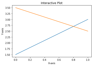
Hence, we have now worked in interactive mode.
Working in non-interactive mode
In the interactive mode, we have seen the graph getting built step by step with each instruction. In non-interactive mode, you give all instructions to build the graph and then display the graph with a command explicitly.
How to do it...
Working on non-interactive mode won't be difficult either:
- Start the kernel afresh, and import the matplotlib and pyplot libraries:
import matplotlib
import matplotlib.pyplot as plt
- Set the interactive mode to OFF:
plt.ioff()
- Check the status of interactive mode:
matplotlib.is_interactive()
- You should get the output False.
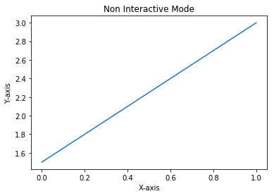
- Execute the following code; you will not see the plot on your screen:
# Plot a line graph
plt.plot([1.5, 3.0])

# Plot the title, X and Y axis labels
plt.title("Non Interactive Mode")
plt.xlabel("X-axis")
plt.ylabel("Y-axis")
- Execute the following statement, and then you will see the plot on your screen:
# Display the graph on the screen
plt.show()
How it works...
Each of the preceding code statements is self-explanatory. The important thing to note is in non-interactive mode, you write complete code for the graph you want to display, and call plt.show() explicitly to display the graph on the screen.
The following is the output obtained:
Reading from external files and plotting
By default, Matplotlib accepts input data as a Python list, NumPy array, or pandas DataFrame. So all external data needs to be read and converted to one of these formats before feeding it to Matplotlib for plotting the graph. From a performance perspective, NumPy format is more efficient, but for default labels, pandas format is convenient.
If the data is a .txt file, you can use NumPy function to read the data and put it in NumPy arrays. If the data is in .csv or .xlsx formats, you can use pandas to read the data. Here we will demonstrate how to read .txt, .csv, and .xlsx formats and then plot the graph.
Getting ready
Import the matplotlib.pyplot, numpy , and pandas packages that are required to read the input files:
- Import the pyplot library with the plt synonym:
import matplotlib.pyplot as plt
- Import the numpy library with the np synonym. The numpy library can manage n-dimensional arrays, supporting all mathematical operations on these arrays:
import numpy as np
- Import the pandas package with pd as a synonym:
import pandas as pd
How to do it...
We will follow the order of .txt, .csv, and .xlsx files, in three separate sections.
Reading from a .txt file
Here are some steps to follow:
- Read the text file into the txt variable:
txt = np.loadtxt('test.txt', delimiter = ',')
txt
Here is the explanation for the preceding code block:
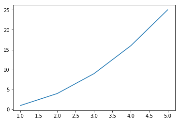
- The test.txt text file has 10 numbers separated by a comma, representing the x and y coordinates of five points (1, 1), (2, 4), (3, 9), (4, 16), and (5, 25) in a two-dimensional space.
- The loadtxt() function loads text data into a NumPy array.
You should get the following output:
array([ 1., 1., 2., 4., 3., 9., 4., 16., 5., 25.])
- Convert the flat array into five points in 2D space:
txt = txt.reshape(5,2)
txt
After executing preceding code, you should see the following output:
array([[ 1., 1.], [ 2., 4.], [ 3., 9.], [ 4., 16.], [ 5., 25.]])
- Split the .txt variable into x and y axis co-ordinates:
x = txt[:,0]
y = txt[:,1]
print(x, y)
Here is the explanation for the preceding code block:
- Separate the x and y axis points from the txt variable.
- x is the first column in txt and y is the second column.
- The Python indexing starts from 0.
After executing the preceding code, you should see the following output:
[ 1. 2. 3. 4. 5.] [ 1. 4. 9. 16. 25.]
Reading from a .csv file
The .csv file has a relational database structure of rows and columns, and the test.csv file has x, y co-ordinates for five points in 2D space. Each point is a row in the file, with two columns: x and y. The same NumPy loadtxt() function is used to load data:
x, y = np.loadtxt ('test.csv', unpack = True, usecols = (0,1), delimiter = ',')
print(x)
print(y)
On execution of the preceding code, you should see the following output:
[ 1. 2. 3. 4. 5.] [ 1. 4. 9. 16. 25.]
Reading from an .xlsx file
Now let's read the same data from an .xlsx file and create the x and y NumPy arrays. The .xlsx file format is not supported by the NumPy loadtxt() function. A Python data processing package, pandas can be used:
- Read the .xlsx file into pandas DataFrame. This file has the same five points in 2D space, each in a separate row with x, y columns:
df = pd.read_excel('test.xlsx', 'sheet', header=None)
- Convert the pandas DataFrame to a NumPy array:
data_array = np.array(df)
print(data_array)
You should see the following output:
[[ 1 1] [ 2 4] [ 3 9] [ 4 16] [ 5 25]]
- Now extract the x and y coordinates from the NumPy array:
x , y = data_array[:,0], data_array[:,1]
print(x,y)
You should see the following output:
[1 2 3 4 5] [ 1 4 9 16 25]
Plotting the graph
After reading the data from any of the three formats (.txt, .csv, .xlsx) and format it to x and y variables, then we plot the graph using these variables as follows:
plt.plot(x, y)
Display the graph on the screen:
plt.show()
The following is the output obtained:
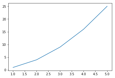
How it works...
Depending on the format and the structure of the data, we will have to use the Python, NumPy, or pandas functions to read the data and reformat it into an appropriate structure that can be fed into the matplotlib.pyplot function. After that, follow the usual plotting instructions to plot the graph that you want.
Changing and resetting default environment variables
Matplotlib uses the matplotlibrc file to store default values for various environment and figure parameters used across matplotlib functionality. Hence, this file is very long. These default values are customizable to apply for all the plots within a session.
You can use the print(matplotlib.rcParams) command to get all the default parameter settings from this file.
The matplotlib.rcParams command is used to change these default values to any other supported values, one parameter at a time. The matplotlib.rc command is used to set default values for multiple parameters within a specific group, for example, lines, font, text, and so on. Finally, the matplotlib.rcdefaults() command is used to restore default parameters.
Getting ready
The following code block provides the path to the file containing all configuration the parameters:
# Get the location of matplotlibrc file
import matplotlib
matplotlib.matplotlib_fname()
You should see the directory path like the one that follows. The exact directory path depends on your installation:
'C:\\Anaconda3\\envs\\keras35\\lib\\site-packages\\matplotlib\\mpl-
    data\\matplotlibrc'
How to do it...
The following block of code along with comments helps you to understand the process of changing and resetting default environment variables:
- Import the matplotlib.pyplot package with the plt synonym:
import matplotlib.pyplot as plt
- Load x and y variables from same test.csv file that we used in the preceding recipe:
x, y = np.loadtxt ('test.csv', unpack = True, usecols = (0,1),
                    delimiter = ',')
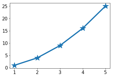
- Change the default values for multiple parameters within the group 'lines':
matplotlib.rc('lines', linewidth=4, linestyle='-', marker='*')
- Change the default values for parameters individually:
matplotlib.rcParams['lines.markersize'] = 20
matplotlib.rcParams['font.size'] = '15.0'
- Plot the graph:
plt.plot(x,y)
- Display the graph:
plt.show()
The following is the output that will be obtained:
How it works...
The matplotlib.rc and matplotlib.rcParams commands overwrite the default values for specified parameters as arguments in these commands. These new values will be used by the pyplot tool while plotting the graph.
There's more...
You can reset all the parameters to their default values, using the rsdefaults() command, as shown in the following block:
# To restore all default parameters
matplotlib.rcdefaults()
plt.plot(x,y)
plt.show()
The graph will look as follows:
.