


 Download code from GitHub
To learn programming, we often start with printing the "Hello world!" message. For graphical plots that contain all the elements from data, axes, labels, lines and ticks, how should we begin?
This chapter gives an overview of Matplotlib's functionalities and latest features. We will guide you through the setup of the Matplotlib plotting environment. You will learn to create a simple line graph, view, and save your figures. By the end of this chapter, you will be confident enough to start building your own plots, and be ready to learn about customization and more advanced techniques in the coming sections.
Come and say "Hello!" to the world of plots!
Here is a list of topics covered in this chapter:
- What is Matplotlib?
- Setting up the Python environment
- Installing Matplotlib and its dependencies
- Setting up the Jupyter notebook
- Plotting the first simple line graph
- Loading data into Matplotlib
- Exporting the figure
Welcome to the world of Matplotlib 2.0! Follow our simple example in the chapter and draw your first "Hello world" plot.
Matplotlib is a versatile Python library that generates plots for data visualization. With the numerous plot types and refined styling options available, it works well for creating professional figures for presentations and scientific publications. Matplotlib provides a simple way to produce figures to suit different purposes, from slideshows, high-quality poster printing, and animations to web-based interactive plots. Besides typical 2D plots, basic 3D plotting is also supported.
On the development side, the hierarchical class structure and object-oriented plotting interface of Matplotlib make the plotting process intuitive and systematic. While Matplotlib provides a native graphical user interface for real-time interaction, it can also be easily integrated into popular IPython-based interactive development environments, such as Jupyter notebook and PyCharm.
Matplotlib 2.0 features many improvements, including the appearance of default styles, image support, and text rendering speed. We have selected a number of important changes to highlight later. The details of all new changes can be found on the documentation site at http://matplotlib.org/devdocs/users/whats_new.html.
If you are already using previous versions of Matplotlib, you may want to pay more attention to this section to update your coding habits. If you are totally new to Matplotlib or even Python, you may jump ahead to start using Matplotlib first, and revisit here later.
The most prominent change to Matplotlib in version 2.0 is to the default style. You can find the list of changes here: http://matplotlib.org/devdocs/users/dflt_style_changes.html. Details of style setting will be covered in Chapter 2, Figure Aesthetics.
For quick plotting without having to set colors for each data series, Matplotlib uses a list of colors called the default property cycle, whereby each series is assigned one of the default colors in the cycle. In Matplotlib 2.0, the list has been changed from the original red, green, blue, cyan, magenta, yellow, and black, noted as ['b', 'g', 'r', 'c', 'm', 'y', 'k'], to the current category10 color palette introduced by the Tableau software. As implied by the name, the new palette has 10 distinct colors suitable for categorical display. The list can be accessed by importing Matplotlib and calling matplotlib.rcParams['axes.prop_cycle'] in Python.
Colormaps are useful in showing gradient. The yellow to blue "viridis" colormap is now the default one in Matplotlib 2.0. This perceptually uniform colormap better represents the transition of numerical values visually than the classic “jet” scheme. This is a comparison between two colormaps:

Besides defaulting to a perceptually continuous colormap, qualitative colormaps are now available for grouping values into categories:

Points in a scatter plot have a larger default size and no longer have a black edge, giving clearer visuals. Different colors in the default color cycle will be used for each data series if the color is not specified:


While previous versions set the legend in the upper-right corner, Matplotlib 2.0 sets the legend location as "best" by default. It automatically avoids overlapping of the legend with the data. The legend box also has rounded corners, lighter edges, and a partially transparent background to keep the focus of the readers on the data. The curve of square numbers in the classic and current default styles demonstrates the case:


Dash patterns in line styles can now scale with the line width to display bolder dashes for clarity:

From the documentation (https://matplotlib.org/users/dflt_style_changes.html#plot)
Just like the dots in the scatter plot shown before, most filled elements ("artists", which we will explain more in Chapter 2, Figure Aesthetics) no longer have a black edge by default, making the graphics less cluttered:

Matplotlib 2.0 presents new features that improve the user experience, including speed and output quality as well as resource usage.
The alpha channel, which specifies the degree of transparency, is now fully supported in Matplotlib 2.0.
Matplotlib 2.0 now resamples images with less memory and less data type conversion.
It is claimed that the speed of text rendering by the Agg backend is increased by 20%. We will discuss more on backends in Chapter 6, Adding Interactivity and Animating Plots.
To generate a video output of animated plots, a more efficient codec, H.264, is now used by default in place of MPEG-4. As H.264 has a higher compression rate, the smaller output file size permits longer video record time and reduces the time and network data needed to load them. Real-time playback of H.264 videos is generally more fluent and in better quality than those encoded in MPEG-4.
Some of the settings are changed in Matplotlib v2.0 for convenience or consistency, or to avoid unexpected results.
New parameters are added, such as date.autoformatter.year for date time string formatting.
Style files are no longer allowed to configure settings unrelated to the style to prevent unexpected consequences. These parameters include the following:
'interactive', 'backend', 'backend.qt4', 'webagg.port', 'webagg.port_retries', 'webagg.open_in_browser', 'backend_fallback', 'toolbar', 'timezone', 'datapath', 'figure.max_open_warning', 'savefig.directory', tk.window_focus', 'docstring.hardcopy'
Matplotlib is a Python package for data visualization. To get ourselves ready for Matplotlib plotting, we need to set up Python, install Matplotlib with its dependencies, as well as prepare a platform to execute and keep our running code. While Matplotlib provides a native GUI interface, we recommend using Jupyter Notebook. It allows us to run our code interactively while keeping the code, output figures, and any notes tidy. We will walk you through the setup procedure in this session.
Matplotlib 2.0 supports both Python versions 2.7 and 3.4+. In this book, we will demonstrate using Python 3.4+. You can download Python from http://www.python.org/download/.
For Windows, Python is available as an installer or zipped source files. We recommend the executable installer because it offers a hassle-free installation. First, choose the right architecture. Then, simply follow the instructions. Usually, you will go with the default installation, which comes with the Python package manager pip and Tkinter standard GUI (Graphical User Interface) and adds Python to the PATH (important!). In just a few clicks, it's done!
Note
64-bit or 32-bit?
In most cases, you will go for the 64-bit (x86-64) version because it usually gives better performance. Most computers today are built with the 64-bit architecture, which allows more efficient use of system memory (RAM). Going on 64-bit means the processor reads data in larger chunks each time. It also allows more than 3 GB of data to be addressed. In scientific computing, we typically benefit from added RAM to achieve higher speed. Although using a 64-bit version doubles the memory footprint before exceeding the memory limit, it is often required for large data, such as in scientific computing. Of course, if you have a 32-bit computer, 32-bit is your only choice.
- Press Win + R on the keyboard to call the
Rundialog. - Type
cmd.exein theRundialog to open Command Prompt:
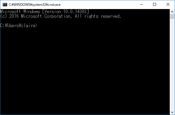
- In Command Prompt, type
python.
Note
For brevity, we will refer to both Windows Command Prompt and the Linux or Mac Terminal app as the "terminal" throughout this book.
Note
Some Python packages, such as Numpy and Scipy require Windows C++ compilers to work properly. We can obtain Microsoft Visual C++ compiler for free from the official site: http://landinghub.visualstudio.com/visual-cpp-build-tools As noted in the Python documentation page (https://wiki.python.org/moin/WindowsCompilers), a specific C++ compiler version is required for each Python version. Since most codes in this book were tested against Python 3.6, Microsoft Visual C++ 14.0 / Build Tools for Visual Studio 2017 is recommended. Readers can also check out Anaconda Python (https://www.continuum.io/downloads/), which ships with pre-built binaries for many Python packages. According to our experience, the Conda package manager resolves package dependencies in a much nicer way on Windows.
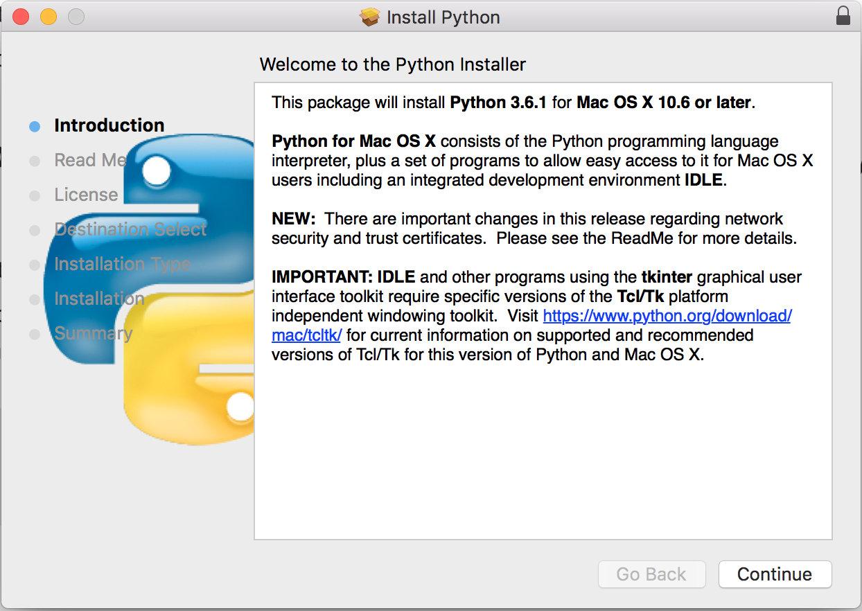
macOS comes with Python 2.7 installed. To ensure compatibility with the example code in this book, Python 3.4 or above is required, which is available for download from https://www.python.org/downloads/mac-osx/. You will be prompted by a graphical installation wizard when you run the downloaded installation package:
After completing the graphical installation steps, Python 3 can be accessed via these steps:
- Open the Finder app.
- Navigate to the
Applicationsfolder, and then go into theUtilitiesfolder. - Open the Terminal app.
- You will be prompted by the following message when you type
python3in the terminal:
Python 3.6.1 (v3.6.1:69c0db5, Mar 21 2017, 18:41:36 [GCC 4.2.1 (Apple Inc. build 5666) (dot 3)] on Darwin
Type "help", "copyright", "credits" or "license" for more information.
>>>
Most recent Linux distributions come with Python 3.4+ preinstalled. You can check this out by typing python3 in the terminal. If Python 3 is installed, you should see the following message, which shows more information about the version:
Python 3.4.3 (default, Nov 17 2016, 01:08:31) [GCC 4.8.4] on Linux
Type "help", "copyright", "credits" or "license" for more information.
>>>
If Python 3 is not installed, you can install it on a Debian-based OS, such as Ubuntu, by running the following commands in the terminal:
sudo apt update
sudo apt install Python3 build-essential
The build-essential package contains compilers that are useful for building non-pure Python packages. You may need to substitute apt with apt-get if you have Ubuntu 14.04 or older.
We recommend installing Matplotlib by a Python package manager, which will help you to automatically resolve and install dependencies upon each installation or upgrade of a package. We will demonstrate how to install Matplotlib with pip.
pip is installed with Python 2>=2.7.9 or Python 3>=3.4 binaries, but you will need to upgrade pip.
For the first time, you may do so by downloading get-pip.py from http://bootstrap.pypa.io/get-pip.py.
Then run this in the terminal:
python3 get-pip.pyYou can then type pip3 to run pip in the terminal.
After pip is installed, you may upgrade it by this command:
pip3 install –upgrade pipThe documentation of pip can be found at http://pip.pypa.io.
While Matplotlib offers a native plotting GUI, Jupyter notebook is a good option to execute and organize our code and output. We will soon introduce its advantages and usage.
Jupyter notebook (formerly known as IPython notebook) is an IPython-based interactive computational environment. Unlike the native Python console, code and imported data can easily be reused. There are also markdown functions that allow you to take notes like a real notebook. Code and other content can be separated into blocks (cells) for better organization. In particular, it offers a seamless integration with the matplotlib library for plot display.
Jupyter Notebook works as a server-client application and provides a neat web browser interface where you can edit and run your code. While you can run it locally even on a computer without internet access, notebooks on remote servers can be as easily accessed by SSH port forwarding. Multiple notebook instances, local or remote, can be run simultaneously on different network ports.
Here is a screenshot of a running Jupyter Notebook:
Jupyter notebook provides multiple saving options for easy sharing. There are also features such as auto-complete functions in the code editor that facilitate development.
In addition, Jupyter notebook offers different kernels to be installed for interactive computing with different programming languages. We will skip this for our purposes.
Jupyter notebook is easy to use and can be accessed remotely as web pages on client browsers. Here is the basic usage of how to set up a new notebook session, run and save code, and jot down notes with the Markdown format.
- Type
jupyter notebookin the terminal or Command Prompt. - Open your favorite browser.
- Type in
localhost:8888as the URL.
To specify the port, such as when running multiple notebook instances on one or more machines, you can do so with the --port={port number} option.
For a notebook on remote servers, you can use SSH for port forwarding. Just specify the –L option with {port number}:localhost:{port number} during connection, as follows:
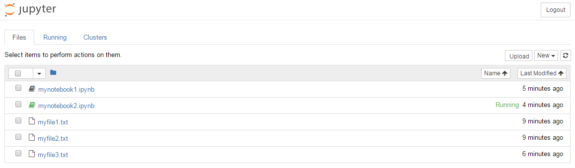
ssh –L 8888:localhost:8888 smith@remoteserverThe Jupyter Notebook home page will show up, listing files in your current directory. Notebook files are denoted by a book logo. Running notebooks are marked in green.
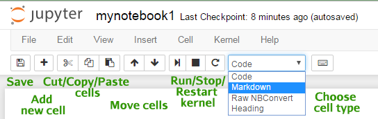
A notebook contains boxes called cells. A new notebook begins with a gray box cell, which is a text area for code editing by default. To insert and edit code:
- Click inside the gray box.
- Type in your Python code.
- Click on the >| play button or press Shift + Enter to run the current cell and move the cursor to the next cell:
Cells can be run in different orders and rerun multiple times in a session. The output and any warnings or error messages are shown in the output area of each cell under each gray textbox. The number in square brackets on the left shows the order of the cell last run:
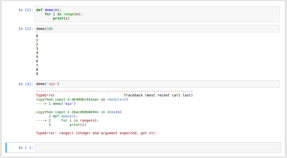
Once a cell is run, stored namespaces, including functions and variables, are shared throughout the notebook before the kernel restarts.
You can edit the code of any cells while some cells are running. If for any reason you want to interrupt the running kernel, such as to stop a loop that prints out too many messages, you can do so by clicking on the square interrupt button in the toolbar.
How do we insert words and style them to organize our notebook?
Here is the way:
- Select
Markdownfrom the drop-down list on the toolbar. - Type your notes in the gray box.
- Click on the >| play button or press Shift + Enter to display the markdown.
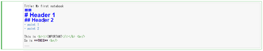
Markdown notation provides a handy way to style without much manual clicking or galore of tags:
Style | Method |
Headers: H1, H2, H3… | Start the line with a hash #, followed by a space, for example, # xxx, ## xxx, ### xxx. |
Title | Two or more equal signs on the next line, same effect as H1. |
Emphasis (italic) | *xxx* or _xxx_. |
Strong emphasis (bold) | **xxx** or __xxx__. |
Unordered list | Start each line with one of the markers: asterisk (*), minus (-), or plus (+). Then follow with a space, for example, * xxx. |
Ordered list | Start each line with ordered numbers from 1, followed by a period (.) and a space. |
Horizontal rule | Three underscores ___. |
A detailed cheatsheet is provided by Adam Pritchard at https://github.com/adam-p/markdown-here/wiki/Markdown-Cheatsheet.
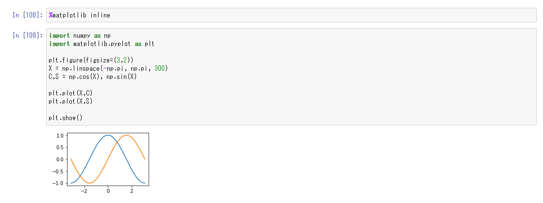
For static figures, type %matplotlib inline in a cell. The figure will be displayed in the output area:
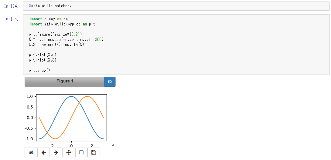
Running %matplotlib notebook will embed the Matplotlib interface in the output area.
Real-time interaction such as zooming and panning can be done under this mode. Clicking on the power sign button in the top-right corner will stop the interactive mode. The figure will become static, as in the case of %matplotlib inline:
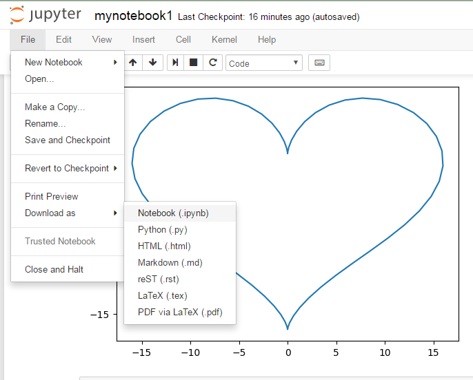
Each notebook project can easily be saved and shared as the standard JSON-based .ipynb format (which can be run interactively by Jupyter on another machine), an ordinary .py Python script, or a static .html web page or .md format for viewing. To convert the notebook into Latex or .pdf via LaTeX files, Pandoc is required. More advanced users can check out the installation instructions of Pandoc on http://pandoc.org/installing.html:
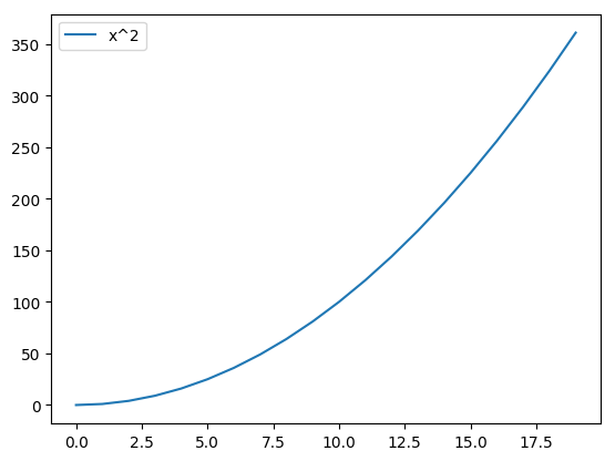
We will start with a simple line graph of a curve of squares, that is, y = x2.
To visualize data, we should of course start with "having" some data. While we assume you have some nice data on hand to show, we will briefly show you how to load it in Python for plotting.
There are several common data structures we will keep coming across.
List is a basic Python data type for storing a collection of values. A list is created by putting element values inside a square bracket. To reuse our list, we can give it a name and store it like this:
evens = [2,4,6,8,10]
When we want to get a series in a greater range, for instance, to get more data points for our curve of squares to make it smoother, we may use the Python range() function:
evens = range(2,102,2)
This command will give us all even numbers from 2 to 100 (both inclusive) and store it in a list named evens.
Very often, we deal with more complex data. If you need a matrix with multiple columns or want to perform mathematical operations over all elements in a collection, then numpy is for you:
import numpy as np
We abbreviated numpy to np by convention, keeping our code succinct.
np.array() converts a supported data type, a list in this case, into a Numpy array. To produce a numpy array from our evens list, we do the following:
np.array(evens)
A pandas dataframe is useful when we have some non-numerical labels or values in our matrix. It does not require homogeneous data, unlike Numpy. Columns can be named. There are also functions such as melt() and pivot_table() that add convenience in reshaping the table to facilitate analysis and plotting.
To convert a list into a pandas dataframe, we do the following:
import pandas as pd
pd.DataFrame(evens)
You can also convert a numpy array into a pandas dataframe.
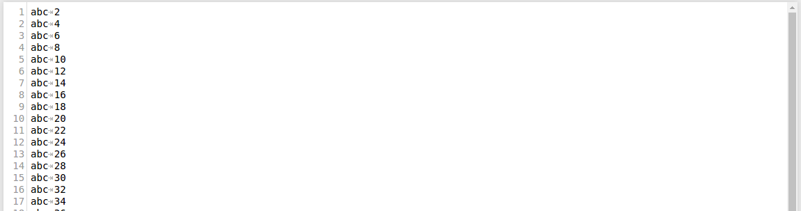
While all this gives you a refresher of the data structures we will be working on, in real life, instead of inventing data, we read it from data sources. A tab-delimited plaintext file is the simplest and most common type of data input. Imagine we have a file called evens.txt containing the aforementioned even numbers. There are two columns. The first column only records unnecessary information. We want to load the data in the second column.
Here is what the dummy text file looks like:
We can initialize an empty list, read the file line by line, split each line, and append the second element to our list:
evens = []
with open as f:
    for line in f.readlines():
evens.append(line.split()[1])It is simple when we have a file with only two columns, and only one column to read, but it can get more tedious when we have an extended table containing thousands of columns and rows and we want to convert them into a Numpy matrix later.
Numpy provides a standard one-liner solution:
import numpy as np
np.loadtxt(‘evens.txt’,delimiter=’\t’,usecols=1,dtype=np.int32)
The first parameter is the path of the data file. The delimiter parameter specifies the string used to separate values, which is a tab here. Because numpy.loadtxt() by default separate values separated by any whitespace into columns by default, this argument can be omitted here. We have set it for demonstration.
For usecols and dtype that specify which columns to read and what data type each column corresponds to, you may pass a single value to each, or a sequence (such as list) for reading multiple columns.
Numpy also by default skips lines starting with #, which typically marks comment or header lines. You may change this behavior by setting the comment parameter.
Similar to Numpy, pandas offers an easy way to load text files into a pandas dataframe:
import pandas as pd
pd.read_csv(usecols=1)
Here the separation can be denoted by either sep or delimiter, which is set as comma , by default (CSV stands for comma-separated values).
There is a long list of less commonly used options available as to determine how different data formats, data types, and errors should be handled. You may refer to the documentation at http://pandas.pydata.org/pandas-docs/stable/generated/pandas.read_csv.html. Besides flat CSV files, Pandas also has other built-in functions for reading other common data formats, such as Excel, JSON, HTML, HDF5, SQL, and Google BigQuery.
To stay focused on data visualization, we will not dig deep into the methods of data cleaning in this book, but this is a survival skill set very helpful in data science. If interested, you can check out resources on data handling with Python.
The Matplotlib package includes many modules, including artist that controls the aesthetics, and rcParams for setting default values. The Pyplot module is the plotting interface we will mostly deal with, which creates plots of data in an object-oriented manner.
By convention, we use the plt abbreviation when importing:
import matplotlib.pylot as plt
Don't forget to run the Jupyter Notebook cell magic %matplotlib inline to embed your figure in the output.
Note
Don't use the pylab module!
The use of the pylab module is now discouraged, and generally replaced by the object-oriented (OO) interface. While pylab provides some convenience by importing matplotlib.pyplot and numpy under a single namespace. Many pylab examples are still found online today, but it is much better to call the Matplotlib.pyplot and numpy modules separately.
Plotting a line graph of the list can be as simple as:
plt.plot(evens)
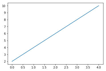
When only one parameter is specified, Pyplot assumes the data we input is on the y axis and chooses a scale for the x axis automatically.
To plot a graph, call plt.plot(x,y) where x and y are the x coordinates and y coordinates of data points:
plt.plot(evens,evens**2)
To label the curve with a legend, we add the label information in the plot function:
plt.plot(evens,evens**2,label = 'x^2')
plt.legend()
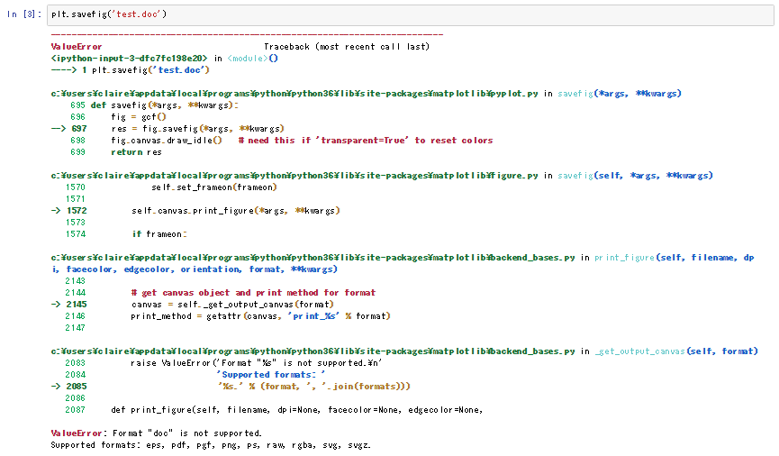
Now we have drawn our first figure. Let's save our work! Surely we don't want to resort to screen capture. Here is a simple way to do it by calling pyplot.savefig().
If you want to both view the image on screen and save it in file, remember to call pyplot.savefig() before pyplot.show() to make sure you don't save a blank canvas.
The pyplot.savefig() function takes the path of the output file and automatically outputs it in the specified extension. For example, pyplot.savefig('output.png') will generate a PNG image. If no extension is specified, an SVG image will be generated by default. If the specified format is unsupported, let's say .doc, a ValueError Python exception will be thrown:
Compared to JPEG, another common image file format, PNG, has the advantage of allowing a transparent background. PNG is widely supported by most image viewers and handlers.
A PDF is a standard document format, which you don't have to worry about the availability of readers. However, most Office software do not support the import of PDF as image.
SVG is a vector graphics format that can be scaled without losing details. Hence, better quality can be achieved with a smaller file size. It goes well on the web with HTML5. It may not be supported by some primitive image viewers.
Postscript is a page description language for electronic publishing. It is useful for batch processing images to publish.
Resolution measures the details recorded in an image. It determines how much you can enlarge your image without losing details. An image with higher resolution retains high quality at larger dimensions, but also has a bigger file size.
Depending on the purpose, you may want to output your figures at different resolutions. Resolution is measured as the number of color pixel dot per inch (dpi). You may adjust the resolution of a figure output by specifying the dpi parameter in the pyplot.savefig() function, for example, by:
plt.savefig('output.png',dpi=300)While a higher resolution delivers better image quality, it also means a larger file size and demands more computer resources. Here are some references of how high should you set your image resolution:
- Slideshow presentations: 96 dpi+
Here are some suggestions by Microsoft for graphics resolution for Powerpoint presentations for different screen sizes: https://support.microsoft.com/en-us/help/827745/how-to-change-the-export-resolution-of-a-powerpoint-slide:
Screen height (pixel) | Resolution (dpi) |
720 | 96 (default) |
750 | 100 |
1125 | 150 |
1500 | 200 |
1875 | 250 |
2250 | 300 |
- Poster presentation: 300 dpi+
- Web : 72 dpi+ (SVG that can scale responsively is recommended)