Search icon CANCEL
Subscription
0
Cart icon
Your Cart (0 item)
Close icon
You have no products in your basket yet
Arrow left icon
Explore Products
Best Sellers
New Releases
Books
Events
Videos
Audiobooks
Packt Hub
Free Learning
Arrow right icon
timer SALE ENDS IN
0 Days
:
00 Hours
:
00 Minutes
:
00 Seconds
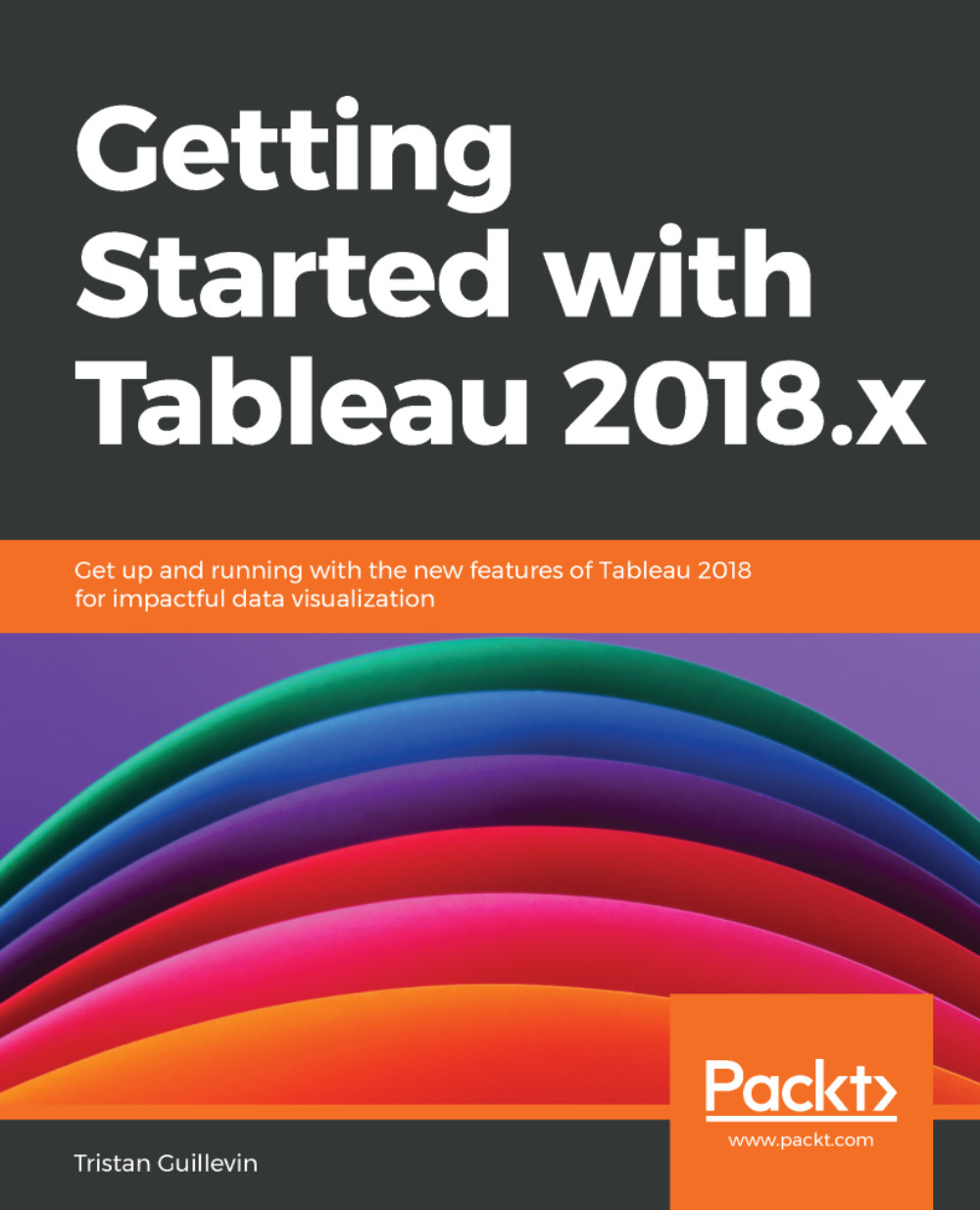
Mastering Tableau 2026

Mastering Tableau 2026: Implement advanced data visualizations, BI techniques and AI-powered analytics with Tableau , Fifth Edition

Arrow left icon
Profile Icon Marleen Meier
Arrow right icon
$59.99
Paperback Apr 2026 738 pages 5th Edition
eBook
$35.99 $47.99
Paperback
$59.99
Arrow left icon
Profile Icon Marleen Meier
Arrow right icon
$59.99
Paperback Apr 2026 738 pages 5th Edition
eBook
$35.99 $47.99
Paperback
$59.99
eBook
$35.99 $47.99
Paperback
$59.99

What do you get with Print?

Product feature icon Instant access to your digital copy whilst your Print order is Shipped
Product feature icon Paperback book shipped to your preferred address
Product feature icon Redeem a companion digital copy on all Print orders
Product feature icon Access this title in our online reader with advanced features
Product feature icon DRM FREE - Read whenever, wherever and however you want
Product feature icon AI Assistant (beta) to help accelerate your learning
Modal Close icon
Payment Processing...
tick Completed

Shipping Address

Billing Address

Shipping Methods
Table of content icon View table of contents Preview book icon Preview Book

Mastering Tableau 2026

1

Reviewing the Basics

Tableau is one of the leading tools used to solve Business Intelligence (BI) and analytics challenges. With this book, you will master Tableau's features and offerings in various paradigms of the BI domain. As an update to the successful Mastering Tableau series, this book covers essential Tableau concepts, data preparation, and calculations with Tableau, all the way up to Machine Learning (ML) use cases, data governance, and the AI features in Tableau 2026.

This edition comes with new datasets used to learn all about the latest Tableau 2026 features. We will look at AI-powered analytics and explore data governance functionality to guarantee excellent data quality for your workbooks. By the end of this book, you'll have mastered the advanced offerings of Tableau and its latest updates, up to Tableau version 2026.

Those who are fairly new to Tableau should find this chapter helpful in getting up to speed quickly; however, since this book targets advanced topics, relatively little time is spent considering the basics. For a more thorough consideration of fundamental topics, consider Learning Tableau, written by Joshua Milligan and published by Packt Publishing.

Continue reading if you want to gain a solid foundation in Tableau's interface and core functionality—specifically, if you want to learn how to navigate Tableau, connect to data, and design your first worksheets and dashboards. These skills are a steppingstone for more advanced topics covered later in the book. The goal of this chapter is to get you comfortable with Tableau's environment so that you can begin building basic yet effective visualizations. By the end, you'll have the confidence to start exploring more advanced features and workflows.

In this chapter, we'll discuss the following topics:

  • Creating worksheets and dashboards
  • Connecting Tableau to your data
  • Measure Names and Measure Values
  • Three essential Tableau concepts
  • Exporting data to other devices

Now, let's get started by exploring worksheet and dashboard creation in Tableau.

Your purchase includes a free PDF copy + exclusive extras

Your purchase includes a DRM-free PDF copy of this book, 7-day trial to the Packt+ library (no credit card required), and additional exclusive extras. See the Free benefits with your book section in the Preface to unlock them instantly and maximize your learning.

Creating worksheets and dashboards

At the heart of Tableau are worksheets and dashboards. Worksheets contain individual visualizations, and dashboards contain one or more worksheets. Additionally, worksheets and dashboards may be combined into stories to communicate particular insights to the end user through a presentation environment. Lastly, all worksheets, dashboards, and stories are organized in workbooks, which can be accessed using Tableau Desktop, Server, Reader, or the Tableau Mobile app.

In this section, we'll consider how to create worksheets and dashboards. Our intention here is to communicate the basics, but we'll also provide some insights that may prove helpful to more seasoned Tableau users.

Tableau Public

At this point, I would like to introduce you to Tableau Public (https://public.tableau.com). It is a web-based collection of dashboards, as well as a creator's platform that allows you to design beautiful dashboards without a license or installation. Although it doesn't come with all the same features as Tableau Desktop, you can install the Tableau Public version to follow-along with most examples in this book.

Even if you do use Tableau Desktop, I recommend creating a Tableau Public profile for sharing all the dashboards you've created that you think the world shouldn't miss out on. The best part, however, is that you can download many of the ones created by others, open them in your own version of Tableau, and start learning and replicating. In summary, Tableau Public is a free option for developing dashboards but offers limited data source connectivity, and feature availability. However, it does provide an excellent platform for downloading and sharing visualizations.

Since Q1 2026, Tableau Desktop can also be used for free with extended data source connectivity and feature availability but with it will not allow you to publish dashboards anywhere, not even to Tableau Public.

Creating worksheets

Before creating a worksheet, we'll need to create a visualization to populate it with. At the most fundamental level, a visualization in Tableau is created by placing one or more fields on one or more shelves. As an example, note that the visualization created in the following diagram is generated by placing Base case on the Text shelf on the Marks card:

Image 1

Figure 1.1: The Marks card

In the next subsection, you will get the chance to follow-along in your own Tableau workbook. Let's go!

Creating a visualization

Now, let's explore the basics of creating a visualization using an exercise:

  1. Navigate to https://github.com/PacktPublishing/Mastering-Tableau-2026/tree/main/Chapter01 to locate and download the workbook associated with this chapter. Alternatively, you can find the workbook here: https://github.com/PacktPublishing/Mastering-Tableau-2026/tree/main/Chapter01.
  2. Open the file by double-clicking on the downloaded workbook.
  3. The dashboard is connected to the CM_Data_Explorer data source from IEA.org and provides comprehensive global energy statistics and insights. This dataset is ideal for learning Tableau because it includes diverse, real-world data points on energy production, consumption, and related metrics, allowing you to practice building meaningful and actionable visualizations. For this first exercise, we will use Electronic Vehicle (EV) data, located under the 4.3 EV tab. Drag the data source from the Sheets pane into the canvas (enable Cleaned with Data Interpreter):
    Image 2

    Figure 1.2: Data source

  4. Click on the Demand Minerals 2024 vs 2030 (NetZero) worksheet tab and locate Base case within the Data pane, which can be found on the left-hand side:
    Image 3

    Figure 1.3: The Data pane

  5. Drag Base case to the Rows shelf:
    Image 4

    Figure 1.4: Dragging Base case to Rows

  6. Drag 2024 and Net Zero Emissions by 2050 Scenario 2030 to the Columns shelf and see the comparison on mineral demand increase from 2024 to 2030 to achieve Net Zero emissions by 2050 (the name change to SUM(2024) and SUM(Net Zero Emissi... will be explained in the next section, Beyond the default behavior):
    Image 5

    Figure 1.5: Critical mineral demand 2024 versus 2030

    To get a better picture of how many more critical minerals are needed, click on either pill on the Columns shelf and select Dual Axis. This will merge both charts into one.

    Image 6

    Figure 1.6: Dual Axis

  7. Now, click on one of the two x axes and select Synchronize Axis to make it easier for the user to compare the two different data points.
    Image 7

    Figure 1.7: Synchronize Axis

  8. In the Marks card, select All, which means the change will be applied to both pills, and choose Bar as the type of visualization:
    Image 8

    Figure 1.8: Selecting Bar

  9. Next, click on SUM(2024) in the Marks card and then Size and change the size of the 2024 mineral demand to the largest, the rightmost option. You will see blue bars appear below the orange ones:
    Image 9

    Figure 1.9: Changing size

This is your first visualization! Change the color of the bars to your liking by clicking on either the SUM(2024) or the SUM(Net Zero Emi... pill, or change any other of the parameters in the Marks card. Feel free to play around and create a visualization you'd most like to represent the increasing demand for critical minerals 2024 versus 2030 for EVs, following the Net Zero emission by 2050 scenario.

Did you come up with any interesting visualizations? Feel free to share them on Tableau Public. Add a #MasteringTableau tag if you want other readers of this book to find them—sharing is caring!

As you explore Tableau's behavior by dragging and dropping different fields onto different shelves, you'll notice that Tableau responds with default behaviors. These defaults, however, can be overridden, which we'll explore next.

Beyond the default behavior

In the preceding exercise, Creating a visualization, you may have noticed that the Marks card initially read Automatic. This means that Tableau is providing the default view. The default view can easily be overridden by choosing a different selection from the drop-down menu, which we did by selecting Bar; see Figure 1.9. By changing these settings on the Marks card, we can adjust the format in which your data will be displayed.

Another type of default behavior can be observed when dragging a field onto a shelf. For example, dragging and dropping a measure onto a shelf will typically result in the SUM() aggregation, which will sum up all values to the highest level of aggregation. If no dimension is present, it will be the sum of all values. If a dimension is present on the Marks card, this same dimension will serve as the highest level of aggregation. In Creating a visualization, you saw that the numeric values 2024 and Net Zero Emissions by 2050 Scenario 2030 were aggregated by the previously added dimension Base case. In Figure 1.6, you see that the numeric values are summed up by critical mineral; for example, in 2024, the demand for copper, to build EVs, was 497.

In Windows, you can override this default behavior by right-clicking and dragging a pill from the Data pane and dropping it onto a shelf. Tableau will respond with a dialog box and various aggregation options.

If you are working on macOS, you can right-click on the pill after you've dragged it to its location and then adjust the default behavior by changing the measure. This works on Windows as well. Another option is to right-click on the field while it is still in the Data pane on your left-hand side and select Default Properties | Aggregation.

Sorting and nested sorting

Now that you are familiar with the basics of dragging and dropping pills and are aware of Tableau's default aggregation behavior, the next thing most users want to do is to sort data to draw first conclusions, regarding, for example, minimum and maximum values. Navigate to the Nested Sorting tab and try to sort the region by the number under Tourism Inbound, but separately for each year.

Did it work for you?

In Tableau, sorting and nested sorting can be done by simply clicking on the icon next to each axis label:

Image 10

Figure 1.10: Sorting

To double-check the way of sorting, move your cursor onto the Region pill until an arrow appears in the right corner, and select Sort…:

Image 11

Figure 1.11: Sort settings

From the dropdown, select Nested and the desired Field Name value, as well as the Aggregation type:

Image 12

Figure 1.12: Nested sort

You will now see that from 2000 to 2005, the Middle East had fewer inbound tourists than Oceania. However, in 2006, this changed, and the Middle East had more inbound tourists than Oceania. This is a nested sort. After having completed and understood sorting and nested sorting, you will immediately be able to add value to your dashboards by presenting values in the most logical way. Now, we can move on to the next topic: the different default chart types Tableau comes with, available with the Show Me functionality.

Show Me

Show Me can help users new to Tableau to create the visualization they are looking for, such as bar charts, histograms, and area charts. It allows the Tableau author to create visualizations from input data at the click of a button. To understand how it works, let's refer to the following screenshot, which makes use of the Overriding Defaults worksheet. This view can be accessed by clicking the Show Me button in the upper-right corner of any Tableau sheet:

Image 13

Figure 1.13: Show Me

Every icon in Show Me that isn't grayed out represents a visualization that can be created simply by clicking on it. For example, in the preceding screenshot, Figure 1.13, the Tableau author may choose to click on the scatterplot chart icon to create a chart showing the relationship between GDP and Tourism Outbound for a region in 2012.

Show Me options are highlighted based on the selected fields deployed in the view.

Show Me may be effectively used for the following reasons:

  • Efficiency: A proficient Tableau author already knows how to create basic visualization types. Show Me automates these basic types and thus may be used for quicker production.
  • Inspiration: Determining an effective way to visualize a dataset can be challenging. Show Me can help with this challenge by allowing the Tableau author to quickly consider various options.
  • Education: An inexperienced Tableau author may access Show Me to better understand how various visualizations are created. By reading the help text displayed at the bottom of Show Me and changing the pill placement accordingly, much can be learned:
Image 14

Figure 1.14: Show Me

These three reasons demonstrate the strong capabilities that Show Me provides for worksheet creation; however, be careful not to use it as a crutch. If you click on the various options without understanding how each visualization is created, you're not only shortchanging the educational process, but you may also generate results that you don't understand and hence cannot explain to your stakeholders.

Once you are happy with the results and confident that the selected visualization puts enough emphasis on your data storytelling, your worksheet is ready for the next round of development. We've looked at some basic visualization creation and configuration techniques, so let's now look at how to group multiple worksheets into a dashboard.

Creating dashboards

Although, as stated earlier in this section, a dashboard contains one or more worksheets, dashboards are much more than just static presentations. They're an essential part of Tableau's interactivity. In this section, we'll populate a dashboard with worksheets and then deploy actions for interactivity.

Let's begin by building a dashboard.

Building a dashboard

To build our first dashboard, we will use the EV data again from the beginning of this chapter. I want to use the Net Zero emission scenario that shows us how many more critical minerals are needed in 2030 to be on track to achieve the Net Zero emission goal by 2050. The dashboard will be split into three areas: What is Net Zero?, a forecast, and additional information about the respective minerals and what EV producers are committed to.

The following are the steps for building a dashboard:

  1. In the workbook for this chapter, navigate to the Building a Dashboard tab.

    Note the Floating and Tiled buttons at the bottom left, next to your dashboard. If you select Tiled, your worksheets will auto-adjust, while when selecting Floating, this will not happen anymore, and your worksheets will be "floating" around the dashboard instead. This is a free form of worksheet arrangement on a dashboard that is a powerful functionality, especially when combined with transparent backgrounds. Note that floating can also be achieved by selecting it from the More Options dropdown on the right-hand side of every sheet in the dashboard.

  2. For our first dashboard, select Tiled.
  3. In the Objects pane, located on the left side of Figure 1.15, double-click on the Vertical Container object. This will help us create three sections:
    Image 15

    Figure 1.15: Creating a dashboard

    After double-clicking, you will see a blue outline that indicates that the container has been placed. Containers are meant for a selection of sheets that auto-adjust to fit next to (horizontal) or underneath (vertical) each other on your dashboard. At any point in time, select the container by clicking inside its white space. A blue outline will appear again. A selected container can be dragged to a different location on the dashboard, replacing an existing sheet or sharing space.

  4. Next, drag a Web Page object into the upper part of the container. The placement is indicated by a gray shaded area:
    Image 16

    Figure 1.16: Moving worksheets

  5. A URL popup will appear. Type in https://netzeroclimate.org/what-is-net-zero-2/.

    The gray shading provided by Tableau when dragging elements, such as worksheets and containers, onto a dashboard helpfully communicates where the elements will be placed. Take your time and observe carefully when placing an element on a dashboard, or the results may be unexpected.

  6. Next, drag a Horizontal Container object just below the previously added Web Page object:
    Image 17

    Figure 1.17: Dragging a Horizontal Container object

  7. Now, drag the Demand Minerals... worksheet inside the horizontal container:
    Image 18

    Figure 1.18: Dragging the worksheet

  8. Next to it, place another Web Page object (use the following URL: wikipedia.org):
    Image 19

    Figure 1.19: Placing another Web Page object

  9. Lastly, place a Text object below the horizontal container:
    Image 20

    Figure 1.20: Placing a Text object below the horizontal container

  10. Add the text from the EV Magazine website:
    Image 21

    Figure 1.21: Adding text

  11. You can now start formatting the dashboard as desired. The following tips may prove helpful:
    • Double-click on the Text object to change the font, and don't forget to add the source.
    • Change the Width and Height values by selecting Dashboard in the top-left corner:
      Image 22

      Figure 1.22: Changing the width and height

    • While the Text object is selected, click on Layout in the top-left corner of Tableau Desktop/Public and select a background color.
    • If any white space is still visible at the bottom of your dashboard, click inside and remove it by clicking X.
    • Add Blank objects in between tiles for a cleaner look and feel.
    • Add a dashboard title and change the font.
    • Change the worksheet title to make it more meaningful.
    • Remove the Measure Names container on the right side by selecting it and clicking X.
    • Select the Demand Minerals... worksheet and Fit Width in the top control bar on Tableau. This will shrink or extend the worksheet to perfectly fit into its space.
    • Adjust the sizes of elements on the screen by hovering over the edges between each element and then clicking and dragging. Drag the edges of containers to adjust the size of each worksheet.
    • Since we used containers, you can also select a container and then use Distribute Contents Evenly:
      Image 23

      Figure 1.23: Selecting Distribute Contents Evenly

This is my version of the dashboard so far.

You just created your first dashboard! In the next part, we will add further functionality to make the dashboard more interactive and meaningful.

Adding interactivity to a dashboard

One of the primary benefits of Tableau is the interactivity it provides for the end user. Dashboards aren't simply for viewing; they're meant for interaction. In this exercise, we'll add interactivity to the dashboard that was created in the previous exercise:

  1. Select the Demand Minerals... worksheet on the dashboard and click on the drop-down arrow on the right-hand side, which will open a menu. From there, select Filters, then Base case (Wiki):
    Image 24

    Figure 1.24: Adding a filter

  2. Now, select the newly created filter window, click again on the drop-down options arrow, and select Multiple Values (dropdown), as shown in Figure 1.25:
    Image 25

    Figure 1.25: Filter settings

  3. Deselect the - value.
  4. Lastly, navigate to Dashboard | Actions…. In the dialog box, click Add Action | Go To URL... and create a URL action, as shown here:
    Image 26

    Figure 1.26: Creating a URL action

This action will load the respective wiki page for each mineral whenever the user clicks on a mineral name in the Demand Minerals... worksheet. You have to make sure that the correct Web Page object is selected (wikipedia.org) and that the Base case (Wiki) field is inserted as a suffix to the Wikipedia URL. What this will do is enable the URL to change according to the selected value in the dashboard. In Figure 1.26, you can see an example below the URL, in blue: https://en.wikipedia.org/wiki/cobalt. This is the result when "cobalt" is selected. I created the Base case (Wiki) field from the original Base case field and changed uppercase to lowercase, as well as "Battery-grade graphite" to "graphite" to comply with the Wikipedia logic. In Chapter 13, Improving Performance, this topic will be discussed in more detail.

In Tableau, filters are used to subset the underlying data based on certain conditions, while action filters allow users to interactively filter data by clicking on a visual element.

Having completed the preceding dashboard exercise, you should now be able to click on the mineral names on the dashboard to observe the interactivity. You should also be able to interact with the wikipedia.org and the netzeroclimate.org web pages through your Tableau dashboard.

To learn some more advanced dashboard techniques, be sure to check out Chapter 10, Designing Dashboards and Best Practices for Visualizations.

Want to see a really cool Net Zero viz? Check out The Dark Side of Net Zero by James Espanol, Sara Khoo, and Thomas Bok (https://public.tableau.com/app/profile/james.espanol1478/viz/DarkSideofNetZero_jespanol/TheDarkSideofNetZero).

Image 27

Figure 1.27: The Dark Side of Net Zero

To conclude, you have learned how to put existing worksheets, as well as tiled or floating objects, on a dashboard. You have changed the dashboard layout by dragging and dropping, as well as by using containers, filters, and action filters. Each of these core activities will be repeated multiple times throughout the book, so feel free to come back to this chapter and repeat the exercise steps whenever needed!

Next, you will learn how to connect your own data to Tableau and work with it.

Connecting Tableau to your data

At the time of writing, Tableau's data connection menu includes more than 100 different connection types, including a wide range of file types, databases, cloud services, and web data sources. We won't cover the details for every connection type, but we will cover the basics. The official documentation on all Tableau Desktop connectors can be found at https://www.tableau.com/support/help.

Upon opening a new instance of Tableau Desktop from within Tableau Desktop (File | New), you'll notice a Connect to Data link in the top-left corner of the workspace. Clicking on that link will enable you to connect to the data. Opening a new instance of Tableau from the application's location on your computer will bring up the blue Connect pane right away. Alternatively, you can click on the New Data Source icon on the toolbar.

Although in future chapters we'll connect to other data sources, here, we'll limit the discussion to connecting to Microsoft Excel and text files.

Connecting to a file

Let's see how you can connect to a file, using Excel as an example:

  1. In Tableau, navigate to Data | New Data Source | Excel to connect to the Sample - Superstore dataset that is installed with Tableau Desktop (it should be located on your hard drive under My Tableau Repository | Data sources).
  2. Double-click on the Orders sheet.
  3. Click on the New Worksheet tab, as shown in Figure 1.28:
    Image 28

    Figure 1.28: New Worksheet

  4. Rename the newly created tab to Orders by right-clicking and selecting Rename.
  5. Place Discount on the Text shelf in the Marks card.
  6. Double-click on Profit and Sales:
    Image 29

    Figure 1.29: Orders

If you want to connect to a CSV file, you could use the Text file option. Later in this book (for example, in Chapter 11, Leveraging Advanced Analytics), we will also connect to spatial files.

In this section, we learned how to connect to files. We'll continue with another important connection type in the next section — Tableau Server.

Connecting to Tableau Server

Connecting to Tableau Server is perhaps the single most important server connection type to consider, since it's frequently used to provide a better level of performance than may otherwise be possible. Additionally, connecting to Tableau Server enables the author to receive not only data but also information regarding how that data is to be interpreted—for example, whether a given field should be considered a measure or a dimension.

We'll discuss the difference between these terms in the Dimensions and measures section later in the chapter.

The following are the steps for connecting to Tableau Server:

  1. To complete this exercise, access to an instance of Tableau Server is necessary. If you don't have access to Tableau Server, consider installing a trial version on your local computer.
  2. In the workbook associated with this chapter, navigate to the Connecting to Tableau Server worksheet.
  3. Right-click on the Sample - Superstore data source and select Publish to Server…:
    Image 30

    Figure 1.30: Publish to Server…

  4. Log in to Tableau Server and follow the prompts to complete the publication of the data source.
  5. Open a new instance of Tableau Desktop, select Data | New Data Source | Tableau Server, and then search for the Sample - Superstore dataset you just published and connect.

Having completed the preceding two exercises, let's discuss the most germane point—that is, metadata. Metadata is often defined as data about data. In the preceding case, the data source name, default aggregation, and default number formatting are all examples of consistency across multiple authors.

If you were to change a field name, for example, and then publish the data source to Tableau Server, the new field name would remain since Tableau remembers changes made to the metadata. This is important, for example, if your company has a policy regarding the use of decimal points when displaying currency; that policy will be easily adhered to if all Tableau authors start building workbooks by pointing to data sources where all formatting has been predefined.

Later on in this book, we will connect to other server types, such as Google BigQuery, but the handling of all servers is pretty much the same and very straightforward. If you still have questions, you can always check out the official Tableau documentation at https://www.tableau.com/support/help.

Now, our last missing piece regarding connections is saved data sources. Please follow-along with this as well.

Connecting to saved data sources

Connecting to a saved data source on a local machine is very similar to connecting to a data source published on Tableau Server. Metadata definitions associated with the local data source are preserved just as they are on Tableau Server. Of course, since the data source is local instead of remote, the publication process is different.

Let's explore the following steps to create a local data connection using an example:

  1. In the workbook associated with this chapter, navigate to the Orders tab.
  2. In the Data pane, right-click on the Sample - Superstore data source and select Add to Saved Data Sources.
  3. Using the resulting dialog box, save the data source as Superstore in My Tableau Repository | Data sources, which is located on your hard drive.
    Image 31

    Figure 1.31: Saving a data source

  4. Click on the Show Start Page Tableau icon located in the top-left part of your screen and observe the newly saved data source:
    Image 32

    Figure 1.32: Saved Data Sources

You can save a local data source that points to a published data source on Tableau Server. First, connect to a published data source on Tableau Server. Then, right-click on the data source in your workspace and choose Add to Saved Data Sources. Now, you can connect to Tableau Server directly from your start page!

Now that we've learned how to connect to files, Tableau Server, and saved data sources, we will continue our journey and dive into more details regarding Measure Names and Measure Values.

Measure Names and Measure Values

I've observed the following scenario frequently: a new Tableau author creates a worksheet and drags a measure to the Text shelf. They drag the second measure to various places on the view and get results that seem entirely unpredictable. The experience is very frustrating for the author since it's so easy to accomplish this in Microsoft Excel! The good news is that it's also easy to accomplish this in Tableau. It just requires a different approach.

Measure Names and Measure Values are generated fields in Tableau. They don't exist in the underlying data, but they're indispensable for creating many kinds of views. As may be guessed from its placement in the Data pane and its name, Measure Names is a dimension whose members are made up of the names of each measure in the underlying dataset. Measure Values contains the numbers or values of each measure in the dataset.

In this section, we'll watch what happens when these generated fields are used independently, then observe how they work elegantly together to create a view. Let's explore this with an exercise:

  1. In the workbook associated with this chapter, navigate to the MeasureNames/Values worksheet and make sure that the Sample - Superstore data source is selected.
  2. Drag Measure Values to the Text shelf and observe the results; all four values are printed on top of each other:
    Image 33

    Figure 1.33: Measure Values

  3. Clear the worksheet by clicking on the Clear Sheet icon on the toolbar:
    Image 34

    Figure 1.34: Clear Sheet

  4. Now, drag Measure Names to the Rows shelf and observe that the view merely displays No Measure Values.
  5. Drag Measure Values to the Text shelf. Note the list of measures and associated values; each of the four values is printed in the respective row:
    Image 35

    Figure 1.35: List of measure values

Perhaps the relationship between Measure Names and Measure Values is best explained by an analogy. Consider several pairs of socks and a partitioned sock drawer. Step 2 is the equivalent of throwing the socks into a pile. The results are, well, disorganized. Step 4 is the equivalent of an empty sock drawer with partitions. The partitions are all in place, but where are the socks? Step 5 is a partitioned drawer full of nicely organized socks. Measure Names is like the sock drawer. Measure Values is like the socks.

Independent of one another, they aren't of much use. Used together, they can be applied in many different ways.

Measure Names and Measure Values shortcuts

Tableau provides various shortcuts to quickly create the desired visualization. If you're new to the software, this shortcut behavior may not seem intuitive, but you'll gain an understanding of it. Let's use the following exercise to explore how you can use a shortcut to rapidly deploy Measure Names and Measure Values:

  1. In the workbook associated with this chapter, navigate to the MeasureNames/Values ShrtCts worksheet.
  2. Drag Profit onto Text in the Marks card.
  3. Drag Sales directly on top of Profit in the view (Show Me appears):
    Image 36

    Figure 1.36: Show Me and measures

  4. Observe the results, including the appearance of the Measure Values shelf, the deployment of Measure Names on the Rows and Filters shelves, and Measure Values on the Text shelf:
    Image 37

    Figure 1.37: Measure Values appearance

Several things happened in step 2 of this exercise. After placing the Sales number on top of the Profit number in the view, Tableau did the following:

  1. Deployed Measure Names on the Filters shelf: Open the Measure Names filter by right-clicking and hit Edit Filter.... Observe that only Sales and Profit are selected. This limits the view to display only those two measures.
  2. Deployed Measure Names on the Rows shelf: Measure Names is acting like a partitioned container—that is, like the sock drawer in the analogy. Because of the filter, the only rows that display are for Sales and Profit.
  3. Displayed the Measure Values shelf: The Measure Values shelf is somewhat redundant. Although it clearly shows measures that are displayed in the view, it essentially acts as an easy way to access the filter. You can simply drag measures on and off the Measure Values shelf to adjust the filter and thus display/hide additional measure values. You can also change the order within the Measure Values shelf to change the order of measures in the view.
  4. Deployed Measure Values on the Text shelf: Measure Values is simply defining numbers that will display for each row—in this case, numbers associated with Sales and Profit.

If the visualization has an axis, the shortcut to deploy Measure Names and Measure Values requires the placement of a second measure on top of the axis of an initial measure. In Figure 1.38, Order Date is located on the Columns shelf and Sales on the Rows shelf. Note that the screenshot was taken while Profit was placed on top of the y axis:

Image 38

Figure 1.38: Axis shortcut

The resulting worksheet can be seen in Figure 1.39:

Image 39

Figure 1.39: Two-line chart

This section gave us a better understanding of Measure Names and Measure Values. You will come across those concepts more in your Tableau career, but now that you've successfully mastered the basics, let's move on to three other concepts that will be beneficial for your learning curve.

Three essential Tableau concepts

An important stop on the road to mastering Tableau involves three essential concepts. In this section, we'll discuss each of them:

  • Dimensions and measures
  • Row-level, aggregate-level, and table-level calculations
  • Continuous and discrete values

We'll start by defining dimensions and measures.

Dimensions and measures

Tableau categorizes every field from an underlying data source as either a dimension or a measure. A dimension is qualitative or, to use another word, categorical. A measure is quantitative or aggregable. A measure is usually a number but may be an aggregated, non-numeric field, such as MAX (Date). A dimension is usually a text, Boolean, or date field, but may also be a number, such as Count. Dimensions provide meaning to numbers by slicing those numbers into separate parts/categories. Measures without dimensions are mostly meaningless.

Let's look at an example to understand better:

  1. In the workbook associated with this chapter, navigate to the Dimensions and Measures worksheet.
  2. Drag Orders (Count) to the Text shelf on the Marks card. The result is mostly meaningless. The result is 10,194, but without the context supplied by slicing the measure across one or more dimensions, there is really no way to understand what it means:
    Image 40

    Figure 1.40: Worksheet without context

  3. Place Region on the Columns shelf and Order Date on the Rows shelf:
    Image 41

    Figure 1.41: Dimensions and Measures

As shown in Figure 1.41, step 3 brings meaning. Placing Region and Order Date on the Columns and Rows shelves provides context, which imparts meaning to the visualization.

Row-level, aggregate-level, and table-level calculations

There are three levels of calculations in Tableau: row, aggregate, and table. To understand how these three levels function, it's important to understand the Tableau processes. We'll do so with an example that considers the Number of Records and Quantity fields from the Orders dataset.

In earlier versions of Tableau, Number of Records was a field created automatically. This is not the case anymore; therefore, please create a calculated field called Number of Records by selecting Analysis | Create Calculated Field and typing 1 inside it:

Image 42

Figure 1.42: Number of Records

Consider the following calculation types: calculated fields and queries. A comparison to the commonly used language SQL will give us a better understanding of how to interpret Tableau calculations. Note that the SQL is slightly simplified for the sake of this example.

Let's take a deeper look at the three levels of calculations and consider the example in the following table:

Calculation type

Calculated field in Tableau

Query passed to data source

Row-level

Number of Records /Quantity
SELECT Number of Records / Quantity)
FROM Orders

Aggregate-level

[Number of Records])/Sum(Quantity)
SELECT [Number of Records]),
SUM(Quantity) FROM [Orders]

Table-level

WINDOW_Sum([Number of Records])/Quantity))
SELECT [Number of Records]),
SUM(Quantity) FROM [Orders]

Table 1.1: Levels of calculation

For the row- and aggregate-level calculations, the computation is actually completed by the data source engine, as Tableau is an in-memory tool. Tableau merely displays the results. This, however, isn't the case for the table-level calculation. Although the query passed to the data source for the table-level calculation is identical to the query for the aggregate-level calculation, Tableau performs additional computations on the returned results. Let's explore this further with an exercise using the same calculated fields.

Let's look at the following steps and begin our exercise:

  1. In the workbook associated with this chapter, navigate to the Row_Agg_Tbl worksheet.
  2. Connect to the Orders data source by clicking on Orders in the Data section in the top-left corner.
    Image 43

    Figure 1.43: Connecting to Sample - Superstore dataset

  3. Select Analysis | Create Calculated Field to create the following calculated fields. Note that each must be created separately; that is, it isn't possible in this context to create a single calculated field that contains all three calculations:
    • Name the first calculation LevRow and enter the following code: [Number of Records]/[Quantity].
    • Next, name the second calculation LevAgg and enter the following code: SUM ([Number of Records])/SUM (Quantity).
    • Lastly, name the third calculation LevTab and enter WINDOW_AVG ([Lev - Agg]).
  4. In the Data pane, right-click on the three calculated fields you just created and select Default Properties | Number format.
  5. In the resulting dialog box, select Percentage and click OK.
  6. Place Order Date on the Columns shelf.
  7. Place Measure Names on the Rows shelf and Measure Values on Text on the Marks card.
  8. Exclude all values except for LevRow, LevAgg, and LevTab by dragging them off the Measure Values shelf or removing them from the Measure Names filter:
    Image 44

    Figure 1.44: Level of calculations

    Let's break the values in detail:

    • LevAgg is an aggregate-level calculation. The computation is completed by the data source engine. The sum of [Number of Records] is divided by the sum of [Quantity]. The results of the calculation are likely useful for the Tableau author.
    • LevRow is a row-level calculation. The computation is completed by the data source engine. The[Number of Records] field is divided by the [Quantity] field for each row of the underlying data. The results are then summed across all rows. Of course, in this case, the row-level calculation doesn't provide useful results; however, since a new Tableau author may mistakenly create a row-level calculation when an aggregate-level calculation is what's really needed, the example is included here.
    • LevTab is a table calculation. Some of the computation is completed by the data source engine, that is, the aggregation. Tableau completes additional computation on the results returned from the data source engine based on the dimensions and level of detail in the data displayed in the sheet. Specifically, the results of LevAgg are summed and then divided by the number of members in the dimension. For the preceding example, this is the following:

      B33477_01_001.png

      Once again, the results in this case aren't particularly helpful but do demonstrate knowledge that a budding Tableau author should possess.

Continuous and discrete values

Continuous and discrete aren't concepts that are unique to Tableau. Indeed, both can be observed in many arenas. Consider the following example of two rivers: River-Liquid and River-Ice. Water is flowing in River-Liquid. River-Ice is composed of ice cubes. Could you theoretically sort the ice cubes in River-Ice? Yes! Is there any way to sort the water in River-Liquid? In other words, could you take buckets of water from the bottom of the river, cart those buckets upstream, and pour the water back into River-Liquid, and thereby say "I have sorted the water in the river?" No.

The H2O in River-Liquid is in a continuous form; that is, water. The H2O in River-Ice is in a discrete form; that is, ice.

Having considered continuous and discrete examples in nature, let's turn our attention back to Tableau. Continuous and discrete in Tableau can be more clearly understood with the following seven considerations:

  • Continuous is green and discrete is blue: Select any field in the Data pane or place any field on a shelf, and you'll note that it's either green or blue. Also, the icons associated with fields are either green or blue.
  • Continuous is always numeric. Discrete may be a string.
  • Continuous and discrete aren't synonymous with dimensions and measures:
    • It's common for new Tableau authors to conflate continuous with measures and discrete with dimensions. They aren't synonymous. A measure may be either discrete or continuous.
    • Also, a dimension, if it's a number, may be discrete or continuous. To prove this point, right-click on any numeric or date field in Tableau and note that you can convert it:
      Image 45

      Figure 1.45: Converting between discrete and continuous

  • Discrete values can be sorted. Continuous values can't: Sortable/not sortable behavior is most easily observed with dates and a measure like Sum(Sales), as shown in the following example:
    Image 46

    Figure 1.46: Left: continuous (not sortable); right: discrete (sortable)

  • Continuous colors are gradients. Discrete colors are distinct: The following example shows Sales as continuous and then as discrete. Note the difference in how colors are rendered. The left portion of the screenshot demonstrates the continuous results in gradients, and the right portion demonstrates the discrete results in distinctly colored categories:
    Image 47

    Figure 1.47: Sales as continuous (left) and discrete (right)

  • Continuous pills can be placed to the right of discrete pills, but not to the left because the discrete pills define the aggregation level:
    • The Tableau author is able to place Region to the right of Year when Year is discrete
    • The Tableau author is unable to place Region to the right of Year when Year is continuous
  • Continuous creates axes and discrete creates headers: Note in the right portion of the following screenshot that Order Date is continuous and the Year of Order Date axis is selected. Since Year of Order Date is an axis, the entire x-plane is selected. In the left portion, however, Year(Order Date) is discrete, and 2014 is selected. Since 2014 is a header only, it's selected and not the entire x-plane. Figure 1.48 shows the discrete dates.
    Image 48

    Figure 1.48: Discrete dates

    Figure 1.49 shows the continuous dates.

    Image 49

    Figure 1.49: Continuous dates

Congratulations—you just mastered three important concepts in Tableau: measures and dimensions, the level of calculations, and discrete and continuous values. With this knowledge alone, you will be able to create your first dashboards. I want to highly encourage you to do so; the learning curve when playing around with these tools will be very steep, and you will gain confidence quickly with practice! It will also help you to follow-along in the upcoming chapters.

To conclude the basics, we will cover the export of dashboards to other devices next. Even if you don't feel ready to do so yet, it will round up the basic Tableau Desktop tour and will provide the raw diamond as a whole. We can then continue improving all bits and pieces in future chapters!

Exporting data to other devices

Once a dashboard looks as it's expected to, the developer has different choices for sharing the work. An upload to Tableau Server is the most likely option. The end user might not look at the results on just a laptop; they could use a tablet or cellphone, too.

Exporting data to a mobile phone

While developing a dashboard, Tableau Creator has the option to take a look at Device Designer or Device Preview. Whenever you are on a Dashboard tab, you can find it here:

Image 50

Figure 1.50: Device Preview

Tableau comes with default phone settings. If needed, those defaults can be adjusted by clicking on Phone and then on the three dots. Once you're in Device Designer mode, select a Device type option, and you'll get choices of the most common models. Please be aware that you can only use the sheets that are in the default layout of your dashboard. If you want to add a default layout for a tablet, for example, go into Device Designer mode, select Tablet, and move the content so that the sheets you want to see on your tablet are within the device frame. Satisfied? Then add the new layout (highlighted in Figure 1.50) to the workbook. It will appear under the Default one in the top-left area. The user can now select the design needed whenever opening a workbook from Tableau Server.

Not only can your projects be viewed conveniently on a mobile device, but you can also work on them on the go using Tableau Mobile! We'll cover this in the next section.

Tableau Mobile

To support flexible working, Tableau has created an app that can be downloaded from the App Store or from Google Play, called Tableau Mobile. Once installed on your phone and/or tablet, you will get the option to connect the app to Tableau Server or Tableau Online. Go ahead and publish the dashboard we created in this chapter, in the Building a dashboard section, to either of those two instances. If you have questions regarding the publishing, please see Chapter 13, Exploring Tableau Server and Tableau Cloud, for further instructions.

At the bottom of your landing page, click Explore to see all views you just published. Click on the Building a Dashboard view and see your previously created dashboard. The best part is yet to come. The dashboard is fully interactive, so try the drop-down filter or the Medals filter. Also, try to click on a mark and select Keep Only. By clicking on the workbook icon at the top right (the first icon from the left), all the other sheets you created will be visible, making it possible to switch between sheets:

Image 51

Figure 1.51: Sheet selection

Now, if you click the three dots at the top right, even more options will appear, such as Revert, Alert, Subscribe, and so on. To learn more about the different options that are also available on Tableau Server, see Chapter 13, Exploring Tableau Server and Tableau Cloud. For now, we can conclude that Tableau Mobile makes it easy to check your favorite dashboards wherever you are.

Follow-along dashboard using basics

To give you another chance to practice your Tableau skills, I have prepared the following exercise for you. Simply follow-along! We'll use the Global CO₂ Emissions by Country dataset from Our World in Data (OWID).

This dataset is great for practicing Tableau because it contains yearly CO₂ emissions, population, and per-capita values across countries; perfect for learning comparisons, trends, and geographic visualization:

  1. Go to the OWID CO₂ dataset repository at https://github.com/owid/co2-data and download the CSV file.
  2. Save the file locally on your computer. I called it OWID.csv.
  3. Open Tableau Desktop.
  4. On the start page, click Connect | To a File | Text File.
  5. Select the downloaded OWID.csv file:
    Image 52

    Figure 1.52: OWID.csv

  6. Open a new worksheet and drag Year to the Columns shelf, drag Co2 to the Rows shelf, and name the worksheet Emission Trends.
  7. To include only countries without any aggregations, such as all Organization for Economic Co-operation and Development (OECD) countries, please move ISO Code to the Filter shelf and deselect the Null value. Click on the filter again and select Apply to Worksheets | All Using This Data Source.
    Image 53

    Figure 1.53: Emission Trends

    You have now finished the first of three worksheets. A line chart shows emission trends.

  8. Next, add a new worksheet and drag Country to the Rows shelf. Also, drag Co2 to the Columns shelf. Then, drag Year to the Filter shelf, and filter for the most recent year (e.g., 2023). Make sure your Year pill is discrete (blue).
  9. Now, sort the chart in descending order and give the worksheet the title Top Emitters: <Year>. By adding the <Year> variable to the header, the title will be auto-adjusted, depending on the year you select. The ISO Code filter is inherited from the Emission Trends worksheet since we applied the filter there to all worksheets using the OWID data:
    Image 54

    Figure 1.54: Ranking

  10. For the last missing piece, open a new worksheet and drag Country to Detail in the Marks card. Tableau will recognize it as a geographic field and create a world map.
  11. Next, drag Co2_per_capita to Color and Year to the Filter shelf, and set the filter to the same year you used in the second worksheet, Top Emitters.
  12. Adjust the color scale to highlight differences (e.g., darker colors = higher per-capita emissions).

    I called this worksheet World Emission: <Year>.

    Image 55

    Figure 1.55: World Emission

    To get from three worksheets to an interactive dashboard, we must do the following:

  13. Open a new dashboard by clicking on the respective tab at the bottom of your page.
  14. From the left pane, drag your worksheets (Emission Trends, Top Emitters, World Emission) onto the canvas.
  15. Arrange them in a clean grid layout: Emission Trends (top left), Top Emitters (top right), World Emission (bottom):
    Image 56

    Figure 1.56: Dashboard

  16. Add a title, for example, Global CO₂ Emissions Dashboard.
  17. Click on the Top Emitters worksheet on the dashboard and select Filters | Year:
    Image 57

    Figure 1.57: Filters

  18. Click on the newly created filter and select Multiple Values (dropdown):
    Image 58

    Figure 1.58: Filter 2

  19. Also, click in the same filter, on Apply to Worksheets | Selected Worksheets, and select the World Emission worksheet as well:
    Image 59

    Figure 1.59: Applying the filter to the worksheet

  20. To clean up the dashboard, click on 1 unknown button on the world map (bottom right) and select Filter Data.
    Image 60

    Figure 1.60: Applying the filter

  21. Lastly, click on the World emission worksheet and select the filter icon on the right-hand side to use the map as a filter for the two upper worksheets:
    Image 61

    Figure 1.61: Use as Filter

The result is your very own emissions dashboard that shows a line chart comparing emissions over time for International Organization for Standardization (ISO) countries, and a bar chart of the top CO₂-emitting countries for the latest year, with a filter option to select any other year present in the dataset. Finally, you have a world map highlighting per-capita emissions, which also serves as a filter when clicking on any given country.

This combination gives a holistic view of global emissions and allows interactive exploration. I hope you like it! Feel free to add some more functionality and upload it to your Tableau Public profile.

Summary

In this chapter, we covered the basics of Tableau. We began with some basic terminology, then we looked at the basics of creating worksheets and dashboards. We focused on default behavior and how to override that behavior, and we considered some best practices. Then, we reviewed the fundamental principles of Measure Names and Measure Values. After that, we explored three essential Tableau concepts: dimensions and measures; row-, aggregate-, and table-level calculations; and the concept of continuous and discrete values. Of particular importance is understanding that row- and aggregate-level calculations are computed by the data source engine, while table-level calculations are handled by Tableau. Finally, we saw how to adjust your dashboard for other devices, such as a cellphone or tablet, and saw Tableau Mobile in action.

In the next chapter, we'll continue our Tableau exploration by looking at data. We'll consider how data is prepared using Tableau's data-handling engine, Hyper, and explore some useful data preparation models and techniques.

Get this book's PDF version and more

Scan the QR code (or go to packtpub.com/unlock). Search for this book by name, confirm the edition, and then follow the steps on the page.

Image 62
Image 63

Note: Keep your invoice handy. Purchases made directly from Packt don't require an invoice.

Left arrow icon Right arrow icon
Download code icon Download Code

Key benefits

  • Build advanced Tableau dashboards and data visualizations for business intelligence
  • Leverage Tableau AI features, automated insights, and LOD expressions to accelerate analysis
  • Master Tableau Prep Builder, Server, and advanced analytics, including time series and geospatial

Description

Master the full capabilities of Tableau to design, build, and scale modern data visualization and business intelligence solutions. This book takes you beyond the basics to help you create advanced Tableau dashboards, perform efficient data preparation with Tableau Prep Builder, and deliver impactful analytics across your organization. Through practical examples, you’ll learn how to turn raw data into meaningful insights using proven Tableau data visualization techniques. As you progress, you’ll work with calculated fields and LOD expressions to build more flexible and powerful analyses. You’ll also explore performance optimization, deployment, and collaboration using Tableau Server, along with best practices for data governance and security in enterprise environments. In addition, the book covers AI-powered Tableau features that enhance analysis and accelerate insight discovery. You’ll apply advanced techniques such as time series analysis, geospatial analytics, and data modeling, and extend Tableau’s capabilities through Python and R integration for more sophisticated analytics workflows. By the end of this book, you’ll be equipped to build scalable, high-performance Tableau analytics solutions, enabling you to solve complex business problems with confidence.

Who is this book for?

This book is designed for business analysts, business intelligence professionals, and data analysts who want to master Tableau to solve a range of data science and business intelligence problems. Prior exposure to Tableau will help you get to grips with the features more quickly, but it’s not a prerequisite.

What you will learn

  • Learn Tableau components like calculated fields and LOD expressions
  • Master Tableau Prep Builder with all its features and settings
  • Explore and implement data analytics with Python and R
  • Use Tableau Exchange for accelerators, extensions, and connectors
  • Interact with Tableau Server to understand its functionalities
  • Study advanced visualizations and dashboard creation techniques
  • Master self-service, time series, and geo-spatial analytics
  • Learn to implement data governance and AI-powered features
Estimated delivery fee Deliver to United States

Economy delivery 10 - 13 business days

Free $6.95

Premium delivery 6 - 9 business days

$21.95
(Includes tracking information)

Product Details

Country selected
Publication date, Length, Edition, Language, ISBN-13
Publication date : Apr 30, 2026
Length: 738 pages
Edition : 5th
Language : English
ISBN-13 : 9781806100712
Category :
Languages :
Tools :

What do you get with Print?

Product feature icon Instant access to your digital copy whilst your Print order is Shipped
Product feature icon Paperback book shipped to your preferred address
Product feature icon Redeem a companion digital copy on all Print orders
Product feature icon Access this title in our online reader with advanced features
Product feature icon DRM FREE - Read whenever, wherever and however you want
Product feature icon AI Assistant (beta) to help accelerate your learning
Modal Close icon
Payment Processing...
tick Completed

Shipping Address

Billing Address

Shipping Methods
Estimated delivery fee Deliver to United States

Economy delivery 10 - 13 business days

Free $6.95

Premium delivery 6 - 9 business days

$21.95
(Includes tracking information)

Product Details

Publication date : Apr 30, 2026
Length: 738 pages
Edition : 5th
Language : English
ISBN-13 : 9781806100712
Category :
Languages :
Tools :

Packt Subscriptions

See our plans and pricing
Modal Close icon
$19.99 billed monthly
Feature tick icon Unlimited access to Packt's library of 7,000+ practical books and videos
Feature tick icon Constantly refreshed with 50+ new titles a month
Feature tick icon Exclusive Early access to books as they're written
Feature tick icon Solve problems while you work with advanced search and reference features
Feature tick icon Offline reading on the mobile app
Feature tick icon Simple pricing, no contract
$199.99 billed annually
Feature tick icon Unlimited access to Packt's library of 7,000+ practical books and videos
Feature tick icon Constantly refreshed with 50+ new titles a month
Feature tick icon Exclusive Early access to books as they're written
Feature tick icon Solve problems while you work with advanced search and reference features
Feature tick icon Offline reading on the mobile app
Feature tick icon Choose a DRM-free eBook or Video every month to keep
Feature tick icon PLUS own as many other DRM-free eBooks or Videos as you like for just $5 each
Feature tick icon Exclusive print discounts
$279.99 billed in 18 months
Feature tick icon Unlimited access to Packt's library of 7,000+ practical books and videos
Feature tick icon Constantly refreshed with 50+ new titles a month
Feature tick icon Exclusive Early access to books as they're written
Feature tick icon Solve problems while you work with advanced search and reference features
Feature tick icon Offline reading on the mobile app
Feature tick icon Choose a DRM-free eBook or Video every month to keep
Feature tick icon PLUS own as many other DRM-free eBooks or Videos as you like for just $5 each
Feature tick icon Exclusive print discounts

Table of Contents

18 Chapters
Chapter 1: Reviewing the Basics Chevron down icon Chevron up icon
Chapter 2: Cleaning Your Data Chevron down icon Chevron up icon
Chapter 3: Using Tableau Prep Builder Chevron down icon Chevron up icon
Chapter 4: Learning About Joins, Blends, and Data Structures Chevron down icon Chevron up icon
Chapter 5: Introducing Table Calculations Chevron down icon Chevron up icon
Chapter 6: Utilizing OData, Data Densification, Big Data, and Google BigQuery Chevron down icon Chevron up icon
Chapter 7: Practicing Level of Detail Calculations Chevron down icon Chevron up icon
Chapter 8: Going Beyond the Basics Chevron down icon Chevron up icon
Chapter 9: Working with Maps Chevron down icon Chevron up icon
Chapter 10: Designing Dashboards and Best Practices for Visualizations Chevron down icon Chevron up icon
Chapter 11: Leveraging Advanced Analytics Chevron down icon Chevron up icon
Chapter 12: Improving Performance Chevron down icon Chevron up icon
Chapter 13: Exploring Tableau Server and Tableau Cloud Chevron down icon Chevron up icon
Chapter 14: Integrating Programming Languages Chevron down icon Chevron up icon
Chapter 15: The Intelligent Era of Tableau AI, Pulse, and Next Chevron down icon Chevron up icon
Chapter 16: Developing Data Governance Practices Chevron down icon Chevron up icon
Chapter 17: Unlock Your Exclusive Benefits Chevron down icon Chevron up icon
Index Chevron down icon Chevron up icon
Get free access to Packt library with over 7500+ books and video courses for 7 days!
Start Free Trial

FAQs

What is the digital copy I get with my Print order? Chevron down icon Chevron up icon

When you buy any Print edition of our Books, you can redeem (for free) the eBook edition of the Print Book you’ve purchased. This gives you instant access to your book when you make an order via PDF, EPUB or our online Reader experience.

What is the delivery time and cost of print book? Chevron down icon Chevron up icon

Shipping Details

USA:

'

Economy: Delivery to most addresses in the US within 10-15 business days

Premium: Trackable Delivery to most addresses in the US within 3-8 business days

UK:

Economy: Delivery to most addresses in the U.K. within 7-9 business days.
Shipments are not trackable

Premium: Trackable delivery to most addresses in the U.K. within 3-4 business days!
Add one extra business day for deliveries to Northern Ireland and Scottish Highlands and islands

EU:

Premium: Trackable delivery to most EU destinations within 4-9 business days.

Australia:

Economy: Can deliver to P. O. Boxes and private residences.
Trackable service with delivery to addresses in Australia only.
Delivery time ranges from 7-9 business days for VIC and 8-10 business days for Interstate metro
Delivery time is up to 15 business days for remote areas of WA, NT & QLD.

Premium: Delivery to addresses in Australia only
Trackable delivery to most P. O. Boxes and private residences in Australia within 4-5 days based on the distance to a destination following dispatch.

India:

Premium: Delivery to most Indian addresses within 5-6 business days

Rest of the World:

Premium: Countries in the American continent: Trackable delivery to most countries within 4-7 business days

Asia:

Premium: Delivery to most Asian addresses within 5-9 business days

Disclaimer:
All orders received before 5 PM U.K time would start printing from the next business day. So the estimated delivery times start from the next day as well. Orders received after 5 PM U.K time (in our internal systems) on a business day or anytime on the weekend will begin printing the second to next business day. For example, an order placed at 11 AM today will begin printing tomorrow, whereas an order placed at 9 PM tonight will begin printing the day after tomorrow.


Unfortunately, due to several restrictions, we are unable to ship to the following countries:

  1. Afghanistan
  2. American Samoa
  3. Belarus
  4. Brunei Darussalam
  5. Central African Republic
  6. The Democratic Republic of Congo
  7. Eritrea
  8. Guinea-bissau
  9. Iran
  10. Lebanon
  11. Libiya Arab Jamahriya
  12. Somalia
  13. Sudan
  14. Russian Federation
  15. Syrian Arab Republic
  16. Ukraine
  17. Venezuela
What is custom duty/charge? Chevron down icon Chevron up icon

Customs duty are charges levied on goods when they cross international borders. It is a tax that is imposed on imported goods. These duties are charged by special authorities and bodies created by local governments and are meant to protect local industries, economies, and businesses.

Do I have to pay customs charges for the print book order? Chevron down icon Chevron up icon

The orders shipped to the countries that are listed under EU27 will not bear custom charges. They are paid by Packt as part of the order.

List of EU27 countries: www.gov.uk/eu-eea:

A custom duty or localized taxes may be applicable on the shipment and would be charged by the recipient country outside of the EU27 which should be paid by the customer and these duties are not included in the shipping charges been charged on the order.

How do I know my custom duty charges? Chevron down icon Chevron up icon

The amount of duty payable varies greatly depending on the imported goods, the country of origin and several other factors like the total invoice amount or dimensions like weight, and other such criteria applicable in your country.

For example:

  • If you live in Mexico, and the declared value of your ordered items is over $ 50, for you to receive a package, you will have to pay additional import tax of 19% which will be $ 9.50 to the courier service.
  • Whereas if you live in Turkey, and the declared value of your ordered items is over € 22, for you to receive a package, you will have to pay additional import tax of 18% which will be € 3.96 to the courier service.
How can I cancel my order? Chevron down icon Chevron up icon

Cancellation Policy for Published Printed Books:

You can cancel any order within 1 hour of placing the order. Simply contact customercare@packt.com with your order details or payment transaction id. If your order has already started the shipment process, we will do our best to stop it. However, if it is already on the way to you then when you receive it, you can contact us at customercare@packt.com using the returns and refund process.

Please understand that Packt Publishing cannot provide refunds or cancel any order except for the cases described in our Return Policy (i.e. Packt Publishing agrees to replace your printed book because it arrives damaged or material defect in book), Packt Publishing will not accept returns.

What is your returns and refunds policy? Chevron down icon Chevron up icon

Return Policy:

We want you to be happy with your purchase from Packtpub.com. We will not hassle you with returning print books to us. If the print book you receive from us is incorrect, damaged, doesn't work or is unacceptably late, please contact Customer Relations Team on customercare@packt.com with the order number and issue details as explained below:

  1. If you ordered (eBook, Video or Print Book) incorrectly or accidentally, please contact Customer Relations Team on customercare@packt.com within one hour of placing the order and we will replace/refund you the item cost.
  2. Sadly, if your eBook or Video file is faulty or a fault occurs during the eBook or Video being made available to you, i.e. during download then you should contact Customer Relations Team within 14 days of purchase on customercare@packt.com who will be able to resolve this issue for you.
  3. You will have a choice of replacement or refund of the problem items.(damaged, defective or incorrect)
  4. Once Customer Care Team confirms that you will be refunded, you should receive the refund within 10 to 12 working days.
  5. If you are only requesting a refund of one book from a multiple order, then we will refund you the appropriate single item.
  6. Where the items were shipped under a free shipping offer, there will be no shipping costs to refund.

On the off chance your printed book arrives damaged, with book material defect, contact our Customer Relation Team on customercare@packt.com within 14 days of receipt of the book with appropriate evidence of damage and we will work with you to secure a replacement copy, if necessary. Please note that each printed book you order from us is individually made by Packt's professional book-printing partner which is on a print-on-demand basis.

What tax is charged? Chevron down icon Chevron up icon

Currently, no tax is charged on the purchase of any print book (subject to change based on the laws and regulations). A localized VAT fee is charged only to our European and UK customers on eBooks, Video and subscriptions that they buy. GST is charged to Indian customers for eBooks and video purchases.

What payment methods can I use? Chevron down icon Chevron up icon

You can pay with the following card types:

  1. Visa Debit
  2. Visa Credit
  3. MasterCard
  4. PayPal
What is the delivery time and cost of print books? Chevron down icon Chevron up icon

Shipping Details

USA:

'

Economy: Delivery to most addresses in the US within 10-15 business days

Premium: Trackable Delivery to most addresses in the US within 3-8 business days

UK:

Economy: Delivery to most addresses in the U.K. within 7-9 business days.
Shipments are not trackable

Premium: Trackable delivery to most addresses in the U.K. within 3-4 business days!
Add one extra business day for deliveries to Northern Ireland and Scottish Highlands and islands

EU:

Premium: Trackable delivery to most EU destinations within 4-9 business days.

Australia:

Economy: Can deliver to P. O. Boxes and private residences.
Trackable service with delivery to addresses in Australia only.
Delivery time ranges from 7-9 business days for VIC and 8-10 business days for Interstate metro
Delivery time is up to 15 business days for remote areas of WA, NT & QLD.

Premium: Delivery to addresses in Australia only
Trackable delivery to most P. O. Boxes and private residences in Australia within 4-5 days based on the distance to a destination following dispatch.

India:

Premium: Delivery to most Indian addresses within 5-6 business days

Rest of the World:

Premium: Countries in the American continent: Trackable delivery to most countries within 4-7 business days

Asia:

Premium: Delivery to most Asian addresses within 5-9 business days

Disclaimer:
All orders received before 5 PM U.K time would start printing from the next business day. So the estimated delivery times start from the next day as well. Orders received after 5 PM U.K time (in our internal systems) on a business day or anytime on the weekend will begin printing the second to next business day. For example, an order placed at 11 AM today will begin printing tomorrow, whereas an order placed at 9 PM tonight will begin printing the day after tomorrow.


Unfortunately, due to several restrictions, we are unable to ship to the following countries:

  1. Afghanistan
  2. American Samoa
  3. Belarus
  4. Brunei Darussalam
  5. Central African Republic
  6. The Democratic Republic of Congo
  7. Eritrea
  8. Guinea-bissau
  9. Iran
  10. Lebanon
  11. Libiya Arab Jamahriya
  12. Somalia
  13. Sudan
  14. Russian Federation
  15. Syrian Arab Republic
  16. Ukraine
  17. Venezuela
Modal Close icon
Modal Close icon